
Job:03171 Title:Typography Referenced (Rockport)
Page: 152
142-165 03171.indd 152 9/23/11 11:42 AM
152
Typography, Referenced
Text
Job:03171 Title:Typography Referenced (Rockport)
Page: 152
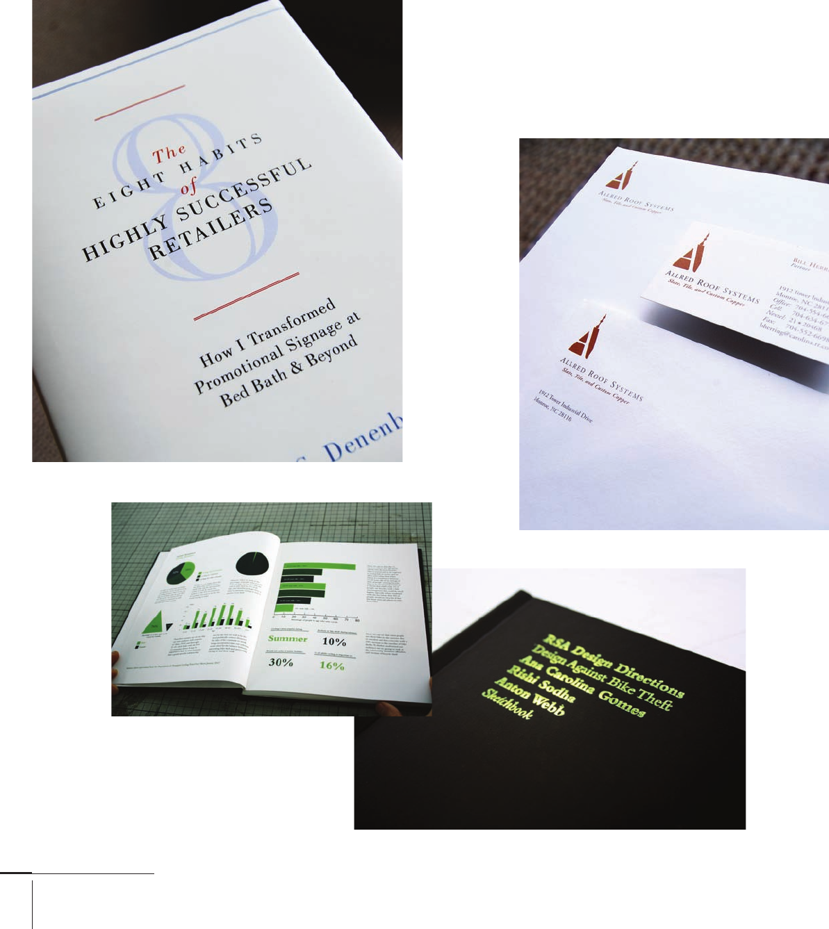
Bodoni Book and Bodoni
Openface come together
on the The Eight Habits
of Highly Successful
Retailers book cover.
Designed by Cotton and
Crown, United States.
This Design Directions sketchbook
cover by Creatives uses Adobe Bembo for
its title. The interior spread incorporates
it for subheads and body text.
142-165 03171.indd 152 9/23/11 11:42 AM

Job:03171 Title:Typography Referenced (Rockport)
Page: 153
142-165 03171.indd 153 9/23/11 11:43 AM
153
Text
Job:03171 Title:Typography Referenced (Rockport)
Page: 153
Typefaces and Specimens
The Texas Children’s Hospital
Hand Hygiene Campaign by
Principle combined Bodoni’s grace
with Gotham’s force in a playful
and complementary fashion.
The Allred Roof Systems
identity collateral
uses Adobe Garamond
regular. Designed by
Cotton and Crown,
United States.
142-165 03171.indd 153 9/23/11 11:43 AM
Job:03171 Title:Typography Referenced (Rockport)
Page: 154
ABCDE FGHIJKLMNOPQ RSTUVWXYZ
abcdefghijklmnopqrstuvwxyz
142-165 03171.indd 154 9/23/11 11:43 AM
154
Typography, Referenced
Text
Job:03171 Title:Typography Referenced (Rockport)
Page: 154
Background
Traits
John Baskerville () took some of the biggest steps forward in
letter design and printing. Using specially crafted paper and
drying racks, he shortened the time ink remained moist on
a paper’s surface. This allowed Baskerville’s foundry to print
letters with a much higher contrast () between thick and
thin, generating a light and delicate alphabet. In , Zuzana
Licko () based her font Mrs. Eaves on many of Baskerville’s
qualities and distributed it through the () foundry.
Baskerville’s higher contrast between the thick and thin
strokes makes for a lighter-looking letter. This makes
Baskerville
ORIGINAL DESIGNERS
John Baskerville
CLASS
Transitional
SELECTED BASKERVILLE ALPHABETS
Top to bottom: -point New Baskerville roman, italic, and bold
EXAMPLE
-point New Baskerville
YEAR
circa
Baskerville a safe choice for book designers who must set large
volumes of text type () at sizes ranging from to point
without overwhelming readers’ eyes.
Like many of the Transitional () faces, the font has
enough clarity for easy readability () without drawing
much attention to itself. However, it possesses various widths
throughout the alphabet that can make for unsightly kerning
() pairs. For example, its uppercase () E has a noticeably
longer beak (the bottom serif) that juts out oddly. Other unique
characters include its Q, with an organic tail that sits below the
baseline, an attribute that has prompted some designers to use
Baskerville whenever they need a capital Q.
A designer’s job will become even
more challenging as the quantity
of information and noise
increases during the twenty-fi rst
century. Those who possess
a broad typographic understanding
will best meet the communicative
and creative challenge, especially
during a time when people
know the difference between
one font and another—and which
ones read better or worse with software’s
default 120-percent leading.
ABCDEFGHIJKLMNOPQRSTUVWXYZ 1234567890
abcdefghijklmnopqrstuvwxyz
The quick brown fox jumped over the lazy dog.
ABCDEFGHIJKLMNOPQRSTUVWXYZ 1234567890
abcdefghijklmnopqrstuvwxyz
The quick brown fox jumped over the lazy dog.
ABCDEFGHIJKLMNOPQRSTUVWXYZ 1234567890
abcdefghijklmnopqrstuvwxyz
The quick brown fox jumped over the lazy dog.
142-165 03171.indd 154 9/23/11 4:58 PM
Job:03171 Title:Typography Referenced (Rockport)
Page: 155
ABCDEFGHIJKLMNOPQRSTUVWXYZ
abcdefghijklmnopqrstuvwxyz
142-165 03171.indd 155 9/23/11 11:43 AM
155
Typefaces and Specimens
Text
Job:03171 Title:Typography Referenced (Rockport)
Page: 155
Background Traits
Francesco Griff o () originally designed Bembo for Cardinal
Bembo for Aldus Manutius () to use to print the book
de Aetna, written by Pietro Bembo. As a punchcutter, Griff o
relied on his knowledge and expertise of metallurgy to
arrive at more modeled letterforms than his contemporary
letter designers could achieve using calligraphic methods.
In , Stanley Morison () based the Bembo typeface
on Griff o and Manutius’s printed work for Pietro Bembo.
Like Baskerville, Bembo works well for text type () not only
because it was invented for uninterrupted reading, but also
because of its crisp serifs and terminals. Those are traits that
Old Style () fonts such as Garamond () lack; their blobby
serifs have a more rounded appearance, which can create
slightly heavier areas on a page.
Bembo
YEAR
circa
ORIGINAL DESIGNERS
Francesco Griff o
CLASS
Old Style, Garalde
A designer’s job will become
even more challenging as the
quantity of information and noise
increases during the twenty-fi r
century. Those who possess a broad
typographic under anding will be
meet the communicative and creative
challenge, especially during a time
when people know the di erence
between one font and another—
and which ones read better or worse with
software’s default 120-percent leading.
ABCDEFGHIJKLMNOPQRSTUVWXYZ 1234567890
abcdefghijklmnopqrstuvwxyz
The quick brown fox jumped over the lazy dog.
ABCDEFGHIJKLMNOPQRSTUVWXYZ 1234567890
abcdefghijklmnopqrstuvwxyz
The quick brown fox jumped over the lazy dog.
ABCDEFGHIJKLMNOPQRSTUVWXYZ 1234567890
abcdefghijklmnopqrstuvwxyz
The quick brown fox jumped over the lazy dog.
SELECTED BEMBO ALPHABETS
-point Monotype Bembo book, book italic, and book bold
EXAMPLE
-point Monotype Bembo
142-165 03171.indd 155 9/23/11 11:43 AM

Job:03171 Title:Typography Referenced (Rockport)
Page: 156
ABCDEFGHIJKLMNOPQRSTUVWXYZ
abcdefghijklmnopqrstuvwxyz
142-165 03171.indd 156 9/23/11 11:43 AM
156
Typography, Referenced
Text
Job:03171 Title:Typography Referenced (Rockport)
Page: 156
Background Traits
Giambattista Bodoni () designed many of the Modern
typefaces during the forty-fi ve years he worked as the director
of printing and publishing at the house of the Duke of Parma
in Italy. In the late s, he began experimenting with ways
to use mathematics and geometry in his type designs.
Combining those interests with his skill as a masterful
engraver allowed Bodoni to render the sharp, hairline serifs
that became his signature.
As body or text type (), standard issues of Bodoni can
appear faint with hard-to-see serifs. But both Adobe () and
() have book versions that make Bodoni an excellent
choice for subheads or pull quotes, even text type.
Bodoni
YEAR
circa
ORIGINAL DESIGNERS
Giambattista Bodoni
CLASS
Modern, Didone
A designer’s job will become
even more challenging as the
quantity of information and noise
increases during the twenty-fi rst
century. Those who possess a
broad typographic understanding
will best meet the communicative
and creative challenge, especially
during a time when people know
the diff erence between one font
and another—and which ones
read better or worse with software’s
default 120-percent leading.
ABCDEFGHIJKLMNOPQRSTUVWXYZ 1234567890
abcdefghijklmnopqrstuvwxyz
The quick brown fox jumped over the lazy dog.
ABCDEFGHIJKLMNOPQRSTUVWXYZ 1234567890
abcdefghijklmnopqrstuvwxyz
The quick brown fox jumped over the lazy dog.
ABCDEFGHIJKLMNOPQRSTUVWXYZ 1234567890
abcdefghijklmnopqrstuvwxyz
The quick brown fox jumped over the lazy dog.
SELECTED BODONI ALPHABETS
-point Bodoni roman, italic, and bold
EXAMPLE
-point Bodoni
142-165 03171.indd 156 9/23/11 11:43 AM
..................Content has been hidden....................
You can't read the all page of ebook, please click here login for view all page.