

vwy
Job:03171 Title:Typography Referenced (Rockport)
Page: 157
ABCDEFGHIJKLMNOPQRSTUVWXYZ
abcdefghijklmnopqrstuvwxyz
142-165 03171.indd 157 9/23/11 11:43 AM
157
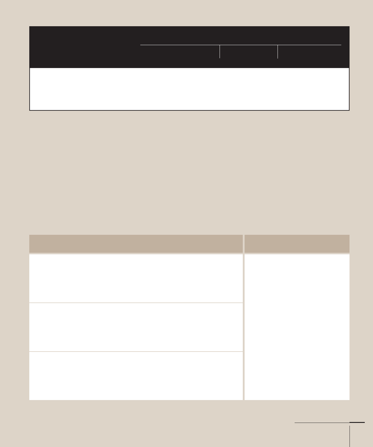
Typefaces and Specimens
Text
Job:03171 Title:Typography Referenced (Rockport)
Page: 157
Background Traits
Dutch foundries applied a more rigid and muscular shape to
how they created letters, and Englishman William Caslon I ()
took this into consideration when he designed his Caslon type-
face in . It became the standard for many of the American
colonies, eventually used in printed copies of the United States
Declaration of Independence and the Constitution.
Caslon’s short x-height makes its lowercase () ascenders
appear statuesque compared to other serif typefaces. In terms
of rendering, the italic v, w, and y appear handwritten com-
pared to the rest of the lowercase letters.
Caslon
YEAR
ORIGINAL DESIGNERS
William Caslon
CLASS
Old Style, Garalde
A designer’s job will become
even more challenging as the
quantity of information and noise
increases during the twenty-
r century. ose who possess a
broad typographic under anding
will be meet the communicative
and creative challenge, especially
during a time when people know
the di erence between one font
and another—and which ones
read better or worse with software’s
default 120-percent leading.
ABCDEFGHIJKLMNOPQRSTUVWXYZ 1234567890
abcdefghijklmnopqrstuvwxyz
e quick brown fox jumped over the lazy dog.
ABCDEFGHIJKLMNOPQRSTUVWXYZ 1234567890
abcdefghijklmnopqrstuvwxyz
e quick brown fox jumped over the lazy dog.
ABCDEFGHIJKLMNOPQRSTUVWXYZ 1234567890
abcdefghijklmnopqrstuvwxyz
e quick brown fox jumped over the lazy dog.
SELECTED CASLON ALPHABETS
Top to bottom: -point Adobe Caslon Pro roman, italic, and bold
EXAMPLE
-point Adobe Caslon
142-165 03171.indd 157 9/23/11 11:43 AM

Job:03171 Title:Typography Referenced (Rockport)
Page: 158
ABCDEFGHIJKLMNOPQRSTUVWXYZ
abcdefghijklmnopqrstuvwxyz
142-165 03171.indd 158 9/23/11 11:43 AM
158
Typography, Referenced
Text
Job:03171 Title:Typography Referenced (Rockport)
Page: 158
Background Traits
Bruce Rogers () based Centaur on Nicolas Jenson’s () roman
type from the fi fteenth century () and designed it for New
York’s Metropolitan Museum Press. The typeface fi rst appeared
in Montague Press’s The Centaur by Maurice de Guerin.
In , the Monotype Company () issued it for machine
composition, bowing to requests to make the face available
to the general public. Rogers worked with Frederic Warde to
craft an italic face and used an italic version of Warde’s Arrighi
for Centaur italic.
Compared to Jenson’s typeface, Centaur is lighter in
color and has a crisp appearance when used for text type
(). Many of the lowercase () vertical strokes and
stems appear curved, giving it a handcrafted feel.
Centaur
YEAR
ORIGINAL DESIGNERS
Bruce Rogers
CLASS
Humanist
A designer’s job will become even
more challenging as the quantity of
information and noise increases
during the twenty- rst century.
Those who possess a broad
typographic understanding will best
meet the communicative and creative
challenge, especially during a time
when people know the di erence
between one font and another—
and which ones read better or worse with
software’s default 120-percent leading.
ABCDEFGHIJKLMNOPQRSTUVWXYZ 1234567890
abcdefghijklmnopqrstuvwxyz
The quick brown fox jumped over the lazy dog.
ABCDEFGHIJKLMNOPQRSTUVWXYZ 1234567890
abcdefghijklmnopqrstuvwxyz
The quick brown fox jumped over the lazy dog.
ABCDEFGHIJKLMNOPQRSTUVWXYZ 1234567890
abcdefghijklmnopqrstuvwxyz
The quick brown fox jumped over the lazy dog.
SELECTED CENTAUR ALPHABETS
Top to bottom: -point Monotype Centaur regular, italic, and bold
EXAMPLE
-point Monotype Centaur
142-165 03171.indd 158 9/23/11 11:43 AM
Job:03171 Title:Typography Referenced (Rockport)
Page: 159
ABCDEFGHIJKLMNOPQRSTUVWXYZ
a bcdefghijklmnopqrstuvwxyz
142-165 03171.indd 159 9/23/11 11:43 AM
159
Typefaces and Specimens
Text
Job:03171 Title:Typography Referenced (Rockport)
Page: 159
Background Traits
Linn Boyd Benton cut the fi rst version of Century in with T. L
de Vinne for Century Magazine. Century appeared darker than its
contemporaries. Benton’s son Morris Fuller Benton ()
created Century Expanded and other variants for American
Type Founders. By , the younger Benton had made further
modifi cations, resulting in New Century Schoolbook.
Because of the added counterspaces in Century’s lowercase
() a, the letter looks airy compared to other Old Style ()
serifs. Both Century and New Century Schoolbook have tested
well in legibility () studies, making it the de facto choice for
setting children’s reading primers and educational materials.
Century
YEAR
ORIGINAL DESIGNERS
Linn Boyd Benton and
T. L. de Vinne
CLASS
Old Style, Transitional
A designer’s job will become
even more challenging as the
quantity of information and
noise increases during the
twenty-fi rst century. Those who
possess a broad typographic
understanding will best meet
the communicative and creative
challenge, especially during
a time when people know the
difference between one font and
another—and which ones read
better or worse with software’s
default 120-percent leading.
ABCDEFGHIJKLMNOPQRSTUVWXYZ 1234567890
abcdefghijklmnopqrstuvwxyz
The quick brown fox jumped over the lazy dog.
ABCDEFGHIJKLMNOPQRSTUVWXYZ 1234567890
abcdefghijklmnopqrstuvwxyz
The quick brown fox jumped over the lazy dog.
ABCDEFGHIJKLMNOPQRSTUVWXYZ 1234567890
abcdefghijklmnopqrstuvwxyz
The quick brown fox jumped over the lazy dog.
SELECTED CENTURY ALPHABETS
-point Monotype Century Expanded roman, italic, and bold
EXAMPLE
-point Monotype Century Expanded
142-165 03171.indd 159 9/23/11 11:43 AM
Job:03171 Title:Typography Referenced (Rockport)
Page: 160
ABCDEFGHIJKLMNOPQRSTUVWXYZ
a bcde fghijk lmnopqrstuvwxyz
142-165 03171.indd 160 9/23/11 11:43 AM
160
Typography, Referenced
Text
Job:03171 Title:Typography Referenced (Rockport)
Page: 160
Background Traits
Morris Fuller Benton () designed Clearface in , and it
was recognized for its nuanced lowercase () letterforms.
The rather small—almost slab ()—serifs make it an
understated Old Style () face. Due to Clearface’s popularity,
a majority of the major font foundries including Linotype
(), Intertype, Monotype (), British Monotype, and
Ludlow have licensed or copied it. Open-faced versions have
been distributed under the names Clearface Open, Clearface
Handtooled, and Dominus.
Clearface’s lowercase e, k, v, w, and y all possess quirks
that make the letters stand out when used for large bodies
of text type (). But it’s the a that’s the most signifi cant
because of its reduced curve from the ball terminal to the
stem, creating more negative space than any other serif a.
However, the condensed body enables many characters to
be set in a paragraph measure compared with other, wider
Old Style () typeface.
Clearface
YEAR
ORIGINAL DESIGNERS
Morris Fuller Benton
CLASS
Transitional
A designer’s job will become
even more challenging as the
quantity of information and
noise increases during the
twenty-fi rst century. Those who
possess a broad typographic
understanding will best meet
the communicative and creative
challenge, especially during
a time when people know the
difference between one font and
another—and which ones read
better or worse with software’s
default 120-percent leading.
ABCDEFGHIJKLMNOPQRSTUVWXYZ 1234567890
abcdefghijklmnopqrstuvwxyz
The quick brown fox jumped over the lazy dog.
ABCDEFGHIJKLMNOPQRSTUVWXYZ 1234567890
abcdefghijklmnopqrstuvwxyz
The quick brown fox jumped over the lazy dog.
ABCDEFGHIJKLMNOPQRSTUVWXYZ 1234567890
abcdefghijklmnopqrstuvwxyz
The quick brown fox jumped over the lazy dog.
SELECTED CLEARFACE ALPHABETS
Top to bottom: -point Clearface regular, italic, and heavy
EXAMPLE
-point Clearface
142-165 03171.indd 160 9/23/11 11:43 AM
Job:03171 Title:Typography Referenced (Rockport)
Page: 161
ABCDEFGHIJKLMNOPQRSTUVWXYZ
abcdefghijklmnopqrstuvwxyz
142-165 03171.indd 161 9/23/11 11:43 AM
161
Typefaces and Specimens
Text
Job:03171 Title:Typography Referenced (Rockport)
Page: 161
Background Traits
Firmin Didot () created his eponymous font during a search
for clean and effi cient letter rendering and did so with a high
contrast () in strokes and minuscule hairline serifs. These
traits epitomized the new Modern style, and Didot fi rmly
established this standard in France. His work predates that by
his Italian competitor, Giambattista Bodoni (), but both are
credited for laying the foundation for what’s today known as
Modern typeface.
Like Bodoni’s, Didot’s serifs contain no brackets. Other Modern
features include a vertical stress and high contrast between
strokes. The curved tail of the Q and curved leg of the R give
Didot humanistic properties. Several revivals or newer versions
look similar to the original, including those from Deberny &
Peignot, Ludwig & Mayer, Linotype (), and Monotype ().
Didot
YEAR
ORIGINAL DESIGNERS
Firmin Didot
CLASS
Modern, Didone
A designer’s job will become
even more challenging as
the quantity of information
and noise increases during
the twenty-fi rst century.
Those who possess a broad
typographic understanding
will best meet the
communicative and creative
challenge, especially during
a time when people know
the difference between
one font and another—
and which ones read better
or worse with software’s
default 120-percent leading.
ABCDEFGHIJKLMNOPQRSTUVWXYZ 1234567890
abcdefghijklmnopqrstuvwxyz 1234567890
The quick brown fox jumped over the lazy dog.
ABCDEFGHIJKLMNOPQRSTUVWXYZ 1234567890
abcdefghijklmnopqrstuvwxyz 1234567890
The quick brown fox jumped over the lazy dog.
ABCDEFGHIJKLMNOPQRSTUVWXYZ 1234567890
abcdefghijklmnopqrstuvwxyz 1234567890
The quick brown fox jumped over the lazy dog.
SELECTED DIDOT ALPHABETS
Top to bottom: -point Linotype Didot roman, italic, and bold
EXAMPLE
-point Linotype Didot
142-165 03171.indd 161 9/23/11 11:43 AM
..................Content has been hidden....................
You can't read the all page of ebook, please click here login for view all page.