
Job:03171 Title:Typography Referenced (Rockport)
Page: 222
206-233 03171.indd 222 9/23/11 5:24 PM
Text
Job:03171 Title:Typography Referenced (Rockport)
Page: 222
222
Typography, Referenced
T
ypographic hierarchy refers to the level of impor-
tance expressed by a piece of text in its environment,
whether print-based or on screen. A variety of
factors may indicate hierarchy: letterform size,
letterform weight, letterform design characteristics, text
color, text contrast () with the background, text position
and orientation on the page or screen, and general mass.
These factors exist in relation to each other and also in rela-
tion to images, margin space, and space between lines on the
page. For motion-based screen text, animation characteristics—
how long the element is visible, how it moves into, off of, and
around the screen—also aff ect hierarchy.
The viewers take cues from all of the above factors as they
scan the text, making split-second decisions about what to
read and in which order. Actually, “read” may not best describe
what happens because viewers may actually be apprehending
a variety of information at once rather than reading individual
components. Indeed, as people become increasingly busy
multitaskers, they make fewer hierarchically driven decisions
about how much attention to divert to any single task.
Designers must be cognizant of the scant amount of attention
their designs may receive, making it increasingly important to
create clear typographic hierarchy.
TYPOGRAPHIC PRINCIPLES
Hierarchy
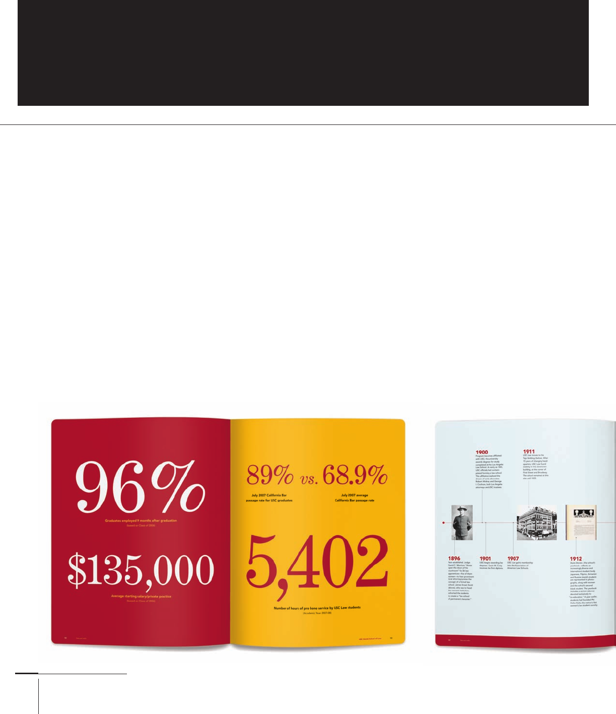
Each of these spreads from the Law Viewbook is an exemplar of the complex arrangement of hierarchical information. It is useful to
observe how the format can be altered to suit the need of the subject matter, yet remain connected to the grid and typographic structure.
Even though the pages include three typefaces—Adobe Caslon Pro, Century Expanded Std, and Avenir—a plethora of shifts in size,
weight, case, slope, and tracking clearly direct the reader’s attention to the text in order of its importance. The weight and size of the
display type also serve as a kind of ballast for the pages, providing contrast and visual interest. AdamsMorioka, Inc., United States.
206-233 03171.indd 222 9/23/11 5:24 PM
Job:03171 Title:Typography Referenced (Rockport)
Page: 223
206-233 03171 C2.indd 223 10/12/11 10:25 AM
Text
Job:03171 Title:Typography Referenced (Rockport)
Page: 223
223
Typographic Principles
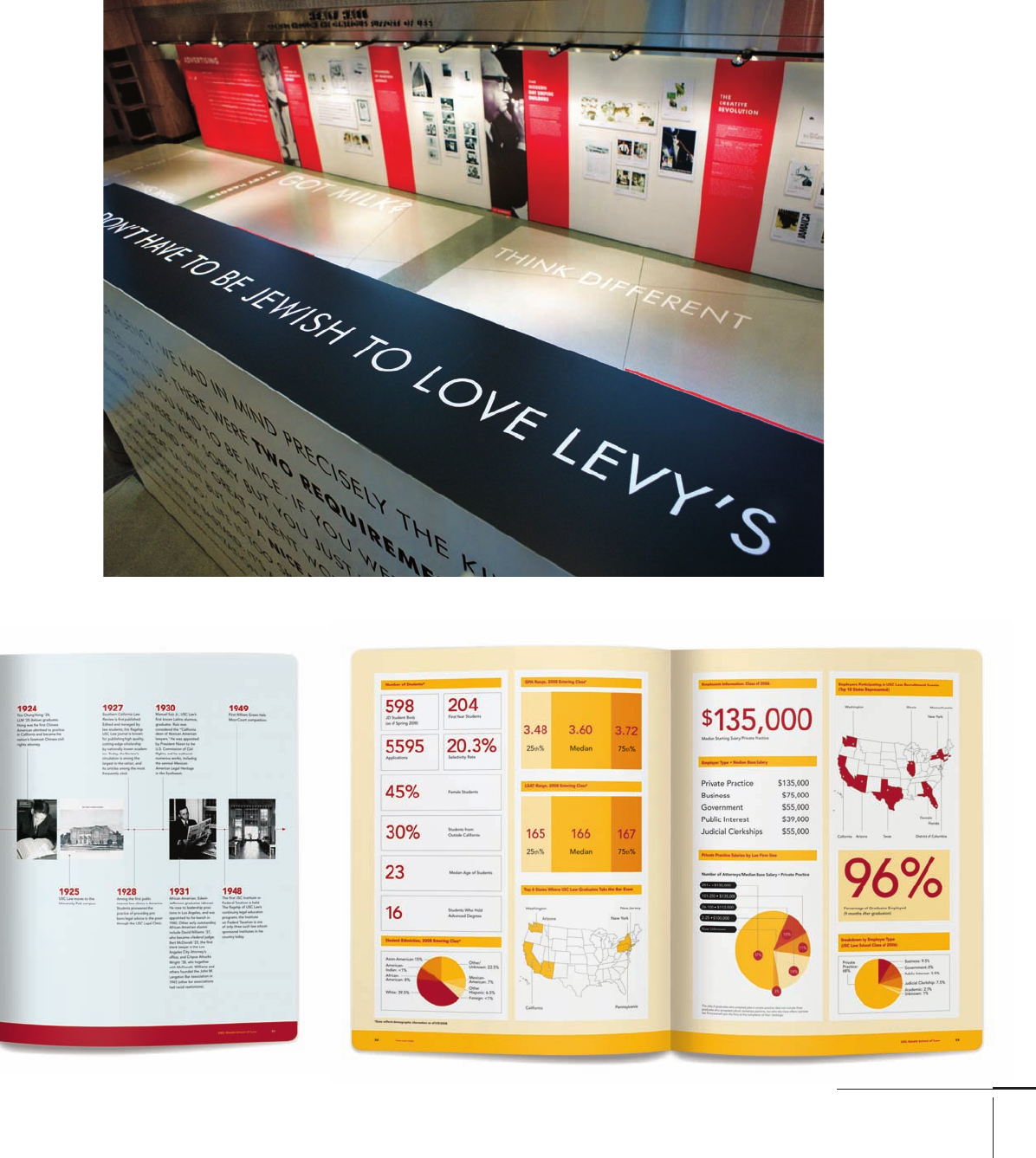
Hierarchy is especially
important for environ-
mental graphics, where
the text guides the user
through diff ering levels
of information. In this
The One Club Exhi-
bition, the typeface
Futura does the heavy
lifting, announcing
campaigns and catch
phrases, among other
text-based informa-
tion. Varying the size
demonstratively gives
users enough visual
cues from afar to pull
them in. Design,
United States.
206-233 03171.indd 223 9/23/11 5:24 PM
Job:03171 Title:Typography Referenced (Rockport)
Page: 224
206-233 03171.indd 224 9/24/11 10:08 AM
Text
Job:03171 Title:Typography Referenced (Rockport)
Page: 224
224
Typography, Referenced
W
hen diff ering elements on a format look
like they belong together, designers call
it unity. This togetherness across multi-
ple documents, such as pages found in
books or magazines or areas of a website, tells users
that they are interacting with something whole and
complete. Many designers use the term Gestalt—
meaning an organized whole perceived as more than
the sum of its parts—to explain unity in design com-
positions, whether printed, digital, or experiential.
Repetition is one way to achieve unity through color,
shape, size, placement, arrangement, order, or depth.
Typographic variety is one of the primary tools
to create hierarchy () by varying, for example,
the typeface’s size, tone, color, texture, placement,
weight, width, and position. Too much repetition
isn’t always necessary, and sometimes it can
fragment a design’s message or worse yet, frazzle the
reader. Just enough variation between typographic
elements can go a long way to diff erentiating levels of
information at both large and small scales.
Unity and Variety
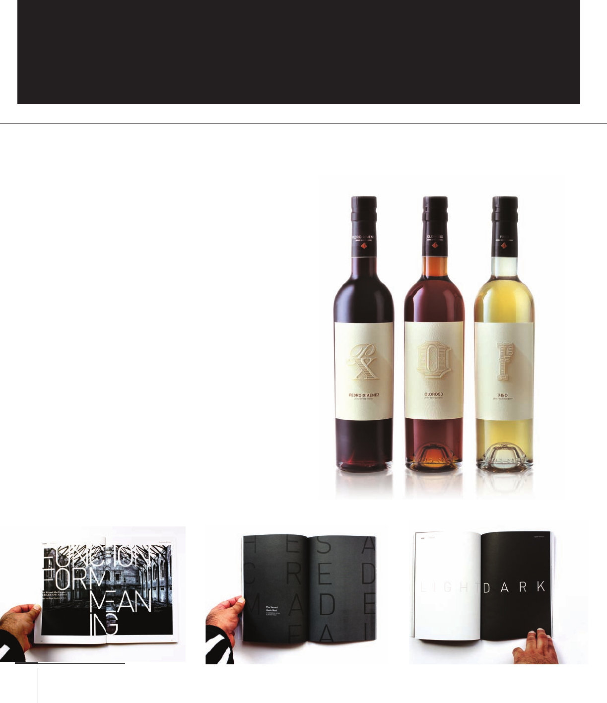
These three bottles for FdeC sherry each have diff erent color
contents and identifi cation labels. However, the consistent
visual treatment of the typography—in terms of size, weight,
and placement—tells shoppers that the bottles come from
the same product family. Design Bridge, United Kingdom.
As readers page through the Westminster School’s Vision magazine,
they encounter a range of weighted spreads that include photo-
graphic content, as well as all text. (These pages include the typefaces
Akzidenz Grotesk, Garamond, and .) One added feature in this
design is the use of matte versus gloss inks, to give it a subtle but appre-
ciative fourth level of variety. Creatives, United Kingdom.
206-233 03171.indd 224 9/24/11 10:08 AM
TYPOGRAPHIC PRINCIPLES

Job:03171 Title:Typography Referenced (Rockport)
Page: 225
206-233 03171 C2.indd 225 10/12/11 10:26 AM
Text
Job:03171 Title:Typography Referenced (Rockport)
Page: 225
225
Typographic Principles
To convey a unifi ed brand identity, Kevin Finn
used a typographic and ruled system that ties
together all of these business documents, despite
each of their separate functions. From top to
bottom: letterhead, invoice, label, business card.
Globale Bold and Regular, Kevin Finn, Australia.
The Dirty Hostage Business card
uses diff ering weights of Avenir
typeface to identify the photo-
journalist’s name and contact
information. Kevin Finn, Australia.
206-233 03171.indd 225 9/23/11 5:25 PM
Job:03171 Title:Typography Referenced (Rockport)
Page: 226
206-233 03171.indd 226 9/23/11 5:25 PM
Text
Job:03171 Title:Typography Referenced (Rockport)
Page: 226
226
Typography, Referenced
G
raphic designers can achieve balanced compo-
sitions through symmetrical or asymmetrical
compositions. A symmetrical layout results
when the left and right sides of a composi-
tion receive equal weight. This mirror-imaged layout
often brings about less dynamic work than the contrast-
ing option of asymmetry. An asymmetrical composition
occurs when there is nothing similar between left and
right. These tend to be less static than symmetrical work
and less reliant on the center, where everything falls into
a convenient and comfortable place. Neither composi-
tional method is inherently better or worse; each is a tool
to further a designer’s intention, message, or concept.
TYPOGRAPHIC PRINCIPLES
Symmetry and Asymmetry
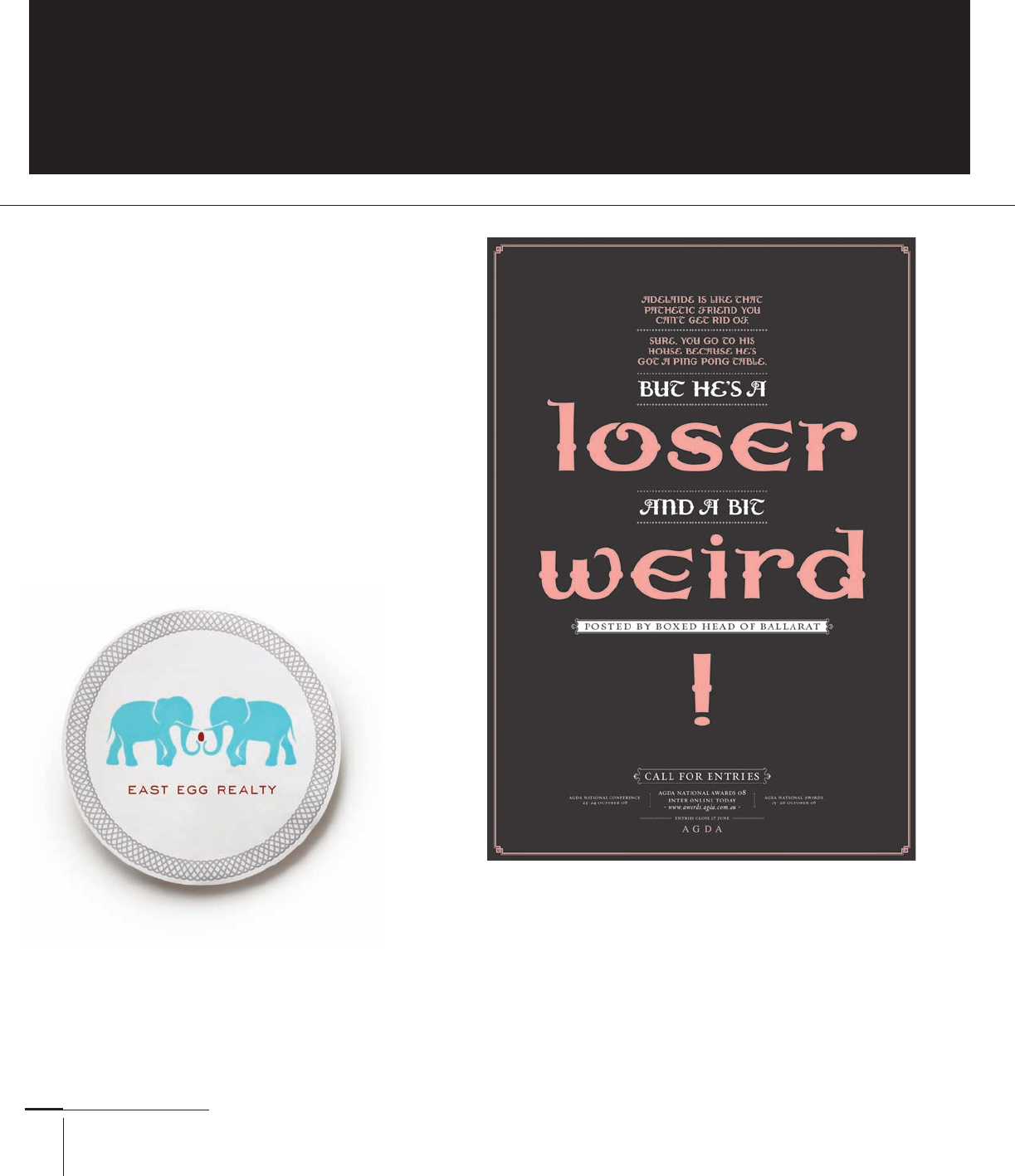
A call-for-entries poster from the Australian Graphic Design Association
situates centered lines of text that pull the reader down to the call to action,
proving that a symmetrical layout can have purpose. Voice, Australia.
This identity for East Egg Realty situates two
opposing elephants on either side of an egg,
denoting the harmonious, stable, reliable feeling
that many of the realtor’s clients hope to expe-
rience. Composing this with an asymmetrical,
dynamic design would not give off the same sense
of calmness. Spunk Design Machine, United States.
206-233 03171.indd 226 9/23/11 5:25 PM
..................Content has been hidden....................
You can't read the all page of ebook, please click here login for view all page.