
CHAPTER 5
How Design Does It
The role of the designer, as the humane and aesthetic conscience of industry, is that of a surrogate for the consumer. He senses the pattern of evolutionary factors in manufactured products and directs the object toward the perfection of its typeform.
—ARTHUR PULOS
You are a 32-year-old scientist, jobless, broke, and considering suicide. A pandemic is growing across the country and around the world. Your daughter is a victim. You blame yourself for your child’s death. No doctor or researcher has yet found a cure. When you consider the state of the world and your failure to protect your child’s precious life, you begin to drink heavily. You are living in low-income public housing near the shores of Lake Michigan. One day you decide you have had enough and begin to walk out onto the beach and into the water. You are chilled but just keep walking. As the waves break across your chest, one last idea occurs to you. As a scientist you can’t stop teasing at this idea and soon have formulated an experiment. It will be the next and last one you will ever run.

You decide to run an experiment to find what a “human of average size, experience, and capability . . . could effectively do [to] . . . lastingly improve the physical protection and support of all human lives. . . .”
Your name is R. Buckminster Fuller and you will ask that your epitaph read, “Call me Trimtab.” But the headstone will have to wait more than 50 years because you’ve got an experiment to run.
Buckminster Fuller, scientist, engineer, architect, futurist, and designer, was born in the waning days of the nineteenth century and would live to the age of 83. During his time he would focus on the challenges facing all of the inhabitants of Spaceship Earth. A structure that he designed to shelter humanity, the famous geodesic dome turned out to embody a design pattern identical to that found in a particular molecule of carbon whose atoms are arranged on a perfect sphere (Figure 5.1). When scientists in the late twentieth century discovered these surprising nanoscale soccer balls, they officially named them buckminsterfullerene, and universally refer to them as “buckyballs.”1
Figure 5.1 The Montreal Biosphère, a geodesic dome originally built as the United States Pavilion at Expo 67, designed by R. Buckminster Fuller

While patterns found in Nature inspire us and give us ideas for how to build things, they are not the end but rather the beginning of the story. Design, as a practice, continues the tale.
Bucky’s phrase “Call me Trimtab” refers to an elegant piece of nautical engineering based on an understanding of fluid dynamics. A giant ship like the Queen Mary has a rudder to help it change directions, but on that rudder is a small device known as a trimtab—it is the rudder’s rudder. By changing the angle of that little device, just enough turning force is created to counteract the direction of the ocean current and keep the ship moving at the intended bearing. The realization that he was just one small part of a very large system, but that he could change the world by consciously applying design techniques to solve problems at the point of greatest leverage, was profound, and for Fuller, life saving. When asked what he was, rather than answering with a typical discipline descriptor such as engineer, or architect, he liked to say, “I am not a noun, I seem to be a verb.” These two quotes begin to explain the value of design as a practice.
BIRTH OF INDUSTRIAL DESIGN
Soon after Buckminster Fuller walked the shores of Chicago contemplating the future, the world was plunged into the Great Depression. One little-mentioned factor that helped America emerge from the devastating downward spiral was the emergence of the profession of industrial design.
The industrial designer emerged out of the financial chaos to become a consumer advocate with a carrot rather than with a stick—representing the consumer’s interests in the corporate boardrooms, and rewarding the attentive industrialist with increased market share and increasing profits.
In the late 1920s and early 1930s a few dozen men (they were virtually all men)2 more or less drifted from other careers—mostly in various of the visual arts—to meet the demand being created among manufacturers by advertisers and economic recovery theorists for help in creating, through an essentially craft tradition, aesthetically and functionally improved products. A smaller number proved to possess the right combination of skills—technical, aesthetic, diplomatic, organizational and promotional—to build large nationally known design organizations. Most prominent of the latter group were the big four designers: Norman Bel Geddes, Walter Dorwin Teague, Raymond Loewy, and Henry Dreyfuss.
It is notable that “fine” artists founded none of the early full-service industrial design organizations. Bel Geddes and Dreyfuss were successful stage designers, while Teague and Loewy had had careers in commercial art. Goaded by their advertising agencies, who felt increasingly helpless in attempting to convince depression-weary customers to purchase tired old merchandise, and encouraged by enthusiastic articles in trade and business journals—most notably Fortune—manufacturers increasingly sought out designers, whose employment started out as something of a fad and eventually became institutionalized as a part of standard business practice in many industries.
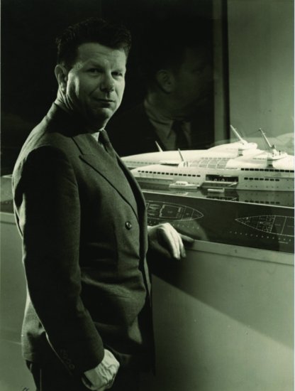
The personalities of these early designers, and their views on the relationship among technology, design, and society, were markedly diverse. Bel Geddes (Figure 5.2) was a showman and a visionary, with a reputation as “the man who, when asked to redesign a product, went on to design its factory.” Consistently ahead of his time, he was the least successful of the big-name designers in terms of commissions actually produced, but he excelled at promoting industrial design as a consequential and glamorous profession and at popularizing streamlining as a uniquely American design style.
Figure 5.2 Norman Bel Geddes with a model of his ocean liner concept
Source: Courtesy of Edith Lutyens & Norman Bel Geddes Foundation and Harry Ransom Center, The University of Texas at Austin.
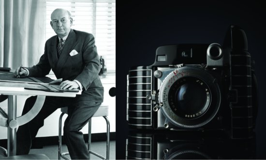
In contrast to Bel Geddes’ flamboyance, Teague (Figure 5.3) was by temperament reserved and understated, more the businessman than the artist. Politically conservative, he was trusted and liked by the businessmen who were his clients because he was like them and trusted in their enterprise and the cumulative wisdom of their enlightened self-interest to bring about social progress.
Source: New Yorker, 1932. © Kemp Starrett/The New Yorker Collection/www.cartoonbank.com.

Figure 5.3 (left) Walter Dorwin Teague in his New York City office. (right) The Kodak Bantam Special Camera, designed by the Teague office in 1936, part of a long-term designer-client relationship with Kodak
Source: Courtesy of TEAGUE. Copyright TEAGUE.
Raymond Loewy had a simpler view of the role of design in human affairs. Eschewing the more extreme claims of functionalist determinism, and avoiding, for the most part, extravagant visions of technological utopias, Loewy’s passion as a designer was simply to make the technological world, and the lives of the people who inhabit it, less abrasive and more pleasant. Loewy (Figure 5.4) characterized his early efforts to sell his design services as a personal crusade to convince America’s industrialists that improving people’s lives by improving the design of the products they used was not only possible, but was also profitable. Although Loewy was temperamentally reserved, throughout his long career he was an indefatigable promoter of himself and of his profession, and was by no means hesitant to stretch a fact for the sake of rhetoric. However, there is no reason to doubt that a modest quest for elegance and style was the motivating force in both his personal and professional lives. Loewy coined the acronym, MAYA, that we use as our company’s name, for that optimal zone that balances the Most Advanced design that is Yet Acceptable for normal consumers.

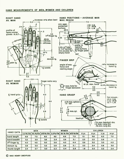
Most modest of all in his aspirations for the profession, Henry Dreyfuss (Figures 5.5 and 5.6) devoted his career to an effort to mold the products of technology to the needs of people rather than the reverse. Dreyfuss was educated in the tradition of the Society of Ethical Culture to the belief that the highest moral imperative was to direct one’s efforts toward the improvement of society and to a broadly conceived concept of “progress.” Claiming no mystical wisdom and embracing no grand designs, Dreyfuss believed that the role of the designer was simply to, first, understand the needs and characteristics of users as individuals and as groups and, second, to make products more useful—and therefore more saleable—by applying such understanding to improving their usability, safety, and aesthetics. As part of its product design regimen, the Dreyfuss office accumulated voluminous statistical data about the physical and perceptual characteristics of the population. As a result, Dreyfuss became recognized as one of the founders of the discipline of ergonomics.
Figure 5.5 Hand anthropometrics from Dreyfuss’s The Measure of Man, a landmark compilation of human factors data for designers, stressing usability
Source: Courtesy of Henry Dreyfuss Associates. Copyright 1960 Henry Dreyfuss.
For all their diversity, these and other successful early designers evolved remarkably similar methods of operation and, by the end of the 1930s, represented a genuine movement in the annals of American industry. Teague once accounted for the fact that all of the well-known designers developed such convergent methods by observing that “those who did not, simply did not last.” More explanatory, however, are a number of common themes that emerge from an examination of their careers and of their writings.
One such recurring theme in each of their stories was a rejection of superficial “surface” design. In the pre-industrial design era manufacturers often hired artists and craft-oriented designers to “beautify” products by applying surface decoration prior to mass production.
Source: U.S. Library of Congress, U.S. Department of the Interior, National Park Service, Historic American Engineering Record.

In contrast, the founders of the major design offices unanimously rejected this approach in favor of an “inside out” functionally driven approach. Dreyfuss often repeated the story that early in his career the Bell Telephone Company selected him as one of 10 commercial artists to be offered a thousand dollars each to provide sketches of an improved telephone set. Dreyfuss declined the offer, insisting that a successful product design could not be completed under such circumstances, but must rather be carried out in close collaboration with the company’s engineers. A year later, Bell returned to Dreyfuss, admitted that the submitted designs proved impractical, and hired him in a consultant relationship that lasted throughout the rest of his career (Figure 5.6).
Figure 5.6 Dreyfuss (L) and William H. Martin (R), an engineer and Bell VP, with studies from their work with ATT
Source: Eric Schaal/Getty Images.

NOVELTY, BEAUTY, RITUAL, AND COMFORT
Soon after design was recognized as a profession, it was further specialized into narrower concerns—product design, graphic design, communication design, interior design, sound design, fashion design, and even further specialized into product categories such as automotive design, furniture design, and, more recently, interface design and web design.
These specialties were born of the human love of novelty, beauty, ritual, and comfort; they were raised in the arts and enabled by engineering and technology. They have grown to be powerful resources employed in the service of building brand, stirring desire, and “fitting” products and services within our human-scale world.
For a brief period there was uncertainty whether the teaching of design belonged in schools of engineering or schools of art. In our opinion, it should have remained balanced precisely at the intersection of the two. But Academe is notoriously bad at such interdisciplinary balancing acts, and, so in the event, it ended up for the most part in art colleges or university departments of art or architecture. Graphic design typically grew out of painting programs, industrial design out of sculpture programs, and interior design out of architecture. And the method of instruction was typically through the imitation of masters, with scant analysis or reasoning to back it up.
Over time, the various flavors of design have evolved significant methods and rationales. They have been enormously successful at tapping the cultural streams that determine human reactions to our designed and built environment—reactions of desire or satisfaction; a sense of beauty, of pride, of place, of ownership. Structured methods have been developed for sensing problems, defining problems, and solving problems. But they also help us with elements of drama, surprise, and satisfaction. And because many of these specializations rely on the visual language of design, they are spatial and holistic at their core. Many of the methods and techniques used in these areas have proven to be effective at describing design problems between and across diverse disciplines beyond their traditional borders—tapping into the perceptual powers that all players in the product development process—engineers, mathematicians, social scientists, writers, business executives, financial analysts, and policy specialists—bring to the table.
HEARING HISTORY RHYME
There have been three fundamental technological revolutions in human history. Eight thousand years ago was the agricultural revolution. Roughly 200 years ago the industrial revolution began. But then, no sooner had that revolution run its course than we found ourselves in the midst of the information revolution. In human history, only these three developments have made a fundamental, permanent difference in the lives of ordinary people. And of course the increasing time-compression of these periods—8,000 years, 200 years, and 50 years—has been remarked upon countless times.
The industrial revolution brought unprecedented, world-changing power but it also foisted unspeakable mechanized ugliness and brutality upon human beings—not to mention on the landscape, the natural world in general, the planet itself. The so-called machine age crushed people both figuratively and literally. In its final stage, its technology impinged on the everyday lives of people in the form of inexpensive mass-produced products intended for mass consumption. But it also produced a transformation of the average person’s daily environment from a pre-industrial state of relative order and integrity to an early-industrial state of noise, danger, squalor, and ugliness. “History doesn’t repeat itself,” as Mark Twain allegedly put it, “but it does rhyme.” We founded MAYA Design because we heard history rhyming. The information revolution was echoing its predecessor.
Today, we are arguably on the cusp of a fourth revolution: the age of Trillions. No one disputes the evolving phenomenon itself, though some argue that it is merely a continuation of the information revolution. We think that pervasive computing represents a profoundly different relationship of people to information, and that eventually it will be understood as a distinct epoch of human history. As an intrinsically networked phenomenon, it will also continue the historical trend of acceleration. A decade in the era of pervasive computing will bring unimaginable changes.
Figure 5.7 Original Crystal Palace of 1851
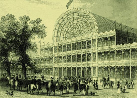
Figure 5.8 A work table displayed in the Crystal Palace

INSTABILITY AS THE STATUS QUO
One of the changes that we—business people, designers, consumers—are already dealing with is the recognition that good design decisions are increasingly influenced by the need to be context dependent and dynamic. Context dependency has always qualified the “goodness” of design decisions. The addition of dynamic considerations, giving us a dynamic context, makes for a tricky scenario—an inherent and persistent instability.
Experts who deal routinely with potentially dangerous dynamic situations have evolved elaborate procedures and protocols that are worthy of study as examples of complexity design. Rock climbers employ highly structured sets of telegraphic calls and acknowledgments for reliably communicating the state of a climb to the belaying partner on the other end of the rope. Similarly, military pilots and astronauts revert to a highly drilled set of terse commands and responses when communicating on noisy channels under the pressures of flight.
Space flight provides an interesting example of how dynamic systems can require constant reevaluation in light of new circumstances: Throughout the American space program and up until the Apollo moon landings, the act of deciding whether to continue or to abort a mission was termed a “go/no go” decision. However, just a few months before the Apollo 11 landing, mission planners realized that this term, which had served well in all previous circumstances, suddenly became ambiguous and potentially confusing once the lunar module touched down on the surface of the moon. As a result of this insight, the terminology was quickly changed to “stay/no stay.” What constitutes “good design” is always contextual, and never more so than in the case of complex, rapidly changing systems.
The above examples—climbers, pilots, and astronauts—all share the common characteristics of operating in highly dynamic situations involving limited bandwidth. That is, compared to most human communication situations, the quantity of information that can be passed back and forth in a given amount of time is limited. This is true both because verbal communications is often carried out over noisy or otherwise “weak” channels, and also because such situations are often impoverished in terms of the various nonverbal cues that are so important in more normal human communications. Both of these same impoverishments—limited bandwidth or attention span and lack of nonverbal cues—also characterize the kinds of human-machine communications that are the essence of user interface design.
Design has consequences that can go far beyond matters of appearance and personal preference. The annals of technology are littered with examples of disasters attributable directly to designs that inadequately coped with dynamic complexity.
POST-INDUSTRIAL DESIGN
From today’s perspective, the early pioneers of industrial design might seem to have been pursuing a shallow and sometimes crassly commercial role in industrial America. But they were on the right track. They learned how to learn. And many of the major elements of a post-industrial design were there: an integrative position situated between industry and consumer, the collection and application of explicit design data and design methods, the persuasive power of aesthetics, and collaborative methods for integrating the expertise of a broad range of disciplines.
When we founded MAYA Design in 1989, the basic idea was perfectly simple: We proposed to do the same thing for post-industrial design.
We were hearing in the burgeoning computer industry the unmistakable echo of the industrial revolution’s impact on human beings. The information revolution wasn’t spewing smoke and steam from “dark satanic mills” or shattering tranquility with the cacophony of heavy steel, but it was placing significant stresses upon people—all the more insidious, one could argue, for not being ear-splitting or suffocating or glaring.
Computers were by then well into a metamorphosis from rare and precious tools for trained specialists to a major constituent of the everyday environment. For the first time in human history, highly complex systems were in the hands of ordinary people—systems that had nothing to do with natural human life. Their complexity stemmed directly from the ultraminiaturized electronics they were built from, a profound mismatch with human senses and cognition and interests. This was something genuinely new in the world. It demanded new approaches to design. But for the most part, the computer industry was making no real distinction between design and engineering. Indeed, engineers often were the sole designers of computing machines intended to be sold to and used by people who knew nothing about engineering.
Post-Industrial Design = Complexity Design
Humanizing technology, shielding ordinary people from the inhumane impacts of machines, creating and expanding markets for well-designed products—this was what industrial designers were supposed to do. But the profession was not rising to the challenges of the information age as it had risen to the social and business needs of the machine age. There were certainly specific individuals with vision in this regard, but in the final decades of the twentieth century, industrial design (ID) as a whole had abdicated its leadership in the development of usable, safe, pleasant, attractive, and otherwise marketable high technology products.
The vacuum created by this abdication of responsibility by the ID profession was certainly recognized at the time. In an effort to fill it, a new discipline came into existence, calling itself Human Computer Interaction (HCI). Unfortunately, with only a few important exceptions, its early practitioners were trained either as engineers or as academic psychologists—both highly relevant disciplines, but ones that almost entirely lacked access to the 50 years of accumulated methodological wisdom in human-centered design that formed the foundations of the profession of ID. As a result, the HCI community was attempting to reinvent Design out of whole cloth.
No one involved in high-tech product design was addressing or even talking about the central issue raised by the proliferation of computing and electronically transmitted information: the collision course of ordinary people and complexity.
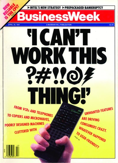
It is significant that the icon of that moment in American technological history was not a computer per se, but an inexpensive computerized device that could be found in almost every home—the VCR flashing “12:00” in red LED numerals all day. This ubiquitous machine had become so commoditized that you could buy one for less than $100, yet it was so complex to operate that most owners could not figure out how to set its clock.3 The few who managed it probably went on to learn how to program the machine to record a TV show unattended—one of the primary reasons for owning the device (and something you couldn’t do if you couldn’t set the clock). But in the end their VCRs flashed “12:00” too, because the stupid things lost their hard-won settings with every power outage, and it just wasn’t worth the effort to constantly re-figure-out how to fix them.
It did not take a genius to see that the day would come when every home in the United States would contain 10, 15, 20 such devices, each of them a source not of pleasure and satisfaction but of frustration and anger, even fear (Figure 5.9). And then there was the personal computer. PCs were young adolescents at that point, still a special, expensive purchase, hardly found in every household. That would take another decade or so. But it was pretty clear that we were soon going to have a mess on our hands.
Figure 5.9 April 29, 1991: Usability awareness makes the cover of BusinessWeek
Source: Used with permission of Bloomberg L.P. Copyright © 1991. All rights reserved.
A world full of microelectronics was going to need design redemption in the worst way, but it wouldn’t come from any community of designers already in existence. Once again, a new profession would have to tame the beast of a new era. If Industrial Design humanized the Industrial Revolution, it stood to reason that the Information Revolution needed Information Design. In the end we chose the even more encompassing term complexity design, but information design is a big part of what you do to achieve complexity design.
The need to humanize information technology wasn’t apparent to most people back then, and a passing glance at computer culture today will confirm that for the most part it still isn’t. Like fish that can’t see the water that surrounds them, we aren’t fully conscious of the milieu we live in. Computing today (by some measures, but not others) is the best it’s ever been, so we have nothing to compare it to. Nothing high-tech, that is. We certainly do have something non-high-tech to compare computing to—namely, the long stretch of human life before computing.
But many technologists treat all of that as if it were now somehow completely irrelevant. Their implicit assumption is that people—after eons of adaptation to the physical world—should now completely change their behavior to accommodate machines that are based upon developments five or ten years old. If users want to benefit from the brave new world of cyberspace, they are expected to pull up stakes, sign onto a wagon train to the life digital, and wave goodbye to their old lives. The designers of the new world force technical complexities upon users, burdening them with the intricacies of whatever arbitrary designs pop into their heads and forcing them to suppress their natural gifts for functioning in the real world—the accumulated endowment of a million years of evolution.
Becoming “Human Literate”
When Nintendo designed the controller of its Wii game machine to be swung through the air like a golf club or a tennis racket, they may have been leaving hard-core gamers behind, but they were embracing real human beings. We can’t overstate the importance of that lesson.
Like anything else immature, high technology tends to be amazed by itself and to want to call constant attention to its own wondrous powers. The powers are wondrous, but they are also supremely ugly—ugly because they continue to demand that human beings become computer literate when, by all that is right and just, computers should be becoming human literate.
What is technically possible is virtually always attempted sooner rather than later. Thus the early tangible result of new technologies is inevitably chaotic, unplanned, and often counterproductive—almost by definition not-by-design. Such times of revolution must equally inevitably be followed by more deliberate, more evolutionary periods during which the technologies are tamed, the possibilities are explored and sorted out, and mastery is sought and attained. It is during such periods that design assumes center stage.
Taming complexity will always increase the size of markets for the simple reason that frustratingly complicated products are just not salable to a significant segment of the population. For every early adopter who prizes the aura of the Next Big Thing and revels in mastering a challenging new interface or platform, a hundred ordinary people4 will give wide berth to digital products if perceived complexity even slightly exceeds perceived value.
The Interdisciplinary Dimension
There may still be people in the world who can claim the title of Renaissance Person, but there are certainly not enough of them to save us from the deluge of the coming revolution. The necessary disciplines have become far too numerous and demanding for us to expect even exceptionally talented individuals to attain adequate mastery in more than a few. Rather, design today must be seen as fundamentally and essentially a collaborative enterprise.
None of this will come as a surprise to anyone—engineer, designer, or business leader—who has ever seriously attempted to create a powerful product or service with ease of use as a primary goal. Our understanding of the process has increased dramatically in recent years, yet there are few great success stories of brilliant usability design in the computer industry. This helps to explain why the few that exist—Apple products being the obvious recent example—make worldwide headlines, and drive new forms of value.
By now, the notion of interdisciplinary design has become commonplace. Interdisciplinary and innovation are often heard in the same sentence. But sadly these ideals are more often than not honored in the form of faddish, cookbook exercises or, worse, as bureaucratic hoops to be avoided when possible and jumped through otherwise. Sometimes a group of engineers—mechanical, structural, civil—is called interdisciplinary. Perhaps that’s strictly true, but functionally it’s not much of a stretch. Sometimes the group’s work is passed sequentially from one specialist to the next—procedurally, that’s not very inter. So, after the first blush of enthusiasm, we hear such groups expressing something less than excitement for their interdisciplinary experiment. Not surprisingly, real interdisciplinary practice is hard, and the reason is simple: The specialization of professional fields, while essential to their mastery, militates against such an overarching vision of design.
Draw What You Mean
A truly interdisciplinary approach to a problem will not be the most apparently “efficient” one. Further, few businesses possess the means to build, nurture, and support interdisciplinary teaming. However, one of the most effective methods is almost too simple to be taken seriously—draw what you mean. If you are, say, an interaction designer and you ask, say, an engineer to draw, rather than tell you, what is in his head, you can decode the jargon almost instantly. Drawing can serve as the lingua franca of thinking. You can immediately map what the engineer has drawn into your own worldview, you can see how the engineering discipline structures the problem or solution, you can note what isn’t drawn, you can treat the drawing as a communications medium by adding your own parts to the picture, and most importantly, you can identify critical gaps in your collaborator’s thinking that your discipline can fill in. We often wonder if a simple metric based on the number of square feet of drawing surface (in the form of papers pinned to walls, whiteboards, etc.) in use between disciplines within an organization would be a reliable indicator of true interdisciplinary teaming, collaboration, and innovation. Effective teams share images. If a day goes by where you don’t hear “draw what you mean” at least a few times within and between teams, it’s likely that deeper sharing and integration is not happening either. Our prediction is that on Trillions Mountain everyone involved in building new experiences, new services, new connected things, and new business models (not just designers but business leaders and even customers) will draw as a basic literacy of collaboration (Figure 5.10).
Figure 5.10 An interdisciplinary session in action

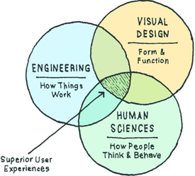
Only one of the original founders of MAYA, Joe, has a traditional design background. Pete is a cognitive psychologist who would not be thought of as a designer by most people. Jim Morris, the third founding partner of MAYA Design, is a computer scientist who played a role in the birth of the modern PC at Xerox PARC; he typically wouldn’t be considered a designer either. But by insisting upon a fusion of traditional design, the human sciences, and engineering, we have been consistently able to practice design in a rigorously interconnected manner.
When we started MAYA in 1989—one computer scientist, one cognitive psychologist, and one industrial designer, and with yet other disciplines entering the mix—we set aside time to explicitly break the disciplinary barriers. We tried explaining design concepts in each other’s languages. We summarized for each other the classic works of our individual fields. We shared each other’s reading lists. In short, we committed time and money to making interdisciplinary collaboration work. And over the decades of MAYA’s existence, we have developed other practices and traditions that continue to contribute to the richness of our process.
The Value of Real Estate
One example of our cultural practice in this regard is something called MAYA Neighborhoods. Our workplaces are arranged, not by disciplines—an engineering section, a marketing section, or a visual design section—but rather in interdisciplinary groups of six to eight people. These neighborhoods do not represent fixed teams that necessarily work together on the same project. A given client project will most often draw from a number of neighborhoods. But avoiding clumping neighbors by discipline has both symbolic and practical impact. In addition to being a constant reminder of what we value, maintaining intimate physical proximity among disciplines leads to uncounted serendipitous synergies as eavesdropping neighbors chime in with unexpected contributions of data and ideas. By recognizing the high price we pay for such real estate, and the high cognitive and perceptual value we can receive by sharing it across disciplines, we increase the bandwidth, the agility, and speed of collaboration (Figure 5.11).
Figure 5.11 An impromptu meeting in one of MAYA’s neighborhoods

Making Things Out of Atoms and Bits
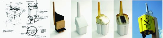
Figure 5.12 Stages in the design process from sketched prototypes to a production prototype
Does It Fit?
Violent Agreement and the Opposable Mind
The Future Is Already Here
William Gibson—our cyberspace prognosticator from Chapter 2—once quipped, “The future is already here, it’s just unevenly distributed.” No one understood this better than Raymond Loewy. He loved to tell the story of redesigning the Sears Roebuck Coldspot refrigerator.
For this assignment, he ended up using a new material for the shelving—sheets of perforated aluminum—that he had discovered in a previous project involving the design of an automotive grille. It would never have occurred to anyone inside the refrigerator industry to use that particular material for shelves. No one in refrigeration was aware it existed. But it had precisely the right combination of light weight, durability, good looks, and resistance to corrosion and rust. The perforated aluminum shelves became a marketplace differentiator and a selling point for the new Coldspot design. The product sold nearly five times as many units as its predecessor.
Nothing could have made Loewy happier. He was famous for insisting that his work be not only elegant and innovative, but also attractive to consumers and commercially viable. The purveyors of locomotives, automobiles, refrigerators, and vacuum cleaners needed him, but he needed them too, and he worked for them with affection and respect. Some of his more theoretical (and briefly more famous) counterparts eventually went out of business by conceiving futuristic designs that couldn’t be built, but Loewy’s firm prospered for many decades thanks to his insistence upon measuring his own success by the success of his clients in the marketplace. If a Loewy design failed to inspire consumers to buy, he had failed. In many particulars, the design industry has left Loewy behind, but in terms of basic goals and motivations, the underlying patterns remain. The designers who will really matter in the age of Trillions are the ones who figure out how to apply Loewy’s commercial sensibilities in the context of a thoroughly decentralized world—a world in which commercial transactions will be absurdly numerous and yet seemingly just out of reach.
1 In 1996, Robert F. Curl, Jr., Sir Harold W. Koto, and Richard E. Smalley were awarded the Nobel Prize in Chemistry for their discovery of buckyballs in 1985.
2 In 1959 Cary Grant famously fell in love with a female industrial designer while traveling North by Northwest in an inspired bit of scriptwriting meant to hint at a certain élan and untapped resourcefulness.
3 In fairness to those owners, it is probably less accurate to say that they couldn’t figure it out than that they found it just too ridiculously complicated to be worth the trouble.
4 Let us be clear here: The segment of the population in question does not comprise the “dumb” ones—people too slow to cope with innovation. Quite the opposite, these are the people smart enough not to waste their precious time with tasks that insult their intelligence.
5 I was born before electronic television was first demonstrated at the New York World’s Fair and, while we did have telephones and airplanes, the first telephone I used was one where you picked up the receiver and waited for the operator to say, “Number, please,” and I remember the day during World War II when my Uncle Frank showed me the first picture I ever saw of an airplane without a propeller! He said it was called a “jet.”
6 The earliest reference to a specific designer that I’ve found is in the Bible, Exodus 31: 1–5. After God has given Moses the specifications for the tabernacle in the wilderness, He says “I have called Bezalel … and I have filled him with divine spirit, with ability, intelligence and knowledge in every kind of craft, to devise artistic ‘DESIGNS’…” in order to make all that He had commanded.”