
Chapter 15
Find Significant xs
In This Chapter
♦ Collecting data for analysis
♦ The basics of experimental design
♦ Know your sample size
♦ Risk comes in alpha or beta
♦ Calculating sample sizes
♦ Testing your hypotheses
Now the real detective work begins. You have a lot of leads from brainstorming, fishboning, process mapping, and failure mode analyzing. Your evidence is still circumstantial, and you need the hard facts to prove your case to the judge—the almighty Process Owner. You also need to present your case to the jury (stakeholders), so they can understand and take action.
In this chapter, we’ll show you how to slice and probe your data until you can explain much of the variation in Y, leaving little to the imagination. You’ll determine what data needs to be collected to examine the potential xs you’ve already generated and prioritized. The Lean Six Sigma analysis toolbox is full of methods to get to the root of the x-Y relationships.
Collect Data on the xs
Using good data collection methods will simplify and improve the accuracy of your analysis. It takes a world-class statistician to extract information from an unorganized data set, but precise data collection and a few simple graphical tools can pop those critical xs out of a haystack of organized data with minimal effort.
Any data collection system requires accurate and precise information for both the input (x) and output (Y)—and operational definitions and methods of recording data must be standardized up front. A Measurement System Analysis (MSA) should be conducted on key inputs and on all outputs to verify the integrity of the data. We covered MSA in Chapter 11.
One data collection method does not satisfy all characteristics desired for analysis. This relationship matrix shows the strengths of various collection methods.

Let’s explore some of the potential data collection methods that might apply to your project.
Computer Databases
Computer databases can track process parameters automatically by capturing times, test results, scrap costs, order delays, service times, response times to nursing call lights, project completion dates, and even repeat calls from the same telephone number. Summary reports are issued, helping managers identify opportunities for improvement.
Computer databases are relatively easy to download for analysis in spreadsheets or statistical software packages. With the help of the IT department, more frequent reports or special inquiries can provide specific data for your project.
Rookie Black Belts believe that there’s a magic database waiting for them that includes all the potential xs they listed on their fishbone diagram. Reality sets in quickly, and they learn that other methods are needed to get the proper information.
Logs (Logbooks and Log Sheets)
Logbooks are commonly kept by maintenance, production, customer service, nursing, and many other functions. The intent is usually to communicate specific problems and actions taken. Extracting data from logbooks usually takes extra effort from a team member who is familiar with the logbook.
Log sheets are kept for process steps by those most closely associated with specific tasks (e.g., operators, clerks, lab technicians, dispatchers). The format is usually in rows and columns, with time or changeovers defining the rows and specific x and Y measurements, or comments, for the columns. Log sheets provide more specific and easier-to-extract data on xs than logbooks do.
Logs (logbooks and log sheets) are usually readily accessible and tell the history of process steps from an insider’s viewpoint. Comments in logbooks and log sheets can provide valuable insights to defects, rework, and hidden factories.
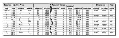
Manufacturing operations frequently use log sheets for operators to record machine conditions. This log sheet for producing plastic parts shows data for many of the xs listed on the team’s Fishbone Diagram.
Data Collection Forms
Data collection sheets are very similar to log sheets, but are designed to collect detailed information on the potential xs, focused on the problem at hand. The intent is to get specific x-Y data for analysis. Data collection sheets might be used to study task times, control settings for producing a product, or factors under study in a clinical environment.
Data collection sheets are intended to be used for a short period of time to study the process in detail. Typically, the data collection sheet is designed by the Lean Six Sigma team after generating potential xs. The more detailed the collection form, the more likely assistance from team members will be required to collect the data.
Check Sheets
Check sheets are designed to collect data with minimal effort but high visibility. They can vary from simple tally sheets to custom-designed forms to solve a specific problem. Categorical (attribute) data can be quickly recorded by line personnel close to the process.
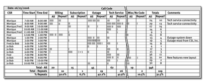
This tally sheet for a call center used customer service representatives to record the type of call and if the call was a repeat from a customer for the same problem. The Lean Six Sigma project goal was to reduce repeat (unresolved) calls.
Control Charts
Control Charts provide time-ordered data on shifts, drifts, and unusual events for specific process measures. The data from Control Charts are usually focused on output (Y) characteristics (e.g., defectives, dimensions, service time) and do not inherently contain detailed information on the xs.
The benefit of Control Charts lies in the feedback from those closest to the process. The impact of specific xs can be identified by associating shifts, trends, and outliers with specific observable changes in the xs (inputs, environment, or process controls). See Chapter 21 for all the details on Control Charts.
Observation of Processes
Independent observation of processes can provide an unbiased view of the process and record events not recognized by those closest to the process. Standard forms might be used to observe task times or methods used in a process. One example is the Standard Work Combination form common to Lean, recording tasks within each process step in detail (see Chapter 14). Videotaping of processes (or going to the Genba) is another observation technique that allows more than one person to view the same activities. By reviewing how each operator differs in methods, critical differences can be identified.
Special Studies
You can undertake specific studies to manipulate xs and determine the resulting behavior in Y, which gives you knowledge of your transfer function, or Y = f(x). Another advantage of special studies is that they can be conducted quickly and at the convenience of the team.
The key with special studies is that you are looking for the critical few x variables that exercise the most influence over your Y of concern, your output metric. Lean Six Sigma is all about leverage, and about finding the leverage, especially when it comes to solving complex defect and performance issues.
With special studies, you can home in on the xs you believe have the most signifcant effect on Y, and prove or disprove those assumptions. You can also home in on the xs you think have the least significance, or influence on Y, and test those assumptions as well. Both ways, you begin to formulate a scientifically valid picture of how your xs impact your Y.
The most common and powerful tool for conducting special x-Y studies is Design of Experiments, or DOE for short. When applicable, you use DOE methods to examine multiple xs in a concise set of experiments. Getting ready for DOE, we revisit our fishermen friends, Wayne and Fred, to view their following data collection sheet.
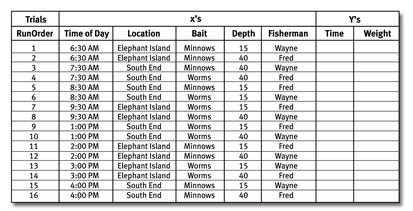
Design of Experiments (DOE) methods manipulate factors (xs) in specific patterns to ensure independence ofxs and integrity of data. In this DOE, Wayne and Fred examined the Time of Day, Location, Bait, Depth, and Fisherman in 16 balanced trials.
We’re going to give you more details in the next chapter, showing you more about how to run a simple DOE. Note that the DOE subject matter is broad and deep, and you can find entire texts devoted to them if you want more.
Sample Size Calculations
To conduct special studies, you have to calculate your sample sizes, and to do this you need to employ statistical sampling methods. In this vein, you ask one important question: How much evidence do I need to convict a particular x of exercising significant influence over Y? Answer: You need enough evidence to make the arrest and bring the case to court. And to do this, using statistics, you must manage your risk of making incorrect decisions. So before you calculate your data sample sizes for special studies, you have to determine the level of risk—or uncertainty—with which you’re willing to live. Then you adjust your sample size accordingly.
So first, here is what you need to know about risk:
Alpha (α) Risk is the risk of making a Type I error—detecting a false difference or declaring that the x influences Y when it’s only random variation. If you were on a jury, this is the risk of convicting an innocent defendant.
Confidence is the likelihood of not making a Type I error, defined as (1-α).
Beta (β) Risk is the risk of making a Type II error—not having enough evidence to detect that x really does influence Y. Back to the jury—this is the risk of letting a guilty person go free for lack of sufficient evidence.
Power is the probability that we would detect a specific minimum difference in the populations with a given sample size, defined as (1-β).
When the Y is a continuous distribution, we might look for changes in shape (normal versus not normal), location (average or median), or spread (standard deviation). When the Y is attribute data, we might compare samples from populations to detect differences in proportions. Specific comparison methods will be covered soon, in this chapter.
To calculate an appropriate sample size to determine statistically significant differences in Y, you first need to determine …
♦ The type of comparison you are making—averages, variability, proportions, etc.
♦ The smallest change in Y that you need to detect, delta (∆).
♦ An estimate of the variability of Y (i.e., standard deviation, s).
♦ The acceptable alpha risk of making a Type I error. For initial screening of xs, we might set the alpha risk between 0.05 and .15 (i.e., between 5 and 15 percent chance we might label an x significant when it’s not).
♦ The acceptable beta risk of making a Type II error. For initial screening, we don’t want to hastily ignore significant xs, so we might set the beta risk at 0.10 (i.e., a 10 percent chance we might not have sufficient data to identify a significant x, thereby mistakingly placing it in the “no effect” pile).
As with many other Lean Six Sigma tools and techniques, sampling techniques and calculations can be complex and varied. For example, you use different sampling techniques for different types of data: averages, standard deviations, and percentages. We’ll give you some details for the more common scenarios of calculating sample sizes for averages and percentages.
Comparing Averages
Averages can be compared to each other or to some target or historical value. It’s convenient to standardize the difference in averages by estimating a Z-score, which is done by dividing delta (∆) by the estimated standard deviation (s). The Z-score allows us to use standard statistical tests and tables and simplifies the process.

This table provides sample sizes for comparing averages of samples from two populations based on the estimated Z-score. Reducing variability has a large impact on reducing sample size for detecting smaller differences in average. For a reduction of 50 percent in variability, the sample size recommended is reduced by about 75 percent.
For example: Wayne and Fred want to compare the fishing near Elephant Island of Grand Lake to the south end near the inlet. They are hoping to find at least a 0.25 pound difference between the shores. From previous fishing in the one spot with the same bait, they estimated the short-term standard deviation to be 0.25 pounds. How many fish do they need to catch from each spot in the lake?
Z-score = 0.25 lbs. /0.25 lbs. = 1.00
Using the previous table, they should catch 18 fish from each spot to compare the populations of fish at each end of the lake. This would give them a 90 percent (1-β) probability of detecting at least a 0.25 pound difference, and they would have 95 percent (1-α) confidence that they won’t be misled by the data if no difference exists.
If the difference was 0.375 pounds between the populations, then the Z-score = 0.375/0.25 = 1.50, and it would only take nine fish at each spot to detect that there is a statistically significant difference in average weights.
Comparing Percentages (Proportions)
When your data is not measured on a continuous scale, you might measure the results as pass or fail. The table that follows shows recommended minimum sample sizes to detect a 50 percent reduction in defectives.
When the process is running at a lower proportion of defectives, the sample size required increases dramatically.

For example: A package-sorting operation currently missorts 1 percent of the packages to the wrong destination. If the process is reduced to a 0.5 percent missort level, how many samples would be recommended to affirm the statistical significance of the improvement? Using the previous table, the proportion defectives would be reduced from 0.01 to 0.005, and a sample size of 2,582 would be recommended to compare the new process to the previous process historical proportion missorted.
Graphical Analysis
Okay, you’ve got the data you need, and the evidence is clear to you. Or is it? You have data on so many xs that you need to sort out the significant ones for trial. If a picture is worth a thousand words, then a graph is worth a thousand data points. A good graphical picture of the data will make the significant x pop out of the crowd. That’s what you’re after!
But, still, not so fast. Before you present your summation to the jury, you will need to use statistical analysis to confirm hypotheses you make from the graphs.
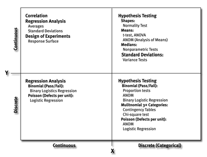
So back to the graphs. You’re looking for solid evidence that Y moves when x is changed, and to do this you have a whole slew of graphical tools at your disposal. To sort through these tools, and select the right one(s), you need to determine what type of xs you’re examining (continuous or discrete), and what type of data you’ve recorded for Y (continuous or attribute).
Reminder: Continuous xs are measured on a continuous scale (e.g., time, temperature, age, distance). Discrete xs are those that are grouped into distinct categories (e.g., transaction type, day of the week, gender). The selection matrix that follows will assist you in selecting the right tool for the job.

Minitab software offers a variety of graphs that can be quickly created to identify potential significantxs. This chart summarizes some of the most common graphs you can use, depending on the nature of your x and Y data.
Graphs may represent all the data points, showing the density and spread of the data. These include Histograms, Scatter Plots, Dot Plots, and Box Plots. Other graphs focus on such summary statistics as averages or variation. Summary graphs include Main Effect and Interaction Plots, confidence intervals, and Pareto Charts.
Scatter Plots display pairs of continuous x and Y data. When examining a lot of x and Y relationships, Matrix Plots can be used to view many Scatter Plots at once. With the use of regression or lowess techniques, a best fit line can be drawn to help identify the Y = f(x) relationship.
Boxplots display quartiles of data with the lower and upper 25 percent represented by the whiskers and the middle 50 percent of the data points within the box, including a line for the median (middlemost) value. They are so frequently used to display the differences of categorical xs that one Lean Six Sigma Black Belt wanted to name his first child “Boxplot.”
Main Effects Plots are free from the usual clutter of individual data points. Interaction Plots display averages of the combinations of two xs and help identify any additional combined effects of the xs.

Performance Pitfall
Graphs that average individual raw data can create a false impression of x-Y relationships. Small sample sizes, outliers, and highly correlated input variables (e.g., shoe size and height) can distort the relationship to the point of misidentifying (α risk) or not identifying (β risk) the critical xs. To reduce the risk of this pitfall, construct graphs diplaying individual data points, and use statistical analysis to confirm your conclusions. Consult your friendly statistician frequently.

Real-Life Story
Neural network software, such as RapAnalyst, has been used by Lean Six Sigma practitioners to process enormous amounts of data, and to visually display their relationships. Such analytical horsepower comes in handy when you need to find meaningful x-Y relationships amongst very large populations of variables.
Probability Plots for discrete Y values show the “best fit” relationship of the probabilities that an event (e.g., bankruptcy) will occur, given predictor variables (xs) that are continuous (e.g., debt to equity ratios) or discrete (e.g., marital status).
Various tables displaying and summarizing the relationship of discrete xs and discrete Ys can be created in spreadsheets (e.g., pivot tables) or statistical software (e.g., contingency tables).
Pareto Charts display the counts of discrete categories of events in a descending order. The visual display of high counts on the left helps identify the largest categories for investigation. The 80/20 rule frequently applies to Pareto Charts.
Conduct Statistical Analysis
Statistical analysis is the grand jury of the Analyze phase—do you have enough evidence to pursue the case for or against your many xs? Do you know enough to convict the alleged x suspect of its crime in causing your defect?
Some statistical orientation is needed here. We are concerned with getting the correct decisions a high percentage of the time using the factual evidence collected (how often do you make good decisions based on opinions?).
To test whether the xs are truly significant, we state two hypotheses—different or not different—similar to a jury that will conclude a defendant is guilty or not guilty. Does the jury ever say “innocent”? No; you’re either guilty (responsible) or not guilty (not responsible).
In essense, statistical tests tell you if there is any significant difference in one population (Y) over another based on changes in some x or set of xs. For example, if task cycle time is your Y metric of concern, and you think training can significantly shorten this time, you can test for this by examining the population cycle times for the trained (group A) and the untrained (group B).
If you turn up no statistical (significant) difference, then you are very sure that training (x) does not exercise leverage over your cycle time (Y). If there is a statistical difference, then your x of training is responsible, so you know what to do to make the change you need: conduct more training.
p-Values and Hypothesis Testing
For statistical tests, a common method for determining if one population is different from another is to calculate a p-Value. A common decision point is to call the populations different if the p-Value is less than 0.05. This would equate to a 95 percent confidence that the populations are different.
Hypothesis testing uses samples from populations to compare the populations to standards or other populations and make statements of statistical significance about the populations.
Before the data is examined, both a Null Hypothesis and an Alternate Hypothesis are stated, together with the risk levels we assign to our decision.
The Null Hypothesis (H0) is a statement of no difference or independence—that the x does not affect Y. If we are testing samples from two populations of data, the Null Hypothesis might be that the averages of the populations are equal (not different). Innocent until proven guilty—right?
The Alternate Hypothesis (HA) is a statement of difference or dependence: that changes in x do affect Y. For our example, the Alternate Hypothesis can be stated that the average task time of the population of trained employees is less than the average task time of untrained employees.
Through appropriate statistical tests, you calculate a p-Value, which represents the probability that the Null Hypothesis is true. If the p-Value is less than your alpha risk, you reject the Null Hypothesis and accept the Alternate Hypothesis that the populations are different.
Remember that alpha risk (α risk) is the risk we are willing to take that we conclude there is a difference between the populations (a Type I error), when in truth there is not a difference. The beta risk identifies the chance of making a Type II error—not identifying a statistical difference in the populations when in truth they are different.
Type II errors can occur because there isn’t enough evidence (sample size) to conclude that the x significantly influenced the Y. The evidence could also be insufficient to overcome the background noise (e.g., standard deviation) of the sample data. This would be like trying to convict a defendant who was involved in a gang rumble. So many xs are involved—which ones really did the damage?
Statistical Analysis Methods
Recall that a statistic is a calculated value derived from a set of sample data used to describe a characteristic of a population. A statistic might be the average (arithmetic mean), standard deviation, proportion defective, or count of defects per unit. Statistics can also describe the shape of data distributions (e.g., normal, gamma, weibull, binomial, Poisson).
Statistical tests have been developed by statisticians over the centuries based on sampling behavior probabilities. Tables of probabilities have now been converted to algorithms in software programs for ready reference in summarizing results of hypothesis tests. Common tests used in statistical analysis for DMAIC are shown in the chart that follows.
Hypothesis tests have been developed for a wide variety of analysis combinations. This table shows the most common statistical tests used.
As with sample size calculations, statistical tests exist for a wide variety of data and conditions. There are statistical tests for distribution shape, for averages, for variability, for proportions, and for testing hypotheses that entail multiple xs. For simplicity’s sake, we’ll only cover some details of statistical tests for averages and for proportions—as we did previously for calculating sample sizes.
Tests for Averages
The most common test to compare averages is the t-test. Normality of the population distributions is assumed in calculating t-test statistics.
For example: Wayne and Fred caught and weighed 16 fish from one area of the lake. The average weight was 4.20 pounds, and the standard deviation was 0.50 pound. They wanted to determine if they had enough evidence that the population average was greater than 4.0 pounds.
The statistical software calculated a t-statistic as follows:
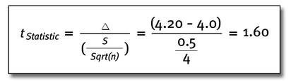
The software cross-referenced a t-table and returned a p-Value of 0.065 (a 6.5 percent chance that the sample data could have come from a population averaging 4.00 pounds). Since Wayne and Fred had established an alpha risk of 0.05 for 95 percent confidence, they decided that they needed to fish some more to get a larger sample size and test the hypothesis again.
When comparing averages of three or more groups of data, the appropriate method is Analysis of Variance (ANOVA), if each distribution is normally distributed. If distributions are not normally distributed, tests for the medians of populations are usually used.
Tests for Proportions
Hypothesis tests for pass/fail data require larger sample sizes than tests for averages, medians, or standard deviations. In a recent election, 1,200 potential voters were polled to determine which candidate they favored; 47 percent favored one candidate, 44 percent favored another, and 9 percent were undecided.
A hypothesis test was conducted to determine if the population contained a higher proportion of voters for the first candidate. With a p-Value of 0.07, the test determined that the associated margin of error placed the candidates in a “virtual statistical tie” prior to the election.
The Least You Need to Know
♦ Good data collection includes detailed data on the xs with good measurement systems. Be wary of historical data—there may be errors and pitfalls.
♦ To make sound inferences about your data populations, you must follow the rules and formulas for calculating sample sizes.
♦ Alpha risk is the risk of falsely declaring that an x influences Y when it doesn’t. Beta risk is not ascribing responsibility to an x that does significantly impact Y.
♦ Graphical methods abound for comparing discrete or continuous xs to discrete or continuous Ys. Tell the story with graphs and charts—back up your conclusions with statistics.
♦ Statistical analysis gives you the examination of evidence to sort out critical xs, but you will probably need special studies to derive a good Y = f(x) relationship.
..................Content has been hidden....................
You can't read the all page of ebook, please click here login for view all page.