
4. Grouping, Sorting, and Filtering Pivot Data
Some of the excellent new features that Microsoft added to pivot tables filtering in Excel 2010 include the following:
• Slicers provide a visual way to filter data set. Slicers are far superior to the old Page Filter technology. Yes, they can take up a lot more real estate, but they also vastly improve the multifiltering technology introduced in Excel 2007.
• Sets will someday make an impressive grouping feature in pivot tables. Unfortunately, in Excel 2010, they are limited to OLAP and PowerPivot data sets.
Note
Are Sets good enough in Excel 2010 that you should convert your Excel data set to a PowerPivot data set? Read Chapter 10, “Mashing Up Data with PowerPivot” to find out.
These improvements continue the changes to pivot tables that were introduced in Excel 2007:
• Whenever Mike or Bill entertains audiences at a seminar, he could be sure to “wow” the audience with obscure features like the Top 10 AutoShow feature that was buried four menus deep in legacy versions of Excel. In Excel 2007, Microsoft exposed the AutoSort and AutoShow options so they are now just two clicks away from any pivot table.
• Grouping features went from being buried three levels deep in legacy version of Excel to being a button on the Ribbon in Excel 2007.
• Excel 2007 added filtering options for row and column fields that include context-sensitive filters for dates, text, and values.
The remainder of this chapter covers grouping, sorting, filtering, data visualizations, and pivot table options.
Grouping Pivot Fields
Although most of your summarization and calculation needs can be accomplished with standard pivot table settings, you might want reports to be summarized even further in special situations.
For example, transactional data is typically stored with a transaction date. You commonly want to report this data by month, quarter, or year. The Group option provides a straightforward way for you to consolidate transactional dates into a larger group such as month or quarter. Then you can summarize the data in those groups just as you would with any other field in your pivot table.
In the next section, you learn that grouping is not limited to date fields. In fact, you can also group nondate fields to consolidate specific pivot items into a single item.
Grouping Date Fields
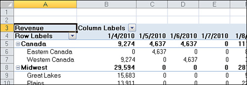
Figure 4.1 shows a pivot report by date. With two years of transactional data, the report spans more than 500 columns. These columns are a summary of the original 50,563 rows, but managers often want detail by month instead of detail by day.
Figure 4.1 When reported by day, the summary report spans more than 500 columns. It would be meaningful to report by month, quarter, and/or year instead.
Excel provides a straightforward way to group date fields. Select any date heading such as Cell B4 in Figure 4.1. On the Options tab, click Group Field in the Group option.
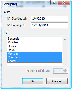
When your field contains date information, the Grouping dialog box appears. By default, the Months option is selected. You have choices to group by Seconds, Minutes, Hours, Days, Months, Quarters, and Years. It is possible, and usually advisable, to select more than one field in the Grouping dialog box. In this case, select Months, Quarters, and Years, as shown in Figure 4.2.
Figure 4.2 Business users of Excel usually group by months, quarters, and years.
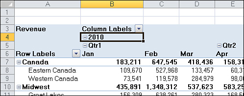
There are several interesting points to note about the resulting pivot table. First, notice that Quarters and Years have been added to your Field List. Don’t let this fool you. Your source data is not changed to include these new fields, Instead, these fields are now part of your pivot cache in memory. Another interesting point is that, by default, the Years and Quarters fields are automatically added to the same area as the original date field in the pivot table layout, as shown in Figure 4.3.
Figure 4.3 By default, Excel adds the new grouped date fields to your pivot table layout.
Including Years When Grouping by Months
Although this point is not immediately obvious, it is important to understand that if you group a date field by month, you also need to include the year in the grouping.
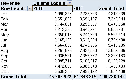
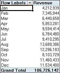
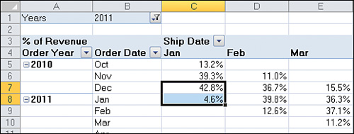
Examine the pivot table shown in Figure 4.4. This table has a date field that has been grouped by month and year. The months in Column A use the generic abbreviations Jan, Feb, and so on. The sales for January 2010 are $1,990,243.
Figure 4.4 This table has a date field that is grouped by both month and year.
However, if you choose to group the date field only by month, Excel continues to report the date field using the generic Jan abbreviation. The problem is that dates from January 2010 and January 2011 are both rolled up and reported together as Jan.
Having a report that totals Jan 2010 and Jan 2011 might be useful only if you are performing a seasonality analysis. Under any other circumstance, the report of $4,212,939 in January sales is too ambiguous and is likely to be interpreted wrong. To avoid ambiguous reports like the one shown in Figure 4.5, always include a year in the Group dialog box when you are grouping by month.
Figure 4.5 If you fail to include the Year field in the grouping, the report mixes sales from Jan 2010 and Jan 2011 in the same number.
Grouping Date Fields by Week
The Grouping dialog box offers choices to group by Second, Minute, Hour, Day, Month, Quarter, or Year. It is also possible to group on a weekly or biweekly basis.
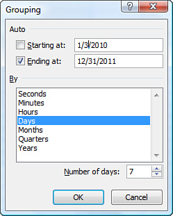
The first step is to find either a paper calendar or an electronic calendar, such as the Calendar feature in Outlook, for the year in question. If your data starts on January 4, 2010, it is helpful to know that January 4 was a Monday that year. You need to decide if weeks should start on Sunday or Monday or any other day. For example, you can check the paper or electronic calendar to learn that the nearest starting Sunday is January 3, 2010.
Select any date heading in your pivot table. Then select Group Field from the Options tab. In the Grouping dialog box, clear all the By options and select only the Days field. This enables the spin button for Number of Days. To produce a report by week, increase the number of days from 1 to 7.
Next, you need to set up the Starting At date. If you were to accept the default of starting at January 4, 2010, all your weekly periods would run from Monday through Sunday. By checking a calendar before you begin, you know that you want the first group to start on January 3, 2010. Change this setting as shown in Figure 4.6.
Figure 4.6 The key to accessing the Number of Days spin button is to select only Days from the By field.
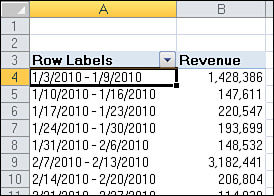
The result is a report showing sales by week, as shown in Figure 4.7.
Figure 4.7 You have produced a report showing sales by week.
Caution
If you choose to group by week, none of the other grouping options can be selected. You cannot group this or any other field by month or quarter.
Grouping Two Date Fields in One Report
When you group a date field by months and years, Excel repurposes the original date field to show months and adds a new field to show years. The new field is called Years. This is simple enough if you have only one date field in the report.
However, if you need to produce a report that has two date fields, and you attempt to group both date fields by months and years, Excel arbitrarily names the first grouped field Years and the second grouped field Years2. This naming convention inevitably leads to confusion. When this occurs, it is important to rename the fields with a meaningful name.
Case Study: Creating an Order Lead-Time Report
The material schedulers at a manufacturing plant are usually concerned with the lead time, which is the time it takes from when an order arrives until when it needs to ship. The schedulers might know that it takes 60 business days to procure material, schedule production, and build the product. In a perfect world, if all their customers would order 61 or more days in advance, the manufacturing plant would not have to keep any excess raw material inventory on hand.
However, in the real world, the plant always receives orders in which the customer wants the product faster. In these cases, the manufacturing plant might purchase extra inventory of the components with the longest lead time to accommodate rush orders.
If your transactional data source includes a field for date shipped and another field for date ordered, you can produce a report showing the normal order lead time by product. This is a valuable report for the master schedulers in the manufacturing plant. Here are the steps to follow:
1. Build a report with Ship Date going across the column area of the report.
2. Group the Ship Date field by month and year.
3. In the PivotTable Field List, drag the Years field to the Report Filter drop zone area of the pivot table. Use the drop-down in B1 to select one year from the data.
4. Drag the Order Date field to the row area of the pivot table.
5. Group the Order Date field by months and years.
6. Excel arbitrarily names the Years field for Order Date as Years2, so rename the field Order Year.
7. Choose any cell in the values area of the pivot table. On the Options tab, open the Show Values As drop-down and select % of Column Total.
8. In the Active Field box, type a new name of % of Revenue.
9. Click the Field Settings button. Click the Number Format button. Give the Revenue field a custom number format of 0.0%;;. The semicolons suppress the display of negative and zero values.
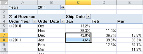
The resulting table is shown in Figure 4.8. Cell C8 indicates that 4.6 percent of the orders shipped in January 2011 were ordered during the month of January. Another 42.8 percent of those orders were received in December 2010. This means that 47.4 percent of the sales from January were received within the manufacturing lead time. This fact dictates that your manufacturing facility needs to increase the amount of inventory to meet these short lead-time orders.
Figure 4.8 The order lead-time report makes use of two fields grouped by month and year.
Grouping Numeric Fields
The Grouping dialog box for numeric fields enables you to group items into equal ranges.
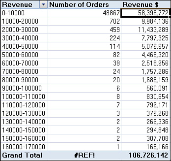
In Figure 4.9, the Row Labels field contains the size of each order.
Figure 4.9 Select a value and choose Group Field to display the Grouping dialog box.
Select any number in Column A, and then select Group Field from the Options dialog box. Excel displays the Grouping dialog box.
In the Grouping dialog box, choose parameters for the group. In Figure 4.9, the dialog is suggesting groups from 0 to 180,000 in increments of 10,000.
The result shows the number of orders in each group (see Figure 4.10).
Figure 4.10 The numeric row field has been grouped into ranges.
Ungrouping
After you have established groups, you can undo the groups by using the Ungroup icon on the Options tab. To undo a group, select one of the grouped cells, and then click the Ungroup icon on the Options tab.
Looking at the PivotTable Field List
The following topics in this chapter involve sorting and filtering your pivot table. Both of these tasks involve subtleties in the PivotTable Field List. The following sections take you through a quick tour of the PivotTable Field List.
Docking and Undocking the PivotTable Field List
The PivotTable Field List starts out docked on the right side of the Excel window.
Grab the gray title bar for the pane and drag to the left to enable the pane to float anywhere in your Excel window.
After you have undocked the PivotTable Field List, you might find that it is difficult to redock it on either side of the screen. To redock the Field List, you must grab the title bar and drag until at least 80 percent of the Field List is off the edge of the window. Pretend that you are trying to remove the floating Field List completely from the screen. Eventually, Excel gets the hint and redocks the Field List. Note that the PivotTable Field List can be either docked on the right or left side of the screen.
Case Study: Grouping Text Fields
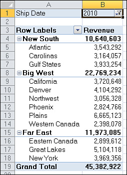
You get a call from the VP of Sales. Secretly, the Sales department is considering a massive reorganization of the sales regions. The VP would like to see a report showing sales for last year by the new proposed zones. You have been around long enough to know that the proposed zones will change several times before the reorganization happens, so you are not willing to change the Zone field in your source data quite yet.
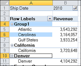
First, build a report showing revenue by market. The VP of Sales is proposing to build a new zone composed of Atlantic, Carolinas, and Gulf States. Using the Ctrl key, highlight the three zones that make up the new zone. Figure 4.11 shows the pivot table before the first group is created.
Figure 4.11 Use the Ctrl key to select the noncontiguous cells that make up the new zone.
From the Options tab, click Group Selection. Excel adds a new field called Market2. The three selected cells that are selected together belong to a Market2 grouping that is arbitrarily called Group1, as shown in Figure 4.12.
Figure 4.12 Excel arbitrarily calls the first grouping Group1.
Select Group1 in A4. Click the Field Settings icon on the Options tab. Although Excel called this field Zone2, give the field a new name such as Proposed Zones.
Click in Cell A4 and type a meaningful name instead of Group1.
As you repeat these steps to build other regions, Excel continues to assign names such as Group2 or Group3. After creating each region, simply type a meaningful name over the cell containing the arbitrary group name.
You find that the New Region field is a real field. You can use the sorting feature to sequence it alphabetically. The sorting feature is discussed in the “Sorting in a Pivot Table” section later in this chapter.
By default, Excel does not add subtotals for the New Region field. Use the Subtotals drop-down on the Design tab to add subtotals.
Figure 4.13 shows the report that is ready for the VP of Sales. You can probably predict that the Sales department needs to shuffle markets from the Big West region to balance the regions.
Figure 4.13 After you group all the markets into new regions, the report is ready for review.
Rearranging the PivotTable Field List
As shown in Figure 4.14, a small drop-down appears near the top right of the PivotTable Field List. Select this drop-down to see the five possible arrangements of the PivotTable Field List. Although the default is to have the Fields section at the top of the list and the areas section at the bottom of the list, four other arrangements are possible.
Figure 4.14 Use this drop-down to rearrange the PivotTable Field List.
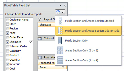
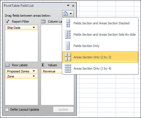
The final three arrangements offered in the drop-down are rather confusing. If someone changes the PivotTable Field List to show only the areas section, you could not see new fields to add to the pivot table.
If you ever encounter a version of the PivotTable Field List with only the areas sections (see Figure 4.15) or only the fields, remember that you can return to a less confusing view of the data by using the arrangement drop-down.
Figure 4.15 If you encounter this confusing arrangement of the PivotTable Field List, use the drop-down to return to an arrangement showing fields and areas.
Using the Areas Section Drop-Downs
As shown in Figure 4.16, every field in the areas section has a visible drop-down arrow. When you select this drop-down arrow, you see four categories of choices:
• The first four choices enable you to rearrange the field within the list of fields in that area of the pivot table.
• The next four choices enable you to move the field to a new area. This could also be accomplished by dragging the field to a new area.
• The next choice enables you to remove the field from the pivot table. This can also be accomplished by dragging the field outside of the field list.
• The final choice displays the Field Settings dialog box for the field.
Figure 4.16 The drop-downs in the areas section of the PivotTable Field List are not very useful.
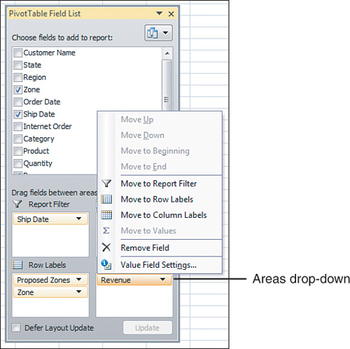
Because these drop-down arrows are always visible, you might be more likely to open these drop-downs. However, they are far less powerful than the hidden drop-downs in the Fields section of the list.
Using the Fields Drop-Down
A second set of drop-downs is available in the PivotTable Field List. Hover the mouse cursor over any field in the Fields section of the PivotTable Field List, and a hidden drop-down appears, as shown in Figure 4.17.
Figure 4.17 You have to hover your mouse cursor over a field before you realize that a drop-down is available.

After you open the drop-down in the Fields section, you can see that all the useful sorting and filtering options are behind the hidden drop-down.
Figure 4.18 shows the drop-down menu for the Product Line field in the top of the PivotTable Field List. Both the Label Filters and Value Filters options open to a flyout menu with many powerful filter choices.
Figure 4.18 You shouldn’t be surprised that all the powerful features are in the drop-down that Microsoft hides from view.

Caution
Microsoft has created a catch-22 for anyone trying to teach pivot tables. If this book suggests that you use the Product Line drop-down in the PivotTable Field List, most people tend to use the drop-down visible in the areas section of the PivotTable Field List. For the rest of this chapter, when the text refers to the “Product drop-down in the Fields section of the PivotTable Field List,” you should use the hidden drop-down shown in Figure 4.18.
Sorting in a Pivot Table
By default, items in each pivot field are sorted in ascending sequence based on the item name.
Beginning in Excel 2007, Microsoft dramatically simplified pivot table sorting. With these changes, you have the freedom to sort data fields to suit your needs. You can use one of several methods to apply sorting to your pivot table:
• Use the Sorting buttons on the Options tab.
• Use the hidden drop-down in the Fields section of the PivotTable Field List.
• Right-click any item in the row or column section and select Sort.
• Use the manual method.
Sorting Using the Sort Icons on the Options Tab
Three icons appear in the Sort group of the Options tab. The AZ button sorts ascending; the ZA button sorts descending. The Sort icon brings up a dialog box with more options.
To use the Sort icons successfully, pay attention to where you place the cell pointer before clicking the icon.
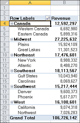
In Figure 4.19, the pivot table is in the default sort order. The regions are sorted alphabetically (Canada, Midwest, Northeast, Southeast, Southwest, and West). Within each region, the markets are sorted alphabetically.
Figure 4.19 This pivot table is in the default sequence.

There are eight ways to sort this data. You get a different sort depending on whether you have selected A4, B4, A5, or B5 when you click the AZ or ZA buttons. Refer to Figure 4.19 as you read these options:
• If you select Cell A4 and click ZA, the regions are sorted in descending order. The West region appears first. Within the West region, the zones are still sorted in ascending sequence (California, Northwest).
• If you select Cell A5 and click ZA, the markets are sorted in descending order within each region. The zones in the West region appear in descending sequence (Northwest, California).
• If you select Cell B4 and click ZA, the regions are sorted so that the largest region appears first. This is the Midwest region with $27.2 million, followed by the Southeast region with $18.1 million. The zones retain their previous sequence.
• If you select Cell B5 and click ZA, the zones are sorted within each region so that the largest zone appears first. In the Midwest region, the Plains zone appears first, with $15.9 million, followed by the Great Lakes zone with $11.3 million.
In Figure 4.20, the regions are sorted in descending alphabetical order, and the zones are sorted in descending revenue order within the regions.
Figure 4.20 After two sorts, the regions are in descending order alphabetically, and the zones are in descending order by region.
Think about sorting using the Data or Home tab; the sort is a one-time event. If data changes, you must manually choose to sort the data again.
Pivot table sorts are more powerful. When you sort using the pivot table sorting options, Excel sets up a rule for the field. If you change the order of the pivot fields, Excel continues to apply the rule. In Figure 4.21, the Region field was removed from the report. Excel remembered that the Market field should be sorted by descending revenue. Excel correctly re-sorted the data, moving Plains from Row 8 to Row 4.
Figure 4.21 Sort rules applied to a pivot table cause the data to be re-sorted after every pivot or refresh.
Sorting Using the Field List Hidden Drop-Down
An alternative method for sorting is to use the hidden drop-down in the Fields section of the PivotTable Field List.
Hover the mouse cursor over any field in the top half of the PivotTable Field List, and a drop-down appears. Select this drop-down to access AZ and ZA options and a More Sort Options menu choice.
You can also right-click any label in the pivot table and select Sort from the dialog box.
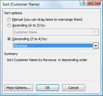
If you select the More Sort Options choice or the Sort icon in the Options tab, you access the Sort dialog box, as shown in Figure 4.22. In this pivot table version of the Sort dialog box, you can choose to sort the specific field based on another field. In Figure 4.22, you can see that the customer field should be sorted into descending revenue sequence.
Figure 4.22 You can specify complex sort criteria by using this Sort dialog box.
Understanding the Effect of Layout Changes on AutoSort
If you change the report filter, the report automatically re-sorts. Different customers might appear at the top of the list based on their purchases of the filtered items.
If you drop a new field on the report, the pivot table remembers the AutoSort option for the sorted field and does its best to present the data in that order. This might not be in the spirit of your report focusing on the best customers. Say that you add the Zone field as the outer row field. The Zone field is sorted alphabetically by name, but within each region, the customers are arranged in descending order by revenue.
Using a Manual Sort Sequence
Note that the dialog box in Figure 4.23 offers something called a manual sort. Rather than using the dialog box, you can invoke a manual sort in a surprising way.
Figure 4.23 Use a manual sort.
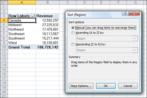
Note that the regions in Figure 4.23 are in the following order: Canada, Midwest, Northeast, Southeast, Southwest, and West. If this company is based in New York, company traditions might dictate that the Northeast region should be shown first, followed by Southeast, Midwest, Southwest, West, and Canada. On the face of it, there is no easy way to sort the Region field into this sequence. An ascending sort would cause the Canada region to be first. A descending sort would cause the West region to be first. Neither sort is in the proper sequence to match the company’s standard reporting.
You might try to convince your company to change a decades-long tradition of reporting in the North, South, West, and Midwest sequence. Alternatively, the company could change the region names to accommodate sorting in your pivot table. Both of these concepts would be tough to sell and are not viable options. Fortunately, Microsoft offers a simple solution to this problem, as described below.
Place the cell pointer in Cell A4 and type the word Northeast. Excel figures out that you want to move the Northeast column to be first and moves the Northeast values to Row 4. Canada is moved down to Row 9. Next, type Southeast in Cell A5. The values for Southeast move to Row 5.
This behavior is completely unintuitive. You should never try this behavior with a regular (nonpivot table) data set in Excel. You would never expect Excel to change the data sequence just by moving the labels.
Figure 4.24 shows the pivot table after typing new column headings in Column A.
Figure 4.24 Simply type a heading in A4 to move a new region to be first

Caution
After you use this technique, any new regions you add to the data source are automatically added to the end of the list because Excel does not know where to add the new region.
You can also reorder labels by dragging them. However, it can be difficult to find the correct place for dragging. Select a label. Hover over the right edge of the cell until the cursor changes to a four-headed arrow. Click and drag the field to resequence it.
Using a Custom List for Sorting
The other solution to the Northeast, Southeast, Midwest, Southwest, West, and Canada sequence problem is to set up a custom list. Custom lists are maintained in the Excel Options dialog box.
Follow these steps to set up a custom list:
1. In an out-of-the-way section of the worksheet, type the regions in their proper sequence. Type one region per cell, going down a column.
2. Select the cells containing the list of regions in the proper sequence.
3. Click the File menu. Select Excel Options from the bottom of the left navigation.
4. Select the Advanced category in the left navigation. Scroll down to the Display group. Click the Edit Custom Lists button.
5. In the Custom Lists dialog box, your selection address is entered in the Import text box. Click Import to bring the regions in as a new list, as shown in Figure 4.25. The new list appears at the bottom of the Custom Lists box.
Figure 4.25 Import a new custom list to enable custom sorts.
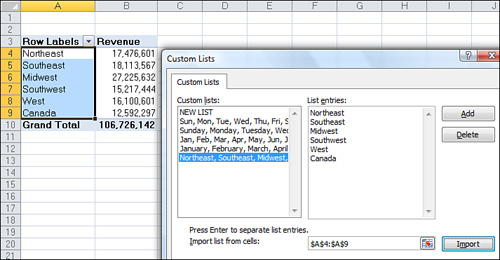
6. Click OK to close the Custom Lists dialog box. Then click OK to close the Excel Options dialog box.
The custom list is now stored on your computer and is available for all future Excel sessions.
To sort the pivot table by the custom list, follow these steps:
1. Select one of the Region cells in the pivot table.
2. From the Options tab, click the Sort icon.
3. In the Sort (Region) dialog box, select Ascending by Region.
4. In the Sort (Region) dialog box, click the More Options button in the lower-left corner.
5. In the More Sort Options dialog box, clear the AutoSort check box.
6. As shown in Figure 4.26, in the More Sort Options dialog box, open the First Key Sort Order drop-down and select Northeast, Southeast, Midwest, Southwest, West, Canada.
Figure 4.26 Choose to sort by the custom list.
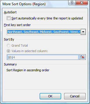
7. Click OK twice.
Filtering the Pivot Table
There are five ways to filter a pivot table, as shown in Figure 4.27.
Figure 4.27 Filter drop-downs in B1:B2, A5:B5, and C4 offer various filter options.
• Drop-downs in A5 and B5 offer new row label features, including virtual date filters. These filters were new in Excel 2007.
• Drop-downs in C4 offer new Label filters.
• Drop-downs in B1 and B2 offer what was known as Page Filters in legacy versions of Excel and are now known as Report Filters.
• Cell J5 offers the top-secret AutoFilter location.
• Slicers are a visual method of filtering. They replace the filters in Cells B1:B2 (see Figure 4.28).
Figure 4.28 Slicers are a graphical filter and a great improvement over (Multiple Items) in the old filters.
Slicers are discussed in the “Using Slicers” section later in this chapter.
Using Filters in the Label Areas
Click the drop-down for the Region field in Cell C4 of Figure 4.29. Excel offers a list of all values in the field. The Select All button toggles all the other fields on and off. If you need to limit the report to three of the six regions, clear the three unwanted regions, as shown in Figure 4.29.
Figure 4.29 You can filter by selecting or clearing items in the filter.
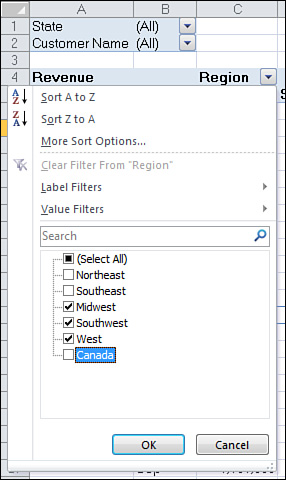
Text fields offer a flyout menu called Label filters. If you want to filter regions that contain the word “west,” you can choose the Contains option (see Figure 4.30). Alternatively, you can type the text in the new Search box.
Figure 4.30 The Label Filters enable you to find labels that match a text pattern.
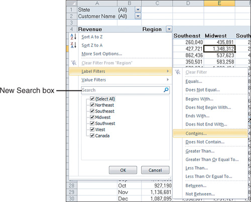
When you choose one of the filter items from the menu, Excel displays the Label Filter dialog box. In this dialog box, you can use wildcard characters. For example, you can use an * to match any series of characters or use ? to match a single character.
You can also choose Regions where the sales match a certain level. When you select the Value Filters flyout, these filters enable you to include or exclude regions based on the revenue values for those filters (see Figure 4.31).
Figure 4.31 The Value Filters enable you to select regions based on their values in a numeric field.

If your label field contains all dates, Excel replaces the Label Filter flyout with a Date Filters flyout. These filters offer many virtual filters such as Next Week, This Month, Last Quarter, and so on (see Figure 4.32).
Figure 4.32 The Date Filters offer various virtual date periods.
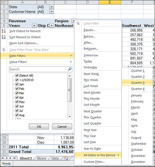
If you choose Equals, Before, After, or Between, you can specify a date or a range of dates.
Options for the current or past or next day, week, month, quarter, or year occupy 15 options. Combined with Year to Date, these options change day after day. You can pivot a list of projects by due date and always see the projects that are due in the next week using this option. When you open the workbook on another day, the report recalculates.
Tip
In Microsoft’s world, a week runs from Sunday through Saturday. If you select Next Week, the report always shows a period from the next Sunday through the following Saturday.
When you select All Dates in the Period, a new flyout menu offers options such as Each Month and Each Quarter.Case Study
Caution
If you display your report in Compact Layout with multiple row fields, Excel includes all the fields in the first column of the pivot table. In this case, you have one drop-down on the Row Labels cell. To use the Row Labels drop-down, you first need to use the Select Field drop-down at the top of the Row Labels drop-down.
Creating a Top 10 Report
One of the useful value filters is the Top 10 filter. This value filter can be used to select the Top N, Bottom N, Top N%, or Bottom N%.
For a value filter, you can select text row fields where the corresponding value fields are in the top 10, top 20, and so on.
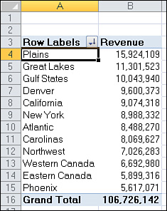
In Figure 4.33, the pivot table shows revenue by customer.
Figure 4.33 There are too many customers to read the whole report.
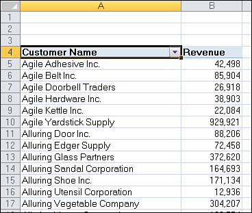
Because there are more than 500 customers, your chance of getting a sales manager to read this report is slim. It would be better to show a report of the top 10 customers.
Follow these steps to filter the report:
1. Select the Row Labels drop-down in Cell A4.
2. Select Value Filters from the drop-down.
3. Select Top 10 from the flyout menu. Excel displays the Top 10 Filter (Customer Name) dialog box, as shown in Figure 4.34.
Figure 4.34 Initially, the Top 10 Filter finds the top 10 customers.

4. Click OK to close the dialog box. Your pivot table then shows only the top 10 customers.
5. If you want the customers to be listed high to low, choose a field in the Revenue column. Click the ZA button in the Options tab. The resulting pivot table is shown in Figure 4.35
Figure 4.35 Specify that the customers should be sorted high to low.
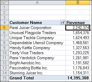
Beware that the total in Row 15 is only the total of the top 10 customers.***
Filtering Using the Report Filter Area
Pivot table veterans remember the old page area section of a pivot table. This area has been renamed the report filter area and still operates basically the same as in legacy versions of Excel. Microsoft did add the capability to select multiple items from the report filter area.
Adding Fields to the Report Filter Area
The pivot table in Figure 4.36 is a perfect ad hoc reporting tool to give to a high-level executive. You can use the drop-downs in B1:B6 to find revenue quickly for any combination of region, zone, state, category, product, or customer. This is a typical use of Report Filters.
Figure 4.36 With multiple fields in the Report Filter area, this pivot table can answer many ad hoc queries.
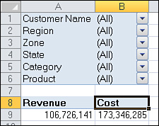
To set up the report, drag revenue and cost to the Values drop zone, and then drag as many fields as desired to the Report Filter drop zone.
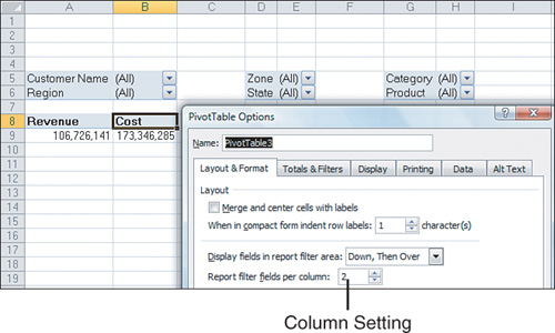
Tip
If you add many fields to the report filter area, you might want to use one of the obscure pivot table options settings. Click Options on the Options tab. On the Layout & Format tab of the PivotTable Options dialog box, change the Report Filter Fields Per Column from 0 to a positive number. Excel rearranges the filter fields into multiple columns, as shown in Figure 4.37. You can also change Down, Then Over to Over, Then Down to rearrange the sequence of the filter fields.
Figure 4.37 To show the filter fields in multiple columns, change this setting to be nonzero.
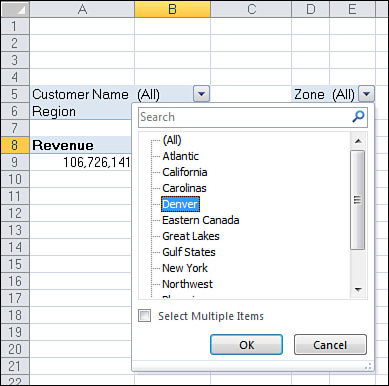
Choosing One Item from a Report Filter
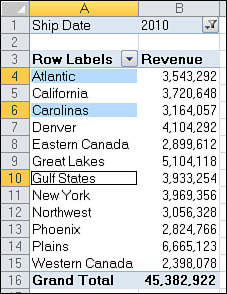
To filter the pivot table, click any drop-down in the report filter area of the pivot table. The drop-down always starts with (All), but then lists the complete unique set of items available in that field.
To filter to a single item, click that item in the list, as shown in Figure 4.38.
Figure 4.38 After you select this option, the report shows the revenue from the Denver zone.
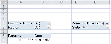
Note
Using the Select Multiple Items filter leads to a situation in which the report consumer might not know what items are included in the report. In Figure 4.40, you can see that E5 reports the somewhat cryptic (Multiple Items) label. Slicers solve this problem.
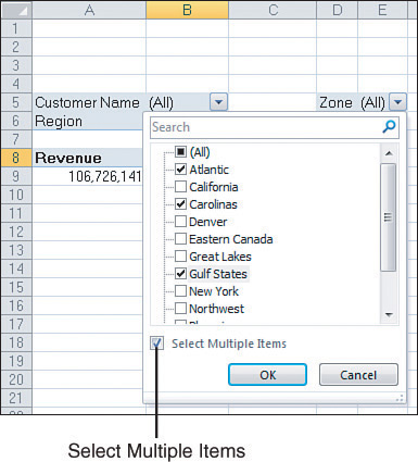
Choosing Multiple Items from a Report Filter
At the bottom of the report filter drop-down is a check box labeled Select Multiple Items. If you select this box, Excel adds a check box next to each item in the drop-down. This enables you to check multiple items from the list.
In Figure 4.39, the pivot table is filtered to show revenue from three zones.
Figure 4.39 Use the Select Multiple Items check box to enable combination filters.
Quickly Selecting or Clearing All Items from a Filter
The (All) check box at the top of the Market drop-down in Figure 4.39 is powerful. Selecting the (All) check box represents a quick way to select or clear all the items in the drop-down.
If the (All) check box is clear, click it to select all items. If the (All) check box is selected, click it to clear all items rapidly.
Figure 4.40 This report includes multiple zones, but which ones?
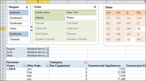
Using Slicers
Slicers are graphical versions of the Report Filter fields. Rather than hiding the items selected in the filter dropdown behind a heading like (Multiple Items), the slicer is a large array of buttons that will show at a glance which items are included or excluded.
To add slicers, click the Insert Slicer icon on the Options tab. Excel displays the Insert Slicers dialog. Choose all the fields for which you want to create graphical filters, as shown in Figure 4.41.
Figure 4.41 Choose fields for slicers.

Initially, Excel chooses one-column slicers of similar color in a tiled arrangement (see Figure 4.42). However, you can change these settings.
Figure 4.42 The slicers appear with one column each.
You can add more columns to a slicer. If you have to show 50 two-letter state abbreviations, that will look much better as 5 rows of 10 columns instead of 50 rows of one column. Click on the slicer to get access to the Slicer Tools Options tab. Use the Columns spin button to increase the number of columns in the slicer. Use the resize handles in the slicer to make the slicer wider and shorter. To add visual interest, choose a different color from the Slicer Styles gallery for each field.
After formatting the slicers, arrange them in a blank section of the worksheet, as shown in Figure 4.43.
Figure 4.43 After formatting, your slicers might fit on a single screen.
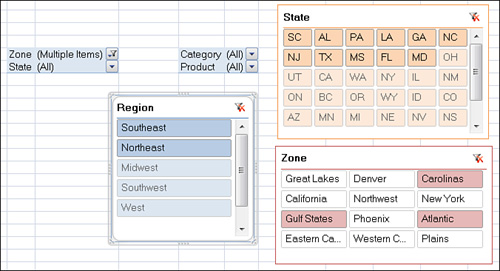
There are three colors that might appear in a slicer. The dark color indicates items that are selected. White boxes often mean the item has no records because of other slicers. Gray boxes indicate items that are not selected.
![]() To see a demo of slicers, search for “Pivot Table Data Crunching 4” at YouTube.
To see a demo of slicers, search for “Pivot Table Data Crunching 4” at YouTube.
Next Steps
In Chapter 5, “Performing Calculations Within Pivot Tables,” you learn how to use pivot table formulas to add new virtual fields to your pivot table.