13. Advanced Pivot Table Tips and Techniques
Unique Solutions to Common Pivot Table Problems
In this chapter, you discover techniques that provide unique solutions to some of the more common pivot table problems. Take time to glance at the topics covered here. Who knows? You might find a few unique tips that can help you tackle some of your pivot table conundrums!
Tip 1: Force Pivot Tables to Refresh Automatically
In some situations, you might need to have your pivot tables refresh themselves automatically. For instance, suppose you created a pivot table report for your manager. You might not be able to trust that he will refresh the pivot table when needed.
You can force each pivot table to automatically refresh when the workbook opens by following these steps:
1. Right-click your pivot table and select PivotTable Options.
2. In the activated dialog box, select the Data tab.
3. Select the Refresh Data When Opening the File property check box.
When this property is activated, the pivot table refreshes itself each time the workbook in which it’s located is opened.
Note
The Refresh Data When Opening the File property must be set for each pivot table individually.
Tip 2: Refresh All Pivot Tables in a Workbook at the Same Time
When you have multiple pivot tables in a workbook, refreshing all of them can be bothersome. There are several ways to avoid the hassle of manually refreshing multiple pivot tables. Here are a couple options:
Option 1: You can configure each pivot table in your workbook to automatically refresh when the workbook opens. To do so, right-click your pivot table and select PivotTable Options. This activates the PivotTable Options dialog box. Then, select the Data tab and select the Refresh Data When Opening the File property check box. After you have configured all pivot tables in the workbook, they automatically refresh when the workbook is opened.
Option 2: You can create a macro to refresh each pivot table in the workbook. This option is ideal when you need to refresh your pivot tables on demand, rather than only when the workbook opens. The idea is to start recording a macro. While the macro is recording, simply go to each pivot table in your workbook and refresh. After all pivot tables are refreshed, stop recording. The result is a macro that can be fired any time you need to refresh all pivot tables.
→ Revisit Chapter 11, “Enhancing Pivot Table Reports with Macros,” to get more detail on using macros with pivot tables.
Option 3: You can use VBA to refresh all pivot tables in the workbook on demand. This option can be used when it is impractical to record and maintain macros that refresh all pivot tables. This approach entails the use of the RefreshAll method of the Workbook object. To employ this technique, start a new module and enter the following code:
![]()
You can now call this procedure any time you want to refresh all pivot tables within your workbook.
Note
Keep in mind that the RefreshAll method refreshes all external data ranges along with pivot tables. This means that if your workbook contains data from external sources, such as databases and external files, that data is refreshed along with your pivot tables.
Tip 3: Sort Data Items in a Unique Order (Not Ascending or Descending)
Figure 13.1 shows the default sequence of regions in a pivot table report. Alphabetically, the regions are shown in sequence of Midwest, North, South, and West. If your company is based in California, company traditions might dictate that the West region should be shown first, followed by Midwest, North, and South. Unfortunately, neither an ascending sort order nor a descending sort order can help you.
Figure 13.1 Although company traditions dictate that the Region field should be in West, Midwest, North, and South sequence, they appear in alphabetical order.

You can rearrange data items in your pivot table manually by simply typing the exact name of the data item where you would like to see its data. You can also drag the data item where you want it.
To solve the problem in this example, you simply type the word West in cell B4, and then press Enter. The pivot table responds by resequencing the regions. The $3 million in sales for the West region automatically moves from column E to column B. The remaining regions move over to the next two columns.
Tip 4: Turn Pivot Tables into Hard Data
You created your pivot table only to summarize and shape your data. You do not want to keep the source data or the pivot table with all its overhead.
Turning your pivot table into hard data enables you to utilize the results of the pivot table without having to deal with the source data or a pivot cache. How you turn your pivot table into hard data depends on how much of your pivot table you are going to copy.
If you are copying just a portion of your pivot table, do the following:
1. Select the data you want to copy from the pivot table, and then right-click and select Copy.
2. Right-click anywhere on a spreadsheet and select Paste.
If you are copying your entire pivot table, follow these steps:
1. Select the entire pivot table, right-click, and select Copy.
2. Right-click anywhere on a spreadsheet and select Paste Special.
3. Select Values, and then click OK.
Tip
You might want to consider removing any subtotals before turning your pivot table into hard data. Subtotals typically aren’t very useful when you are creating a standalone data set.
To remove the subtotals from your pivot table, first identify the field for which subtotals are being calculated. Then, right-click the field’s header (either in the pivot table itself or in the PivotTable Field List) and select Field Settings. Selecting this option opens the Field Settings dialog box. Here, you change the Subtotals option to None. After you click OK, your subtotals are removed.
Tip 5: Fill the Empty Cells Left by Row Fields
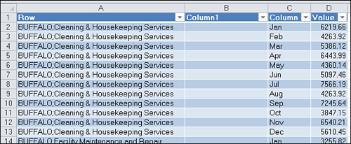
When you turn a pivot table into hard data, you are left not only with the values created by the pivot table, but also the pivot table’s data structure. For example, the data in Figure 13.2 came from a pivot table that had a tabular layout.
Figure 13.2 It would be impractical to use this data anywhere else without filling in the empty cells left by the row field.

Notice that the Market field kept the same row structure it had when this data was in the row area of the pivot table. It would be unwise to use this table anywhere else without filling in the empty cells left by the row field, but how do you easily fill these empty cells?
Excel 2010 actually provides you two effective ways of fixing this problem.
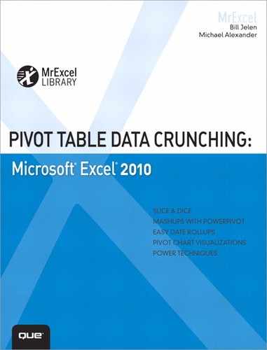
Option 1: Implement the New Repeat All Data Items Feature
The first option is to apply Excel 2010’s new Repeat Item Labels functionality. This new feature ensures that all item labels are repeated to create a solid block of contiguous cells. To implement this feature, place your cursor anywhere in your pivot table. Then, go up to the Ribbon and select Design, Report Layout, Repeat All Item labels (see Figure 13.3).
Figure 13.3 The Repeat All Item Labels option enables you to show your pivot data in one contiguous block of data.
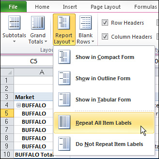
Figure 13.4 shows what a pivot table with this feature applied looks like.
Figure 13.4 The Repeat All Item Labels option fills all cells with data items.
Now you can turn this pivot table into hard values, ending up with a contiguous table of data without gaps.
Option 2: Use Excel’s GOTO Special Functionality
The other solution to this problem involves using Excel’s GOTO Special functionality.
In order to implement this method, you will need to first convert your pivot table to hard data. You can do this by following these steps:
1. Select the entire pivot table, right-click, and select Copy.
2. Right-click anywhere on a spreadsheet and select Paste Special.
3. Select Values, and then click OK.
Now, you can select a range in columns A and B that extends from the first row with blanks to the row just above the grand total. In the present example, this includes cells A4:B100. Press F5 to activate the Go To dialog box. The Go To Special dialog box is a powerful feature that enables you to modify your selection based on various conditions. In the lower-left corner of the Go To dialog box, select the Special button. This activates the Go To Special dialog you see in Figure 13.5. From here, you select the option for Blanks.
Figure 13.5 Using the Go To Special dialog box enables you to select all the blank cells to be filled.

The result is that only the blank cells within your selection are selected.
Enter a formula to copy the pivot item values from the cell above to the blank cells. You can do this with four keystrokes, but it helps if you don’t look at the screen while you perform them. Type = (equal sign). Press the up-arrow key. Hold down the Ctrl key while pressing Enter.
Note
The equal sign tells Excel that you are entering a formula in the active cell. Pressing the up-arrow key points to the cell above the active cell. Pressing Ctrl+Enter tells Excel to enter a similar formula in all the selected cells instead of just the active cell. As Figure 13.6 illustrates, with these few keystrokes, you enter a formula to fill in all the blank cells at once.
Figure 13.6 Pressing Ctrl+Enter enters the formula in all selected cells.

You still should convert those formulas to values. However, if you attempt to copy the current selection, Excel presents an error; you cannot copy a selection that contains multiple selections. By selecting Blanks from the Go To Special dialog box, you actually selected many areas of the spreadsheet.
You have to reselect the original range of cells A4:B100. You can then press Ctrl+C to copy, and then select Edit, Paste Special, Values to convert the formulas to values.
This method provides a quick way to fill in the outline view provided by the pivot table.
Tip 6: Add a Rank Number Field to Your Pivot Table
When you are sorting and ranking a field with a large number of data items, it can be difficult to determine the number ranking of the current data item you are analyzing. Furthermore, you might want to turn your pivot table into hard values for further analysis. An integer field that contains the actual rank number of each data item could prove to be helpful in analysis outside the pivot table.
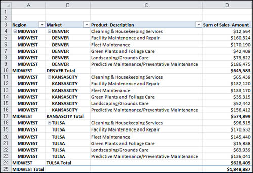
Start with a pivot table similar to the one shown in Figure 13.7. Notice that the same data measure is shown twice; in this case, it is SumOfSalesAmount.
Figure 13.7 Start with a pivot table where the data value is listed twice.
Right-click the second instance of data measure. Select Show Values As, and then Rank Largest to Small Smallest (see Figure 13.8).
Figure 13.8 Adding a Rank field is simple with Excel 2010’s new Show Values As option.

After your ranking is applied, you can adjust the labels and formatting, as demonstrated in Figure 13.9. This leaves you with a clean-looking ranking report.
Figure 13.9 Your final pivot table with ranking applied.

Tip 7: Reduce the Size of Your Pivot Table Reports
When you initiate the creation of a pivot table report, Excel takes a snapshot of your data set and stores it in a pivot cache. A pivot cache is nothing more than a special memory subsystem in which your data source is duplicated for quick access. That is to say, Excel literally makes a copy of your data, and then stores it in a cache that is attached to your workbook.
Each pivot table report you create from a separate data source creates its own pivot cache that increases your file size. The increase in file size depends on the size of the original data source that is being duplicated to create the pivot cache.
Of course, the benefit you get from a pivot cache is optimization. Any changes you make to the pivot table report, such as rearranging fields, adding new fields, or hiding items, are made rapidly and with minimal overhead.
The down side of the pivot cache is that it basically doubles the size of your workbook. So every time you make a new pivot table from scratch, you essentially add to the file size of your workbook.
The following sections discuss a few ways you can avoid pivot table-induced file bloat.
Copy and Paste Instead of Creating From Scratch
Sometimes you need to make multiple pivot tables from the same data source. Instead of making each pivot table from scratch, which adds to the file’s size, copy and paste the pivot table. When you copy an existing pivot table and paste it, you essentially create a pivot table that reads from the same pivot cache. That is, you create a new pivot table without creating another memory container to add to the file size.
Delete Your Source Data Tab
If your workbooks have both your pivot table and your source data tab, you are wasting space. That is, you are essentially distributing two copies of the same data. You can delete your source data, and your pivot table functions just fine. After deleting the source data, saving shrinks the file.
Note
Note that pivot tables that share the same pivot cache also share calculated fields, calculated items, and groupings.
Your clients can use the pivot table as normal, and your workbook is half as big. The only functionality you lose is the ability to refresh the pivot data because the source data is not there.
Note
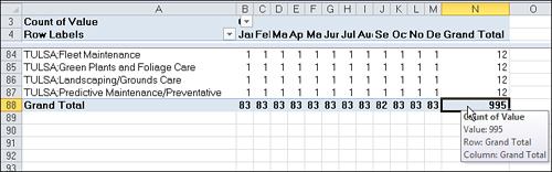
So what happens if your clients need to see the source data? They can simply double-click the intersection of the row and column grand totals. This tells Excel to output the contents of the pivot table’s cache into a new worksheet. With one double-click, your clients can re-create the source data that makes up the pivot table!
Use a Duplicate Cache Finder
If you already have a workbook filled with pivot tables, you can use a Duplicate Cache Finder to find and fix all duplicate caches. That is to say, a Cache Finder helps you point all your pivot tables to the same pivot cache. In this way, shrink your file size by eliminating duplicate caches.
Note
Debra Dalgleish, purveyor of www.contextures.com, has a nifty workbook that does just that. Her Cache Finder can be found at http://www.contextures.com/PivotCacheFix.zip.
Tip 8: Create an Automatically Expanding Data Range
You will undoubtedly encounter situations in which you have pivot table reports that are updated daily. That is, records are constantly added to the source data. When records are added to a pivot table’s source data set, you must redefine the range that is captured before the new records are brought into the pivot table. Redefining the source range for a pivot table once in a while is no sweat, but when the source data is changed on a daily or weekly basis, it can start to get bothersome.
The solution is to turn your source data table into a table before creating your pivot table. Again, Excel tables enable you to create a defined range that automatically shrinks or expands with the data. This enables any component, chart, pivot table, or formula tied to that range to keep up with changes in your data.
To implement this trick, simply highlight your source data, and then click the table icon on the Insert tab (see Figure 13.10). Confirm the range to be included in your table, and then click OK.
Figure 13.10 Convert your source data into a table.
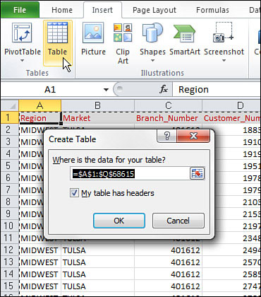
After your source data has been converted to a table, any pivot table you build on top of it automatically keeps when your source data expands or shrinks.
Note
Keep in mind that although you don’t have to redefine the source range anymore, you still need to trigger a Refresh to have your pivot table show the current data.
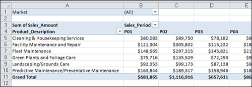
Tip 9: Comparing Tables with a PivotTable
If you’ve been an analyst for more than a week, you’ve been asked to compare two separate tables to come up with some brilliant analysis about the differences between them. This is a common scenario where leveraging a pivot table can save some time.
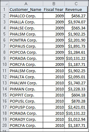
In this scenario, imagine you have two tables that show customers in 2009 and in 2010. Figure 13.11 illustrates two separate tables. For this example, the tables were made small for instructional purposes. Imagine you’re working with something bigger here.
Figure 13.11 You need to compare these two tables.

The idea is to create one table you can use to pivot. Be sure you have a way to tag which data comes from which table. As you see in Figure 13.12, you have a column called Fiscal Year that serves this purpose.
Figure 13.12 Combine your tables into one table.
After your tables have been combined, use the combined data set to create a new pivot table. Format the pivot table so that the table tag (the identifier telling you which table the data came from) is in the column area of the pivot table. In Figure 13.13, years are in the column area, and customers are in the row area. The data area contains the count records for each customer name.
Figure 13.13 Create a pivot table to see an easy-to-read visual comparison of the two data sets.
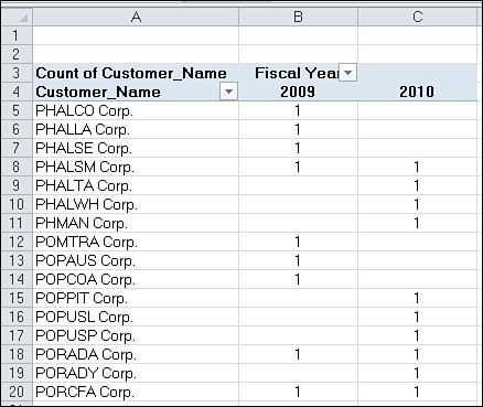
As you see in Figure 13.13, you instantly get a visual indication of which customers are only in the 2009 table, which are in the 2010 table, and which are in both tables.
Tip 10: AutoFilter a PivotTable
The conventional wisdom is that you can’t apply an Autofilter to a PivotTable. Technically, that’s true, but there is a way to trick Excel into making it happen.
The trick is to place your cursor directly adjacent to the last title in the PivotTable, as demonstrated in Figure 13.14. After you have it there, you can go to the application menu, select Data, and then select AutoFilter.
Figure 13.14 Place your cursor just outside your pivot table.
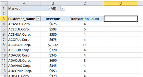
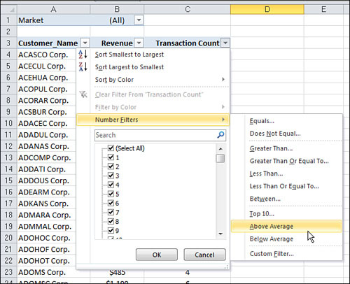
At this point, you have AutoFilters on your PivotTable! With this, you can do something cool like apply a Custom AutoFilter to find all customers with an above average transaction count (see Figure 13.15).
Figure 13.15 With AutoFilters implemented, you can take advantage of custom filtering not normally available to pivot tables.
This is a fantastic way to add an extra layer of analytical capabilities to your pivot table reports.
Tip 11: Transposing a Data Set with a PivotTable
In Chapter 2, “Creating a Basic Pivot Table,” you learned that the perfect layout for the source data in a pivot table is a tabular layout. A tabular layout is a particular table structure where the following attributes exist: no blank rows or columns, every column has a heading, every field has a value in every row, and columns do not contain repeating groups of data.
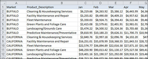
Unfortunately, you often encounter data sets like the one shown in Figure 13.16. The problem is that the month headings are spread across the top of the table, pulling double duty as column labels and actual data values. In a pivot table, this format would force you to manage and maintain 12 fields, each representing a different month.
Figure 13.16 You need to convert this matrix-style table to a tabular data set.
Interestingly enough, you can fix this issue by using a Multiple Consolidated Pivot Table. Follow these basic steps to convert this matrix-style data set to one that is appropriate for use with a pivot table:
Step 1: Combine All Noncolumn Oriented Fields into One Dimension Field
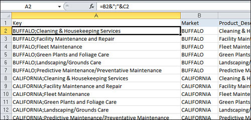
Due to the nature of Multiple Consolidation PivotTables, it’s important that you have only one dimension column. In this example, anything that isn’t a month field is considered a dimension. So, the Market and Product_Description fields need to be pulled into one column.
To do this, you can simply type a formula that concatenates these two fields with a semicolon delimiter. Be sure you give your new column a name. You can see the exact formula to use in the formula bar in Figure 13.17.
Figure 13.17 Concatenate the Market and Product_Description fields with a semicolon delimiter.
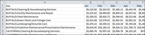
After you create your concatenated column, be sure to convert the formulas into hard data. Select the newly created concatenated column, press Ctrl+C to copy, and then select Edit, Paste Special, Values to convert the formulas to values.
Now, you can remove the Market and Product_Description fields (see Figure 13.18).
Figure 13.18 Be sure to remove all but one dimension field.
Step 2: Create a Multiple Consolidation Ranges PivotTable
The next step is to start the old PivotTable and PivotChart Wizard. Press Alt+D+P to call up the old wizard. You need the old wizard because it’s the only place you find the Multiple Consolidation Ranges option. Here are the steps to walk through the wizard:
1. Click the option for Multiple Consolidation Ranges, and then click Next.
2. Select the I Will Create the Page Fields option, and then click Next.
3. Define the range you are working with, and then click Finish.
Step 3: Double-Click Grand Total Intersection of Row and Column
At this point, you should have a multiple consolidation pivot table that looks practically useless. Go to the intersection of the row and column Grand Totals and double-click the number (see Figure 13.19).
Figure 13.19 Double-click the intersection of Row and Column Grand Totals.
You get a new sheet similar to the one shown in Figure 13.20. This is essentially a transposed version of your data.
Figure 13.20 Your data set has been transposed.

Step 4: Parse Your Dimension Column into Separate Fields
Now all there is left to do is parse out the Row column into separate fields again. The first step in that process is to ensure there are enough columns to parse into. Because the Row column has one semicolon, you need one extra empty column. So, as demonstrated in Figure 13.21, add a new empty column next to the Row column.
Figure 13.21 Add an empty column so there is room to parse the Row field.
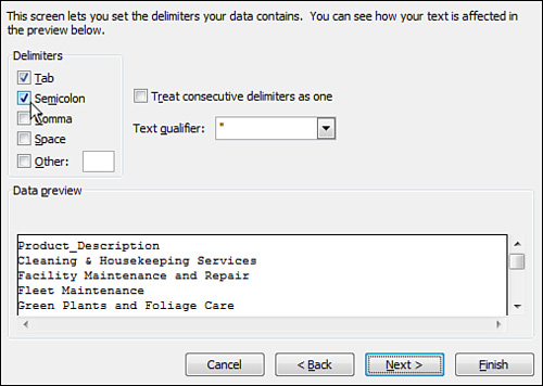
Select the Row (column A) and call up the Text to Columns dialog box. Go to the Ribbon select Data, and then select Text to Columns. The idea here is to parse out the concatenated field using the semicolon delimiter.
In the Wizard, select the Delimited option, and then click Next.
On the next screen, select the Semicolon option, and then click Finish, as demonstrated in Figure 13.22.
Figure 13.22 Select the Delimited option, and then click Finish.
After a few relabeling and formatting actions, your transposed data set should look similar to Figure 13.23.
Figure 13.23 Your final transposed data set.
Tip 12: Forcing Two Number Formats in a Pivot Table
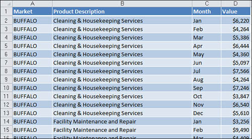
Every now and then, you have to deal with a situation where a normalized data set makes it difficult to build an appropriate pivot table. For example, the data set shown in Figure 13.24 contains metrics information for each Market. Notice a column that identifies the Measure and a column that specifies the corresponding Value.
Figure 13.24 This metric table has many different data types in one Value field.
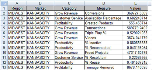
Although this is generally a nicely formatted table, you notice that some of the measures are meant to be Number format while others are meant to be Percentage. In the database where this data set originated, the Values field is a Double data type, so this works.
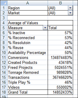
The problem is that when you create a pivot table out of this data set, you can’t assign two different number formats for the Values field. After all, one field is one number format.
As you see in Figure 13.25, trying to set the number format for the percentage measures also changes the format for the measure that are supposed to be straight numbers.
Figure 13.25 You can only have one number format assigned to each data measure.
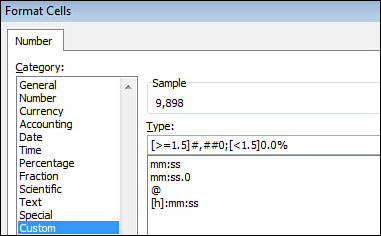
The solution is to apply a custom number format that formats any value greater than 1.5 to a number. Any value less than 1.5 is formatted as a percent. In the Format Cells dialog box, click Custom, and then enter the following syntax in the Type input (see Figure 13.26):
[>=1.5]#,##0;[<1.5]0.0%
Figure 13.26 Apply a custom number format telling Excel to format any number less 1.5 to a percent.
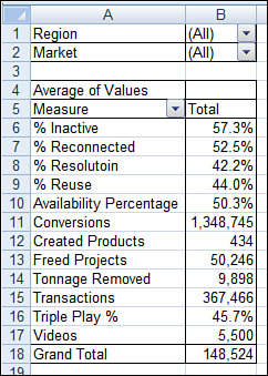
The result, as shown in Figure 13.27, is that each Measure is now formatted appropriately. Obviously, you have to get a little lucky with the parameters of the situation you’re working in. Although this technique wouldn’t work in all scenarios, it does open some interesting options.
Figure 13.27 Two formats in one Data field. Amazing!
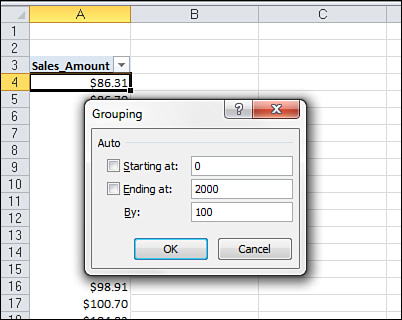
Tip 13: Creating a Frequency Distribution with a Pivot Table
If you’ve created a frequency distribution with the Frequency function, you know it can quickly devolve into a confusing mess. The fact that it’s an array formula doesn’t help matters, and then there’s that Histogram functionality you find in the Analysis Tool Pack. That doesn’t make life much better. Each time you have to change your Bin ranges, you have to restart the entire process again.
In this tip, you learn how you can use a pivot table to quickly implement a simple frequency distribution.
First, you need to create a pivot table where the data values are plotted in the Row area (not the Values area). Notice in Figure 13.28 the Sales_Amount field is placed in the Row Labels area.
Figure 13.28 Place your data measure into the Row area.
Next, right-click any value in the Row area and select Group. In the Grouping dialog box shown in Figure 13.29, set the start and end values, and then set the intervals. This essentially creates your frequency distribution.
Figure 13.29 Use the Grouping functionality to create your frequency intervals.
After you click OK, you can leverage the result to create a distribution view of your data.
In Figure 13.30, you can see that Customer_Name has been added to get a frequency distribution of the number of customer transactions by dollar amount.
Figure 13.30 You now have the distribution of customer transactions by dollar amount.

The benefit to this technique is you can use the pivot table’s Report Filter to interactively filter the data based on other dimensions like Region and Market. Also, unlike the Analysis Tool Pack Histogram, you can quickly adjust your frequency intervals by simply right-clicking on any number in the Row area and selecting Group.
Tip 14: Use a Pivot Table to Explode a Data Set to Different Tabs
One of the most common requests an analyst gets is to create a separate pivot table report for each region, market, manager, and so on. These types of requests usually lead to a painful manual process in which you copy a pivot table onto a new worksheet, and then change the filter field to the appropriate region or manager. You then repeat this process as many times as you need to get through each selection.
Creating separate pivot table reports is one area where Excel really comes to the rescue. Excel has a function called Show Report Filter Pages that automatically creates a separate pivot table for each item in your filter fields.
To use this function, simply create a pivot table with a filter field, as shown in Figure 13.31.
Figure 13.31 Start with a pivot table that contains a filter field.
Place your cursor anywhere on the pivot table, and then go up to the Ribbon to select the Options tab. On the Options tab, go to the PivotTable group and click the Options drop-down. Click the Show Report Filter Pages button, as demonstrated in Figure 13.32.
Figure 13.32 Click the Show Report Filter Pages button.
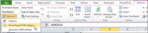
A dialog box opens, enabling you to choose the filter field for which you would like to create separate pivot tables. Select the appropriate filter field and click OK.
Your reward is a sheet for each item in your filter field containing its own pivot table. Figure 13.33 illustrates the result. Note the newly created tabs are named to correspond with the filter item shown in the pivot table.
Figure 13.33 With just a few clicks, you can have a separate pivot table for each market!

Note
Be aware that you can use Show Report Filter Pages on only one filter field at a time.
Tip 15: Use a Pivot Table to Explode a Data Set to Different Workbooks
Imagine you have a data set with more than 50,000 rows of data. You have been asked to create a separate workbook for each market in this data set. In this tip, you discover how you can accomplish this task by using a pivot table and a little Visual Basic for Applications (VBA).
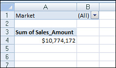
Place the field you need to use as the group dimension (in this case, Market) into the ReportFilter field. Place the count of Market into the data field. Your pivot table should look similar to the one shown in Figure 13.34.
Figure 13.34 Create a simple pivot table with one data field and a Report Filter.
You can also manually select a Market in the Page/Filter field, and then double-click the Count of Market. This gives a new tab containing all the records that make up the number you double-clicked. You can imagine how you could do this for every market in the Market field and save the resulting tabs to their own workbook.
Using this same concept, you can implement the following VBA that goes through each item in your chosen page field and essentially calls the ShowDetails function for you, creating a raw data tab. The procedure then saves that raw data tab to a new workbook:
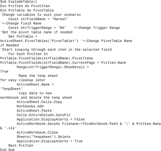
To implement this technique, enter this code into a new VBA Module.
Be sure to change these constants and variables if needed.
• Const strFieldName: The field name is the name of the field you want to separate the data. In other words, this is the field you put in the Page/Filter area of the pivot table.
• Const strTriggerRange: The trigger range is essentially the range that holds the one number in the pivot table’s Data area. For example, if you look at Figure 13.34, you’ll see the trigger cell in A4.
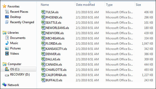
As you see in Figure 13.35, running this procedure outputs data for each Market into its own separate workbook.
Figure 13.35 After you run this VBA, you have a separate workbook for each filtered dimension.
Next Steps
In Chapter 14, “Dr. Jekyll and Mr. GetPivotData,” you learn about one of the most hated pivot table features—the GetPivotData function. However, you also learn how to use this function to create refreshable reports month after month.