
2. Creating a Basic Pivot Table
Preparing Data for Pivot Table Reporting
When you have a family portrait taken, the photographer takes time to make sure that the lighting is right, the poses are natural, and everyone smiles his or her best smile. This preparation ensures that the resulting photo is effective in its purpose
When you create a pivot table report, you are the photographer taking a snapshot of your data. Taking time to make sure your data looks its best ensures that your pivot table report is effective in accomplishing the task at hand.
One of the benefits of working in a spreadsheet is that you have the flexibility of laying out your data to suit your needs. Indeed, the layout you choose depends heavily on the task at hand. However, many of the data layouts used for presentations are not appropriate when used as the source data for a pivot table report.
As you read the next section that discusses how to prepare your data, keep in mind that pivot tables have only one hard rule as it pertains to your data source: Your data source must have column headings that are labels in the first row of your data describing the information in each column. If this is not the case, your pivot table report cannot be created.
However, just because your pivot table report is created successfully does not mean that it is effective. A host of things can go wrong as a result of bad data preparation—from inaccurate reporting to problems with grouping and sorting.
Let’s look at a few of the steps you can take to ensure you end up with a viable pivot table report.
Ensure Data Is in a Tabular Layout
A perfect layout for the source data in a pivot table is a tabular layout. In tabular layout, there are no blank rows or columns. Every column has a heading. Every field has a value in every row. Columns do not contain repeating groups of data.
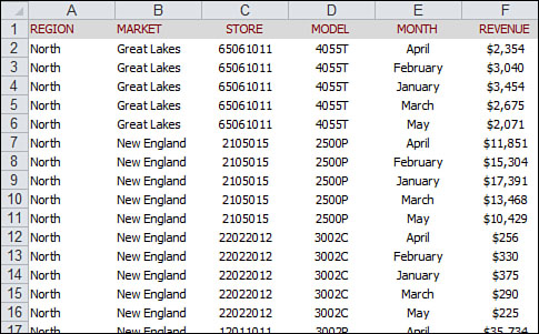
Figure 2.1 shows an example of data structured properly for a pivot table. There are headings for each column. Even though the values in D2:D6 are all the same model, the model number appears in each cell. Month data is organized down the page instead of across the columns.
Figure 2.1 This data is structured properly for use as a pivot table source.
Tabular layouts are database-centric, which means these types of layouts are most commonly found in databases. Database-centric layouts are designed to store and maintain large amounts of data in a well-structured, scalable format.
Tip
You might work for a manager who demands that the column labels be split into two rows. For example, he might want the heading Gross Margin to be split with Gross in Row 1 and Margin in Row 2. Because pivot tables require a unique heading one row high, your manager’s preference can be problematic. To overcome this problem, start typing your heading. For example, type Gross. Before leaving the cell, press Alt+Enter and then type Margin. The result is a single cell that contains two lines of data.
Avoid Storing Data in Section Headings
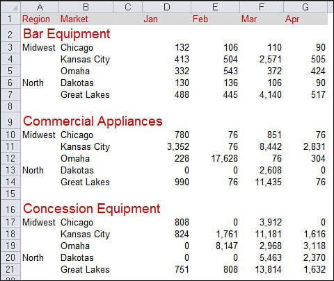
Examine the data in Figure 2.2. This spreadsheet shows a report of sales by month and model for the North region of a company. Because the data in Rows 2 through 24 pertains to the North region, the author of the worksheet put a single cell with North in B1. This approach is effective for display of the data, but not effective when used as a pivot table data source.
Figure 2.2 Region and model data are not formatted properly in this data set.

Also in Figure 2.2, the author was creative with the model information. The data in Rows 2 through 6 applies to Model 2500P, so the author entered this value once in A2 and then applied a fancy vertical format combined with Merge Cells to create an interesting look for the report. Again, although this is a cool format, it is not useful for pivot table reporting.
Also, the worksheet in Figure 2.2 is missing column headings. You can guess that Column A is Model, Column B is Month, and Column C is Sales. However, for Excel to create a pivot table, this information must be included in the first row of the data.
Avoid Repeating Groups as Columns
The format shown in Figure 2.3 is common. A time dimension is presented across several columns. Although it is possible to create a pivot table from this data, this format is not ideal.
Figure 2.3 This matrix format is common but not effective for pivot tables. The Month field is spread across several columns of the report.

The problem is that the headings spread across the top of the table pull double duty as column labels and actual data values. In a pivot table, this format would force you to manage and maintain six fields, each representing a different month.
Eliminate Gaps and Blank Cells in the Data Source
Delete all empty columns within your data source. An empty column in the middle of your data source causes your pivot table to fail on creation because the blank column, in most cases, does not have a column name.
Delete all empty rows within your data source. Empty rows might cause you to inadvertently leave out a large portion of your data range, making your pivot table report incomplete.
Fill in as many blank cells in your data source as possible. Although filling in cells is not required to create a workable pivot table, blank cells are generally errors waiting to happen. Therefore, a good practice is to represent missing values with some logical missing value code wherever possible.
Note
Although this might seem like a step backward for those of you who are trying to create a nicely formatted report, it pays off in the end. After you are able to create a pivot table, there is plenty of time to apply some pleasant formatting. In Chapter 3, “Customizing a Pivot Table,” you learn how to apply style formatting to your pivot tables.
Apply Appropriate Type Formatting to Fields
Formatting your fields appropriately helps you avoid a whole host of possible issues from inaccurate reporting to problems with grouping and sorting.
Make certain that any fields to be used in calculations are explicitly formatted as a number, currency, or any other format appropriate for use in mathematical functions. Fields containing dates should also be formatted as any one of the available date formats.
Summary of Good Data Source Design
The attributes of an effective tabular design are as follows:
• The first row of your data source is made up of field labels or headings that describe the information in each column.
• Each column in your data source represents a unique category of data.
• Each row in your data source represents individual items in each column.
• None of the column names in your data source double as data items that will be used as filters or query criteria such as names of months, dates, years, locations, and employees.
Case Study: Cleaning Up Data for Pivot Table Analysis
The worksheet shown in Figure 2.4 is a great-looking report. However, it cannot be used effectively as a data source for a pivot table. Can you identify the problems with this data set?
Figure 2.4 Someone spent a lot of time formatting this report to look good, but what problems prevent it from being used as a data source for a pivot table?
Let’s take a look as some of the reasons why this report can’t be used as an effective data source for a pivot table.
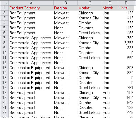
1. The model information does not have its own column. Product Category information appears in the Region column. To correct this problem, insert a new column for Product Category and include the category name on every row.
2. There are blank columns and rows in the data. Column C should be deleted. The blank rows between models, such as Rows 8 and 15, should also be deleted.
3. Blank cells present the data in an outline format. The person reading this worksheet would probably assume that Cells A4:A5 fall into the Midwest region. These blank cells need to be filled in with the values from above.
Tip
Here is a trick for filling in the blank cells. Select the entire range of data. Next, select the Home tab on the Ribbon, and then select the Find & Select icon from the Editing group. On the menu that appears, select Go To Special. In the Go To Special dialog box, select Blanks. With all the blank cells selected, begin a formula by typing the equal sign (=), press the up arrow on your keyboard, and then press Ctrl+Enter to fill this formula in all blank cells. Remember to copy and paste special values to convert the formulas to values.
4. The worksheet presents one data column——the data containing the month—among several columns in the worksheet. Columns D through G need to be reformatted as two columns. Place the month name in one column and the units for that month in the next column. This step either requires a fair amount of copying and pasting or a few lines of VBA macro code.
Tip
For a great book to learn VBA macro programming, read Que Publishing’s VBA and Macros: Microsoft Excel 2010 by Bill Jelen and Tracy Syrstad (ISBN 0789743140). It is another book in this MrExcel Library series.
After you make the four changes described previously, the data is ready to be used as a pivot table data source. As you can see in Figure 2.5, every column has a heading. There are no blank cells, rows, or columns in the data. The monthly data is now presented down Column E instead of across several columns.
Figure 2.5 Although this data takes up six times as many rows, it is perfectly formatted for pivot table analysis.
Creating a Basic Pivot Table
Now that you have a good understanding of the importance of a well-structured data source, let’s walk through creating a basic pivot table.
To start, click on any single cell in your data source. This ensures that the pivot table captures the range of your data source by default. Next, select the Insert tab and find the Tables group. In the Tables group, select PivotTable and then select PivotTable from the drop-down list. Figure 2.6 demonstrates how to start a pivot table.
Figure 2.6 Start a pivot table by selecting PivotTable from the Insert tab.

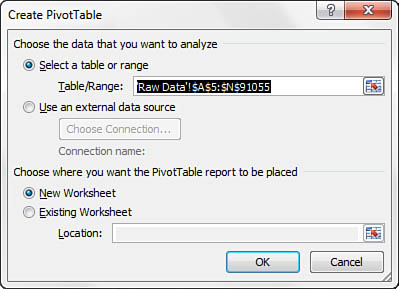
Selecting these options activates the Create PivotTable dialog box, as shown in Figure 2.7.
Figure 2.7 The Create PivotTable dialog box replaces the classic PivotTable and PivotChart Wizard.
Note
There are other ways to activate the Create PivotTable dialog box. You can click the PivotTable icon on the Insert tab to activate the Create PivotTable dialog box. You can also press the hotkeys Alt+N+V+T to start a pivot table.
A more roundabout way is to format your data set as a table, and then select the Summarize with Pivot command. To do this, place your cursor inside your data set and select Format as Table from the Styles group in the Home tab. After your table has been formatted, place your cursor anywhere inside your data set to activate the Table Tools tab. From the Table Tools tab, you can select the Summarize with Pivot option in the Tools group.
As you can see in Figure 2.8, the Create PivotTable dialog box essentially asks you two questions: Where is the data that you want to analyze, and where do you want to put the pivot table? The following bullets describe each of these questions:
Figure 2.8 The Create PivotTable dialog box asks you two questions.
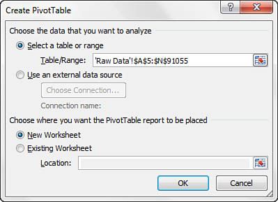
• Choose the Data That You Want to Analyze—In response to this question, you tell Excel where your data set is. You can either specify a data set that is located within your workbook, or you can tell Excel to look for an external data set. As you can see in Figure 2.8, Excel is smart enough to read your data set and fill in the range for you. However, you always should take note of this to ensure you are capturing all your data.
• Choose Where You Want the PivotTable Report to Be Placed—In response to this question, you tell Excel where you want your pivot table to be placed. This is set to New Worksheet by default, meaning your pivot table will be placed in a new worksheet within the current workbook. You will rarely change this setting because there are relatively few times you need your pivot table to be placed in a specific location.
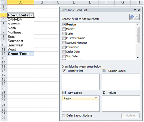
After you have answered these two questions in the Create PivotTable dialog box, click OK. At this point, Excel adds a new worksheet that contains an empty pivot table report. Next to that is the PivotTable Field List dialog box, as shown in Figure 2.9. This dialog box helps you build your pivot table.
Figure 2.9 Use the PivotTable Field List dialog box to build your pivot table.

Adding Fields to the Report
You can add the fields you need into the pivot table by using the four drop zones found in the PivotTable Field List: Report Filter, Column Labels, Row Labels, and Values. These drop zones, which correspond to the four areas of the pivot table, are used to populate your pivot table with data.
Tip
Review Chapter 1, “Pivot Table Fundamentals,” for a refresher on the four areas of a pivot table.
• Report Filter—Adding a field to the Report Filter drop zone includes that field in the filter area of your pivot table, which enables you to filter on its unique data items.
• Column Labels—Adding a field into the Column Labels drop zone displays the unique values from that field across the top of the pivot table.
• Row Labels—Adding a field into the Row Labels drop zone displays the unique values from that field down the left side of the pivot table.
• Values—Adding a field into the Values drop zone includes that field in the values area of your pivot table, which enables you to perform a specified calculation using the values in the field.
Because this is generally the point where most new users get stuck, before moving on, let’s review some fundamentals of laying out your pivot table report. For example, do you know how to determine which field goes where?
Before you start dropping fields into the various drop zones, ask yourself two questions: What am I measuring? How do I want to see it? The answer to the first question tells you which fields in your data source you need to work with, and the answer to the second question tells you where to place the fields.
For your first pivot table report, you want to measure the dollar sales by region. This tells you automatically that you need to work with the Sales_Amount field and the Region field. How do you want to see it? You want regions to go down the left side of the report and the sales amount to be calculated next to each region.
To achieve this effect, you need to add the Region field to the Row Labels drop zone and add the Sales_Amount field to the Values drop zone.
Find the Region field in the field list, as shown in Figure 2.10.
Figure 2.10 Find the field you want to add to your pivot table.

Select the check box next to the field. As you can see in Figure 2.11, not only is the field automatically added to the Row Labels drop zone, but your pivot table is updated to show the unique region names.
Figure 2.11 Select the Region field check box to automatically add that field to your pivot table.
Now that you have regions in your pivot table, it is time to add in the dollar sales. To do that, select the Sales Amount field check box. As Figure 2.12 illustrates, the Sales Amount field is automatically added to the Values drop zone, and your pivot table report now shows the total dollar sales for each region.
Figure 2.12 Select the Sales Amount field check box to add data to your pivot table report.
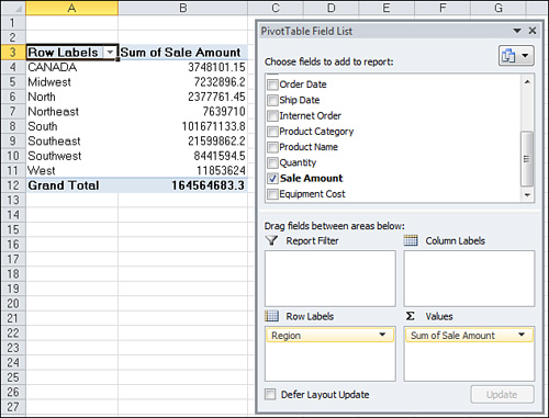
At this point, you have created your first pivot table report!
Adding Layers to a Pivot Table
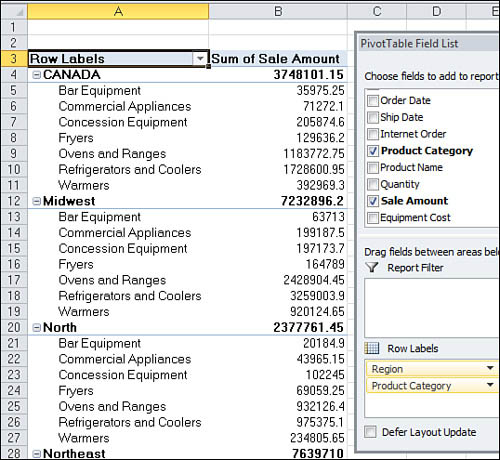
Now you can add another layer of analysis to your report. This time you want to measure the amount of dollar sales each region earned by product category. Because your pivot table already contains the Region and Sales Amount fields, all you have to do is select a check box next to the Product Category field. As you can see in Figure 2.13, your pivot table automatically adds a layer for Product Category and refreshes the calculations to include subtotals for each region. Because the data is stored efficiently in the pivot cache, this change took less than a second.
Figure 2.13 Before pivot tables, adding layers to analyses would have required hours of work and complex formulas.
Rearranging a Pivot Table
Suppose this view does not work for your manager because he wants to see Product Categories across the top of the pivot table report. To rearrange these categories, simply drag the Product Category field from the Row Labels drop zone to the Column Labels drop zone, as illustrated in Figure 2.14.
Figure 2.14 Rearranging a pivot table is as simple as dragging fields from one drop zone to another.

Instantly, the report is restructured, as shown in Figure 2.15.
Figure 2.15 Product categories are now column oriented.
Longing for Drag-and-Drop Functionality?
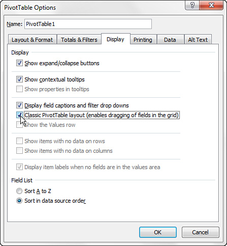
If you are upgrading from Excel 2003, you notice that you can no longer drag and drop fields directly onto the pivot table layout. This functionality is enabled only within the PivotTable Field List dialog box. However, the good news is that Microsoft has provided the option of working with a classic pivot table layout that enables the drag-and-drop functionality.
To activate the classic pivot table layout, right-click anywhere inside the pivot table and select Table Options. In the Table Options dialog box, select the Display tab, and then select the Classic PivotTable Layout check box, as demonstrated in Figure 2.16. Click OK to apply the change.
Figure 2.16 Select the Classic PivotTable Layout check box.
At this point, you can drag and drop fields directly onto your pivot table layout.
Unfortunately, this setting is not global. This means you need to go through the same steps to apply the classic layout to each new pivot table you create. However, this setting persists when a pivot table is copied.
Creating a Report Filter
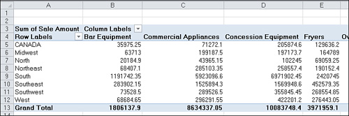
Often, you might be asked to produce reports for one particular region, market, or product. Instead of building separate pivot table reports for every possible analysis scenario, you can use the Filter field to create a report filter. For example, you can create a region filter by simply dragging the Region field to the Report Filter drop zone. This allows you to analyze one particular region. Figure 2.17 shows the totals for just the North region.
Figure 2.17 With this setup, you can see revenues by line of business and can click the Region drop-down to focus on one region.

Introducing Slicers
With Excel 2010, Microsoft introduces a new feature called slicers. Slicers enable you to filter your pivot table, similar to the way Filter fields filter a pivot table. The difference is that slicers offer a user-friendly interface that enables you to see the current filter state.
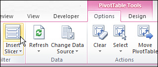
To understand the concept behind slicers, place your cursor anywhere inside your pivot table, then go up to the Ribbon and select the Option tab. On the Option tab, click the Insert Slicer icon (see Figure 2.18).
Figure 2.18 Inserting a slicer in Excel 2010.
This activates the Insert Slicers dialog box, as shown in Figure 2.19. The idea is to select the dimensions you want to filter. In this case, the Region and Market slicers are created when you select these dimensions.
Figure 2.19 Select the dimensions you want filtered using slicers.

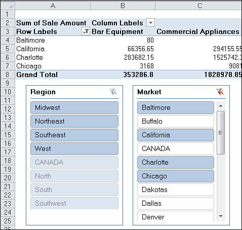
After the slicers are created, you can click the filter values to filter your pivot table. As shown in Figure 2.20, clicking Midwest in the Region slicer not only filters your pivot table, but the Market slicer also responds by highlighting the markets that belong to the Midwest region.
Figure 2.20 Select the dimensions you want filtered using slicers.

You can also select multiple values by pressing the Ctrl key while selecting the needed filters. In Figure 2.21, pressing the Ctrl key selected Baltimore, California, Charlotte, and Chicago. This highlights the selected markets in the Market slicer and their associated regions in the Region slicer.
Figure 2.21 The fact that you can visually see the current filter state gives slicers a unique advantage over the Filter field.
Another advantage gain with slicers is that each slicer can be tied to more than one pivot table. In other words, any filter you apply to your slicer can be applied to multiple pivot tables.
To connect your slicer to more than one pivot table, right-click the slicer, and then select PivotTable Connections (see Figure 2.22).
Figure 2.22 Activating the PivotTable Connections dialog box.

This activates the PivotTable connections dialog box, as shown in Figure 2.23. Next, select the check box next to any pivot table that you want to filter using the current slicer.
Figure 2.23 Select the pivot tables that will be filtered by this slicer.

At this point, any filter you apply to the slicer is applied to all the connected pivot tables. Again, slicers have a unique advantage over Filter fields in that they can control the filter state of multiple pivot tables. Filter fields can only control the pivot table in which they live
Note
It is important to note that slicers are not part of the pivot table object. Instead, they are separate objects that can be used in a variety of ways. For a more detailed look at slicers, their functionality, and how to format slicers, see “Using Slicers” in Chapter 4 of Que Publishing’s Microsoft Excel 2010 In Depth by Bill Jelen (ISBN 0789743086).
Case Study: Analyzing Activity by Market
Say your organization has 18 markets that sell products revolving around seven types of products. You have been asked to build a report that breaks out each market, highlighting the dollar sales by each product. You are starting with an intimidating transaction table that contains more than 91,000 rows of data. To start your report, do the following:
1. Place your cursor inside your data set, select the Insert tab, click PivotTable, and then select PivotTable from the drop-down list.
2. When the Create PivotTable dialog box appears, click OK. At this point, you should see an empty pivot table with the field list, as shown in Figure 2.24.
Figure 2.24 The beginnings of your pivot table report.

3. Find the Market field in the PivotTable Field List, and then select the check box next to it.
4. Find the Sales Amount field in the PivotTable Field List, and then select the check box next to it.
5. To get the product breakouts, find the Product Category field in the PivotTable Field List and drag it into the Column Labels drop.
In five easy steps, you have calculated and designed a report that satisfies the requirements given to you. After a little formatting, your pivot table report should look similar to the one shown in Figure 2.25.
Figure 2.25 This summary can be created in less than a minute.

Note
Lest you lose sight of the analytical power you just displayed, keep in mind that your data source has more than 91,000 rows and 14 columns, which is a hefty set of data by Excel standards. Despite the amount of data, you produced a relatively robust analysis in a matter of minutes.
Keeping Up with Changes in the Data Source
Let’s go back to the family portrait analogy. As years go by, your family changes in appearance and probably grows to include some new members. The family portrait that was taken years ago remains static and no longer represents the family today. So another portrait needs to be taken.
The same thing occurs with data. As time goes by, your data might change and grow with newly added rows and columns. However, the pivot cache that feeds your pivot table report is disconnected from your data source, so it cannot represent any of the changes you make to your date source until you take another snapshot.
The action of updating your pivot cache by taking another snapshot of your data source is called refreshing your data. There are two reasons you might have to refresh your pivot table report:
• Changes have been made to your existing data source.
• Your data source’s range has been expanded with the addition of rows or columns.
These two scenarios are handled in different ways that are discussed in the following sections.
Changes Have Been Made to Existing Data Sources
If a few cells in your pivot table’s source data have changed due to edits or updates, your pivot table report can be refreshed with a few clicks. To refresh your data source, right-click inside your pivot table report and select Refresh Data. This selection takes another snapshot of your data set and overwrites your previous pivot cache with the latest data.
Note
You can also refresh the data in your pivot table by selecting the Options group from the PivotTable Tools tab and then selecting Refresh.
Tip
Clicking anywhere inside your pivot table activates the PivotTable Tools tab that is located just above the main Ribbon.
Data Source’s Range Has Expanded
When changes have been made to your data source that affect its range such as when you have added rows or columns, you need to update the range being captured by the pivot cache.
To do this, click anywhere inside your pivot table, and then select Options from the PivotTable Tools tab. From here, select Change Data Source. This selection triggers the dialog box shown in Figure 2.26.
Figure 2.26 The Change PivotTable Data Source dialog box enables you to redefine the source data for your pivot table.
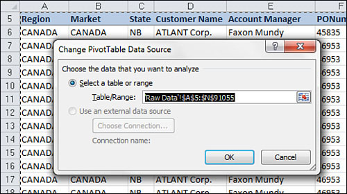
All you have to do in the Change PivotTable Data Source dialog box is update the range to include new rows and columns. After you have specified the appropriate range, click OK.
Sharing the Pivot Cache
Many times, you need to analyze the same data set in multiple ways. In most cases, this process requires you to create separate pivot tables from the same data source. Keep in mind that every time you create a pivot table, you are storing a snapshot of your entire data set in a pivot cache. Every pivot cache that is created increases your memory usage and file size. For this reason, you should consider sharing your pivot cache. In other words, in those situations in which you need to create multiple pivot tables from the same data source, you can use the same pivot cache to feed multiple pivot tables. By using the same pivot cache for multiple pivot tables, you gain a certain level of efficiency when it comes to memory usage and files size.
In legacy versions of Excel, when you created a pivot table using a data set that was already being used in another pivot table, Excel actually gave you the option to use the same pivot cache. However, Excel 2010 does not give you such an option.
Instead, each time you create a new pivot table in Excel 2010, a new pivot cache is automatically created even though one might already exist for the data set being used. The side effect of this behavior is that your spreadsheet bloats with redundant data each time you create a new pivot table using the same data set.
You can work around this potential problem by employing copy and paste. That’s right; by simply copying a pivot table and pasting it somewhere else, you create another pivot table, without duplicating the pivot cache. This enables you to link as many pivot tables as you want to the same pivot cache, with a negligible increase in memory and file size.
Side Effects of Sharing a Pivot Cache
It is important to note that there are a few side effects to sharing a pivot cache. For example, say you have two pivot tables using the same pivot cache. Certain actions affect both pivot tables, including:
• Refreshing Your Data—You cannot refresh one pivot table without refreshing the other pivot table. Refreshing affects both tables.
• Adding a Calculated Field—If you create a calculated field in one pivot table, your newly created calculated field shows up in the other pivot table’s field list.
• Adding a Calculated Item—If you create a calculated item in one pivot table, it also shows in the other pivot table.
• Grouping or Ungrouping Fields—Any grouping or ungrouping you perform affects both pivot tables. For example, say you group a date field in one pivot table to show months. The same date field in the other pivot table is also grouped to show months.
Although none of these side effects are critical flaws in the concept of sharing a pivot cache, it is important to keep them in mind when determining if sharing a pivot table as your data source is the best option.
Saving Time with New Pivot Table Tools
Microsoft has invested a lot of time and effort in the overall pivot table experience. The results of their efforts are tools that make pivot table functionality more accessible and easier to use. The following sections look at a few of the tools that help you save time when managing your pivot tables.
Deferring Layout Updates
The frustrating part of building a pivot table from a large data source is that each time you add a field to a pivot area, you have to wait while Excel crunches through all that data. This can become a maddeningly time-consuming process if you have to add several fields to your pivot table.
Excel 2010 offers some relief for this problem by providing a way to defer layout changes until you are ready to apply them. You can activate this option by selecting the relatively inconspicuous Defer Layout Update check box on the PivotTable Field List dialog box, as shown in Figure 2.27.
Figure 2.27 Select the Defer Layout Update check box to prevent your pivot table from updating while you add fields.
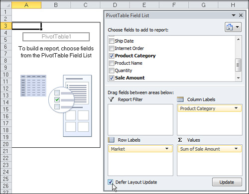
Here is how this feature works: When you select the Defer Layout Update check box, you prevent the pivot table from making real-time updates as you move fields around within the pivot table. In Figure 2.27, notice that fields in the drop zones are not in the pivot table yet. The reason is that the Defer Layout Update check box is selected. When you are ready to apply your changes, simply click the Update button on the lower-right corner of the PivotTable Field List dialog box.
Note
Remember to clear the Defer Layout Update check box when you have finished building your pivot table. Leaving this check box selected results in your pivot table remaining in a state of manual updates, which prevents you from using the other features of the pivot table such as sorting, filtering, and grouping.
Starting Over with One Click
There are times when you want to start from scratch when working with your pivot table layouts. Excel 2010 provides a straightforward way to essentially start over without deleting your pivot cache. To do this, select Options under the PivotTable Tools tab, and then select the Clear drop-down.
As you can see in Figure 2.28, this command enables you to either clear your entire pivot table layout or remove any existing filters that have been applied in your pivot table.
Figure 2.28 The Clear command enables you to clear your pivot table fields or remove the applied filters in your pivot table.

Relocating a Pivot Table
After you have created your pivot table, you might find that you need to move the pivot table to another location. For example, your pivot table might be in the way of other analyses on a worksheet, or you might simply need to move it to another worksheet. Although there are several ways to move your pivot table, Excel 2010 provides a no-frills way to change the location of your pivot table.
To move your pivot table to a different location, select Options under the PivotTable Tools tab, and then select Move PivotTable. This activates the Move PivotTable dialog box illustrated in Figure 2.29. All you have to do in this dialog is specify where you want your pivot table moved.
Figure 2.29 The Move PivotTable dialog box enables you to quickly move your pivot table to another location.

Next Steps
In the next chapter, you learn how to enhance your pivot table reports by customizing your fields, changing field names, changing summary calculations, applying formats to data fields, adding and removing subtotals, and using the Show As setting.