1. Pivot Table Fundamentals
What Is a Pivot Table?
Imagine that Excel is a large toolbox that contains different tools at your disposal. The pivot table is essentially one tool in your Excel toolbox. If a pivot table were indeed a physical tool that you could hold in your hand, a kaleidoscope would most accurately represent it.
When you look through a kaleidoscope at an object, you see that object in a different way. You can turn the kaleidoscope to move around the details of the object. The object itself does not change, and it is not connected to the kaleidoscope. The kaleidoscope is simply a tool that you use to create a unique perspective on an ordinary object.
Think of a pivot table as a kaleidoscope that is pointed at your data set. When you look at your data set through a pivot table, you have the opportunity to see details in the data you might not have noticed before. Furthermore, you can turn your pivot table to see your data from different perspectives. The data set itself does not change, and it is not connected to the pivot table. The pivot table is simply a tool you are using to create a unique perspective on your data.
A pivot table allows you to create an interactive view of your data set. We call this view a pivot table report. With a pivot table report, you can quickly and easily categorize your data into groups, summarize large amounts of data into meaningful information, and perform a wide variety of calculations in a fraction of the time it takes by hand. But the real power of a pivot table report is that you can interactively drag and drop fields within your report, dynamically changing your perspective and recalculating totals to fit your current view.
Why Should You Use a Pivot Table?
As a rule, your dealings in Excel can be split into two categories: calculating data and shaping or formatting, data. Although many built-in tools and formulas facilitate both of these tasks, the pivot table is often the fastest and most efficient way to calculate and shape data.
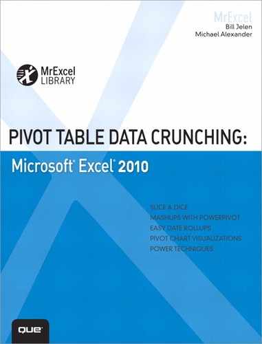
Let’s look at one simple scenario that illustrates this point. Say you have just given your manager some revenue information by month, and he has predictably asked for more information. He adds a note to the worksheet and emails it back to you. As you can see in Figure 1.1, your manager wants you to add a line that shows credits by month.
Figure 1.1 Your manager predictably changes his request after you provide the first pass of a report.
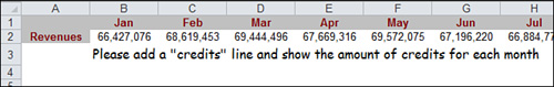
To meet this new requirement, you run a query from your legacy system that provides the needed data. As usual, the data is formatted specifically to make you suffer. Instead of data by month, the legacy system provides detailed transactional data by day, as shown in Figure 1.2.
Figure 1.2 The data from the legacy system is by day instead of by month.
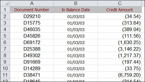
Your challenge is to calculate the total dollar amount of credits by month and shape the results into an extract that fits the format of the original report. The final extract should look like the data shown in Figure 1.3.
Figure 1.3 Your goal is to produce a summary by month and transpose the data to a horizontal format.
Creating this extract manually takes 18 mouse clicks and three keystrokes:
• Format dates to month: three clicks
• Create subtotals: four clicks
• Extract subtotals: six clicks, three keystrokes
• Transpose vertical to horizontal: five clicks
By contrast, creating this extract with a pivot table takes nine mouse clicks:
• Create the pivot table report: five clicks
• Group dates into months: three clicks
• Transpose vertical to horizontal: one click
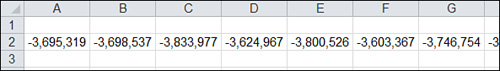
Both methods produce the same extract, which can be pasted into your final report, as shown in Figure 1.4.
Figure 1.4 After adding credits to the report, you can calculate net revenue.

However, using a pivot table to accomplish this task not only cuts down the number of actions by more than half, but also reduces the possibility of human error. Above that, using a pivot table enables for quick and easy shaping and formatting of the data.
What this example shows is that using a pivot table is not just about calculating and summarizing your data. Instead, pivot tables can often help you do a number of tasks faster and better than using conventional functions and formulas. For example, you can use pivot tables to instantly transpose large groups of data vertically or horizontally. You can use pivot tables to quickly find and count the unique values in your data. You can also use pivot tables to prepare your data to be used in charts.
The bottom line is that pivot tables can help you dramatically increase your efficiency and decrease errors on a number of tasks you may have to accomplish with Excel. Even though pivot tables cannot do everything for you, understanding how to use just the basics of pivot table functionality can take your data analysis and productivity to a new level.
When Should You Use a Pivot Table?
Large data sets, ever-changing impromptu data requests, and multilayered reporting are absolute productivity killers if you have to tackle them by hand. Doing hand-to-hand combat with one of these tasks is not only time consuming, but it also opens the possibility of an untold number of errors in your analysis. So how do you recognize when to use a pivot table before it is too late?
Generally, a pivot table serves you well in any of the following situations:
• You need to find relationships and groupings within your data.
• You need to find a list of unique values for one field in your data.
• You need to find data trends using various time periods.
• You anticipate frequent requests for changes to your data analysis.
• You need to create subtotals that frequently include new additions.
• You need to organize your data into a format that is easy to chart.
Anatomy of a Pivot Table
Because the anatomy of a pivot table is what provides its flexibility and, ultimately, its functionality, truly understanding pivot tables is difficult without understanding their basic structure.
A pivot table is composed of the following four areas:
• Row area
The data you place in these areas defines both the utility and appearance of the pivot table. Keeping in mind that you will go through the process of creating a pivot table in the next chapter, let’s prepare by taking a closer look at the four areas and the functionality around them in the following sections.
Values Area
The values area is shown in Figure 1.5. It is a large rectangular area below and to the right of the headings. In this figure, you can see that the values area contains a sum of the revenue field.
Figure 1.5 The heart of the pivot table is the values area. This area typically includes a total of one or more numeric fields.
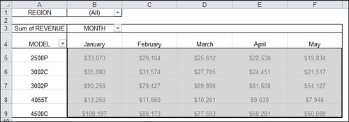
The values area is the area that calculates. The values area is required to have at least one field and one calculation of that field within this area. The data fields that you drop into the values area are those that you want to measure or calculate. The values area might include Sum of Revenue, Count of Units, and Average of Price.
It is also possible to have the same field dropped in the values area twice, but with different calculations. For example, a marketing manager might want to see Minimum of Price, Average Price, and Maximum of Price.
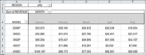
Row Area
The row area is shown in Figure 1.6. This area is composed of the headings that go down the left side of the pivot table.
Figure 1.6 The headings down the left side of the pivot table make up the row area of the pivot table.

Dropping a field into the row area displays the unique values from that field down the rows of the left side of the pivot table. The row area typically has at least one field, although it is possible to have no fields. Recall the example presented earlier in this chapter, in which you needed to produce a one-line report of credits. This report is an example of when there are no row fields in the row area.
The types of data fields that you drop into the row area include those that you want to group and categorize such as Products, Names, and Locations.
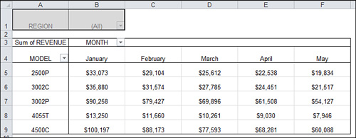
Column Area
The column area is composed of headings that stretch across the top of columns in the pivot table. For example, in the pivot table in Figure 1.7, the month field is in the column area.
Figure 1.7 The column area stretches across the top of the columns. In this example, it contains the unique list of months in your data set.
Dropping fields into the column area displays your items in column-oriented perspective. The column area is ideal to show trending over time. The types of data fields that you drop into the column area include those you want to trend or show side by side such as Months, Periods, and Years.
Report Filter Area
The Report Filter area is an optional set of one or more drop-downs located at the top of the pivot table. In Figure 1.8, the filter area contains the Region field. In this case, the pivot table is set to show all regions.
Figure 1.8 Filter fields are great for quickly filtering a report. The Region drop-down in Cell B1 allows you to print this report for one particular region manager.
Dropping fields into the filter area allows you to filter the data items in your fields. Even though the filter area is optional, it comes in handy when you need to filter results dynamically. The types of data fields that you drop into the filter area include those that you want to isolate and focus on such as Regions, Line of Business, and Employees.
Pivot Tables Behind the Scenes
It is important to understand that pivot tables come with a few file space and memory implications for your system. To get a better idea of what this means, let’s look at what happens behind the scenes when you create a pivot table.
When you initiate the creation of a pivot table report, Excel takes a snapshot of your data set and stores it in a pivot cache. A pivot cache is nothing more than a special memory subsystem in which your data source is duplicated for quick access. Although the pivot cache is not a physical object that you can see, you can think of it as a container that stores the snapshot of the data source.
Caution
Any changes you make to your data source are not picked up by your pivot table report until you take another snapshot of the data source or “refresh” the pivot cache. Refreshing is easy; you simply right-click the pivot table and then click Refresh Data. You can also select the large Refresh button on the Options tab.
Each pivot table report you create from a separate data source creates its own pivot cache, which increases your memory usage and file size. The increase in memory usage and file size depends on the size of the original data source that is being duplicated to create the pivot cache.
Your pivot table report is essentially a view that gets its data solely from the pivot cache. This means that your pivot table report and your data source are disconnected.
The benefit of working against the pivot cache and not your original data source is optimization. Any changes you make to the pivot table report, such as rearranging fields, adding new fields, or hiding items, are made rapidly and with minimal overhead.
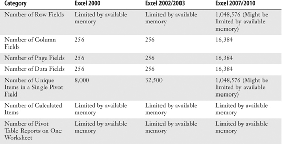
Limitations of Pivot Table Reports
Before discussing the limitations of pivot table reports, it is important to note that beginning with Excel 2007, Microsoft introduced a dramatic increase in the number of rows and columns allowed in one worksheet. However, increasing limits had a ripple effect on several of the tools and functions in Excel, which forced limitation increases in many areas including pivot tables.
Table 1.1 highlights the changes in pivot table limits from Excel 2000 to Excel 2010. Whereas some of these limitations remain constant, others are highly dependent on available system memory.
Table 1.1 Pivot Table Limitations
A Word About Compatibility
If you are working in an environment where legacy versions of Excel are still being used, you should be aware of the compatibility issues between legacy versions of Excel and Excel 2010. As you can imagine, the extraordinary increases in pivot table limitations lead to some serious compatibility questions. For instance, what if you create a pivot table that contains more than 256 column fields and more than 32,500 unique data items? How are users with legacy versions of Excel affected? Fortunately, Excel comes with some precautionary measures that can help you avoid compatibility issues.
The first precautionary measure is Compatibility mode, which is a state that Excel automatically enters when opening an .xls file. When Excel is in Compatibility mode, it artificially takes on the limitations of legacy versions of Excel. For example, while you are working with an .xls file, you cannot exceed any of the Excel 2003 pivot table limitations shown in Table 1.1. This effectively prevents you from unwittingly creating a pivot table that is not compatible with legacy versions of Excel. If you want to get out of Compatibility mode, you have to save the .xls file as one of Excel’s new file formats, which are .xlsx or .xlsm.
Caution
Beware of the Convert option found under Info section of the File menu. Although this command is designed to convert a file from Excel 2003 to Excel 2010, it actually deletes the Excel 2003 copy of the file.
The second precautionary measure is Excel’s Compatibility Checker. The Compatibility Checker is a built-in tool that checks for any compatibility issues when you try to save an Excel workbook as an .xls file. For example, if your pivot table exceeds the bounds of Excel 2003 limitations, the Compatibility Checker alerts you with a dialog box similar to the one shown in Figure 1.9.
Figure 1.9 The Compatibility Checker alerts you of any compatibility issues before you save to a legacy version of Excel.
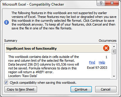
With this dialog box, Excel gives you the option to save your pivot data as hard values in the new .xls file. If you choose to do so, the data from your pivot table is saved as hard values, but the pivot table object and the pivot cache are lost.
Note
For information on Excel’s compatibility tools, pick up Que Publishing’s Excel 2010 In Depth (ISBN 978-0789743084) by Bill Jelen.
Next Steps
In the next chapter, you learn how to prepare your data to be used by a pivot table. Chapter 2, “Creating a Basic Pivot Table,” also walks through creating your first pivot table report using the Pivot Table Wizard.