
Chapter 4
Using the jQuery User Interface Toolkit
In This Chapter
 Exploring the jQuery UI
Installing the UI and templates
Using UI template classes
Dragging and dropping
Binding events
Resizing elements
The jQuery library is an incredible tool for simplifying JavaScript programming. It's so popular and powerful that developers began adding new features to make it even more useful. Among the most important of these is a framework called jQuery UI (User Interface), sometimes also called the UI toolkit. That's what this chapter's all about.
What the jQuery User Interface Brings to the Table
This tool adds some very welcome features to web development, including new visual elements (widgets), a uniform icon set, and a mechanism for easily generating attractive CSS styles:
- New user interface elements: As a modern user interface tool, HTML is missing some important tools. Most modern visual languages include built-in support for such devices as scroll bars, dedicated datepickers, and multiple tab tools. Although HTML5 does promise some of these features, support varies greatly by browser. jQuery UI adds versions of these features that work on older and newer browsers in a consistent way.
- Advanced user interaction: The jQuery widgets allow new and exciting ways for the user to interact with your page. With the UI toolkit, you can easily let users make selections by dragging and dropping elements, and expand and contract parts of the page.
- Flexible theme templates: jQuery UI includes a template mechanism that controls the visual look and feel of your elements. You can choose from dozens of prebuilt themes or use a tool to build your own particular look. You can reuse this template library to manage the look of your other page elements, too (not just the ones defined by the library).
- A complete icon library: The jQuery UI has a library of icons for use in your web development. It has arrows, buttons, and plenty of other doodads that can be easily changed to fit your template.
- A very clean, modern look: It's very easy to build forward-looking visual designs with jQuery UI. It supports patterns, shadows, and plenty of special visual effects.
- The power of jQuery: Because jQuery UI is an extension of jQuery, it adds on to the incredible features of the jQuery language.
- Open-source values: The jQuery UI (like jQuery itself) is an open-source project with a very active community. This means the library is free to use and can be modified to suit your needs.
 The jQuery toolkit is pretty exciting. The best way to get an overview of it is to see an example online. The jQuery website (http://jqueryui.com) is a great place to get the latest information about jQuery.
It's a theme park
One of the coolest tools in jQuery UI is a concept called a theme, which is simply a visual rule-set. The theme is essentially a complex CSS document designed to be used with the UI library.
Using the themeRoller to get an overview of jQuery
The jQuery website also features a marvelous tool called the themeRoller. The themeRoller allows you to select and modify themes, so it's a great place to preview how themes work, as well as see the key features of the UI extension. Figure 4-1 shows this web page, which demonstrates many of the great features of jQuery UI.

Figure 4-1: The themeRoller lets you review many jQuery UI elements and modify their look.
Before you use themeRoller to change themes, use it to get acquainted with the UI elements. Several useful tools are visible in Figure 4-1:
- Accordion: The upper-middle segment of the page has three segments (section 1, section 2, and section 3). By clicking a section heading, the user can expand that section and collapse the others.
- Slider: Sliders (or scroll bars) are an essential user interface element. They allow the user to choose a numeric value with an easy visual tool. jQuery sliders can be adjusted in many ways to allow easy and error-free input.
- Datepicker: It's very difficult to ensure that users enter dates properly. The datepicker control automatically pops up a calendar into the page and lets the user manipulate the calendar to pick a date. It's a phenomenally useful tool.
- Tabs: It's common to have a mechanism for hiding and showing parts of your page. The accordion technique is one way to do so, but tabs are another very popular technique. This mechanism allows you to build a very powerful multitab document without much work.
Scrolling down the page, you see even more interesting tools. Figure 4-2 shows some of these widgets in action.

Figure 4-2: Even more exciting widgets.
These widgets demonstrate even more of the power of the jQuery UI library:
- Progress bar: It's always best to design your code so that little delay exists, but if part of your program is taking some time, a progress bar is a great reminder that something is happening.
- Dialog: The open dialog button pops up what appears to be a dialog box. It acts much like the JavaScript alert, but it's much nicer looking, and it has features that make it much more advanced. In Figure 4-2, the dialog box has a clever title: Dialog Title.
- Formatting tools: The jQuery UI includes special tools for setting apart certain parts of your page as warnings, as highlighted text, or with added shadows and transparency. If you look carefully at Figure 4-2, you'll see several examples of special formatting, including the red alert box, drop shadows, and the UI-highlight style.
- Icons: jQuery UI ships with a large collection of icons that you can use on your page. Hover over each of the icons on the themeRoller to see a description of the icon. These can be easily used to allow various user interactions.
This is just a quick preview of the visual elements. Read more about how to implement the various elements in Chapter 5 of this minibook after you understand the basics of how to install and work with jQuery UI in this chapter.
Look at the left column on the themeRoller page. If you click the gallery tab (yep, it's using a jQuery UI tab interface), you can see a list of prebuilt themes. Figure 4-3 shows the themeRoller page with an entirely different theme in place.

Figure 4-3: Now themeRoller is using the Le Frog theme.
The built-in themes are pretty impressive, but of course, you can make your own. Although you're always free to edit the CSS manually, the whole point of the themeRoller application is to make this process easier.
If you go back to the Roll Your Own tab, you can see an accordion selection that you can use to pick various theme options. You can change fonts, add rounded corners, pick various color schemes, and much more. You can mess around with these options all you want and create your own visual style. You can then save that theme and use it in your own projects.
The themes and widgets are obvious features of the jQuery user interface library, but they aren't the only features. In addition to these more visible tools, jQuery UI adds a number of new behaviors to jQuery nodes. These new behaviors (drag and drop, resize, and more) are used to add functionality to a web page, which is quite difficult to achieve in more traditional programming.
Wanna drag? Making components draggable
The basic idea of this program is completely consistent with the jQuery concepts described in Chapters 2 and 3 of this minibook. The page has very simple HTML code. An initialization function creates a special jQuery node and gives it functionality. That's all there is to it.
Your first building example is a simple application that allows the user to pick up a page element and move it with the mouse. While you do this with JavaScript and DOM in Book IV, Chapter 7, you'll find it's quite easy to get the same effect with jQuery UI. Figure 4-4 shows this page in action.

Figure 4-4: The user can simply drag the box anywhere on the page.
This example is a good starting place because it's pretty easy. Often, the hardest part of jQuery UI applications is attaching to the library. After that's done (and it's not that hard), the rest of the programming is ridiculously easy. Take a look at the code, and you can see what I'm talking about:
<!DOCTYPE html>
<html lang = "en">
<head>
<title>drag.html</title>
<meta charset= "UTF-8" />
<style type = "text/css">
#dragMe {
width: 100px;
height: 100px;
border: 1px solid blue;
text-align: center;
}
</style>
<script type = "text/javascript"
src = "js/jquery-1.9.1.js"></script>
<script type = "text/javascript"
src = "js/jquery-ui-1.10.3.custom.min.js"></script>
<script type = "text/javascript">
$(init);
function init(){
$("#dragMe").draggable();
}
</script>
</head>
<body>
<h1>Drag Demo</h1>
<div id = "dragMe">
Drag me
</div>
</body>
</html>
Downloading the library
Writing jQuery UI code isn't difficult, but getting the right parts of the library can be a bit confusing. The jQuery UI library is much larger than the standard jQuery package, so you may not want to include the entire thing if you don't need it.
 Previous versions of jQuery UI allowed you to download the entire package but stored each of the various elements in a separate JavaScript file. It was common to have a half-dozen different script tags active just to get the various elements in place. Worse, some dependency issues existed, so you needed to make sure that you had certain packages installed before you used other packages. This made a simple library quite complex to actually use.
Fortunately, the latest versions of the jQuery UI make this process quite a bit simpler:
- Pick (or create) your theme.
Use the themeRoller site to pick a starting place from the template library. You can then customize your theme exactly to make whatever you want (changing colors, fonts, and other elements).
- Download the theme.
The themeRoller has a download button. Click this when you're ready to download your theme.
- Pick the elements you want.
When you're first starting on a project, you'll probably pick all the elements. If you find that the page is loading too slowly, you might build a smaller version that contains only those elements you need. For now, pick everything.
- Download the file.
After you've chosen the elements you want, you can download them in a zip file.
- Install the contents of the zip file to your working directory.
The zip file contains a number of files and directories. Copy the css and js directories into the directory where your web pages will be (often the public_html or htdocs directory). You do not need to copy the development-bundle directory or the index.html page.
- If you install multiple themes, copy only the theme information from additional themes.
All themes use the same JavaScript. Only the CSS (and related image files) changes. If you want to have multiple themes in your project, simply copy the CSS contents. Each theme will be a different subdirectory of the main CSS directory.
- Link to the CSS files.
 Use the standard link technique to link to the CSS files created by jQuery UI. You can also link to your own CSS files or use internal CSS in addition to the custom CSS. Be sure that you get the path right. Normally, the path looks something like css/themeName/jquery-ui-1.8.1.custom.css. (Note I'm not linking to the CSS in this first example. The CSS is explained in the upcoming section called “Resizing on a Theme.”
 - Link to the JavaScript files.
The jQuery UI toolkit also installs two JavaScript files: the standard jQuery library and the jQuery UI library. By default, both of these files are installed in the js directory. You'll need to link to both files. One will be called something like jquery-1.9.1.js and the other will be called something like jquery-ui-1.10.3.custom.min.js. Sometimes you will see minimized files alongside ordinary versions. The minimized version will have the term min embedded. Either version is fine, but the minimized version will load faster.
If something isn't working right, check your file paths again. Almost always, when the jQuery UI stuff isn't working right, it's because you haven't linked to all the right files. Also, note that the CSS files created by jQuery UI also include images. Make sure that your theme has an associated images directory, or your project may not work correctly. If you copied the entire CSS and JS directories from the download, you should be fine.
Writing the program
Here's how you go about putting the program together:
- Create a basic HTML document.
The standard document doesn't have to be anything special. I created one div with the ID dragMe. That's the div I want to make draggable (but of course you can apply dragging functionality to anything you can select with jQuery).
- Add the standard jQuery library.
The first script tag imports the standard jQuery library. The UI library requires jQuery to be loaded first.
- Add a link to the jQuery UI library.
A second script tag imports the jQuery UI library. (See the following section on downloading and installing jQuery for details on how to obtain this library.)
- Create an initialization function.
Use the standard jQuery techniques to build an initialization function for your page (as usual, I call mine init()).
- Build a draggable node.
Use standard jQuery selection techniques to isolate the element(s) you want to make draggable. Use the draggable() method to make the element draggable.
- Test your application.
Believe it or not, that's all there is to it. As long as everything's set up properly, your element will be draggable! The user can drag it with the mouse and place it anywhere on the screen.
 If you're really paying attention, you might notice that the jQuery version that came with the UI is slightly older than the 10.2 version I used in the previous chapter. Really, it's not a big deal because the differences are minor. For UI examples, I go with the version of jQuery bundled with the UI library because I know they're tested to work together.
Resizing on a Theme
The next example demonstrates two important ideas in the jQuery UI package:
- It shows an element that is resizable. The user can drag on the bottom or right border to change the size of the element. Making an element resizable is very similar to making it draggable.
- It shows the use of a theme. Take a look at Figure 4-5 to see what's going on.
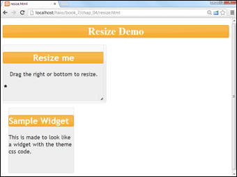
Figure 4-5: The size of this lovely element can be changed by the user.
You can see from Figure 4-5 that the page has a definite visual style. The elements have distinctive fonts and backgrounds, and the headers are in a particular visual style. Although there's nothing earth-shattering about this (after all, it's just CSS), the exciting thing is that these styles are defined by the theme. The theme can easily be changed to another theme (created by hand or via themeRoller), and the visual look of all these elements will reflect the new theme.
Themes provide a further level of abstraction to your websites that make changing the overall visual style much easier.
Figure 4-6 shows the page after the resize me element has changed sizes, and you can see that the rest of the page reformats itself to fit the newly resized element.

Figure 4-6: When the element is resized, the rest of the page adjusts.
The following code reveals that most of the interesting stuff is really CSS coding, and the resizing is really just more jQuery UI magic:
<!DOCTYPE html>
<html lang = "en-US">
<head>
<meta http-equiv="content-type" content="text/xml; charset=utf-8" />
<link rel = "stylesheet"
type = "text/css"
href = "css/ui-lightness/jquery-ui-1.10.3.custom.css" />
<style type = "text/css">
h1 {
text-align: center;
}
#resizeMe {
width: 300px;
height: 300px;
text-align: center;
}
#sample {
width: 200px;
height: 200px;
margin: 1em;
}
</style>
<script type = "text/javascript"
src = "js/jquery-1.9.1.js"></script>
<script type = "text/javascript"
src = "js/jquery-ui-1.10.3.custom.min.js"></script>
<script type = "text/javascript">
$(init);
function init(){
$("#resizeMe").resizable();
themify();
} // end init
function themify(){
//add theme-based CSS to the elements
$("div").addClass("ui-widget")
.addClass("ui-widget-content")
.addClass("ui-corner-all");
$(":header").addClass("ui-widget-header")
.addClass("ui-corner-all");
$("#resizeMe").append('<span class = "ui-icon ui-icon-star"></span>'),
}
</script>
<title>resize.htm</title>
</head>
<body>
<h1>Resize Demo</h1>
<div id = "resizeMe">
<h2>Resize me</h2>
<p>
Drag the right or bottom to resize.
</p>
</div>
<div id = "sample">
<h2>Sample Widget</h2>
<p>
This is made to look like a widget
with the theme css code.
</p>
</div>
</body>
</html>
Examining the HTML and standard CSS
As usual, the HTML is the foundation of the entire page. It's very clean as usual, and it shows the general structure of the page. The HTML consists of only three primary elements: a heading and two divs. Each div contains its own level-two heading and a paragraph. The divs are given IDs to make them easier to style.
I also included a basic CSS section to handle the general layout of the page. I wanted the widgets to have specified beginning sizes, so I used ordinary CSS to get this effect.
Importing the files
jQuery applications require importation of JavaScript code libraries. In this application (and most jQuery UI applications), I import three files:
- The main jQuery library: This file is the essential jQuery base library. It is imported as described in Chapter 2 of this minibook, as an ordinary JavaScript file.
- The jQuery UI library: This file is also a standard JavaScript library. Earlier in this chapter, I describe how to obtain a custom version of this file.
- The theme CSS file: When you create a theme with themeRoller, you are provided with a CSS file. This file is your theme. Because this is a CSS file rather than JavaScript code, use the link tag to attach it to your page.
Not all jQuery UI examples require a theme, but most do. As you see in the following example, themes provide some other really great effects too, so it's worth it to include a theme CSS file whenever you want to use jQuery UI.
Making a resizable element
Surprisingly, the easiest part of the project is making the resizable element have the resizable behavior. It's a pretty standard jQuery UI trick:
$(init);
function init(){
$("#resizeMe").resizable();
themify();
} // end init
- Begin with an initialization function.
Like all good jQuery code, this example begins with standard initialization.
- Make an element resizable.
Identify the resizeMe div as a jQuery node, and use the resizable() method to make it resizable. That's all there is to it.
- Call a second function to add theming to the elements.
Although the resizable() method doesn't require use of jQuery themes, the themes do improve the look of the element.
Adding themes to your elements
The jQuery theme tool makes it quite easy to decorate your elements through CSS. The great thing about jQuery themes is that they are semantic; that is, you specify the general purpose of the element and then let the theme apply the appropriate specific CSS. You can use the themeRoller application to easily create new themes or modify existing ones. In this way, you can create a sophisticated look and feel for your site and write very little CSS on your own. It's a very powerful mechanism.
Many of the jQuery interface elements (such as the accordion and tab tools described elsewhere in this chapter) automatically use the current CSS theme. Of course, you can also apply them to any of your own elements to get a consistent look.
Themes are simply CSS classes. To apply a CSS theme to an element, you can just add a special class to the object.
For example, you can make a paragraph look like the current definition of the ui-widget by adding this code to it:
<div class = "ui-widget">
My div now looks like a widget
</div>
Of course, adding classes into the HTML violates one of the principles of semantic design (that is, separating the content from the layout), so it's better (and more efficient) to do the work in JavaScript with jQuery:
function themify(){
//add theme-based CSS to the elements
$("div").addClass("ui-widget")
.addClass("ui-widget-content")
.addClass("ui-corner-all");
$(":header").addClass("ui-widget-header")
.addClass("ui-corner-all");
$("#resizeMe")
.append('<span class = "ui-icon ui-icon-star"></span>'),
}
The themify() function adds all the themes to the elements on my page, applying the pretty jQuery theme to it. I use jQuery tricks to simplify the process:
- Identify all divs with jQuery.
I want all the divs on my page to be styled like widgets, so I use jQuery to identify all div elements.
- Add the ui-widget class to all divs.
This class is defined in the theme. All jQuery themes have this class defined, but the specifics (colors, font sizes, and so on) vary by theme. In this way, you can swap out a theme to change the appearance, and the code still works. The ui-widget class defines an element as a widget.
- Add ui-widget-content as well.
The divs need to have two classes attached, so I use chaining to specify that divs should also be members of the ui-widget-content class. This class indicates that the contents of the widget (and not just the class itself) should be styled.
- Specify rounded corners.
Rounded corners have become a standard of the Web 2.0 visual design. This effect is extremely easy to achieve with jQuery — just add the ui-corner-all class to any element you want to have rounded corners.
Rounded corners use CSS3, which is not yet supported by all browsers. Your page will not show rounded corners in older browsers, but the page will still work fine otherwise. - Make all headlines conform to the widget-header style.
The jQuery themes include a nice headline style. You can easily make all heading tags (H1 to H6) follow this theme. Use the :header filter to identify all headings, and apply the ui-widget-header and ui-corner-all classes to these headers.
The jQuery UI package supports a number of interesting classes, which are described in Table 4-1.
Table 4-1 CSS Classes Defined by jQuery UI
|
Class |
Used On |
Description |
|
ui-widget |
Outer container of widget |
Makes element look like a widget. |
|
ui-widget-header |
Heading element |
Applies distinctive heading appearance. |
|
ui-widget-content |
Widget |
Applies widget content style to element and children. |
|
ui-state-default |
Clickable elements |
Displays standard (unclicked) state. |
|
ui-state-hover |
Clickable elements |
Displays hover state. |
|
ui-state-focus |
Clickable elements |
Displays focus state when element has keyboard focus. |
|
ui-state-active |
Clickable elements |
Displays active state when mouse is clicked on element. |
|
ui-state-highlight |
Any widget or element |
Specifies that an element is currently highlighted. |
|
ui-state-error |
Any widget or element |
Specifies that an element contains an error or warning message. |
|
ui-state-error text |
Text element |
Allows error highlighting without changing other elements (mainly used in form validation). |
|
ui-state-disabled |
Any widget or element |
Demonstrates that a widget is currently disabled. |
|
ui-corner-all, ui-corner-tl (etc) |
Any widget or element |
Adds current corner size to an element. Specify specific corners with tl, tr, bl, br, top, bottom, left, right. |
|
ui-widget-shadow |
Any widget |
Applies shadow effect to a widget. |
A few other classes are defined in UI themes, but these are the most commonly used. Refer to the current jQuery UI documentation for more details.
Adding an icon
Note the small start that appears inside the resizeMe element in Figure 4-6. This element is an example of a jQuery UI icon. All jQuery themes support a standard set of icons, which are small (16px square) images. The icon set includes standard icons for arrows as well as images commonly used in menus and toolbars (save and load, new file, and so on). Some jQuery UI elements use icons automatically, but you can also add them directly. To use an icon in your programs, follow these steps:
- Include a jQuery UI theme.
The icons are part of the theme package. Include the CSS style sheet that corresponds with the theme (as you've already done in this example).
- Be sure that the images are accessible.
When you download a theme package, it includes a directory of images. The images included in this directory are used to create custom backgrounds as well as icons. The CSS file expects a directory called images to be in the same directory as the CSS. This directory should contain several images that begin with ui-icons. These images contain all the necessary icons. If the icon image files are not available, the icons will not display. (Of course, you can edit these images in your graphics tool to customize them if you want.)
- Create a span where you want the icon to appear.
Place an empty span element wherever you want the icon to appear in the HTML. You can place the span directly in the HTML if you want, or you can add it through jQuery. I prefer to add UI elements through jQuery to keep the HTML as pristine as possible.
- Attach the ui-icon class to the span.
This tells jQuery to treat the span as an icon. The contents of the span will be hidden, and the span will be resized to hold a 16-pixel square icon image.
- Attach a second class to identify the specific icon.
Look at the themeRoller page to see the available icons. When you hover over an icon on this page, you can see the class name associated with the icon.
You can add the code directly in your HTML like this:
<p id = "myPara">
This is my text
<span class = "ui-icon ui-icon-star"></span>
</p>
Or, you can use jQuery to add the appropriate code to your element:
$("#myPara").append('<span class = "ui-icon ui-icon-star"></span>'),
Dragging, Dropping, and Calling Back
jQuery elements look good, but they also have interesting functionality. Most jQuery UI objects have the ability to respond to specialized events. As an example, look over the dragDrop.html page shown in Figure 4-7.
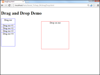
Figure 4-7: The page has a group of draggable elements and a target.
When you drop an element onto the target, the color and content of the target change, as shown in Figure 4-8.

Figure 4-8: The target knows when something has been dropped onto it.
Another interesting aspect of this program is the inclusion of several draggable elements. This program demonstrates how jQuery simplifies working with a number of elements.
Take a look at the entire program before you see the smaller segments:
<!DOCTYPE html>
<html lang = "en">
<head>
<title>dragDrop.html</title>
<meta charset = "utf-8" />
<link rel = "stylesheet"
type = "text/css"
href = "css/ui-lightness/jquery-ui-1.10.3.custom.css" />
<style type = "text/css">
.dragMe {
width: 100px;
height: 100px;
border: 1px solid blue;
text-align: center;
background-color: white;
position: absolute;
z-index: 100;
}
#target {
width: 200px;
height: 200px;
border: 1px solid red;
text-align: center;
position: absolute;
left: 300px;
top: 100px;
z-index: 0;
}
</style>
<script type = "text/javascript"
src = "js/jquery-1.9.1.js"></script>
<script type = "text/javascript"
src = "js/jquery-ui-1.10.3.custom.min.js"></script>
<script type = "text/javascript">
$(init);
function init(){
// make some clones of dragMe
cloneDragMe();
//make all drag me elements draggable
$(".dragMe").draggable();
//set target as droppable
$("#target").droppable();
//bind events to target
$("#target").bind("drop", changeTarget);
$("#target").bind("dropout", resetTarget);
} // end init
function cloneDragMe(){
for (i = 1; i <= 4; i++){
zValue = (101 + i) + "";
yPos = 100 + (i * 20) + "px";
$("div:first").clone()
.insertAfter("div:last")
.css("top", yPos)
.css("zIndex", zValue)
.append(" #" + i);
} // end for loop
} // end cloneDragMe
function changeTarget(event, ui)
$("#target").addClass("ui-state-highlight")
.html("Dropped ")
.append(ui.draggable.text());
} // end changeTarget
function resetTarget(event, ui){
$("#target").removeClass("ui-state-highlight")
.html("Drop on me");
} // end reset
</script>
</head>
<body>
<h1>Drag and Drop Demo</h1>
<div class = "dragMe">
Drag me
</div>
<div id = "target">
Drop on me
</div>
</body>
</html>
Building the basic page
As typical with jQuery, the HTML code is simple. It's very striking that you only see a single dragMe element. It turns out to be simpler to build a single element in HTML and use jQuery and JavaScript to make as many copies as you need. You also see a single target element. I added basic CSS to make the element easy to see (borders) and set them as absolute positioned so that I could control the initial position.
Note that I attached an ID to target (because there will be a single target on the page) and made dragMe a class (because I want to be able to have several draggable elements on the page).
Initializing the page
The initialization is a bit more elaborate than some of the earlier examples in this chapter, but it still isn't too difficult to follow. The main addition is the ability to respond to some specialty events:
$(init);
function init(){
// make some clones of dragMe
cloneDragMe();
//make all drag me elements draggable
$(".dragMe").draggable();
//set target as droppable
$("#target").droppable();
//bind events to target
$("#target").bind("drop", changeTarget);
$("#target").bind("dropout", resetTarget);
} // end init
The steps here aren't hard to follow:
- Make copies of the dragme element.
This part isn't critical (in fact, I added it after testing with a single element). However, if you want to have multiple copies of the draggable element, use a method to encapsulate the process.
- Make all dragme elements draggable.
Use the jQuery draggable() method on all elements with the dragMe class.
- Establish the target as a droppable element.
The droppable() method sets up an element so that it can receive events when a draggable element is dropped on it. Note that making something droppable doesn't have any particular effect on its own. The interesting thing comes when you bind events to the element.
- Bind a drop event to the target.
Droppable elements can have events attached to them just like any jQuery object. However, the mechanism for attaching an event to a user interface object is a little bit different than the standard jQuery event mechanism (which involves a custom function for each event). Use the bind() method to specify a function to be called when a particular event occurs. When the user drops a node that has been made draggable onto the target element, this triggers the drop event, so call the changeTarget() function.
- Bind a dropout event to the target as well.
You can bind another event to occur when the user removes all draggable elements from the target. This event is called dropout, and I've told the program to call the resetTarget() function when this event is triggered.
You often see programmers using shortcuts for this process. Sometimes, the functions are defined anonymously in the bind call, or sometimes the event functions are attached as a JSON object directly in the droppable() method assignment. Feel free to use these techniques if you are comfortable with them. I've chosen the technique used here because I think it is the clearest model to understand.
Handling the drop
When the user drags a dragMe element and drops it on the target, the target's background color changes and the program reports the text of the element that was dragged. The code is easy:
function changeTarget(event, ui){
$("#target").addClass("ui-state-highlight")
.html("Dropped ")
.append(ui.draggable.text());
} // end changeTarget
Here's how to put this together:
- Create a function to correspond to the drop event.
The drop event is bound to a function called changeTarget, so I need to create such a function.
- Include two parameters.
Bound event functions require two parameters. The first is an object that encapsulates the event (much like the one in regular DOM programming) and a second element called ui, which encapsulates information about the user interface. You can use the ui object to determine which draggable element was dropped onto the target.
- Highlight the target.
It's a good idea to signal that the target's state has changed. You can change the CSS directly (with jQuery) or use jQuery theming to apply a predefined highlight class. I chose to use the jQuery theme technique to simply add the ui-state-highlight class to the target object.
- Change the text to indicate the new status.
Normally you should do something to indicate what was dropped. (If it's a shopping application, you should add the element to an array so that you can remember what the user wants to purchase, for example.) In this example, I simply change the text of the target to indicate that the element has been dropped.
- Use ui.draggable to get access to the element that was dropped.
The ui object contains information about the user interface. ui.draggable is a link to the draggable element that triggered the current function. It's a jQuery element, so you can use whatever jQuery methods you want on it. In this case, I extract the text from the draggable element and append it to the end of the target's text.
Beauty school dropout events
Another function is used to handle the dropout condition, which occurs when draggable elements are no longer dropped on the target. I bind the resetTarget() function to this event:
function resetTarget(event, ui){
$("#target").removeClass("ui-state-highlight")
.html("Drop on me");
} // end reset
All you have to do is this:
- Remove the highlight class from the target.
One great thing about using the theme classes is how easy they are to remove. Remove the highlight class, and the target reverts to its original appearance.
- Reset the HTML text.
Now that the target is empty, reset its HTML so that it prompts the user to drop a new element.
Cloning the elements
You can simply run the program as it is (with a single copy of the dragMe class), but more often, drag and drop is used with a number of elements. For example, you might allow users to drag various icons from your catalog to a shopping cart.
The basic jQuery library provides all the functionality necessary to make as many copies of an element as you want. Copying an element is a simple matter of using the jQuery clone() method.
The more elaborate code is used to ensure that the various elements display properly:
function cloneDragMe(){
for (i = 1; i <=4; i++){
zValue = (101 + i) + "";
yPos = 100 + (i * 20) + "px";
$("div:first").clone()
.insertAfter("div:first")
.css("top", yPos)
.css("zIndex", zValue)
.append(" #" + i);
} // end for loop
} // end cloneDragMe
Here are the steps:
- Create a for loop.
Anytime you're doing something repetitive, a for loop is a likely tool. In this case, I want to make four clones numbered 1 through 4, so I have a variable named i that can vary from 1 to 4.
- Create a zValue for the element.
The CSS zIndex property is used to indicate the overlapping of elements. Higher values appear to be closer to the user. I give each element a zOrder of over 100 to ensure that it appears over the target. (If you don't specify the zIndex, dragged elements might go under the target and become invisible.) The zValue variable is mapped to the zIndex.
- Determine the y position of the element.
I want each successive copy of the dragMe element to be a bit lower than the previous one. Multiplying i by 20 ensures that each element is separated from the previous one by 20 pixels. Add 100 pixels to move the new stack of elements near the original.
- Make a clone of the first element.
Use the clone() method to make a clone of the first div. (Use the : first filter to specify which div you want to copy.)
- Remember to insert the newly cloned element.
The cloned element exists only in memory until it is somehow added to the page. I chose to add the element right after the first element.
- Set the top of the element with the yPos variable.
Use the yPos variable you calculated earlier to set the vertical position of the newly minted element. Use the css() method to apply the yPos variable to the element's left CSS rule.
- Set the zIndex.
Like the y position, the zValue variable you created is mapped to a CSS value. In this case, zValue is mapped to the zIndex property.
- Add the index to the element's text.
Use the append() method to add the value of i to the element's HTML. This way you can tell which element is which.