
Chapter 4
Using Alternative Positioning
In This Chapter
 Setting position to absolute
Managing z-index
Creating fixed and flexible layouts
Working with fixed and relative positioning
Using the new flexbox model
Floating layouts (described in Chapter 2 of this minibook) are the preferred way to set up page layouts today but, sometimes, other alternatives are useful. You can use absolute, relative, or fixed positioning techniques to put all your page elements exactly where you want them. Well, almost exactly. It's still web development, where nothing's exact. Because none of these alternatives are completely satisfying, the W3C (web standards body) has introduced a very promising new layout model called the flexbox model.
The techniques described in this chapter will give you even more capabilities when it comes to setting up great-looking websites.
Working with Absolute Positioning
Begin by considering the default layout mechanism. Figure 4-1 shows a page with two paragraphs on it.

Figure 4-1: These two paragraphs have a set height and width, but default positioning.
I used CSS to give each paragraph a different color (to aid in discussion later) and to set a specific height and width. The positioning is left to the default layout manager, which positions the second (black) paragraph directly below the first (blue) one.
Setting up the HTML
The code is unsurprising:
<!DOCTYPE html>
<html lang = "en-US">
<head>
<meta charset = "UTF-8">
<title>boxes.html</title>
<style type = "text/css">
#blueBox {
background-color: blue;
width: 100px;
height: 100px;
}
#blackBox {
background-color: black;
width: 100px;
height: 100px;
}
</style>
</head>
<body>
<p id = "blueBox"></p>
<p id = "blackBox"></p>
</body>
</html>
If you provide no further guidance, paragraphs (like other block-level elements) tend to provide carriage returns before and after themselves, stacking on top of each other. The default layout techniques ensure that nothing ever overlaps.
Adding position guidelines
Figure 4-2 shows something new: The paragraphs are overlapping!
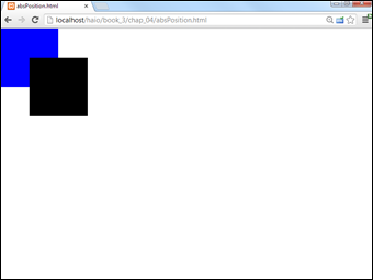
Figure 4-2: Now the paragraphs overlap each other.
This feat is accomplished through some new CSS attributes:
<!DOCTYPE html>
<html lang = "en-US">
<head>
<meta charset = "UTF-8">
<title>absPosition.html</title>
<style type = "text/css">
#blueBox {
background-color: blue;
width: 100px;
height: 100px;
position: absolute;
left: 0px;
top: 0px;
margin: 0px;
}
#blackBox {
background-color: black;
width: 100px;
height: 100px;
position: absolute;
left: 50px;
top: 50px;
margin: 0px;
}
</style>
</head>
<body>
<p id = "blueBox"></p>
<p id = "blackBox"></p>
</body>
</html>
 So, why do I care if the boxes overlap? Well, you might not care, but the interesting part is this: You can have much more precise control over where elements live and what size they are. You can even override the browser's normal tendency to keep elements from overlapping, which gives you some interesting options.
Making absolute positioning work
A few new parts of CSS allow this more direct control of the size and position of these elements. Here's the CSS for one of the boxes:
#blueBox {
background-color: blue;
width: 100px;
height: 100px;
position: absolute;
left: 0px;
top: 0px;
margin: 0px;
}
- Set the position attribute to absolute.
Absolute positioning can be used to determine exactly (more or less) where the element will be placed on the screen:
position: absolute;
- Specify a left position in the CSS.
After you determine that an element will have absolute position, it's removed from the normal flow, so you're obligated to fix its position. The left attribute determines where the left edge of the element will go. This can be specified with any of the measurement units, but it's typically measured in pixels:
left: 0px;
- Specify a top position with CSS.
The top attribute indicates where the top of the element will go. Again, this is usually specified in pixels:
top: 0px;
- Use the height and width attributes to determine the size.
Normally, when you specify a position, you also want to determine the size:
width: 100px;
height: 100px; - Set the margins to 0.
When you're using absolute positioning, you're exercising quite a bit of control. Because browsers don't treat margins identically, you're better off setting margins to 0 and controlling the spacing between elements manually:
margin: 0px;
Generally, you use absolute positioning only on named elements, rather than classes or general element types. For example, you won't want all the paragraphs on a page to have the same size and position, or you couldn't see them all. Absolute positioning works on only one element at a time.
Managing z-index
When you use absolute positioning, you can determine exactly where things are placed, so it's possible for them to overlap. By default, elements described later in HTML are positioned on top of elements described earlier. This is why the black box appears over the top of the blue box in Figure 4-2.
Handling depth
You can use a special CSS attribute called z-index to change this default behavior. The z-axis refers to how close an element appears to be to the viewer. Figure 4-3 demonstrates how this works.

Figure 4-3: The z-index allows you to change which elements appear closer to the user.
The z-index attribute requires a numeric value. Higher numbers mean the element is closer to the user (or on top). Any value for z-index places the element higher than elements with the default z-index. This can be very useful when you have elements that you want to appear over the top of other elements (for example, menus that temporarily appear on top of other text).
Here's the code illustrating the z-index effect:
<!DOCTYPE html>
<html lang = "en-US">
<head>
<meta charset = "UTF-8">
<title>zindex.html</title>
<style type = "text/css">
#blueBox {
background-color: blue;
width: 100px;
height: 100px;
position: absolute;
left: 0px;
top: 0px;
margin: 0px;
z-index: 1;
}
#blackBox {
background-color: black;
width: 100px;
height: 100px;
position: absolute;
left: 50px;
top: 50px;
margin: 0px;
}
</style>
</head>
<body>
<p id = "blueBox"></p>
<p id = "blackBox"></p>
</body>
</html>
Working with z-index
The only change in this code is the addition of the z-index property. The higher a z-index value is, the closer that object appears to be to the user. Here are a couple things to keep in mind when using z-index:
- One element can totally conceal another. When you start positioning things absolutely, one element can seem to disappear because it's completely covered by another. The z-index attribute is a good way to check for this situation.
- Negative z-index can be problematic. The value for z-index should be positive. Although negative values are supported, some browsers (notably older versions of Firefox) do not handle them well and may cause your element to disappear.
- It may be best to give all values a z-index. If you define the z-index for some elements and leave the z-index undefined for others, you have no guarantee exactly what will happen. If in doubt, just give every value its own z-index, and you'll know exactly what should overlap what.
- Don't give two elements the same z-index. The point of the z-index is to clearly define which element should appear closer. Don't defeat this purpose by assigning the same z-index value to two different elements on the same page.
Building a Page Layout with Absolute Positioning
You can use absolute positioning to create a page layout. This process involves some trade-offs. You tend to get better control of your page with absolute positioning (compared to floating techniques), but absolute layout requires more planning and more attention to detail. Figure 4-4 shows a page layout created with absolute positioning techniques.

Figure 4-4: This layout was created with absolute positioning.
The technique for creating an absolutely positioned layout is similar to the floating technique (in the general sense).
Overview of absolute layout
Before you begin putting your page together with absolute positioning, it's good to plan the entire process. Here's an example of how the process should go:
- Plan the site.
Having a drawing that specifies how your site layout will look is really important. In absolute positioning, your planning is even more important than the floating designs because you'll need to specify the size and position of every element.
- Specify an overall size.
This particular type of layout has a fixed size. Create an all div housing all the other elements and specify the size of this div (in a fixed unit for now, usually px or em).
- Create the HTML.
The HTML page should have a named div for each part of the page (so if you have headers, columns, and footers, you need a div for each).
- Build a CSS style sheet.
The CSS styles can be internal or linked, but because absolute positioning tends to require a little more markup than floating, external styles are preferred.
- Identify each element.
It's easier to see what's going on if you assign a different colored border to each element.
- Make each element absolutely positioned.
Set position: absolute in the CSS for each element in the layout.
- Specify the size of each element.
Set the height and width of each element according to your diagram. (You did make a diagram, right?)
- Determine the position of each element.
Use the left and top attributes to determine where each element goes in the layout.
- Tune-up your layout.
You'll probably want to adjust margins and borders. You may need to do some adjustments to make it all work. For example, the menu is 150px wide, but I added padding-left and padding-right of 5px each. This means the width of the menu needs to be adjusted to 140px to make everything still fit.
Writing the HTML
The HTML code is pretty straightforward:
<!DOCTYPE html>
<html lang = "en-US">
<head>
<meta charset = "UTF-8">
<title>absLayout.html</title>
<link rel = "stylesheet"
type = "text/css"
href = "absLayout.css" />
</head>
<body>
<div id = "all">
<div id = "head">
<h1>Layout with Absolute Positioning</h1>
</div>
<div id = "menu">
</div>
<div id = "content">
</div>
</div>
</body>
</html>
(As typical with layout examples, I have removed the lorem text from this code listing for clarity.)
The HTML file calls an external style sheet called absLayout.css.
Adding the CSS
The CSS code is a bit lengthy but not too difficult:
/* absLayout.css */
#all {
border: 1px solid black;
width: 800px;
height: 600px;
position: absolute;
left: 0px;
top: 0px;
}
#head {
border: 1px solid green;
position: absolute;
width: 800px;
height: 100px;
top: 0px;
left: 0px;
text-align: center;
}
#menu {
border: 1px solid red;
position: absolute;
width: 140px;
height: 500px;
top: 100px;
left: 0px;
padding-left: 5px;
padding-right: 5px;
}
#content{
border: 1px solid blue;
position: absolute;
width: 645px;
height: 500px;
top: 100px;
left: 150px;
padding-left: 5px;
}
A static layout created with absolute positioning has a few important features to keep in mind:
- You're committed to position everything. After you start using absolute positioning, you need to use it throughout your site. All the main page elements require absolute positioning because the normal flow mechanism is no longer in place.
You can still use floating layout inside an element with absolute position, but all your main elements (heading, columns, and footing) need to have absolute position if one of them does.
- You should specify size and position. With a floating layout, you're still encouraging a certain amount of fluidity. Absolute positioning means you're taking the responsibility for both the shape and size of each element in the layout.
- Absolute positioning is less adaptable. With this technique, you're pretty much bound to a specific screen width and height. You'll have trouble adapting to tablets and cellphones. (A more flexible alternative is shown in the next section.)
- All the widths and the heights have to add up. When you determine the size of your display, all the heights, widths, margins, padding, and borders have to add up, or you'll get some strange results. When you use absolute positioning, you're also likely to spend some quality time with your calculator, figuring out all the widths and the heights.
Creating a More Flexible Layout
You can build a layout with absolute positioning and some flexibility. Figure 4-5 illustrates such a design.
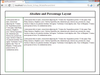
Figure 4-5: This page uses absolute layout, but it doesn't have a fixed size.
The size of this layout is attached to the size of the browser screen. It attempts to adjust to the browser while it's resized. You can see this effect in Figure 4-6.

Figure 4-6: The layout resizes in proportion to the browser window.
The page simply takes up a fixed percentage of the browser screen. The proportions are all maintained, no matter what the screen size is.
 Having the page resize with the browser works, but it's not a complete solution. When the browser window is small enough, the text will no longer fit without some ugly bleed-over effects. You can fix this with the overflow attribute, but then you will have scrollbars in your smaller elements.
Designing with percentages
This absolute but flexible trick is achieved by using percentage measurements. The position is still set to absolute, but rather than defining size and position with pixels, use percentages instead. Here's the CSS:
/* absPercent.css */
#all {
border: 1px black solid;
position: absolute;
left: 5%;
top: 5%;
width: 90%;
height: 90%;
}
#head {
border: 1px black solid;
position: absolute;
left: 0%;
top: 0%;
width: 100%;
height: 10%;
text-align: center;
}
#head h1 {
margin-top: 1%;
}
#menu {
border: 1px green solid;
position: absolute;
left: 0%;
top: 10%;
width: 18%;
height: 90%;
padding-left: 1%;
padding-right: 1%;
overflow: auto;
}
#content {
border: 1px black solid;
position: absolute;
left: 20%;
top: 10%;
width: 78%;
height: 90%;
padding-left: 1%;
padding-right: 1%;
overflow: auto;
}
The key to any absolute positioning (even this flexible kind) is math. When you just look at the code, it isn't clear where all those numbers come from. Look at the diagram for the page in Figure 4-7 to see how all the values are derived.

Figure 4-7: The diagram is the key to a successful layout.
Building the layout
Here's how the layout works:
- Create an all container by building a div with the all ID.
The all container will hold all the contents of the page. It isn't absolutely necessary in this type of layout, but it does allow for a centering effect.
- Specify the size and position of all.
I want the content of the page to be centered in the browser window, so I set its height and width to 90 percent, and its margin-left and margin-top to 5 percent. In effect, this sets the margin-right and margin-bottom to 5 percent also. These percentages refer to the all div's container element, which is the body, with the same size as the browser window.
- Other percentages are in relationship to the all container.
Because all the other elements are placed inside all, the percentage values are no longer referring to the entire browser window. The widths and heights for the menu and content areas are calculated as percentages of their container, which is all.
- Determine the heights.
Height is usually pretty straightforward because you don't usually have to change the margins. Remember, though, that the head accounts for 10 percent of the page space, so the height of both the menu and content needs to be 90 percent.
- Figure the general widths.
In principle, the width of the menu column is 20 percent, and the content column is 80 percent. This isn't entirely accurate, though.
- Compensate for margins.
You probably want some margins, or the text looks cramped. If you want 1 percent margin-left and 1 percent margin-right on the menu column, you have to set the menu's width to 18 percent to compensate for the margins. Likewise, set the content width to 78 percent to compensate for margins.
As if this weren't complex enough, remember that Internet Explorer 6 (IE6) and earlier browsers calculate margins differently! In these browsers, the margin happens inside the content, so you don't have to compensate for them (but you have to remember that they make the useable content area smaller). You'll probably have to make a conditional comment style sheet to handle IE6 if you use absolute positioning.
Exploring Other Types of Positioning
If you use the position attribute, you're most likely to use absolute. However, here are other positioning techniques that can be handy in certain circumstances:
- Relative: Set position: relative when you want to move an element from its default position. For example, if you set position to relative and top: -10px, the element would be placed 10 pixels higher on the screen than normal.
- Fixed: Use fixed position when you want an element to stay in the same place, even when the page is scrolled. This is sometimes used to keep a menu on the screen when the contents are longer than the screen width. If you use fixed positioning, be sure you're not overwriting something already on the screen.
The real trick is to use appropriate combinations of positioning schemes to solve interesting problems.
Creating a fixed menu system
Figure 4-8 illustrates a very common type of web page — one with a menu on the left and a number of stories or topics in the main area.
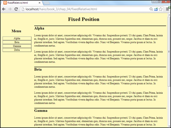
Figure 4-8: At first glance, this is yet another two-column layout.
Something is interesting about this particular design. The button list on the left refers to specific segments of the page. When you click one of these buttons (say, the Gamma button), the appropriate part of the page is called up, as shown in Figure 4-9.

Figure 4-9: The page scrolls to the Gamma content, but the menu stays put.
Normally, when you scroll down the page, things on the top of the page (like the menu) disappear. In this case, the menu stays on the screen, even though the part of the page where it was originally placed is now off the screen.
Gamma isn't necessarily moved to the top of the page. Linking to an element ensures that it's visible but doesn't guarantee where it will appear.
You can achieve this effect using a combination of positioning techniques.
Setting up the HTML
The HTML for the fixed menu page is simple (as you'd expect by now):
<!DOCTYPE html>
<html lang = "en-US">
<head>
<meta charset = "UTF-8">
<title>fixedRelative.html</title>
<link rel = "stylesheet"
type = "text/css"
href = "fixedRelative.css" />
</head>
<body>
<h1>Fixed Position</h1>
<div id = "menu">
<h2>Menu</h2>
<ul>
<li><a href = "#alpha">Alpha</a></li>
<li><a href = "#beta">Beta</a></li>
<li><a href = "#gamma">Gamma</a></li>
<li><a href = "#delta">Delta</a></li>
</ul>
</div>
<div class = "content"
id = "alpha">
<h2>Alpha</h2>
</div>
<div class = "content"
id = "beta">
<h2>Beta</h2>
</div>
<div class = "content"
id = "gamma">
<h2>Gamma</h2>
</div>
<div class = "content"
id = "delta">
<h2>Delta</h2>
</div>
</body>
</html>
The HTML has only a few noteworthy characteristics:
- It has a menu. The div named menu contains a list of links (like most menus).
- The menu has internal links. A menu can contain links to external documents or (like this one) links inside the current document. The <a href = “#alpha”>Alpha</a> code means create a link to the element in this page with the ID alpha.
- The page has a series of content divs. Most of the page's content appears in one of the several divs with the content class. This class indicates all these divs will share some formatting.
- The content divs have separate IDs. Although all the content divs are part of the same class, each has its own ID. This allows the menu to select individual items (and would also allow individual styling, if desired).
As normal for this type of code, I left out the filler paragraphs from the code listing.
Setting the CSS values
The interesting work happens in CSS. Here's an overview of the code:
/* fixedRelative.css */
body {
background-color: #fff9bf;
}
h1 {
text-align: center;
}
#menu {
position: fixed;
width: 18%;
}
#menu li {
list-style-type: none;
margin-left: -2em;
text-align: center;
}
#menu a{
display: block;
border: 2px gray outset;
text-decoration: none;
color: black;
}
#menu a:hover{
color: white;
background-color: black;
border: 2px gray inset;
}
#menu h2 {
text-align: center;
}
.content {
position: relative;
left: 20%;
width: 80%;
}
.content h2 {
border-top: 3px black double;
}
Most of the CSS is familiar if you've looked over the other chapters in this minibook. I changed the menu list to make it look like a set of buttons, and I added some basic formatting to the headings and borders. The interesting thing here is how I positioned various elements.
Here's how you build a fixed menu:
- Set the menu position to fixed by setting the position attribute to fixed.
The menu div should stay on the same spot, even while the rest of the page scrolls. Fixed positioning causes the menu to stay put, no matter what else happens on the page.
- Give the menu a width with the width attribute.
It's important that the width of the menu be predictable, both for aesthetic reasons and to make sure the content isn't overwritten by the menu. In this example, I set the menu width to 18 percent of the page width (20 percent minus some margin space).
- Consider the menu position by explicitly setting the top and left attributes.
When you specify a fixed position, you can determine where the element is placed on the screen with the left and top attributes. I felt that the default position was fine, so I didn't change it.
- Set content position to relative.
By default, all members of the content class will fill out the entire page width. Because the menu needs the leftmost 20 percent of the page, set the content class position to relative.
- Change content's left attribute to 20 percent.
Because content has relative positioning, setting the left to 20 percent will add 20 percent of the parent element to each content's left value. This will ensure that there's room for the menu to the left of all the content panes.
- Give content a width property.
If you don't define the width, content panels may bleed off the right side of the page. Use the width property to ensure this doesn't happen.
 In reality, I rarely use absolute positioning for page layout. It's just too difficult to get working and too inflexible for the range of modern browsers. However, it is still used in certain specialty situations like web game development where the programmer is deliberately subverting normal layout schemes for more control of the visual interface.
Flexible Box Layout Model
Page layout has been a constant concern in web development. There have been many different approaches to page layout, and all have weaknesses. The current standard is the floating mechanism. While this works quite well, it has two major weaknesses.
- It can be hard to understand: The various parts of the float specification can be difficult to follow, and the behavior is not intuitive. The relationship between width, clear, and float attributes can be difficult to follow.
- The page order matters: One goal of semantic layout is to completely divorce the way the page is created from how it is displayed. With the floating layout, the order in which various elements are written in the HTML document influences how they are placed. An ideal layout solution would allow any kind of placement through CSS, even after the HTML is finished.
Absolute positioning seems great at first, but it has its own problems:
- It's a lot more detail-oriented: Absolute positioning is a commitment. You often end up having to directly control the size and position of every element on the screen, which is tedious and difficult.
- It's not as flexible: With responsive design (creating a page that can adapt to the many different devices available) all the rage today, the absolute position scheme simply doesn't deliver the flexibility needed in modern web development.
There are some other layout mechanisms (tables and frames) that have already been rejected as viable layout options, which seems to leave web programmers without an ideal solution.
Creating a flexible box layout
CSS3 proposes a new layout mechanism which aims to solve a lot of the layout problems that have plagued web development. The flexible box layout scheme (sometimes called flexbox) shows a lot of promise. Here's essentially how it works (I'm deliberately leaving out details here for clarity. Read on for specific implementation):
- Designate a page segment as a box.
The display attribute of most elements can be set to various types. CSS3 introduces a new display type: box. Setting the display of an element to box makes it capable of holding other elements with the flexible box mechanism.
- Determine the orientation of child elements.
Use a new attribute called box-orient to determine if the child elements of the current element will be placed vertically or horizontally inside the main element.
- Specify the weight of child elements.
Each child element can be given a numeric weight. The weight determines how much space that element takes up. If the weight is zero, the element takes as little space as possible. If the weight of all the elements is one, they all take up the same amount of space. If one element has a weight of two and the others all have a weight of one, the larger element has twice the size of the others, and so on. Weight is determined through the box-flex attribute.
- Nest another box inside the first.
You can nest flexboxes inside each other. Simply apply the box display type to inner elements that will show the display.
- Modify the order in which elements appear.
Normally elements appear in the order in which they were placed on the page, but you can use the box-ordinal-group attribute to adjust the placement order.
Viewing a flexible box layout
As an example, take a look at the following HTML code:
<div id = "a">
<div id = "b">b</div>
<div id = "c">c</div>
<div id = "d">
<div id = "e">e</div>
<div id = "f">f</div>
</div>
</div>
Although this is a clearly made-up example, it shows a complex structure that could be difficult to style using standard layout techniques. Figure 4-10 illustrates a complex nested style that would be difficult to achieve through traditional layout techniques:

Figure 4-10: This structure would not be easy to build with CSS2.
The following style sheet is used to apply a flex grid style to this page:
div {
border: 1px solid black;
}
#a {
width: 300px;
height: 200px;
display: box;
box-orient: horizontal;
}
#b {
box-flex: 1;
}
#c {
box-flex: 1;
}
#d {
display: box;
box-orient: vertical;
box-flex: 2;
}
#e {
box-flex: 1;
box-ordinal-group: 2;
}
#f {
box-flex: 1;
}
The CSS looks complex, but there are only four new CSS elements. Here's how this specific example works:
- Set up a to be the primary container.
The a div is the primary container, so give it a height and width. It will contain flex boxes, so set the display attribute to box. Determine how you want the children of this box to be lined up by setting the box-orient attribute to vertical or horizontal.
- Specify the weights of b, c, and d.
In my example, I want elements b and c to take up half the space, and d to fill up the remainder of the space. To get this behavior, set the box-flex value of b and c to 1, and the box-flex value of d to 2.
- Set up d as another container.
The d element will contain e and f. Use display: box to make d a flex container, and box-orient to vertical to make the elements line up vertically. (Normally nested elements will switch between horizontal and vertical.)
- Elements e and f should each take half of d.
Use the box-flex attribute to give these elements equal weight.
- Change the ordinal group of e so it appears after f.
The box-ordinal-group attribute indicates the order in which an element will be displayed inside its group. Normally, all items have a default value of 1, so they appear in the order they are written. You can demote an element by setting its box-ordinal-group value to a higher number, causing that element to be displayed later than normal. I set e to ordinal group 2, so it is displayed after element f.
… And now for a little reality
The flexbox system seems perfect. It's much more sensible than the Byzantine layout techniques that are currently in use. However, the flexible box system is not ready for common use yet. Right now, not a single browser implements the flexbox attributes directly. However, there are special vendor-specific versions available. WebKit-based browsers (primarily Safari and Chrome) use variations that begin with -webkit- and Gecko-based browsers (Firefox and Mozilla) use the -moz- prefix. Microsoft finally supports flexbox, but it requires the -ms-. To make the example in this chapter work in modern browsers, you need to include -ms-, -webkit- and -moz- versions of all the attributes, like this:
#a {
width: 300px;
height: 200px;
box-orient: horizontal;
display: box;
-moz-box-orient: horizontal;
display: -moz-box;
-webkit-box-orient: horizontal;
display: -webkit-box;
-ms-box-orient: horizontal;
display: -ms-box;
}
#b {
box-flex: 1;
-moz-box-flex: 1;
-webkit-box-flex: 1;
-ms-box-flex: 1;
}
None of the browsers currently support the vanilla version, but I put it in anyway because hopefully in the near future only that version will be necessary. This technique is worth learning about because it may well become the preferred layout technique in the future.
For a complete example, take a look at Figure 4-11, which shows a standard two-column page.
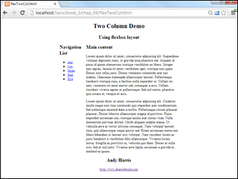
Figure 4-11: This standard layout uses flexbox.
Though you can't tell from the screen shot, this page uses HTML5 throughout, including the new semantic tags (See the sidebar for a discussion of semantic tags) and a flexbox layout model.
Although the CSS code may look complex, it's actually quite simple, but repeated four times to handle all the various browser prefixes:
<!DOCTYPE HTML>
<html lang = "en">
<head>
<title>flexTwoCol.html</title>
<meta charset = "UTF-8" />
<style type = "text/css">
#all {
display: box;
display: -moz-box;
display: -wekbit-box;
display: -ms-box;
box-orient: vertical;
-moz-box-orient: vertical;
-webkit-box-orient: vertical;
-ms-box-orient: vertical;
height: 400px;
width: 600px;
margin-right: auto;
margin-left: auto;
}
#main {
display: box;
display: -moz-box;
display: -webkit-box;
display: -ms-box;
box-orient: horizontal;
-moz-box-orient: horizontal;
-webkit-box-orient: horizontal;
-ms-box-orient: horizontal;
}
#nav {
box-flex: 1;
-moz-box-flex: 1;
-webkit-box-flex: 1;
-ms-box-flex: 1;
}
#article {
box-flex: 6;
-moz-box-flex: 6;
-webkit-box-flex: 6;
-ms-box-flex: 6;
}
header, footer {
display:block;
text-align: center;
}
</style>
</head>
<body>
<div id = "all">
<header>
<hgroup>
<h1>Two Column Demo</h1>
<h2>Using flexbox layout</h2>
</hgroup>
</header>
<div id = "main">
<div id = "nav">
<h2>Navigation List</h2>
<ul>
<li><a href = "#">one</a></li>
<li><a href = "#">two</a></li>
<li><a href = "#">three</a></li>
<li><a href = "#">four</a></li>
<li><a href = "#">five</a></li>
</ul>
</div>
<div id = "article">
<h2>Main content</h2>
</div>
</div>
<footer>
<h2>Andy Harris</h2>
<a href = "http://www.aharrisbooks.net">
http://www.aharrisbooks.net</a>
</footer>
</div>
</body>
</html>
The flexbox approach is really promising. When you get used to it, flexbox is less mysterious than the float approach, and far more flexible than absolute positioning. Essentially, my page uses a fixed width div and places a flexbox inside it. There's no need to worry about float, clear, or any specific measurements except the one for the all div. The only downside is the need to code the CSS for all the browser prefixes. For now, I fix that with macros in my text editor.
Determining Your Layout Scheme
All these layout options might just make your head spin. What's the right strategy? Well, that depends.
The most important thing is to find a technique you're comfortable with that gives you all the flexibility you need.
Floating layouts are generally your best bet, but it's good to know how absolute positioning works. Every once in a while, you find a situation where absolute positioning is a good idea, but generally it's more difficult to pull off than the floating mechanism.
Absolute positioning seems very attractive at first because it promises so much control. The truth is, it's pretty complicated to pull off well, it isn't quite as flexible as the floating layout techniques, and it's hard to make it work right in older browsers.
Sometimes, fixed and relative positioning schemes are handy, as in the example introduced in the fixed menu example described in this chapter.
The flexbox approach seems very promising, but it's currently tedious to write as you'll need to repeat your code for all the browser prefixes. When it can be used without prefixes, it will probably become the dominant scheme.
Sometimes, you'll find it's best to combine schemes. (It's difficult to combine absolute positioning with another scheme, but you can safely combine floating, fixed, and relative positioning techniques most of the time.)
The main point is to understand the various options available to you so you can make a good choice for whatever project you're currently working on.