
Chapter 2
Building Floating Page Layouts
In This Chapter
 Creating a classic two-column page
Creating a page-design diagram
Using temporary background colors
Creating fluid layouts and three-column layouts
Working with and centering fixed-width layouts
The floating layout technique provides a good alternative to tables, frames, and other layout tricks formerly used. You can build many elegant multi-column page layouts with ordinary HTML and CSS styles.
Creating a Basic Two-Column Design
Many pages today use a two-column design with a header and footer. Such a page is quite easy to build with the techniques you read about in this chapter.
Designing the page
It's best to do your basic design work on paper, not on the computer. Here's my original sketch in Figure 2-1.
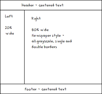
Figure 2-1: This is a very standard two-column style.
Draw the sketch first so you have some idea what you're aiming for. Your sketch should include the following information:
- Overall page flow: How many columns do you want? Will it have a header and footer?
- Section names: Each section needs an ID, which will be used in both the HTML and the CSS.
- Width indicators: How wide will each column be? (Of course, these widths should add up to 100 percent or less.)
- Fixed or percentage widths: Are the widths measured in percentages (of the browser size) or in a fixed measurement (pixels)? This has important implications. For this example, I'm using a dynamic width with percentage measurements.
- Font considerations: Do any of the sections require any specific font styles, faces, or colors?
- Color scheme: What are the main colors of your site? What will be the color and background color of each section?
This particular sketch (in Figure 2-1) is very simple because the page will use default colors and fonts. For a more complex job, you need a much more detailed sketch. The point of the sketch is to separate design decisions from coding problems. Solve as much of the design stuff as possible first so you can concentrate on building the design with HTML and CSS.
Building the HTML
After you have a basic design in place, you're ready to start building the HTML code that will be the framework. Start with basic CSS, but create a div for each section that will be in your final work. You can put a placeholder for the CSS, but don't add any CSS yet. Here's my basic code. I removed some of the redundant text to save space:
<!DOCTYPE html>
<html lang = "en-US">
<head>
<meta charset = "UTF-8">
<title>twoColumn.html</title>
<link rel = "stylesheet"
type = "text/css"
href = "twoCol.css" />
</head>
<body>
<div id = "head">
<h1>Two Columns with Float</h1>
</div>
<div id = "left">
<h2>Left Column</h2>
<p>
Lorem ipsum dolor sit amet, consectetuer adipiscing elit. Vivamus dui.
</p>
</div>
<div id = "right">
<h2>Right Column</h2>
<p>
Lorem ipsum dolor sit amet, consectetuer adipiscing elit. Vivamus dui.
</p>
</div>
<div id = "footer">
<h3>Footer</h3>
</div>
</body>
</html>
Nothing at all is remarkable about this HTML code, but it has a few important features, such as
- It's standards-compliant. It's good to check and make sure the basic HTML code is well formed before you do a lot of CSS work with it. Sloppy HTML can cause you major headaches later.
- It contains four divs. The parts of the page that will be moved later are all encased in div elements.
- Each div has an ID. All the divs have an ID determined from the sketch.
- No formatting is in the HTML. The HTML code contains no formatting at all. That's left to the CSS.
- It has no style yet. Although a <link> tag is pointing to a style sheet, the style is currently empty.
Figure 2-2 shows what the page looks like before you add any CSS to it.
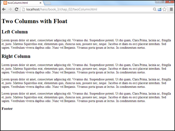
Figure 2-2: The plain HTML is plain indeed; some CSS will come in handy.
Using temporary background colors
And now for one of my favorite CSS tricks… Before doing anything else, create a selector for each of the named divs and add a temporary background color to each div. Make each div a different color. The CSS might look like this:
#head {
background-color: lightblue;
}
#left {
background-color: yellow;
}
#right {
background-color: green;
}
#footer {
background-color: orange;
}
You won't keep these background colors, but they provide some very useful cues while you're working with the layout:
- Testing the selectors: While you change the background of each selector, you can see whether you've remembered the selector's name correctly. It's amazing how many times I've written code that I thought was broken just because I didn't write the selector properly.
- Identifying the divs: If you make each div a different color, it'll be easier to see which div is which when they are not acting the way you want.
- Specifying the size of each div: The text inside a div isn't always a good indicator of the actual size. The background color tells you what's really going on.
Of course, you won't leave these colors in place. They're just helpful tools for seeing what's going on during the design process. Look at bg.html and bg.css on the website to see the full code.
Figure 2-3 displays how the page looks with the background colors turned on.

Figure 2-3: Colored backgrounds make it easier to manipulate the divs.
 It's fine that you can't see the actual colors in the black-and-white image in Figure 2-3. Just appreciate that when you see the page in its full-color splendor, the various colors will help you see what's going on.
Setting up the floating columns
This particular layout doesn't require major transformation. A few CSS rules will do the trick:
#head {
border: 3px black solid;
}
#left {
border: 3px red solid;
float: left;
width: 20%;
}
#right {
border: 3px blue solid;
float: left;
width: 75%
}
#footer {
border: 3px green solid;
clear: both;
}
I made the following changes to the CSS:
- Float the #left div. Set the #left div's float property to left so other divs (specifically the #right div) are moved to the right of it.
- Set the #left width. When you float a div, you must also set its width. I've set the left div width to 20 percent of the page width as a starting point.
- Float the #right div, too. The right div can also be floated left, and it'll end up snug to the left div. Don't forget to add a width. I set the width of #right to 75 percent, leaving another 5 percent available for padding, margins, and borders.
- Clear the footer. The footer should take up the entire width of the page, so set its clear property to both.
Figure 2-4 shows how the page looks with this style sheet in place (see floated.html and floated.css on the website for complete code).

Figure 2-4: Now, the left column is floated.
Tuning up the borders
The colored backgrounds in Figure 2-4 point out some important features of this layout scheme. For instance, the two columns are not the same height. This can have important implications.
You can change the borders to make the page look more like a column layout. I'm going for a newspaper-style look, so I use simple double borders. I put a black border under the header, a gray border to the left of the right column, and a gray border on top of the bottom segment. Tweaking the padding and centering the footer complete the look. Here's the complete CSS:
#head {
border-bottom: 3px double black;
}
#left {
float: left;
width: 20%;
}
#right {
float: left;
width: 75%;
border-left: 3px double gray;
}
#footer {
clear: both;
text-align: center;
border-top: 3px double gray;
}
The final effect is shown in Figure 2-5.

Figure 2-5: This is a decent design, which adjusts with the page width.
Advantages of a fluid layout
This type of layout scheme (with floats and variable widths) is often called a fluid layout because it has columns but the sizes of the columns are dependent on the browser width. This is an important issue because, unlike layout in the print world, you really have no idea what size the browser window that displays your page will be. Even if the user has a widescreen monitor, the browser may be in a much smaller window. Fluid layouts can adapt to this situation quite well.
Fluid layouts (and indeed all other float-based layouts) have another great advantage. If the user turns off CSS or can't use it, the page still displays. The elements will simply be printed in order vertically, rather than in the intended layout. This can be especially handy for screen readers or devices with exceptionally small screens, like phones.
Using semantic tags
As web developers began using floating layout techniques, they almost always created divs called nav, header, and footer. The developers of HTML5 decided to create new elements with these names. Take a look at the following code to see the semantic tags in action.
<!DOCTYPE HTML>
<html lang="en">
<head>
<title>semantic</title>
<meta charset="UTF-8">
<style type = "text/css">
header {
border-bottom: 5px double black;
}
nav {
float: left;
width: 20%;
clear: left;
min-height: 400px;
border-right: 1px solid black;
}
section {
float: left;
width: 75%;
padding-left: 1em;
}
article {
float: left;
width: 75%;
padding-left: 1em;
}
footer {
clear: both;
border-top: 5px double black;
text-align: center;
}
</style>
</head>
<body>
<header>
<h1>This is my header</h1>
</header>
<nav>
<h2>Navigation</h2>
<ul>
<li><a href="#">link a</a></li>
<li><a href="#">link b</a></li>
<li><a href="#">link c</a></li>
<li><a href="#">link d</a></li>
<li><a href="#">link e</a></li>
</ul>
</nav>
<section id = "1">
<h2>Section 1</h2>
<p>Section body...</p>
</section>
<section id = "2">
<h2>Section 2</h2>
<p>Section body...</p>
</section>
<article>
<h2>Article</h2>
<p>Article body...</p>
</article>
<footer>
<h2>Footer</h2>
<address>
Andy Harris <br />
<a href = "mailto:[email protected]">
[email protected]</a>
</address>
</footer>
</body>
</html>
As you can see, there are a number of new semantic markup tags in HTML5:
- header: This is not the same as the h1-h6 tags. It denotes a chunk of the page that will contain a header for the page. Often the header will fill up the page width, and will have some sort of banner image. It frequently contains h1 content.
- nav: This tag indicates some kind of navigation section. It has no particular style of its own, but it is frequently used as either a horizontal or vertical menu for site navigation.
- section: A section is used to specify a generic part of the page. You can have multiple sections on the same page.
- article: An article is like a section, but it's intended for use with external resources. Many pages are built automatically by software, and when these pages integrate content from other sources, it's intended to use the article tag to integrate this content.
- footer: A footer is intended to display footer contents at the bottom of a page. Typically a footer covers the bottom of a page, although this is not the default behavior.
Note that none of these elements have any specific formatting. It's up to you to provide formatting through CSS code. Each of the elements can be formatted directly as an HTML element (because that's what it is). All latest-version browsers support the semantic markup tags, but if you want to support older browsers (especially IE before version 8), you'll still need to use divs.
Building a Three-Column Design
Sometimes, you'll prefer a three-column design. It's a simple variation of the two-column approach. Figure 2-6 shows a simple three-column layout.

Figure 2-6: This is a three-column floating layout.
This design uses very basic CSS with five named divs. Here's the code (with the dummy paragraph text removed for space):
<!DOCTYPE html>
<html lang = "en-US">
<head>
<meta charset = "UTF-8">
<title>threeColumn.html</title>
<link rel = "stylesheet"
type = "text/css"
href = "threeColumn.css" />
</head>
<body>
<div id = "head">
<h1>Three-Column Layout</h1>
</div>
<div id = "left">
<h2>Left Column</h2>
<p>
Lorem ipsum dolor sit amet, consectetuer adipiscing elit. Vivamus dui.
</p>
</div>
<div id = "center">
<h2>Center Column</h2>
<p>
Lorem ipsum dolor sit amet, consectetuer adipiscing elit. Vivamus dui.
</p>
</div>
<div id = "right">
<h2>Right Column</h2>
<p>
Lorem ipsum dolor sit amet, consectetuer adipiscing elit. Vivamus dui.
</p>
</div>
<div id = "footer">
<h3>Footer</h3>
</div>
</body>
</html>
Styling the three-column page
As you can see from the HTML, there isn't really much to this page. It has five named divs, and that's about it. All the really exciting stuff happens in the CSS:
#head {
text-align: center;
}
#left {
float: left;
width: 20%;
padding-left: 1%;
}
#center {
float: left;
width: 60%;
padding-left: 1%;
}
#right {
float: left;
width: 17%;
padding-left: 1%;
}
#footer {
border: 1px black solid;
float: left;
width: 100%;
clear: both;
text-align: center;
}
Each element (except the head) is floated with an appropriate width. The process for generating this page is similar to the two-column layout:
- Diagram the layout.
Begin with a general sense of how the page will look and the relative width of the columns. Include the names of all segments in this diagram.
- Create the HTML framework.
Create all the necessary divs, including id attributes. Add representative text so you can see the overall texture of the page.
- Add temporary background colors.
Add a temporary background color to each element so you can see what's going on when you start messing with float attributes. This also ensures you have all the selectors spelled properly.
- Float the leftmost element.
Add the float attribute to the leftmost column. Don't forget to specify a width (in percentage).
- Check your work.
Frequently save your work and view it in a browser. Use the browser's F5 key for a quick reload after you've saved the page.
- Float the center element.
Add float and width attributes to the center element.
- Float the right-most element.
Incorporate float and width in the right element.
- Ensure the widths total around 95 percent.
You want the sum of the widths to be nearly 100 percent but not quite. Generally, you need a little space for margins and padding. Final adjustments come later, but you certainly don't want to take up more than 100 percent of the available real estate.
- Float and clear the footer.
To get the footer acting right, you need to float it and clear it on both margins. Set its width to 100 percent, if you want.
- Tune up.
Remove the temporary borders, adjust the margins and padding, and set alignment as desired. Use percentages for margins and padding, and then adjust so all percentages equal 100 percent.
 Early versions of Internet Explorer (6 and earlier) have a well-documented problem with margins and padding. According to the standards, the width of an element is supposed to be the width of the content, with borders, margins, and padding outside. A properly behaved browser won't shrink your content when you add borders and margins. The early versions of Internet Explorer (IE) counted the width as including all borders, padding, and margin, effectively shrinking the content when you added these elements. If your page layout is looking a little off with IE, this may be the problem. Use the conditional comment technique described in Chapter 5 of Book II to make a variant style for IE if this bothers you.
Problems with the floating layout
The floating layout solution is very elegant, but it does have one drawback. Figure 2-7 shows the three-column page with the background colors for each element.

Figure 2-7: The columns aren't really columns; each is a different height.
Figure 2-7 shows an important aspect of this type of layout. The columns are actually blocks, and each is a different height. Typically, I think of a column as stretching the entire height of a page, but this isn't how CSS does it. If you want to give each column a different background color, for example, you'll want each column to be the same height. This can be done with a CSS trick (at least, for the compliant browsers).
Specifying a min-height
The standards-compliant browsers (all versions of Firefox and Opera, and IE 7+) support a min-height property. This specifies a minimum height for an element. You can use this property to force all columns to the same height. Figure 2-8 illustrates this effect.

Figure 2-8: The min-height attribute forces all columns to be the same height.
The CSS code simply adds the min-height attribute to all the column elements:
#head {
text-align: center;
border-bottom: 3px double gray;
}
#left {
float: left;
width: 20%;
min-height: 30em;
background-color: #EEEEEE;
}
#center {
float: left;
width: 60%;
padding-left: 1%;
padding-right: 1%;
min-height: 30em;
}
#right {
float: left;
width: 17%;
padding-left: 1%;
min-height: 30em;
background-color: #EEEEEE;
}
#footer {
border: 1px black solid;
float: left;
width: 100%;
clear: both;
text-align: center;
}
Some guesswork is involved still. You have to experiment a bit to determine what the min-height should be. If you guess too short, one column will be longer than the min-height, and the columns won't appear correctly. If you guess too tall, you'll have a lot of empty space at the bottom of the screen.
All modern browsers support min-height, but a few of the older browsers may not support this attribute.
Using height and overflow
The min-height trick is ideal if you know the size of your content, but modern web development is all about multiple screen sizes. It's hard to predict how your page will look on a smart phone or other smaller browser. If you use min-height and the text is too large to fit the screen, you can use another strategy. You can set the height of each element if you wish using the height rule. Like all CSS, the height is a suggestion. The question is what to do when content that fits fine in a large browser is forced to fit in a smaller space. The answer is a range of techniques popularly called responsive design. The basic idea of responsive design is to design a page so it naturally adjusts to a good view regardless of the device it's on. One very basic approach to responsive design is to specify both width and height for a page element, but then allow the browser to manage overflow conditions. Figure 2-9 illustrates a page that is shrunk below the minimum size needed to display the text. See Book VII chapter 7 for more information on responsive web design and mobile web development.

Figure 2-9: The page is too small to hold the text. Note the scroll bar.
If you set the height and width to a specific percentage of the page width, there is a danger the text will not fit. You can resolve this by adding an overflow rule in your CSS.
Take a look at the CSS code used in overflow.html:
#head {
text-align: center;
border-bottom: 3px double gray;
}
#left {
float: left;
width: 20%;
height: 30em;
overflow: auto;
background-color: #EEEEEE;
}
#center {
float: left;
width: 60%;
padding-left: 1%;
padding-right: 1%;
height: 30em;
overflow: auto;
}
#right {
float: left;
width: 17%;
padding-left: 1%;
height: 30em;
overflow: auto;
background-color: #EEEEEE;
}
#footer {
border: 1px black solid;
float: left;
width: 100%;
clear: both;
text-align: center;
}
Setting the overflow property tells the browser what to do if it cannot place the text in the indicated space. Use overflow: auto to place scrollbars only when necessary. Other options for the overflow rule are visible (text flows outside the box — the default value), hidden (overflow is not shown), and scroll (always place a scrollbar). I prefer auto.
Building a Fixed-Width Layout
Fluid layouts are terrific. They're very flexible, and they're not hard to build. Sometimes, though, it's nice to use a fixed-width layout, particularly if you want your layout to conform to a particular background image.
The primary attribute of a fixed-width layout is the use of a fixed measurement (almost always pixels), rather than the percentage measurements used in a fluid layout.
Figure 2-10 shows a two-column page.

Figure 2-10: A fixed-width layout can work well but looks off-center.
The next examples will look off-center. Follow along to see what's going on, and see how to center a floated layout in the “Building a Centered Fixed-width Layout” section later in this chapter.
Setting up the HTML
As usual, the HTML code is minimal. It contains a few named divs. (Like usual, I've removed filler text for space reasons.)
<!DOCTYPE html>
<html lang = "en-US">
<head>
<meta charset = "UTF-8">
<title>fixedWidth.html</title>
<link rel = "stylesheet"
type = "text/css"
href = "fixedWidth.css" />
</head>
<body>
<div id = "header">
<h1>Fixed Width Layout</h1>
</div>
<div id = "left">
<h2>Left Column</h2>
</div>
<div id = "right">
<h2>Right Column</h2>
</div>
<div id = "footer">
<h3>Footer</h3>
</div>
</body>
</html>
Fixing the width with CSS
After the HTML is set up, you can use CSS to enforce the two-column scheme.
Here's the CSS code:
#header {
background-color: #e2e393;
border-bottom: 3px solid black;
text-align: center;
width: 800px;
padding-top: 1em;
}
#left {
float: left;
width: 200px;
clear: left;
border-right: 1px solid black;
height: 30em;
overflow: auto;
padding-right: .5em;
}
#right {
float: left;
width: 570px;
height: 30em;
overflow: auto;
padding-left: .5em;
}
#footer {
width: 800px;
text-align: center;
background-color: #e2e393;
border-top: 3px double black;
clear: both;
}
It's all pretty straightforward:
- Color each element to see what's happening.
Begin by giving each div a different background color so you can see what is happening.
- Determine the overall width of the layout.
Pick a target width for the entire layout. I chose 800 pixels because it's a reasonably standard width.
- Adjust the widths of the page-wide elements.
It's often easiest to start with elements like the header and footer that often take up the entire width of the design.
- Float the columns.
The columns are floated as described throughout this chapter. Float each column to the left.
- Set the column widths.
Begin by making the column widths add up to the width of the entire design (in my case, 800 pixels). Later you'll adjust a bit for margins and borders.
- Clear the left column.
Ensure the left column has the clear: left rule applied.
- Set column heights.
Give each column the same height. This makes things look right if you add borders or background colors to the columns.
- Adjust borders and padding.
Use borders, padding, and margin to adjust your page to get the look you want. In my case, I added a border to the left column to separate the columns, and I added padding to keep the text from sitting right on the border.
- Adjust widths again.
Adding borders, padding, and margin can change the widths of the existing elements. After you've modified these attributes, take a careful look at your layout to be sure it didn't get messed up, and modify the various widths if necessary.
Building a Centered Fixed-Width Layout
Fixed-width layouts are common, but they look a little strange if the browser isn't the width specified in the CSS. If the browser is too narrow, the layout won't work, and the second column will (usually) drop down to the next line.
If the browser is too wide, the page appears to be scrunched onto the left margin with a great deal of white space on the right.
The natural solution is to make a relatively narrow fixed-width design that's centered inside the entire page. Figure 2-11 illustrates a page with this technique.

Figure 2-11: Now the fixed-width layout is centered in the browser.
Some have called this type of design (fixed-width floating centered in the browser) a jello layout because it's not quite fluid and not quite fixed.
Making a surrogate body with an all div
In any case, the HTML requires only one new element, an all div that encases everything else inside the body (as usual, I removed the placeholder text):
<!DOCTYPE html>
<html lang = "en-US">
<head>
<meta charset = "UTF-8">
<title>fixedWidthCentered.html</title>
<link rel = "stylesheet"
type = "text/css"
href = "fixedWidthCentered.css" />
</head>
<body>
<div id = "all">
<div id = "header">
<h1>Fixed Width Centered Layout</h1>
</div>
<div id = "left">
<h2>Left Column</h2>
</div>
<div id = "right">
<h2>Right Column</h2>
</div>
<div id = "footer">
<h3>Footer</h3>
</div>
</div>
</body>
</html>
The entire page contents are now encapsulated in a special all div. This div will be resized to a standard width (typically 640 or 800 pixels). The all element will be centered in the body, and the other elements will be placed inside all as if it were the body:
#all {
width: 800px;
height: 600px;
margin-left: auto;
margin-right: auto;
border: 1px solid gray;
}
#header {
background-color: #e2e393;
border-bottom: 3px solid black;
text-align: center;
width: 800px;
height: 100px;
padding-top: 1em;
}
#left {
float: left;
width: 200px;
clear: left;
border-right: 1px solid black;
height: 400px;
padding-right: .5em;
}
#right {
float: left;
width: 580px;
height: 400px;
padding-left: .5em;
}
#footer {
width: 800px;
height: 60px;
text-align: center;
background-color: #e2e393;
border-top: 3px double black;
padding-bottom: 1em;
clear: both;
}
How the jello layout works
This code is very similar to the fixedWidth.css style, but it has some important new features:
- The all element has a fixed width. This element's width will determine the width of the fixed part of the page.
- all also needs a fixed height. If you don't specify a height, all will be 0 pixels tall because all the elements inside it are floated.
- Center all. Remember, to center divs (or any other block-level elements) you set margin-left and margin-right both to auto.
- Do not float all. The margin: auto trick doesn't work on floated elements. all shouldn't have a float attribute set.
- Ensure the interior widths add up to all's width. If all has a width of 800 pixels, be sure that the widths, borders, and margins of all the elements inside all add up to exactly 800 pixels. If you go even one pixel over, something will spill over and mess up the effect. You may have to fiddle with the widths to make everything work.
- Adjust the heights: If your design has a fixed height, you'll also need to fiddle with the heights to get everything to look exactly right. Calculations will get you close, but you'll usually need to spend some quality time fiddling with exact measurements to get everything just right.
Limitations of the jello layout
Jello layouts represent a compromise between fixed and fluid layouts, but they aren't perfect:
- Implicit minimum width: Very narrow browsers (like cellphones) can't render the layout the way you want. Fortunately, the content will still be visible, but not in exactly the format you wanted.
- Wasted screen space: If you make the rendered part of the page narrow, a lot of space isn't being used in higher-resolution browsers. This can be frustrating.
- Complexity: Although this layout technique is far simpler than table-based layouts, it's still a bit involved. You do have to plan your divs to make this type of layout work.
You can investigate a number of other layout techniques in Chapter 4 of this mini-book.