

What we'll cover in this chapter:
Pages/States panel
Library and Layers panels
Properties and Timelines panels
Files used in this chapter:
None
Flash Catalyst is a unique addition to the design tools created by Adobe. It allows a user-interface designer to quickly create an interactive and dynamic prototype of a site that can then be taken into Flash Builder to be completed. You can bring together visual assets created in Illustrator, Photoshop, and Fireworks and add interaction and movement to them. This gives you fine control over how the interface responds to the user's interactions before a developer needs to get involved; it also increases the speed at which an interface can be created and tested and allows for a more iterative design process.
As you create the interface's interactions and movements, the code that drives them is automatically created in the background. The developer can use this code to create the final product in Flash Builder. The naming and structure that are created in Catalyst are also carried along and so need to be well organized. Chapter 6 looks at this topic in depth.
This chapter walks through the elements of the Catalyst interface to give you an initial foundation in the tools and techniques that make up the Catalyst workflow. You use each major section of the interface in your first sample project in Chapter 2; subsequent chapters elaborate on these interface components.
To begin exploring the Catalyst interface, open Flash Catalyst. In the initial dialog box, select Adobe Flash Catalyst Project under the Create New Project heading (see Figure 1-1).

Although Catalyst takes some concepts from the interfaces of other Adobe products such as Flash and Flex, it also has elements that are distinct to it. Figure 1-2 shows the various Catalyst interface elements that you look at in this chapter.
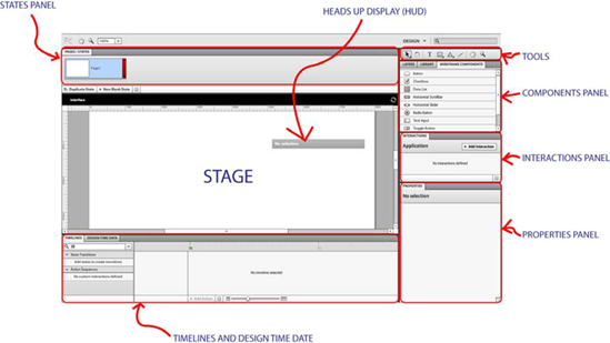
This chapter looks closely at the elements that make up the Flash Catalyst interface and defines the purpose of each panel, to help familiarize you with the interface and related concepts before you dive into the exercises in later chapters.
This section also serves as a reference, so you can come back any time to refresh your memory about the use or definition of any interface element.
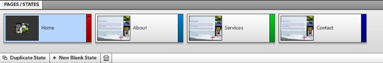
Moving clockwise from upper left, you begin at the Pages/States panel. In Catalyst, pages and states are the same thing. You can think of them as pages if you're used to doing page-based web design. In Flex, these are referred to as states (hence the double naming). If you're familiar with Flash, you can also consider them the keyframes of your application. Although the terms states and pages are interchangeable in the context of Catalyst, it's more common to refer to them as states because, in the background, Catalyst is creating Flex states.
States are essentially the different ways your project appears at a given point. For example, if you built a simple web site containing four sections called Home, About, Services, and Contact, they would be your project's states, as shown in Figure 1-3.
At any given point, one of your states is selected. As you place assets onto the stage, they're included in that state and are copied with it if you duplicate the state. You can think of designing in Catalyst as building out a series of pages/states and then moving through them based on user interaction.
By default, Catalyst names the states you create Page1, Page2, and so on, but it's a good idea to name them something that has more meaning in your application (for example, Home, About, Services, and Contact in Figure 1-3). To change the name of a state, double-click the current name in the Pages/States panel, and type in the new name (see Figure 1-4).

Building out your project involves creating new states for each section of your site. You can do this either by creating a new blank state or by duplicating an existing state. To do so, select one of the two options at the bottom of the Pages/States panel (see Figure 1-5).

The majority of the time, you select Duplicate State, because most sites have a variety of shared assets across multiple states (for example, your background image and menu system are likely to stay consistent across all states).
As you create a design, you often have the same assets in different states in different positions or with different properties. For example, a submenu may be visible in one state and hidden in another state. It can become difficult to manage which asset is in which state and in which position, especially as your project grows and you add new assets to later states. To manage this, Catalyst allows you to share or remove individual assets (or groups of assets) across states.
For example, let's say you're creating the four-state project (Home, About, Services, Contact) used as an example previously. As you're building the Contact state, you decide to add a Home button. You realize that you want this button to also exist in the Services state but not in the Home state. You can select the button and use the menus to select States

As you can see in the States menu, you can also make an asset the same in all states: that means wherever that asset exists, its properties, position, so forth are the same as for the asset you've selected. This is useful when you move an object in one state but want it to be in the exact same position in the other states. You can also remove an asset from a specific state. In other words, when you select an item, if you decide to copy it or delete it, the asset and all its properties are copied or deleted across all states. You can also access this menu by right-clicking an asset.
Catalyst depends heavily on the use of components. Components are objects that have a set of reactions based on user interaction. The simplest of these is a button, but components can also be more complicated, such as check boxes and scrollbars. In Catalyst, the reactions of these components are largely set: a scrollbar responds as a scrollbar, and a check box responds as a check box (although you can also create custom components that give you more control over the interaction, as covered in Chapter 9). A set of all the components in Catalyst with a default aesthetic exist in the Wireframe Components panel that you examine later this chapter, but you can also add custom visuals to components. This is where states come back into play.
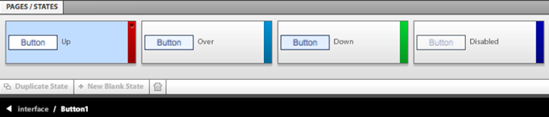
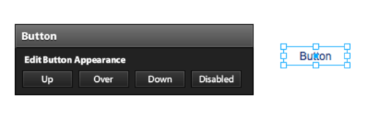
When you're working with components, Catalyst uses the same idea of states and the same methods to control assets across them. If you drag the simplest component, a button, from the Wireframe Components panel onto the stage and open it by double-clicking it, you find that it has four states, as shown in Figure 1-7: Up, Over, Down, and Disabled. These states give any button its visual appearance based on user interaction. For example, the look of the Up state is seen before the user rolls over the button, the Over state is seen on rollover, and the Down state is seen as the user clicks the button.
Other components have a similar set of states that define their appearance. You can customize the contents of these states. Because states make up the basis of the project as a whole and the components in it, the techniques, such as animation, that you learn for states can be applied to animating transitions both in the project and in components.
Chapters 2 and 3 look at buttons and other components in greater depth.
Compared to the tools panels available in other design software such as Photoshop, the Tools panel in Catalyst is pretty bare (see Figure 1-8). This is because most sophisticated graphics work should be done in more specialized programs such as Photoshop, Illustrator, and Fireworks and then brought into Catalyst to make it interactive.
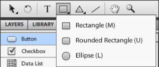
You still have the basics available, and they're very useful for creating assets quickly. The Select, Rectangle/Ellipse, and Shape tools have suboptions that you can access by clicking and holding the top option. Let's look at the tools individually:
Select and Direct Select (Figure 1-9): The Select tool (dark arrow) allows you to select an entire object, whereas the Direct Select tool (light arrow) lets you select individual parts of an object, such as the stroke around a shape.
Transform (Figure 1-10): This tool allows you to change an object's scale, rotation, and center point. Scaling allows you to stretch a graphic object by dragging the square handles around it. You can rotate an object by dragging the handles inward with a circular motion. And you can change the center point by dragging the handle displayed in the middle of the object.
Text tool: The Text tool allows you to create point text or area text. Point text is a text object that begins at one point and continues along a single line until the text is complete. Area text is defined by a bounding box created for the text; a new line begins each time the text reaches the edge of the bounding box. To create point text, click the stage with the text tool selected. To create area text, click and drag to create the bounding box (see Figure 1-11). Note that to contain the text in a defined area, it's best to create area text—if you paste text from another document without using area text, the text often overflows the edges of the stage.
Rectangle/Ellipse (Figure 1-12): To draw using this tool, select the correct variation (for example, Rounded rectangle), and click and drag on the stage. You draw the shape first and then modify its properties (fill color, radius of the corners, and so on) in the Properties panel.
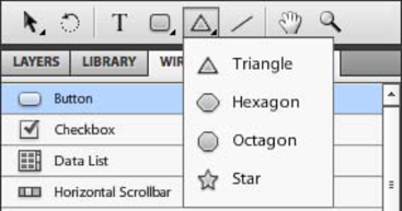
Shape (Figure 1-13): This tool provides some basic shapes (triangle, hexagon, octagon, and star), which are useful if you want to quickly create design elements (such as a Play button) or if you get bored and want to starify your entire design.
Line: Holding down Shift as you draw with the Line tool restricts the tool to drawing on 90 and 45 degree angles.
Hand: The Hand tool allows you to move the stage in the software. You can also access this tool by holding down the spacebar.
Zoom: Select and click the area you want to zoom in on. Hold down Alt (or Option on the Mac) while clicking to zoom out. At upper left in the Catalyst interface, you can see how far you're zoomed in.


In Flash Catalyst's default layout, the Layers, Library, and Wireframe Components panels are conveniently grouped together. As you work with projects, you'll interact with these panels all the time, so let's run through them in detail.
Every asset that is created is given a layer, whether it's created in Catalyst or an outside program. If assets are created externally (in Photoshop or Illustrator), they retain their layer names from the outside program. These layers can quickly become difficult to manage if you don't keep them organized by naming them clearly and grouping multiple layers into sublayers.
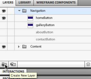
You can rearrange layers by using drag and drop in the Layers panel. When an object is created, such as a button or an image, it's automatically given a layer with an image of the object as the layer thumbnail. Any layer or sublayer you create is given a folder icon. These folder layers are used to organize the other object layers. You can drag and drop object layers into the folder layers (with the folder icons) to better organize your project. Figure 1-14, for example, shows the layers containing each menu button placed in a folder layer named Navigation.

The way a layer is shown in the Layers panel also lets you know which object is visible in the current state. Look at Figure 1-15.

In Figure 1-15, homeButton exists and is visible in the current state, as indicated by the presence of the eye on that layer. galleryButton exists but isn't visible in this state—it isn't grayed out (meaning it exists), but it also doesn't have an eye icon next to it (meaning it isn't visible). Having layers invisible in a state is useful when you're creating transitions away from the state; Chapter 4 looks at this in detail. aboutButton and contactButton don't exist in this state (they're grayed out), but their presence in the Layers panel indicates that they do exist in another state. As long as an object exists in one of the states, it's listed in the Layers panel; this makes it easier to access objects but can also make for a disorganized project if you don't use folder layers to organize them.
To create a new layer, click the Create New Layer button at the bottom of the Layers panel, as shown in Figure 1-16.
The Library panel contains all the components, images, and media that you create in the project. Any components you create based on elements you create in a graphics program are automatically placed in the Library panel. Any images, SWF files, or media files that are imported into the project are also placed in the Library. Figure 1-17 shows the Library panel with four buttons, a set of thumbnail images and a sound clip. If you import a single image, it's placed both on the stage and in the Library, whereas importing a set of images only places them in the Library.

The two buttons at lower left in the Library panel allow you to import and export a library package. Library packages are a way to share project assets across multiple projects. Chapter 9 looks at this in more detail.
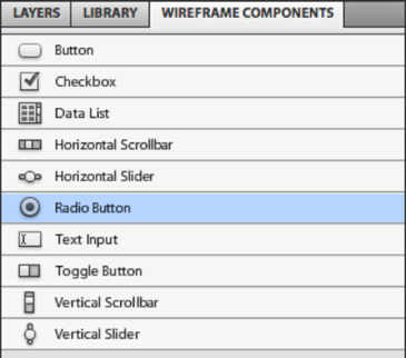
Wireframe components have a low-fidelity look. You can use them to quickly create a project that has the interactions and behaviors of the final application without worrying about the visual appearance of the final product. They're also very useful for getting an understanding of the kinds of components you can create in Catalyst. The Wireframe Components panel presents Catalyst's complete set of built-in components (see Figure 1-18). You can create custom components to extend them, as discussed in Chapter 9.
Wireframes help you create variations of a layout without going into detail on the aesthetics. They're generally used at the start of a project to clarify what is expected in terms of interface and to familiarize all parties involved with the application or web site.
Normally, wireframes are static and don't give a sense of the application's interactions or movement; but with Flash Catalyst, interactions and movement are integrated into the wireframe. This gives you a sense of the user experience much earlier in the process.
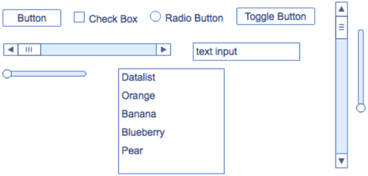
As you can see in Figure 1-19, wireframe components have a basic appearance specifically so that when you create a prototype with them, anyone looking at the design knows that they're placeholders and don't represent the final aesthetic of the planned site. It's similar to giving a design a sketch aesthetic before handing it to a client, so they know the design isn't final.
Chapter 3 looks at the use of wireframe components in detail.
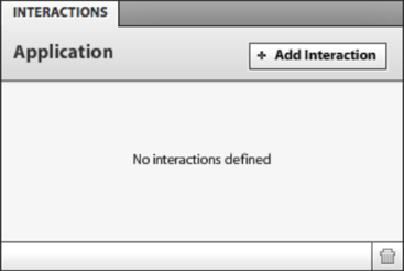
The Interactions panel, shown in Figure 1-20, controls what happens in your application based on user interactions. You can place an interaction on any component or on the application itself. To create an interaction, select the component, and click Add Interaction in the Interactions panel. Doing so brings up a set of combo boxes that define the details of the interaction (see Figure 1-21).

The first combo box defines when you want this action to occur—for example, On Click. The second defines what you want to happen; generally, this involves jumping to a different state (Play Transition to State), but you can also choose Play Action Sequence, open a different web page (Go To URL), or control a video file. The Play Action Sequence option lets you trigger an action while staying in the same state. This is useful to trigger action in a SWF file, play a sound, or change the property of a button in the current state. The most common interaction, though, is Play Transition to State, which is why it's the default setting.
If you're playing a transition to a different state, then the third combo box defines which state you're going to. The fourth combo box defines in which state this interaction holds true. Most of the time, the interaction is true in all states—for example, a contact button always does the same thing regardless of the state in which it's clicked. But in some circumstances, it's useful to have objects do different actions depending on the state. An example of this is a Next button.
The Interactions panel changes slightly based on what is selected. For example, a datagrid allows you to define the interaction when any item is selected or when a specific item is selected.
You can also define interactions for the application, in order to trigger actions on the application start. For example, you can have the navigation elements fade in after the application is loaded.
Chapter 5 looks at the Interactions panel in depth.
The Properties panel holds a wide variety of settings for each component and object in Catalyst. These settings allow you to define the label on a button, control the opacity of a rectangle, and so on. The properties on the panel affect the appearance of a component including blend modes, filters, and whether the component is enabled.
The Properties panel is context specific, meaning that the properties that are listed changed based on what kind of object is selected. Changes in the Properties panel affect the object in the current state only—this means changing the x position of a button in one state doesn't automatically change it in the other states.
A component's properties are broken into categories. The Common and Component categories, shown in Figure 1-22, include the properties that most components carry, whereas the Appearance category includes the blend modes, the focus ring color, and whether the hand cursor is shown on rollover (see Figure 1-23).


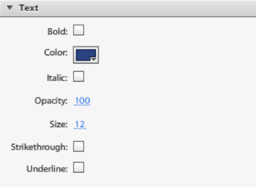
The Text category lets you change the properties of the text in a component, if any (see Figure 1-24).
The final category gives you the object's filter properties (see Figure 1-25). You can apply filters to components, images, and vectors; and you can use multiple filters on a single object.

The Timelines panel is the part of the Catalyst interface that controls animation (see Figure 1-26). Although this panel pulls some ideas from Flash timelines and from Flex transitions and effects, working with animations in Catalyst is considerably different.

You can create animation in two primary ways in Catalyst: by creating transitions between states and by creating action sequences. Transitions between states are more common, so let's start there.
Catalyst projects are made up of multiple pages/states that change based on user interaction (controlled through the Interactions panel). By default, these changes have no animation associated with them, but you can make the changes smooth by adding timeline transitions. The Timelines panel includes a list of all the possible movements between states. For example, if you have two states, you can move from the first to the second or from the second to the first. As the number of states in your project increases, this list grows exponentially.
Figure 1-27 shows the possible state movements for a Catalyst project that has two states. When one of them is selected, the timeline lists all the components that differ between the two states. Figure 1-28 shows that two buttons are different between the two states. The first button exists only in the first state, so Catalyst sets it to have a Fade Out effect. The second button is in a different position on Page2, so Catalyst sets it to have a Move effect. Both of these transitions currently have a duration of 0 seconds. You can extend this either by pulling them out manually or by clicking the Smooth Transition button.


Creating transitions in components (for example, creating a rollover animation for a button) uses the same technique, but it affects the states in the component.
Action sequences are different because they don't involve a change of state. Instead, they can trigger a sound, play a SWF file, or affect a component property while staying in the current state. Changing a component property by using action sequences is done much more rarely that using state transitions, but you can do this to create some unique effects. In Chapter 4, for example, you use action sequences to create a 3D flip effect. Chapter 4 looks closely at animation.
You use the Design-Time Data panel whenever you use a data-list component. Data-list components let you repeat a series of similar objects to create a more complicated object. This comes in very handy when you're creating repeating objects such as thumbnails or menu items. In completed applications, these kinds of elements are often repeated based on live data. The Design-Time Data panel allows you to easily modify the repeated objects so they look similar to live data. Figure 1-29 shows an example of a data-list component.
Creating a data-list component is a multistep process that is shown in detail in Chapter 7; this section just explains it in broad strokes. You first make one instance of the things to be repeated. In the example shown in Figure 1-29, the things to be repeated are an image and two text boxes. When these objects are selected and made into a data list, they're repeated to make a set. Initially, they're all exactly the same. The Design-Time Data panel lets you see the content of each repeated item and easily change an individual item. In Figure 1-29, the second and third images have been changed to make the set look more realistic. The text can also be changed easily to give the impression that it's data being pulled from a database. When the project is handed over to the developer, the design-time data is replaced by live data from a data source.

Also referred to as the artboard, the stage is the main area on which you place components. The size and color of the stage are set when you first create your project and define the project's screen size. Unfortunately, it isn't possible to have a fluid layout in a Catalyst project.
The stage provides rulers that can guide your layout, similar to those in Photoshop and Illustrator. Along the top of the stage, a black bar displays Catalyst's breadcrumb navigation, as shown in Figure 1-30.
The breadcrumb navigation lets you know where you are in the project's nesting. In this case, the Catalyst project is named exampleProject, and you're in the button named buttonExample. When you move into a component, the component name is placed in the breadcrumb navigation, and the rest of the design is slightly grayed out. Clicking a part of the breadcrumb navigation takes you to that level in the nesting.

The final piece of the interface in Catalyst is the Heads-Up Display (HUD). The HUD is unique to Catalyst and gives you context-specific commands related to the object that is currently selected; it essentially tries to guide you through the next logical step of whatever you're currently doing.
For example, if you have an image selected, as in Figure 1-31, the HUD guides you through the next two most likely actions: Convert Artwork to Component and Optimize Artwork.

The HUD is context specific, changing depending on the kind of object selected. Figure 1-32 shows how different the HUD choices are for a button. You'll use the HUD a lot as you work on projects in Flash Catalyst, and you'll find that it significantly increases the speed of your workflow.
As you're doing design work, importing graphic elements, changing properties, adding interactions, and smoothing transitions, Catalyst is busy putting your design into a form that a developer can manipulate into the finished project in Flex Builder. You can look at this code by switching to the code view at upper right in the interface. Figure 1-33 shows a very simple application—the code becomes very complex fairly quickly.

Although you can't change any of the code in the code view, it's useful to look at this area as you import assets and build your project to ensure that it stays as neat as possible for the developer. You do this primarily by using a consistent, clear naming convention for all your components. Naming conventions and other best practices are covered in Chapter 6.
Now that you've had a look around and gotten an initial impression of the tools available to you in Catalyst, you're ready to dive into creating your first project. Whereas this chapter was meant to familiarize you with interface, the next chapter shows you how to move from Illustrator assets into a full interactive animated project. It shows how the various aspects of Catalyst come together to rapidly create a fully functioning prototype. The chapters that follow it drill deeper into specific aspects of Catalyst.