

What we'll cover in this chapter:
Files used in this chapter:
interactions-start.fxpinteractions-complete.fxp
Creating interactions in Catalyst is surprisingly direct and intuitive. This is partially due to Catalyst's focus has on the most common types of interactions, as opposed to trying to provide all possible options, and partially due to the intuitive design of the process. The Interactions panel responds to the type of object that is selected and guides you through the options specific to that component (although many interactions follow a similar pattern).
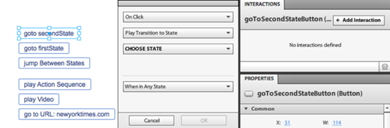
This chapter looks at how to use interactions to control state changes, trigger action sequences, control video, and open outside web sites. To explore these, you begin with the file interactions-start.fxp that is provided with this chapter. This file contains the series of buttons and video component shown in Figure 5-1, but no interactions yet. The design has been kept minimal so that you can focus specifically on the interactions. It contains two states: firstState and secondState. Both states are exactly the same with the exception of the text showing which state the user is currently in.

By far the most common use of interactions in Catalyst is to change states. Catalyst projects change states to move users through the different sections of a design. You create the states by duplicating a state in the States panel. The starter file provided with this chapter has two states created in it already. To create an interaction on a button, you select the button and then add the interaction in the Interactions panel:
Select the first button, goToSecondStateButton. To create an interaction, in the Interactions panel, click Add Interaction to open a dialog box that is specific to that component type (see Figure 5-2).
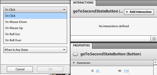
This dialog box provides a set of four (sometimes three) drop-down menus that allow you to define the interaction. The first of these deals with when the action is to occur (see Figure 5-3).
This drop-down gives you a set of the five most common types of interactions that are possible with the component. Most of these options are similar (for example, On Roll Over, On Roll Up, On Mouse Down, and On Mouse Up occur for all components), but some are specific to the component. For example, a button includes On Click; a data list includes On Select, as you see in Chapter 9; and a scrollbar includes On Change. The one exception is an application, which only includes On Application Start. An example of the On Application Start interaction is shown later this chapter.
The next drop-down deals with what is to happen during this interaction (see Figure 5-4).
The first of these, and the most common, is Play Transition to State; this is the interaction you set for the first three buttons in the example. Later, this chapter looks at each of these options.
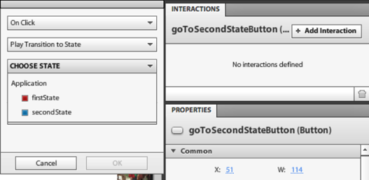
The third drop-down defines which state to play to when Play Transition to State is selected. This drop-down lists all the main states in the project (see Figure 5-5).
The fourth drop-down allows you to define the state in which this interaction is active (see Figure 5-6). The example's third button shows how this is useful.
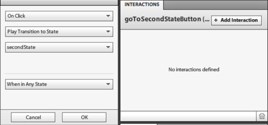
In goToSecondStateButton's Interactions panel, set the interaction to be On Click, Play Transition to State, secondState, When in Any State (see Figure 5-7). This creates an interaction that changes the application's main state to secondState.
To test this, run the project by selecting File

You can use the same technique to create the interactions for the second button, goToFirstState, allowing the user to return to the original firstState:
Select goToFirstStateButton and, in the Interactions panel, set the interaction to be On Click, Play Transition to State, firstState, When in Any State (see Figure 5-8).
Note that it doesn't matter which state the button is in when you create the interaction. A button's interactions are attached to the button itself, not to the state it's currently in. You don't, for example, have to add the interaction to secondState, even though that is where the interaction takes place.
To control whether an interaction occurs in a specific state, you use the last of the drop-downs in the add Interactions dialog box. This is useful if you want clicking a button to have a different effect depending on the state it's in. This is how you create the interactions for the third button, jumpBetweenStatesButton. As the name implies, this button lets the user jump to secondState if they're in the first, and to firstState if they're in the second. Because this is two interactions, you adding two interactions to the same button. It's possible to have multiple interactions on a single component.
Select jumpBetweenStatesButton, and, in the Interactions panel, click Add Interaction. Define the first interaction for this button as On Click, Play Transition to State, firstState, When in secondState, as shown in Figure 5-9. A click of this button transitions the user to secondState; but while in secondState, the button currently does nothing. For this reason, you need a second interaction.
With jumpBetweenStatesButton selected, in the Interactions panel, click Add Interaction. Define this second interaction as On Click, Play Transition to State, secondState, When in firstState, as shown in Figure 5-10.


You've now placed two interactions on the same button (see Figure 5-11). If there is a conflict between interactions on the same button, the one at the bottom, which is read last, overrides the earlier one. An example is shown in Chapter 9.

Run this project to see how the interactions work in the project.
The second major type of interaction that is triggered in Catalyst is the action sequence. As you saw in Chapter 4, an action sequence is a series of actions and animations that run in the current state. Chapter 4 showed how having an action occur while staying in a state can be useful and keep the number of states down. This is especially true if you're doing a simple animation onto a large number of items, such as a series of thumbnails.
To create an action sequence, you first define it in the Interactions panel and then add actions to it. Continue the example as follows:
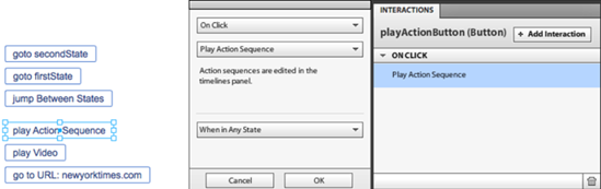
Select playActionButton, and, in the Interactions panel, click Add Interaction. Define the interaction as On Click, Play Action Sequence, When in Any State (see Figure 5-12). Doing so creates an action sequence that is associated with this interaction in the Timelines panel (see Figure 5-13).
You can now add a variety of actions to the action sequence, including sound effects, 3D rotations, and SWF control. Chapter 4 looked at 3D rotation, and Chapter 8 examines sound effects and SWF control. To add an action to the action sequence, you select the object that is to be affected by the action and click Add Action at the bottom of the Timelines panel.
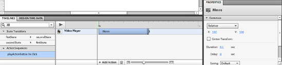
Select the video on the stage, and click Add Action in the Timelines panel. You can add a variety of different kinds of actions here, and Chapter 8 looks at most of them in detail: SWFs, video, and audio. To stay focused on interactions, add a simple Move action (see Figure 5-14).


Adding the move places the action on the timeline for the action sequence. To control the move, select it on the timeline, and change its properties in the Properties panel. By default, the move is 100 pixels down and 100 pixels to the right (see Figure 5-15). You can also define whether the move is relative or to a specific location. When it's defined as relative, a movement begins from wherever the object is. If you define the example movement as relative, it moves 100 pixels down and 100 pixels to the right every time the action is called until it can no longer be seen on the stage. When you define a move as being to a specific location, the X and Y coordinates define the exact location on the stage to which the object moves.
You can add numerous actions to a single action sequence and control the timing and duration of the action in the timeline.
Catalyst creates a video component when a video is imported. You can control this video component either in an action sequence, using the same technique you just used to add the Move action, or from the Interactions panel.
In this example, use playVideoButton to control the video:
Select the button on which the interaction will be placed, in this case playVideoButton. In the Interactions panel, click Add Interaction.
In this case, you want to play a video. Select Play Video in the second drop-down; a new drop-down appears that lets you define which video to play. Because only one video is imported into this project, only one is listed. The final interactions settings should look like Figure 5-16.

The final interaction type available in Catalyst is Go To URL. This command allows you to open a file or site on interaction and control where it opens. In most cases, this takes the form of opening an outside site. In this example, you use gotoUrlButton to open the New York Times web site:
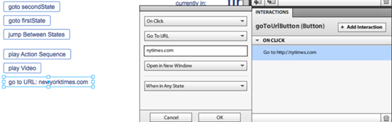
Select gotoUrlButton, and click Add Interaction.
In the options, select On Click, Go To URL. A text box appears in which you can enter the URL. For this example, enter
nytimes.com.The next drop-down lets you define where the site opens: Current Window, New Window, Parent Window (the window that opened the current one), or Top Window (the first window or frame that opened subsequent windows). The last two options are relatively obscure; most of the time, you open a site in either the current window or a new one. Select Open in New Window for this example. The resulting interaction settings look like Figure 5-17.
Generally, interactions are placed on components and triggered by user interactions, but one kind of interaction trigger doesn't follow this model: interactions on the application itself. This particular type of interaction is triggered when the application load is complete. This is very useful when you want some kind of interaction to occur right at the beginning, such as playing a movie, animating the navigation system onto the screen, fading in images, and so on.
In this example, you use the On Application Start interaction to create an action sequence that fades in the video, but any kind of action is possible. To access the On Application Start interaction, click the stage away from any components. When nothing is selected, the Interactions panel defaults to showing the interactions for the application.
Continue as follows:
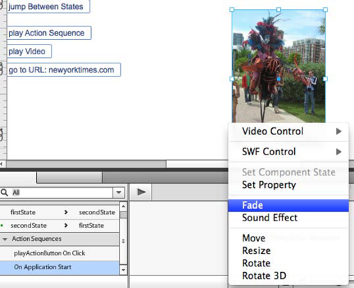
In the Interactions panel, click Add Interaction, and set the interaction to On Application Start, Play Action Sequence (see Figure 5-18). As you saw earlier this chapter, this creates an action sequence in the Timelines panel that allows you to add a variety of kinds of actions. The most common type of interaction on application start fades in the various elements on the stage. In this example, you fade in the video, but this technique works for any and all elements on the stage.
With the action sequence selected in the Timelines panel and the video selected on the stage, click Add Action
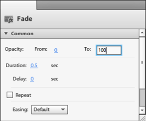
To access the properties for the Fade action, select the fade in the Timelines panel. In the Properties dialog box, set the From value to 0 and the To value to 100, as shown in Figure 5-20.

Run the project (File
In this chapter's example, you've used a variety of different interactions; and, significantly, you've created them without a lick of code. The code is created automatically in the background, in the form of MXML. This allows the interaction designer to focus on creating the experience without needing to pull in a developer at this point.
The next chapter looks at Catalyst best practices so that when it's time for you to pull the developer into the project, the file is clear and usable for them.