
What we'll cover in this chapter:
Animating across states using transitions
Tweaking transitions
Adding custom actions to transitions
Creating actions sequences
Files used in this chapter:
Catalyst is very good at giving you the ability to quickly add animation to a design. This reinforces how the application ultimately responds to the user. It also allows you to finely control and define how the objects respond, rather than passing that work on to the developer.
Animation in Catalyst is primarily done by controlling the changes in object properties across states. If an image is in one position in the first state and in a different position in the second state, you can animate how the image moves between those two positions. This is true of transitions across the application's primary states and in components (such as rollover effects). You can also create animation separate from state transitions by creating action sequences. This chapter looks at all of these topics.
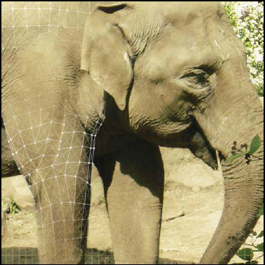
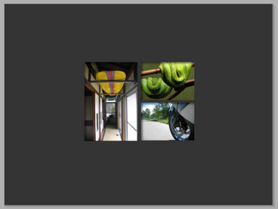
To work through the various kinds of animation features that are available, in this chapter you create an example of a simple interactive magazine layout. You can see the final example at www.greggoralski.com/animationExample (see Figure 4-1) or look at final Catalyst file, animationExample-complete.fxp.
This file has a series of different types of animations including, in the order you create them, rollover and click animations for the three buttons, a state-change animation when the surfButton is clicked, a state-change animation involving 3D rotation, and a series of fade-in effects on the front page that are action sequences.
One of the most common uses of animation in interface design is the creation of rollover and click effects. These can guide users through the interface and let them clearly see when something has been triggered.
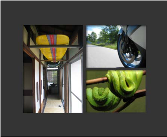
To begin this exercise, open animationExample-start.fxp. You can begin with a blank file if you wish, but this one has a collection of objects in the Library that lets you move more quickly through the example and concentrate on the elements that are important for animation. Look through the file before you begin: it's relatively straightforward, with nothing created on the stage but a variety of objects in the Library. These include buttons, custom components, images, and audio, as shown in Figure 4-2.
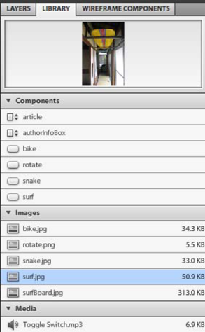
You begin by creating an animated button from a static image, in this case surf.jpg. Follow these step:
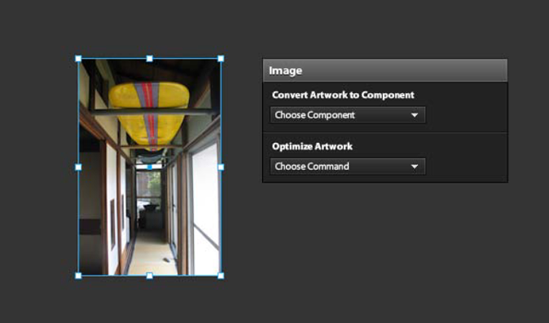
Drag an instance of
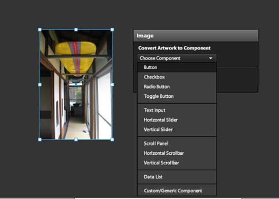
surf.jpgonto the stage (see Figure 4-3). To drag an item out of the Library, select the name in the list and drag it onto the stage.The HUD guides you to convert this image into a component. Select Convert Artwork to Component

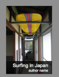
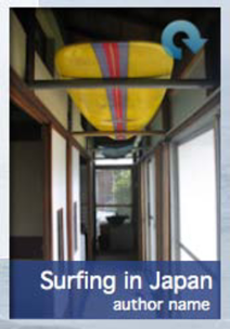
In each state, you draw how you want the button to look at that time. For now, leave the Up state as it is. Select the Over state, and use the Catalyst drawing tools to draw a box. In the box's Properties, set its stroke to None, the fill to black, and Opacity to 80. Using the Text tool, add text over the box as shown in Figure 4-6.
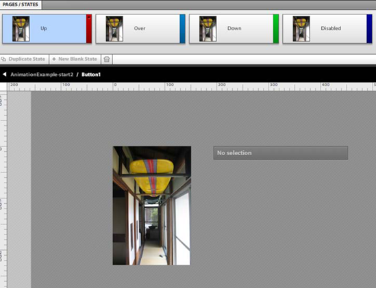
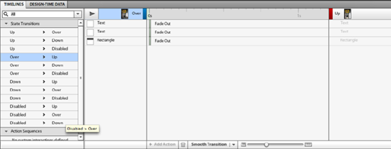
At left in the Timelines panel is a list of all the possible transitions between the states—for example, from Over to Up. If you select Over,
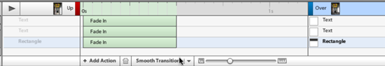
The addition of the box and the two text fields are recognized as differences between the two states that can be animated. Catalyst automatically gives them the most appropriate change (in this case, because not all of the elements exist in the Up state, but they do exist in the Over state, the most appropriate change is a fade). At this point, the changes happen instantly. To make them animated, you need to provide them with a duration. To do so, drag them out (see Figure 4-8, fading the Up to Over state). By default, a timeline of 1 second is shown, but most animations are shorter.
Alternatively, you can click Smooth Transition (see Figure 4-9). Doing so gives a default half-second duration to all undefined animations in the selected state transition. You see how to modify these default settings when you use this technique to make transitions between the main states of a project.
Click Smooth Transition, and then run the project to see how this works.
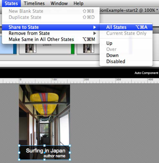
You've created your first rollover effect. Let's tinker with it a bit to see some of the options you can use to affect this transition. The box fades in nicely, but you want it to resize. This kind of effect needs the object to exist in the transition's starting and ending states. This makes logical sense: in order for something to resize, it must be there in the first place. The same applies for changes in position. You eventually have a variation of the box in every state of the button, so you may as well share it with all the states at this point:
To share the box with all the other states, select it and choose States
When you have a copy of the element that needs to change in all the states, you can modify it and smooth the state transitions. Let's start with the Up state. In the Pages/States panel, select the Up state, and scale the box vertically until it's invisible (you can scale a box down to have a height of 0, as shown in Figure 4-11).
In the Timelines panel, select the Up
The animation is closer to what you're looking for, but it's awkward that the text appears before the box opens. You can manually modify the transition's start and duration by dragging the animations on the timelines. To make the texts fade in later than the start of the rectangle resize, move the times as shown in Figure 4-13.
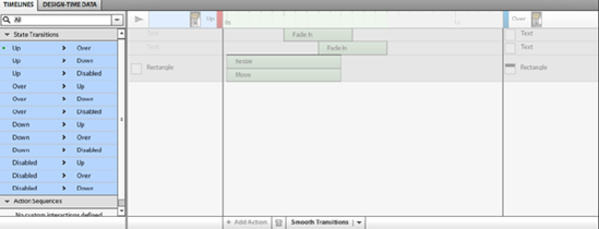
To create the way the box and texts look in the other states, follow the same process: share the elements with the states as needed, modify the elements on each state in a certain way (for example, resize, change color, change opacity), and click Smooth Transition. To make the process less cumbersome, especially when many states are involved, select all of the state transitions and click Smooth Transitions (see Figure 4-14). Doing so inserts a default half-second of smoothing that you can then tweak.
This example uses a trick. If you've tried the completed example, you may have noticed that after the surfButton is clicked, it stays highlighted, reinforcing for the user where they are in the navigation. To get this effect, create the Disabled state to look like a highlighted version of the button. As you build out the next state of the project, you control when the Disabled state is visible by using the button's Enabled property.
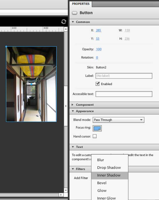
As a finishing touch, add an inner shadow to the button by selecting the button in the main state and then, in the Properties panel, selecting Add Filter
Create the other two buttons using the same process, or use the buttons named Bike and Snake in the Library to save time. A trick to make the process of creating similar buttons faster is to duplicate buttons that you've already created and then modify them. You do this the same way you would in Flash. You can duplicate a button in the Library by right-clicking it and selecting Duplicate; this duplicate of the button can then be edited.
Arrange the three buttons in the first state (see Figure 4-16).
A new layer was automatically created for each button. To keep things clean and organized, name the layers as shown in Figure 4-17.


Catalyst uses the same logic when creating animations between the main states of a project that it does between the states of a button (or any other component). The significant difference with the main states is that they're created by the designer and tend to have more dramatic changes.
Almost all animations in Catalyst are between states. In this case, the animation you focus on is the transition from the cover to an article page—specifically, an article about surfing in Japan. If you look at the completed example, you can see that it involves the buttons moving to new positions while the article and background image fade in. (The article and the background image are in the Library and are named article and beach.jpg.)
To create the animation, follow these steps:
Because you're creating the states, begin start by naming the first state cover as shown in Figure 4-18.
Duplicate the cover state, and name the duplication surfArticle.
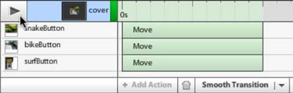
In this new state, you can rearrange and add elements to create the look you want for the surfing article. Move the buttons as shown in Figure 4-19, and notice what happens on the Timelines panel: everything that is different between the two states is listed with the appropriate changes (in this case, Move; see Figure 4-20).
Select the cover
To change the easing of a movement, you can select the movement in the Timelines panel (you can also select multiple movements if required). The Properties panel shows the movement properties, including Duration, Delay, and Easing. By default, Catalyst has a relatively soft in/out easing that generally works quite well. The other options include the following:
Linear: Easing acceleration and deceleration are at a constant rate. You can control the timing of the easing in and out.
Sine: The ease accelerates to a mid point and then decelerates. This creates a movement that feels less artificial and stiff than a Linear ease. You can control the timing of the easing in and out.
Power: Similar to Sine, because it accelerates to a midpoint; but it allows you to control the amount of acceleration and deceleration using the exponent value. The higher the exponent, the more dramatic the acceleration and deceleration. You can control the timing of the easing in and out.
Bounce and Elastic: These options create either a bouncing animation or a rubber-band effect. Because these two easing styles have more movement, you should give them more time, or they look very unnatural.
Drag the background image,
beach.jpg, and the surf article,article, from the Library onto the stage.articleis a custom/generic component that contains a partially transparent rectangle and text fields containing the article and title. Custom/generic components are covered in Chapter 9; in this case, one is used very simply. The article component is merely a way to group the images and text involved in the article into a single component. Initially, the image and the article are on top of the buttons, as shown in Figure 4-22.In the Layers panel, move the layers containing the article and the background image below the buttons, as shown in Figure 4-23.
With these elements on the stage, you can take a closer look at the default smooth transition you've been working with. Clicking the button to the right of Smooth Transition opens a menu that allows you to modify the default animation settings (see Figure 4-24).
In this dialog box, you can define the duration and also the type of timing to use. Simultaneous runs all the effects at the same time, whereas Smart Smoothing runs the animations for elements that exist in the opening state before starting the transitions on the elements that only exist in the finishing state. This change to the default settings becomes the new setting for the Smooth Transition button, allowing you to use these settings for subsequent transitions.
Use the default settings to complete this transition. The design now has the look for two states defined, along with how the animation looks—but it doesn't yet have the interactions. The interactions control when the application changes states. As you saw in Chapter 1, you create them in the Interactions panel.
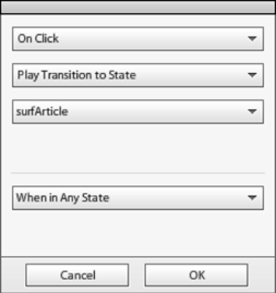
In the first state, select the surfButton. In the Interactions panel, click Add Interaction. Define the interaction as being On Click, Play Transition to State, surfArticle (as shown in Figure 4-25). When you created this button, you gave it a visual for all the states, including the Disabled state. This state serves as your highlighted version.
In the surfArticle state, select the surfButton. In the Properties panel, uncheck Enabled. Test the animation by selecting File
The project should now play the animation when you click the surfButton. To make the other buttons work, repeat the same process for each one.


Although most animations in Catalyst are between states, you can add other animation during a transition. In this example, you add a 3D flip to a normal transition. It's an example of how you can add actions to an existing animation to add complexity.
You can see this effect in the finished project: it's triggered by the Rotation button on top of the surfButton. When the Rotation button is clicked, the surfButton flips like a playing card to reveal a description on the back. The placement of the rotation button is shown in Figure 4-26.
As before, this is a transition between two states, so the first step is the creation of new state based on surfArticle:
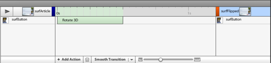
Duplicate the surfArticle state, and name the duplicate surfFlipped. This gives you a new state exactly the same as the surfArticle state. No changes are available in the timeline, but you can add to it.
Select the surfArticle
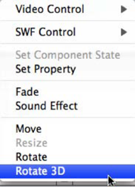
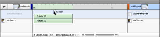
In the list of options are a variety of properties along with SWF, Video, and Sound effects. (Chapter 8 looks at these.) Select Rotate 3D, as shown in Figure 4-29. Doing so creates a 3D rotation movement on the timeline, as shown in Figure 4-30.
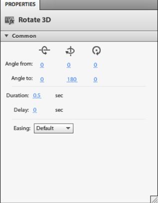
Selecting the 3D rotation lets you see its properties in the Properties panel. You can set how much and along which axis your want the rotation to occur, along with easing and delay if you choose. For this effect, the surfButton needs to rotate halfway (180 degrees) along the x-axis. Set the rotation as shown in Figure 4-31.
Play the animation by clicking the Play button in the Timelines panel to see the effect so far. You see the button rotating in 3D space. Note that even though you're rotating it, it still ends in the same position at the end (because that is how it's defined in the state).
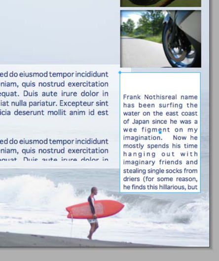
The other half of this effect is the author information that's displayed. To save time, the Library contains a generic component named authorInfoBox that holds the author info. Drag an instance of authorInfoBox directly on top of the surfButton in the surfFlipped state. As shown in Figure 4-32, this creates the appearance of the button when it's flipped. This text is "on the back of the playing card" in this example's analogy.
Select the authorInfoBox, and give it a 3D rotation using the same process but rotating from 180 to 360 degrees (see Figure 4-33). The difference is due to the card moving from being on its back to its front, so that it's face up in the surfFlipped state. You set this in the Properties panel.
With the authorInfoBox, you can play the animation to see it working. Notice that the authorInfoBox stays on top of the surfButton the entire time. This is because there is no z-stacking in Catalyst (that is to say, the layer order doesn't change during transitions).
Because you only want the authorInfoBox to be visible halfway through the animation (when both objects are at 90 degrees to the viewer), move the fade in for the authorInfoBox to be halfway through the animation, as shown in Figure 4-34. This creates the flip animation going from the surfButton to the authorInfoBox whenever the project goes from the surfArticle state to the surfFlipped state.
Note
Don't worry if you set up your action incorrectly, it's a simple thing to fix. In order to remove an action from the Timelines panel, select it and then click on the trash can icon at the bottom of the panel. You can then add the action again.
Use the same technique to create the animation for the reverse flip (from authorInfoBox to surfButton) when the project goes from the surfFlipped state to the surfArticle state. The only difference is that this time, the surfButton needs to flip from 180 to 360 degrees (flip back), and the authorInfoBox goes from 0 to 180 degrees (flips over).
Create similar movements for the surfFlipped to surfArticle state transition using the same technique.


To control the project's movement from the surfArticle state to the surfFlipped state and back, you need a button. This button is available in the Library; use the same technique you used to create the three main buttons. Then, follow these steps:
In the surfFlipped state, drag an instance of the Rotate button onto the authorInfoBox, as shown in Figure 4-35.
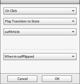
In the Interactions panel, set the interaction for this button to On Click, Play Transition to State, surfArticle, When in surfFlipped (see Figure 4-36). Note the addition of When in surfFlipped. You do this because the button has a slightly different interaction when clicked in the surfArticle state, allowing the same button to jump back and forth between the two states. Run the project to test the effect by selecting File
To have the same button flip the button back, share the button with the surfArticle state and, in the Interactions panel, add the interaction: On Click, Play Transition to State, surfFlipped, When in surfArticle (see Figure 4-37).


A final kind of movement that is possible in Catalyst is the action sequence. An action sequence is an animation or action that happens in a single state as opposed to between two states. Action sequences are triggered by some form of event, usually a click or the completion of the application load, but they don't need a change of state. Because of this, they can be useful in minimizing the number of states in a project.
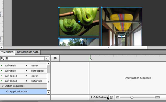
An example of this kind of action sequence is the initial build of the navigation on load. To create any kind of action sequence, you first need to create the interaction that triggers it. The interaction that triggers the action sequence in this example is On Application Start, meaning that as soon as the application finishes loading, this action sequence begins.
Follow these steps:
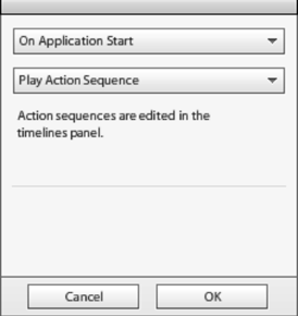
Click anywhere on the application's background. This makes sure the application as a whole is the selected object in the Interactions panel. The Interactions panel now provides the options for adding an interaction to the application. The application can trigger only one kind of event: On Application Start. This event is triggered when all the application elements have been loaded.
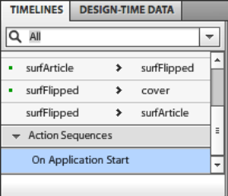
In the Interactions panel, click Add Interaction to create the interaction. Define the interaction as being On Application Start, Play Action Sequence, as shown in Figure 4-38. This creates an empty action sequence below the list of state transitions in the Timelines panel (see Figure 4-39). You can place actions in this action sequence using the same technique you used to create the flip effect earlier in the chapter.
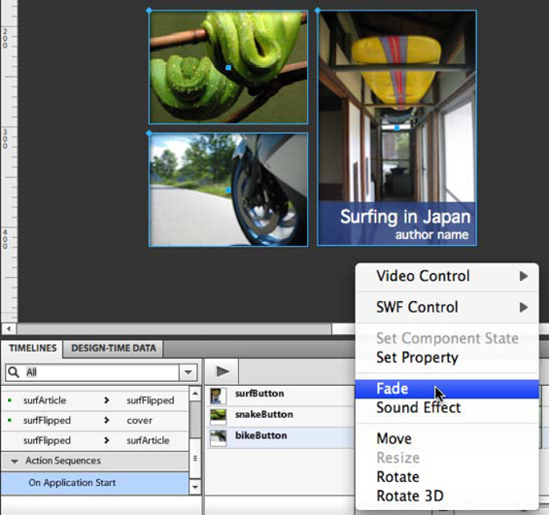
The action sequence you create in this example is a fade in of the three buttons. To create the fades, in the cover state, select all three buttons (Surf, Bike, and Snake) and click Add Action (see Figure 4-40).
From the options that are presented, select Fade, as shown in Figure 4-41.
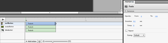
By default, the Fade action fades out the selected objects. To have them fade in, use the Properties panel to set the Opacity of each button's fade to be from 0 to 100 (see Figure 4-42). This creates a fade effect for each of the three buttons when the application finishes loading.
This chapter's example demonstrates the primary ways that animation works in Catalyst. You've seen how most animation in Catalyst is in the form of transitions, with elements changing from one state to the next. Catalyst is very effective at this kind of animation, allowing you to create appropriate transitions quickly using the Smooth Transition button in the Timelines panel. After you create animations, you can tweak them quite a bit.
This chapter also looked at another form of animation: additional actions and action sequences. Additional actions add a movement to an existing transition, and action sequences allow for animation without changing states.
The next chapter looks at how to best organize your assets when you're creating a Catalyst project.