

What we'll cover in this chapter:
Creating custom components
Exporting library packages
Files used in this chapter:
customComponent-start.fxpcustomComponent-complete.fxp
Catalyst comes with a variety of components that cover most interaction situations. These include components such as the button and the horizontal slider, and other components that are included in the wireframe component set and were used in Chapter 3. Inevitably, you stumble onto a situation where these default components aren't appropriate and you want to create a different sort of interaction. This is where custom/generic components come into play.
Custom/generic components are used primarily in two situations. The first of these is when you need to add interactions to an object that doesn't have them; this is the generic type of component. The second is more sophisticated and involves creating custom functionality for a component. You look at an example of this later in this chapter in the form of a custom navigation bar.
The simplest use of the custom/generic component adds interaction to an object that doesn't have it. This is most often the case with images that are used to trigger interactions. As you can see in Figure 9-1, you can't add interactions directly to an image.

By converting the image into a custom/generic component, you can use the image to trigger state changes or action sequences (see Figure 9-2) the same way you use a button component.

To create a custom/generic component from an image or other kind of object, first select the image. Then, in the HUD, select Convert Artwork to Component
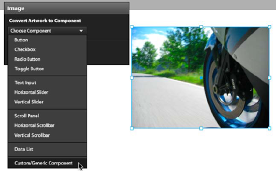
This places the image into a custom/generic component containing a single state (named state1 by default). The resulting component is very simple and doesn't have any unnecessary states or interactions (see Figure 9-4).

A custom component begins much the same way as a generic component, but then you add states and behaviors to create custom functionality. You can wrap a set of objects (images, text, or other components) into a single component and then add states in it. These states can then be changed through interactions to create the component's behavior. This allows you to create unique interactions and minimize the number of states in the main stage. As a result, the project is more manageable.
For example, this approach is particularly useful in animated menu systems. Such a menu system requires multiple states (for the animation), and it usually appears on multiple states/pages throughout the project. By wrapping a menu system in a custom component, you can create sophisticated animation across multiple states while keeping the menu as a single component on the stage.
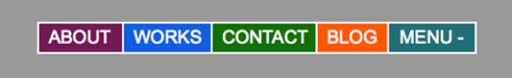
The example in this chapter illustrates by creating a menu system that opens and closes based on user interaction; you can find the complete example at www.greggoralski.com/customComponent. The menu begins closed (see Figure 9-5) and opens when you click Menu + (see Figure 9-6).

You can also select items when the menu is in its compressed state, as shown in Figure 9-7.

To create the menu system, you need four buttons (one for each menu item) and a toggle button, which is used to open and close the menu (see Figure 9-8).

These assets are included in the provided file customMenu-start.fxp. Follow these steps to create the menu:
Open the
customMenu-start.fxpfile in Catalyst, and look at the assets. The four main buttons—About, Works, Contact, and Blog—are all simple buttons. Menu + is a toggle button; it appears as Menu - in its selected state (see Figure 9-9), which indicates to the user that the button is used to open and close the menu.You create a custom component much the same way as any other component. The difference is that instead of selecting one of the standard components in the HUD, you select Custom/Generic Component. Select all the buttons, and, in the HUD, select Convert Artwork to Component
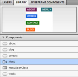
In the Library panel, rename the component Menu (see Figure 9-11).
This new component contains all the assets of the menu but doesn't yet have any custom functionality. The custom functionality in this case consists of opening and closing the menu, along with the way the menu reveals the nested options on rollover.
To create this kind of functionality, you enter the custom component and, using the same techniques you use to create states in the main stage, add states that show how the component is to appear in various circumstances. Then, you create the interactions that reveal those states:
To enter the custom component, either double-click it or select Edit Custom Component Appearance
Change State1's name to Open. This state represents how the custom component appears when it's open.
Rearrange the buttons and the toggle button the way they should appear when the menu is open (see Figure 9-13). In the Properties panel, set the toggle button to be selected; this displays the toggle button as Menu -, indicating that clicking it will close the menu when the menu is open. With the Open state complete, you can now create the Closed state for the menu system.
Click Duplicate State, as shown in Figure 9-14, and name the new state Closed.
Modify the position of the buttons to represent the menu's Closed state, as shown in Figure 9-15. In the Properties panel, set the toggle button to be not selected; this displays the toggle button as Menu +.
You've now created the way you want the custom menu to appear when it's open and when it's closed. The menu also has additional functionality: when it's closed, clicking any of the hidden buttons expands that part of the menu, revealing the clicked button. Figure 9-16 shows how the menu appears when the Works button is rolled over. To give the menu this kind of functionality, you need to create a state that indicates how the menu appears when each button is rolled over:
For each button—About, Works, Contact, and Blog—duplicate the Closed state and adjust the layout so one button at a time is fully visible. For example, make the layout shown in Figure 9-16 into a state named works. The result is four new states, one for each button. Name each new state after the button that's visible in it, as shown in Figure 9-17.


You've now created all the states for the custom component. You can think of this as having created the structure of the component; next, you breathe life into it by adding interactions.
The custom component has six states; Open, Closed, and a state for each of the four buttons. To control when each of these states is visible, you add interactions to the buttons using the same technique you used in Chapter 5.
Let's begin with the About button:
In the custom component, select the About button. In the Interactions panel, click Add Interaction. Doing so brings up the Interactions dialog box, where you can define the interaction for this part of the component. In this case, any time the About button is clicked, you want to transition to the state in which the menu is compressed but shows the About button (the state named about).
In the Interactions dialog box, set the interaction to be On Click
Add similar interactions to the three remaining buttons (Works, Contact, and Blog) by repeating steps 1 and 2 for each.
The state in which you create these interactions doesn't matter, because the interactions for a component stay with the component in all of its states.
Also note that when there are other states on the main stage, they also appear as options to transition to. This allows a button in a custom component to affect not just the states in the component but also those outside of it. This project currently doesn't have a state in the main stage; but if it had one named newState, it would appear as shown in Figure 9-19.
Similarly, the states you create in the custom component are included in the states listed in the Interactions panel for components outside the custom component. This allows outside buttons to affect the states in the custom component.
The toggle button (named menuOpenClose) is slightly different, because it needs to both open and close the menu system:
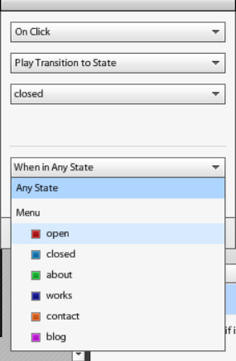
For the toggle button, set the interaction to be On Click
There is only one situation in which you want clicking the toggle button to close the menu: when the menu is already open. Add a second interaction to the toggle button, set to On Click
This interaction closes the menu system when the toggle button in clicked in the Open state. This works despite the second statement conflicting with the first, because the second command overrides the first. A single component in Catalyst can have multiple interactions, with interactions you create later overriding earlier interactions if there are conflicts. For example, the toggle button currently has two interactions, as shown in Figure 9-22. In this case, "Play Transition to closed if in open" comes after "Play Transition to open," overriding it. This example wouldn't work if the two interactions were reversed.
As a final touch, set the menu to animate to the Close state when the application starts. To create this interaction, jump to the project's main stage, and click an empty area of the stage (doing so sets the application as the target of the Interactions panel). In the Interactions panel, set the interaction to On Application Start


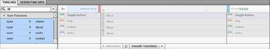
To animate the menu, you need to smooth the transition between the states: in the Timelines panel, select all the transitions, and click Smooth Transitions (see Figure 9-24). Notice that because you now have six states, the list of possible transitions is rather long; but it's preferable to have them encapsulated in the custom component rather than have them add to the number of states on the main stage.
The menu system is now complete. Run the project to see it in action.
Having created the menu system, you may want to share this custom component across multiple Catalyst projects or Flash Builder directly. To do this, you export it as a Library package (FXPL). Library packages contain all the custom components, component skins, and supporting assets of a project but without the MXML file that defines the project's layout (the MXML is created in the background as you lay out your project on the main stage). Essentially, everything in your Library can be wrapped up and passed to multiple projects.
The Export Library Package button is at the bottom of the Library panel, as shown in Figure 2-25.
The Import Library Package button is directly to the left. Clicking it lets you open an FXPL file and import all the visual assets, skins, and custom components it contains.
Creating custom components is a useful technique because you can build a library of assets that you can use over and over again in multiple projects. Flash Catalyst can handle a large variety of projects and use cases, but sometimes the complexity of a project demands that you create an application in Flash Builder. In my experience, this happens the second you feel the need to add a custom micro-architecture: when you modify the code in Flash Builder, it's impossible for Flash Catalyst to account for the changes. Creating as much as possible of your application as separate, reusable components helps you save time skinning parts of the project. Even if you decide to create a project in Flash Builder, you can use Flash Catalyst to export components' Library packages and speed up your project.

With the example of the animated menu, you've seen how to go beyond the set of components that ships with Catalyst and create your own custom components. In most situations, the preexisting components work fine, and they're often faster because they come prebuilt. But it's useful to know that when you want a unique interaction, you can create it in Catalyst using custom components.
In the next chapter, you look at how you can take a project created in Catalyst into Flash Builder to connect it to live data and complete it. In most production processes, a dedicated developer handles the conversion of the Catalyst project into a completed site with live data; but understanding how this works gives you greater insight into how to build Catalyst projects so the process goes more smoothly.