

What we'll cover in this chapter:
Files used in this Chapter:
wireframeComplete.fxp
Chapter 2 looked at how to use a Photoshop file to create an interactive prototype complete with animations. Another major use of Catalyst is the creation of wireframes. In the context of Flash Catalyst, wireframing is the use of simplified, low-fidelity components to quickly sketch out the site and its interaction.
Before you begin building a wireframe in Catalyst, this chapter first talks a bit about sketching and its key characteristics as they apply to Catalyst.
The process of sketching, wireframing, and prototyping is often misunderstood. More often than not, designers confuse the meaning of these terms and their importance in the design and development process.
In the design process, sketching is a way to quickly get ideas down on paper (or screen) and communicate them to other members of the design team. Sketches are quick, cheap, plentiful, and disposable. They're meant to suggest and explore ideas as opposed to being complete designs. They're low fidelity out of necessity (because it would take longer to create properly branded, visually stunning components), but the low fidelity also serves the purpose of communicating that this is one design idea, not the final design idea.
The most common form of sketch, and the one that unifies most design fields, is the paper sketch. Nothing is as quick, cheap, or disposable as a sketch put down on paper (see Figure 3-1). And this form of sketch is an important part of any design process (many a great idea/company was first sketched out on a napkin). But there are some limitations of paper sketches as they apply to interaction design. This is partly due to the importance of motion in interaction design. It matters for the user experience how something moves and reacts to the user. Catalyst tries to cover this limitation by allowing you to create a digital sketch that has the same characteristics as a paper sketch—quick, cheap, plentiful, and disposable—while also including movement and behavior in the sketch. (A detailed look at the power of sketching in interaction is available in Bill Buxton's book Sketching User Experiences.)

As you move through the creation of your first wireframe, keep in mind these characteristics of sketches to see the stages of the design process in which they apply. The wireframing process is a bit different. Wireframing is more about exploring and further refining the concepts that are born out of sketching and also better communicating those concepts to a team.
In a way, Catalyst brings the two processes together. You use wireframe components to quickly sketch out the interaction and movement of an application. The resulting sketch can then also be solidified into a wireframe that is used to define the specifications of the application.
The line dividing sketching, wireframing, and prototyping is faint, and Flash Catalyst makes it even more difficult to separate one from the other. It's important for the designer or developer to manually enforce these stages in the conceptualization of a project.
Whenever possible, take the time to explore interactions, because they add value to the final product. Sometimes, the details that make an application or interface stand out from the rest are discovered in this process.

This chapter explores wireframing and prototyping a simple conference site. You create wireframes for the different pages that make up the site. The chapter focuses on creating interactive wireframes rather than visual design. You also become more familiar with the diversity of prebuilt components in Catalyst, because the wireframe components are merely low-fidelity versions of the full components that are available. After you've completed this chapter, you'll understand how to harness the wireframing and prototyping capabilities of Adobe Flash Catalyst to use them in your own projects.
Let's begin by creating a new Catalyst file. In the example in Chapter 2, you created a project based on a Photoshop file that already included the visuals for your project. Here, you start with a blank slate; and sketch a design for a Catalyst conference primarily using the drawing tools and wireframe components contained in Catalyst. Follow these steps:
Select Create New Project

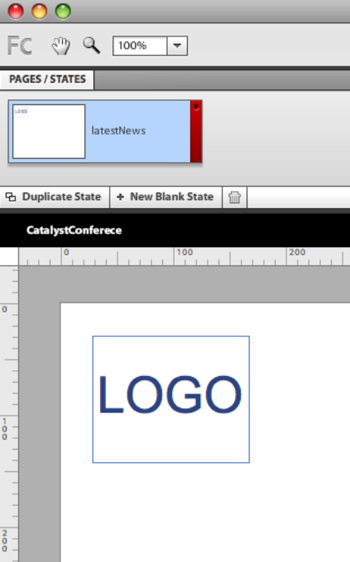
You begin with a blank document. Along the top, the default page/state is named Page1. To make it a bit clearer, double-click Page1, and rename it latestNews (see Figure 3-4). This is the first page of your application, which shows the latest news regarding the conference.
At upper right in the interface are Catalyst's drawing tools. In a sketch, you can use the drawing tools to define specific areas and the layout of the overall design. Use the Rectangle drawing tool to specify the area that will ultimately be occupied by the logo in the design, as shown in Figure 3-5.
The default settings for a rectangle in Catalyst are white fill with a 1 px blue stroke. It's a good idea to maintain this default setting for your drawn elements because it's consistent with the visual style of the wireframe components and it reinforces the idea that color isn't an important part of the sketch. Instead, you want anyone who looks at this sketch to give feedback about the sections, movement, and interactions. The visual design and branding should come further down the design process.
To make it clear what this section is for, use the text tool to write the word LOGO inside the rectangle. Using the Properties panel, change the font size of the word to better match the rectangle, as shown in Figure 3-6.
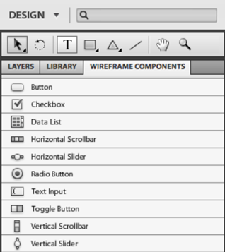
In Chapter 2, you looked at how to create a button based on art that was previously created in Photoshop. But in a wireframe, you're specifically trying not to focus attention on the visual design of the components. Instead, you're trying to keep attention focused on the structure and behavior of the wireframe. For this reason, you want to use generic-looking components. Catalyst provides a set of components with a generic look in the Wireframe Components panel, directly below the Tools panel at upper right in the interface (see Figure 3-7).
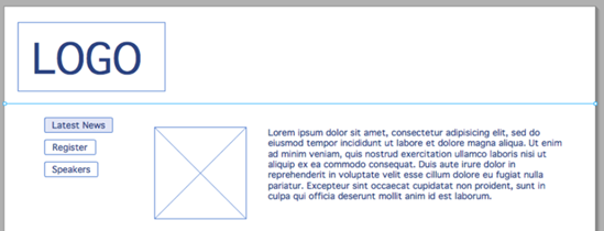
Let's continue building out this first page design, starting with the menu. You saw a basic button in Chapter 2, so let's use a slightly more sophisticated button here. In this example, you use a toggle button to create the main menu.
Drag an instance of the Toggle Button component from the Wireframe Components panel onto the stage, placing it below the logo as shown in Figure 3-8.
A toggle button is similar to a regular button except that it has a different look when it's selected. You can test this by running the project as it's set up so far (File
Inside, you can see the states that are available for a toggle button. There are the same states you saw in a regular button (Up, Over, Down, and Disabled) and an additional set representing the button in its selected state (Selected, Up; Selected, Over; Selected, Down; and Selected, Disabled). Figure 3-9 shows the look of the toggle button in each of its states. If you're creating a toggle button from artwork, you can modify each state. Radio buttons and check boxes share this same state structure.
Let's look at the toggle button's properties. You can find the Properties panel at right in the interface below the Interactions panel. Because you're trying to stick with a generic look for your components, the only properties you want to change are Label and Selected (see Figure 3-10).
For the toggle button, set the Label property to Latest News. Select the Selected check box, to make this toggle button selected on this page/state. By having the button for each state selected, you create the look of a highlighted menu item for that page.
This wireframe has two more sections: Register (in which you use the wireframe components to create a page to elicit info from the user) and Speakers (in which you use the Data List component to create a layout for speaker information). Each section needs a toggle button.
Create two more toggle buttons below the first one. Set their labels to Register and Speakers. Don't select the Selected check box for either. The result should look like Figure 3-11.
In the first state/page, you define the layout for a simple news page. Essentially, each news item consists of an image, a title, and the body text. To keep things simple, and to reinforce that speed is important for wireframing, in this example you create these by using the drawing and text tools in Catalyst's Tools panel. Create the image area by drawing a rectangle with two lines though it. Create a text area by using the Text tool: click and drag to define the size of the text area. Fill the text area with Loren Ipsum text (you can generate some at
www.lipsum.com). You can also create the title using the Text tool, but we've just left a single text box that will include the title and body text. There is no need to tinker with the fonts, because the emphasis is on speed and a generic look. Create a line along the top to define the edge of the news item. Figure 3-12 shows the result.Duplicate the elements of the news item so you can better see what the page would look like with multiple news items. To do so, select the elements and use copy (Ctrl-C) and paste (Ctrl-V). See Figure 3-13.
This wraps up the first state/page. Because many of the elements of the design in the first state are also in the second, you use the first as a base.
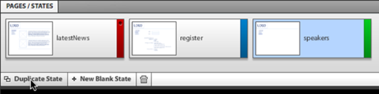
Click Duplicate State in the Pages/States panel (see Figure 3-14), and rename the new state register. Delete the news items to make room for other elements.
This area lets you play with the other types of components that are available in Catalyst. Figure 3-15 shows an example of the kind of registration layout you can create in this page. You should be less concerned with the particulars of the layout than with the use of specific components. The set of wireframe components includes a good diversity of the most common interface elements but definitely not all you may require. Chapter 9 looks at creating custom components, but for now, let's get acquainted with the components that are predefined.
The layout in Figure 3-15 uses the Text Input, Check Box, and Radio Button components along with the text objects and drawn elements you're already familiar with. To maintain the speed and generic look of the wireframe, they're all placed on the stage with their default appearance.
The Text Input component is relatively straightforward. It has only two states: Normal and Disabled (see Figure 3-16).
The Check Box and Radio Button components have a similar structure and functionality but with one critical difference. When you place check boxes on the stage, they act independently of each other, allowing any or all of them to be checked at one time. On the other hand, radio buttons act as a set: only one radio button in a set can be selected at any given moment. To have two sets of radio buttons, you need different radio button groups (see Figure 3-16).
Make the Register toggle button selected and the Latest News toggle button not selected. Doing so highlights the Register button whenever the user is on this state.
The third state you need to create is the Speakers page. This page uses the most versatile of Catalyst's components: the Data List component.
Duplicate the register state, and rename it speakers (see Figure 3-18). Delete the elements you created on the registration page.
In most applications, you create lists of some kind. You generally need to sort relevant information and group this information in a logical order. You may group together, for example, names, pictures, numbers, prices, and so on, or even a combination of these mixed together. This is why Catalyst provides the Data List component.
The Data List component is highly useful and versatile because it can take simple elements and components and repeat them, creating a more sophisticated component. You can create design-time data, giving the impression of having live data in the prototype. This component is also useful for creating more complex navigational elements, as you explore in Chapter 7. In this example, you use a data list to create a list of the speakers.
Create a single speaker entry using the drawing and text tools, as shown in Figure 3-19. Again, Lorem Ipsum text is fine for the content.
Select all the elements for the speaker entry, and in the HUD, select Convert Artwork to Component
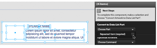
The data list needs to know more about what in the selection should be repeated. The HUD is very useful at this point, because it guides you through the process. In the HUD, select Edit Parts; you find yourself inside the Data List component.
Select all the elements. In the HUD, select Convert to Data List Part
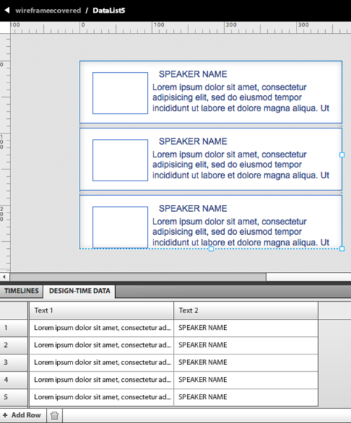
The list in the Design-Time Data panel shows all the elements that are repeated. You can change these values manually by double-clicking any of the fields. You can modify text as well as images. When you click an image, you're offered the option to select another image from the library. Keep in mind that all of this data is for simulation only—the developer will replace these values with dynamic data later in the development process.
Data lists also offer the possibility of adding a scrollbar from a custom component.
Because the data list is the most sophisticated of the components, many properties and tricks are involved with its use; Chapter 7 looks at these in detail. For this example, you can stick with the default settings (see Figure 3-22).
Expand the bounding box of the Data List component so that all the elements are visible (see Figure 3-23). On this page/state, make sure the Speakers toggle button is selected. Now is also a good time to add the interactions to the toggle buttons to navigate through the states.
To create an interaction for a button, select the button, and, in the Interactions panel, click Add Interaction. Select the appropriate state name from the Choose State pull-down menu, as shown in Figure 3-24.
Repeat this process for each of the three toggle buttons. Then, run the project (File


So far, you've created a wireframe that shows the sections of the application and the layout of the major elements. In the next section, you add motion to the wireframe.
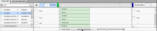
The repeated items in the Data List component have an Over effect. This indicates that the data list can have interactions associated with it. In this example, you create an expanded version of the speaker information: you add movement to the transition, because the user is affected by how the expanded information appears. Follow these steps:
Duplicate the speakers state, and name it speakersExtended (see Figure 3-25).
In this state, move the data list over to create a bit of space, and create a layout for the expanded speaker information using the drawing and text tools as shown in Figure 3-26.
For the animation, you want to create the impression that the expanded information about the speakers is coming out from behind the data list. This involves a fade and a change in x position. A fade is available pretty universally for the elements in Catalyst; but to create a change in position, you need a starting point and an ending point. The ending point is the location of the elements in the state you're transitioning to, whereas the starting point is the location of the elements in the state you're transitioning from. Because the elements currently exist only in the speakersExtended state, you need to also place them on the speakers state. This situation comes up quite often in Catalyst, and the developers at Adobe created an easy way to copy elements to other states.
Select all the elements that make up the expanded information for the speaker, and right-click them. Select Share To State
To smooth the transition between the speakers state and the speakersExtended state, open the Timelines panel at the bottom of the interface. In the list of timelines, select speakers
Add to the data list an interaction to transition to the speakersExtended state, using the same technique you used for the toggle buttons earlier in the chapter.
Run the project.


When you've had some practice with wireframing, creating a wireframe like this should take you about an hour. Much more than that, and you're likely making it too much like the final product; and much less than that, and your mouse might catch fire! The emphasis is on illustrating ideas quickly and being able to share them quickly. Because Catalyst allows you to create wireframes so quickly, you can create more of them, and you don't become overly tied to your first ideas. The more ideas you have at the beginning stage of your design phase, the better the final results are likely to be.
Note that Adobe Flash Catalyst may not necessarily have wireframe components to suit all your needs. You may also want to create custom images to serve as place holders, or use the drawing tools to quickly create your own wireframe components.
Wireframes are meant to test ideas. After you've decided on a design, it's generally better to start with a clean file in Illustrator or Photoshop and create the prototype as you did in Chapter 2, rather than trying to add graphics to a wireframe. This may seem surprising—Catalyst allows for the very quick creation of components from graphics, but it can be cumbersome to add graphics to wireframes