

What we'll cover in this chapter:
Creating Data Lists
Modifying design-time data
Adding a horizontal scrollbar to a data list
Files used in this chapter:
DataListAndDesignTimeData-complete.fxp
Six images
Designing a site often involves using a repeated set of similar objects. This is true whether the repeated items are thumbnails in a gallery, posts in a blog, items on a product site, or dates on a calendar. Often, these repeated items are created based on external data from XML or server-side data. This is a mainstay of web design and makes for easily updatable and expandable pages. The challenge for the interaction designer at the start of a project is to create the look and behavior of the repeated items without requiring the outside data source to be created. Catalyst deals with this challenge through the use of Data Lists to repeat items and design-time data to give the impression that an outside data source exists.
Data Lists are components that repeat a set of objects a number of times to create a set. The simplest way to imagine this is to think about creating a photographer's site. Rather than individually creating each photograph thumbnail, you can create one and, using the Data List component, have it repeat as many times as you require. You can then control the layout of the thumbnails through the Data List component rather than manually repositioning all the thumbnails if the design changes. The Data List component allows you to change the orientation of the repeated items (such as horizontal, vertical, or tile) as well as the spacing between repeated items and the padding of the gallery as a whole. This makes it easier to create and modify your design; but more important, it makes it easier for the developer to connect your design with an external data source. Later in this chapter, you see how a developer can bring in the external data while maintaining the behavior and animation you create.
Design-time data allows you to modify the content of each repeated item so that it appears to be pulling from an external data source. To continue with the photographer site example, design-time data lets you change the image of each thumbnail easily to give the impression of a complete gallery rather than one repeated image. As you see in this chapter, this quick change of the content of the repeated item lets you make each one unique while maintaining any animation and behavior that you created on the first repeated item. The design-time data is later replaced with live data by the developer in Flash Builder.
In this chapter, you explore the Data List component and design-time data by creating a very simple bookstore prototype. The bookstore includes a series of repeated books complete with author name and information, rollover effects, scrollbar, and interaction. The visual appearance of this example is kept simple so it's easier to focus on how the Data List and design-time data function. The final result is shown in Figure 7-1. The completed project is provided with the files for this chapter.

You begin by creating a new Catalyst project as you've done for previous examples:
In the initial dialog box, select Create New Project

Import the six images that represent the books in your bookstore. These are the six JPG files provided with this example. Import them by choosing File


Data List components are an effective way to manage the repeating items that are so common in interface design. Creating a Data List begins by creating a single item in the list. It can be simple, as with a single image, or sophisticated, involving several components. You then develop this single item, modifying the look of the item for its Over and Selected states, as well as adding animation.
For this example, the repeated item includes the book cover image and text boxes for the author name and release date. Although the author name and release date aren't visible until rollover, it's best to create your repeated item with all the pieces right away so they're included in the design-time data (which is covered later this chapter). If you miss an element, you can add it to the design-time data later. This example looks at how this is done.
At this point, the project has in its Library the six book covers you imported. To create the first repeated item, follow these steps:
Place the first of the six book covers onto the stage, as shown in Figure 7-4. To bring an image from the Library, select the file name and drag it onto the stage.
The image is a bit large for a thumbnail and needs to be scaled down. (The original image is large because you use a larger version of the image later in the design.) Using the bounding-box handles, scale the image to be about 125 px wide by 165 px tall. Holding the Shift button as you scale the image maintains the aspect ratio, preventing it from distorting. You can also change the scale by entering the size of the image into the Properties panel.
Next, you need to add the other elements that make up the repeated item. For this design, you want to display the author name and release date when the user rolls over the cover. It's easiest to create at the start all the elements that go into the repeated item, although it's possible to add elements afterward.
Using the Text tool, add the text for the author name and release date, as shown in Figure 7-5. Because the content of the author name and release date text areas change for each author, draw the text area the width of the image, and set the alignment to Center (as opposed to creating it as point text).


You now have the all the elements for your repeated item. The next steps involve making these into a data list and then defining which items to repeat in the design-time data. This process is largely guided by the Heads-Up Display (HUD):
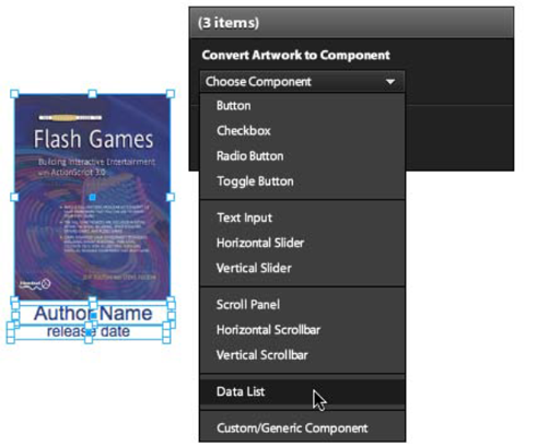
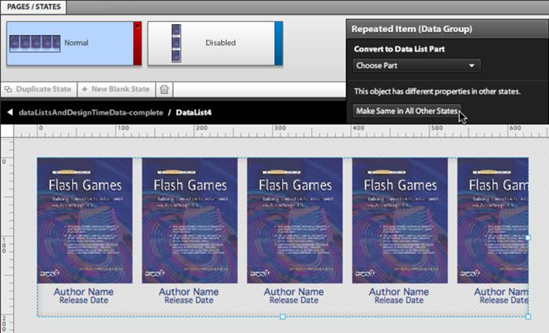
Select all three items that you've created. Using the HUD, convert them into a Data List, as shown in Figure 7-6.
Because a Data List is a more complicated component than, say, a button, Catalyst needs a bit more information to know how to properly convert the visual assets into a data list. The HUD attempts to guide you through this process. Specifically, Catalyst needs you to identify which of the items are repeated.
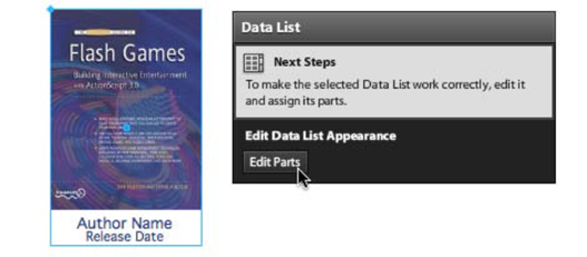
In the HUD, click Edit Parts, as shown in Figure 7-7. Doing so brings you inside the Data List component.
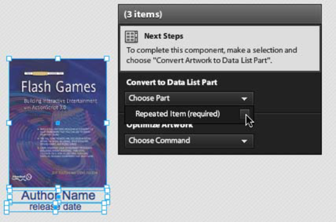
Because you want to repeat all the items, select them all. In the HUD, select Choose Part
The book cover and two text areas are now repeated to create a functioning Data List. The next steps are modifying the look of the Data List and then changing its design-time data.
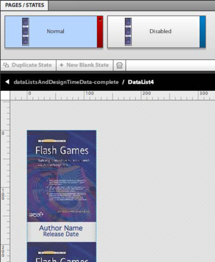
Let's take a minute and look at what you've created. By default, the Data List created five identical repeated items and placed them in a vertical alignment. Your design should currently look similar to Figure 7-9: you can see three copies of the book cover and text that you created. Only these three are visible because the bounding box of the Data List cuts off the other two.
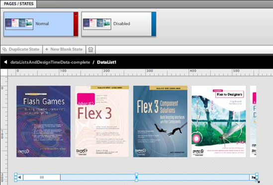
The Data List has also created two states, Normal and Disabled, as shown in Figure 7-10.
These two states affect how the Data List appears overall when it's in its Normal and Disabled settings. As you see later this chapter, the Data List has also created nested states that let you affect the rollover and selected setting for the repeated items.
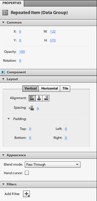
Looking through the Properties panel for the Data List, shown in Figure 7-11, gives you a good indication what kinds of modifications are possible for this component. The most important settings are the Layout properties.
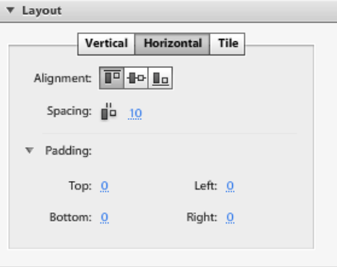
You can control the Data List's layout by defining it as Vertical, Horizontal, or Tile. This design uses a horizontal layout; you add a scrollbar later. Because each repeated item in the design has the same height, the alignment settings have no impact. You can also change the spacing between the items. For this design, a 10 px space between the items works well:
Set the Data List to a Horizontal layout, and set the Spacing to be 10, as shown in Figure 7-12.
At first, it appears that only one instance of the repeated item remains, because the bounding box doesn't automatically change with the bounding box of the Data List. You must do this manually:
Adjust the Data List's bounding box by dragging the handle, as shown in Figure 7-13. Note that it doesn't need to show all the items. You add a horizontal scrollbar later, so you can have items be outside the bounding box. Notice that the change in the layout only affects the Normal state—the Disabled state remains vertically aligned.
To have the same layout and bounding box for the Normal and Disabled states, select the Data List in the Normal state and select Make Same in All Other States in the HUD, as shown in Figure 7-14.


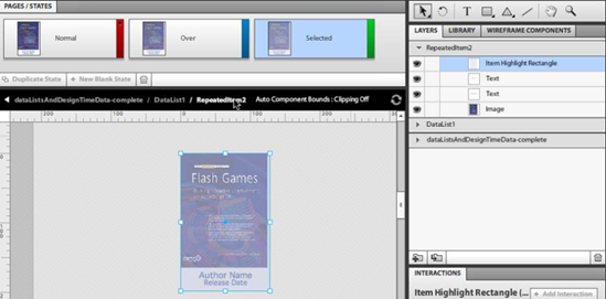
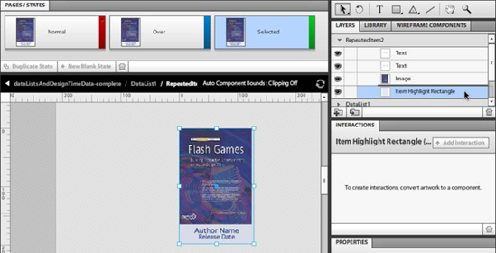
In addition to the Normal and Disabled states of the Data List as a whole, a Data List also creates a set of three states to control the appearance of the selected item. These states are called Normal, Over, and Selected. Just as you've seen with the states in of a button in previous chapters, these states affect how the repeated item appears based on user interaction. Unlike buttons, these states also automatically add an Item Highlight Rectangle that creates an automatic difference between the states.
Follow these steps:
To change the states for the repeated items, double-click one of them. This brings you into one repeated item and makes the others disappear temporarily. It doesn't matter which of the repeated items you double-click, because any changes to the states of one are included in all. The states at the beginning are the same with the exception of Item Highlight Rectangle.
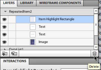
Figure 7-15 shows the Item Highlight Rectangle on the stage and in the Layers panel. By default, this is a blue rectangle that is transparent in the Normal state, has a 30% opacity on the Over state, and has 50% opacity on the Selected state. This gives an automatic, if generic, highlighting to the Data List. You can test what this looks like in the browser by running the project (File
As you can see in Figure 7-15, the Item Highlight Rectangle is placed on top of the image and text you created. This makes the image and text look washed out in your design. You can either remove the Item Highlight Rectangle completely by deleting it in the Layers panel (see Figure 7-16) or drag it below the other layers so the highlighting still exists but is behind the other elements.
For this example, move the Item Highlight Rectangle below the other elements so the highlighting remains but doesn't affect the clarity of the image (see Figure 7-17).
This design has the author name and release date move into position from behind the image on rollover and gives the image a drop shadow when selected. And because this is Catalyst, you animate between them.
The method of creating transitions for a repeated item follows the same process you saw in Chapter 4 and can include the same kinds of animation. As you saw in that chapter, you can do some complex animations with Catalyst. Because this chapter is more about working with Data Lists and design-time data, the animations are simple. Begin with the Normal state:
In the Normal state, the author name and release date are behind the image (so they can move into position in the Over state) Move the author name and release date text so that they're behind the image, as shown in Figure 7-18.
Nothing needs to be changed in the Over state, because it should look the way it did when you created it. The Selected state for a repeated item defines how the item looks after the user clicks that item. In a Data List, the last item clicked stays selected. To make it more obvious to the user which item is selected, you can affect the appearance of the Selected state:
In the Selected state, add a drop shadow effect to the image. To do so, add a Drop Shadow filter in the Properties panel, as shown in Figure 7-19.
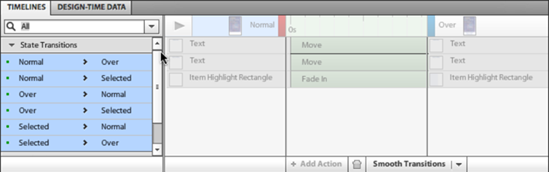
You can animate the transitions between states the same way you explored in Chapter 4. Smooth the transitions between the state changes in the Timelines panel, selecting all state transitions and clicking Smooth Transitions as shown in Figure 7-20. Doing so animates the movement of the text and changes the alpha of the Item Highlighting Rectangle, but not the Drop Shadow filter.


Now is a good time to test your project to see how things are working (File
This gives you an impression of what the final experience could be, but using identical images and text for each repeated item limits this. To get closer to the final experience of the site, you need different content in each of the repeated items. This is where design-time data comes in.
Design-time data is sample data that you can work with during the design phase in place of live data. Catalyst makes it very simple to change identical repeated items into a set of repeated items that better represents what the final project will look like while maintaining the behavior and animations you created for the first repeated item. It does this by changing the underlying data of the repeated item. For example, it changes the content of the text areas and the image, but the animations, drop shadows, and so on remain.
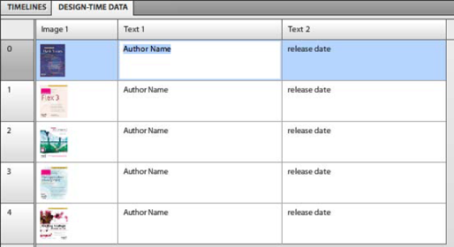
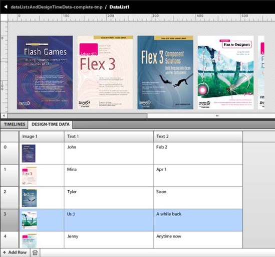
You can see this data on the Design-Time Data panel next to the Timelines panel. This data is structured the same way it would be if it was being brought in from an outside source. Figure 7-21 shows that the underlying data for the Data List is currently identical for each repeated item.

To change the content for a given item, click it in the Design-Time Data panel; you're then presented with the most appropriate method of changing that kind of data. For images, this takes the form of a dialog box that lists the images in the Library and gives you the ability to import more (see Figure 7-22). Selecting a different book cover image from this list replaces the original image. The new image maintains the animations and filters of the original image and also fills the same bounding box. This means the image scales to fit the space that exists for the original image.

Follow these steps:
Use the Select Asset dialog box to change the images to different images than those you previously imported.
Selecting a text area allows you to directly modify the text in it, as shown in Figure 7-23.
Change the content Author Name and Release Date text areas by clicking each and entering new data (see Figure 7-24).
You can see from how quickly you can change the content that after you create the structure and animations of a Data List, it's very easy to modify. It's also easy to add repeated items to the Data List. If you want to add another book to this Data List, all you need to do is add a row to the design-time data:
Add a repeated item by clicking the Add Row button at lower left in the Design-Time Data panel, as shown in Figure 7-25.
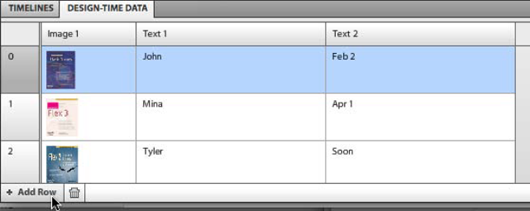
This creates a duplicate of the selected row that you can then modify. The new item also has all the animations and behaviors of the repeated item. This technique can serve as a quick method of working with recurring items in a design, especially if you have a large number of recurring items. But the biggest benefit comes later in the production process when the developer begins to work with the file. If you created each repeating item on its own—a button, for example—the developer would essentially have to re-create your layout and animations using live data.
But because the design-time data is structured the same as live data, the developer can swap the data. To see this, look at the code that was created for the Data List. As previously mentioned, all the work Catalyst does is captured in the form of MXML a markup language that developers can easily manipulate in Flash Builder. Figure 7-26 shows the design-time data for the Data List you just created.

The highlighted parts of the code can be easily substituted by a repeater that enters live data from a database. The behaviors and animations you created are maintained exactly as they were in Catalyst.
With repeating items, you may find yourself in a situation where there are too many items for the space available. Usually, the answer to this kind of problem is the addition of a scrollbar. Adding one to a Data List is surprisingly straightforward: it involves placing a scrollbar inside the Data List, aligning it, and sizing it.
Here are the steps:
Double-click the component to enter it. In the Normal state, drag a horizontal scrollbar below the repeated items from the Wireframe Components panel (see Figure 7-27). You using a wireframe component here, but a custom-built one would work just as well.
Scale the scrollbar as shown in Figure 7-28, using the bounding-box handles. It's positioned a bit low so there is room for the rollover text.

And that, surprisingly, is all you need to do to add a scrollbar to a Data List. Run the project (File
This chapter looked at how you can repeat a single item in a design using the Data List component to create a set. By changing the repeated item, you can create a wide variety of interface elements, from galleries to blog posts to calendars. Each of them is similar because they're all created through the repetition of a singular item.
You also looked at how to use design-time data to substitute for live data during the design phase, allowing for the project to appear closer to the final product without a developer getting involved.
The next chapter looks at how to bring in video, audio, and SWFs to create a more compelling experience for the user.