
Windows Forms offers a way to build Windows desktop applications using the .NET Framework. This may sound rather familiar if you’re reading the chapters in order—surely WPF does that? The two technologies do overlap, but they work very differently. Windows Forms is essentially a wrapper around the classic Win32-based UI: when you create a Windows Forms text box, you get an ordinary Windows text box with a .NET wrapper. That’s not true in WPF—in order to escape the limitations of the Win32 UI its controls are all rebuilt from scratch. So while they go to great lengths to look and behave like their Win32 counterparts, they’re not based on them. (And Silverlight can run on Mac OS X, so it’s clearly not dependent on any of the Windows common controls either.)
Since WPF rebuilds so much of the UI infrastructure from the ground up, it took awhile to emerge—it only appeared in .NET version 3.0, almost half a decade after .NET 1.0 shipped. Windows Forms was available from day one, presumably due in part to its less ambitious scope—since Windows provided the underpinnings it has less to do than WPF.
While this history explains how we ended up with two different technologies for building Windows desktop applications in C#, it leaves the question: why might you care about Windows Forms today? WPF was invented to get away from some limitations of the underlying Win32 UI system, so it’s more powerful than Windows Forms, but Windows Forms offers a couple of advantages.
First, because Windows Forms was around long before WPF, it’s very well supported, both by Microsoft’s tools and by third parties. In Visual Studio, the Windows Forms designer is more mature than the WPF one—in Windows Forms, you can get a higher proportion of things done in the designer than in WPF, where you can end up needing to do more things by hand in C# or Xaml. And if you’re looking to reuse existing controls, you might be able to find Windows Forms controls that offer more of the features you would like than the nearest WPF equivalent. (You can mix WPF and Windows Forms in a single application, so you might end up using a Windows Forms control in a WPF application, although using two different UI frameworks can complicate your program.)
The second advantage of Windows Forms is that it tends to be somewhat more frugal. WPF applications often have a larger memory footprint than an equivalent application would in Windows Forms. Of course, it’s not always possible to build an equivalent application in Windows Forms, but if you’re not exploiting any of the potential benefits of WPF, you may be paying for things you don’t need. If your application needs to run on older machines with low specifications, this may be the deciding factor.
If neither of these benefits is useful to you, WPF is likely to be a better choice. Windows Forms lacks WPF’s powerful composition-based model, exemplified by the content model and powerful template system. Windows Forms is less strong graphically, and has no animation support. It doesn’t have styling features, has a much more basic data binding system, and has no equivalent of Xaml, which seems to have had the result that very few tools outside of Visual Studio offer any kind of Windows Forms support, whereas tools that can export to Xaml are rather more widespread. (And while it’s technically possible to create Windows Forms user interfaces in Xaml, Visual Studio doesn’t support this, and it’s rather cumbersome because Windows Forms was not designed with Xaml in mind.) Moreover, Microsoft has indicated that Windows Forms is unlikely to see much significant new development—it will be fully supported for years to come, but it will not grow many new features.
Since you’ve continued reading, presumably the benefits are of interest to you, so in this chapter, we’ll walk through the creation of a simple Windows Forms application to show you the Visual Studio designer support and the main aspects of the programming model.
We’ll build a simple application for showing and editing a
to-do list. To create a new Windows Forms application, open the New
Project dialog (Ctrl-Shift-N) and in the Installed Templates on the left,
select Visual C#→Windows. In the templates
in the middle, select Windows Forms Application. We’ll call our project
ToDoList. Visual Studio will create a
new project with a single form called Form1—a class derived from the Form base class. A Form is just a window—the name reflects the fact
that one of the tasks Windows Forms is particularly well suited to is
making line-of-business applications that involve filling in forms.
Visual Studio will be showing the empty form in a design view that
you can drag controls onto. However, before we start adding the UI, we’re
going to define a class to represent the to-do items in our application.
So we’ll add a new class called ToDoEntry to the project, shown in Example 22-1.
Example 22-1. Class representing to-do list entries
public class ToDoEntry
{
    public string Title { get; set; }
    public string Description { get; set; }
    public DateTime DueDate { get; set; }
}
Note
If you’re following this in Visual Studio, make sure you build your project after adding this class. We’re going to be using some design-time features of Visual Studio that will need to know about your class, and you need to have built the project for these to work.
Next, we need to make sure Windows Forms knows we’re using this class as a data source, which we’ll do by creating a binding source.
The BindingSource class
keeps track of how a Windows Forms UI is using a particular data source.
When you have a collection of items, such as the entries in our to-do
list, the BindingSource tracks which
item is currently selected and can coordinate additions, deletions, and
changes. Using a BindingSource can
also make life easier in the UI designer, because it provides Visual
Studio with information about the data you’re working with so that it
can help connect that data to your controls.
We add a BindingSource by going
back to the design view of Form1,
making sure Visual Studio’s Toolbox is open (which you can do from the
View menu if it’s not already visible), and then expanding the Data
section of the Toolbox. This section contains a BindingSource item, which we drag onto the
form.
Note
Utility components that aren’t visible at runtime, such as timers or data sources, don’t appear on the form itself at design time. A panel at the bottom of the design view, outside the form, contains all such nonvisual components.
Visual Studio picks a nondescript name—bindingSource1. We can change this by
selecting the item and then going to the Properties panel—we’ll set its
(Name) property to entriesSource. Next we need to tell it what
we’re using as a data source. The Properties panel will show a DataSource property for the BindingSource, and if you expand its drop
down, a pop up showing available data sources in the project will
appear, as Figure 22-1 shows. There
are none right now, so we need to click on the Add Project Data Source
link at the bottom.

Clicking this link opens the Data Source Configuration Wizard
window. This supports a few different kinds of sources. It may vary
depending on exactly which edition of Visual Studio you have installed,
but you may see Database, Service, Object, and SharePoint offered. We’re
binding to objects—that’s why we added the ToDoEntry class—so we’ll select Object and click
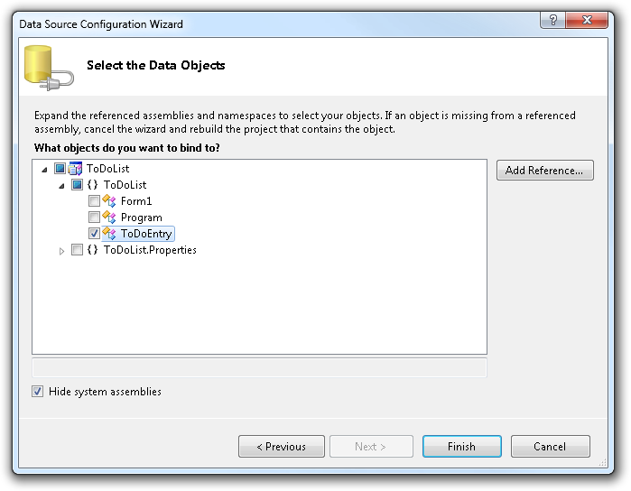
Next. The next page, shown in Figure 22-2, lets us choose the object
types we plan to bind to—the ToDoEntry class in this case.
When we click Finish, the BindingSource now knows what kind of object it
will be working with. The final step is to supply it with the specific
objects. If we had connected to a database, Visual Studio could arrange
to fetch the data automatically, but since we’re binding to objects,
it’s our job to provide those objects. We do this in the code behind. By
default, Visual Studio shows you the design view for a form, but if you
right-click, you’ll see a View Code option (or you can just press F7) to
see the code behind. As with WPF, Silverlight, and ASP.NET, the code
behind is a partial class in which you add code to handle events and
work with the UI—Visual Studio generates the other part of this partial
class based on what you do in the designer. We’ll modify the code behind
by making the additions highlighted in Example 22-2.
Example 22-2. Supplying objects to a binding source
public partial class Form1 : Form
{
    private BindingList<ToDoEntry> entries = new BindingList<ToDoEntry>();

    public Form1()
    {
        InitializeComponent();

        entriesSource.DataSource = entries;
    }
...
The BindingList<T> class
raises events when its contents change, enabling the Windows Forms data
binding system to remain up-to-date if we add or remove data items. So
the binding source now has the objects, and because we’ve configured the
source appropriately, Visual Studio will know exactly what properties
are available and will be able to connect those to any controls we add
to our user interface. So next, we’re going to need to add some
controls.
The Control class in
Windows Forms is the base class of almost all visual elements. A handful
of exceptions—most notably menus and tool tips—work differently in Windows
Forms because they also work differently in Win32, but the vast majority
of UI elements you’ll use in a Windows Forms application will be
controls.
Note
This is a significant difference between Windows Forms and WPF.
WPF’s Control class (the one in
System.Windows.Controls, as opposed
to the Windows Forms one in System.Windows.Forms) is more specialized, as
you saw in Chapter 20. In Windows Forms, not
only do interactive elements such as Button derive from Control, so do layout elements. The nearest equivalent to the
Windows Forms Control class in WPF
and Silverlight is actually FrameworkElement.
Our application is going to have a list of entries at the top, and
some fields to edit the selected entry at the bottom. We’ll use a SplitContainer to arrange these two sections—SplitContainer provides a draggable splitter bar
that can be used to resize a pair of panels sharing some space on-screen.
We add this by dragging it from the Toolbox’s Containers section onto the
form. It automatically fills the whole window. However, it splits the
window with a vertical splitter—the two halves are on the left and right,
but we wanted them on the top and bottom. This is easily fixed, because
like many controls, the SplitContainer
offers a pop-up window for performing common tasks. At the top-righthand
corner of the control, a little arrow in a box appears, and if we click on
this, the pop up appears, as Figure 22-3 shows. Clicking “Horizontal
splitter orientation” gives use the orientation we require.
In the top half of the UI, we want a list showing each to-do entry.
We’re likely to want to show at least a couple of pieces of
information—the entry title and its due date, for example. The simple
ListBox control is not sufficient here.
Unlike the WPF ListBox, Windows Forms
cannot easily add multiple columns, because it’s based on the Win32
ListBox. It wouldn’t be completely
impossible as you can write code that customizes how each item is
rendered, but that seems like an unnecessarily complex solution when the
ListView provides multicolumn list
support.
While ListView is the right
control for presenting the information to the user, we just caused
ourselves a problem. Support for data binding in Windows Forms is somewhat
uneven, and while you can data-bind a ListBox, you can’t do that with ListView. This puts us in a tricky situation:
either we use a ListBox, compromising
the UI to make life easier for us, the developers, or we have to do more
work by hand to use the ListView, in order to do right by the end
user. Or we could use a data grid, but for such a simple application, it
seems like overkill—the ListView is
something all Windows users will be familiar with, and it fits the bill.
And because it means doing a few things by hand, it also gives us an
opportunity to explore a few details of the data binding system that we
might otherwise not have seen, so we’ll go with that.
The ListView control is in the
Common Controls section of the Toolbox. When we drag it onto the top panel
in the SplitContainer, we need to fix a
few things with the Tasks pop up. First, we want the list view to fill the
whole of the top panel—there’s a Dock in parent
container task just for that. We also have to change its
View—the default is LargeIcon, but we need to change that to
Details for the multicolumn view we
want. And finally, we need to tell it about the columns, by clicking the
Edit Columns task.

The ColumnHeader Collection Editor opens. Clicking Add a couple of
times adds two columns. As Figure 22-4
shows, Visual Studio has been characteristically unadventurous with the
names—columnHeader1 and columnHeader2 don’t say much. These are the
names it will give to the fields that make these objects accessible to us
in the code behind. It’s usually a good idea to provide more informative
names each time you add anything in the Windows Forms designer—whether
it’s a control, a nonvisual component, or a column like this. Otherwise,
your program rapidly acquires a long list of incomprehensible identifiers.
So we’ll set the (Name) on the right to
titleColumn for the first column, and
dueDateColumn for the second.
Of course, we also want the displayed text in the column headers to
be a bit more useful than the default, ColumnHeader, so we’ll change the Text property of the two columns to Title and Due
Date, respectively. Finally, to ensure that the two columns make
reasonably good use of the space initially available, we’ll set their
Width properties to 200 and 70. Figure 22-5 shows how the form looks once this is
done. We haven’t given the ListView
itself a good name yet, so we’ll call it entriesListView.


Note
Some developers have a stylistic objection to field or variable
names that include information about the type, and would argue that
entriesListView is unnecessarily
verbose. However, it’s quite common in UI applications to have several
different objects all representing the same thing at different
layers—we’ve put the underlying model in a field called entries, we have the binding source
representing that model to the data binding system, which we’ve called
entriesSource, and we have a control
displaying the information, called entriesListView. Clearly these objects can’t
all be called entries. We could call
the control entriesView, but that
sounds less like an individual control and more like a description of
the whole form we’re building right now. So entriesListView feels right because it seems
to be a minimally descriptive and unique name.
We would not recommend just slapping the type name on the end of your control names out of habit, of course. Choosing identifier names requires thought (and that goes for all identifiers, not just those in Windows Forms apps). You should aim for the shortest possible name that will make it easy to understand the code when you return to it six months after you wrote it. If that happens to be a name that includes the type name, that’s fine, as long as you thought about it first.
Finally, ListView supports
multiple-item selection, but we want to have only one item selected at a
time. Since multiple selection is the default, we need to set the MultiSelect property to
false.
Next, we’ll add a TextBox so that the user
can edit entry titles and a corresponding Label so that the user can see what the TextBox is for. These controls are found in the
Common Controls section of the toolbar. We’ll set the Text property of the Label to &Title:—the ampersand denotes an access key
so that the user can press Alt-T to put the focus into the text box.
Access keys make user interfaces much easier to use from the
keyboard.
Note
When you give a Label an access
key, it puts the focus into whichever control is next in the tab order.
By default, the tab order will be the order in which you added the
controls to the form. But you can change this by selecting the View
menu’s Tab Order item (which is present only when a Windows Forms design
view has the focus). When you enable Tab Order mode, you can click on
the controls one after another, and the order in which you click will
define the tab order.
Therefore, your life will be marginally easier if you add each
Label control just before you add the
associated TextBox control because
you won’t then need to go back and redo the tab order.
We’ll also add a label with the text &Due Date: followed by a DateTimePicker control, and finally another text
box with a label of Descri&ption:.
(Note that we’ve been careful to avoid ambiguous access keys; Alt-D is for
the due date, so we had to pick a different letter for the
description—Alt-P.) For the description, we’d like the user to be able to
write multiple lines of text, so we need to do two things. We need to set
the AcceptsReturn property to true—this prevents the Return key from having
the usual effect of clicking the form’s default button, and lets the text
box handle returns instead. We also need to set the Multiline property to true. These two properties may seem redundant,
but sometimes it’s useful to support multiple lines with word wrapping but
still have the Return key click the default button, which is why these two
aspects are separated out. In this application we need to set both.
Finally, we need a couple of buttons—one to add new items and one to
delete items. We’ll set the Text
properties to &New and &Delete, once more taking care to keep
access keys unique. Again, we want all our controls to have sensible
names, so we’ll go with titleText,
dueDatePicker, descriptionText, newButton, and deleteButton for the various controls we’ve just
added. (The names of the Label controls
are not so significant, as we won’t be using them from the code behind,
but out of a slightly obsessive sense of neatness we’ll called those
titleLabel, dueDateLabel, and descriptionLabel.) Figure 22-6 shows the work in progress.

In fact, we’re not quite done here because there’s a problem when
the user resizes the form. As Figure 22-7
shows, the ListView fills all the
width, but the remaining controls have somewhat disappointing behavior.
Fortunately, we can fix this.

Windows Forms controls support a couple of kinds of
automatic resizing behavior. They can be docked—we already have two docked
controls, in fact. The SplitContainer
is docked to fill the entire form, and the ListView is docked to fill the top half of the
SplitContainer. If you edit the
Dock property with the Properties
window (instead of the Task pop up we used earlier) you can also dock
controls to a particular edge of their container, rather than having to
fill the whole thing—this is useful for menus and toolbars that need to
appear along the top edge of a window.
The other form of automatic resizing is anchoring. An anchored control doesn’t have to fill the whole width and/or height of its container, but instead can resize or move as its container resizes. You can anchor the top, left, bottom, or right of any control to the corresponding edge of its container. In fact, by default, controls are anchored to the top and left sides of their container—this means that when the container (e.g., the window) moves, the contained controls go with it, but if the user resizes the window by moving either the right or bottom edge, the controls remain as they are.
We can exploit this to make our controls resize. The Title text box and the date picker should both be anchored to the top, left, and right, as shown in Figure 22-8. So as the window changes width, the righthand edge of these controls will follow its righthand edge. The Description text box should be anchored on all four sides, so it resizes both vertically and horizontally.

The two buttons should be anchored only on the bottom and right, meaning you need to unanchor them from the top and left. That’s because we want them to follow the bottom-right corner of the window, but not to resize.
With these changes in place, the user interface will now resize gracefully as the user resizes the window or adjusts the splitter. Good though that looks, our application doesn’t do anything yet. So the next step will be to hook up the controls to the data.
Earlier, we configured a data source and then we added some
controls to represent our data. Now it’s time to connect the two. If we
select the text box for the title, and then
in the Properties panel scroll to the top of the list, there’s an
expandable (DataBindings) item, inside which is a list
of properties you’re likely to want to bind. (You can bind other
properties, but most controls have only a handful of properties that it’s
likely to be useful to data-bind to.) If you show the drop down for the
Text property, the reason for adding a
binding source earlier becomes apparent. As Figure 22-9 shows, Visual Studio offers a list of
available data sources (just the one here—our form’s entriesSource), which you can expand to select
the property you require.
We’ll bind the two text boxes and date picker (binding the
Value property in that case) on our
form to the three properties. To check that this is working, we’ll need
some data—the list we created
earlier is currently empty. We’ll add a helper function to create a new
item; we’ll need this for when the user clicks the New button, as well as
for creating an initial item for when the application starts:
private void CreateNewItem()
{
    ToDoEntry newEntry = (ToDoEntry) entriesSource.AddNew();
    newEntry.Title = "New entry";
    newEntry.DueDate = DateTime.Now;
    entriesSource.ResetCurrentItem();
}
Notice that we’re using the AddNew method offered by
the binding source—this means the binding system is aware that a new item
is being created, and if other controls end up being bound to the same
source, they will be aware of the change. We then modify two of the
properties.
Note
Since we’re using a BindingList, the data binding system would
also be aware of a new item if we just added it directly to the entries collection. However, there’s a subtle
difference with AddNew—rather than
just appearing on the end of the list view, this new item will become
the selected item. And in fact, it’ll be in a tentative state until we
move to a different item or add another new one—this program happens not
to exploit this, but we could cancel the addition of a new item if the
user presses the Escape key.

Our ToDoEntry class doesn’t offer
change notification events, so we had to tell the binding source that it
needs to refresh any controls bound to the current item by calling
ResetCurrentItem. If we implemented
INotifyPropertyChanged on ToDoEntry so that it raised an event anytime a
property changed, this last line would be unnecessary.
We need to add a call to this new method in our constructor so that we have one entry to start with:
public Form1()
{
    InitializeComponent();

    entriesSource.DataSource = entries;

    CreateNewItem();
}
With this in place, we’ll see the New
entry title set by the CreateNewItem method
appearing in the Title text box as Figure 22-10 shows. The description is empty for
now, so there’s nothing to see, and although the due date is now bound to
the DueDate property, there’s no
obvious evidence of this—DueDate is set
to the current time and date, which is what the DateTimePicker control defaults to in the
absence of any other information, so we can’t see any change resulting
from data binding for that control yet.

There’s one glaring omission: the ListView isn’t showing any data. And that’s
because, as mentioned previously, it doesn’t have built-in support for
data binding. We’re going to need to write some code. Fortunately, it’s
relatively straightforward—the binding source raises events to let us know
whenever something has changed. If you select the entriesSource item in the form’s design view and
then go to the Properties panel and select the lightning bolt symbol to
show the available events, there’s a ListChanged event. We can add a handler by
double-clicking that event. We expect three kinds of changes in the
application—addition of new items, updates to existing items, and deletion
of existing items—so we’ll be writing three methods to handle that. The
change event argument tells us which kind of change we’re getting, so we
just pick the relevant method based on the change type, as Example 22-3 shows.
Example 22-3. Handling changes
private void entriesSource_ListChanged(object sender, ListChangedEventArgs e)
{
    switch (e.ListChangedType)
    {
        case ListChangedType.ItemAdded:
            MakeListViewItemForNewEntry(e.NewIndex);
            break;

        case ListChangedType.ItemDeleted:
            RemoveListViewItem(e.NewIndex);
            break;

        case ListChangedType.ItemChanged:
            UpdateListViewItem(e.NewIndex);
            break;
    }
}
You might be wondering why we are asking the binding source to tell
us when items have been added and changed, when we’re writing the code
that adds and changes items in the first place. The main reason is that
there are certain tricky cases, such as what happens if you have an event
handler for a text box’s TextChanged
event that runs as a result of a data-binding-related change, but which in
turn causes further data binding changes; it’s easy to tie yourself in
knots, or end up with code that’s rather fragile because it depends on
things happening in a specific order. But if we just perform updates when
the data binding system tells us to (via the events that BindingSource raises) things tend to run more
smoothly.
Let’s start with the code that handles the addition of a new entry.
We need to create a new ListViewItem
for the list and ensure that it contains two columns. Since a new ListViewItem already has one column by default,
we need to add a second one, as Example 22-4 shows. And then we
just insert it into whatever position the binding source said it was added
to—in this application we always expect that to be the end, but since
we’re given a specific index, we may as well use it.
Example 22-4. Adding new list items when new to-do entries appear
private void MakeListViewItemForNewEntry(int newItemIndex)
{
    ListViewItem item = new ListViewItem();
    item.SubItems.Add("");
    entriesListView.Items.Insert(newItemIndex, item);
}
This code doesn’t bother to provide values for the newly created item, because the binding source immediately follows a new item notification with an item change notification. So by putting code to update the list view item in the change notification handler, shown in Example 22-5, we cover two cases: new items and changes to existing items.
Example 22-5. Making list view items reflect changes
private void UpdateListViewItem(int itemIndex)
{
    ListViewItem item = entriesListView.Items[itemIndex];
    ToDoEntry entry = entries[itemIndex];
    item.SubItems[0].Text = entry.Title;
    item.SubItems[1].Text = entry.DueDate.ToShortDateString();
}
Finally, Example 22-6 shows the code for handling deleted items. We’ve not added the code to perform deletions yet, but we need this method in place for Example 22-3 to compile.
Example 22-6. Removing list view items for deleted entries
private void RemoveListViewItem(int deletedItemIndex)
{
    entriesListView.Items.RemoveAt(deletedItemIndex);
}
Running the application will now show the title and due date for a newly created entry in the list view immediately. And updating the title or date will also cause the list view to update. There’s still one small problem. By default, data bindings don’t perform an update until the focus moves away from the control in question. This is only mildly annoying for the text box, but it looks quite odd with the date picker—selecting the date involves clicking on a day, at which point the pop-up calendar disappears. This is a sufficiently positive action that it feels weird to have to move the focus somewhere else for the action to take effect. We can fix this by setting up the bindings manually, because that gives us the opportunity to specify exactly when data is transferred.
To do this, we must first remove the bindings we set up with Visual
Studio—if we’re creating them manually we don’t have any need for the ones
the designer created. We do this by going back to the (DataBindings) section in the Properties panel,
right-clicking on the relevant bound
property, and selecting Reset. (If you switched to the event list with the
lightning bolt earlier, remember to switch the Properties panel back to
property mode.) You need to do this for only the due date and the
title—the description isn’t shown anywhere other than in its text box,
which means the default updates are good enough, so we can leave that as
is. Then, we can add the highlighted code shown here in the form’s
constructor directly after the call to InitializeComponent:
public Form1()
{
    InitializeComponent();

    titleText.DataBindings.Add("Text", entriesSource, "Title", true,
        DataSourceUpdateMode.OnPropertyChanged);
    dueDatePicker.DataBindings.Add("Value", entriesSource, "DueDate", true,
        DataSourceUpdateMode.OnPropertyChanged);

    entriesSource.DataSource = entries;

    CreateNewItem();
}
The first three arguments of each of these specify the control
property, the data source, and the source property—this defines what
information the binding connects. The true argument that follows says it’s OK for
binding to format the data if necessary. These arguments just do the same
thing Visual Studio did for us previously. The final argument is the
interesting one. We’re saying we want the binding to refresh anytime the
property changes, rather than the default setting of waiting until either
the focus moves or something else means we can’t wait any longer (e.g.,
different data is about to be loaded).
With this in place, changes to either the title or the due date will show up immediately in the list view.
So we now have some controls that present the data, and in the case of the text boxes and date picker, which will also modify the data. The next job is to make those buttons do something.
To respond to user input in Windows Forms applications, we can just use ordinary C# event handling—user interface elements are all represented as objects, and they raise events in the usual way whenever anything interesting happens. As you already saw with the binding source change notifications, Visual Studio can generate the event-handling code for us.
Controls define a default event, usually the event you are most
likely to want to handle for the control in question. So we can handle the
Click events of the two buttons by
double-clicking on them in the designer. Visual Studio will add event
handler methods with suitable names and signatures, and will add the code
to handle the event in the generated part of the partial class. We simply
need to provide the code. The New button handler is pretty
straightforward, because we already wrote the code to add a new
item:
private void newButton_Click(object sender, EventArgs e)
{
    CreateNewItem();
}
Deletion is slightly more involved:
private void deleteButton_Click(object sender, EventArgs e)
{
    if (entriesListView.SelectedIndices.Count != 0)
    {
        int entryIndex = entriesListView.SelectedIndices[0];
        entriesSource.RemoveAt(entryIndex);
    }
}
The ListView control is able to
support multiple selection. We’ve disabled this, but we still have to
negotiate an API designed to support it—it offers a SelectedIndices collection, providing all the
selected items. We just make sure it’s not empty, and then use the first
index. We remove the object via the binding source so that the data
binding system knows what’s going on, just as we did when adding a new
item. (In fact, it would work if we didn’t do this because this example
uses a BindingList to hold the model,
and that raises change notifications. Unlike AddNew, there’s no particular advantage to going
via the binding source here, but since we’re treating the binding source
as the central point through which all changes are handled, it’s good to
be consistent.)
We can now add multiple entries. This reveals a missing piece—we
have done nothing yet to ensure that when the user selects an item in the
list view, the corresponding entry’s properties appear in the rest of the
form. So we need to add a handler to the list view’s SelectedIndexChanged event. That’s its default
event, so you can just double-click the list view in the form designer.
Then all we need to do is set the binding source’s Position property:
private void entriesListView_SelectedIndexChanged(object sender, EventArgs e)
{
    if (entriesListView.SelectedIndices.Count != 0)
    {
        int entryIndex = entriesListView.SelectedIndices[0];
        entriesSource.Position = entryIndex;
    }
}
We’ve had to jump through the same hoop to get the selected item
index. There’s really just one line of interest here—the one that sets the
Position.
Note
We have to do this only because the ListView doesn’t do data binding
automatically. The ListBox and most
data grid controls will automatically synchronize the current data
binding position with the selected item.
One little bug remains. When we delete all the items, the text boxes
and date picker are bound to nothing. This doesn’t crash the program; it
just means the user can type in details that go nowhere. There are a
couple of ways we could fix this. In the list change notification handler,
we could look at the number of entries, and disable everything except the
New button to make it clear that there’s nothing to edit right now. Or we
could handle change notifications in the text boxes—text box controls
raise a TextChanged event, and we could
handle that (as well as changes to the date picker or description) and
create a new entry if the user types into an empty list. Since neither of
these would illustrate anything you haven’t already seen we’ll leave this
part up to you.
Windows Forms provides a .NET wrapper around the Win32 user
interface model. Visible elements are represented as objects that derive
from the Control base class. Control
features are configured with normal .NET properties, and we can use
ordinary C# event handlers to respond to user input. Data binding
automates some aspects of connecting data to the screen, although the
support in Windows Forms is not as comprehensive as in WPF, and we needed
to do some extra work to get the effect we required on the control we
wanted to use. Windows Forms may be less powerful than WPF, but it has a
smaller memory footprint and may be more suitable on low-end hardware, or
if you need to use controls that are available only for Windows
Forms.