
WPF and Silverlight are related technologies for building user interfaces in .NET. Although they are aimed at two significantly different scenarios, they share so many concepts and features that it makes sense to discuss both of them at the same time—almost everything in this chapter applies to both WPF and Silverlight.
As its name suggests, the Windows Presentation Foundation (WPF) is for building interactive applications that run on Windows. WPF applications typically run as standalone applications, requiring an installation step to get them onto the target machine, as they may need prerequisites to be installed first. (WPF is .NET-based, so it requires the .NET Framework to be installed.) This means they are deployed like old-school Windows desktop applications. However, WPF makes it easy for applications to exploit the graphical potential of modern computers in a way that is extremely hard to achieve with more traditional Windows UI technologies. WPF applications don’t have to look old-school.
Silverlight is for web applications, or more specifically, so-called Rich Internet Applications (RIAs). It does not depend on the full .NET Framework—it is a browser plug-in that provides a self-contained, lightweight, cross-platform version of the framework. The whole Silverlight runtime is around a 5 MB download, whereas the full .NET Framework is far more than 200 MB[53]—and Silverlight installs in seconds rather than minutes. Once the plug-in is installed, Silverlight content downloads as part of a web page, just like AJAX and Flash content, with no installation step for new applications. (Like with Flash-based Adobe AIR applications, it’s also possible for a Silverlight application to run out-of-browser once it has been downloaded, if the user consents.) But because Silverlight contains a form of the .NET Framework, you get to write client-side code in C#, which can run in all of the popular web browsers, on both Windows and Mac OS X.
Note
At the time of this writing, Microsoft does not produce a Silverlight plug-in for Linux. However, an open source project called Moonlight offers a Linux-compatible version of Silverlight. This is based on the Mono project, an open source version of C# and the .NET Framework that can run on various non-Microsoft systems, including Linux.
Microsoft has provided some assistance to the Moonlight project to help its developers achieve compatibility with the Microsoft Silverlight plug-in. However, be aware that the Moonlight plug-in has historically lagged behind Microsoft’s—as we write this, Moonlight’s current official release is two major version numbers behind Microsoft’s. If you need to support Linux desktop machines with a Silverlight-based web application, this lag will limit the features you can use.
Despite the very different environments in which WPF and Silverlight applications run, they have a great deal in common. Both use a markup language called Xaml to define the layout and structure of user interfaces. Their APIs are sufficiently similar that it is possible to write a single codebase that can be compiled for either WPF or Silverlight. There are critical concepts, such as data binding and templating, which you need to understand to be productive in either system.
It’s not accurate to say that Silverlight is a subset of WPF. However, this doesn’t stop people from saying it; even Microsoft sometimes makes this claim. It’s strictly untrue: WPF has many features that Silverlight does not and Silverlight has a few features that WPF does not, so neither is a subset of the other. But even if you allow a slightly woolly interpretation of the word subset, it’s a misleading way to describe it. Even where both Silverlight and WPF offer equivalent features they don’t always work in the same way. A few minutes with a decompilation tool such as Reflector or ILDASM makes it abundantly clear that WPF and Silverlight are quite different beasts on the inside. So if you are contemplating building a single application that works both in the browser as a Silverlight application and on the desktop as a WPF application, it’s important to understand the point in the following warning.
Warning
While it is possible to write a single codebase that can run as both WPF and Silverlight code, this doesn’t happen automatically. Silverlight code is likely to need some modification before it will run correctly in WPF. If you have existing WPF code, significant chunks of it may need rewriting before it will run in Silverlight.
Codebases that run on both WPF and Silverlight tend to use conditional
compilation—they use the C#
preprocessor’s #if, #else, and #endif directives to incorporate two different
versions of the code in a single source file in the places where differences
are required. Consequently, development and testing must be performed on
Silverlight and WPF side by side throughout the development process.
In practice, it’s not common to need to write a single body of code that runs in both environments. It might be useful if you’re writing a reusable user interface component that you plan to use in multiple different applications, but any single application is likely to pick just one platform—either WPF or Silverlight—depending on how and where you need to deploy it.
In this chapter, the examples will use Silverlight, but WPF equivalents would be very similar. We will call out areas in which a WPF version would look different. We will start by looking at one of the most important features, which is common to both WPF and Silverlight.
Xaml is an XML-based markup language that can be used to construct a user interface. Xaml is a former acronym—it used to be short for eXtensible Application Markup Language, but as so often happens, for obscure marketing reasons it officially no longer stands for anything. And to be fair, most acronyms are reverse-engineered—the usual process is to look through the list of unused and pronounceable (it’s pronounced “Zammel,” by the way) three- and four-letter combinations, trying to think of things that the available letters might plausibly stand for.
Since etymology can’t tell us anything useful about what Xaml is, let’s look at an example. As always, following the examples yourself in Visual Studio is highly encouraged. To do that, you’ll need to create a new Silverlight project. There’s a separate section under Visual C# in the New Project dialog for Silverlight projects, and you should choose the Silverlight Application template. (Or if you prefer, you can find the WPF Application template in the Windows section underneath Visual C#, although if you choose that, the details will look slightly different from the examples in this chapter.)
When you create a new Silverlight project, Visual Studio will ask you if you’d like it to create a new web project to host the Silverlight application. (If you add a Silverlight project to a solution that already contains a web project, it will also offer to associate the Silverlight application with that web project.) Silverlight applications run from the web browser (initially, at least), so you’ll need a web page simply to run your code. It’s not strictly necessary to create a whole web application, because if you choose not to, Visual Studio will just generate a web page automatically when you debug or run the project, but in general, Silverlight projects are an element of a web application, so you’d normally want both kinds of projects in your solution. Let it create one for now.
Note
If you were building a WPF application, you wouldn’t have an associated web project, because WPF is for standalone Windows desktop applications.
Once Visual Studio has created the project, it shows a file
called MainPage.xaml. This is a Xaml
file defining the appearance and layout of your user interface. Initially,
it contains just a couple of elements: a <UserControl> at the root (or a <Window> in a WPF project), and a <Grid> inside this. We’ll add a couple of
elements to the user interface so that there’s something to interact with.
Example 20-1 shows the Xaml you get by
default with a new Silverlight project, along with two new elements: a
Button and a TextBlock; the additional content is shown in
bold.
Example 20-1. Creating a UI with Xaml
<UserControl
    x:Class="SimpleSilverlight.MainPage"
    xmlns="http://schemas.microsoft.com/winfx/2006/xaml/presentation"
    xmlns:x="http://schemas.microsoft.com/winfx/2006/xaml"
    xmlns:d="http://schemas.microsoft.com/expression/blend/2008"
    xmlns:mc="http://schemas.openxmlformats.org/markup-compatibility/2006"
    mc:Ignorable="d" d:DesignWidth="640" d:DesignHeight="480"
    d:DesignHeight="300" d:DesignWidth="400">

    >

    <Grid x:Name="LayoutRoot" Background="White">

        <Button
            x:Name="myButton"
            HorizontalAlignment="Center" VerticalAlignment="Top"
            FontSize="20"
            Content="Click me!"
            />

        <TextBlock
            x:Name="messageText"
            Text="Message will appear here"
            TextWrapping="Wrap"
            TextAlignment="Center"
            FontSize="30" FontWeight="Bold"
            HorizontalAlignment="Center"
            VerticalAlignment="Center"
            />

    </Grid>
</UserControl>
Note
Visual Studio presents Xaml in a split view. At the top it shows how it looks, and at the bottom it shows the Xaml source. You can either edit the source directly or drag items around on the design view at the top, adding new items from the Toolbox. As you make changes in one view the other view updates automatically.
If you run the application by pressing F5, Visual Studio will show the Silverlight application in a web page, as you can see in Figure 20-1.

Warning
You will see the Silverlight application only if you run the correct page from the web application. Visual Studio will usually launch the right one if you create a brand-new web application at the same time as your Silverlight application. But be aware that if you add other pages to your web application, Visual Studio might pick one of those when you debug and you might not see your Silverlight UI. You can tell Visual Studio to always use the same file in the web project by right-clicking on it in the Solution Explorer and selecting Set as Start Page. (Visual Studio creates two test pages for your Silverlight code—an .aspx and an .html file, both of which will be named by appending TestPage to your Silverlight project’s name. Either works; it offers both so that you can choose between a dynamic ASP.NET page and static HTML to host your Silverlight UI.)
This simple Silverlight example contains a button, but if you click it, nothing will happen because we have not defined any behavior. Xaml files in WPF and Silverlight are usually paired with a so-called code behind file, a C# (or VB.NET, or whatever language you’re using) file that contains code associated with the Xaml file, and we can use this to make the button do something.
The easiest way to add a click handler for the button to your code
behind is from the Xaml file. You can just double-click the button on the
design view and it will add a click handler. In fact, most user interface
elements offer a wide range of events, so you might want a bit more
control. You could select the item on the design surface and then go to
the Properties panel—it has an Events tab that lists all the available
events, and you can double-click on any of these to add a handler. Or if
you prefer typing, you can add a handler from the Xaml source editor view.
If you go to the Button element and
start adding a new Click attribute,
you’ll find that when you type the opening quote for the attribute value
an IntelliSense pop up appears showing the text “<New Event
Handler>”. If you press the Tab or Enter key, Visual Studio will fill
in the attribute value with myButton_Click.
No matter which way you add an event, Visual Studio populates the
attribute by taking the first part from the element’s name, as specified
with the x:Name attribute, and adding
the event name on the end:
<Button
    x:Name="myButton"
    HorizontalAlignment="Center" VerticalAlignment="Top"
    FontSize="20"
    Content="Click me!"
    Click="myButton_Click"
    />
It doesn’t just edit the Xaml—it also adds a method with this name to the code behind file. You can go to the code behind by pressing F7, or you can find it in the Solution Explorer—if you expand a Xaml file node, you’ll see a .xaml.cs file inside it, and that’s the code behind. Example 20-2 shows the click handler, along with some additional code in bold. (You’re not obligated to use this naming convention for handlers, by the way. You could rename it after Visual Studio creates the handler, as long as you change both the Xaml and the code behind.)
Example 20-2. Click handler in the code behind
private void myButton_Click(object sender, RoutedEventArgs e)
{
    messageText.Text = "Hello, world!";
}
Because the Xaml refers to this handler method in the Button element’s Click attribute, the method will run anytime the
button is clicked. The one line of code we added here refers to the
TextBlock element. If you
look at the Xaml, you’ll see that the element’s x:Name attribute has a value of messageText, and this lets us use this name in
the code behind to refer to that element. Example 20-2 sets the Text property, which, as you’ve no doubt
guessed, causes the TextBlock to show
the specified text when the button is clicked.
Note
Just to be clear, this is happening on the client side. The Silverlight plug-in downloads your application and then renders the UI as defined by your Xaml. It hosts your code behind (and any other code in your Silverlight project) inside the web browser process, and calls the specified event handlers without needing to communicate any further with the web server. Silverlight applications can communicate back with the web server after being loaded, but this click-handling interaction does not involve the server at all, unlike clicking a button on a normal web form.
The Xaml in Example 20-1 and the C# in
Example 20-2 both set the Text of the TextBlock. The Xaml does this using standard
XML’s attribute syntax, while the C# code does it using normal C# property
syntax. This highlights an important feature of Xaml: elements typically
correspond to objects, and attributes correspond either to properties or
to events.
Although Xaml is the usual mechanism for defining the user
interface of WPF and Silverlight applications, it’s not strictly
necessary. You could remove the bold code in Example 20-1 that adds the Button and TextBlock to the Xaml, and instead modify the
class definition and constructor in the code behind, as Example 20-3 shows.
Example 20-3. Creating UI elements in code
public partial class MainPage : UserControl
{
    private Button myButton;
    private TextBlock messageText;

    public MainPage()
    {
        InitializeComponent();

        myButton = new Button
        {
            HorizontalAlignment = HorizontalAlignment.Center,
            VerticalAlignment = VerticalAlignment.Top,
            FontSize = 20,
            Content = "Click me!"
        };
        myButton.Click += myButton_Click;

        messageText = new TextBlock
        {
            Text = "Message will appear here",
            TextWrapping = TextWrapping.Wrap,
            TextAlignment = TextAlignment.Center,
            FontSize = 30,
            FontWeight = FontWeights.Bold,
            HorizontalAlignment = HorizontalAlignment.Center,
            VerticalAlignment = VerticalAlignment.Center
        };

        LayoutRoot.Children.Add(myButton);
        LayoutRoot.Children.Add(messageText);
    }
...
Each element that had an x:Name
attribute has been replaced here with a field in the class, and we
initialize that field in the constructor. This example uses the C#
object initializer syntax to set the property values to emphasize the
structural similarity between this code and the Xaml it replaces, but
normal property setter syntax works too, of course.
XML attribute values are just text, whereas in C# we have to
provide values of the correct type—enumeration entries, numbers, or
strings as appropriate. The Xaml compiler works out how to turn text
into something of the appropriate type. (It uses the .NET Framework
class library’s TypeConverter system
to do this.) Also, as you will recall C# uses a different syntax to
attach event handlers than the one for setting properties—we’ve used the
+= syntax here—whereas Xaml uses
attribute syntax for both properties and event handlers.
This code has the same effect as Xaml. Xaml is really just a language for creating objects, setting their properties, and attaching event handlers, so for the most part it doesn’t really matter whether you use C# or Xaml to create your user interface. This raises the question of why we have Xaml at all, when C# seems to work perfectly well. The main reason Xaml exists is to make it possible to create user interfaces in tools other than a text editor. For example, Microsoft offers a program called Expression Blend, part of its Expression family of design-oriented programs. Blend is a tool for creating WPF and Silverlight user interfaces, and it works mostly in Xaml.
This separation is more than just a convenience for people wanting
to write design tools. It’s useful to both developers and designers. It
enforces some separation, making it possible for designers to work on
the visual design of an application, without needing tools that can edit
C# source files. In fact, successful collaboration between developers
and designers takes a bit more than this—the separation of Xaml and code
behind is not in itself sufficient, because it’s still fairly easy for
designers and developers to trip over one another. If a developer writes
code behind that relies on certain elements with particular x:Name attributes being present in the Xaml,
but the designer decides to delete those elements because they’re ugly
and then creates new replacements but forgets to give them the same
names, we’re obviously going to see problems. In practice, a smooth
developer/designer workflow goes a bit deeper than this, and relies on
other WPF and Silverlight features, most notably templates, which we’ll
be getting to later. But Xaml is an important part of the
solution.
Note
The x:Name attribute is
optional. In fact, most Xaml elements tend not to be named—you only
name the elements that you need to be able to access from the code
behind. This makes the Xaml less cluttered, and if you are working
with designers, it makes it easier for them to know which elements are
structurally important, and which ones they can rework for design
purposes.
The equivalence between elements and objects suggests that Xaml doesn’t necessarily have to be used just for the user interface. The Xaml syntax can be used to create .NET objects of almost any kind. As long as a type has a default constructor and can be configured through its properties with suitable type converters, it’s possible to use it from Xaml—it’s technically possible to create a Windows Forms UI in Xaml, for example. However, Xaml tends to be cumbersome if you use it for types that weren’t designed with Xaml in mind, so in practice, it’s a much better fit for WPF, Silverlight, and also the Workflow Foundation, all of which are meant to be used from Xaml, than it is for other parts of the .NET Framework.
Given that you have a choice between Xaml and C#, which should you use? Xaml is often easier because you can use tools such as Visual Studio’s Xaml designer (or even Expression Blend) to edit the appearance and layout—this can take much less effort than tweaking code repeatedly until the outcome looks the way you want. Obviously, if developers and designers are involved, Xaml is preferable by far, because it enables designers to tweak and refine the appearance without needing to involve developers for every change. But even for a UI being created entirely by developers, an interactive design surface is a much more efficient way to create a layout than code. This doesn’t mean you should go out of your way to avoid creating elements in code, however, particularly if code looks like the most straightforward solution to a problem. Use whichever approach is more convenient for the task at hand.
Now that we’ve seen that Xaml is really just a way of creating objects, what types of objects do Silverlight and WPF offer?
Some of the types used to construct a user interface are interactive elements with a distinctive behavior of their own, such as buttons, checkboxes, and listboxes. Although you need code to connect these elements to your application, they have some built-in interactive behavior: buttons light up when the mouse cursor moves over them and look pushed in when clicked; listboxes allow items to be selected; and so on. Other elements are more primitive. There are graphical shape elements and text elements, which are visible to the user but which don’t have an intrinsic behavior—if you want them to do more than simply be visible you need to write code to make that happen. And some elements don’t even appear directly; for example, there are layout elements that are often not visible themselves, as their job is to decide where other elements go.
You can tell what type of element you’re dealing with by looking at
the corresponding .NET type’s base class. Most UI elements ultimately
derive from FrameworkElement, but this
class has some more specialized subtypes. Panel is the base class of layout elements.
Shape is the base class of elements
involving 2D graphical shapes. Control
is the base class of elements that have some intrinsic interactive
behavior of their own.
Note
This means that not all UI elements are controls. In fact, the
majority of UI elements are not controls. Having said that, the term
control is often used loosely—many authors, and
even some parts of Microsoft’s documentation, use the term
control to describe any UI element, including ones
that don’t in fact derive from Control. To further confuse the issue there’s
a System.Windows.Controls namespace,
in which not all of the types derive from Control.
We believe this is confusing, so in this book, we will use the
term control only when talking about types that
derive from Control. When we’re
discussing features that apply to all UI objects that derive from
FrameworkElement
(which includes all controls) we will use the more general term
element. But be aware that you will come across
other, more confusing conventions on the Web and in other books.
Before we get to the controls, we’ll look at how elements are positioned and sized—interactive elements are not much use if you can’t choose where they appear.
Panel is the abstract
base class of user interface elements that control the layout of other
elements. You choose a particular concrete derived type to determine
which layout mechanism to use. Silverlight version 3 offers
three[54] panel types: Grid,
StackPanel, and Canvas. WPF provides these and a few more, as
we’ll see shortly.
Grid is the most
powerful panel, which is why Visual Studio provides you with one by
default in a new UI. As the name suggests, it carves up the available
space into rows and columns, and then positions child elements into the
resultant grid cells. By default, a Grid has a single row and a single column,
making just one big cell, but you can add more. Example 20-4 shows how to do this.
Note
This example uses a Xaml feature called a property element—the <Grid.ColumnDefinitions> element does
not represent a child object to be added to the grid, but instead
indicates that we want to set the Grid object’s ColumnDefinitions property. The <ColumnDefinition> elements it
contains are added to the collection in that property, whereas the
<Button> elements are added
to the collection in the Children
property of the Grid.
Example 20-4. Grid with rows and columns
<Grid>
    <Grid.ColumnDefinitions>
        <ColumnDefinition Width="Auto" />
        <ColumnDefinition />
        <ColumnDefinition />
    </Grid.ColumnDefinitions>

    <Grid.RowDefinitions>
        <RowDefinition Height="30" />
        <RowDefinition Height="2*" />
        <RowDefinition />
        <RowDefinition Height="Auto" />
    </Grid.RowDefinitions>

    <Button Grid.Column="0" Grid.Row="0"
        Content="(0, 0)" />
    <Button Grid.Column="1" Grid.Row="0"
        Content="(1, 0)" />
    <Button Grid.Column="2" Grid.Row="0"
        Content="(2, 0)" />

    <Button Grid.Column="0" Grid.Row="1"
        Grid.ColumnSpan="3"
        Content="Row 1, 3 columns wide" />

    <Button Grid.Column="0" Grid.Row="2"
        Grid.ColumnSpan="3"
        Content="Row 2, 3 columns wide" />

    <Button Grid.Column="1" Grid.Row="3"
        FontSize="50"
        Content="(3, 1)" />

</Grid>
Figure 20-2 shows how this looks. The four rows are fairly clear—each button belongs to just one row. The columns are less obvious—you can see all three clearly in the first row, because there’s one button in each, but the next two rows contain just one button each, spanning all three rows. And the final row contains a single button in the second column.
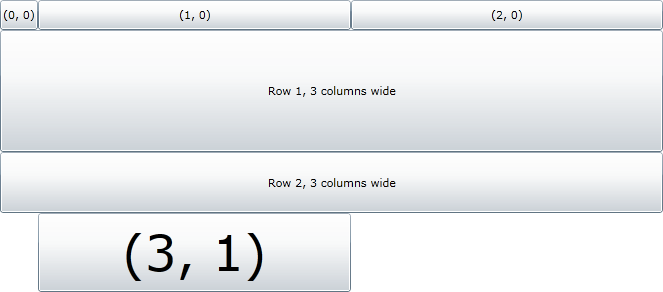
The Grid knows which columns
and rows elements belong to, and how many they span, because each button
in Example 20-4 has properties that
control this. The Grid.Column and Grid.Row properties do what their names
suggest, while the Grid.ColumnSpan and Grid.RowSpan properties determine how many
grid cells the element occupies. The column and row default to 0, while
the spans default to 1.
Note
These properties use another special Xaml feature called
attached properties. An attached
property is one defined by a different type (e.g., Grid) than the object it is applied to
(e.g., Button). The attached
properties in Example 20-4 are
attributes, but you can also set attached properties with the property
element syntax shown earlier—for example, if a <Grid> element could contain a
<ToolTipService.ToolTip>
element, to set the attachable ToolTip property defined by the ToolTipService
class.
While Silverlight, WPF, and Xaml support the idea that
properties don’t necessarily have to be defined by the object on which
they are set, C# has no syntax for this. So classes that define
attachable properties also define get and set methods to enable those
properties to be used from code. For example, the Grid class offers SetColumn, SetRow, and so on.
The rows and columns in Figure 20-2 are
different sizes. This is because of the settings on the <RowDefinition> and <ColumnDefinition> elements. The first
column’s Width has been set to
Auto, so it takes its size from the
widest child in that column. In this case, only one child belongs
exclusively to that column, so the column is exactly wide enough to hold
it. The other two columns are at their default width, the value 1*, which causes them to share the remaining
space equally. The rows use similar features, except the first row has a
fixed height of 30, so it ignores the
size of the content and makes every element 30 pixels high. The final
row is Auto sized, and since its
content has a large font size, it ends up being fairly tall. And the
middle two rows use so-called star sizing, so as with the second and
third columns, they end up sharing the space left over. However, since
they have different star size values—1* and 2*—they get different amounts of space. The
2* row gets to be twice the height of
the 1* row. Note that the ratios are
all that matter with star sizing—changing 1* and 2*
to 10* and 20* would not change the outcome in this
example, because 20* is still twice
as large as 10*.
So as you can see, a grid can use fixed sizes, it can base sizes
on the content at hand, or it can divide the available space
proportionally. This makes it a pretty flexible layout mechanism. You
can build dock-style layouts where elements are aligned to the top,
bottom, left, or right of the available space through the use of
Auto sized rows and columns, and by
making elements span all the available rows when docking to the left or
right, or all the columns when docking to the top or the bottom. You can
also stack elements horizontally or vertically by using multiple rows or
columns with Auto sizes. And as we’ll
see, it’s even possible to exercise precise control over the size and
position of elements within the grid. One slight problem is that your
Xaml can get a little verbose when using grids. So there are some
simpler panel types.
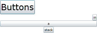
StackPanel arranges children in
a vertical or horizontal stack. Example 20-5
shows a StackPanel with its Orientation set explicitly to Vertical. You can
doubtless guess how to make a horizontal stack. (In fact, vertical
stacks are the default, so you could leave the orientation out from
Example 20-5 without changing its
behavior.)
Example 20-5. Vertical StackPanel
<StackPanel Orientation="Vertical">
    <Button Content="Buttons" FontSize="30" />
    <Button Content="in" />
    <Button Content="a" />
    <Button Content="stack" />
</StackPanel>
Figure 20-3 shows the result.
Notice that in the direction of stacking—vertical in this example—the
behavior is similar to the Auto
height grid rows, in that each row has been made tall enough to
accommodate the content. In the other direction, the elements have been
stretched to fill the available space, although as we’ll see shortly,
you can change that.

The Canvas panel takes an
even simpler approach: it doesn’t have a layout strategy, and it simply
puts elements where you tell it to. As Example 20-6 shows, just as Grid offers attachable properties to specify
which grid cells elements occupy, Canvas defines attachable Left and Top properties that specify where the elements
should appear.
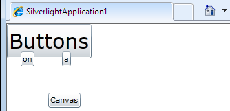
Example 20-6. Explicit positioning with Canvas
<Canvas>
    <Button Content="Buttons" FontSize="30" />
    <Button Canvas.Left="20" Canvas.Top="40"
            Content="on" />
    <Button Canvas.Left="80" Canvas.Top="40"
            Content="a" />
    <Button Canvas.Left="60" Canvas.Top="100"
            Content="Canvas" />
</Canvas>
As Figure 20-4 shows, the exact
positioning possible with a Canvas
has let us position elements so that they overlap. (This figure includes
some of the browser chrome to illustrate that positions are relative to
the top-left corner of the Canvas.)
Notice that the Canvas sizes children
based on how much space they require—similar to the Auto rows and columns, but in this case the
buttons are sized to content in both dimensions. Unless you specify
explicit widths and heights, a Canvas
will attempt to give each child exactly as much space as it
requires.
Silverlight and WPF have extensible layout systems, so you can
derive your own types from Panel or
use libraries that offer other panels. For example, Microsoft offers the
Silverlight Toolkit, a free library you can download in
source or binary form from http://silverlight.codeplex.com/, which defines various
controls, panels, and other useful components. This includes two panels,
both based on panels that are built into WPF. There’s WrapPanel, which lays
out its children in much the same way that text is word-wrapped in web browsers and word
processors—items are arranged from left to right until all the space is
used up, at which point the panel starts on a new line. And there’s also
DockPanel, which lets
you arrange elements by stacking them up against the left, right, top,
or bottom of the panel. (DockPanel
doesn’t do anything Grid can’t do,
but it can be slightly simpler to use.)
Layout in WPF and Silverlight is not just about panels. Panels define the strategy by which elements are allocated a layout slot—the area on-screen in which they must fit themselves. But properties are available on all elements—regardless of the panel in use—that can influence both how big the layout slot is and what the element does with the space it is offered.
All elements have common properties that influence
layout. There are Width and
Height properties that let you
specify an explicit size, rather than basing the size on the content
or the available space. This is important for elements that don’t
otherwise have an intrinsic size. Textual content has a natural size,
but some graphical elements such as Ellipse and Rectangle don’t. If you were to create an
Ellipse without setting the height
and put it in a vertical StackPanel
it would vanish, because the StackPanel asks it to calculate the minimum
amount of space it requires, and if you have not specified any
constraints, that’ll be zero. So elements with no intrinsic size
usually have an explicit Width and
Height, or you might use MinWidth and MinHeight to ensure that they never vanish
entirely, but are able to expand to fill whatever space is
available—some layouts will end up with more space than needed if the
user resizes a window, so it can be useful to have a layout that
adapts. MaxWidth and MaxHeight let you specify upper limits on
just how far elements will expand.
The various width and height properties are useful when an
element is being asked to determine its own size, such as in Auto sized grid cells. But sometimes an
element’s layout slot size is imposed on it—for example, if your
Silverlight user interface is configured to fill the entire browser
window, the user is in charge of how big it is. This is sometimes
referred to as constrained layout—this describes
situations where the layout system has to make things fit a
predetermined space, rather than trying to work out how much space is
required. Most user interfaces contain a mixture of constrained and
unconstrained layout—the top level of the UI is usually constrained by
window size, but you might have individual elements such as text
blocks or buttons that have to be large enough to display their
content.
Note
When elements that have no intrinsic size are put in a
constrained layout, they will fill the space available if you don’t
set the width and height. For example, if you put an Ellipse as the only element of the root
Grid layout element, and you
don’t set any of the width or height properties, it will fill the
whole Silverlight application UI.
You can even get a mixture of constrained and unconstrained layouts on one element. In Figure 20-3, we saw a vertical stack of elements, and vertically, each one’s size was based on its content—since the elements are free to size themselves it means we have unconstrained layout vertically. But the elements are all the same width regardless of content, indicating that constrained layout was in use horizontally. Stack panels always work this way—children are unconstrained in the direction of stacking, but are constrained to have the same sized layout slots in the other direction.
When an element has more space than it needs due to constrained
layout, additional properties that determine what the element does
with the excess space come into play. The HorizontalAlignment
attribute lets you position the element within its slot. Example 20-7 shows a modified version of Example 20-5, specifying each of the four HorizontalAlignment
options.
Example 20-7. Horizontal alignment
<StackPanel Orientation="Vertical">
    <Button Content="Buttons" FontSize="30"
            HorizontalAlignment="Left" />
    <Button Content="in"
            HorizontalAlignment="Right" />
    <Button Content="a"
            HorizontalAlignment="Stretch" />
    <Button Content="stack"
            HorizontalAlignment="Center" />
</StackPanel>
Figure 20-5 shows the results.
As before, each child has been given a layout slot that fills the
whole width of the StackPanel, but
all except the third row have been sized to content, and have then positioned
themselves within their slot based on the HorizontalAlignment property. The third
button still fills the whole of its row because its alignment is
Stretch. That’s the default, which
is why elements fill their whole layout slot unless you specify an
alignment. VerticalAlignment works
in much the same way, offering Top,
Bottom, Center, and Stretch.
Note
The alignment properties do something only when the layout
slot is larger than the element requires. When an element has been
given a slot exactly as large as it asked for in either the
horizontal or vertical dimension, the corresponding alignment
property does nothing. So setting VerticalAlignment on the child of a
vertical StackPanel does
nothing—the layout slot is already exactly as tall as the element
requires, so the element is simultaneously at the top, the bottom,
and the center of the slot.
Another very important ubiquitous layout property is Margin—this lets you specify the amount of
space you’d like between the edge of an element and the boundary of
its layout slot. In unconstrained layout, a margin will cause an
element to be given a larger slot than it would otherwise have had,
while in constrained layout, it causes an element to fill less of the
slot than it otherwise would have. Example 20-8 illustrates this within a
vertical StackPanel—since this uses
constrained horizontal layout and unconstrained vertical layout for
its children, we’ll see both effects.
Example 20-8. Buttons with Margin properties
<StackPanel Orientation="Vertical">
    <Button Content="Buttons" FontSize="30" />
    <Button Content="in" Margin="10" />
    <Button Content="a" Margin="20" />
    <Button Content="stack" Margin="30" />
</StackPanel>
In Figure 20-6, the first button
fills the entire width because it has no margin. But each successive
button gets narrower, because each has a larger margin than the last.
Since the width is constrained, the layout system needs to make the
buttons narrower to provide the specified margin between the element’s
edges and its layout slot. But since the children here are
unconstrained vertically, the margin has no effect on their vertical
size, and instead ends up adding increasing amounts of space between
each element—in the unconstrained case, Margin makes the slot larger.

Example 20-8 specifies the
margins as single numbers, denoting a uniform margin on all four
sides, but you can be more precise. You can provide two numbers,
setting the horizontal and vertical margins. Or you can provide four
numbers, indicating the left, top, right, and bottom[55] margins independently. This enables precise positioning
of elements within a Grid—it turns
out that you don’t have to use a Canvas to specify the position of an
element. If you align an element to the left and the top, the first
two numbers in a margin effectively determine its position within the
containing grid cell, just as the attachable Canvas.Left and Canvas.Top properties work for children of a
Canvas. The interactive design
surfaces in Visual Studio and Blend use this to let you drag elements
around on a grid and place them exactly where you want. It appears to
be a completely free form of layout, but if you inspect what these
programs do to the Xaml as you move elements around, they simply set
the alignment properties appropriately and adjust the margins.
All of the layout features we’ve looked at so far take a rigidly rectangular approach—everything is either strictly horizontal or strictly vertical. In fact, WPF and Silverlight are a bit more flexible than that, thanks to their support for transforms.
You can apply a transform to any element, modifying its
size, position, and orientation, or even skewing it. (If you’re
familiar with the coordinate geometry features found in most modern
graphics system, you’ll recognize these as being the usual two-dimensional affine transformations possible
with a 2×3 matrix.[56]) Example 20-9 shows another
variation on our StackPanel
example, with transforms applied to the children.
Example 20-9. Transforms
<StackPanel Orientation="Vertical">
    <Button Content="Buttons" FontSize="30">
        <Button.RenderTransform>
            <ScaleTransform ScaleX="1.5" ScaleY="0.5" />
        </Button.RenderTransform>
    </Button>
    <Button Content="in">
        <Button.RenderTransform>
            <RotateTransform Angle="30" />
        </Button.RenderTransform>
    </Button>
    <Button Content="a">
        <Button.RenderTransform>
            <SkewTransform AngleX="30" />
        </Button.RenderTransform>
    </Button>
    <Button Content="stack">
        <Button.RenderTransform>
            <TranslateTransform Y="-50" />
        </Button.RenderTransform>
    </Button>
</StackPanel>
As Figure 20-7 shows, the RenderTransform property Example 20-9 uses can mess up the layout. The transform
is applied after the layout calculations are complete, so the ScaleTransform on the first button has had
the effect of making it too large to fit—the default HorizontalAlignment of Stretch is in effect here, so the button has
been made exactly as wide as the containing StackPanel, and then has been scaled to be
1.5 times wider and 0.5 times higher, causing it to be cropped
horizontally. Likewise, the elements that have been rotated and skewed
have had corners cut off. WPF offers a LayoutTransform property that takes the
transform into account before performing layout, which can avoid these
problems, but Silverlight does not—you would need to tweak the layout
to get things to fit.

Note
A transform applies not just to the target element, but also
to all that element’s children. For example, if you apply a RotateTransform to a panel, the panel’s
contents will rotate.
This support for rotation, scaling, and shearing reveals that WPF and Silverlight are designed to support more graphically interesting user interface styles than traditional, rigidly rectilinear Windows user interfaces. So this seems like a good time to look at some of the graphical elements.
WPF and Silverlight support several kinds of graphical elements. The shape elements provide scalable vector-oriented two-dimensional shapes. There are also various ways to incorporate bitmap images. Video is supported through the media element. And WPF and Silverlight both provide some support for 3D graphics, although they take rather different approaches.
Shape is the base
class of various two-dimensional shapes. It’s an abstract class, and
it defines common properties such as Fill and Stroke to control how the interior and
outline of shapes are painted. Some of the derived classes are
self-explanatory—it doesn’t take much imagination to work out what
Ellipse, Rectangle, and Line do. Polyline, Polygon, and Path require a little more
explanation.
Polyline lets you define a
shape as a series of straight lines—you simply provide a list of
coordinate pairs defining each point the shape’s outline passes
through. Polygon does the same
thing, but closes off the shape—it automatically joins the final point
with the first one. However, you rarely use either of these, because
Path lets you do all this and more.
(Expression Blend never creates Polyline or Polygon elements—even if you create a shape
whose outline is made up entirely of straight edges, it still makes a
Path. And most Xaml export tools
from programs such as Adobe Illustrator do the same. So in practice,
Path is the one you’ll come across.
The other two exist because they are slightly simpler to work with
from code.)
Path lets you define a shape
with any mixture of straight and curved segments in its outline. Example 20-10 shows a Path made up entirely of straight
edges.
Example 20-10. Path with straight edges
<Path Fill="Red" Stroke="Black"
      StrokeThickness="5"
      Data="M50,0 L100,50 50,100 0,50 z"
      />
The Data property defines the
shape. It consists of a series of commands and coordinates. The
letters indicate the command—the initial M means Move to the specified position, (50,
0) in this case. The L means draw a
Line to the next coordinate. And since this example has three
coordinate pairs after the L, even
though L requires only one, that
means we repeat the command—so that’s three straight line segments
passing through the coordinates (100, 50), (50, 100), and (0, 50).
Each segment starts where the previous one left off. Finally, the
z indicates that we’d like to make
this a closed shape, so it will join that final point back up with the
first one to form the diamond shape you see in Figure 20-8. This shape is filled in and
given a thick outline, thanks to the Fill, Stroke, and StrokeThickness properties, which are
available on any shape element.
Note
The shape defined by the Data describes the center of the line
drawn for the outline. This means that making the StrokeThickness larger effectively
increases the size of the shape—a thicker outline will encroach into
the interior of the shape, but will also expand outward by the same
amount. That means that the Path
in Example 20-10 has a bounding box
slightly larger than that implied by the coordinates in the Data. The first line segment starts at
(50, 0), which is at the very top of the shape, but the stroke
thickness means that the peak of the shape actually appears a bit
higher. (The peak is at approximately (50, −3.54). The angle of this
particular stroke means that the top corner is above the specified
point by half the stroke thickness multiplied by √2.) So if you put
this path at the very top left of the UI its top and left corners
will be slightly cropped.

Path offers more complex
commands for drawing curved shapes. Example 20-11 shows a shape
with straight line segments and a single cubic Bezier curve segment,
indicated with the C
command.
Example 20-11. Path with Bezier curve and straight edges
<Path Fill="Red" Stroke="Black"
      StrokeThickness="5"
      Data="M50,0 L100,50 C125,74 75,125 50,100 L0,50 z"
      />
Cubic Bezier curves require four points to define them. So the
C command demands three pairs of
coordinates. (The first point is wherever the previous command
finished, so it requires three more to bring the total to four.)
Therefore, in this case, the three pairs of numbers that follow the
C do not constitute three repeated
commands as they did with L. You
can repeat the C command; you just
need to add three pairs for each segment. Figure 20-9 shows the shape
defined by Example 20-11.

These examples have used simple named colors for the Fill and Stroke, but you can get more advanced. You
can specify hexadecimal RGB colors using a #, as you would with HTML—for example,
Fill="#FF8800" indicates a shade of
orange, by mixing full-strength red (FF) with slightly more than
half-strength green (88) and no blue (00). You can extend this to
eight digits to define partially transparent colors—for example,
Fill="8000FFFF" specifies an
alpha (transparency) of 80 (semitransparent), 0
red, and full-strength green and blue, to define a semitransparent
shade of turquoise.
You can also create more complex brushes. Linear and radial gradient brushes are available. Example 20-12 sets the fill of a shape to a radial gradient brush, and sets its stroke to be a linear gradient brush.
Example 20-12. Gradient brushes for fill and stroke
<Path StrokeThickness="10"
      Data="M50,0 L100,50 C125,74 75,125 50,100 L0,50 z"
      >
  <Path.Fill>
    <RadialGradientBrush>
      <GradientStop Offset="0" Color="Blue" />
      <GradientStop Offset="1" Color="White" />
    </RadialGradientBrush>
  </Path.Fill>

  <Path.Stroke>
    <LinearGradientBrush StartPoint="0,0"
                         EndPoint="0,1">
      <GradientStop Offset="0" Color="Black" />
      <GradientStop Offset="0.5" Color="White" />
      <GradientStop Offset="1" Color="Black" />
    </LinearGradientBrush>

  </Path.Stroke>
</Path>
As you can see in Figure 20-10, these
brushes change color across the shape. The radial brush starts from a
point in the middle (or some other point—there are properties to
control the exact settings) and spreads out to an elliptical boundary.
The linear gradient brush simply changes colors between the specified
start and end points. Notice that you can run through as many
different colors as you like with the GradientStop elements.

You can even create a bitmap-based brush with which to paint shapes, so let’s look at bitmap handling next.
The shape elements are great for graphics that can be built out of geometric elements. Skilled designers can produce remarkably realistic-looking imagery with these sorts of primitives using tools such as Adobe Illustrator. However, some kinds of pictures do not lend themselves to this sort of construction—photographs, for example. You might be able to draw a stylized rendition of a photograph, but if you just want to incorporate a photographic image directly into an application, bitmaps are the way to go.
Bitmaps are pixel-oriented rather than vector-based. (From a tool perspective, it’s like the distinction between Adobe Photoshop and Adobe Illustrator.) Bitmaps do not scale as well—if you enlarge a bitmap, eventually you just see the individual pixels, leading to an appearance that is either jagged or fuzzy, depending on the way in which the bitmap is enlarged. Shapes don’t have that problem; because shapes are geometrically defined, WPF or Silverlight can render them perfectly crisply no matter how large you make them. So there’s a trade-off here—bitmaps can offer a much more photorealistic impression than vector art, but they don’t adapt so well to changes in size. That’s why graphics systems need to support both.
The simplest way to use a bitmap is with the <Image> element. You can point its
Source property at any URL that
contains a bitmap. Example 20-13 uses
a miscellaneous image from one of the authors’ blogs. WPF or
Silverlight will download and display the image at runtime. (The image
may not appear in the design view, though.)
Example 20-13. Image element with HTTP URL
<Image Source="http://www.interact-sw.co.uk/images/WpfMidpointGradient.png"
       Stretch="None" />
The Stretch property
indicates how to size the image. The value None says that we want the image to be
rendered at its natural size. The Image element’s default behavior is to
resize the bitmap so that it fills the layout slot, but that’s not
always appropriate. This particular image happens to be a screenshot,
and those tend to go a bit blurry if you resize them, so disabling
stretching is a good idea here. Resizing is less problematic for
photographs, though, so the default behavior of stretching to fit is
useful there.
The Image class is a user
interface element, deriving from FrameworkElement like any other. But there’s
also ImageBrush—this derives from a
different class, Brush, in common
with the gradient brushes we saw earlier. You can use an ImageBrush to paint a shape. Example 20-14 uses the same image
to provide the Fill of a Path. (Again, you may find that the image
appears only at runtime, not at design time.)
Example 20-14. Painting a shape with an ImageBrush
<Path StrokeThickness="3" Stroke="Black"
      Data="M50,0 L100,50 C125,74 75,125 50,100 L0,50 z"
      >
  <Path.Fill>
    <ImageBrush
       ImageSource="http://www.interact-sw.co.uk/images/WpfMidpointGradient.png"
       />
  </Path.Fill>

</Path>
You don’t have to download images with HTTP. You can compile an
image into a WPF or Silverlight application as a resource—simply
adding a JPEG or PNG to the project in Visual Studio will do that. Or
with WPF you can point an Image or
ImageBrush at a file on
disk.
Note
Silverlight supports only JPEG and PNG bitmaps—to keep the Silverlight plug-in download small, Microsoft chose a minimal set of formats, and these two cover most bases. JPEG provides efficient compression for photographic and photorealistic images, but does a bad job with screenshots and doesn’t support transparency. Conversely, PNG can reproduce screenshots perfectly and supports transparency, but compresses photographic images inefficiently.
WPF supports a much wider range of image types, including TIFF, BMP, and GIF. Moreover, it’s built on top of the extensible Windows Imaging Components (WIC) mechanism, so the set of supported formats is not closed. Some digital camera vendors provide WIC drivers for their native raw image formats, so if you have those installed, WPF can display those images directly.
Still images may not be enough for your application. You might want to incorporate movies.
WPF and Silverlight offer the MediaElement, which can render videos. It
can also be used to play audio files. In use, it’s almost identical to
the Image element; you just point
it at a video file rather than a bitmap.
Silverlight offers a VideoBrush that lets you create a brush from
a video, in the same way that ImageBrush lets you create a brush from a
bitmap. Slightly surprisingly, WPF does not offer this type—this is a
good example of how Silverlight is not a subset of WPF. It’s possible
to paint things with video in WPF, though; you just do it using
something called a VisualBrush.
VisualBrush is far more powerful
than VideoBrush—it lets you take
any UI element (even one that has children, like a panel) and turn it
into a brush. So you can wrap a MediaElement in a VisualBrush to create the same effect;
Silverlight doesn’t have VisualBrush, which is why it provides the
more specialized VideoBrush.
Speaking of moving images, you can also apply movement to other elements in a user interface.
WPF and Silverlight allow any element to be animated—most properties that have an impact on the appearance of the UI can be modified over time. Of course, you could achieve that yourself by setting up a timer, and modifying properties of UI elements each time the timer fires. But you can let the animation system do that work for you. A complete description of animation would fill a chapter, but Example 20-15 shows a typical example.
Example 20-15. An animation
<UserControl.Resources>
    <Storyboard x:Key="ellipseAnimation">
        <DoubleAnimation
                     From="50" To="100"
                     AutoReverse="True" RepeatBehavior="Forever"
                     Storyboard.TargetName="animatedEllipse"
                     Storyboard.TargetProperty="Width" />
    </Storyboard>
</UserControl.Resources>
Animations are separate objects from the things they animate,
and typically live in a Resources
section—all elements have a Resources property which is a handy place to
put useful objects. It’s just a dictionary—a name/value collection—a
specialized dictionary similar to those of the kind described in Chapter 9. This particular example would appear
as a child of the UserControl at
the root of the user interface.
While this is a simple example, it illustrates all the important
points. The whole thing is contained in a Storyboard—this is a collection of
animations. Animations are always defined in storyboards, as this
enables you to target multiple properties, or perhaps orchestrate a
sequence of different animations over time. This example is simple and
contains just a single animation, but we’re still required to put it
in a Storyboard.
The animation itself has a From and a To value specifying the range of values the
property will span during the animation—these are numbers because this
is a DoubleAnimation (as in the
System.Double floating-point type);
if this were a ColorAnimation you’d
see color values in there instead. The AutoReverse and RepeatBehavior properties here indicate that
this animation runs back and forth indefinitely. And the final two
properties indicate the element and property to be animated. So
somewhere in the Xaml we’d expect to find an element with the name
indicated, for example:
<Ellipse x:Name="animatedEllipse"
         Fill="Blue" />
Something needs to kick the animation off. In the code behind, you’d extract the animation from the resources and start it like this:
Storyboard anim = (Storyboard) Resources["ellipseAnimation"];
anim.Begin();
There are other ways to start animations. WPF supports
triggers, which let you place
instructions in Xaml that certain animations should be run when
specific things happen. So you could tie an animation to the raising
of a MouseEnter event, for example,
or run an animation when the value of a property changes. You can do
something similar in Silverlight using behaviors, which make it easy to
define a variety of UI responses (such as running animations) with
Expression Blend. Both WPF and Silverlight also support automatic
running of animations in control templates, as we’ll see later.
WPF has basic support for 3D graphics, but that’s a
topic that would take a whole chapter to cover in itself, so we won’t
be getting into that in this book. Silverlight doesn’t have WPF’s 3D
features, but it does have some very limited support for 3D in the
form of special transforms. Besides the RenderTransform we saw earlier, you can set
an element’s Projection property to
make it look like it has been rotated in 3D, including perspective
effects you can’t get with a 2D affine transform. This falls short of
the full 3D models you can create in WPF, but provides the bare bones
required to build up 3D aspects to the user interface.
Layout and graphical services are necessary to render things on-screen, but most applications require something a little more high-level—standard elements the user can interact with. So WPF and Silverlight provide controls.
Silverlight and WPF offer a range of controls, similar to
many of the common controls you find in typical Windows applications.
For example, there are buttons—CheckBox and
RadioButton for selection, Button for a basic pushbutton, and HyperlinkButton for when you want to make your
button look like a hyperlink. There’s also RepeatButton, which looks like a normal button
but repeatedly raises click events for as long as you hold the button
down.
For the most part, these work in a very straightforward
fashion—you already saw how to handle the Click event, in Example 20-2 and Example 20-3. And as you’d expect, the two
selection buttons offer events called Checked and Unchecked to notify you when they’re toggled,
and an IsChecked property to
represent the state. However, there is one potentially surprising
feature that buttons inherit from their ContentControl base class.
Many controls have some sort of caption—buttons usually
contain text; tab pages have a header label. You might expect these
controls to offer a property of type string to hold that caption, but if you look
at the Content property of a
Button or the Header of a TabItem, you’ll see that these properties
are of type object. You can put
text in there, but you don’t have to. Example 20-16 shows an
alternative.
Example 20-16. Button with Ellipse as content
<Button>
  <Button.Content>
    <Ellipse Fill="Green" Width="100" Height="50" />
  </Button.Content>
</Button>
In fact, you don’t need to write that <Button.Content> property element—the
base ContentControl class is marked
with a [ContentProperty("Content")]
attribute, which tells the Xaml compiler to treat elements that appear
inside the element as the value of the Content property. So Example 20-16 is equivalent to
this:
<Button>
  <Ellipse Fill="Green" Width="100" Height="50" />
</Button>
This creates a button with a green ellipse as its content. Or you can get more ambitious and put a panel in there:
<Button>
  <StackPanel Orientation="Horizontal">
    <Ellipse Fill="Green" Width="100" Height="50" />
    <TextBlock Text="Click me!" FontSize="45" />
    <Ellipse Fill="Green" Width="100" Height="50" />
  </StackPanel>
</Button>
Figure 20-11 shows the results. Content controls let you go completely crazy—there’s nothing stopping you from putting buttons inside buttons inside tab controls inside listbox items inside more buttons. Just because you can doesn’t mean you should, of course—this would be a terrible design for a user interface. The point is that you’re free to put any kind of content in a content control.

Some controls can contain multiple pieces of content. For
example, a TabItem has a Content property which holds the main body
of the tab page, and also a Header
property for the tab caption. Both properties accept any kind of
content. And then the items controls take this a step further.
ItemsControl is the base
class of controls that display multiple items, such as ListBox, ComboBox, and TreeView. If you add children to these
controls, each child can be an arbitrary piece of content, much like a
button’s content but with as many children as you like. Example 20-17 adds various elements to a
ListBox.
Example 20-17. ListBox with mixed content
<ListBox>

    <StackPanel Orientation="Horizontal">
        <Ellipse Fill="Green" Width="100" Height="50" />
        <TextBlock Text="Text and graphics" FontSize="45" />
        <Ellipse Fill="Green" Width="100" Height="50" />
    </StackPanel>

    <Button Content="Button" />

    <TextBox Text="Editable" />

</ListBox>
Figure 20-12 shows the
results. As well as showing the content we provided, the ListBox provides the
usual visual responses to mouse input—the item underneath the mouse
has a slightly darker background than the item below to indicate that
it can be selected. The item at the bottom is darker still because it
is currently selected. These highlights come from the item
container—all items controls generate an item container for
each child. A ListBox will generate
ListBoxItem containers; TreeView generates
TreeViewItem objects, and so
on.

Sometimes it’s useful to bring your own container, because you
may need to do more than populate it with a single piece of content.
For example, when building a tree view, you don’t just need to set the
node caption; you may also want to add child nodes. Example 20-18 explicitly creates
TreeViewItem containers to define a
tree structure.
Example 20-18. Explicit TreeViewItem containers
<ctl:TreeView>
    <ctl:TreeViewItem>
        <ctl:TreeViewItem.Header>
            <StackPanel Orientation="Horizontal">
                <Ellipse Fill="Green" Width="100" Height="50" />
                <TextBlock Text="Content" FontSize="45" />
                <Ellipse Fill="Green" Width="100" Height="50" />
            </StackPanel>
        </ctl:TreeViewItem.Header>

        <ctl:TreeViewItem Header="Child A" />
        <ctl:TreeViewItem Header="Child B" />
    </ctl:TreeViewItem>


    <ctl:TreeViewItem>
        <ctl:TreeViewItem.Header>
            <Button Content="Button" />
        </ctl:TreeViewItem.Header>

        <ctl:TreeViewItem Header="Child 1" />
        <ctl:TreeViewItem Header="Child 2" />
        <ctl:TreeViewItem>
            <ctl:TreeViewItem.Header>
                <Button Content="Child 3" />
            </ctl:TreeViewItem.Header>
        </ctl:TreeViewItem>
    </ctl:TreeViewItem>

    <ctl:TreeViewItem>
        <ctl:TreeViewItem.Header>
            <TextBox Text="Editable" />
        </ctl:TreeViewItem.Header>
    </ctl:TreeViewItem>

</ctl:TreeView>
Notice the unusual ctl:
prefix—see the sidebar on the next page for an explanation.
As you can see from Figure 20-13,
each Header property value has
ended up as the label for a single node in the tree. The parent-child
relationship of the nodes is determined by the nesting of the TreeViewItem elements in the Xaml.

While you can add elements directly to items controls like this, it’s often easier and more flexible to use data binding, so we’ll be coming back to items controls later.
Because this chapter is just an introduction to Silverlight and
WPF, we won’t go through all the available controls in detail. There
are simple data entry controls such as TextBox, AutoCompleteBox, Slider, and DatePicker. There are more comprehensive
data-oriented controls such as DataGrid and DataPager. There are also utility controls
such as the draggable Thumb and
GridSplitter. But there’s one more
kind of control we need to look at: user controls.
A user control is, as the name
suggests, a user-defined control. In Silverlight, you’ll have at least
one of these—your whole user interface is one big user control, as you
can see from the <UserControl>
element at the root of your main page’s Xaml. But you can create more.
User controls are a useful way to manage complexity.
A problem that crops up a lot in big WPF and Silverlight projects—particularly the first such project any team works on—is the 10,000-line Xaml file. Visual Studio creates one Xaml file for your user interface, and the path of least resistance is to put everything in there. As you add graphical resources, templates, data sources, animations, styles, and all the other things you can put in Xaml, it can grow very large surprisingly quickly. And there’s a related problem of having the entire application’s functionality in the one code behind file. Such programs are not maintainable, so you need to split things up.
Instead of creating one big Xaml file, it’s usually best to try to have as little as possible in your main page. It should typically do nothing more than define the overall layout, saying where each piece of the UI belongs. And then each part can go into its own user control. A user control is simply a Xaml file with some code behind. And since Xaml files with code behind always compile into classes, you can use them from other Xaml files—remember that Xaml is just a way to create objects. Example 20-19 shows the Xaml for an application’s main UI that uses this approach.
Example 20-19. Main UI containing nothing but user controls
<UserControl
    x:Class="SlUcExample.MainPage"
    xmlns="http://schemas.microsoft.com/winfx/2006/xaml/presentation"
    xmlns:x="http://schemas.microsoft.com/winfx/2006/xaml"
    xmlns:app="clr-namespace:SlUcExample"
    xmlns:d="http://schemas.microsoft.com/expression/blend/2008"
    xmlns:mc="http://schemas.openxmlformats.org/markup-compatibility/2006"
    mc:Ignorable="d" d:DesignWidth="640" d:DesignHeight="480">

    <Grid x:Name="LayoutRoot">
        <Grid.RowDefinitions>
            <RowDefinition Height="Auto" />
            <RowDefinition />
        </Grid.RowDefinitions>

        <Grid.ColumnDefinitions>
            <ColumnDefinition />
            <ColumnDefinition />
        </Grid.ColumnDefinitions>

        <app:SearchBarView      Grid.Column="0" Grid.ColumnSpan="2" />
        <app:ProductListView    Grid.Column="0" Grid.Row="1" />
        <app:ProductDetailsView Grid.Column="1" Grid.Row="1" />

    </Grid>
</UserControl>
Notice that this example defines an XML namespace prefix, app, and tells the Xaml compiler that this
refers to types in the SlUcExample
namespace—the default project namespace for this particular example.
This time we don’t need the assembly=
part because the user controls are defined as part of this project, not
in a separate DLL. This prefix then refers to three user controls which
would be defined elsewhere in the project.
Defining the user controls themselves is simple. You can add them as new items to your project in Visual Studio, and it will create a Xaml file with a corresponding code behind file, which you edit in exactly the same way as the main UI.
Note
As you can see in Example 20-19, we chose names that end in View for all the user controls. This is not mandatory, but it helps distinguish user control classes, which define appearance and superficial interactive behavior, from the other types that define the core behavior of your application. This distinction isn’t useful if you plan to put everything into the code behind, of course, but we presume you have more refined software design sensibilities than that, and will want to ensure that each class in your application has a single, well-defined, reasonably narrow responsibility.
User controls can contain any other controls and elements, so you can use elements built into Silverlight as well as any control libraries you may have acquired. So user controls have a lot of flexibility. However, you don’t necessarily have to build a user control anytime you want some custom UI—the scope for customization of built-in controls is greater than you might think, thanks to control templates.
As you already saw, controls are elements that have interactive behavior of some kind—buttons are clickable; you can type into text boxes; you can scroll through the items in a listbox and select them. What may not be obvious is that most controls only provide behavior. Controls do not define their own appearance.
This may appear to be a ludicrous claim. After all, if you add a
Button to your user interface, you can
see it. In fact, the appearance comes from a separate entity called a
template. Controls have a default template, which is
why something appears when you create a control, but this separation of
appearance from behavior is important because you are free to replace the
default template with your own. This lets you change the appearance of a
control completely, without losing any of the behavior.
The behavior of controls is often surprisingly subtle and complex.
You might think that a button is a pretty simple sort of thing, and that
you could create your own equivalent by handling the MouseLeftButtonDown event on a shape. And while
that would give you a clickable element, there’s a lot missing. For
example, there’s the way buttons push down and pop back up. They should
respond to keyboard input as well as mouse input. They should be visible
to accessibility tools so that users with visual or coordination issues
can use your application. And a button is about as simple as it gets. If
you’ve ever used a Flash application with, say, a scroll bar that just
didn’t feel like it was working properly you’re already familiar with the
hazards of trying to recreate basic controls from scratch. Fortunately,
control templates mean you don’t have to.
Note
Only controls have templates. So while types such as Button and TextBox have them, more primitive types
such as shapes and TextBlock—UI
elements that don’t have any intrinsic behavior—don’t. This shouldn’t be
too surprising; an Ellipse element’s
only job is to look like an Ellipse,
so what would it mean for it to have a template? (And what element would
you use inside the template to define the appearance? Another Ellipse? Where would it get its appearance
from?)
The Control base class defines a
Template property. To customize the
appearance of a control, you simply set this property. As Example 20-20 shows, the property expects a
ControlTemplate object, and then inside
this, you can put any element you like to define the appearance. (You
could, of course, use a panel if you wanted to build up a complex
appearance with multiple elements.)
Example 20-20. Button with custom template
<Button Content="OK" FontSize="20">
    <Button.Template>
        <ControlTemplate TargetType="Button">
            <Border
                Background="LightBlue"
                BorderThickness="3"
                BorderBrush="Black"
                CornerRadius="10">

                <ContentPresenter
                    Margin="20"
                    Content="{TemplateBinding Content}"
                    HorizontalAlignment="Center"
                    VerticalAlignment="Center"
                    />

            </Border>
        </ControlTemplate>
    </Button.Template>
</Button>
Figure 20-14 shows the
results. It’s rather static—it doesn’t offer a visual response to mouse
activity yet, but we’ll fix that later. But it will still raise the
Click event when clicked, so it’s
functional, if rather dull. Notice that we’ve set the Content property of the button, and this
content—the text “OK”—has appeared as you’d hope. That doesn’t happen
automatically; our template needs to say where the content should appear,
and that’s the purpose of the ContentPresenter in Example 20-20. Templates for content controls
need one of these placeholders for the Content property to do anything. And if you’re
defining a template for a control that can hold multiple pieces of
content—the Content and Header of a TabItem, for example—you need to provide a
ContentPresenter for each.

How does Silverlight (or WPF) know which placeholder corresponds to
which property? Look at the Content
property of the ContentPresenter in
Example 20-20—its value has an unusual
syntax. The attribute value is enclosed in braces, which indicates that
we’re not setting a literal value—in this case the TemplateBinding text signifies that we want to
connect this particular property in this element in the template to a
corresponding property of this template’s control. So {TemplateBinding Content} connects this ContentPresenter to our Button element’s Content property, while {TemplateBinding Header} would connect it to the
Header property in a control that had
such a property.
In fact, it’s common to use many template bindings. Example 20-20 hardcodes a lot of features of the appearance into the template, but it’s possible to reuse templates on several different controls, at which point you might want to retain the flexibility to change things such as the background color, border thickness, and so on, without needing to define a new template every time. Example 20-21 looks the same as Figure 20-14, but instead of hardcoding everything into the template it picks up more of the control’s properties using template bindings.
Example 20-21. Template with less hardcoding
<Button Content="OK" Background="LightBlue">
  <Button.Template>
    <ControlTemplate TargetType="Button">
      <Border
          Background="{TemplateBinding Background}"
          BorderThickness="{TemplateBinding BorderThickness}"
          BorderBrush="{TemplateBinding BorderBrush}"
          CornerRadius="10">

        <ContentPresenter
            Margin="{TemplateBinding Padding}"
            Content="{TemplateBinding Content}"
            ContentTemplate="{TemplateBinding ContentTemplate}"
            HorizontalAlignment="{TemplateBinding HorizontalContentAlignment}"
            VerticalAlignment="{TemplateBinding HorizontalContentAlignment}"
            />

      </Border>
    </ControlTemplate>
  </Button.Template>
</Button>
This template is now looking like a candidate for reuse—we might want to apply this to lots of different buttons. The usual way to do this is to wrap it in a style.
A style is an object that defines a
set of property values for a particular type of element. Since elements’
appearances are defined entirely by their properties—Template is a property, remember—this means a
style can define as much of a control’s appearance as you like. It could
be as simple as just setting some basic properties such as FontFamily and Background, or it could go as far as defining
a template along with property values for every property that affects
appearance. Example 20-22 sits between these two
extremes—it puts the template from Example 20-21 into a style, along with
settings for a few other properties.
Example 20-22. Button style
<UserControl.Resources>
  <Style x:Key="buttonStyle" TargetType="Button">
    <Setter Property="Background" Value="LightBlue" />
    <Setter Property="BorderBrush" Value="DarkBlue" />
    <Setter Property="BorderThickness" Value="3" />
    <Setter Property="FontSize" Value="20" />

    <Setter Property="Template">
      <Setter.Value>
        <ControlTemplate TargetType="Button">
          <Border
           Background="{TemplateBinding Background}"
           BorderThickness="{TemplateBinding BorderThickness}"
           BorderBrush="{TemplateBinding BorderBrush}"
           CornerRadius="10">

           <ContentPresenter
            Margin="{TemplateBinding Padding}"
            Content="{TemplateBinding Content}"
            ContentTemplate="{TemplateBinding ContentTemplate}"
            HorizontalAlignment="{TemplateBinding HorizontalContentAlignment}"
            VerticalAlignment="{TemplateBinding HorizontalContentAlignment}"
            />

          </Border>
        </ControlTemplate>
      </Setter.Value>
    </Setter>

  </Style>
</UserControl.Resources>
Notice that the style is inside a Resources section—remember that all elements
have a Resources property, which is a
dictionary that can hold useful objects such as styles. We can then
apply the style to an element like so:
<Button Content="OK" Style="{StaticResource buttonStyle}" />This will pick up all the properties from the style. Again notice
the use of braces in the attribute value—this signifies that we’re using
a markup extension, which is a type that works out
at runtime how to set the property’s real value. We already saw the
TemplateBinding
markup extension, and now we’re using StaticResource, which looks up an entry in a
resource dictionary.
Note
Unlike the Template property,
which is available only on controls, the Style property is defined by FrameworkElement, so it’s available on all
kinds of elements.
By the way, an element that uses a style is free to override any of the properties the style sets, as shown in Example 20-23.
Example 20-23. Overriding a style property
<Button Content="OK" Style="{StaticResource buttonStyle}"
        Background="Yellow" />
Properties set directly on the element override properties from
the style. This is why it’s important to use TemplateBinding in templates. The style in
Example 20-22 sets a default Background color of LightBlue, and the template then picks that up
with a TemplateBinding, which means
that when Example 20-23 sets the
background to yellow, the control template picks up the new color—that
wouldn’t have happened if the light blue background had been baked
directly into the template. So the combination of styles, templates, and
template bindings makes it possible to create a complete look for a
control while retaining the flexibility to change individual aspects of
that look on a control-by-control basis.
There’s one problem with our button style: it’s rather static. It doesn’t offer any visible response to mouse input. Most controls light up when the mouse cursor moves over them if they are able to respond to input, and the fact that our control doesn’t is likely to make users think either that the application has crashed or that the button is merely decorative. We need to fix this.
A control template can include a set of instructions
describing how its appearance should change as the control changes its
state. These are added with an attachable property called VisualStateGroups, defined by the VisualStateManager class.[57] Example 20-24 shows a modified
version of the template that adds this attachable property.
Example 20-24. Control template with visual state transitions
<ControlTemplate TargetType="Button">
    <Border x:Name="background"
      Background="{TemplateBinding Background}"
      BorderThickness="{TemplateBinding BorderThickness}"
      BorderBrush="{TemplateBinding BorderBrush}"
      CornerRadius="10">

        <VisualStateManager.VisualStateGroups>
            <VisualStateGroup x:Name="CommonStates">
                <VisualState x:Name="MouseOver">
                    <Storyboard>
                        <ColorAnimation Storyboard.TargetName="background"
                            Storyboard.TargetProperty="(Border.Background).
                                                (SolidColorBrush.Color)"
                            To="Red" Duration="0:0:0.5" />
                    </Storyboard>
                </VisualState>
                <VisualState x:Name="Normal">
                    <Storyboard>
                        <ColorAnimation Storyboard.TargetName="background"
                            Storyboard.TargetProperty="(Border.Background).
                                                (SolidColorBrush.Color)"
                            Duration="0:0:0.5" />
                    </Storyboard>
                </VisualState>
            </VisualStateGroup>

        </VisualStateManager.VisualStateGroups>

        <ContentPresenter
            Margin="{TemplateBinding Padding}"
            Content="{TemplateBinding Content}"
            ContentTemplate="{TemplateBinding ContentTemplate}"
            HorizontalAlignment="{TemplateBinding HorizontalContentAlignment}"
            VerticalAlignment="{TemplateBinding HorizontalContentAlignment}"
            />

    </Border>
</ControlTemplate>
The VisualStateGroups property
contains one or more VisualStateGroup
elements—the groups you can add in here are determined by the control.
Button defines two groups: CommonStates and FocusStates. Each group defines some aspect of
the control’s state that can vary independently of the other groups. For
example, FocusStates defines a
Focused and an Unfocused state based on whether the button
has the keyboard focus. The CommonStates group defines Normal, MouseOver, Pressed, and Disabled states—the control can be in only one
of those four states at any time, but whether it’s focused is
independent of whether the mouse cursor is over it, hence the use of
different groups. (The groups aren’t wholly independent—a disabled
button cannot acquire the focus, for example. But you see multiple state
groups anytime there’s at least some degree of independence.)
Example 20-24
defines behaviors for when the button enters the MouseOver state and the Normal state, with a VisualState for each. These define the
animations to run when the state is entered. In this example, both
animations target the Border
element’s Background. The first animation fades the
background to red when the mouse enters, and the second animates it back
to its original color when the state returns to normal. (The absence of
a To property on the second animation
causes the property to animate back to its base value.)
Note
Visual state transitions typically end up being very verbose—the only way to modify properties is with animations, even if you want the changes to happen instantaneously, so even a simple change requires a lot of markup. And you will typically want to provide transitions for all of the states. In practice, you would normally create them interactively in Expression Blend, which will add all the necessary Xaml for you.
So far, everything we’ve looked at has been strictly about the visible bits, but any real application needs to connect the frontend up to real data. To help with this, WPF and Silverlight offer data binding.
Data binding lets you connect properties of any .NET object to properties of user interface elements. The syntax looks pretty similar to template binding. Example 20-25 shows a simple form with a couple of text entry fields, both using data binding to hook up to a source object.
Example 20-25. Data entry with data binding
<Grid>
    <Grid.ColumnDefinitions>
        <ColumnDefinition Width="Auto" />
        <ColumnDefinition />
    </Grid.ColumnDefinitions>

    <Grid.RowDefinitions>
        <RowDefinition Height="Auto" />
        <RowDefinition Height="Auto" />
    </Grid.RowDefinitions>

    <TextBlock VerticalAlignment="Center" Text="Name:" />
    <TextBox Grid.Column="1"
             Text="{Binding Path=Name}" />

    <TextBlock VerticalAlignment="Center" Grid.Row="1" Text="Age:" />
    <TextBox Grid.Column="1" Grid.Row="1"
             Text="{Binding Path=Age}" />
</Grid>
Just as template bindings refer to properties on the target control, so these data binding expressions refer to properties on some source object. Data sources don’t need to be anything special—Example 20-26 shows an extremely simple class that will work just fine as the data source for Example 20-25.
Example 20-26. A very simple data source
public class Person
{
    public string Name { get; set; }
    public double Age { get; set; }
}
The code behind can create an instance of this type, and then make
it available to the binding expressions in our user interface by putting
it in the DataContext property as Example 20-27 shows.
Example 20-27. Setting up a data source
public partial class MainPage : UserControl
{
    private Person source = new Person { Name = "Ian", Age = 36 };

    public MainPage()
    {
        InitializeComponent();

        this.DataContext = source;
    }
}
As you can see from Figure 20-15, the UI
displays the two properties from the source object thanks to data binding.
This may not seem any more convenient than just writing code to set the
Text properties of the two TextBox elements
directly, but data binding can do a little more than that. When the user
types new values into the text boxes, the source Person object’s properties get updated with
those new values. If we were to modify the Person class to implement the INotifyPropertyChanged interface—a common way to provide notification events
anytime a property changes—data binding would detect changes in the data
source and update the UI automatically.
Arguably the most important benefit of this kind of data binding is
that it provides an opportunity to separate your application logic from
your UI code. Notice that our Person
class doesn’t need to know anything about the user interface, and yet the
data it holds is connected to the UI. It’s much easier to write unit tests
for classes that don’t require a user interface simply to run.
A classic rookie mistake with WPF and Silverlight is to write code
that relies too much on UI elements—an example would be to use TextBox elements as the place you store your
data. That might seem like a simplifying step—why add a class to remember
the Name and Age when the UI can remember them for us? But
that would mean any code that needed to access that data would have to
read it out of the UI elements. This causes two problems: first, it makes
it hard to change anything in the user interface without breaking the
whole program, and second, it makes it impossible to test any individual
part of the program in isolation. So while the separation illustrated with
this example may seem excessive, for any nontrivial application it turns
out to be very useful to keep the UI code completely separate from the
rest of the code, hooking things together only via data binding. This
tends to lead to code that is much easier to maintain than programs where
a lot of the code deals directly with user interface elements.
Example 20-25 uses just a couple of ad hoc binding expressions in a user interface, but there’s a slightly more structured and very powerful data binding feature you can use with item controls: data templates.
Just as a control’s appearance is defined by a control template, you can create a data template to define the appearance of a particular data type. Look at the user interface in Figure 20-16—it shows a pair of listboxes, in a typical master/details scenario.
The ListBox on the left looks
fairly ordinary—it lists product categories, showing each one as simple
text. You might think this works by fetching the list of categories and
then iterating over them with a loop that creates a ListBoxItem for each one. In fact, it’s much
simpler than that. Example 20-28
shows the Xaml for the ListBox on the
left.
Note
This application is using the Adventure Works sample database introduced in Chapter 14, which the hosting web application is making available to the Silverlight client with a combination of the WCF Data Services mechanism described in the same chapter, and some of the networking features described in Chapter 13. The precise details of the server code are not directly relevant to this chapter, but you can get the code by downloading the samples from this book’s web page: http://oreilly.com/catalog/9780596159832/.

Example 20-28. ListBox displaying simple text
<ListBox x:Name="categoryList" DisplayMemberPath="DisplayName"
         SelectionChanged="categoryList_SelectionChanged">
Example 20-29 shows the code that puts the categories into it.
Obviously, we left out some code—that categoryViewModels variable, which contains a
list of objects each representing a category, had to come from
somewhere. But right now we’re focusing on how the data gets hooked up
to the UI, not where it came from, so to avoid distracting you with
details irrelevant to this chapter’s topic, we’re just showing the code
that deals with the UI aspects. And as you can see, it’s really very
simple. ListBox derives from ItemsControl, from which it inherits an
ItemsSource property, and you can
assign any collection into ItemsSource. The control will iterate through
the collection for you, generating an item container (a ListBoxItem in this case) for every
object.
The Xaml sets the DisplayMemberPath attribute to DisplayName—this determines which property on
the source object the ListBoxItem
reads to work out what text to display for the object. And that’s why
the lefthand list displays the category names. But clearly the list on
the righthand side of Figure 20-16 is
much more interesting. It shows all the products for the currently
selected category, but it’s not just displaying text—it’s showing an
image for each product. The product list is updated when we select a
category, and Example 20-30 shows the code
that handles the SelectionChanged
event of the category ListBox, which
was hooked up in Example 20-28.
Example 20-30. Loading the selected category’s products
private void categoryList_SelectionChanged(object sender,
                     SelectionChangedEventArgs e)
{
    CategoryViewModel currentCategory =
        categoryList.SelectedItem as CategoryViewModel;
    if (currentCategory == null)
    {
        productList.ItemsSource = null;
    }
    else
    {
        productList.ItemsSource = currentCategory.Products;
    }
}This has some code to deal with the fact that we sometimes get a
SelectionChanged event to notify us
that nothing at all is selected. But the interesting code here looks
much the same as before—once again we’re just setting the ItemsSource of a ListBox (the one on the right this time) to a
collection of objects, the products in the selected category.
Example 20-30 sets
the ItemsSource in much the same way
as Example 20-29, but the two
listboxes—on the left and right of Figure 20-16—look very different. That’s
because the Xaml for the second listbox is different:
<ListBox
    x:Name="productList"
    Grid.Column="1">
    <ListBox.ItemTemplate>
        <DataTemplate>
            <Grid>
                <Grid.ColumnDefinitions>
                    <ColumnDefinition />
                    <ColumnDefinition />

                </Grid.ColumnDefinitions>

                <TextBlock Text="{Binding Path=DisplayName}" />
                <Image Grid.Column="1" Source="{Binding Path=Thumbnail}" />
            </Grid>
        </DataTemplate>
    </ListBox.ItemTemplate>
</ListBox>
Instead of using DisplayMemberPath to specify what text to
display, this sets the ItemTemplate, which does for an items
control’s data items roughly what a control’s Template property does for the whole
control—it defines the appearance. For each item in the ItemsSource, an instance of that DataTemplate will be created, with its
DataContext set
to the source item in question. So those two Binding expressions will pick up the Text property for the TextBlock and the Thumbnail property for
the Image from the data source object
for the product.
Note
The fact that our source object provides a Thumbnail property is a good example of why
we need a view model class that’s distinct from
the model. The underlying model may well offer
the bitmap—indeed, in this example, there is a model object (not
shown, but available for download) with a property containing the raw
binary data for the bitmap. And while WPF can automatically convert a
byte array to the ImageSource type
the Image element requires,
Silverlight cannot, and it becomes the job of the view model to
transform the data into a suitable data type. So although the view
model has no dependencies on the view code itself, it provides data
tailored specifically for the view, even to the point of offering
properties with types specific to WPF or Silverlight.
There is a connection between data templates and content controls:
any content control is able to load a data template. (In fact, the heart
of the mechanism is the ContentPresenter type that appears in any
content control’s template, as you saw in Example 20-20. This is the element that knows
how to load a data template.) The reason items controls are able to
instantiate a data template for each item is that the item containers
(ListBoxItem, TreeViewItem, etc.) are content controls. So
you can use data templates in all sorts of places—for the content of
buttons, the headers and contents of tab controls, the labels on tree
views, and so on. Just as items controls offer an ItemTemplate property, you’ll find similar
ContentTemplate and HeaderTemplate properties that also accept
data templates.
In this chapter, we discussed how you can build the structure of a user interface with Xaml, and how the associated code behind file can handle events and provide the UI elements with the information they need to perform their work. You saw some of the more important control types, and in particular, you looked at the content controls that can contain anything you like as content. You also saw how to connect your application’s data to the screen with data binding.
[53] It’s not usually necessary to download the entire .NET Framework—an online installer can determine which bits are required for the target machine. Even so, a full Silverlight download ends up being about one-fifth the size of the smallest possible download required for the full framework.
[54] If you look in the documentation you’ll see that more than
three types derive from Panel.
However, the others are in the System.Windows.Controls.Primitives
namespace, signifying that they are not meant for general use. These
are specialized panels designed only to be used inside specific
controls.
[55] Yes, that is a different order than CSS. Silverlight and WPF follow the coordinate geometry convention of specifying pairs of coordinates as horizontal and then vertical measures—x before y. Hence left, then top, followed likewise by right, then bottom.
[56] Strictly speaking, it’s a 3×3 matrix, but the final column is fixed to contain (0, 0, 1).
[57] This class was originally unique to Silverlight. It was added later to WPF in .NET 4. WPF has an older mechanism called triggers that can also be used to get the same results. Triggers are more complex, but are also more powerful. Silverlight does not currently offer them.