Chapter 21
Object Styles
As you learned in the previous chapter, styles control the display properties of labels but they also control the display properties of objects. Object styles control the starting display of AutoCAD® Civil 3D® objects such as points, surfaces, alignments, pipes, sections, and so on.
Consider a Civil 3D surface. Sometimes you want to see the surface as contours, other times you want to see the surface as triangles, and sometimes you don't want to see it at all. With styles changing what you see is not usually just a matter of freezing and thawing layers, but it is a matter of changing the active style. Think of the active style on an object as a wrapper. A surface model will have many potential wrappers depending on what you want to see. The underlying data does not change, but the representation of the data will change.
Understanding and applying object styles correctly can mean the difference between getting a job out in several hours, and fighting with your CAD drawing for days.
In this chapter, you will learn to:
- Override object styles with other styles
- Create a new surface style
- Create a new profile view style
Getting Started with Object Styles
Before you get your hands on specific object styles, it is nice to understand some general things all styles have in common.
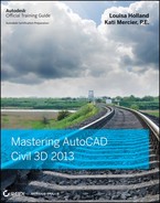
There are several ways to enter the various dialogs used for editing styles. The easiest, most direct way into any style is from the Settings tab. Right-click on any style you see listed and select Edit, as shown in Figure 21.1.
Figure 21.1 Every style can be edited by right-clicking on the style name from the Settings tab of Toolspace.
You can also enter the styles' dialogs from the properties of any object by clicking the Edit button. Figure 21.2 shows the active styles on a surface, with the Edit button to the right. Editing at this level affects all objects that use the style, the same as it would if you had entered the style from the Settings tab. The downside to editing a style in this manner is that you will not immediately be able to click Apply to see your change. You'll need to exit the style's dialog and click Apply at the object level before seeing your style update.
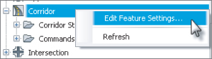

Figure 21.2 An object's properties reveal the current style, which can be edited, as in this Surface Properties dialog.

Frequently Seen Tabs
Object styles control the display of Civil 3D objects such as points, surfaces, alignments, pipes, sections, and so on.
Consider a Civil 3D surface. Sometimes you want to see the surface as contours, other times you want to see the surface as triangles, and sometimes you don't want to see it at all. Changing what you see is not a matter of freezing and thawing layers, but it is a matter of changing the active style. Think of the active style on an object as a wrapper. A surface model will have many potential wrappers depending on what you want to see. The underlying data does not change, but the representation of the data will change.
On the Settings tab of Toolspace, if you click the Expand button next to the drawing name, you see the full array of objects that Civil 3D uses to build its design model. Each of these has special features unique to the object being described, but there are some common features as well.
Information Tab
The Information tab (Figure 21.3) controls the name of the style. You will see this tab in every object style dialog.
Figure 21.3 The Information tab exists for all object styles.

The description is always optional, but we recommend that you add some information to the style. The description can be seen in tooltip form as you search through the Settings tab, as shown in Figure 21.4.
Figure 21.4 Tooltip showing style information, including the description
On the right side of the dialog you will see the name of the style, the date when it was created, and the last person who modified the style. These names are initially pulled from the Windows login information and only the Created By field can be edited.
Display Tab
On the Display tab, you will see a list of the various components that can be displayed for the object you are working with. You will see this tab in every object style dialog. The Display tab controls the look of the object in Plan, Model, Profile, and Section views. Not every object type will have all of these views available. In Figure 21.5 you can see that a general-purpose marker contains only one component (the marker itself), and a surface model has components for contours, triangles, points, and more.
Figure 21.5 The display of a simple marker style (above) and a more complex surface style (below)
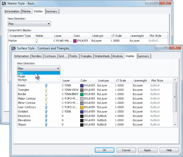
While other tabs in an object style control the specifics of how certain components look, the Display tab controls if the component displays at all. The visibility lightbulb indicates whether the component will be displayed when the style is applied to the object. In the Surface Style dialog shown in Figure 21.5, you can see that triangles, border, major contours, and minor contours will all display for the Surface object style but the other components will not be displayed in plan view.
Each component will have a layer designation. You may be wondering, “Didn't I set a surface layer back in the Drawing Settings on the Object Layers tab back in Chapter 1?” Yes, you did. Those were overall object layers. The layers you see here are component layers. Using the analogy of a base AutoCAD® block, the Object layer can be thought of in the same way as a block insertion layer. The object component layers can be thought of in the same way as layers inside the block definition.
This is Civil 3D, of course, so the objects exist in three dimensions. View Direction controls the display of an object depending on how you are looking at it. Certain items, such as a profile view, are intended to only be seen in plan, so they do not have multiple view directions listed. Surface models make an appearance in plan, model, and section, as shown previously in Figure 21.5. A marker, on the other hand, can be shown in plan, model, profile, or section, as seen in Figure 21.6.
Figure 21.6 View Directions for the marker style

Summary Tab
The Summary tab is exactly what it sounds like — that is, a summary of all other settings that exist in the style. You will see this tab in every object style dialog. The information from other tabs in list form as well as their override status is shown in Figure 21.7.
Figure 21.7 Summary tab of a marker style

You can click the + or – button next to each category branch to expand to see further settings. At the bottom-right corner of the dialog are three buttons. The top button collapses all of the category branches, the middle button expands all of the category branches, and the bottom button (which is sometimes not selectable) overrides all child dependencies. In addition, at the bottom of this dialog, additional information will be shown for the property selected.
General Settings
The General collection contains settings and styles that are applied to various objects across the entire product. The General collection serves as the catchall for styles that apply to multiple objects and for settings that apply to no objects. The General collection has three collections (or branches):
- Multipurpose Styles
- Label Styles
- Commands
You learned about the Label Styles collection in Chapter 20, “Label Styles,” but let's look a little closer at the Multipurpose Styles and Commands collections.
Multipurpose Styles
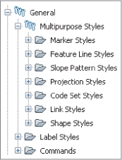
If you expand the Multipurpose Styles collection, you will see seven folders, as shown in Figure 21.8.
Figure 21.8 General ⇒ Multipurpose Styles
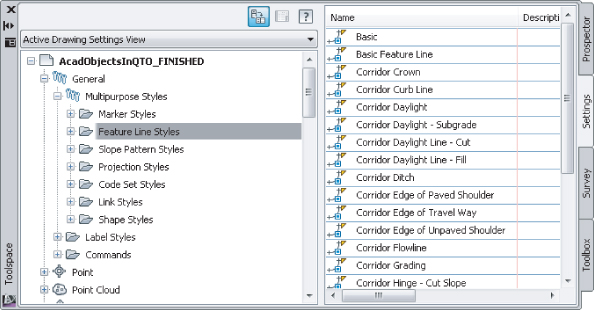
These styles are used in many objects to control the display of components in objects. For example, the Marker Styles and Link Styles collections are typically used in cross-section views, whereas the Feature Line Styles collection, shown in Figure 21.9, is used in grading and other commands.
Figure 21.9 Feature Line Styles collection
Commands
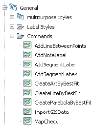
Almost every branch in the Settings tree contains a Commands folder. Expanding this folder, as shown in Figure 21.10, shows the typical long, unspaced command names that refer to the parent object. Various commands have been discussed throughout this book.
Figure 21.10 Commands folder
Point and Marker Object Styles
Markers are used in many places throughout Civil 3D. They are called from other styles to show vertices on Civil 3D objects, as label location marks, or even as a marker to indicate the start of a flow line.
Marker Tab
Marker styles and point styles both contain a Marker tab (Figure 21.11). The Marker tab controls what symbol or block is used, its rotation, and how it should be sized when it is placed in the drawing.
Figure 21.11 Marker tab for the Benchmark point style.
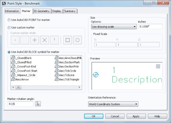
Three symbol types can be used. Use Custom Marker and Use AutoCAD BLOCK Symbol For Marker are the best options. Use AutoCAD POINT For Marker is a poor choice because it uses the symbol specified by the DDPTYPE setting and is difficult to control. When you choose the Use Custom Marker option, you can select a combination of symbols to mix and match, one symbol from the left of the vertical and either or none of the symbols from the right of the vertical line.
When you choose the Use AutoCAD BLOCK Symbol For Marker option, you will be able to access a listing of blocks in your drawing. If the block you want to use does not yet exist in the drawing, you can right-click in the block listing and choose Browse, as shown in Figure 21.12.
Figure 21.12 Right-click to browse for a block if it is not already defined in your drawing.

The Size options control how the symbol is scaled when inserted in the drawing (Figure 21.13):
Figure 21.13 Size options for marker display

Use Drawing Scale
Use Drawing Scale allows you to specify the plotted size of the symbol. The modelspace size of the symbol will be the size specified in the style multiplied by your annotation scale.
Use Fixed Scale
Use Fixed Scale will scale the symbol based on the X, Y, and Z scale set in the style. This option will also use the Fixed scale factor in the description key set when used with a survey point.
Use Size In Absolute Units
Use Size In Absolute Units is the option you will use in point styles that vary in size based on a survey description. For example, if this is a TREE symbol and you want the size of the symbol to reflect the trunk diameter in feet, set this to 1.
Size Relative To Screen
Size Relative To Screen allows you to specify the size of the symbol as a percentage of your screen. This setting can quickly become annoying, because the marker will constantly change size as you zoom in or out. We do not recommend that you enable it.
Orientation Reference (as seen in the bottom-right corner of Figure 21.11) controls whether the symbol stays rotated with the view, world coordinate system, or, in the case of survey points, the object. In most cases, the Orientation Reference setting should be set to World Coordinate System or View.
Create a Marker Style
Now to get your hands on some object styles. You will start with simple styles and work your way up in complexity as this chapter progresses. In this first exercise you will create a marker style.
Your VPI marker will now be listed in the General ⇒ Multipurpose Styles ⇒ Marker Styles branch. By creating this marker style in a drawing template, you have made it accessible for any future projects that use this template to start from. Keep this drawing template open for the next portion of the exercise.
Create a Survey Point Style
Survey point styles contain many of the same options as marker styles. As you work through the following example, you will perform many of the same steps you did in the previous exercise:
Figure 21.14 Use the Shift key on your keyboard as you click the components to multiselect.

You can save and keep this drawing template open to continue on to the next exercise, or use the saved copy of this drawing template (PointObjectTemplate_FINISHED.dwt or PointObjectTemplate_METRIC_FINISHED.dwt) available from the book's web page at www.sybex.com/go/masteringcivil3d2013.
Linear Object Styles
In this section, you will see some linear styles such as alignments, profiles, and parcels. Hopefully, you are already seeing that concepts from one type of style often apply to other types of object styles. For alignment styles and profile styles, this is especially true.
Both alignment styles and profile styles have a Design tab, as shown in Figure 21.15. In the case of the alignment styles, the Enable Radius Snap option restricts the grip-edit behavior of alignment curves. If you enable this option and set a value of 0.5', the resulting radius value of curves will be rounded to the nearest 0.5'. In the case of profiles, the curve tessellation distance is a little more abstract. Curve tessellation refers to the smoothing factor applied to the profile when viewing it in 3D. Most users leave these settings at their default values.
Figure 21.15 Design tabs exist in both alignment and profile object styles.

Alignment styles and profile styles have very similar Markers tabs. This tab is where you can place markers (like the one you created in the first exercise of the chapter) at specific geometry points. Figure 21.16 shows the markers assigned to various locations along an alignment.
Figure 21.16 Markers for an alignment style.
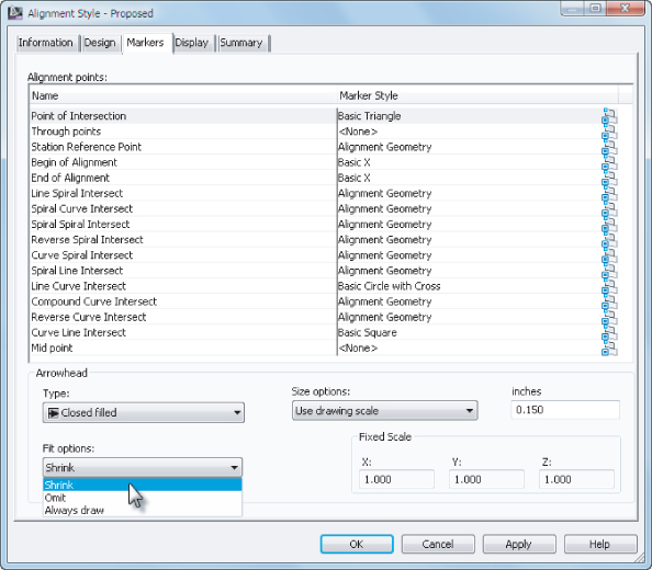
At the bottom of Figure 21.16 you see Arrowhead information. Both alignment styles and profile styles have the option of showing a direction arrow on each segment. Most people choose to omit this by turning the Arrow component off in the Display tab or setting the component to a layer that is set to No Plot. You should consider the latter, as knowing the direction of an alignment comes in handy when designing roundabouts, as you saw in Chapter 11, “Advanced Corridors, Intersections, and Roundabouts.”
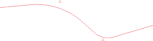
Figure 21.17 shows some commonly highlighted geometry points and components in an alignment. The markers in Figure 21.17 correspond to the markers defined in Figure 21.16.
Figure 21.17 Example alignment with alignment points labeled
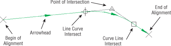
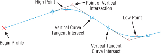
Figure 21.18 shows the Markers tab for the profile style. It looks pretty similar to the alignment Markers tab, don't you think?
Figure 21.18 Markers for a profile style

The markers in Figure 21.19 correspond to the markers defined in Figure 21.18.
Figure 21.19 Example profile with profile points labeled
Alignment Style
Alignment styles can be helpful in identifying key design components, as well as showing the stationing direction. Use multiple alignment styles to visually differentiate centerline alignments from supplemental alignments such as offset alignments and curb return alignments.
In the following exercise, you will create a style that restricts radius grip edits to five-foot increments and displays basic alignment components:
Figure 21.20 Centerline alignment style.
When this exercise is complete, you can close the drawing template. A saved copy of this drawing template is available from the book's web page with the filename AlignmentObjectTemplate_FINISHED.dwt or AlignmentObjectTemplate_METRIC_FINISHED.dwt.
Parcel Styles
The parcel styles have several unique features that make them different from other styles.
In the Design tab of a parcel (shown at the top in Figure 21.21), you see parcel-specific options. A fill distance can be specified to place a hatch pattern along the perimeter of the parcel. This setting is useful to differentiate “special” parcels such as parks, limits of disturbance, or environmentally sensitive areas.
Figure 21.21 Parcel style options (above) and the resulting parcel graphic (below)
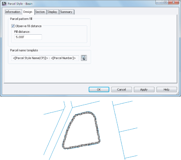
The fill distance indicates the width of the hatch pattern. The Component Hatch Display characteristics, including the pattern, angle, and scale, are specified at the bottom of the Display tab. Be sure to put the hatch component on its own layer so that it can be turned off independently from the parcel itself, as hatches tend to slow down the graphics. The bottom of Figure 21.21 shows the parcel graphic resulting from the design settings shown.
Feature Line Styles
Feature lines are found in quite a few different places. They are created automatically as part of corridors, created as a result of grading, or can be created independently by the user. Because their scope crosses functionality, you will find feature line styles in the General ⇒ Multipurpose Styles collection in Settings.
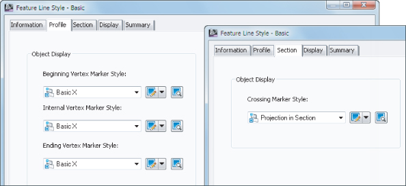
By definition, a feature line is a 3D object; therefore, its style can be controlled in plan, profile, and section. As shown in Figure 21.22, a feature line can use markers at geometry points.
Figure 21.22 Feature line profile marker options (left) and section marker option (right)
Surface Styles
Surface styles are the most widely used styles in any Civil 3D project. Depending on which style is active, certain editing options may be restricted. For example, you need to see points before Civil 3D will let you use the Delete Point command.
Each tab in the Surface Style dialog corresponds to components listed in the Display tab. Remember, the Display tab determines the component's layer, color, linetype, and so forth, but it does not control the specifics of the component's properties (such as contour interval or point symbol).
Once a surface is created, you can display information in many ways. The most common so far has been contours and triangles, but these are the basics. By using varying styles, you can show a large amount of data with one single surface. Not only can you do simple things such as adjust the contour interval, but also Civil 3D can apply a number of analysis tools to any surface:
Contours
Allows the user to specify a more specific color scheme or linetype as opposed to the typical minor-major scheme. Commonly used in cut-fill maps to color negative colors one way, positive contours another, and the balance or zero contours yet another color.
Directions
Draws arrows showing the normal direction of the surface face. This tool is typically used for aspect analysis, helping site planners review the way a site slopes with regard to cardinal directions and the sun.
Elevations
Creates bands of color to differentiate various ranges of elevations. You can use this tool to create a simple weighted distribution to help in creation of marketing materials, hard-coded elevations to differentiate floodplain, and other elevation-driven site concerns, or ranges to help a designer understand the earthwork involved in creating a finished surface.
Slopes
Colors the face of each triangle on the basis of the assigned slope values. While a distributed method is the normal setup, a common use is to check site slopes for compliance with Americans with Disabilities Act (ADA) requirements or other site slope limitations, including vertical faces (where slopes are abnormally high).
Slope Arrows
Displays the same information as a slope analysis, but instead of coloring the entire face of the TIN, this option places an arrow pointing in the downhill direction and colors that arrow on the basis of the specified slope ranges. This is useful in confirming surface flow direction for site drainage.
User-Defined Contours
Refers to contours that typically fall outside the normal intervals. These user-defined contours are useful to draw lines on a surface that are especially relevant but don't fall on one of the standard levels. A typical use is to show the normal water surface elevation on a site containing a pond or lake.
Watersheds
Used for watershed analysis, this style allows you to examine how water flows along and off of a surface. Using the surface TIN, the drain targets and watersheds are defined. An example of creating a watersheds surface style is provided later in this section.
In the following exercises, you will walk through the steps of creating or modifying surface styles.
Contour Style
Contouring is the standard surface representation on which land development plans are built. In this example, you'll copy an existing surface contouring style and modify the interval to a setting more suitable for commercial site design review:
Figure 21.23 The Contours tab in the Surface Style dialog

Figure 21.24 Exaggerate the elevations seen in the Object Viewer.
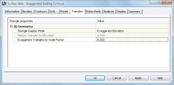
Figure 21.25 Minor Contour flying solo in plan

The surface should be rendered faster than you can read this sentence, even with the contour interval you've selected with only the minor contours displayed. After the style is applied to the surface model, you should see simple contours in plan view (the left image in Figure 21.26) and an exaggerated surface model in the Object Viewer (the right image in Figure 21.26).
Figure 21.26 A portion of the surface showing your new style shown in plan (left) and in model (right) as shown in the Object Viewer

You skipped over one portion of the surface contours that many people consider a great benefit of using Civil 3D: depression contours. If this option is turned on via the Contours tab, ticks will be added to the downhill side of any closed contours leading to a low point. This is a stylistic option, and usage varies widely.
You can save and keep this drawing open to continue on to the next exercise or use the saved copy of this drawing available from the book's web page (SurfaceStyleContours_FINISHED.dwg or SurfaceStyleContours_METRIC_FINISHED.dwg).
Triangle and Points Surface Style
The next style you create will help facilitate surface editing. To work with the Swap Edge or Delete Line Surface edits, you must be able to see triangles. To work with the Delete Point, Modify Point, and Move Point commands, you must be able to see triangle vertices.
It is important to note that the points you see in the surface style do not refer to survey points. The points you are working with in this exercise are triangle vertices. The triangle vertices and survey points will initially be in the same locations for a surface built from points. However, as breaklines are added or edits are made to the triangle vertices, the surface model will differ from the original survey.
Figure 21.27 Access Copy by right-clicking directly on the style name.
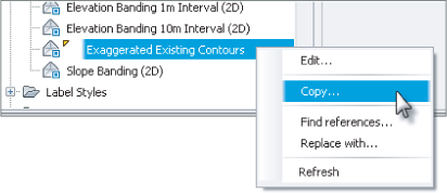
Figure 21.28 Change the point display so triangle vertices stand out.

Figure 21.29 Change the Points and Triangles layers in the Display tab.

Figure 21.30 Triangles and points shown using the new surface style

With the points and triangles displayed, you can now edit the surface, such as deleting points or swapping edges.
You can save and keep this drawing open to continue on to the next exercise or use the saved copy of this drawing available from the book's web page (SurfaceStyleTriangles_FINISHED.dwg or SurfaceStyleTriangles_METRIC_FINISHED.dwg).
Analysis Styles
Analysis styles are unique in several ways. To see the style applied to your design, you must run the analysis in the surface properties in addition to applying the style to the surface. The elevation and slope analysis styles do not let you set a layer for the components because the colors and behavior are set on the Analysis tab.
These distribution methods show up in nearly all the surface analysis methods. Here's what they mean:
Equal Interval
This method uses a stepped scale, created by taking the minimum and maximum values and then dividing the delta into the number of selected ranges. For example, if the surface has elevations from 0 to 10, with four ranges they will be 0 to 2.5, 2.5 to 5.0, 5.0 to 7.5, and 7.5 to 10. This method can create real anomalies when extremely large or small values skew the total range so that much of the data falls into one or two intervals, with almost no sampled data in the other ranges.
Quantile
This method is often referred to as an equal count distribution and will create ranges that are equal in sample size. These ranges will not be equal in linear size but in distribution across a surface. For example, if the surface has elevations from 0 to 10 with most of the surface at the higher elevations, with four ranges they may be 0 to 4.78 (25 percent of the surface), 4.78 to 6.25 (25 percent of the surface), 6.25 to 7.95 (25 percent of the surface), and 7.95 to 10 (25 percent of the surface). This method is best used when the values are relatively equally spaced throughout the total range, with no extremes to throw off the group sizing.
Standard Deviation
Standard Deviation is the bell curve that most engineers are familiar with, suited for when the data follows the bell distribution pattern. It generally works well for slope analysis, where very flat and very steep slopes are common and would make another distribution setting unwieldy.
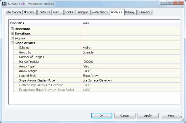
You looked at an elevations, slopes, and slope arrows earlier in Chapter 4, “Surfaces.” In the following exercise, you will create a surface style for watershed analysis. To apply the new style to the surface, you must also run the analysis.
Figure 21.31 Changing the hatch options for watershed areas

Figure 21.32 Set the color scheme and arrow length on the Analysis tab.
Figure 21.33 You must run the analysis in surface properties before the watershed style kicks in.

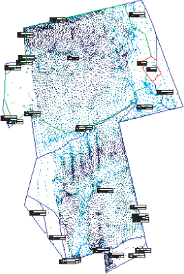
Figure 21.34 The isolated surface using the Watershed Analysis style
Now that the watershed analysis has been run, you could provide further information by generating a dynamic Watershed table similar to how you generated a table showing other surface information in Chapter 4.
When this exercise is complete, you can close the drawing. A saved copy of this drawing is available from the book's web page with the filename SurfaceStyleWatershed_FINISHED.dwg or SurfaceStyleWatershed_METRIC_FINISHED.dwg.
Pipe and Structure Styles
In Chapter 14, “Pipe Networks,” you learned that the best way to manage pipes and structures was in a parts list. One of the functions of a parts list is to associate styles to pipes and structures. In this section, you will learn how to create the pipe and structure styles that are used by a parts list.
In your template, you will have multiple styles for the various parts lists. You will want to have separate styles for water systems, storm sewers, and sanitary sewers. Additionally, you may want to have separate styles for existing and proposed systems. The main difference between the styles for the different systems will be the layers you set in the Display tab.
Pipe Styles
It seems like no two municipalities want pipes displayed the same way on construction documents. Luckily, Civil 3D is very flexible in how pipes are shown. With a single pipe style, you can control how a pipe is displayed in plan, profile, and section views. You can use multiple pipe styles to graphically differentiate larger pipes from smaller ones. This section explores all the options.
Plan Tab
The tab you see in Figure 21.35 controls what represents your pipe when you're working in plan view.
Figure 21.35 The Plan tab in the Pipe Style dialog
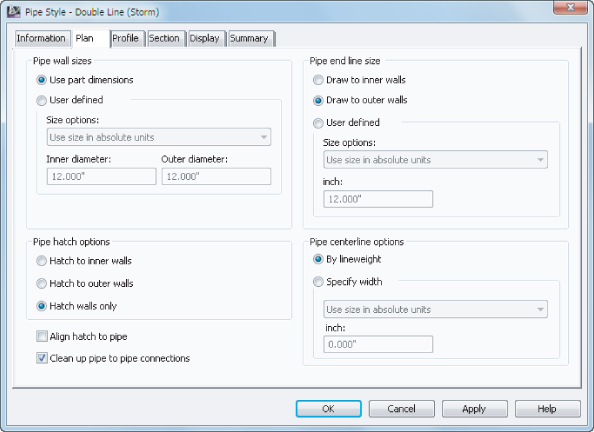
Pipe Wall Sizes
You have a choice of having the program apply the part size directly from the catalog part (that is, the literal pipe dimensions as defined in the catalog), or specifying your own constant or scaled dimensions.
Pipe Hatch Options
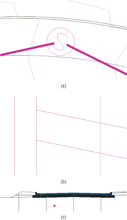
If you choose to show pipe hatching, this part of the tab gives you options to control that hatch. You can hatch the entire pipe to the inner or outer walls, or you can hatch the space between the inner and outer walls only, as shown in Figure 21.36. There are also options to align the hatch to the pipe, and to clean up pipe-to-pipe connections.
Figure 21.36 Pipe hatch to inner walls (a), outer walls (b), and hatch walls only (c)

Pipe End Line Size
If you choose to show an end line, you can control its length with these options. An end line can be drawn connecting the outer walls or the inner walls, or you can specify your own constant or scaled dimensions. The pipes from Figure 21.36 are all shown with pipe end lines drawn to outer walls.
Pipe Centerline Options
If you choose to show a centerline, you can display it by the lineweight established in the Display tab, or you can specify your own part-driven, constant, or scaled dimensions. You could use this option for your sanitary pipes in places where the width of the centerline widens or narrows on the basis of the pipe diameter.
Profile Tab
The Profile tab (see Figure 21.37) is almost identical to the Plan tab, except the controls here determine what your pipe looks like in profile view. The only additional settings on this tab are the crossing-pipe hatch options. If you choose to display crossing pipe with a hatch, these settings control the location of that hatch.
Figure 21.37 The Profile tab in the Pipe Style dialog
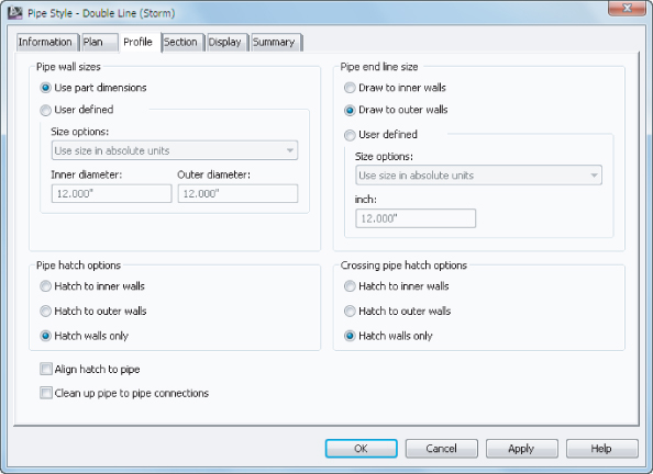
Section Tab
If you choose to show a hatch on your pipes in section, you control the hatch location on this tab (see Figure 21.38).

Figure 21.38 The Section tab in the Pipe Style dialog

In the examples that follow, you will create various types of pipe styles.
The first style is for a situation where the pipe must be shown in plan view with a single line, the thickness of which matches the pipe inner diameter. In profile, the pipe will show the inner diameter lines, and in section it will show as a hatch-filled ellipse.
Figure 21.39 Setting the hatch pattern display for the section view direction
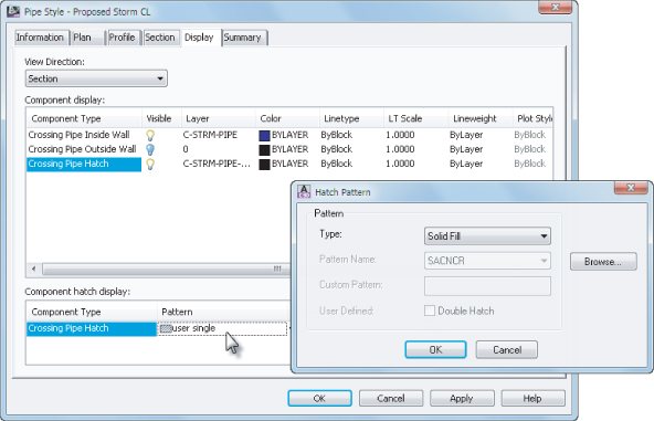
Figure 21.40 Proposed Sanitary CL pipe style shown in plan (a), profile (b), and section (c)
You can save and keep this drawing open to continue to the next exercise, or use the saved copy of this drawing available from the book's web page (PipeStyle_FINISHED.dwg or PipeStyle_METRIC_FINISHED.dwg).
In the next pipe style example, you will create a style that uses several options for hatching pipe walls for a pipe:
Figure 21.41 Proposed Hatch Wall pipe style shown in plan (a), profile (b), and section (c)
When this exercise is complete, you can close the drawing. A saved copy of this drawing is available from the book's web page with the filename PipeStyleHatch_FINISHED.dwg or PipeStyleHatch_METRIC_FINISHED.dwg.
You could also do this same exercise for a pressure pipe style. The only difference would be setting the layers to C-WATR-PIPE instead of C-SSWR-PIPE, or C-WATR-PROF instead of C-SSWR-PROF.
Structure Styles
The following tour through the structure-style interface can be used for reference as you create company-standard styles:
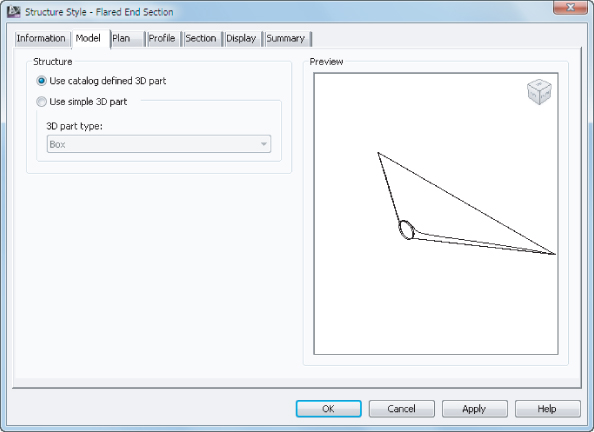
Model Tab
The Model tab (Figure 21.42) controls what represents your structure when you're working in 3D. Typically, you want to leave the Use Catalog Defined 3D Part radio button selected so that when you look at your structure, it looks like your flared end section or whatever you've chosen in the parts list.
Figure 21.42 The Model tab in the Structure Style dialog
Plan Tab
The Plan tab (Figure 21.43) enables you to compose your object style to match that specification.
Figure 21.43 The Plan tab in the Structure Style dialog
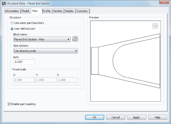
Use Outer Part Boundary
This option uses the limits of your structure from the parts list and shows you an outline of the structure as it would appear in the plan.
User Defined Part
This option uses any block you specify. In the case of your flared end section, you chose a symbol to match the CAD standard. When using a User Defined Part you also must provide Size Options. The options in this drop-down are similar to what you see in other places in Civil 3D. Use Size In Absolute Units is a common way to represent a manhole at actual size. Use Drawing Scale will treat the object like an annotative block.
Enable Part Masking
This option creates a wipeout or mask inside the limits of the structure. Any pipes that connect to the center of the pipe appear trimmed at the limits of the structure.
Profile Tab
Once you know what your structure must look like in the profile, you use the Profile tab (Figure 21.44) to create the style.
Figure 21.44 The Profile tab in the Structure Style dialog
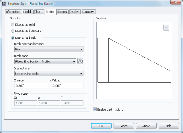
Display As Solid
This option uses the limits of your structure from the parts list, and shows you the mesh of the structure as it would appear in profile view.
Display As Boundary
This option uses the limits of your structure from the parts list, and shows you an outline of the structure as it would appear in profile view. You'll use this option for the sanitary manhole.
Display As Block
This option uses any block you specify. When using a Structure displayed as a block you also must provide Size Options.
Enable Part Masking
This option creates a wipeout or mask inside the limits of the structure. Any pipes that connect to the center of the pipe appear trimmed at the limits of the structure.
Section Tab
Once you know what your structure must look like in section view, you use the Section tab (Figure 21.45) to create the style.
Figure 21.45 The Section tab in the Structure Style dialog
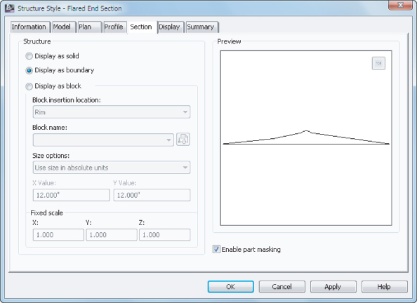
In the following exercise, you'll create a new structure style that uses a block in plan view to represent a sanitary manhole. Because the block is drawn at actual size, you will use the size option Use Fixed Scale.
When this exercise is complete, you can close the drawing. A saved copy of this drawing is available from the book's web page with the filename StructureStyle_FINISHED.dwg or StructureStyle_METRIC_FINISHED.dwg.
While this example discussed creating object styles for a structure, you will find that the same procedure is applicable to the Appurtenances and Fittings styles used in pressure pipe networks.
Profile View Styles
When you are looking at a profile view that contains data, you are seeing many styles in play. The profiles themselves (existing and proposed) have a profile object style applied to them. The labeling has several styles applied to it, as you learned in Chapter 20. Additionally, you will see profile view styles and band styles in action.
This section focuses on the profile view. A profile view controls many aspects of the display. The profile view style has a large role in determining:
- Vertical exaggeration
- Grid spacing
- Elevation annotation
- Title annotation
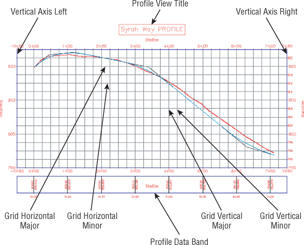
Figure 21.46 shows the basic anatomy of the profile view you have been working with throughout this book.
Figure 21.46 Profile view style and basic anatomy
In the example that follows, you will be making major modifications to a profile view style. The profile view that you will be practicing with does not contain any bands. Later on in this section, you will learn the ins and outs of band creation and modification.
Figure 21.47 Accessing the profile view style

Figure 21.48 Change Vertical Exaggeration on the Graph tab of the Profile View Style dialog.
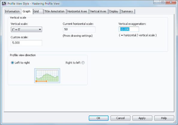
Figure 21.49 The Grid tab of the Profile View Style dialog

Figure 21.50 Working with the Graph View Title size and placement

Figure 21.51 The bottom axis controls grid spacing.
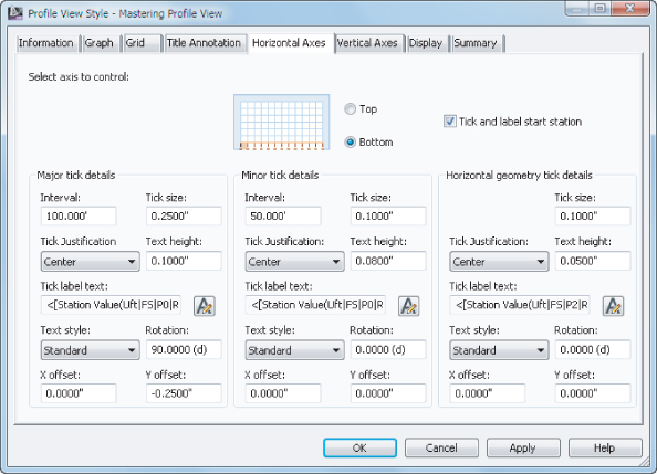
Figure 21.52 Don't forget to change the settings for both Left and Right axes in this tab.

- Graph Title
- Left Axis
- Left Axis Annotation Major
- Right Axis
- Right Axis Annotation Major
- Top Axis
- Bottom Axis
- Bottom Axis Annotation Major
- Grid Horizontal Major
- Grid Horizontal Minor
- Grid Vertical Major
- Grid Vertical Minor
Your profile view should resemble Figure 21.53.
Figure 21.53 Profile view that you started with (above) and after the style is completed (below)

Profile View Bands
Data bands are horizontal elements that display additional information about the profile or alignment that is referenced in a profile view. The most common band type is the profile data band. The other band types are not frequently used, but can be helpful to designers by showing schematic representations of design as it relates to the profile stationing.
Bands can be applied to both the top and bottom of a profile view, and there are six band types: Profile Data Bands, Vertical Geometry Bands, Horizontal Geometry Bands, Superelevation Bands, Sectional Bands, and Pipe Data Bands. These band types were discussed in Chapter 7, “Profiles and Profile Views,” but a graphic reminder of the various band types is shown in Figure 21.54 through Figure 21.59.
Figure 21.54 Profile Data Band showing existing and proposed elevation in addition to major stations
Figure 21.55Vertical Geometry Band
Figure 21.56Horizontal Geometry Band
Figure 21.57Superelevation Data Band
Figure 21.58Section Data Band
Figure 21.59 Pipe Data Band showing invert elevations and slope schematic
Bands can be saved in band sets. Like alignment label sets and profile label sets, a band set determines which bands are applied to a profile view and will dictate the placement. The most common use for a band set is to create a single, viewable band and an additional nonvisible band for spacing purposes in plan and profile sheet generation.
In the following exercise, you will create a band that contains existing and proposed profile elevations:
Figure 21.60 Band Details tab
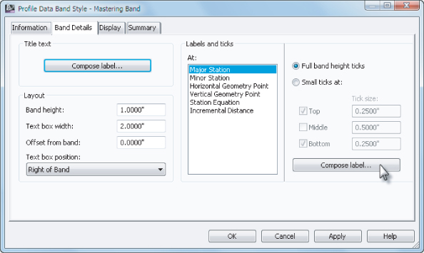
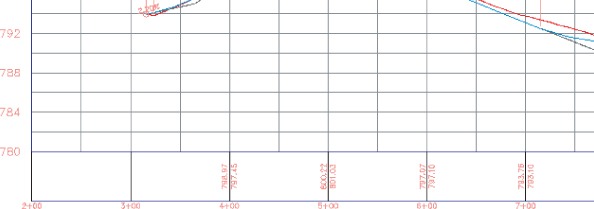
The completed band should resemble Figure 21.61.
Figure 21.61 Text along the bottom of your profile view in the form of a band
As you can see, profile bands can provide a lot of information in a compact manner. In this example you only provided information at the major stations, but you could also provide information at minor stations, horizontal geometry points, vertical geometry points, station equations, and incremental distances.
When this exercise is complete, you can close the drawing. A saved copy of this drawing is available from the book's web page with the filename ProfileBands_FINISHED.dwg or ProfileBands_METRIC_FINISHED.dwg.
Section View Styles
Section view styles share many of the same concepts as creating profile view styles. In fact, the Section View Style dialog has all the same tabs and looks nearly identical to the Profile View style.
In this section, you will walk through the creation of a section view style suitable for creating a section sheet:
- Graph Title
- Left Axis Annotation Major
- Right Axis Annotation Major
- Bottom Axis Annotation Major
Figure 21.62 Yes, this is correct! A very stripped-down section view.

Why the bare-bones section view? The section view grid will come from the group plot style, so the only information you really need is in this simple style.
You can save and keep this drawing open to continue on to the next exercise or use the saved copy of this drawing available from the book's web page (SectionStyles_FINISHED.dwg or SectionStyles_METRIC_FINISHED.dwg).
Group Plot Styles
The driver behind how section sheets get laid out on a page is the group plot style. Upon section creation, the group plot style takes the Section template file and fits sections inside the paperspace viewport:
Figure 21.63 The Array tab controls section view spacing.
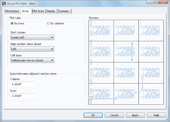
Figure 21.64 The Plot Area tab is where grid spacing on sheets comes from.
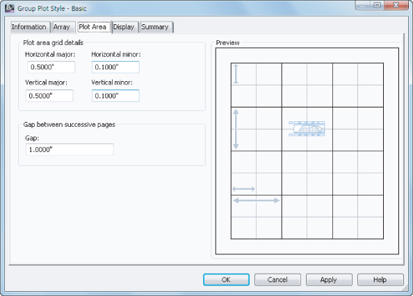
Figure 21.65 Group plot style display components
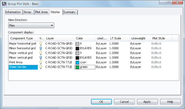
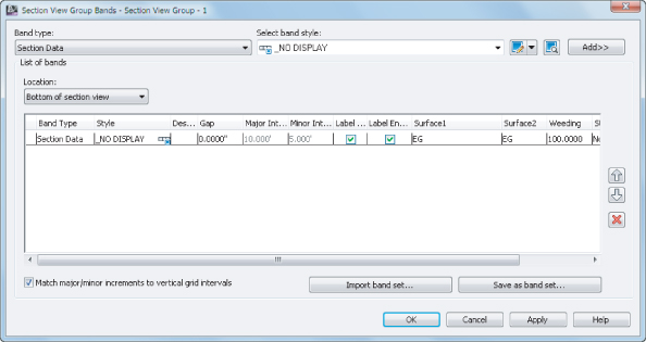
Figure 21.66 Changing the band set in use for all section views
Figure 21.67 Add the data band and set the gap to 0.
The cross section sheets should look like Figure 21.68.
Figure 21.68 The completed exercise

When this exercise is complete, you can close the drawing. A saved copy of this drawing is available from the book's web page with the filename GroupPlotStyles_FINISHED.dwg or GroupPlotStyles_METRIC_FINISHED.dwg.
With all of the object styles, you have a great deal of control over every detail, even ones that may seem trivial. Instead of being bogged down trying to understand every option, don't be afraid to try a “trial and error” approach. If you make a change you don't like, you can always edit the style until you get it right.
The Bottom Line
Override object styles with other styles.
In spite of the desire to have uniform styles and appearances between objects within a single drawing, project, or firm, there are always going to be changes that need to be made.
Master It
Open the MasteringStyles.dwg or MasteringStyles_METRIC.dwg file and change the alignment style associated with Alignment B to Layout. In addition, change the surface style used for the EG surface to Contours And Triangles, but change the contour interval to be 1′ and 5′ (or 0.5 m and 2.5 m) and the color of the triangles to be yellow.
Create a new surface style.
Almost every set of plans that you send out of the office is going to include a surface, so it is important to be able to generate multiple surface styles that match your company standards. In addition to surface styles for production, you may find it helpful to have styles to use when you are designing that show a tighter contour spacing as well as the points and triangles needed to make some edits.
Master It
Open the MasteringSurfaceStyle.dwg or MasteringSurfaceStyle_METRIC.dwg file and create a new surface style named Micro Editing. Set this style to display contours at 0.5′ and 1.0′ (or 0.1 m and 0.2 m), as well as triangles and points. Set the EG surface to use this new surface style.
Create a new profile view style.
Everyone has their preferred look for a profile view. These styles can provide a lot of information in a small space, so it is important to be able to create a profile view that will meet your needs.
Master It
Open the MasteringProfileViewStyle.dwg or MasteringProfileViewStyle_METRIC.dwg file and create a new profile view style named Mastering Profile View. Set this style to not clip the vertical or horizontal grid. Set the bottom horizontal ticks at 50′ and 10′ intervals (25 m and 5 m). Set the left and right vertical ticks at 10′ and 2′ intervals (5 m and 1 m). In addition, turn off the visibility of the Graph Title, Bottom Axis Annotation Major, and Bottom Axis Annotation Horizontal Geometry Point. Set the profile view in the drawing to use this new profile view style.