
IN THIS CHAPTER
Understanding Ajax
Learning about Spry
Incorporating Spry XML data
Dreamweaver Technique: Setting up Master/Detail Data Regions
Validating with Spry form widgets
Dreamweaver Technique: Customizing Spry Validations
Advancing layouts with Spry widgets
Dreamweaver Technique: Adding an Accordion Panel
Applying Spry effects
Dreamweaver Technique: Growing Images from Thumbnails
Remember the first time you saw Google Maps? If you're like me, after you'd spent a good amount of time clicking and dragging the map around or zooming in on a satellite view, you did a right-click to confirm your suspicion that it was done with Flash. Wrong! The magic of Google Maps (http://maps.google.com), as well as other sophisticated sites like Flickr (http://flickr.com) and Yahoo! Tech (http://tech.yahoo.com), all rely on a relatively new technology known as Ajax. Ajax combines advanced JavaScript coding, Document Object Model (DOM) manipulation, and XML data to allow partial page refreshes without long waits for a new page of HTML to arrive from the server.
Ajax is highly touted as a key component of the next generation Internet, known in designer circles as Web 2.0. To make it possible for more and more people to integrate Ajax techniques into their sites, numerous implementations have been developed. One such implementation, Spry, was developed by Adobe and released for use by the general public. The Dreamweaver engineers took Spry to the next level and developed a series of objects and features to make it easy for designers to incorporate the advanced functionality of Ajax into their sites.
This chapter explores the relationship between Ajax, Spry, and the new Spry tools in Dreamweaver. After an overview that provides the background you'll need on Ajax and Spry, you'll learn how to use the Spry data tools to create interactive page regions that update instantly, without requiring a full page refresh. You'll also get a look at a series of Spry widgets, which bring sophisticated JavaScript functionality to both layout and form validation. The chapter closes with an in-depth look at Spry effects—client-side behaviors guaranteed to spice up your sites and have your page visitors wondering how you did it.
Ajax and Spry are two complimentary technologies. The first, Ajax, is the name given to an overall technique for seamlessly updating portions of a page. The second, Spry, is a specific implementation of Ajax, developed and released in the public domain by Adobe on their Labs mini-site (http://labs.adobe.com/technologies/spry).
In this section, you'll dive a bit deeper into both Ajax and Spry to better help you understand how the technologies work and what their uses are.
By now, you've probably heard that Ajax is short for Asynchronous JavaScript and XML—and the key, least understood, word is asynchronous. An asynchronous action is one that occurs out of the normal sequence. On the Web, the typical sequence is something like this:
The user's browser loads a Web page.
The user clicks a link on the page.
Browser sends the request for linked page to the host computer.
The host computer sends the HTML and dependent files to the user's browser.
The browser displays the page to the user.
These series of steps occur regardless of whether an entirely new page or just a section of the page is requested in what is referred to as a full-page refresh. One of the key benefits of Ajax is that it enables a partial-page refresh. Ajax acts as a middleman between the browser and the host computer, requesting only the data needed, out of the normal sequence. Here's a similar sequence with an Ajax-driven page:
The user's browser loads the Web page, along with the associated XML data.
The user clicks the link on the page, requesting new data.
The Ajax engine intercepts the link and sends the data to the browser.
The browser displays the page to the user.
In addition to having fewer steps, it's also important to realize that no long-distance fetching is involved; all the data is already loaded into the Ajax engine, ready for delivery. This makes page updates very fast and also reduces the server load.
Ajax is not without its limitations, however. Because the implementation depends on JavaScript, site visitors with JavaScript turned off will not have the same experience. Moreover, some browser functionality, like the Back button and bookmarking, do not work as might be expected with Ajax-driven pages; you cannot, for example, use the browser Back button to review previous Ajax data selection, nor can you bookmark them. Perhaps most importantly, accessibility suffers significantly under standard Ajax implementations; only a handful of screen readers are equipped to handle partial page updates. Designers need to carefully weigh Ajax's pros against its cons before incorporating the technologies into their sites.
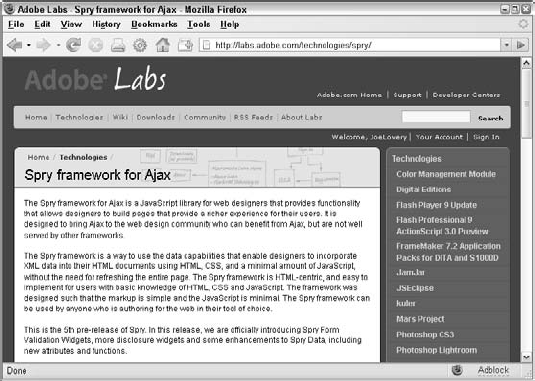
Ajax is a big hit in the Web community, and many, many developers have begun to look for ways to make it easier to integrate into their sites. Adobe jumped on the Ajax bandwagon with Spry in early 2006 through a public release of the technology on the Adobe Labs site (see Figure 18-1). Spry is officially known as a framework for Ajax: a framework is a set of JavaScript libraries combined with methods for applying the JavaScript functions in standard Web pages.
Note
Adobe continues to develop the Spry framework. As of this writing, the version available on the Adobe Labs site is 1.5. To meet documentation and localization requirements, Dreamweaver CS3 ships with version 1.4. Certain functionality and methods of implementation evidenced on the Labs site may not be available without hand-coding in Dreamweaver.
The initial step to working with Spry is to include links to the necessary JavaScript files in your document. When you begin to work with Spry data objects two key files, xpath.js and SpryData.js, are required. Dreamweaver automatically transfers the files you need to your site root and links to these files:
<script src="SpryAssets/xpath.js" type="text/javascript"></script>
<script src="SpryAssets/SpryData.js" type="text/javascript"></script>
To apply other Spry functionality, such as widgets or effects, requires other JavaScript files to be included.
One of the unique approaches of the Spry framework is that it is tag-based. Many other Ajax frameworks rely solely on JavaScript function calls embedded in links. Spry uses tag attributes like spry:region to indicate Ajax functionality, like this:
<div spry:region="ds1">
To ensure that such nonstandard coding still passes validation, Adobe maintains an XML document online that exposes the proprietary code. Such a document is called an XML namespace and is defined in the opening <html> tag of each document, like this (bolded for emphasis):
<html xmlns="http://www.w3.org/1999/xhtml"
xmlns:spry="http://ns.adobe.com/spry">
Again, Dreamweaver automatically adds this namespace declaration whenever Spry functionality is added to the page.
The Spry implementation in Dreamweaver focuses on three distinct areas of Web page development:
Data: Combines XML data with HTML pages, updating only the required portions of the page to present new data.
Widgets: Incorporates advanced JavaScript and CSS to enable sophisticated, interactive page layouts elements and instantaneous form validation.
Effects: Provides JavaScript libraries to achieve complex movements or interactions, like fading in and out, of specified page elements.
The following sections explore each of these separate Spry uses in detail.
One of the most compelling uses of Spry is to incorporate XML data into a standard Web page. A typical use case includes a static XML file and two separate, but connected, areas on a single page. One area, called the master region, lists the main data topics, such as movie titles. The second area, the detail region, displays related aspects of the selected main topic, that is, the movie's plot, director, cast, and poster. Whenever a user selects a different main topic, the details—and only the details—change; the rest of the page is not reloaded. A good example of this type of Spry-driven interaction can be found on Adobe Labs (http://labs.adobe.com/technologies/spry/demos/products/index.html), shown in Figure 18-2.
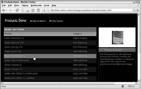
Figure 18-2. Choose any Adobe product from the master region on the left to see related info in the detail region on the right.
Integrating XML data into your Web page is not a trivial task—but the results are totally worth the effort. There are five primary steps to working with Spry data:
Connect to XML data
Specify Spry regions
Bind data
Connect master/detail regions
Add repeating areas
Let's work our way through the process one step at a time, starting with making a connection to your XML data.
Tip
You'll be happy to know that once you've established a connection to an XML data source, all of the following steps can be handled in one step. You'll learn how in the "Working with Spry Tables" section later in this chapter.
Dreamweaver refers to every connection to an XML file as a data set. Each data set connects to a specific tag or node within a single XML file. You'll recall that an XML file is structured to allow repeated data, like this:
<?xml version="1.0" encoding="ISO-8859-1"?>
<properties>
  <property>
    <type>House</type>
    <address>123 Main Street</address>
    <city>Anytown</city>
    <state>NY</state>
    <zip>10003</zip>
  </property>
  <property>
    <type>Apartment</type>
    <address>456 Downtown Avenue</address>
    <city>Key City</city>
    <state>CA</state>
    <zip>90023</zip>
  </property>
</properties>
In this example code, the <property> tag is the node that repeats; the XML data file could contain as many <property> nodes as needed. Once the data set has been established and the node identified, you can include any of the subordinate nodes (in this example, <type>, <address>, <city>, <state>, and <zip>) as data in your page.
Note
To learn more about the structure of XML, see Chapter 32, "Integrating with XML and XSLT."
To establish a Spry XML data set, follow these steps:
From the Spry or Data category of the Insert bar, choose Spry XML Data Set. Alternatively, you can choose Insert

Enter a name for your data set in the Data Set Name field or keep the default suggestion.
Click Browse to locate your XML data file. Either a local XML file in the site or an online file with an absolute URL can be used. However, the XML file must be located within the same domain as the current page for security reasons.
When the Select XML Data dialog box opens, navigate to your XML file and click OK. If you're working with a Web application that creates your XML file dynamically, choose Design Time Feed to select an example XML file to use in page development.
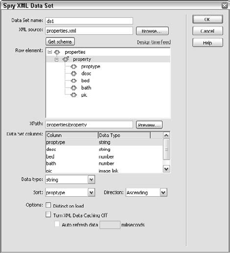
Click Get Schema to read the structure of the selected XML file and displays the results in the Row Element area, shown in Figure 18-3.
In the Row Element area, select the desired node. In most cases, you'll want to select a repeating node, identified with a plus sign. There are, however, circumstances where a non-repeating node is desired. You might, for example, need to establish a data set to get the overall or meta information. Both repeating and non-repeating nodes should contain children or subordinate nodes.
Dreamweaver inserts the proper syntax identifying the node in the XPath field.
If you want to review the selected node's data, click Preview to see the first 20 rows of data, sorted into columns; click OK when you're done to close the Preview dialog box.
To modify the data type for any available column, select the entry in the Data Set Columns and choose the desired type from the Data Type list. As you'll see later in this chapter, in the "Working with Spry Tables" section, Spry has the ability to easily establish sortable columns. If your data is not text, you'll need to choose another option—like number or date—from the Data Type list. Choose the image link option when your data is a path to a graphic file; this identification will allow Dreamweaver to add an
<img>tag when the data column is inserted into the page.To initially sort the data, choose the desired column from the Sort list and the desired Direction.
To avoid duplicate column, select the Distinct On Load option.
To load data directly from the server, enable the Turn XML Caching Off option. Normally, the data is cached on the client's system when the page is loaded to enhance performance. If the data is updates frequently, you should select this option to disable caching.
To update the data automatically, select the Auto Refresh Data option and enter the frequency for the refresh in milliseconds; 1000 is equal to 1 second. Some XML files, like the one used to display product details on Adobe Labs, are modified very infrequently. Others, such as those used for showing stock prices, are in constant flux. Dreamweaver lets you set how frequently the XML data should be refreshed, if at all. If the Auto Refresh option is not enabled, the data is loaded just once, when the page is first requested.
When you're done, click OK.
Save your page. When you save your page the first time a Spry XML data set is created, Dreamweaver informs you that supporting files have been copied to your site and must be uploaded to your remote site for final implementation. The Spry support files in this case are
SpryData.jsandxpath.js; both are placed in a SpryAssets folder at the root of the local site.

After you've completed the Spry XML Data Set dialog box, the data set is listed in the Binding panel; expand the entry to view the included columns, as shown in Figure 18-4.
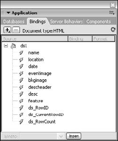
Figure 18-4. Once a connection to your Spry data set is established, the available columns appear in the Bindings panel.
In Code view, the data set object is declared through the JavaScript keyword new:
var ds1 = new Spry.Data.XMLDataSet("example.xml",
"events/event",{sortOnLoad:"name",sortOrderOnLoad:"ascending"});
Next, you'll learn how to identify specific areas of the page as Spry regions.
Once a connection to an XML data source is established, the next step is to define the regions on the page where that data can be used. A Spry region is identified by a proprietary attribute, typically added to either <div> or <span> tags, like this:
<div spry:region = "ds1">
There are two types of Spry regions: master and detail. The master region uses the spry:region attribute, whereas the detail region uses spry:detailregion. A detail region is one that depends on a selection from a master region. For example, you could have a master region that includes the addresses of various properties, while the detail region might show an image as well as a description of the user-selected property.
Dreamweaver includes a Spry Region object that inserts code that can be used in three different ways:
Insert a new
<div>or<span>tags at the current cursor location.Wrap a
<div>or<span>tag around the current selection.Replace the selection with a new
<div>or<span>tag.
Tip
If you want to identify an existing tag as a Spry region, you'll need to use Quick Tag Editor or Code view to add a spry:region or spry:detailregion attribute manually. To make this task as easy as possible, code hinting is available for this—and, in fact, all—Spry attributes. Set the Spry region attribute equal to the defined data set you want to appear in the region. Spry regions can be added to tags other than <div> and <span>; however, they cannot be added to the following tags: <col>, <colgroup>, <frameset>, <html>, <iframe>, <style>, <table>, <tbody>, <tfoot>, <thead>, <title>, and <tr>.
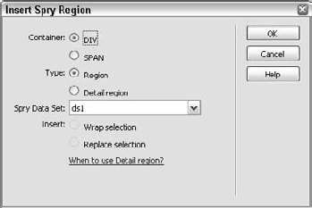
To add a Spry region to your page, follow these steps:
To add an empty Spry region, place your cursor where you'd like the region code to appear; to place a Spry region around existing content, select the desired content.
From the Spry or Data categories of the Insert bar, choose Spry Region.
The Insert Spry Region dialog box appears, as shown in Figure 18-5.
Select the type of tag you'd like to use—either DIV or SPAN—from the Container options.
Choose the type of tag—standard Region or Detail region—from the Type options.
Select the desired data set from the Spry Data Set list.
If you have a current selection, choose either the Wrap Selection or Replace Selection option.
Note
Replace Selection completely removes your selection, including all content contained within it, and substitutes either a <div> or <span> tag with the chosen attributes.
Click OK when you're done.
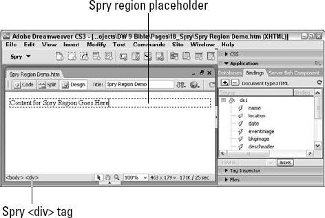
If you've chosen to insert a new <div> or <span> tag, Dreamweaver inserts it with a bit of placeholder content, as shown in Figure 18-6. Spry regions are further identified in the Tag Selector with a reddish-orange background color.
After a Spry XML Data Set has been defined, Spry data columns are shown in the Bindings panel. Inserted data columns are contained within curly braces, such as {address}, and must be placed within Spry regions to work properly.
These data columns can easily be inserted into Spry regions in several ways:
Dragged and dropped: Drag any data column to any position with the Spry region. If the data column is dropped on a selection, the selection will be replaced.
Inserted: Place your cursor where you'd like the selected data column to appear, and click Insert. As with the drag and drop method, any selected text or element will be replaced by the inserted data column.
Manually entered: The proper code (the data column name surrounded by curly braces) can be entered by hand in either Design or Code view as long as it is entered within a Spry region.
Tip
For more complex pages involving multiple data sets, binding data requires a different syntax, like this: {ds1::name}. In the more complete syntax, the data set name precedes the data column name with double colons between the two elements.
A typical workflow might be to convert an existing layout with static, placeholder text to one that displays Spry data. In this workflow, you would attach the Spry XML data set, surround your intended data areas with Spry regions and then begin replacing the placeholder text with Spry data columns.
Dragging or inserting works well when the data column is a text, number or data type, but what if it is the path to an image file? If you've set the data column type to Image Link in the XML Spry Data Set dialog box, the data column is inserted within an <img>, like this:
<img src="{eventimage}"/>To set the image src attribute for a Spry data column that has not been set as an Image Link type, follow these steps:
Place your cursor within the Spry region where you'd like your image to appear.
From the Common category of the Insert bar, choose Images: Image.
When the Select Image Source dialog box, change the Select File Name From option to Data Sources.
If necessary, expand the desired data set node.
Select the data column that contains the filename of the image.
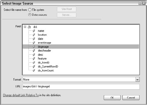
If the images are stored in a folder different from the current page, enter the path to the folder in the URL field before the inserted code, as shown in Figure 18-7.
When you're done, click OK.
The methods covered so far will allow you to display a single set of data on the page. In the next section, you'll discover how to display all the data by setting up repeating Spry regions.
For Spry data regions to be truly effective, all the instances of the chosen data has to be displayed. Spry offers a number of methods for easily setting up your data to be repeated, including the Spry Repeat and Spry Repeat List objects. Both of these objects use either the spry:repeat or spry:repeatchildren attribute, like this:
<div spry:repeat="ds1">
As with the spry:region, the spry:repeat attributes require the name of the data set to work with.
The Spry Repeat object is similar to Spry Region and is used when you want to insert a new <div> or <span> tag or wrap the current selection with either of these tags. To apply a Spry repeat region with the Spry Repeat object, follow these steps:
To add an empty Spry repeat tag, place your cursor where you'd like the region code to appear; to place a Spry repeat tag around existing content, select the desired content.
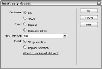
From the Spry or Data categories of the Insert bar, choose Spry Repeat. The Spry Repeat dialog box appears, as shown in Figure 18-8.
Select the type of tag you'd like to use—either DIV or SPAN—from the Container options.
Choose the type of attribute—Repeat or Repeat Children—from the Type options.
When should you use Repeat and when Repeat Children? In most typical cases, they both display the same results. However, the
spry:repeatchildrenattribute is more flexible and robust and is recommended for situations where the data might be filtered or conditionally displayed. For more details on these scenarios, see the sidebar "Restricting Repeated Spry Data" later in this section.Select the desired data set from the Spry Data Set list.
If you have a current selection, choose either the Wrap Selection or Replace Selection option.
Click OK when you're done.
Like Spry Region, placeholder text is inserted if a new <div> or <span> tag is chosen. You'll need to delete the placeholder text and add any Spry data and/or HTML tags you want repeated.
Tip
The Spry Repeat object works well to repeat enclosed <p> tags or data inline. To repeat a table row, you'll need to add the spry:repeat or spry:repeatchildren attribute to the <tr> tag manually in Code view or through the Quick Tag Editor, like this:
<tr spry:repeatchildren = "ds1">
The Spry Repeat List object allows you to apply Spry repeat attributes to four different tag options: <ol>, <ul>, <dt>, and <select>. Unlike the Spry Repeat object, the Spry Repeat List object includes an option to select the data column you want to repeat; with the <dt> and <select> tags, you have an ability to select two separate data columns.
Note
For those new to HTML, an <ol> tag is an ordered or numbered list; an <ul> tag is an unordered or bulleted list; a <dt> tag is a definition list; and a <select> tag is a drop-down form element. To learn more about the list tags, see Chapter 15, "Creating Lists," and for form tags, see Chapter 14, "Interactive Forms."
To insert an <ol>, <ul>, <dt>, or <select> tag with a Spry repeat attribute, follow these steps:
Place your cursor where you'd like the tag to appear.
From the Spry or Data categories of the Insert bar, choose Spry Repeat List.
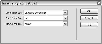
The Spry Repeat List object, showing the default options, appears (see Figure 18-9).
Select the desired tag from the Container Tag list.
The available options change depending on the tag selected.
Choose your data set from the Spry Data Set list.
Select the options for your chosen tag:
If you chose an
<ul>or<ol>tag, select the desired Spry data column from the Display Column list.If you chose a
<dt>tag, select the desired Spry data columns for both the<dt>and<dd>tags from the DT Column and DD Column lists, respectively.If you chose a
<select>tag, select the desired Spry data columns for the labels and values from the Display Column and Value Column, respectively.
Click OK when you're done.
Dreamweaver inserts both the HTML tags and the Spry attributes. Although it's highly unlikely that you would include multiple tags in a single Spry region, it's entirely possible, as shown in Figure 18-10.

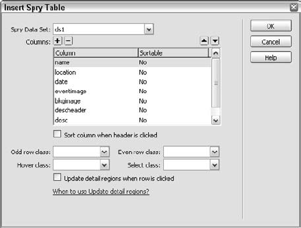
Without a doubt, the fastest way to integrate Spry data into your page is with the Spry Table object. The only preliminary step required is to set up a Spry XML data set—inserting a Spry Table does the rest, and even includes enhanced functionality. With a fully functioning Spry table, you'll be able to sort columns and automatically update an associated Spry detail region under user interaction. The Spry Table object also includes robust CSS support that display different CSS styles on odd and even rows as well as when the user's mouse hovers or clicks on any row.
To insert a Spry table in your page, follow these steps:
Make sure that you've established a Spry XML data set.
Place your cursor where you'd like the Spry table to appear.
If you've already created a place your cursor within the region; however, if you haven't the Spry table object will offer to create one for you after you've completed the Insert Spry Table dialog box (see Figure 18-11).
Select your data set from the Spry Data Set list.
Choose which columns you'd like to appear in the table. Delete a column by selecting it and choosing Remove (–). To restore a deleted column, choose Add (+) and select the desired column from the Add Columns dialog box that appears.
Set the order for your columns by selecting a column and adjusting its position with the up and down arrows.
Columns higher in the list are placed to the left of those lower in the list.
Add interactive sorting to any column by selecting the column and choosing the Sort Column When Header is Clicked option.
Any column with this option enabled will be noted with the word Yes in the Sortable column.
If desired, select the CSS classes to apply to odd and even rows in the Odd Row Class and Even Row Class lists, respectively.
Dreamweaver lists all the available CSS classes in the drop-down lists. If you don't have a class already defined, enter the name for your anticipated CSS rule (without a leading period) and define the rule after the Spry table is inserted.
If desired, select the CSS classes to apply when the user's mouse hovers over or selects a row in the Hover Class and Select Class lists, respectively.
These lists are also editable.
If the table to be inserted is within a master region and you want to automatically update a detail region, choose the Update Detail Regions When Row is Clicked option.
Click OK when you're done.
If your cursor is not within a Spry region, Dreamweaver asks if you'd like to add one: click Yes.
Dreamweaver inserts the customized table, surrounded by a Spry region, if necessary (see Figure 18-12). Each inserted table has with a header row for your column names and a detail row for the data; the header row names are taken from the Spry data columns (with the first letter uppercased) and can be modified easily in design view. Likewise, any additional styling may be applied.
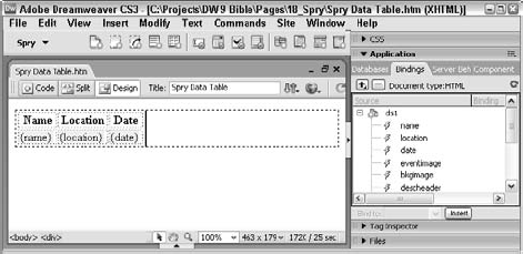
Let's look under the hood at the code generated by the Spry Table object—there's a lot to learn packed in. Here's a typical Spry table with three data columns, each of which is designated to be sortable:
<div spry:region="ds1">
  <table>
    <tr>
      <th onclick="ds1.sort('name','toggle')">Name</th>
      <th onclick="ds1.sort('location','toggle')">Location</th>
      <th onclick="ds1.sort('date','toggle')">Date</th>
    </tr>
    <tr spry:repeat="ds1" onclick="ds1.setCurrentRow('{ds_RowID}'),"
spry:odd="oddRow" spry:even="evenRow" spry:hover="hoverRow"
spry:select="selectRow">
<td>{name}</td>
<td>{location}</td>
<td>{date}</td>
</tr>
</table>
</div>Dreamweaver uses <th> tags for the header row. In each of the three <th> tags, you'll see a Spry sort() function, like this:
onclick="ds1.sort('name','toggle')"The sort() faction takes two arguments: the name of the data column and the type. The type value can either be ascending, descending, or toggle. A toggle value indicates that the data will be re-sorted when the column is clicked; the column toggles between ascending and descending order if clicked multiple times.
All the other functionality in this Spry table is found in the detail row's <tr> tag:
<tr spry:repeat="ds1" onclick="ds1.setCurrentRow('{ds_RowID}'),"
spry:odd="oddRow" spry:even="evenRow" spry:hover="hoverRow"
spry:select="selectRow">
In addition to the Spry repeat region and association with the Spry detail region discussed in previous sections of this chapter, this tag contains all the interactive CSS styles for the table. The spry:odd and spry:even attributes control the look of the alternating data rows of the table. In a Spry table the first row is 1 (odd) and the second row is 2 (even), and so forth. A typical approach is to declare different background colors for each of the respective classes, as shown in Figure 18-13.

The spry:hover and spry:select attributes further augment the usability of a Spry table. Any style applied to the spry:hover attribute is applied when the users mouse hovers over the table row; likewise, the spry:select style comes into play when the user clicks the row.
Adding Spry Data
The simplest way to incorporate Spry data into your Web pages is to establish an XML data connection and apply a Spry Table. This Dreamweaver Technique takes you through the necessary steps for adding Spry data to your page.
From the Techniques site, expand the 18_Spry folder and open the
spry_data_startfile.From the Insert bar's Spry category, choose Spry XML Data Set.
Leave the default data set name, ds1, and click Browse. In the Select XML Source dialog box, navigate to the 18_Spry folder and locate
properties.xml; click OK when you're ready.Click Get Schema. After the Row element area is populated, click the property entry to select the repeating node. (The repeating node is identified by the plus sign next to the angle bracket symbol.)
In the Data Set columns area, select bed and choose number from the Data Type list. Repeat the same operation for bath. Select pic and choose image link from the Data Type list.
From the Sort list, choose proptype. Click OK to confirm your choices and close the dialog box.
Now that the XML data connection is established, let's drop in the Spry Data Table.
Delete the placeholder text Data Table and from the Insert bar's Spry category, choose Spry Table.
When the Insert Spry Table opens, make sure that the Spry Data Set list is set to ds1.
Choose which data columns to display by eliminating those you don't want to show. Select bed from the Columns area and click Remove (–). Repeat the operation for both bath and pic.
To make both columns sortable, select proptype and choose the Sort Column When Header Is Clicked option. Repeat the operation for desc.
The next step establishes CSS classes for the data row in various positions and states.
From the Odd Row Class list, choose oddRow; from the Hover Class list, choose rowHover; and from the Select Class list, choose rowSelect. Leave the Even Row Class list blank.
Choose the Update Detail Regions When Row is Clicked option. Click OK when you're done.
When Dreamweaver asks if you'd like to include a Spry Region, click Yes.
Choose File
If you preview the page in a browser at this point, you'll see the XML data displayed, complete with state-changing effects. In the next Dreamweaver Technique, you'll extend the Spry data connection to a detail region.
Spry is not limited to data manipulation. Another Spry implementation, called widgets, combines HTML, JavaScript, and CSS to produce advanced interactive layouts and form controls. Spry layout widgets bring sophisticated design options—such as pure CSS menus and tabbed panels—to the Web professional's palette, while Spry form widgets solve one of the Web's most persistent problems, form validation, brilliantly.
All Spry widgets share certain common characteristics. First, they are extremely easy to implement: typically, only a dragged-and-dropped object is required. Second, all widgets rely on a customized Property inspector to make Design view modifications a snap. Finally, each widget is completely customizable through associated CSS rules—it's easy to integrate widgets into the look-and-feel of any CSS-based site.
Another commonality that Spry widgets share is their representation in Design view: each is contained by a blue border with an identifying tab, as shown in Figure 18-14, much like editable regions for Dreamweaver templates. To select any widget to modify the values of its Property inspector, click the blue tab.
As with the Spry Data objects, support files—one for JavaScript and one for CSS for each Spry widget—are automatically copied to the SpryAssets folder in your site root. These files are required and must be uploaded to your live site along with your other Web pages and assets.
For all their similarities, each of the Spry widgets offers a great deal of individual functionality. The following sections will show you how you can maximize that functionality to get the most out of your pages, starting with the Spry form validation widgets.
Validating form fields is like visiting the dentist: everybody knows they've got to do it, but the experience is so stressful that avoidance comes easy. Form validations ensure that your site visitors are entering the right kind of data into your forms—an often critical requirement, especially if the data is being stored in a spreadsheet or database. The typical form validation method requires multiple steps for each form element: first, the form element must be added to the page, and then a client-side or server-side behavior added and finally error and messages applied. With the Spry form validation widgets, all of these tasks are included in a single step.
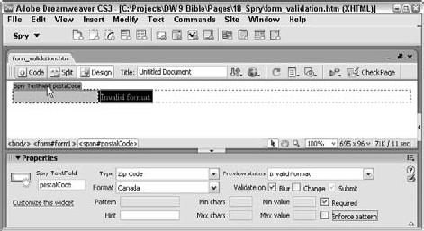
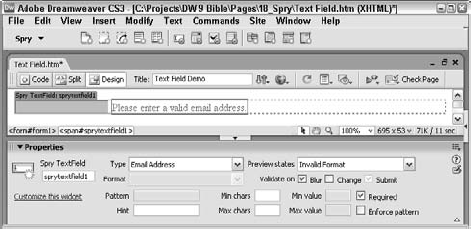
Because filling out a form is an interactive process, each of the Spry form widgets is capable of displaying different states; the number of states depends on the type of form element and the options chosen at design time. The custom Property inspector for each widget gives you the flexibility to switch between the various states at design time. For example, you could choose the Spry Validation Text Field widget's Invalid Format state to modify the error message and then switch to the Valid state to fine-tune the background-color property for a successful entry.
Another common feature among the Spry form widgets is the ability to apply the validation at multiple points in the process. By default, all the widgets automatically perform the requested validation when the user submits the form. Designers can also opt to perform the validation when the user clicks or tabs outside of a form field (onBlur) or when the value in the form field is altered (onChange).
Warning
It's important to understand that the name that appears in the Property inspector when the Spry validation widget is selected is not the name of the form element. The name of a form element is often a critical part of a Web application. To name a form element within a Spry widget, click anywhere on the page outside of the widget and then click on the form element itself; the Property inspector for the form element is now available and the name can be entered in the upper-left corner.
In all, there are four different Spry widgets for various form elements: text field, textarea, checkbox, and select menu. Let's start our tour of them by taking a look at the Spry Validation Text Field first.
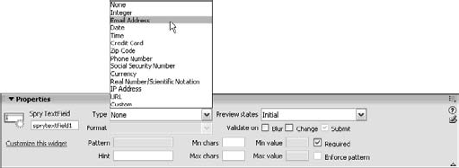
The text field is arguably the most common form element as it can be used for so many different purposes. Whether you're gathering names, email addresses, phone numbers, or even Social Security numbers, the text field is brought into play. Because of the wide range of types of information it is possible to enter into the text field, it requires the most varied range of validation. The Spry Validation Text Field offers 14 different types:
None
Integer
Email Address
Date
Time
Credit Card
Zip Code
Phone Number
Social Security Number
Currency
Real Number/Scientific Notation
URL
Custom
Some of the validation types—date, time, credit card, zip code, phone number, currency, and IP address—include a range of formats to choose from as well, expanding the validation possibilities. Moreover, the custom validation option opens the door for Web designers to specify any pattern of letters, numbers, and special characters.
To insert a Spry Validation Text Field widget, follow these steps:
Place your cursor where you'd like your text field to appear.
From the Spry or Forms categories of the Insert bar, choose Spry Validation Text Field.
If your Dreamweaver Preferences are set to display the accessibility attributes for form fields, the Input Form Accessibility Attributes dialog is displayed; click OK after you've completed the desired fields.
If your cursor is not within a
<form>tag, Dreamweaver asks if you'd like to add one; click Yes.From the Spry TextField Property inspector (see Figure 18-15), select the kind of validation to apply from the Type list.
If you just want to make sure a text value of some kind is entered, leave the Type set to None and verify that the Required option is selected.
If you've chosen a validation type with a number of formats, choose the one you want from the Format list.
If you want the form field to check the validation prior to submitting the form, select the Validate On Blur or Change options. You can select both options but for text fields, validating on blur—after the user has tabbed or clicked away from the field—covers all possibilities, including whether or not the user has changed the entry.
Enter any text you want to appear as the default entry in the Hint field. When the user selects a text field with a hint in it, the hint is removed. This functionality allows you to prompt your user for the desired information.
Set any other available options for the chosen validation. Depending on the validation type chosen, you may be able to set the minimum and maximum number of characters as well as the minimum and maximum value.
If you'd like the user to only be able to enter the desired characters, select the Enforce Pattern option. When the Enforce Pattern option is enabled, the user cannot enter invalid characters; the characters in the form field briefly flash red and the invalid character is discarded.
Note
When a Spry Validation Text Field is on the page, when the user saves the file, a notice appears regarding the supporting files as with the Spry data objects. Here, the files copied to the local root that need to be posted online are SpryValidationTextField.css and SpryValidationTextField.js.
After you've set the validation options for the text field, you can customize the various states. The Spry Validation Text Field widget offers up to four different states:
Initial: The default state of the text field; if a Hint has been specified, it is shown within the text field in the Initial state.
Required: Displays an error message if no value has been entered into field when validated.
Invalid Format: Displays an error message if an invalid value has been entered into field when validated.
Valid: Shown when the entry has passed validation.
To switch from one state to another, choose a different entry from the Preview States list in the Property inspector. When you do, Design view changes to reveal or hide the possible error messages and CSS stylings. You can easily modify any displayed message, as shown in Figure 18-16.
It's just as easy to customize the CSS for any portion of the validated form field like the border around the error message or the background color of the valid entry. Simply switch to the desired state, select the element you want to re-style and choose the CSS button in the Property inspector. The first time you select the CSS button, the CSS Styles panel opens in Current mode, with all the properties of the currently selected element available. Make any desired updates and save the external CSS file to store your changes.
The textarea form element is used to gather any amount of text, from a couple of words to several paragraphs. Because the textarea is open to accept any type of input, there is no validation type as with the text field. However, it is not uncommon for the number of characters to be limited in some fashion, either with a minimum, a maximum, or both. The Spry Validation Textarea widget easily handles these requirements—and with a great deal of flair.
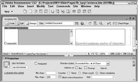
The Spry Validation Textarea widget can easily make the textarea field required through a Property inspector option. You can specify the number of characters desired: minimum, maximum or both. Any attempt to enter text beyond the maximum characters can be blocked. To help the user keep track, a counter can be added to show either the number of characters entered or remaining.
To insert a Spry Validation Textarea widget, follow these steps:
Place your cursor where you'd like your text field to appear.
From the Spry or Forms categories of the Insert bar, choose Spry Validation Textarea.
If your Dreamweaver Preferences are set to display the accessibility attributes for form fields, the Input Form Accessibility Attributes dialog is displayed; click OK after you've completed the appropriate fields.
If your cursor is not within a
<form>tag, Dreamweaver asks if you'd like to add one; click Yes.From the Spry Textarea Property inspector (see Figure 18-17), choose whether the field should be required or not by setting or clearing the Required checkbox.
If you want the form field to check the validation prior to submitting the form, select the Validate On Blur or Change options.
If you want to restrict the number of characters enter, set the minimum and/or maximum number of characters in the Min Chars and Max Chars fields, respectively.
To add a counter showing the number of characters entered into the field, select the Counter: Chars Count option; to add a counter showing the number of characters that can still be entered, select the Counter: Chars Remaining option. You need to enter a value in the Max Chars field to enable the Counter: Chars Remaining option.
If you've set a maximum number of characters and want to prohibit the user from entering any additional characters, select the Block Extra Characters option.
Note
When you save your file the first time after adding a Spry Validation Textfield widget, Dreamweaver will notify you of the supporting files: SpryValidationTextarea.css and SpryValidationTextarea.js.
Depending on your Property inspector settings, the Spry Validation Textarea widget provides up to five different states:
Initial: The default state of the text field; if a Hint has been specified, it is shown within the textarea field in the Initial state.
Required: Displays an error message if no value has been entered into the field when validated.
Min. # of Chars Not Met: Available if a value is entered in the Min Chars field of the Property inspector; and displays an error message if the current character count is less than the minimum.
Exceeded Max. # of Chars: Available if a value is entered in the Max Chars field of the Property inspector; and displays an error message if the current character count is greater than the minimum.
Valid: Shown when the entry has passed validation.
As with the other form validation widgets, you can switch from one state to another by selecting a different entry from the Preview States list in the Property inspector. This action exposes the possible error messages and CSS stylings for each state so you can modify them if desired, as shown in Figure 18-18.

Figure 18-18. Set a countdown counter so that your visitors will know exactly how many more characters they can add to a Spry Validation Textarea widget.
Tip
The counter feature of the Spry Validation Textarea widget really helps with usability. However, both the Chars Count and Chars Remaining options simply add a number without any identifying text. To add a label to the counter, switch to code view and search for <span>. Place your label before this span tag, not within it.
Select lists, also known as drop-down menus, provide the user with a number of choices to choose from. Validating a select list typically means ensuring that the user makes a choice—and the Spry Validation Select widget handles this chore well. Additionally, you can even make sure the user does not select a separator or other invalid choice.
Tip
The Spry Validation Select widget does not provide a field in the Property inspector for adding a hint, but you can set up your first option with a blank value to achieve the same effect.
To insert a Spry Validation Select widget, follow these steps:
Place your cursor where you'd like your text field to appear.
From the Spry or Forms categories of the Insert bar, choose Spry Validation Select.
If your Dreamweaver Preferences are set to display the accessibility attributes for form fields, the Input Form Accessibility Attributes dialog is displayed; click OK after you've completed the desired fields.
If your cursor is not within a
<form>tag, Dreamweaver asks if you'd like to add one; click Yes.From the Spry Select Property inspector (see Figure 18-19), choose whether a choice should be required by setting or clearing the Blank Value checkbox.
For the Blank Value option to work properly, you'll need to include one option, typically the top one, with no value, like this:
<option value="" selected="selected">Make a choice</option>
If you want the form field to check the validation prior to submitting the form, select the Validate On Blur or Change options.
If your form includes separators or other non-meaningful choices, select the Invalid Value option and set the value to restrict in the adjacent field.
The Invalid Value option is intended to prohibit users from selecting options like this one:
<option value="−1">-----------------------------</option>

Note
When you save your file the first time after adding a Spry Validation Select widget, Dreamweaver will notify you of the supporting files: SpryValidationSelect.css and SpryValidationSelect.js.
Depending on your Property inspector settings, the Spry Validation Select widget provides up to four different states:
Initial: The default state of the text field.
Required: Displays an error message if the Blank Value option has been selected and no choice has been made.
Invalid: Displays an error message if the Invalid Value option has been selected and the user has selected an entry with the designated improper value.
Valid: Shown when the entry has passed validation.
As with the other form validation widgets, you switch from one state to another by selecting a different entry from the Preview States list in the Property inspector. This action exposes the possible error messages and CSS stylings for each state so you can modify them if desired.
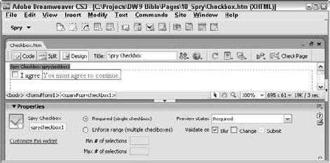
The Spry Validation Checkbox can be used with a single checkbox if it is required or with multiple checkboxes to control the number selected. An individual required checkbox is often used to certify that the site visitor has read and agrees to a statement, typically legal in nature like the terms of use. Multiple checkbox validation comes into play when the application requires that the visitor select a number of options within a certain range.
To insert a Spry Validation Checkbox widget, follow these steps:
Place your cursor where you'd like your text field to appear.
From the Spry or Forms categories of the Insert bar, choose Spry Validation Checkbox.
If your Dreamweaver Preferences are set to display the accessibility attributes for form fields, the Input Form Accessibility Attributes dialog is displayed; click OK after you've completed the appropriate fields.
If your cursor is not within a
<form>tag, Dreamweaver asks if you'd like to add one; click Yes.From the Spry Checkbox Property inspector (Figure 18-20), choose whether you want to validate a single checkbox or multiple checkboxes by selecting the Required or Enforce Range option, respectively.
If you want the form field to check the validation prior to submitting the form, select the Validate On Blur or Change options.
If you chose the Enforce Range option, enter either the minimum number of choices in the Min. # of Selection field or the maximum number in the Max. # of Selections field, or both.
Note
When you save your file the first time after adding a Spry Validation Checkbox widget, Dreamweaver will notify you of the supporting files: SpryValidationCheckbox.css and SpryValidationCheckbox.js.
Depending on your Property inspector settings, the Spry Validation Checkbox widget provides up to four different states:
Initial: The default state of the text field.
Required: Displays an error message if the Required option has been selected and the checkbox is unchecked.
Min. # of Selections Not Met: Displays an error message if the Enforce Range option has been selected and the current number of selected checkboxes is less than the minimum specified.
Max. # of Selections Exceeded: Displays an error message if the Enforce Range option has been selected and the current number of selected checkboxes is more than the maximum specified.
As with the other form validation widgets, you switch from one state to another by selecting a different entry from the Preview States list in the Property inspector. This action exposes the possible error messages and CSS stylings for each state so you can modify them if desired.
If you're working with multiple checkboxes, once you've inserted the Spry Validation Checkbox widget, all the other checkboxes entered should be standard ones, as shown in Figure 18-21. Also, you'll want to make sure that all inserted checkboxes are within the <spanid="sprycheckbox"> tag.

Figure 18-21. To validate multiple checkboxes, use standard Dreamweaver checkboxes after the inserted Spry Validation Checkbox widget.
Connecting to Detail Regions
A Spry detail region updates whenever an element of the associated master region is selected. This Dreamweaver Technique extends the previous technique in this chapter to create a master-detail connection.
From the Techniques site, expand the 18_Spry folder and open the spry_data_start file, if necessary.
The first task is to identify the containing <div> tag as a Spry detail region.
Select the placeholder image in the right-hand column.
From the Tag Selector, choose <div #divRight> and press Ctrl+T (Cmd+T) to open the Quick Tag Editor.
Press the right-arrow key to move past the last attribute and press Space. Enter the following code: spry:detailregion="ds1" and press Enter (Return) when you're done. Notice the tag in the Tag Selector turns a reddish-orange to indicate a Spry attribute.
Now you're ready to begin binding the XML data. Start with the text data.
Delete the placeholder text Number of Bathrooms and choose Window
Repeat the last operation, removing the placeholder text Number of Bedrooms and inserting the XML data column, bed.

From the Field area, choose pic.
Because the pic XML data is composed of just the file name, you'll also need to add the desired path.
Place your cursor in the front of the code {ds1::pic} in the URL field and enter ../images/ so that the final entry in the field looks like this: ../images/{ds1::pic}. Click OK when you're done.
Press Ctrl+S (Cmd+S) to save your page and then press F12 to preview the page in the browser.

As you rollover each of the different properties in the left column, a hover state should display a different background color. Select an entry and the color changes again to a light brown—and the elements in the detail region change as well.
Designers are always on the hunt for an innovative way to improve the layout of their Web pages—and the Spry layout widgets are ready to be put to work. These four widgets—Spry Menu Bar, Spry Tabbed Panels, Spry Accordion, and Spry Collapsible Panel—greatly expand the designer's layout palette. Take a look at the kind of flexibility now built into Dreamweaver:
Standards-based navigation bars, capable of supporting multiple levels, in either vertical or horizontal orientation.
A series of interconnected tabs, each with their own content area, easy to switch from one to the other.
Multiple sliding panels that interact with one another: slide one area open and the other areas close.
Individual pods in which the content can be hidden or revealed under user control.
All of the Spry layout widgets use advanced JavaScript and CSS techniques; like the form widgets, each requires a pair of external files that must be placed online. The layout widgets are just as easy to implement and configure, too. Once dropped on the page, any layout widget can be quickly modified through the custom Property inspector. Better still, for those widgets that involve multiple content areas, Dreamweaver is capable of showing tabs or panels individually in Design view. Layout widgets are fully customizable as well, so designers can totally make these sophisticated layout options their own.
Standards-based navigation bars have a number of advantages: they load very quickly, they're more accessible than graphic-based navigation, and they're very easy to label. However, they have one major disadvantage: they're very difficult to code correctly. The Spry Menu Bar in Dreamweaver dispenses with the downside with its instantaneous drag-and-drop application, while keeping all the upsides—and even adding some more.
A standards-based menu bar typically uses unordered list tags (a.k.a. bullets) that have been heavily styled with CSS to achieve multilevel navigation. The Spry Menu Bar widget can be applied horizontally or vertically and offers a main navigation level with up to two levels of drop-down or fly-out submenus. Once the widget is placed on the page, the custom Property inspector provides an intuitive way to adjust the menu in any way you'd desire. You can add more main or sub-menu items, re-label them, add appropriate links, restyle, and even add tooltips.
To add a Spry Menu Bar to your page, follow these steps:
Place your cursor where you'd like your menu bar to appear.
From the Spry or Layout categories of the Insert bar, choose Spry Menu Bar.
When the Spry Menu Bar dialog box opens, choose either Horizontal or Vertical to set the orientation of your navigation bar; click OK. Dreamweaver inserts the initial navigation bar and displays the custom Property inspector. The default horizontal menu bar is shown in Figure 18-22.
To change the label for any menu item, select it in the Property inspector and enter a new value in the Text field. You can also modify the displayed text directly in Design view. To reveal other menu items, select their entry in the Property inspector.
To create a link, select the menu item in the Property and enter the path in the Link field or use the Browse folder to select the file.
To add a tooltip to a menu item, select it and enter the text for the tooltip in the Title field.
To specify a target for a menu item link, select the menu item and enter the target keyword or name in the Target field. Standard keywords for targets include
_blank, _parent, _topand_self. You can also enter a frame name.
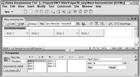
Tip
A great way to quickly modify your menu labels, links and structure in Design view is to select the Turn Styles Off button in the Spry Menu Bar widget Property inspector. With the styles off, you'll see just the unordered list and can make any edits necessary very simply.
To adjust a main menu or sub-menu item, follow these steps:
To add a new main menu item, choose Add (+) above the first column in the Property inspector.
New menu items are added with the label Untitled Item; modify the label in the Text field.
To add a sub-menu item, select the parent menu item and choose Add (+) above the second or third column.
To remove a menu item, select it in the Property inspector and choose Remove (–). If the menu item has any associated sub-menus, Dreamweaver asks for a confirmation before deleting; click OK to remove the menu item and its children.
To change the order of a menu item, select it and choose the up or down arrow in the current column.
Note
As with the form widgets, the first time you save a file with a Spry Menu Bar widget, Dreamweaver lets you know which supporting files have been copied to your site and will need to be posted online. There are different support files for the horizontal and vertical menus bars.
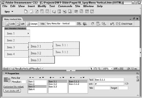
Vertical menus (see Figure 18-23) are just as easy to create and modify. Once they are inserted, you can easily change the labels and links, either through the Spry Menu Bar widget Property inspector or, once the menu item is visible, directly in Design view.
Modifying the CSS of a Spry layout widget is somewhat more involved than changing a form widget's style, but still is quite possible. The key is knowing which styles to adjust. One technique that works for me is to select the text in the menu item you want to adjust and then open the CSS Styles panel in Current mode. If the CSS property you want to modify is not found in the Summary panel, select the next tag to the left of the current one in the Tag Selector. This action effectively walks up the DOM. Continue moving up the DOM until you find the desired property in the CSS Styles panel and make your modification.
The Spry Tabbed Panels are a terrific way to pack a lot of content into a small amount of space. With a tabbed panel, the site visitor sees a series of tabs when the page first loads, with one of the tab's content displayed; a single click allows the user to switch to any other tab. The Spry Tabbed Panel widget is just as easy to set up and customize as the previous widgets.
To add a Spry Tabbed Panel widget to your page, follow these steps:
Place your cursor where you'd like your menu bar to appear.
From the Spry or Layout categories of the Insert bar, choose Spry Tabbed Panel Bar.
The default tabbed panel, with two tabs, is inserted into the page and the custom Property inspector (see Figure 18-24) is displayed.
To increase the number of tabs, from the Property inspector choose Add (+).
The new tab is inserted below the currently selected entry.
To remove a previously inserted tab, choose Remove (-).
To change the order of the tabs, select any tab and use the Up and Down buttons to adjust the tab position.
Tabs nearer to the top in the Property inspector are, in Design view, positioned to the left of the tabs beneath them.
To set the tab initially shown when the page loads, select the tab name from the Default list.
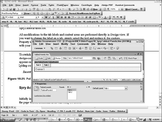
Note
As expected, the first time you save a file with a Spry Tabbed Panel widget, Dreamweaver lets you know of the supporting files that have been copied to your site and will need to be posted online. The Spry Tabbed Panel widget relies on two supporting files: SpryTabbedPanels.js and SpryTabbedPanels.css.
All modifications to the tab labels and content areas are performed directly in Design view. If you want to change the label on a tab, simply select the text and replace it; the custom Property inspector recognizes your new name. To add content, replace the placeholder phrase with your own material. Anything you can put on a Web page, you can put in a tab.
To switch to a different tab, you can select the tab entry in the Property inspector. For a more design-centric focus, move your mouse over the currently unexposed tab. When the eye icon appears on the right of the tab (see Figure 18-25), click the tab to bring it forward for styling or adding content.

If tabbed panels were a popular television show, the spin-off could be called Spry Accordion: The Next Generation. Like tabbed panels, an accordion panel layout is great for containing a good deal of information in a tighter space. Unlike tabbed panels, however, the label portion for an accordion panel runs the full width of the panel and, when selected, smoothly slides open to reveal the content. Spry Accordion Panel widgets, for all their slickness, are extremely easy to incorporate into a page and just as easy to customize.
Tip
Unlike with the Spry Tabbed Panel, there's no way to change the default panel in the Property inspector. The top panel is always open by default.
To add a Spry Accordion Panel widget to your page, follow these steps:
Place your cursor where you'd like your menu bar to appear.
From the Spry or Layout categories of the Insert bar, choose Spry Accordion Panel Bar.
The default accordion panel, with two tabs, is inserted into the page and the custom Property inspector (see Figure 18-26) displays.
To increase the number of panels, from the Property inspector choose Add (+).
The new tab is inserted below the currently selected entry.
To remove a previously inserted panel, choose Remove (-).
To change the order of the panel, select any tab and use the Up and Down buttons to adjust the panel position.

Panels nearer to the top in the Property inspector are, in Design view, positioned to the left of the panels beneath them.
Note
Like the other widgets, the first time you save a file with a Spry Accordion Panel widget, Dreamweaver tells you of the supporting files that have been copied to your site and will need to be posted online. The Spry Accordion Panel widget relies on two supporting files: SpryAccordionPanels.js and SpryAccordionPanels.css.
If you take a look at the HTML code for the Spry Accordion Panel, you'll see that it is essentially a series of nested <div> tags:
<div id="Accordion1" class="Accordion" tabindex="0">
  <div class="AccordionPanel">
    <div class="AccordionPanelTab">Label 1</div>
    <div class="AccordionPanelContent">Content 1</div>
  </div>
  <div class="AccordionPanel">
    <div class="AccordionPanelTab">Label 2</div>
    <div class="AccordionPanelContent">Content 2</div>
  </div>
  </div>
The real magic comes from the attached JavaScript script and the script tag at the bottom of the page that initializes the accordion object:
<script type="text/javascript">
<!--
var Accordion1 = new Spry.Widget.Accordion("Accordion1");
//-->
</script>
Modifications to the accordion panel labels and content areas are, like the tabbed panels, performed directly in Design view. To change the label on a panel, select the text and replace it. To add any content, remove the placeholder phrase and insert your material. Again, you can switch from one panel to another via the Property inspector or by choosing the eye icon in Design view.
A Spry Collapsible Panel is, in a sense, a single accordion panel. The same style of layout is used with the label placed in the full-width top tab and, when clicked, it collapses or expands. Because there is no other associated panel, only the tab remains when the panel collapses. The panel can either be open or closed when the page is initially displayed.
To add a Spry Collapsible Panel widget to your page, follow these steps:
Place your cursor where you'd like your menu bar to appear.
From the Insert bar's Spry or Layout category, choose Spry Collapsible Panel Bar. The default collapsible panel is inserted into the page and the custom Property inspector (see Figure 18-27) displays.
To set the panel to be open when the page loads, choose Open from the Default State list; to set the panel to be collapsed, choose Closed.
Note
As with the other widgets, the first time you save a file with a Spry Collapsible Panel widget, Dreamweaver tells you of the supporting files that have been copied to your site and will need to be posted online. The Spry Collapsible Panel widget relies on two supporting files: SpryCollapsiblePanels.js and SpryCollapsiblePanels.css.

Because the Spry Collapsible Panel widget can be either open or closed when the Web page loads, Dreamweaver lets you replicate those conditions. From the Collapsible panel Property inspector, you can choose either Open or Closed from the Display list. This feature also makes it easy to edit or style content. As with Tabbed and Accordion Panel widgets, you also have the option to select the eye icon that appears when your cursor moves over the Collapsible Panel tab; with the Collapsible Panel widget, the eye icon toggles between open and closed to reflect the state of the panel.
One additional control on the Property inspector allows you to turn the animation on or off. If the animation is disabled, the panel collapses or expands immediately.
Tip
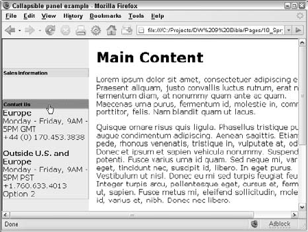
Like other panels, this widget expands to the width of the container—a perfect layout device for a sidebar. Even better, it's possible to stack them within a single container, as shown in Figure 18-28. When the top Spry Collapsible Panel is expanded, the panels below it are pushed down; when collapsed, they move up to fill the space. All in all, a very nice effect.
The third category of the Spry framework in Dreamweaver is Spry effects. Spry effects rely on next generation JavaScript techniques just as Spry data and Spry widgets do. And, like the other Web 2.0 implementations, Spry effects are very simple to implement and adjust.
Essentially, Spry effects are a group of Dreamweaver client-side behaviors. Behaviors are typically applied to a text or image link, although some are appropriate for the <body> tag. Once you have selected the triggering element, choose Window

Note
All of the Spry effects are covered in full detail in the "Dreamweaver CS3 Effects section of Chapter 12, "Using Behaviors."
Collectively, the Spry effects provide a new level of visual effects for the Dreamweaver designer. In all, there are seven different effects:
Appear/Fade: Interactively triggers a targeted page element, like a
<div>tag, to appear or fade over a set period of timeBlind: Simulates windows blinds raising to hide specified content and lowering to reveal it.
Grow/Shrink: Reduces or enlarges the targeted content for a set duration; you also have the option of growing or shrinking from the center of the target or from the upper-left corner.
Highlight: Displays a sudden burst of background color behind a page element, which then fades away of a set period of time.
Shake: Moves the targeted element left and right quickly, shaking it from side to side.
Slide: Similar to the Blind effect in that it hides or reveals targeted content; however, with Slide, it is the content itself that appears to move in or out of view. This effect requires an outer
<div>tag with an ID that surrounds another tag with an ID.Squish: Shrinks from 100% to 0% in the targeted element's upper-left corner; the effect can be applied again to grow the element to 100% in the opposite direction
Note
The JavaScript engine for all the effects are contained in a single file, SpryEffects.js. This file is included in your page automatically whenever you apply a Spry effect.
Without a doubt, Ajax has significantly increased the options a Web designer has to choose from. Adobe's implementation of the Spry framework provides a greatly simplified roadmap to help the Web professional incorporate these options. Dreamweaver takes the final step by providing a set of tools any designer can use to take their sites to the next level:
Ajax combines advanced JavaScript methods with DOM manipulation to seamlessly integrate XML data into Web pages. The Spry framework for Ajax, developed by Adobe, greatly simplifies implementing this technology.
The Spry data tools are used to establish a connection to an XML data source and then expose the data on the page. In addition to a series of lower-level objects such as the Spry Region and Spry Repeat, Dreamweaver also offers Spry Table, which supplies all the core code for displaying Spry data along with special functions like column sorting.
Spry Widgets are an amalgam of JavaScript, CSS, and HTML that advances the Web designer's art in two major areas: forms and layout. All Spry widgets can be straightforwardly added to a page and modified through the custom Property inspector and Design view.
The Spry form widgets make it possible to quickly and easily add form validation to text fields, text area, select lists and checkboxes. Complete customizable error messages to guide the user appear whenever validation fails.
There are four different Spry layout widgets available: Menu Bars, Tabbed Panels, Accordion Panels, and Collapsible Panels. Each of these widgets can be extended via the Property inspector and personalized through attached CSS style sheets.
The seven Spry Effects in Dreamweaver are next-generation behaviors that control the appearance of targeted page elements, such as particular
<div>tags. All Spry effects can be found in the Behavior panel, under the Effects menu entry.
In the next chapter, you begin working with dynamic content by learning the basics of establishing database connections and building recordsets.