
Understanding how divs and AP elements work in Dreamweaver
Inserting
<div>tagsDreamweaver Technique: Applying a CSS Layout
Modifying AP elements: Resizing, moving, and altering properties
Dreamweaver Technique: Inserting an AP element
Using forms in AP elements
Creating interactive AP elements with Dreamweaver behaviors
For many years, page designers have taken for granted the capability to place text and graphics anywhere on a printed page—even enabling graphics, type, and other elements to bleed off a page. This flexibility in design has eluded Web designers until recently. Lack of absolute control over layout has been a high price to pay for the universality of HTML, which makes any Web page viewable by any system, regardless of the computer or the screen resolution.
Lately, however, the integration of absolutely positioned elements (AP elements) within the Cascading Style Sheets specification has brought true absolute positioning to the Web. Page designers with a yen for more control welcome the precision offered with Cascading Style Sheets-Positioning (CSS-P). CSS-P styles are typically applied to <div> tags, which are used to separate a page into different areas or divisions.
Dreamweaver's implementation of <div> tags and AP elements turns the promise of CSS-P into an intuitive, designer-friendly, layout-compatible reality. AP elements offer more than pixel-perfect positioning. You can stack one AP element on another, hide some AP elements while showing others, move an AP element across the screen, and even move several AP elements around the screen simultaneously. AP elements add an entirely new dimension to the Web designer's palette. Dreamweaver enables you to create page layouts using AP elements.
This chapter explores every aspect of how AP elements work in Web pages. With the fundamentals under your belt, you learn how to create, modify, populate, and activate <div> tags and AP elements on your designs.
When the World Wide Web first made its debut in 1989, few people were concerned about the aesthetic layout of a page. In fact, because the Web was a descendant of Standard Generalized Markup Language (SGML)—a multiplatform text document and information markup specification—layout was trivialized. Content and the capability to use hypertext to jump from one page to another were emphasized. After the first graphical Web-browser software (Mosaic) was released, it quickly became clear that a page's graphics and layout could enhance a Web site's accessibility and marketability. Content was still king, but design was moving up quickly.
The first attempt at Web page layout was the server-side image map. This item was typically a large graphic (usually too hefty to be downloaded comfortably) with hotspots. Clicking a hotspot sent a message to the server, which returned a link to the browser. The download time for these files was horrendous, and the performance varied from acceptable to awful, depending on the server's load.
The widespread adoption of tables, released with HTML 2.0 and enhanced with HTML 3.2, radically changed layout control. Designers gained the capability to align objects and text—but a lot of graphical eye candy was still left to graphic files strategically located within the tables. The harder designers worked at precisely laying out their Web pages, the more they had to resort to workarounds such as nested tables and 1-pixel-wide GIFs used as spacers. To relieve the woes of Web designers everywhere, the W3C included a feature within the new Cascading Style Sheets specifications that allows for absolute positioning of an element upon a page. Absolute positioning enables an element, such as an image or block of text, to be placed anywhere on the Web page. Browser support for Cascading Style Sheets-Positioning specification began with fourth-generation browsers and has grown steadily ever since.
The addition of the third dimension, depth, truly turned the positioning specs into AP elements. Now objects can be positioned side by side, and they have a z-index property as well. The z-index gets its name from the practice in geometry of describing three-dimensional space with x, y, and z coordinates; z-index is also called the stacking order because objects can be stacked upon one another.
All these attributes, and others such as background color, can be assigned to a CSS style, as shown in the following code:
#header {
   position: absolute;
   z-index: 1;
   height: 115px;
   width: 400px;
   left: 100px;
   top: 50px;
   background: #FFCC33;
}
The CSS style is then applied to a <div> tag to represent an area on the page, like this:
<div id="header">Header content goes here.</div>
Dreamweaver calls <div> tags that are drawn with your mouse AP elements; the CSS style is automatically created and embedded in the page for you. Drawing out the same AP element results in the same CSS code, except the selector name is automatically created for you (apDiv1, apDiv12, and so on) and the code is embedded in the page, like this:
<style type="text/css">
<!--
#apDiv11 {
   position: absolute;
   z-index: 1;
   height: 115px;
width: 400px; left: 100px; top: 50px; background: #FFCC33; } --> </style>
The <div> code is also added for you, sans content, like this:
<div id="apDiv11"></div>
Although both approaches are valid, many designers prefer to keep the CSS information in the style sheet rather than embedded. As you see in this chapter, Dreamweaver supports both methods fully.
If you don't define a unit of measurement for AP element positioning, Dreamweaver defaults to pixels. If you edit out the unit of measurement, the Web browser defaults to pixels.
Note
Netscape developed two additional proprietary tags for using AP elements in its 4.x browser: <layer> and <ilayer>. The primary difference between the two tags has to do with positioning: The <layer> tag is used for absolute positioning, and the <ilayer> tag for relative positioning. These tags are not supported in Navigator 6.0 or later; instead, Netscape's more recent browsers fully support the CSS standard tags, <div> and <span>.
As noted earlier, CSS-P information can be defined in a style sheet or inline. Defining the CSS rule in a style sheet (either external or internal) has the benefit of truly separating content from presentation, which, in turn, makes it easier to reshape the content via another style sheet for another medium. A block of text, for example, can be positioned on the right when viewed in a monitor and left when printed out. Moreover, many designers find that centralizing the layout information in a style sheet is a far more effective way to work. Often the same layout is used on multiple pages of a site; with CSS-P rules in an external style sheet, you can modify the layout of all the related pages simply by altering the CSS in the style sheet. To accomplish the same change when the CSS is applied inline would require extensive search-and-replace and the re-uploading of every altered file.
Dreamweaver recognizes the importance of the <div> tag in modern Web site design with the integration of the <div> object. Not only is the insertion of the <div> tag now possible in Design view, but Dreamweaver also provides visual feedback indicating placement and easy modification through the Property and Tag inspectors.
When using a <div> object, the typical workflow is to first create the required CSS rules. In most cases, the CSS rule uses the ID selector because it is applied to only one <div> tag. It's a good idea to give your CSS rules descriptive names, such as #header, #footer, #mainContent, and #navigation.
Note
If you're not familiar with creating CSS style rules, see Chapter 7 for more information.
To create a CSS rule for use with <div> tags, follow these steps:
Choose Window

From the CSS Styles panel, click the New CSS Rule button. This action opens the New CSS Rule dialog box.
From the New CSS Rule dialog box, set the Type option to Advanced.
Enter a name for your new style in the Selector field. It's a good idea to create the style for your
<div>tag as an ID. To create an ID, preface the style name with a pound sign, as in#mainContent.If you want to create your style in an external style sheet, use the Browse button to locate an existing style sheet.
If you want to add the style to the
<head>region of the current document, select Define In This Document Only.Click OK when you're finished to open the CSS Rule Definition dialog.
Select the Positioning category.
From the Positioning category (see Figure 11-1), enter desired values for the following attributes: Type, Width, Height, Visibility, Z-Index, Overflow, Placement (Top, Right, Bottom, and Left), and Clip settings (Top, Right, Bottom, Left). Overflow and Clip settings are optional.
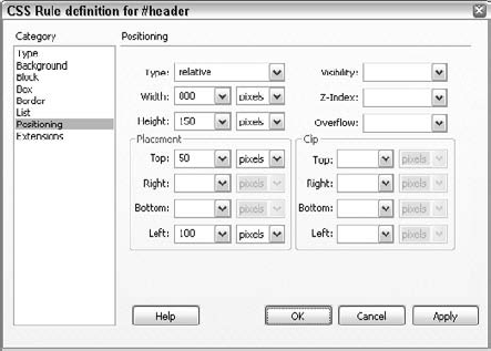
Figure 11-1. Use the Positioning category of the CSS Rule Definition dialog box to set AP element attributes in an internal or external style sheet.
The Type attribute offers three options: Absolute, Relative, and Static. An Absolute
<div>uses the upper-left corner as the origin for the Left and Top measurements, whereas Relative<div>tags originate from the current location. Use Static when you don't want to place the<div>in a certain position, but you still want to specify a rectangular block. Static<div>types ignore the Left and Top attributes.If appropriate, select other categories and enter any additional style sheet attributes. Click OK when you're finished.
After you have defined your CSS rule, follow these steps to add a <div> tag to the page:
Place your cursor where you want the
<div>tag to appear. You can also select content on a page you'd like to wrap a<div>tag around.From the Layout category of the Insert bar, click the Insert Div Tag button. Alternatively, you can choose Insert
Choose the CSS rule from either the Class or ID list. Dreamweaver shows only those IDs that have not been previously applied.
Tip
If the CSS rule is not available from either of the lists—perhaps because the style sheet is dynamically applied—you can enter the name directly into either the Class or ID field. However, unless Design Time Style Sheets are used to show the styles, the layout won't render properly in Dreamweaver.
Select where you'd like the tag placed from the Insert list. Dreamweaver provides different options depending on the makeup of the page and whether content is already selected. Only tags with assigned IDs are listed, along with the
<body>tag. Here are the Insert options you can choose from:At Insertion Point: Inserts the
<div>tag at the current cursor position. This option is available only if no content is selected.Wrap Around Selection: Wraps the
<div>tag around the currently selected content. Available only if a selection was made prior to inserting the<div>tag.Before Tag: Puts the tag before the tag selected in the adjacent field.
After Tag: Inserts the
<div>tag after the tag selected in the adjacent field.After Start Of Tag: Places the
<div>tag immediately following the opening tag in a tag pair, before any content within the tag.Before End Of Tag: Inserts the tag right before the closing tag in a tag pair, after any content within the tag.
Warning
Be sure not to insert the <div> tag in the middle of an empty tag. Empty tags, you may remember, are tags that have no corresponding closing tag and enclose no content, such as <img>.
Click OK when you're finished to insert the tag.
If the <div> tag was not wrapped around previously selected content, Dreamweaver adds placeholder text to help identify the tag and its class or ID. As another helpful aid to identification, a red outline appears when your cursor crosses the outer boundary of the <div>. This highlight is controlled by the Mouse-Over option found in the Highlighting category of Preferences. The red outline is replaced by a thick blue one when the <div> tag is selected, as shown in Figure 11-3.

Select the <div> in Design view and the Property inspector displays all the current attributes. If you make any changes in the Property inspector, such as adding or altering the background color, the change is written into the associated CSS style rule. If the <div> tag's position property is set to absolute, the outline is supplemented with positioning and sizing handles. The interaction among object, Property inspector, and style sheet holds true if you drag the selected <div> around the page or resize it using the sizing handles; see the following section, "Modifying an AP Element," for more details. You can also modify <div> tag properties by editing the style rule directly or by altering its properties on the Tag Inspector panel.
Warning
If your layout is controlled by an external style sheet that also controls the layout of other pages in your site, be careful when adjusting the properties of a <div> tag. When you make changes, Dreamweaver modifies the CSS style rule in the external style sheet, potentially altering the layout of other pages using the same style sheet.
The <div> tag is a structural element, not intended to be apparent when viewed through the browser at run-time. Design-time, however, is another matter. Designers often need to be able to see the underlying structure to craft their layouts; they also need to be able to hide the structure at any point so they can see a browser-like view while designing.
Dreamweaver provides a full slate of visualization options for CSS layouts. Each of the options, found under the Visual Aids menu button on the Document toolbar or the View
In the early stages of laying out a page, it's often helpful to see your basic building blocks clearly depicted. When you invoke the CSS Layout Background options from the Visual Aids menu, Dreamweaver clears any background image or color previously defined in the CSS styles and replaces them with a different solid color for each <div> tag. The resulting patchwork shows at a glance how the page is structured (see Figure 11-4). This option is also useful when debugging layouts because it clearly shows which <div> tags—if any—overlap.

All CSS block elements are rendered in the browser according to the CSS box model. The box model, established by the W3C CSS standards body, determines how much room a block element actually takes up on the page. The amount of space required for a block element, such as a <div> tag, is a combination of the declared width, plus the padding, border, and margin settings. For example, say a div tag has the following style declared:
#myBox {
  width:200px;
  padding:10px;
border:5px; margin:10px; }
Although nominally, the myBox style appears to be 200 pixels wide, CSS specifications indicate that it will actually take up 250 pixels of space. Here's how the space requirement is figured:
200 pixels content area width
       10 pixels padding-left
       10 pixels padding-right
        5 pixels border-left
        5 pixels border-right
       10 pixels margin-left
       10 pixels margin-right
      250 pixels width total
To make it easy for you to design with the box model in mind, Dreamweaver provides the CSS Layout Box Model visual aid. When enabled, any selected <div> tag or otherwise affected block element, depicts all the contributing elements: content area (the width), padding, borders, and margins. Both the padding and margins are shown with colored diagonal lines, although in opposing directions, as shown in Figure 11-5.
Figure 11-5. The CSS Layout Box Model visual aid reveals the unseen reserved space around layout elements.
Dreamweaver not only reveals how the layout element is constructed visually, you'll also receive a wealth of information from tooltips that appear as you move your cursor around the element. The information in the tooltip varies according to cursor's position:
Hover over the content area to see all the CSS properties, including those related to the box model.
Move your cursor over the padding or margin areas to see their respective values; for example, Margin: 10px.
With the cursor over the border, the tooltip reveals the current values for the margin, border, and padding properties.
I recommend turning on the CSS Layout Box Model feature in the fine-tuning and debugging stages of your Web page development; it's a great tool for understanding exactly why elements on your page are positioned the way they are.
CSS Layout Outlines, when enabled, place a border around <div> tags and other block layout elements (see Figure 11-6). The outline is a dashed style for inserted <div> tags and a solid border for drawn Dreamweaver AP elements.
I tend to keep CSS Layout Outlines enabled during most of my design process; I find having the outlines visible quickly allows me to insert content in just the right places and, more importantly, select the <div> tags for quick refinement.
Applying a CSS Layout
In this Technique, you apply previously defined CSS styles to a variety of <div> tags to create a basic layout.
From the Techniques site, expand the 11_Divs folder and open
div_start.htm.The first style to apply acts as a container for the entire page; to apply this properly, you'll need to position the cursor properly.
Place your cursor in the series of links on the page and click the
<p>tag in the Tag Selector.From the Insert bar's Layout category, click Insert Div Tag.
When the Insert Div Tag dialog box opens, make sure the Insert list is set to Wrap Around Selection.
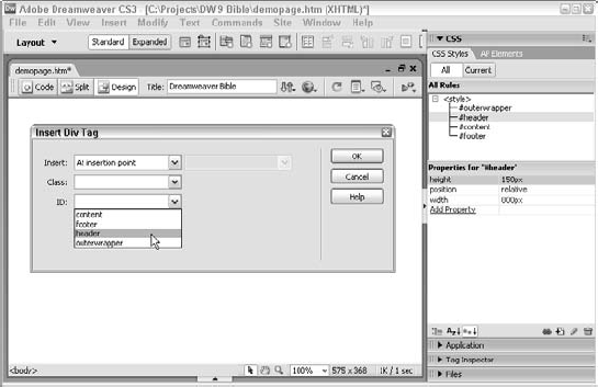
From the ID list, choose Wrapper and click OK.
Next, add the first of three <div> tags, the header so that it appears with the wrapper <div> tag:
From the Insert bar's Layout category, click Insert Div Tag.
From the Insert list, choose After Start Of Tag and then, when the adjacent list appears, select
<div id="wrapper">.From the ID list, choose Header and click OK.
Click Delete to remove the selected placeholder text.
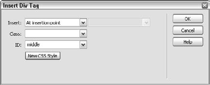
Now you're ready to insert the middle <div> tag after the header <div> tag:
From the Insert bar's Layout category, click Insert Div Tag.
From the Insert list, choose After Tag and then, when the adjacent list appears, select
<div id="header">.From the ID list, choose Middle and click OK.
The final <div> wraps around navigation links and forms the bottom area, the footer:
Place your cursor in the series of links on the page and click the
<p>tag in the Tag Selector.From the Insert bar's Layout category, click Insert Div Tag.
When the Insert Div Tag dialog box opens, make sure the Insert list is set to Wrap Around Selection and, from the ID list, choose Footer; click OK when you're done.

Save your page.
Your new CSS-based layout is now ready to be filled out with content.
Dreamweaver enables you to drag out embedded styled <div> tags, also known as AP elements, creatively and precisely—and without coding. You can drag out an AP element, placing and sizing it by eye, or choose to do it by the numbers—it's up to you. Moreover, you can combine the methods, quickly eyeballing and roughing out an AP element layout and then aligning the edges precisely. For Web design that approaches conventional page layout, Dreamweaver even includes rulers and a grid to which you can snap your AP elements. Creating AP elements in Dreamweaver can be handled in one of three ways:
You can drag out an AP element after clicking the Draw AP DivAP Div button on the Insert bar.
You can add an AP element in a predetermined size by choosing Insert
You can create an AP element with mathematical precision through the CSS Styles panel.
The first two methods are quite intuitive and are explained in the following section. The CSS Styles panel method is examined later.
When you want to draw out your AP element quickly, use the object approach. If you come from a traditional page-designer background and are accustomed to using a program such as QuarkXPress or PageMaker, you're already familiar with drawing out frames or text boxes with the click-and-drag technique. Dreamweaver uses the same method for placing and sizing new AP element objects. To draw out an AP element as an object, follow these steps:
From the Layout category of the Insert bar, click the Draw AP DivAP Div button. Your pointer becomes a crosshairs cursor. (If you decide not to draw out an AP element, you can press Esc at this point or just click once without dragging to abort the process.)
Click anywhere in your document to position the AP element and drag out a rectangle. Release the mouse button when you have an approximate size and shape that is satisfactory (see Figure 11-7).

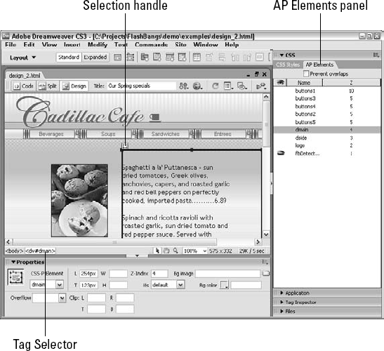
After you've dragged out your AP element, notice several changes to the screen. First, the AP element now has a small box on the outside of the upper-left corner. This box, shown in Figure 11-8, is the Selection handle, which you can use to move an existing AP element around the Web page. When you click the selection handle, eight resize handles appear around the perimeter of the AP element.
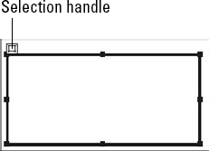
Figure 11-8. After an AP element is created, you can move it by dragging the selection handle and size it with the resize handles.
Another subtle but important addition to the screen is the AP element icon. Like the other Invisible Element icons, the AP element icon can be cut, copied, pasted, and repositioned. When you move the AP element icon, however, its corresponding AP element does not move—you are actually only moving the code for the AP element to a different place in the HTML source. Generally, the location of the actual AP element code in the HTML is immaterial—however, you may want to locate your AP element source in a specific area to be appropriately placed for accessibility purposes. Dragging and positioning AP element icons one after another is a quick way to achieve this task.
The second method for creating an AP element is to use the menus. Instead of selecting an object from the Insert bar, choose Insert
Although the AP element is by default positioned in the upper-left corner of the Document window, it does not have any coordinates listed in the Property inspector. The position coordinates are added when you drag the AP element into a new position. If you repeatedly add new AP elements through the menus without moving them to new positions, each AP element stacks directly on top of the previous one, with no offset.
Warning
It's important to assign a specific position (left and top) to every AP element. Otherwise, the browser displays all AP elements directly on top of one another. To give an AP element measurements, after you've inserted it through the menu, be sure to drag the AP element, even slightly, or manually type coordinates in the Property inspector.
You can designate the default size—as well as other features—of the inserted AP element with Insert

Figure 11-9. If you're building AP elements to a certain specification, use the AP Elements Preferences category to designate your options.
Table 11-1. AP Elements Preferences
AP Element Preference | Description |
|---|---|
Visibility | Determines the initial state of visibility for an AP element. The options are Default, Inherit, Visible, and Hidden. |
Width | Sets the width of the AP element in the measurement system of your choice. The default is 200 pixels. |
Height | Sets the height of the AP element in the measurement system of your choice. The default is 115 pixels. |
Background Color | Sets a color for the AP element background. Select the color from the color palette of Web-safe colors. |
Background Image | Sets an image for the AP element background. In the text box, enter the path to the graphics file or click the Browse button to locate the file. |
Nesting | If you want to nest AP elements when one AP element is placed in the other automatically, check the Nest When Created Within An AP Div checkbox. |
Netscape 4 Compatibility | Select this option to add code for a workaround to a known problem in Navigator 4.x browsers, which causes AP elements to lose their positioning coordinates when the user resizes the browser window. |
In many cases, absolute positioning uses the top-left corner of the Web page—the position at which the <body> tag begins—as the point of origin for positioning the AP elements. You can also specify measurements relative to other objects, such as <divs>. Dreamweaver offers several methods to accomplish relative positioning.
In the first method for handling relative positioning, you select Relative as the Type attribute in the Style Sheet Positioning category. Relative positioning does not force a fixed position; instead, the positioning is guided by the HTML tags around it. For example, you may place a list of some items within a table and set the positioning relative to the table. You can see the effect of this sequence in Figure 11-10. Notice that Dreamweaver does not display sizing handles or a selection handle for relative AP elements.
Relative attributes can be useful, particularly if you want to place the positioned objects within free-flowing HTML. Free-flowing HTML repositions itself based on the size of the browser. When you're using this technique, remember to place your relative AP elements within absolutely positioned AP elements. Otherwise, when the end user resizes the browser, the relative AP elements position themselves relative to the browser and not to the absolutely positioned AP elements. This situation can produce messy results—use relative positioning with caution when mixed with absolute AP elements.
The second technique for positioning AP elements relatively uses nested AP elements. After you nest one AP element inside another, the inner AP element uses the upper-left corner of the outer AP element as its orientation point. One approach for creating a nested AP element is to position your cursor in the outer AP element and press Alt (Option) after you start to drag out your AP element. For more details about nesting layers, refer to the section "Nesting with the AP Elements Panel," later in this chapter.
Dreamweaver helps you deftly alter AP elements after you have created them. Because of the complexity of managing AP elements, Dreamweaver offers a tool in addition to the usual Property inspector: the AP Elements panel. This tool enables you to select any of the AP elements on the current page quickly, change AP element relationships, modify their visibility, and adjust their stacking order. You can also alter the visibility and stacking order of a selected AP element in the Property inspector, along with many other attributes. Before any modifications can be accomplished, however, you have to select the AP element.
You can choose from several methods to select an AP element for alteration (see Figure 11-11). The selection method you choose generally depends on the complexity of your page layout:
When you have only a few AP elements that are not overlapping, just click the selection handle of an AP element to select it.
When you have AP elements placed in specific places in the HTML code (for example, an AP element embedded in a table using relative positioning), click the AP Element icon.
When you have many overlapping AP elements that are being addressed by one or more JavaScript functions, use the AP Elements panel to choose an AP element by name.
When you're working with invisible AP elements, click the
<div>(or<span>) tag in the Tag Selector to reveal the outline of the AP element.
To resize an AP element, position the pointer over one of the eight resize handles surrounding the selected AP element. When over the handles, the pointer changes shape to a two- or four-headed arrow. Now click and drag the AP element to a new size and shape.
You can also use the arrow keys to resize your AP element with more precision. The following keyboard shortcuts change the width and height dimensions while the AP element remains anchored by the upper-left corner:
When the AP element is selected, press Ctrl+arrow (Command+arrow) to expand or contract the AP element by 1 pixel.
Press Ctrl+Shift+arrow (Command+Shift+arrow) to increase or decrease the selected AP element by 10 pixels.
Tip
You can quickly preview the position of an AP element on a Web page without leaving Dreamweaver. Deselecting the View
The easiest way to reposition an AP element is to drag the selection handle. If you don't see the handle on an AP element, click anywhere in the AP element. You can drag the AP element anywhere on the screen—or off the bottom or right side of the screen. To move the AP element off the left side or top of the screen, enter a negative value in the left and top (L and T) text boxes of the CSS-P Property inspector; whenever an AP element is selected, the CSS-P Property inspector is available.
Tip
To hide the AP element completely, match the negative value with the width or height of the AP element. For example, if your AP element is 220 pixels wide and you want to position it offscreen to the left (so that the AP element can slide onto the page at the click of a mouse), set the Left position at −220 pixels.
As with resizing AP elements, you can also use the arrow keys to move the AP element more precisely:
Press any arrow key to move the selected AP element 1 pixel in any direction.
Use Shift+arrow to move the selected AP element by 10 pixels.
You can modify almost all the CSS-P attributes for your AP element right from the CSS-P Property inspector, shown in Figure 11-12. Certain attributes, such as width, height, and background image and color are self-explanatory or recognizable from other objects. Other AP elements-only attributes such as visibility and inheritance require further explanation. Table 11-2 describes all the CSS-P properties, and the following sections discuss the features unique to AP elements.
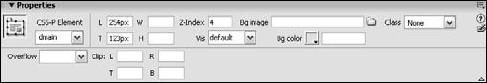
Figure 11-12. The CSS-P Property inspector makes it easy to move, resize, hide, and manipulate all the visual elements of an AP element.
Table 11-2. CSS-P Property Inspector Options
CSS-P Attribute | Possible Values | Description |
|---|---|---|
BgColor | Any hexadecimal or valid color name | Background color for the AP element. |
BgImage | Any valid graphic file | Background image for the AP element. |
Clip (Top, Bottom, Left, Right) | Any positive integer | Measurements for the displayable region of the AP element. If the values are not specified, the entire AP element is visible. |
H (Height) | Any integer measurement in pixels,centimeters, millimeters, inches, points, percentage, ems, or picas | Vertical measurement of the AP element. |
L (Left) | Any integer measurement in pixels,centimeters, millimeters, inches, points, percentage, ems, or picas | Distance measured from the origin point on the left. |
Name | Any unique name without spaces or special characters | A label for the AP element so that it can be addressed by style sheets or JavaScript functions. |
Overflow |
| An indication of how text or images larger than the AP element should be handled. |
T (Top) | Any integer measurement in pixels,centimeters, millimeters, inches, points, percentage, ems, or picas | The distance measured from the origin point on the top |
Tag |
| Type of HTML tag to use for the AP element. |
Vis (Visibility) |
| An indication of whether an AP element is displayed. If visibility is set to |
W (Width) | Any integer measurement in pixels, centimeters, millimeters, inches, points, percentage, ems, or picas | The horizontal measurement of the AP element. |
Z-Index | Any integer | Stacking order of the AP element relative to other AP elements on the Web page. Higher numbers are closer to the top. |
Names are important when working with AP elements. So you can refer to them properly for both CSS and JavaScript purposes, each AP element must have a unique ID attribute, unique among the AP elements and unique among every other object on the Web page. Dreamweaver automatically names each AP element as it is created in sequence: apDiv1, apDiv2, and so forth. You can enter a name that is easier for you to remember by replacing the provided name in the text box on the far left of the Property inspector.
Warning
Netscape Navigator 4.x is strict about its use of the ID attribute. You must ensure that you give the AP element an alphanumeric name that does not use spacing or special characters (such as the underscore or percentage sign). Moreover, make sure your AP element name begins with a letter and not a number—in other words, apDiv9 works, but 9apDiv can cause problems.
Inserting an AP Element
In this Technique, you add a Dreamweaver AP element to a CSS layout. The AP element is absolutely positioned within a relatively positioned <div> tag so that if the centered layout moves, the AP element stays in the proper place.
From the 11_Div folder, open
apDiv_start.htm.Place your cursor in the header
<div>From the Insert bar's Layout category, click Draw AP Div.
Begin dragging out a rectangle on the right side of the header div and, while dragging, press and hold Alt (Option). When your rectangle is approximately 150 pixels wide by 50 pixels high, release the mouse and then Alt (Option). By pressing Alt (Option) while drawing the AP element, Dreamweaver puts the code for the AP element at the cursor position, inside the header
<div>, effectively nesting the AP element.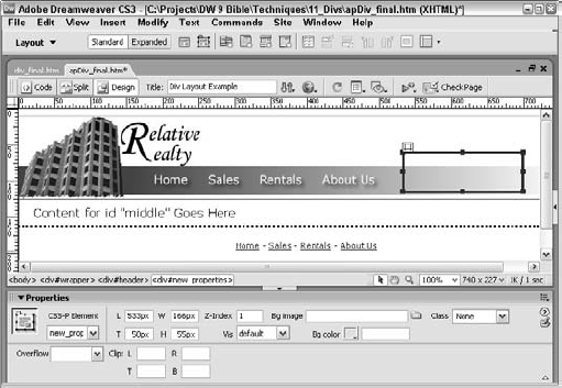
With your cursor inside the newly drawn AP element, switch to the Insert bar's Common category and click Images: Image.
In the Select Image Source dialog box, navigate to the images folder and select
new_properties.jpg. Note that the Property inspector shows the image's dimensions as 166 × 55 pixels.Select the AP element handle and in its Property inspector, change the Width value to 166px and Height to 55px.
Precisely position the AP element by setting the Left value to 533px and Top to 50px.
The last step is to rename the AP element and its accompanying style from the generic apDiv1 to something more precise. In the Property inspector's Name field, enter new_properties.
Save your page.
If you test your page by previewing in the browser, you'll notice that the absolutely positioned AP element stays in the correct place even if the window is resized.
The Tag drop-down list contains the HTML tags that can be associated with the AP element. By default, the positioned AP element has <div> as the tag, but you can also choose <span>. As previously noted, the <div> and <span> tags are endorsed by the World Wide Web Consortium group as part of its CSS standards.
Visibility (Vis in the Property inspector) defines whether you can see an AP element on a Web page. Four values are available:
Default: Enables the browser to set the visibility attribute. Most browsers use the
inheritvalue as their default.Inherit: Sets the visibility to the same value as that of the parent AP element, which enables a series of AP elements to be hidden or made visible by changing only one AP element.
Visible: Causes the AP element and all its contents to be displayed.
Hidden: Makes the current AP element and all its contents invisible.
Remember the following when you're specifying visibility:
Whether or not you can see an AP element, remember that the AP element still occupies space on the page and demands some of the page-loading time. Hiding an AP element does not affect the layout of the page, and invisible graphics take just as long to download as visible graphics.
When you are defining the visibility of a positioned object or AP element, do not use
defaultas the visibility value. A designer does not necessarily know whether the site's end user has set the default visibility tovisibleorhidden. Designing an effective Web page can be difficult without this knowledge. The common browser default is for visibility to be inherited, if not specifically shown or hidden.
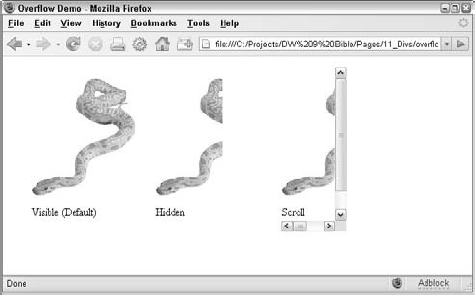
Normally, an AP element expands to fit the text or graphics inserted into it. You can, however, restrict the size of an AP element by changing the height and width values in the Property inspector. What happens when you define an AP element to be too small for an image, or when an amount of text depends on the setting of the AP element's overflow attribute? AP elements (the <div> and <span> tags) support four different overflow settings:
Visible (Default): All the overflowing text or image is displayed, and the height and width settings established for the AP element are ignored.
Hidden: The portion of the text or graphic that overflows the dimensions is not visible.
Scroll: Horizontal and vertical scroll bars are added to the AP element regardless of the content size or amount, and regardless of the AP element's measurements.
Auto: When the content of the AP element exceeds the width and/or height values, horizontal and vertical scroll bars appear.
Currently, support for the overflow attribute is spotty at best. Dreamweaver doesn't display the result in the Document window; it must be previewed in a browser to be seen. Navigator offers limited support: Only the attribute's hidden value works correctly, and just for text. Only Internet Explorer 4.0 or later and Netscape 6 render the overflow attribute correctly, as shown in Figure 11-13.
If you're familiar with the process of cropping an image, you'll quickly grasp the concept of clipping AP elements. Just as desktop publishing software hides but doesn't delete the portion of the picture outside the crop marks, AP elements can mask the area outside the clipping region defined by the Left, Top, Right, and Bottom values in the Clip section of the CSS-P Property inspector.
All clipping values are measured from the upper-left corner of the AP element. You can use any CSS standard measurement system: pixels (the default), inches, centimeters, millimeters, ems, or picas.
The current implementation of CSS supports only rectangular clipping. When you look at the code for a clipped AP element, you see the values you inserted in the CSS-P Property inspector in parentheses following the clip attribute, with the rect (for rectangular) keyword, as follows:
<div id="apDiv1" style="position:absolute; left:54px; top:24px;width:400px; height:115px; z-index:1; visibility:inherit;clip:rect(10px 100px 100px 10px)">
A Visual Clipping Technique
In Dreamweaver, you cannot draw the clipping region visually—the values have to be explicitly input in the Clip section of the CSS-P Property inspector. That said, a trick using a second temporary AP element can make it easier to position your clipping. Follow these steps to get accurate clipping values:
Insert your original AP element and image.
Nest a second, temporary AP element inside the first, original AP element (click the Draw AP Div button in the Insert bar and draw out the second AP element inside the first).
If you have your AP Element Preferences set so that an AP element does not automatically nest when created inside another AP element, press the Alt (Option) key while you draw your AP element to override the preference.
Position the second AP element over the area you want to clip. Use the AP element's sizing handles to alter the size and shape, if necessary.
Note the position and dimensions of the second AP element (the Left, Top, Width, and Height values).
Delete the second AP element.
In the Property inspector for the original AP element, enter the Clip values as follows:
L: Enter the Left value for the second AP element.
T: Enter the Top value for the second AP element.
R: Add the second AP element's Left value to its Width value.
B: Add the second AP element's Top value to its Height value.
Dreamweaver displays the clipped AP element after you enter the final value. The following figure shows the original AP element and the temporary AP element on the left, and the final clipped version of the original AP element on the right.

Generally, you specify values for all four criteria: Left, Top, Right, and Bottom. You can also leave the Left and Top values empty or use the keyword auto—which causes the Left and Top values to be set at the origin point: 0,0. If you leave any of the clipping values blank, the blank attributes are set to auto.
One of an AP element's most powerful features is its capability to appear above or below other AP elements. You can change this order, known as the z-index, dynamically. Whenever a new AP element is added, Dreamweaver automatically increments the z-index—AP elements with higher z-index values are positioned above AP elements with lower z-index values. The z-index can be adjusted manually in either the CSS-P Property inspector or the AP Elements panel. The z-index must be an integer, either negative or positive.
Tip
Although some Web designers use high values for the z-index, such as 3,000, the z-index is completely relative. The only reason to increase a z-index to an extremely high number is to ensure that a particular AP element remains on top.
Certain types of objects—including Java applets, Plugins, and ActiveX controls—ignore the z-index setting when included in an AP element and appear as the uppermost AP element. However, certain ActiveX controls—most notably Flash—can be made to respect the z-index. If you need HTML content on top of active content, you can always hide the AP element containing the ActiveX control when necessary.
Warning
Working with the above and below attributes can be confusing. Notice that they determine which AP element is to appear on top of or underneath the current AP element, and not which AP element the present AP element is above or below.
Inserting a background image or color with the CSS-P Property inspector works like changing the background image or color for a table (as explained in Chapter 13). To insert an image, enter the path to the file in the Bg Image text box or select the folder icon to locate the image file on your system or network. If the AP element is larger than the image, the image is tiled, just as it would be in the background of a Web page or table.
To give an AP element a background color, enter the color name (either in its hexadecimal or nominal form) in the Bg Color text box. You can also select the color box to pick your color from the color palette.
Dreamweaver offers another tool to help manage the AP elements in your Web page: the AP Elements panel. Although this tool doesn't display as many properties about each element as the Property inspector, the AP Elements panel gives you a good overview of all the AP elements on your page. It also provides a quick method of selecting an AP element—even when it's offscreen—and enables you to change the z-index and the nesting order.
The AP Elements panel, shown in Figure 11-14, can be opened either through the Window menu (Window
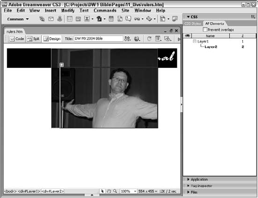
Figure 11-14. Use the AP Elements panel to quickly select—or alter the visibility or relationships of—all the AP elements on your page.
The AP Elements panel lists the visibility, name, and z-index settings for each AP element. You can modify all these properties directly through the AP Elements panel.
The visibility of a particular AP element is noted by the eye symbol in the first column of the inspector. Clicking the eye symbol cycles you through three different visibility states:
Eye closed: Indicates that the AP element is hidden
Eye open: Indicates that the AP element is visible
No eye: Indicates that the visibility attribute is set to the default (which, for both Navigator and Internet Explorer, means
inherit)
Tip
To change all your AP elements to a single state simultaneously, click the eye symbol in the column header. Unlike the individual eyes in front of each AP element name, the overall eye toggles between open and shut.
You can also change an AP element's name (in the second column of the AP Elements panel). Just double-click the current AP element name in the inspector; the name is highlighted. Type in the new name and press Enter (Return) to complete the change.
You can alter the z-index (stacking order) in the third column in the same manner. Double-click the z-index value; and then type in the new value and press Enter (Return). You can enter any positive or negative integer. If you're working with the Netscape proprietary <layer> tags, you can also alter the above or below values previously set for the z-index through the Property inspector. Use A for above and B for below.
Another task managed by the AP Elements panel is nesting or unnesting AP elements. This process is also referred to as creating parent-child AP elements. To nest one AP element inside another through the AP Elements panel, follow these steps:
Choose Window
Press the Ctrl (Command) key, click the name of the AP element to be nested (the child), and drag it on top of the other AP element (the parent).
When you see a rectangle around the parent AP element's name, release the mouse. The child AP element is indented underneath the parent AP element, and the parent AP element has a minus sign (a downward-pointing triangle on the Mac) attached to the front of its name.
To hide the child AP element from view, click the minus sign (a downward-pointing triangle on the Mac) in front of the parent AP element's name. After the child AP element is hidden, the minus sign turns into a plus sign (a right-pointing triangle on the Mac).
To reveal the child AP element, click the plus sign (a right-pointing triangle on the Mac).
To undo a nested AP element, select the child AP element and drag it to a new position in the AP Elements panel.
You can use the nesting features of the AP Elements panel to hide many AP elements quickly. If the visibility of all child AP elements is set to the default—with no eye displayed—then by hiding the parent AP element, you cause all the child AP elements to inherit that visibility setting and also disappear from view.
Tip
You can also delete an AP element from the AP Elements panel. Just highlight the AP element to be removed and press the Delete key. Dreamweaver also enables you to delete nested AP elements as a group by selecting the parent AP element and pressing Delete. If you want to remove a parent AP element but keep all children, the Tag Selector can be used. Select the parent tag, right-click (Control+click), and then choose Remove Tag.
With the capability to position AP elements anywhere on a page comes additional responsibility and potential problems. In anything that involves animation, correct alignment of moving parts is crucial. As you begin to set up your AP elements, their exact placement and alignment become critical. Dreamweaver includes two tools to simplify layered Web page design: the ruler and the grid.
Rulers and grids are familiar concepts in traditional desktop publishing. Dreamweaver's ruler shows the x-axis and y-axis in pixels, inches, or centimeters along the outer edge of the Document window. The grid crisscrosses the page with lines to support a visual guideline when you're placing objects. You can even enable a snap-to-grid feature to ensure easy, absolute alignment.
With traditional Web design, "eyeballing it" was the only option available for Web page layout. The absolute positioning capability of AP elements remedied this deficiency. Now online designers have a more precise and familiar system of alignment: the ruler. Dreamweaver's ruler can be displayed in several different measurement units and with your choice of origin point.
To toggle the ruler in Dreamweaver, choose View
Figure 11-15. Use the horizontal and vertical rulers to assist your AP element placement and overall Web page layout.
By default, the ruler uses pixels as its measurement system. You can change the default by choosing View
Dreamweaver also enables you to move the ruler origin to a new position. Normally, the upper-left corner of the page acts as the origin point for the ruler. On some occasions, it's helpful to start the measurement at a different location—at the bottom-right edge of an advertisement, for example. To move the origin point, select the intersection of the horizontal and vertical rulers and drag the crosshairs to a new location. When you release the mouse button, both rulers are adjusted to show negative values above and to the right of the new origin point. To return the origin point to its default setting, choose View
Tip
You can access a ruler context menu by right-clicking (Control+clicking) the ruler itself. The context menu enables you to change the system of measurement, reset the origin point, or hide the rulers.
With the advent of CSS layouts, Web designers found themselves needing a toolset more traditionally associated with graphic programs: guides. A guide is a single, thin, positionable line used at design-time to align elements on a page. Guides are either horizontal or vertical and stretch from one edge of the browser window to the other.
Dreamweaver guides are wonderfully powerful and incorporate standard features found in graphic programs like Photoshop and Fireworks as well as some unique Web-centric options. Guides can be shown or hidden, set precisely, varied in color, snap-to-the-grid and/or objects. You can even have objects snap to guides. Dreamweaver designers will find guides a welcome addition to their working toolbox.
Before you can display a guide, you have to meet two conditions: the View
To place a guide on the page, follow these steps:
Choose View
Select View
To place a horizontal guide on the page, drag a guide from the ruler at the top of the page.
To place a vertical guide on the page, drag a guide from the ruler at the left of the page.
Once positioned, guides can be moved at any time. You can visually position guides by dragging them to a new location on the page; when your cursor is over the guide, you'll see a tooltip with the precise horizontal or vertical coordinate of the guide in pixels from the top or left of the page, respectively.
To remove a single guide, drag it back into the horizontal or vertical ruler. You can remove all guides on the page by selecting View
One of the slicker guide features implemented in Dreamweaver is the display of distance measurement. If you have a single horizontal or vertical guide onscreen and press Ctrl (Command), Dreamweaver will show you the distance from the guide to the window's edge in your cursor area. Place your cursor between two guides of the same type (either horizontal or vertical), press Ctrl (Command), and you'll see the distance that separates them, as shown in Figure 11-17.
Dreamweaver gives you complete control over guides and positionable page elements. You can lock your guides so that they are not accidentally moved when repositioning elements. You can also snap your elements to your guides or guides to your elements—or both. Here's how it's all done:
Prevent your guides from being moved by choosing View
Align your layout blocks to existing guides by enabling View
Snap guides to the edges of layout blocks by selecting View
Tip
Guides are retained when you save the page and restored when the page is re-opened.
Guides can be positioned precisely as well as by dragging. To set a guide's horizontal or vertical placement to a specific value, follow these steps:
Double-click the guide you want to move.
When the Move Guide dialog box opens, enter the desired position in the Location field.
Select the measurement system (pixels, centimeters, inches, or percentages) from the list.
To use the percentage measurement, enter a value between 0.00 and 100.00; Dreamweaver will reposition the guide according to the width or height of your Document window.
Click OK.
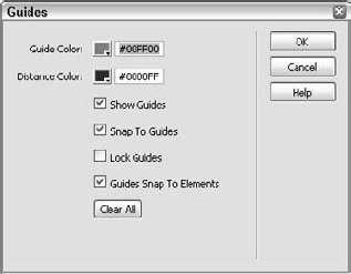
By default, the guides are colored a bright green and the distance indicators a dark blue. If these colors don't contrast enough with your layout to be seen clearly, you can adjust the colors through the Edit Guides dialog box. The Edit Guides dialog box also provides all-in-place access to basic guide controls: Show Guides, Snap To Guides, Lock Guides, Guides Snap To Elements, and Clear All (see Figure 11-18). To access the Edit Guides dialog box, choose View
One application in the guide featureset unique to Dreamweaver is especially useful for Web designers. When a browser displays a Web page, the portion initially visible is said to be "above the fold." The concept of a fold comes from the world of newspaper journalism where papers are divided into a top and bottom portion by the way they are folded. Dreamweaver can quickly display the fold of a browser window—that is, the viewable area—through guides.
Six of the most common browser window configurations are available through the Guides submenu:
You'll recognize the dimensions from the Window Size selector on the Status bar. When you select any of these options from the View
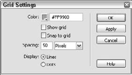
Rulers and guides are generally good for positioning single objects, but a grid is extremely helpful when aligning one object to another. With Dreamweaver's grid facility, you can align elements visually or snap them to the grid. You can set many of the grid's other features, including grid spacing, color, and type.
To turn on the grid, choose View
The snap-to-grid feature is enabled by choosing View
Like most of Dreamweaver's tools, you can customize the grid. To alter the grid settings, choose View
Table 11-3. Grid Settings Dialog Box Options
Grid Setting | Description |
|---|---|
Color | Change the default color (light blue) by selecting the color box (which brings up color palette) or by typing a new value in the text box. |
Show Grid | Show or hide the grid with this checkbox toggle. |
Snap To Grid | Toggle the checkbox to enable or disable the snap-to-grid feature. |
Spacing | Adjust the distance between grid points by entering a numeric value in the text box. |
Spacing Unit of Measure | Select pixels, inches, or centimeters from the Spacing drop-down list. |
Display | Choose either solid lines or dots for the gridlines. |
After you have created and initially positioned your AP elements, you can begin to fill them with content. Inserting objects in an AP element is just like inserting objects in a Web page. The same insertion methods are available to you:
Position the cursor inside an AP element, choose Insert in the menu bar, and select an object to insert.
With the cursor inside an AP element, select any object from the Insert bar. Note that you cannot select the Draw AP Div object.
Drag an object from the Insert bar and drop it inside the AP element.
A known problem exists with Netscape Navigator 4.x browsers and nested AP elements—and AP elements in general. Whenever the browser window is resized, the AP elements lose their left and top position and are displayed along the left edge of the browser window or parent AP element. Dreamweaver includes the capability to insert code that serves as a workaround for this problem. With this code in place, if the browser is resized, the page reloads, repositioning the AP elements. If you want the code to be automatically inserted the first time you add an AP element to your page, select the Add Resize Fix When Inserting AP Elements option found in the AP Elements category of Preferences. You can also insert it on a case-by-case basis by choosing Commands
When you're mixing forms and AP elements, follow only one rule: Always put the form completely inside the AP element. If you place the AP element within the form, all form elements after the AP element tags are ignored. With the form completely enclosed in the AP element, the form can safely be positioned anywhere on the page and all form elements still remain completely active.
Although this rule means that you can't split one form onto separate AP elements, you can set up multiple forms on multiple AP elements—and still have them all communicate to one final CGI or other program. This technique uses JavaScript to send the user-input values in the separate forms to hidden fields in the form with the Submit button. Suppose, for example, that you have three separate forms gathering information in three separate AP elements on a Web page. Call them formA, formB, and formC on apDiv1, apDiv2, and apDiv3, respectively. When the Submit button in formC on layer3 is selected, a JavaScript function is first called by means of an onClick event in the button's <input> tag. The function, in part, looks like the following:
function gatherData() {
  document.formC.hidden1.value = document.formA.text1.value
  document.formC.hidden2.value = document.formB.text2.value
}
Notice how every value from the various forms is sent to a hidden field in formC, the form with the Submit button. Now, when the form is submitted, all the hidden information gathered from the various forms is submitted along with formC's own information.
Note
The code for this separate-forms approach, as shown in the preceding listing, works in Internet Explorer. Netscape 4.x, however, uses a different syntax to address forms in layers. To work properly in Netscape 4.x, the code must look like the following:
document.layers["apDiv3"].document.formC.hidden1.value=document.layers["apDiv1"].document.formA.text1.value
To make the code cross-browser compatible, you can use an initialization function that allows for the differences, or you can build the code into the onClick function. (For more information about building cross-browser–compatible code, see Chapter 30.)
Although most modern Web layouts employ AP elements, some legacy pages still rely on table-based layouts. Dreamweaver enables you to get the best of both worlds by making it possible for you to use AP elements to design complex page layouts, and then to transform those AP elements into tables that can be viewed in earlier browsers. Designing this way has some limitations—you can't, for example, actually place AP element items on top of one another. Nevertheless, Dreamweaver's capability to convert AP elements to tables (and tables to AP elements) enables you to create complex layouts with ease.
Page-layout artists are often confronted with Web-page designs that have been mocked up in a graphics program. Dreamweaver's Tracing Image function enables you to use such images to guide the precise placement of graphics, text, tables, and forms in your Web page, enabling you to match the original design as closely as possible.
To use a Tracing Image, the graphic must be saved in JPG, GIF, or PNG format. After the Tracing Image has been placed in your page, it is viewable only in Dreamweaver—it will never appear in a browser. A placed Tracing Image hides any background color or background graphic in your Web page. Preview your page in a browser or hide the Tracing Image to view your page without it.
Warning
If you're concerned about your page validating, be sure to remove the Tracing Image after you've completed the page. The Tracing Image uses a number of attributes, like tracingsrc and tracingopacity, none of which validate, inside the <body> tag.
To add a Tracing Image to your Dreamweaver page, choose View
Note
Even though the Browse dialog for the Tracing Image enables you to choose from a data source, the image is not displayed on the page.
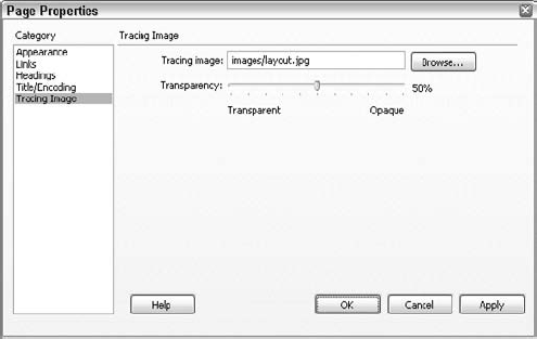
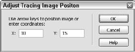
The Tracing Image cannot be selected and moved the same way as other objects on your page. Instead, you must move the Tracing Image using menu commands. You have several options for adjusting the Tracing Image's position to better fit your design. First, you can align the Tracing Image with any object on your page by selecting the object and then choosing View
To precisely or visually move the Tracing Image to a specific location, choose View
Although absolute positioning is a major reason to use AP elements, you may have other motives for using this capability. All the properties of an AP element—the coordinates, size and shape, depth, visibility, and clipping—can be altered dynamically and interactively. Normally, dynamically resetting an AP element's properties entails some fairly daunting JavaScript programming. Now, with one of Dreamweaver's hallmarks—those illustrious behaviors—activating AP elements is possible for nonprogrammers as well.
Note
If you want to learn more about behaviors, Chapter 12 describes Dreamweaver's rich behaviors feature.
Behaviors consist of two parts: the event and the action. In Dreamweaver, three standard actions are designed specifically for working with AP elements:
Drag AP Element: Enables the user to move the AP element and get a response to that movement.
Set Text of Container: Enables the interactive alteration of the content of any AP element to include any HTML, not just text.
Show-Hide Elements: Controls the visibility of AP elements, either interactively or through some preprogrammed action on the page.
You can find detailed information about these actions in their respective sections in Chapter 12. The following sections outline how to use these behaviors to activate your AP elements.
For the Web designer, positioning an AP element is easy: Click the selection handle and drag the AP element to a new location. For the readers of your pages, moving an AP element is next to impossible—unless you incorporate the Drag AP Element action into the page's design.
With the Drag AP Element action, you can set up interactive pages in which the user can rearrange elements of the design to achieve an effect or make a selection. The Drag AP Element action includes an option that enables your application to execute a JavaScript command if the user drops the AP element on a specific target. In the example shown in Figure 11-23, each pair of shoes is in its own AP element. When the user drops a pair in the bag, a one-line JavaScript command opens the desired catalog page and order form.
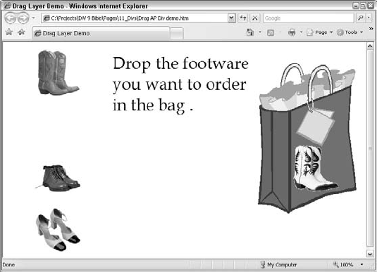
Figure 11-23. On this interactive page, visitors can drop merchandise into the shopping bag; this feature is made possible with the Drag AP Element action.
After you've created all your AP elements, you're ready to attach the behavior. Because Drag AP Element initializes the script to make the interaction possible, you should always associate this behavior with the <body> tag and the onLoad event. Follow these steps to use the Drag AP Element action and to designate the settings for the drag operation:
Choose the
<body>tag from the Tag Selector in the status bar.Choose Window
In the Behaviors panel, click the Add (+) button and make sure that 4.0 and Later Browsers is selected from the Show Events For flyout.
Click the Add (+) button and choose Drag AP Element from the Add Action drop-down list.
In the Drag AP Element dialog box, select the AP element you want to make available for dragging.
To limit the movement of the dragged AP element, select Constrained from the Movement drop-down list. Enter the coordinates needed to specify the direction to which you want to limit the movement in the Up, Down, Left, and/or Right text boxes.
To establish a location for a target, enter coordinates in the Drop Target: Left and Top text boxes. You can fill these text boxes with the selected AP element's present location by clicking the Get Current Position button.
You can also set a snap-to area around the target's coordinates. When released in the target's location, the dragged AP element snaps to this area. Enter a pixel value in the Snap If Within text box.
Click the Advanced tab.
Designate the drag handle:
To enable the entire AP element to act as a drag handle, select Entire Element from the drop-down menu.
If you want to limit the area to be used as a drag handle, select Area Within Element from the drop-down menu. Enter the Left and Top coordinates as well as the Width and Height dimensions in the appropriate text boxes.
If you want to keep the AP element in its current depth and not bring it to the front, deselect the checkbox for While Dragging: Bring Element To The Front. To change the stacking order of the AP element when it is released after dragging, select either Leave On Top or Restore Z-index from the drop-down list.
To execute a JavaScript command when the AP element is dropped on the target, enter the code in the Call JavaScript text box. If you want the script to execute every time the AP element is dropped, enter the code in the When Dropped: Call JavaScript text box. If the code should execute only when the AP element is dropped on the target, make sure there's a check in the Only If Snapped checkbox.
To change the event that triggers the action (the default is
onLoad), select an event from the drop-down list in the Events column.
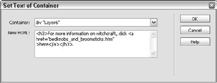
You've seen how AP elements can dynamically move, and change their visibility and their depth—but did you know that you can also change an AP element's content dynamically? With Dreamweaver, you can do it easily. A standard behavior, Set Text of Container, enables you to swap the entire contents of one AP element for whatever you'd like. You're not limited to exchanging just text, either. Anything you can put into HTML, you can swap—which is pretty much everything!
This behavior is extremely useful for putting up context-sensitive help and other information. Rather than construct a series of AP elements that you show and hide, a single AP element is used, and just the contents change. To use Set Text of Container, follow these steps:
Insert and name your AP elements as desired.
Select the graphic, button, or text link you'd like to act as the trigger for changing the content of the AP element.
Choose Window
Choose Set Text
Select the AP element you want to alter from the Container drop-down list.
Enter the text or code in the New HTML text area. You can enter either plain text, which is rendered in the default paragraph style, or any amount of HTML code, including
<img>, <table>, or other tags.Click OK when you're finished.
If you want several AP elements to change when a single event is triggered, just add more Set Text of Container behaviors to the same object.
Note
You may need to change the behavior event from its default; to do so, click the down arrow in between the Event and Action columns on the Behaviors panel and choose a new event from the list.
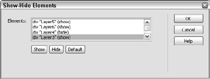
The capability to implement interactive control of an AP element's visibility offers tremendous potential to the Web designer. The Show-Hide Elements action makes this implementation straightforward and simple to set up. With the Show-Hide Elements action, you can simultaneously show one or more AP elements while hiding as many other AP elements as necessary. Create your AP elements and give them a unique name before invoking the Show-Hide Elements action. To use Show-Hide Elements, follow these steps:
Select an image, link, or other HTML tag to which to attach the behavior.
Choose Window
Choose Show-Hide Elements from the Add (+) drop-down list. The Show-Hide Elements dialog (see Figure 11-25) shows a list of the available AP elements in the open Web page.
To cause a hidden AP element to be revealed when this event is fired, select the AP element from the list and click the Show button.
To hide a visible AP element when this event is fired, select its name from the list and click the Hide button.
To restore an AP element's default visibility value when this event is fired, select the AP element and click the Default button.
Click OK when you are finished.
If the default event is not suitable, use the drop-down list in the Events column to select a different one.
As Web creations become more complex, most designers want their AP elements to zip onscreen and offscreen or appear and disappear as quickly as possible for the page's viewer. An AP element can act only when it has finished loading its content—the text and images. Rather than have the user see each AP element loading in, some designers use a loading AP element to mask the process until everything is downloaded and ready to go.
A loading AP element is fairly easy to create. Dreamweaver supplies all the JavaScript necessary in one behavior, Show-Hide Elements. Keep in mind that because this technique uses AP elements, it's good only for 4.0 browsers and later.
To create a loading AP element, follow these steps:
Create all AP elements with the contents in place and the visibility property set as default.
Create the loading AP element. (Choose Insert
Enter and position whatever contents you want displayed in the loading AP element while all the other AP elements are loading.
Open the AP Elements panel by pressing F2.
Turn off the visibility for all AP elements except the loading AP element. In essence, you're hiding every other AP element.
Select the
<body>tag from the Tag Selector.Choose Window
Click the Add (+) action button and choose Show-Hide Elements from the drop-down list.
In the Show-Hide Elements dialog box, select the loading AP element and click the Hide button.
Select all the other AP elements and set them to Show. Click OK when you are finished.
Leave
onLoad(the default) as the event to trigger this action.
Now, when you test your Web page, you should see only your loading AP element until everything else is loaded. Then the loading AP element disappears, and all the other AP elements are made visible.
AP elements are effective placement tools for developing the layout of a page. Anyone used to designing with desktop publishing tools can quickly learn to work with <div> tags and AP elements effectively. Keep these points in mind:
A
<div>tag can be styled for layout purposes using CSS.Dreamweaver calls a drawn out
<div>tag with embedded CSS styling an AP element.AP elements are visible only on fourth-generation and later browsers.
Dreamweaver includes a number of visual aids to help you create a
<div>-based layout.AP elements can be used to place HTML content anywhere on a Web page.
You can stack AP elements on top of one another. This depth control is referred to as the stacking order or the z-index.
AP elements can be constructed so that the end user can display or hide them interactively, or alter their position, size, and depth dynamically.
Dreamweaver provides guides, rulers, and grids to help with AP element placement and alignment.
You can easily activate AP elements by using Dreamweaver's built-in JavaScript behaviors.
In the next chapter, you learn how to use Dreamweaver behaviors to enhance the interactivity of your sites.