Lesson 10. Color Correction Basics
Once you complete your final edit, you’re ready to polish your project by performing color correction, and preparing the content for the web, broadcast, or disc. This phase of the postproduction process is called finishing, and it’s the focus of this section of lessons.
In this lesson, you’ll acquire a deeper understanding of the color correction tools found in Final Cut Pro X. You’ll set up the Final Cut Pro X interface for color correction, use the video scopes to analyze your clips, and apply automatic and manual color adjustments to correct and enhance individual clips, focusing on image contrast. These tools and techniques give you a terrific level of control over the images in your projects.
Getting Ready
For the lessons in this section, you’ll need to access the projects and media found on the APTS FCP X ADV Part 3 disk image.
1. CCopy the APTS FCP X ADV Part 3 disk image to your preferred local volume, and double-click it to mount the image.
2. Open Final Cut Pro X. The APTS FCP X ADV Part 3 disk image will appear at the top of the Event Library, containing Events for Agriculture, Burnt Dinner, Burnt Dinner Finishing, Dining, Hero Scene, and In the City, which are the projects you’ll be using within this section.
The APTS FCP X ADV Part 3 disk image should also appear at the top of the Project Library, including individual folders for the projects used in Lessons 10 through 14.
3. If you haven’t done so, choose Final Cut Pro > Preferences, click Playback, deselect the “Background render” checkbox, and then close the Preferences window.

By turning off background rendering, you avoid filling the APTS FCP X ADV Part 3 disk image with render files. Most of the operations in the following lessons use real-time effects, so background rendering shouldn’t be necessary.
What Is Color Correction?
Color correction was once considered an arcane art that few understood and even fewer practiced. It required hundreds of thousands of dollars of equipment, and as a result, only well-heeled projects benefitted from full-blown color correction sessions.
Fast forward to now. Color correction (or color grading, depending on who you ask) is better understood by far more practitioners, and the essential tools for color correction are far more accessible. Final Cut Pro X has a nice collection of high-quality color adjustment controls that let you make subtle or massive adjustments to the color and contrast of the clips in your projects.
But to use these tools to their best advantage, you must first understand the task that lies before you.
Understanding the Essential Tasks of Color Correction
Color correction is a process of evaluating and adjusting the clips in your project to achieve the following general goals:
• Fix problems with individual clips: Some clips may be too dim, others may have poor color, in still others a particular hue may tint the shot and make the subjects look unattractive. These issues can be fixed, automatically or manually, using the basic Final Cut Pro X color correction toolset.
• Make every shot look its best: Even clips without clear problems can sometimes be improved by stretching or compressing contrast, increasing or diminishing saturation, or subtly changing the tint of ambient lighting. As you use the color correction tools, you’ll also learn techniques for making such overall improvements.
• Make every clip in a scene look like it was shot at the same time in the same place: Scenes often include clips that were captured at different times of the day, on different days, or in different locations. The Final Cut Pro X color correction tools can help you match shots, regardless of the shooting conditions. Doing so ensures that viewers aren’t distracted by differences in lighting and color that call attention to the editing and detract from the flow of a scene. Final Cut Pro X has an automated tool to help with this issue, but in a later lesson, you’ll learn manual techniques for matching shots.
• Add style and pizzazz to a scene: Color correction isn’t just about fixing problems. The more creative aspect of color grading is adding a look, or a stylized visual treatment, to enhance the mood of a scene, or to expand upon the on-set lighting. Creative color grading can also achieve complicated day-for-night looks, or artificially colored looks for reasons of pure style (such as when creating a music video). Final Cut Pro X has many tools to help you achieve this kind of style, and you can further customize them to best suit your individual needs.
Knowing When to Correct and When to Quit
Color correction is usually treated as part of the finishing process performed when editorial is complete. However, one of the benefits of color correcting within your NLE is that the corrections are attached to your shots, so you can rearrange or trim shots without losing your adjustments.
In any case, even dedicated editors should understand the basics of color correction. Inevitably, a particular shot sticks out during the creative editing process or it doesn’t look right because it doesn’t match other clips in the scene. As a result, most projects have some color corrections performed long before the finishing phase begins. Due to the power and accessibility of modern editing/grading tools, the line separating creative editorial from finishing blurs more every year.
Those tools conceal a potential pitfall, however. It’s often said that “films are never completed, they’re simply abandoned.” This is especially true in the finishing process. Although the tools permit almost unlimited changes, at a certain point, it’s good practice to know when to stop noodling with your project, lock the edit, and focus on polishing and completing your project.
Often, project audio is exported, sweetened, and mixed elsewhere while color correction takes place. In these instances, it’s even more important to resist the temptation to alter the edit, as it will throw off the audio/video sync of your project when it’s time to remarry the mix to the final visuals.
Using an Appropriate Display
When you’re color correcting projects destined for Internet distribution, grading on your computer’s display is an acceptable practice—so long as your computer display is of high quality, and you calibrated it using the manual calibration routine in the Displays option of System Preferences, or an automated calibration device.
When you work on a project destined for broadcast, it’s essential to color correct while viewing your clips on a dedicated broadcast display that shows true video output.
You can choose from a number of suitable broadcast displays, including flat-panel LCD-based displays, OLED-based displays, plasma screens, and high-end video projectors. No matter which type of display you choose, they should meet the following characteristics for critical color evaluation:
• Compatibility with the resolution and video signal output from your video output interface, such as Y’PBPR, HDMI, or HD-SDI
• Suitable black levels (in other words, solid black shouldn’t look like gray)
• Appropriate brightness for the environment where the display will be used
• User-selectable color temperature (with the default set at D65)
• Adherence to the Rec. 601 (SD) or 709 (HD) color space standards, as appropriate
• Appropriate gamma (preferably user-adjustable between 2.2 to 2.6)
• Professional-level calibration and adjustment controls
For all these reasons, you’ll want to research which display is appropriate for the type of work you do. Broadcast displays are evolving at a rapid pace, and new models are available every year.
You’ll need a video output device to output a true video signal to your broadcast display. Final Cut Pro X is compatible with a wide variety of video output devices. Some are cards that you install inside a Mac Pro; others are boxes that connect to an iMac, MacBook, or Mac Mini via Thunderbolt.
Whichever video output device you have, make sure the latest Final Cut Pro X-compatible drivers are installed, so you can control video output with a preferences setting and a menu command.
1. Choose Final Cut Pro > Preferences.
2. In the Preferences window, click Playback to reveal the Playback options.
3. Choose your output device from the A/V Output pop-up menu.
If this pop-up menu displays “None Found,” then you need to download and install the appropriate drivers for your device.
4. Close the Preferences window, and choose Window > A/V Output to turn video output on and off.
Using the Highest-Quality Media
The color correction process is your last chance to quality-check your project prior to sending it on its way. No matter what media format you used for the creative edit, always make sure to use the highest-quality media you have available for your final project.
It’s still frequently the case where projects are edited using low-quality offline media (for example, compressed using ProRes Proxy to save space). You want to make sure your project is using high-quality online media before you begin the color correction process, to make sure that you’re seeing each clip in its most pristine state and working with all the available image data.
Using Original or Optimized Media
One way that projects can be edited using low-quality proxy media is via the “Use proxy media” option in the Playback Preferences. If you’ve been using proxy media using the automatic proxy management in Final Cut Pro X, you’ll need to readjust these preferences before you start working.
1. Choose Final Cut Pro > Preferences.
2. In the Preferences window, click Playback to reveal the Playback options.
3. If necessary, select “Use original or optimized media.”
4. From the Playback Quality pop-up menu, choose High Quality.
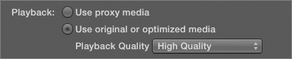
Now that Final Cut Pro X is set to use the highest-quality media available, you can continue finishing your project with confidence.
Manually Relinking Offline Clips Throughout a Project
You can also manually manage the media your project uses by relinking to alternate media files.
The clips listed in the Final Cut Pro Event Browser are simply pointers to the actual media files located on your hard disk. For the most part, Final Cut Pro manages the clip/media file relationship for you automatically.
However, there are situations, particularly during the finishing process, where you may want to manually override this relationship, forcibly relinking a clip with a specific file on disk. Two common instances are:
• If you’ve been handed a project file with a folder of media that’s different than the original media path name used by that project.
• If you’re replacing offline-quality media (such as clips compressed using ProRes Proxy to save space during an offline edit) with higher-quality media archived from the original shoot.
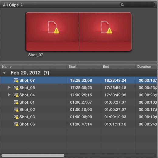
There are other instances where Final Cut Pro simply can’t find the file associated with a particular clip. In this case, it will display the Missing File image in place of the thumbnails in the Event Browser and Timeline as well as the preview in the Viewer. Such files are referred to as offline files. This can happen for a variety of reasons, such as renaming the source media on disk, moving the source media file to another location, or moving the source media file to the Trash.
If an Event or project has an offline file somewhere within, a warning flag appears on that Event or project’s icon in the Event or Project Library.

Tip
A frequent cause of this situation is when a removable hard drive containing the media is unmounted or disconnected from the computer. In that Event, simply mount the hard drive and Final Cut Pro will automatically see it, relink all the offline files and the warning flags go away.
When examining the contents of an Event, each unlinked media file appears with the same warning flag.
Finally, unlinked clips are highlighted in the Timeline with similar red graphics.

When you have offline media in your project, the Relink Media command makes it easy to repair a clip’s relationship to its corresponding source media on disk. The command can also save you the hassle of re-editing clips into your project when you substitute one version of a media file for another.
In the following two exercises, you’ll learn the two methods of relinking media in Final Cut Pro X.
Relinking Media in the Event Library
Relinking a clip in the Event Browser automatically updates all instances of that file within all events and projects that use that clip. This is especially useful when you’ve moved a project to another workstation and you need to relink every clip to a new set of media.
In this exercise, you’ll relink an offline project to media found in the APTS FCP X ADV Part 3 disk image.
1. In the Project Library, display the contents of the APTS FCP X ADV Part 3 disk image.
2. Open the Lesson 10 and 11 folder in the Project Library. You should see that the Dining project is completely offline.
3. In the Event Library, click the Dining event to display its clips. Seven offline clips appear in the Event Browser.
4. Click anywhere within the Event Browser, and then press Shift-A to select every clip at once.
5. Choose File > Relink Event Files. The Relink Files dialog appears.
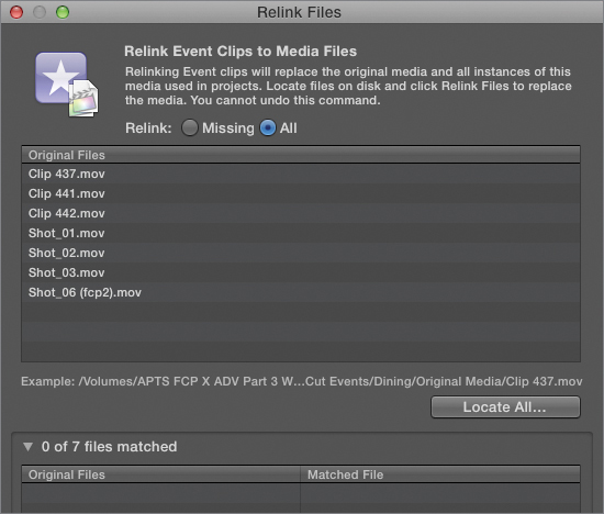
By default, in the Relink Files dialog, Relink mode is set to Missing, which will relink all of the selected files that appear in the Original Files list whether they’re offline or not. The Missing mode shows only missing clips in the Original Files list.
6. Click Locate All.
7. In the dialog that appears, navigate to the APTS FCP X ADV Part 3 disk image, select the “Lesson 10 Media for Relinking” folder, and click Choose.
All items from the Original Files list are moved to the bottom list, which shows the correspondence between each clip and the matched file that Final Cut Pro X believes is the correct file for linking based on file metadata such as UUID, name, timecode, and reel number.
8. Click Relink Files.
At this point, all media in the Event Library should update and will appear online. Furthermore, all formerly offline clips in the Dining project should also be online.
Manually Relinking Individual Clips
You can also relink clips directly in the Timeline. For example, if you’re handed one or two clips that were updated, such as a revised effects clip or a higher-quality piece of stock footage that’s been purchased to replace a placeholder version, you can select the old version of that clip in the Timeline and use relinking to update it to the new version.
There’s an important difference between relinking in the Timeline, and relinking in the Event Library. When you relink clips in the Event Library, you relink every instance of those clips in every project that uses those Events. However, when you relink a clip in the Timeline, you relink only that one instance of the clip within that project. All other instances of the clip in other projects remain unchanged.
Note
The new (relinked) files can have a different resolution and codec than the original files, but they must be the same media type. That is, you can’t relink a video clip to an audio file. Relinked files must also have the same frame rate and audio channels similar to the original files. The relinked files can also be trimmed versions of the original files, but they must be long enough to cover all the clips that refer to the files.
In the following exercise, you’ll use relinking to update a title at the beginning of the Hero Scene to new media with a newer version of the title.
1. In the Project Library, open the Lesson 10 and 11 folder, and open Hero Scene.
2. Play through the first clip, and stop after the title disappears. This is generic placeholder text—created with the final Motion treatment—waiting for the producers to determine the final title of the show.

3. In the Timeline, select the Offline Title clip.

4. Choose File > Relink Project Files. In the Relink Files dialog, select Relink: All.
5. Click Locate All.
6. In the dialog, navigate to the APTS FCP X ADV Part 3 disk image, and open the “Lesson 10 Media for Relinking” folder. Select the Final Titles.mov file, and click Choose.
The Offline Title.mov item moves to the bottom list, showing the Final Titles.mov file in the Matched File column to indicate that the new media will replace the old media.
7. Click Relink Files. The Offline Title clip is updated to link to the new media, and the Harry’s Heroes title appears in the Viewer.

That’s the flexibility of the relinking command. Now that you’ve learned how to make sure you’re using the most appropriate media for your project, it’s time to dig into the nuts and bolts of color correction.
Learning the Color Correction Interface
In this section, you’ll look at the interface for color correction in Final Cut Pro X, discovering where the color correction tools are located, and how to customize your workspace to work most efficiently.
Exploring the Color Correction Interface
Color correction is accomplished by using controls and modifying parameters found in the Inspector, specifically the Video Inspector and the Color Board.
1. In the Project Library, display the contents of the APTS FCP X ADV Part 3 disk image, if necessary, and then click the disclosure triangle next to the Lesson 10 and 11 folder to show its contents.
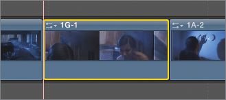
2. Double-click the Burnt Dinner project to open it, and press Shift-Z to expand its clips to the available width of the Timeline.
3. Use the ; (semicolon) and ‘ (apostrophe) keys to move the playhead to the beginning of the fourth clip, and then press C to select the fourth clip in the project.

4. At the right of the toolbar, click the Inspector button to open the Video Inspector.
Note
You can also open the Video Inspector by pressing Command-4, or choosing Window > Show Inspector.

In the Video Inspector you can see the Color control group. The first two controls enable or disable the automatic color correction controls. Under these, a Correction 1 control contains the default manual Color adjustment for the current clip.
Each clip has a blank Color adjustment, ready for you to use.

5. Click the Color Board button to open the Color Board.
The Color Board shows all the color correction controls for that correction.
6. To make an overall color adjustment to tint the entire clip, drag the Global color control up from its default position toward the orange part of the spectrum.
The clip takes on an orange tint that intensifies the farther you drag the control.

7. To return to the Video Inspector, click the back arrow button.
Notice that the Color Board button at the extreme right of Correction 1’s row of controls is now colorfully highlighted. This indicates that Correction 1 has been modified.
8. Press ‘ (apostrophe) to move the playhead to the next edit. Press C to select the fifth clip in the project, and then press Command-6 to reopen the Color Board. Because each clip in a project has individual color adjustments, the controls of the Color Board corresponding to clip 3 are at their default positions.
9. Press ; (semicolon) to move the playhead to the previous edit, and press C to select the previous clip.
The Color Board updates using the tint adjustment you made in step 6. Switching between the Video Inspector and the Color Board is not necessary. Once the Color Board is visible, selecting any clip in a project updates the Color Board with that clip’s color adjustment settings.
10. Click the back arrow button to go back to the Inspector, and then click the Reset button corresponding to Correction 1.
The fourth clip now reverts to its original, unadjusted state.
Applying Automatic Color Adjustments
In the preceding exercise, you made a manual adjustment to learn how the interface works. Now, use the automatic Color Balance controls.
1. In the Event Library, select the Burnt Dinner Event. Select all the clips contained within that Event, and then Control-click (or right-click) one of the selected clips, and from the shortcut menu, choose Analyze and Fix.
2. In the window that appears, select the “Analyze for balance color” checkbox, and click OK.

A progress timer appears next to the timecode field to indicate the ongoing progress of the analysis.
Tip
Click the Background Tasks indicator to open the Background Tasks window.
3. Click anywhere on the fourth clip to select it, if it’s not already selected, and review its parameters in the Video Inspector. The Balance parameter underneath the Color group should be set to Analyzed.

4. Enable Balance. This turns on the previously analyzed auto color balance adjustment for this clip.

However, you can easily turn on color balance for all the clips.
5. Select every clip in the Timeline, and then from the Enhancements pop-up menu in the toolbar, choose Balance Color. This turns on the Balance color control for every selected clip in the Timeline.

6. Play through the scene.
Auto color balance does its best to find a pleasing “neutral” correction so that clips appear naturalistic, without tinting or color casts. Auto color balance also adjusts clip contrast so that shadows look deep and highlights appear vivid. This control often works well with decently exposed standard lighting shots, and documentary-type available light shots.
However, auto color balance doesn’t necessarily take into account creative lighting. In particular, you can see that the automatic correction applied to clip 2 is a bit overzealous relative to the original lighting scheme of the scene.
7. Select clip 2, and turn off the Balance parameter. The shot returns to its original color. You can also use this method to turn off auto color balance for multiple selected clips.
8. Press Command-2 to go to the Timeline, and then press Command-A to select all the clips in the project.
9. From the Enhancements pop-up menu in the toolbar, click the Balance Color checkbox twice.
If the selected clips all have auto-balance turned on, a checkmark appears to the right of the Balance Color command. Choosing Balance Color will turn off auto-balance for all selected clips.
When only some of the selected clips have auto-balance turned on, a dash appears to the right of the Balance Color command in the Enhancements menu. Choosing Balance Color will turn on auto-balance for all clips.
10. Before continuing with the next exercise, make sure that the Balance checkbox is deselected for all the clips in this project. You won’t use the automatic controls in the following exercises.
This exercise illustrated the advantages and drawbacks of the auto-balance controls. In the next few lessons, you’ll perform your own analysis of clips using the video scopes to determine which color qualities are desirable, and which are not; and you’ll use the manual controls of the Color Board to make custom color adjustments.
Controlling iMovie Adjustments
Movie has controls for color correction and video effects. When you import an iMovie project, these color corrections and effects are imported along with every other part of the project, which makes it easy to pick up your project where you left off. However, you can disable these effects to perform more precise adjustments using the Final Cut Pro X color correction and effects toolset.
1. In the Event Library, select the APTS FCP X ADV Part 3 disk image. Then, in the Project Library, select the Lesson 10 and 11 folder.
2. Choose File > Import > iMovie Project.
3. When the Import iMovie Project dialog appears, open the iMovie Projects folder within the APTS FCP X ADV Part 3 disk image. Select the Cooking project file, and click Import.
The new Cooking project appears in the Timeline, and a new Event Library named Cooking appears within the APTS FCP X ADV Part 3 disk image.
4. Double-click Cooking to open it, and then play through the Timeline. Notice that each of the clips has color and effects that carried over from iMovie to Final Cut Pro X.
5. Click anywhere on the first clip in the Timeline to select it, and open the Inspector, if necessary. Within the Inspector, notice that an iMovie effect was applied to this clip and appears within the Effects group of the Video Inspector.

6. Within the Old World effect, select the Match iMovie checkbox.
When you import a project that uses iMovie effects, Final Cut Pro X defaults to an improved version of each effect designed specifically for Final Cut Pro X. However, the Match iMovie parameter within each iMovie-compatible effect ensures that each effect replicates its original appearance in iMovie. This could be essential if you secured client approval for a clip’s appearance in iMovie, or if you simply preferred the iMovie version of the effect.
7. Turn off the Old World effect. With the Old World effect turned off, you still have a color correction applied to the clip, which can be seen in the Color group.
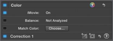
The iMovie color parameter is a single checkbox that controls whether or not the color corrections made in iMovie are used in Final Cut Pro X. No matter how many parameters you modified in iMovie, this one checkbox enables or disables them all at once.
8. Deselect the iMovie color checkbox to disable all iMovie color corrections.
You can also turn off the effects and iMovie color corrections in every clip of your project.
9. Press Command-2 to go to the Timeline, and then press Command-A to select all the project clips. With all the clips selected, the checkbox for effects and iMovie color parameters have three states.
When a subset of selected clips have an effect or iMovie correction turned on, a diagonal split appears in a parameter’s checkbox. Clicking a split checkbox turns on that effect or correction for all clips with that effect or correction. Clicking the checkbox again to turn off the effect or correction turns off that effect or correction for all selected clips in the Timeline.
The three states of the iMovie color correction checkbox
10. Deselect the checkboxes of the Old World effect and the iMovie color parameter to turn them completely off. The effects and color corrections are now off for all selected clips in the Timeline. Play through the project to verify this.
As you can see, you have several options governing iMovie effects and color corrections. At this point, with iMovie effects and color corrections turned off, you can now redo the color corrections completely from scratch, and introduce your own detailed grading using the original range of color and contrast found in each clip.
Using Video Scopes
In addition to examining your clips on a properly calibrated display, you can consult the video scopes to quantitatively evaluate and compare images you’re adjusting.
Final Cut Pro X provides all the necessary video scope displays for color correction. Together, these scopes provide graphic measurements of the luma, chroma, and RGB levels of project clips, helping you to unambiguously evaluate their good and bad qualities, as well as those qualities that differentiate one clip from another.
In this section, you’ll view and customize the video scopes, and learn which scopes to use in your everyday work.
Displaying Video Scopes
Video scopes are essential to making careful color adjustments.
1. Open the Project Library and double-click the Burnt Dinner project to open it into the Timeline.
Tip
Press Shift-Z to expand every clip in the project to the full width of the Timeline, making it easier to see your entire project.
2. Choose Window > Show Video Scopes, or press Command-7. The video scopes open to the right of the Viewer. If nothing appears inside the video scopes, press Command-2 to go to the Timeline, or select any of the clips in the Timeline.

When both the video scopes and Video Inspector are open, the Viewer is reduced to half its size to make room for them. As a result, the Viewer image can be hard to evaluate. If you’re monitoring using an external broadcast display, Viewer image size may not be a problem; but if you’re monitoring on your computer display, you may want to make more room for a larger Viewer.
3. Drag the border between the Event Browser and the Viewer all the way to the left. This enlarges both the video scopes and the Viewer relative to the Clip Browser and video scopes, and makes it easier to see what you’re doing. You can also drag the border dividing the video scopes from the Viewer to the left, shrinking the video scopes and enlarging the Viewer to make it easier to see the image.

If you choose Window > Show Viewer on Second Display, the video scopes appear to the left of the Viewer on your second monitor.
4. Press the ; (semicolon) or ‘ (apostrophe) keys to navigate to the second clip in the Timeline. Press C to select the clip, which opens it in both the current video scope and the Video Inspector.
Note
You could click any clip to select it, but the playhead would move to whichever portion of the clip you clicked, and you wouldn’t necessarily see the same frames used in the following figures. Option-clicking a Timeline clip will select it without moving the playhead.
The video scopes show an analysis of the frame currently appearing in the Viewer.
If you switch focus from the Timeline to the Event Browser, the video scopes will analyze the current frame of the Event being browsed, rather than the frame at the position of the playhead in the Timeline.

5. Turn off skimming by choosing View > Skimming, or pressing S.
Skimming can be an impediment when you want to analyze a specific frame; you don’t want the playhead constantly updating position every time you move the pointer.
Using the Histogram
By default, the video scope displays the RGB Overlay histograms. The RGB histogram shows separate red, green, and blue histogram analyses of the image. The three-color channel analyses are overlaid on each other, which allows you to compare the relative distribution of each color channel across the tonal range of the image.

Tonal range is the range of lightness occurring throughout each clip—from the blackest shadows, through the mid-level lightness of the midtones, to the brightest highlights. It’s important to learn to distinguish which parts of your image fall into which regions of image tonality. You can use the video scopes to learn these distinctions.
1. Click anywhere on the third clip of the Timeline to move the playhead to a frame of that clip.

Notice that the blue histogram graph is much higher than the red and green histogram graphs. This indicates that the values of the blue channel are much higher than those of the red and green channels, which is intuitive given that the image has a strong blue tint to it.

Histograms represent the total number of pixels of each level of luma throughout each color channel of the image by plotting a graph that shows the number of pixels for each percentage of lightness. It’s really a bar graph of sorts, in which each increment of the scale from left to right represents a percentage of image tonality on a scale of −25 to +125 (where 0 = absolute black, and 100 represents allowable white), and the height of each histogram bar shows the number of pixels corresponding to that percentage.
Notice also that the red, green, and blue colors of the overlapping histograms mix, so that the overlap of red and green histograms appears yellow, the overlap of green and blue histograms appears cyan, and the overlap of blue and red histograms appears magenta. Finally, the gray portion of the graph shows a histogram of the luma component of the signal.
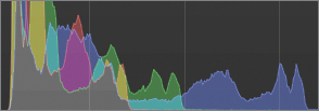
Red, green, and blue histogram overlap can show you where all three color channels “agree” with one another, which can be useful if you’re trying to determine if the left-and right-most parts of all three color signals are balanced, or somewhat equal. In the third clip, the left-most part of all three color channels are nearly lined up, which indicates that the colors in the darkest shadows are almost completely neutral.
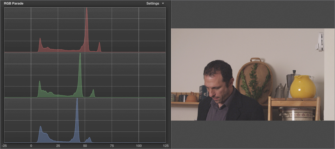
2. At the upper-right corner of the video scopes, from the Settings pop-up menu, choose RGB Parade.
Each video scope in Final Cut Pro X has several options, some of which represent alternate views of the same information. The RGB Histogram can be switched among the default Overlay view; the Parade view you just chose (which shows each histogram separately, one over another); and individual Luma, Red, Green, and Blue histograms.
3. Click the sixth clip in the Timeline to select it.

In this clip, the RGB Parade view clearly shows that the red channel is strongest (it stretches farthest to the right, peaking at around 65), and the blue channel is weakest (it stretches only to approximately 55). This corresponds to the clearly more neutral (in fact, slightly “warmer,” or more orange) color quality of this clip.
Histograms are good tools for overall analysis because they show you the color balance of an image, as well as how close a clip comes to the darkest and lightest extremes of image lightness that are permissible for broadcast. However, other video scopes can represent even more specific aspects of your clips.
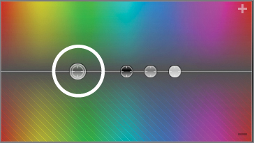
Using the Vectorscope
The Vectorscope shows the overall distribution of color in your image as a “blob” of a graph centered within a circular scale. The blob is actually a collection of individual points (each pixel of the current image corresponds to a connected point in this graph), connected by thin lines that trace from point to point.

These traces bunch together and appear as “arms” that stretch from the center of the Vectorscope into different directions. The traces of the Vectorscope are colored to reflect the colors that appear in the image, but this coloration is only an approximation of the clip’s actual appearance.
The purpose of this graph is to show you how much of which colors are in your clips, and how intense they are.
For each “arm” of the Vectorscope graph, its angle around the circular scale shows the hue (relative to the color targets provided), while its distance from the center of the scale shows the saturation, or intensity, of the color in that part of the image. The center of the Vectorscope represents zero saturation; the farther from the center a point is, the higher its saturation.
In this exercise, you’ll learn to “read” images using the Vectorscope.
1. From the Settings pop-up menu of the video scope, choose Vectorscope.
2. Click the eighth clip of the Timeline, move the playhead to frame 01:00:46:13, and examine the Vectorscope graph.

Notice that four main “arms” appear on the Vectorscope graph: a long red one extending toward the R target box, a bluish/pink one extending toward the B target box, a cyan one extending toward the CY target box, and a yellow/orange one extending toward the YL target box.
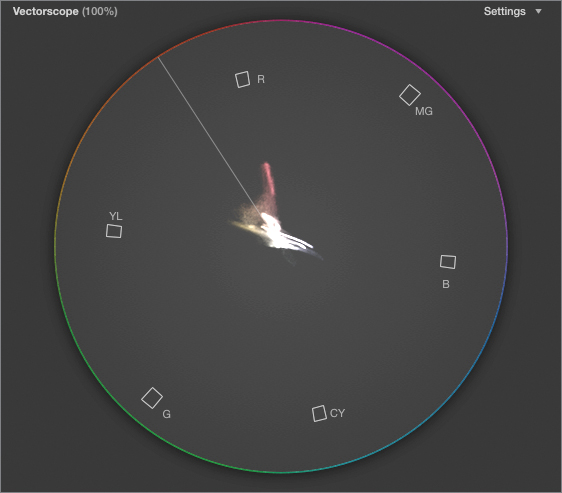
These targets provide a reference to indicate which angles of the Vectorscope correspond to which hues. By noticing which target boxes the arms stretch toward, you can get a sense of how many hues exist within your image.
Tip
Many colorists prefer to work with uncolored video scopes. You can turn off the coloration of the video scope graphs by choosing Monochrome in the video scope Settings pop-up menu. In monochrome mode, the target boxes are even more useful for reference.
The target boxes correspond to the primary and secondary colors of the additive color model upon which video is based. Red, green, and blue are the three primary colors that are added together in varying proportions to create all other visible colors. Magenta, cyan, and yellow are the secondary colors that result by combining any two primary colors: green plus red is yellow, green plus blue is cyan, and blue plus red is magenta.
Notice that the red arm of the graph is longer than the cyan arm of the graph. This shows that the red of the woman’s dress is considerably more saturated, or intense, than the cyan of her potholder.
It’s useful to know that at the default scale of this graph, these targets also serve as an approximate outer boundary for the acceptable amount of saturation. If any arm of your Vectorscope graph goes beyond these targets, that color is probably too saturated and may later cause problems.
3. From the Settings pop-up menu of the video scope, choose 133%. The Vectorscope enlarges to provide a zoomed-in view of the graph. This can be useful if you’re trying to see the angle of specific portions of the graph that may be small because they’re not very saturated.
4. Click the last clip in the Burnt Dinner project, and move the playhead to the very beginning of the clip, where the woman is by herself.
Skin tone is one of the most critical colors for adjustment. All viewers have very specific expectations for the hue of human skin, and if that hue is a bit off, it may cause the people in your project to seem unhealthy or unattractive.
For this reason, the Vectorscope has a special target: the Skin Tone Indicator. The Skin Tone Indicator is a diagonal line that falls between the R and YL targets, and it shows the theoretically ideal hue of human skin tone, regardless of the subject’s complexion or ethnicity.
To use the Skin Tone Indicator, look for the arm of the Vectorscope graph that comes closest to the indicator. Unless the color of the image is wildly wrong, this should represent the skin tone in the scene. The arm’s proximity to the indicator will show you how close the color in your shot approaches the theoretical ideal for skin hue. In the current shot, the skin tone component of the Vectorscope graph is pretty obvious.

5. Click the previous clip in the Timeline (the eleventh clip) to evaluate the closeup of the man.

In this shot, three main arms stick out of the graph, one toward R, one just to the left of the Skin Tone Indicator, and one stretching more toward YL. Looking at the shot, it’s probably a good guess that the right-most arm corresponds to the man’s skin, since the wood shelving in the background is very similar to human skin tone also, and is less red. Finally, the yellow and orange in the background likely corresponds to the left-most arm of the graph.

6. In the Video Inspector, double-click Crop to view the Crop parameters, and drag the Left, Right, Top, and Bottom sliders until you’ve cropped to just the man’s face.
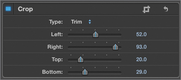
Cropping a clip limits the analysis performed by the video scope, and isolating the man’s face proves our hypothesis about the Vectorscope arms. It also shows that without the distractions of everything else in the shot, the man’s face does look pretty red.
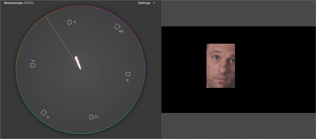
This isn’t necessarily wrong, but it does demonstrate the value of the Vectorscope in showing a strict numerical representation of which colors really appear in the scene.
This brings up another good point. Be aware that the Skin Tone Indicator is only an approximation. Subtle variations of complexion in the population may cause skin tone to fall slightly above (ruddier complexions) or slightly below (olive-skinned complexions) this line. Don’t mistakenly think that all people should fall exactly on the Skin Tone Indicator. However, if you keep in mind that the indicator target is merely the center of what’s considered ideal, it’s a good marker for how close or far different complexions are from where you want them to be.
If the skin tones of your actors are noticeably off, the offset between the most likely nearby area of color in the Vectorscope graph and the skin tone target will give you an idea of the type of correction you should make.
7. In the Video Inspector, click the Crop parameter’s Reset button.
8. In the Timeline, click in the last third of the fourth clip.

In this shot, a prominent blue arm in the Vectorscope graph indicates how much blue is contained in the scene. You can also see that the red/orange part of the graph is very, very close to the center, which shows that the skin tone and color of the cabinetry in the background are much more desaturated than in the previous shots.

Also notice that the entire graph is off-center relative to the Vectorscope Skin Tone Indicator. Because the outer ring of the Vectorscope represents maximum color saturation, the center of the Vectorscope represents zero saturation, which corresponds to untinted black and white in the scene.
Whenever you see a Vectorscope graph that’s off-center like this, it means that the image has no untinted black, gray, or white. This may be the look you want, in the case of an image with extreme tinting, or it may indicate an unwanted “color cast” or color bias in the image that needs to be corrected.
So, if you’re interested in examining which hues are in an image, how saturated or intense they are, and how they compare to the hues of other clips, the Vectorscope is your tool of choice.
Using the Waveform Monitor
The Waveform Monitor is yet another tool for analyzing your video signals. In some respects, it works similarly to the Histogram and displays some of the same information. However, while it’s a bit more complicated to read, the Waveform Monitor offers advantages that make it very versatile.
1. Press the ‘ (apostrophe) key to navigate to the eighth clip in the Timeline. Then press C to select the clip and open it in the current video scope and the Video Inspector.

2. From the Settings pop-up menu of the video scope, choose Waveform. The waveform graph appears, showing luma by default. (If it’s set to a different waveform display, from the Settings pop-up menu, choose Luma.)
All video clips can be broken down into a luma component, which contains all the light and shadow information throughout a clip, and a chroma component, which contains all the color information.
In the previous exercise, you used the Vectorscope to analyze the isolated chroma information. Now you’ll use the luma waveform graph to analyze the isolated image lightness.
3. In the Video Inspector, double-click Crop to reveal the Crop parameters, if necessary. Then drag the Top slider to the right until its value is 99.
The waveform graph shows an overlapping series of individual waveforms, one for each row of pixels in the clip being analyzed. When you crop the rest of the image, the thin strip of image that remains makes it easy to see how the waveform analysis works.
Tip
The graph in the following figure has been intensified using the Brightness slider found at the bottom of the video scope’s Settings pop-up menu. This slider increases the visibility of difficult-to-spot video scope features by intensifying lighter areas of the graph.

The vertical scale of the waveform ranges from −20 to +120, which represents the minimum and maximum values a video signal might contain. Practically speaking, 0 represents minimum black, while 100 represents the maximum white that’s recommended for media distribution. (Note that the −20 and +120 limits provide room for undershoots and overshoots that may exist in the source media, but are not meant for distribution.)
To create the waveform graph, each row of pixels in the image is graphed individually from left to right, so that pixels of low lightness levels are graphed closer to the bottom of the graph, and pixels of higher lightness levels are drawn closer to the top. Consequently, darker areas of the video strip you’ve cropped appear as dips near the bottom of the graph, and brighter areas of the video strip appear as spikes near the top.
4. Slowly drag the Top slider back to the left, until it’s set to 0. As you add more and more rows of pixels to the analysis, additional overlapping waveforms are added to the graph, until a complete analysis appears.

Because the horizontal axis of the waveform graph corresponds to the horizontal dimension of the image being analyzed, there’s a correspondence between subjects in the frame and features of the waveform graph. The waveforms are also colored to suggest the colors being analyzed in the image and to help you understand how the waveform corresponds to the frame contents.
5. Press the Spacebar to play the video, and stop playback before reaching the end of the clip.
As the woman walks from left to right, you can see the red dip in the waveform move along with her. You can also see the tall yellow fuzzy portion of the waveform diminish as she walks in front of the flowers.
The bright, cool blue highlights of the waveform correspond to the light falling on the cabinets and window sill, and are shown as some of the taller spikes on the graph. Farther to the right, the very tallest spikes in the graph (nearing 100) represent the specular highlights on the wine glasses on the counter.
As you learn how features in the image correspond to spikes and dips on the Waveform Monitor, you will look for three key elements:
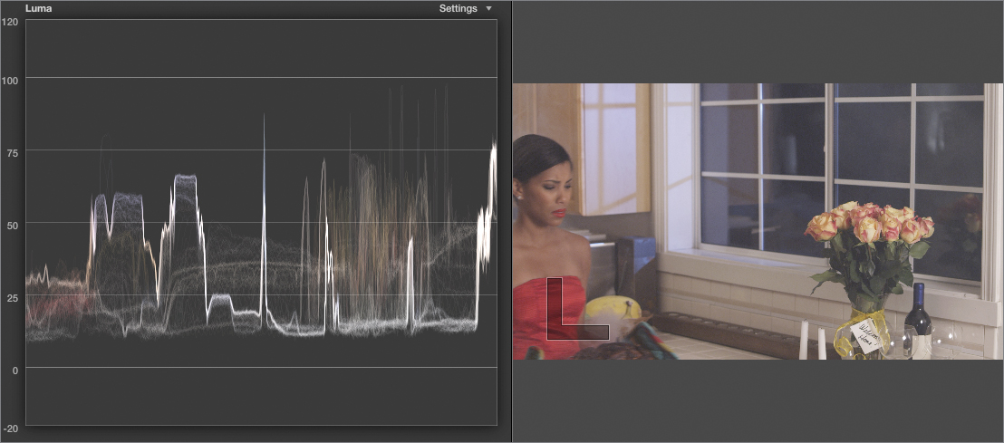
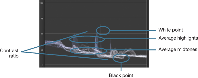
Focus on the top of the waveform. The white point corresponds to the highest spikes on the graph, which correspond to the lightest features in the image. In the current clip, the specular highlights of the wine glasses are technically the white point (at around 95 relative to the graph’s scale), but because so little detail appears in these highlights, they aren’t a good way to judge the average highlights of the image. Highlights corresponding to specular highlights, direct light sources, and reflections are often the peak highlights of an image.
A more practical white point for evaluating the highlights of our image comes from the light falling on the cabinets and on the windowsill, which are around 60 to 70 relative to the graph’s scale. Highlights falling on faces, colored highlights bouncing off objects, and any other bright reflected highlights that are dark enough to contain significant detail can be considered average highlights.

Whether you choose the peak highlights or the average highlights to define the white point is somewhat subjective, but a good piece of advice is that if the image would look better by raising the average highlights, at the expense of clipping the peak highlights, it’s probably safe to do so.
The higher the white point, the brighter your highlights are. The lower the white point, the more subdued your highlights are. When you learn to spot the white point in the Waveform Monitor, you can easily identify how much detail is in the highlights of the image by examining how jagged the highlight graphs are. A jagged graph indicates significant variation between adjacent pixels: in other words, detail within the image.
This scene has a lower, somewhat subdued average white point, which makes sense given that it’s a night shot. However, notice that the specular highlights still nearly hit the top of the scale (specular highlights are pinpoint reflections, sun glints, and highlights). Just because a scene happens at night doesn’t mean that direct lighting or highlights will diminish along with the reflected highlights elsewhere in the scene.
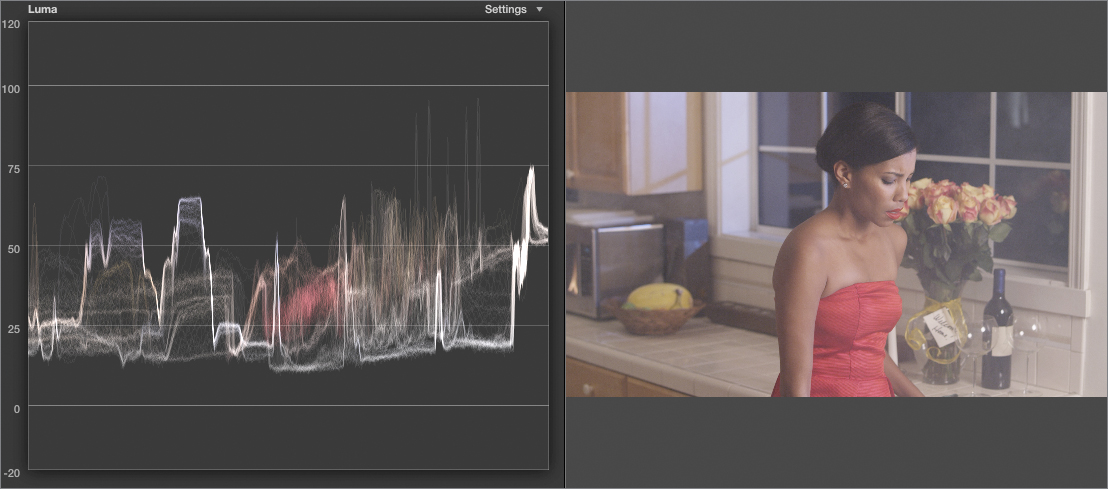
Turning attention to the bottom of the waveform, the black point is the lowest dip in the waveform graph. In the current image, the black point corresponds to the nighttime view through the windows, which dips to approximately 10 relative to the waveform graph’s scale.
The black point represents the darkest shadows in the image, and evaluating how jagged the black point of the graph is will reveal the amount of shadow detail. A lower black point results in darker shadows, a higher black point results in lighter, milkier shadows. This image has elevated shadows, relative to the 0 of absolute black, which gives the scene a softer, less harsh appearance that is appropriate to the romantic mood of the scene.

Now that you’ve spotted the white and black points, the difference between them represents the contrast ratio of the clip. A wider difference between the white and black points indicates a high-contrast ratio, while a narrower difference between the two indicates a low-contrast ratio. In general, low-contrast clips appear more subdued, while high-contrast clips appear sharper and more vivid.
Finally, the average midtones can be seen in the densest cluster of graphed values found between the black and white points. In the current image, the average midtones can be seen in the cluster of values ranging from approximately 20 to 40 relative to the graph’s scale.
Lower average midtones indicate a generally darker image with more shadow and fewer highlights. Higher average midtones indicate a brighter, more fully lit image with pools of light and highlighted detail. This image has lower average midtones, which is appropriate for an evening scene.

6. Click anywhere in the fourth clip in the Timeline.
Now compare the white point, black point, contrast ratio, and average midtones shown in the luma waveform to those of the previous image you evaluated.
You should immediately spot that the highlights are lower, the shadows are a bit elevated, and the average midtones are quite low. Overall, the contrast ratio (the difference between the highlights and shadows) is much, much lower than in the previous shot. Overall, this is a dimmer, more subdued image, as is indicated by the graph.
The luma waveform is invaluable for evaluating and comparing the relative lightness within a scene. It gives you a precise view of the tonal range of your clip, as well as letting you directly compare the black point, white point, and average midtones of two clips you might later want to match. (You’ll learn more about this in Lesson 11.)
7. From the Settings pop-up menu of the video scope, choose Millivolts.
The graph scale changes, now ranging from –140 through 840, with 0 showing absolute black, and 700 showing the maximum allowable white level. Depending on the types of scopes you use, millivolts might be more familiar than the default 0 to 100 IRE scale of the video scope. Also, if you’re adjusting your project’s color according to quality control (QC) guidelines you’ve been provided, the maximum and minimum allowable signal strengths may be expressed in mV.
8. Return the scale to IRE, and then from the Settings pop-up menu, choose RGB Parade.
The RGB Parade scope lets you use three waveforms to analyze the color balance of your clips. The video signal is mathematically separated into red, green, and blue color channels, each of which is monochrome. These three monochrome color channels are then analyzed the same way the luma waveform was, and the results are shown side by side.

This example shows the relative strength of the red, green, and blue channels. In the current clip, the blue channel is much higher, and is therefore much stronger than the lower red and green channels.
9. Click anywhere in the sixth clip in the Timeline.

In this clip, you can see that the bottoms of the red, green, and blue waveforms are fairly balanced, which indicates that the shadows are relatively neutral.

This occurs because red, green, and blue added together in equal measure results in a neutral tone, whether black, gray, or white. This is key information because black shadows and white highlights should always be somewhat balanced with waveforms of roughly equal height at or near the extreme top and bottom of the waveform graph. Color images won’t have RGB waveforms that perfectly line up (only desaturated grayscale images have waveforms that do), but the tops and bottoms should roughly line up if the image is not meant to be tinted.
Knowing this, and looking at the tops of the waveforms for the current image, you’ll see that the top of the red waveform is higher (not the peak white of the spectral highlights on the pottery, but the practical white point falling within the scene). This shows that a slightly warm, reddish color cast exists in the highlights but isn’t in the shadows. This is a valuable detail to know when choosing how to make your upcoming color correction.
10. From the Settings pop-up menu, choose RGB Overlay. The RGB Overlay option shows the same information as the RGB Parade option, except that the three waveforms are overlaid on top of each other.

An interesting feature of the RGB Overlay scope is that when parts of the three red, green, and blue waveforms overlap, the colors interact so that neutral parts of the overlay graph appear white. On the other hand, regions where individual color channels are dramatically offset from one another are easy to see as they’re distinctly color coded.
Whether you use the Overlay or RGB views is largely a matter of preference, depending on which view makes it easier to find the information you’re looking for.
Final Cut Pro has several more waveform viewing modes, but the luma, RGB Parade, and RGB Overlay are the most useful for day-to-day color correction work. In the next section, you’ll combine the image analysis you learned here with color adjustments made using the Color Board.
Adjusting Contrast Using the Color Board
All detailed manual color adjustments in Final Cut Pro X are performed within the Color Board, a dedicated color correction interface with controls for the contrast, color, and saturation of overlapping image regions. In other words, you can make separate but overlapping adjustments to the shadows, highlights, and midtones of your images.
All the adjustments you’ll make in this section are primary color corrections. Primary corrections are adjustments that affect the overall image, and represent the starting point of any color adjustment whether corrective or creative. By learning to make effective primary color adjustments, you’ll also learn how to use the Color Board controls to best effect.
Adjusting Contrast Manually
As you learned when using the Waveform Monitor, contrast is the difference between the darkest and lightest parts of an image. It is also the foundation of every adjustment you’ll make to your clips.
In this section, you’ll manipulate the Final Cut Pro X Exposure controls to modify the shadows, highlights, and midtones, to achieve a specific look.
1. Open the Project Library, if necessary, and double-click the Burnt Dinner project to open it into the Timeline. If necessary, open the video scopes (Command-7), narrow the Event Browser, and adjust the video scope and Viewer to a comfortable size.
2. Click in the latter third of the last clip in the Timeline.

Even when the playhead is on the appropriate location, it’s vital that you always select the clip you want to adjust—either by clicking it, or pressing C. The Video Inspector always shows the properties of the currently selected clip. If your playhead is on the clip you want to work on, but another clip is selected in the Timeline, you’ll make unintended adjustments to the selected clip.
Tip
If the Color Board is already open to a particular set of controls, you can click or otherwise select another clip in the Timeline and the Color Board controls will update to those of the currently selected clip. This feature helps you move more quickly through a group of clips while making adjustments.
3. Use the Settings pop-up menu of the video scope to display the waveform, and choose the Luma option.
As you’ve learned, the luma waveform is ideal for identifying a clip’s contrast ratio. You can immediately see that this clip is fairly dim. However, the luma waveform shows just how much room you have for adjustment.

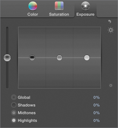
4. In the Video Inspector, click the Color Board button of Correction 1. The Color Board appears and defaults to the Color controls.
5. Click Exposure to open the Exposure controls.

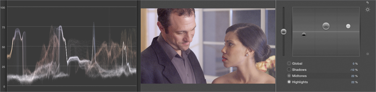
You’ll see four specific controls: Global, Shadows, Midtones, and Highlights.
6. Slowly drag down the Shadows control (the black puck) until the faint dips at the very bottom of the luma waveform touch 0 in the graph.

As you do this, notice how the bottom of the waveform moves to match your adjustment. Also notice that the Shadows percentage value updates to reflect your change.
Because the bottom of the waveform represents the darkest shadows within the image, it’s a good reference for determining how low the Shadows control can go without going below 0. The faint dips represent subtle details within the shadows: wrinkles, textures, even details within dark hair. Keeping the values above 0 preserves all detail within the image, even though the image is really dark at the moment.
7. Drag up the Highlights control (the white puck) until the waveform spike (corresponding to the highlight on the window sill behind the woman) just touches 100 in the graph.
Some brighter peak highlights—such as those corresponding to the glint reflecting off of her earring—now exceed 100, but those are low-detail highlights you can ignore for now. What’s important is to use the Highlights control to adjust any bright, plausible light sources or bright detail-rich reflections up to somewhere between 90 and 100 to maximize the image contrast.
Unfortunately, with the highlights turned up this high, the shine on the man’s forehead is a bit too prominent. You don’t want to park all highlights at 100 percent.
8. Drag down the Highlights control until the spike corresponding to the man’s forehead in the luma waveform falls to approximately 75. The highlights now look a bit more natural.

When you adjusted the highlights, you may have noticed that the shadows were dragged up a bit. These controls are somewhat interactive, such that a large adjustment to one will inevitably affect the other. Think of the Highlights and Shadows exposure controls as two ends of a rubber band with you stretching the video signal between them.
9. Drag down the Shadows control until the bottom of the luma waveform just touches 0 again.
Stretching the contrast, as you’ve just done, is often the first step toward creating a more vibrant and appealing image. Scenes are frequently shot with deliberately low contrast to avoid “clipping,” or eliminating detail in the highlights or shadows and to provide the best possible raw media for later color correction. In those situations, you are expected to make adjustments to realize the final image contrast that was actually intended by the director of photography.
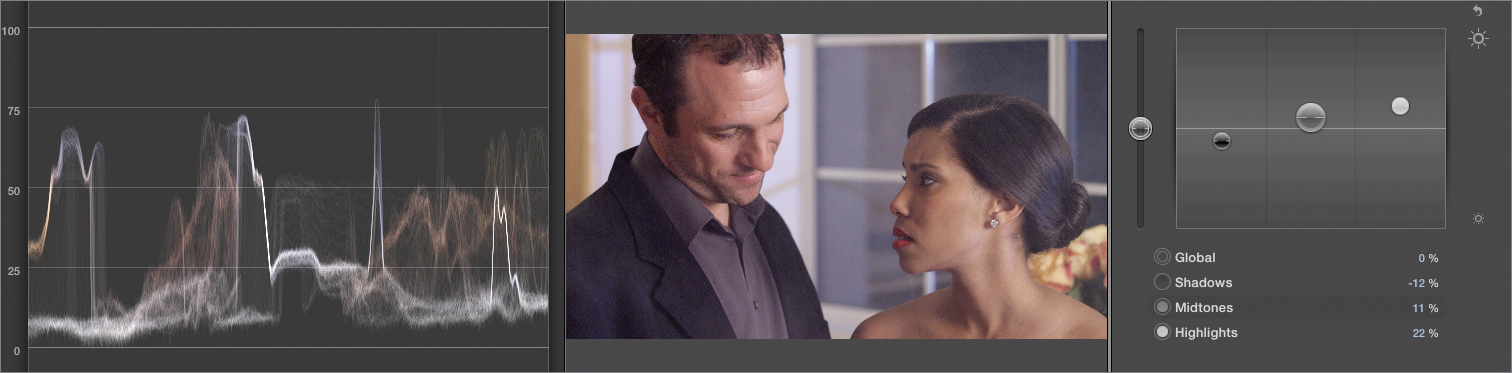
10. Just to see what happens, drag down the Shadows slider so that the portion of the waveform corresponding to the man’s jacket falls underneath 0, and the portion of the waveform corresponding to the woman comes to just underneath 0.
Dragging the shadows under 0 is known as “crushing the blacks.” Although crushing the blacks just a little bit can increase contrast, you’ll also lose the fine shadow details. You can see this in our extreme example, as the man’s jacket has lost most of its detail, and each actor’s hair has flattened out. Indiscriminately crushed blacks can make hair and shadows on clothing unattractive.
11. Drag up the Shadows control again until the bottom of the waveform rests at 0. Now that you have a “contrastier” image, it’s time to set the overall illumination.
12. Slowly drag up the Midtones control (the gray puck) until the top of the average midtone falls around 60 to 70 on the waveform.
The Midtone exposure control adjusts all values between the shadows and highlights in such a way that leaves the shadows and highlights “pinned” in place, while stretching everything in-between. To return to the rubber band analogy, if the shadows and highlights set the position of both ends of the rubber band, the Midtones control grabs the middle and stretches and scales those values toward either end.
As you adjust the Midtones control, you can see that the very bottom of the waveform (the part touching 0) remains “stuck” at 0, and the middle portion of the graph has stretched out.
Practically speaking, you might consider the Midtones exposure control to be your “time-of-day” slider. Due to the adjustment you just made, the image has become quite a bit brighter and could plausibly pass for a daytime shot. But that’s not what you want.
13. Drag down the Midtones control, until the faces are bright enough to be seen clearly, but dark enough so the scene still looks convincingly like evening.
While the luma waveform can guide you in setting the black and white points of your image, setting an appropriate midtones level is much more a matter of feel and experience. In other words, you’ll know the right level when you see it.
14. To compare the corrected image with the original, click the back button to return to the Video Inspector. Then, in the Video Inspector, click the Correction 1 checkbox to turn the correction on and off.

Often, it’s useful to toggle your correction on and off to see if you’re on the right track by comparing what you’re doing to the original shot. In this case, the improvement to the image should be immediately clear.
You should be able to see that the “after” image has more definition, crispness, and presence. That’s the benefit of making a simple adjustment to contrast.
Comparing Global and Shadows Exposure Adjustments
So far, you’ve used the Shadows, Highlights, and Midtones controls to stretch and adjust image contrast, but the Global control has remained untouched. The Global control works similarly to the Shadows control, but with one key difference that’s hard to appreciate without trying it out. In this exercise, you’ll learn the difference between the two controls, and when to choose one or the other.
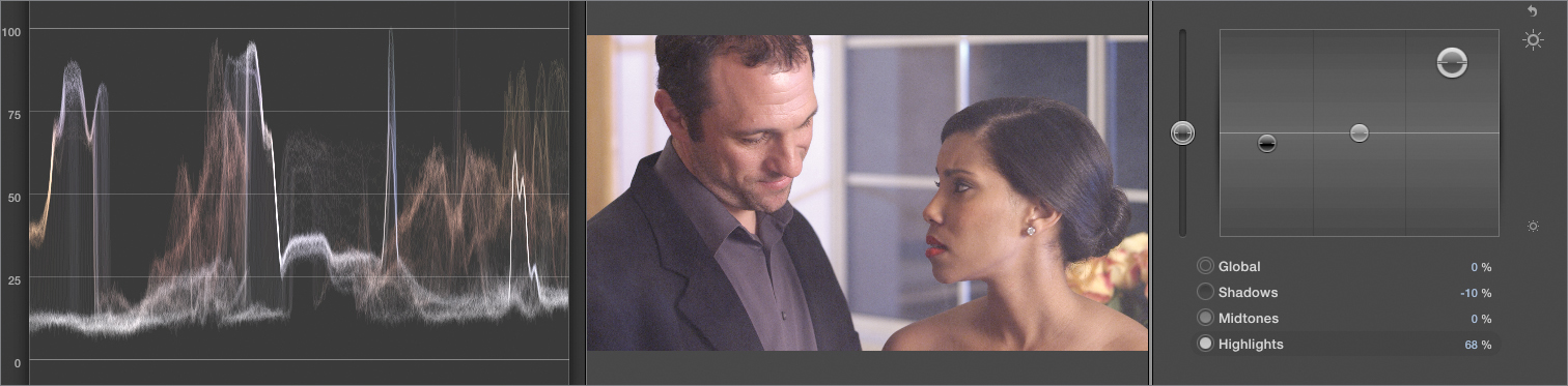
1. Click anywhere in the eighth clip in the Timeline. Then in the Video Inspector, click the Color Board button, and click Exposure.
2. Drag up the Highlights control until the average highlights of the luma waveform just touch 100. The image is a bit bright, but don’t worry about that just yet. The next few adjustments will compensate.
3. With the highlights turned up, drag down the Shadows control until the black point of the luma waveform just touches 0.
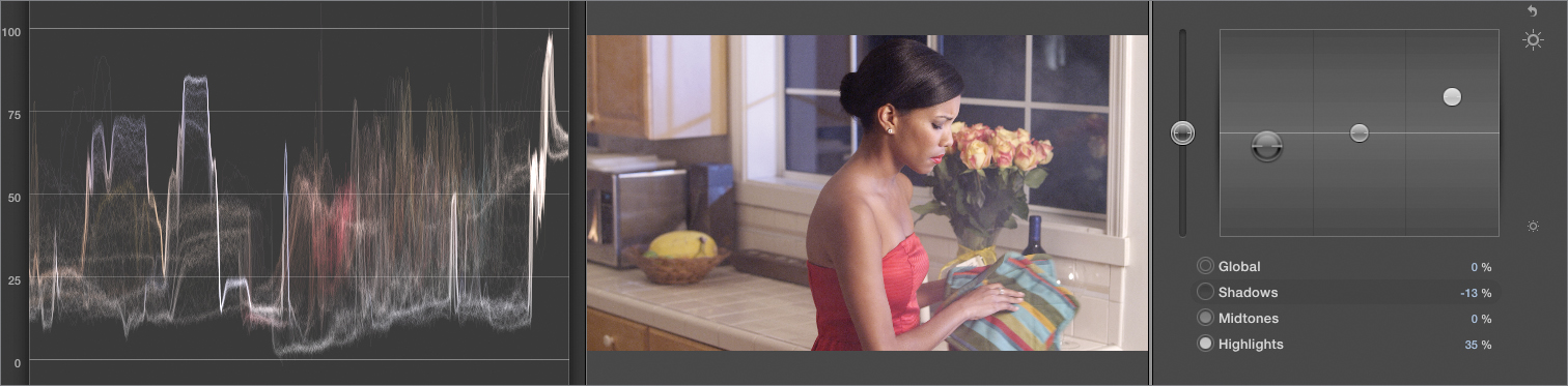
As in the previous exercise, the overall luma waveform has stretched out so that the highlights remain near where they were, while the graph between the shadows and highlights has become taller. That’s how the Shadows control works: It leaves the highlights where they are, and stretches the graph between the shadows and the highlights.
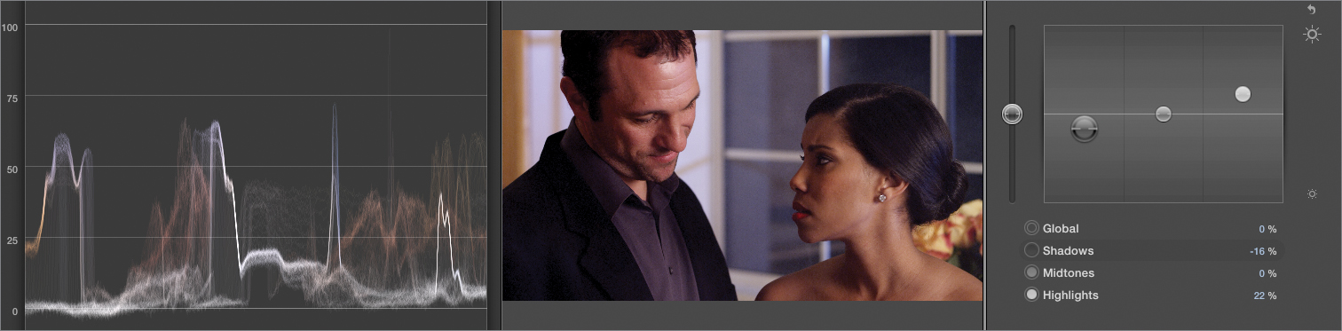
4. With the Shadows control selected, press Delete to return the control to 0.
5. Drag down the Global control (the vertical slider to the left of the Exposure controls) until the bottom of the luma waveform just touches 0, and watch what happens to the graph.

As you adjust the Global control, the luma waveform doesn’t stretch. Instead, the entire waveform simply moves down so that everything is darkened equally, including the peak and average highlights.
In other applications, this type of control is sometimes referred to as lift because it equally lifts (or lowers) the luma of the entire video signal. You can think of the Global exposure control as a shortcut to use when you want to adjust every part of the signal, either lightening the shadows through the highlights, or darkening them. Once you’ve set the overall levels in this way, you can perform more specific adjustments using the Shadows, Midtones, and Highlights controls.
Or, you can ignore the Global control altogether, simply using the other controls to adjust the signal. There is no right or wrong way to work, simply what’s fastest and most comfortable for you.
Take 2
Try making your own contrast adjustment to the seventh clip in this sequence. Use all the Exposure controls to maximize the contrast from the darkest shadows to the brightest highlights without clipping detail. Then set the midtones for a well-lit look that still looks like evening. If you want to experiment further, try adjusting all three exposure controls to create the impression of different times of day.
Tip
Additionally, it’s often important to play through a clip before you start making adjustments because a clip’s color and contrast can change as people move through a location, and the camera pans to different angles. Choose a frame that best represents the average color and contrast of the clip before you start your corrections.
Lesson Review
1. What are the four essential tasks of color correction?
2. Should you use proxy or original/optimized media for color correction?
3. How do you open the video scope using the keyboard?
4. What does the Vectorscope show you?
5. How do you alter the lightness of the brightest part of an image?
6. What contrast control can be described as controlling mood or time of day?
7. What does the luma waveform show you?
8. What does it mean if the graph in the Vectorscope is off-center?
9. How can you see if the skin tone in an image is correct?
Answers
1. Fixing problems, making each clip look its best, matching clips, and adding style
2. Original or optimized media
3. Press Command-7.
4. An analysis of the hue and saturation appearing in a clip
5. Using the Highlights exposure control of the Color Board
6. The midtones
7. The ranges of image contrast
8. There’s a color cast, or tint, in the image.
9. From the proximity of the nearest “arm” of the Vectorscope graph to the Skin Tone Indicator
Keyboard Shortcuts
