
Chapter 6. Custom controls
You can use custom controls in ASP.NET Web Forms to benefit from componentization. As you learned in previous chapters, ASP.NET Web Forms are based on the concept of controls, which are used as placeholders for their given features. Controls are useful when you’re developing complex applications because you can avoid code duplication. Because custom controls are objects, you can use the typical features offered by OOP.
You can start from scratch with your own control, or use an existing control and enrich it. Depending on your needs, you can interact with the Web Form during PostBacks, or support data binding (introduced in chapter 5).
One of the most interesting aspects of custom controls is that you can encapsulate your logic and reuse it many times in your application, without rewriting it. This feature will be a great help when you need to enhance the control even more because the modifications will reflect automatically.
When you’re dealing with custom controls, you need to have a solid understanding of how ASP.NET Web Forms work because you’re more exposed to some internals than you are in other situations. If you need to brush up on ASP.NET Web Forms, be sure that you’ve read chapters 4 and 5.
In this chapter, we’ll take a look at how to build custom controls, starting with the simple ones. After that, we’ll move on to analyzing more complex scenarios, such as data binding and templating. Most of the topics presented here aren’t entirely new to ASP.NET 4.0, but they’re definitely important if you’re working with ASP.NET.
6.1. The basics of custom controls
A custom control is a class that handles a scenario and offers a solution. Typically, it generates a markup (HTML or XHTML), but some scenarios don’t do that. For example, in chapter 5 we talked about data source controls, which don’t generate markup.
When you write a custom control, you’re trying to solve a recurring problem in order to avoid writing the same logic—and code—multiple times. Because the control will be available in the page’s control tree, you need to code it accordingly.
Generally, custom controls are divided into the following groups, based on their features:
- Basic controls are the simplest ones
- Composite controls are created by composing existing controls to create new ones
- Templated controls use a template to give you advanced control over the generated markup
- Data binding controls help you display data coming from a data source
- Control designers are used to leverage Visual Studio’s 2010 design surface
- Control builders let you use your own markup format in the control
In this chapter, we’ll talk about most of these controls, but we won’t peer too deeply. These scenarios can become quite complicated, depending on your needs; the space in this chapter is sufficient to cover only the most common—and interesting—approaches.
Simple controls and custom controls have some commonalities. Before you start writing custom controls, you should take a look at how to build a simple control. That’s what we’re going to do in our first scenario.
Technique 35: Simple controls
Custom controls are built by inheritance. You can enhance complex controls and add your modifications, or start with the simplest one. If you want to build a simple control, or if you don’t want additional features, you can start with System.Web.UI.Control.
The most interesting aspect of custom controls is that you’ll generate the markup with code—you don’t have to write it directly. If you want to build simple reusable objects, ASP.NET Web Forms embrace the concept of user control (which is similar to a partial view in ASP.NET MVC). A user control is a small piece of a page, with all the same peculiarities. It has markup and code that are well separated from each other, and you can freely define your markup using a designer. Keep in mind, though, that you can’t use the approach you use to build custom controls to build user controls because the markup is generated fully in code.
Problem
You need to start to reuse code to solve recurring problems. Our objective with this scenario is to save you time when you’re adding more features. You want to write the code once and use it in different situations.
Solution
When you’re writing a custom control, you have to create a new class that inherits from the Control class. This base class has few members, the most important of which is the Render method. This class is responsible for generating the markup and holds a single instance of HtmlTextWriter. It’s used to write the resulting markup to the buffer, and it inserts the generated output from the control in the final output stream. This approach is used by each control in the control tree, and, as you learned in chapter 5, the ASP.NET Web Form itself (the page) is a control; the rendering is performed in the same way as it is for the page.
When you need to provide output, the easiest way is to just generate it in the Render method. Even though the custom control we’ll build in a moment is simple (it displays only the value of its Text property) you can appreciate some of the most common issues you’ll need to deal with when building custom controls. The code for our custom control is shown in the following listing.
Listing 6.1. A simple custom control with a string property
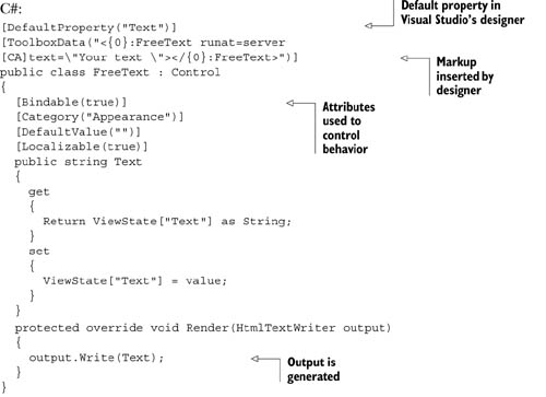

As you can see from this code, attributes are widely used in custom controls to work with both the ASP.NET Page Parser and Visual Studio’s designer. Most of these attributes aren’t necessary to make the control work, but will be useful to other members on your team.
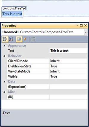
In figure 6.1, you can see how Visual Studio 2010 will host this control in its designer.
Figure 6.1. Our custom control as it appears when hosted in the designer. At the bottom are the properties related to our control.
Now you’ve got the control on your page. But before you can use it, you have to register it.
Registering a control
You can register a control in two ways:
- Locally on the page —The control will be available only on this page
- Globally —The control will be available to the whole application
The syntaxes you use in each of these two cases are similar, and there isn’t a preferred choice. If you need a set of controls in many pages and you don’t want to repeat the registration every time, the global approach is the best way to go. On the other hand, if you need them only on one page, it’s better to register them on the page where you use them.
If you want to globally register a control, you need to open your web.config and place the registration under configurationsystem.webpages, as in the following snippet:
<controls>
  <add tagPrefix="controls"
       namespace="CustomControls.Composite"
       assembly="CustomControls.Composite" />
</controls>
You can locally register a control in a page (or user control) using the @Register directive:
<%@ Register TagPrefix="controls"
             Namespace="CustomControls.Composite"
             Assembly="CustomControls.Composite" %>
The TagPrefix attribute is used to represent the first part of the typical control declaration. The second part, the one after the :, is the class name itself. For our example, the definition in the markup will be:
<controls:FreeText runat="server" Text="This is a test" />
Because it will influence the way you declare the control in markup, the class name is important and must be chosen accordingly.
Tips for Control Registration
If you can, avoid using a long name for your control and don’t add the control suffix (it’s not necessary).
Don’t use the default asp tag prefix either because it will slow down the control’s lookup performance. Using this prefix will add more namespaces to consider when the Page Parser tries to understand where the control is defined; it’s a system namespace, which is often used to clearly identify the fact that a control is coming from the Base Class Library (BCL) BCL.
Everything we’ve introduced with this scenario can be applied to user controls, too. For user controls, you specify the src property to specify the path.
Discussion
Congratulations! Your first control is complete. This control is quite simple, but shows some of the fundamental aspects you’ll have to deal with when you write custom controls. In the real world, it’s more common to write custom controls that are based on existing controls. They will enhance and combine other controls’ features in a single point and will provide an easier way of coding a feature. In the next scenario, we’ll take a look at how these composite controls work in ASP.NET.
Technique 36: Composite controls
Custom controls are often created by combining existing ones, enhancing their features. In most situations, this process consists of picking two or more controls and combining them to produce a single result. Knowing how to do this is important because you can reuse existing controls and add more features to simplify the use of common, recurring situations.
We’re talking about composite controls separately because combining controls is more challenging than creating a new one from scratch. When you create composite controls, you’ll encounter special problems. For example, the controls need to be wrapped, and their members need to be exposed in the corresponding control. This task is simple to perform but it’s also time consuming. The reality is that you’ll map only the most used and useful members, and add the others as you need them.
The problem with this class of controls is that you’re hiding them from the outside, deciding what the external world may and may not use. For this reason, events handled internally by these controls can become a nightmare. You need to implement an event bubbling technique (to let events propagate through the control tree), or opt to define new events to expose just the existing ones outside the wrapped controls. To fully understand how all this will affect how you create a composite control, our next scenario will cover how to build composite controls using ASP.NET.
Problem
Let’s suppose you need to create a special DropDownList that, in a single declaration, can be used to both insert the description and the options to be selected by the user. By using this control, you can save a lot of time in terms of markup to be written, and you can reuse the same feature over and over in your projects.
Solution
Composite controls are generally created by deriving from CompositeControl in System.Web.UI.WebControls. This class implements a lot of the logic necessary to implement custom controls that are web controls, too—composite controls support styling, for example. If you don’t need these features, you can opt for the simple Control class from System.Web.UI. Using the Control class will ensure that the generated markup remains simple, but you’ll need to manually add the missing features that Composite-Control already provides.
Figure 6.2 illustrates the concept of composite controls.
Figure 6.2. A composite control combines other controls. Externally, they’re treated as a single control that encapsulates the entire logic.

Whether you use the CompositeControl class or the Control class, you need to manipulate the page’s control tree and dynamically instantiate controls at runtime. Contrary to the previous example, where the Render method was used to compose the markup, composite controls work by combining controls together, so the controls are added using the CreateChildControls method.
The CreateChildControls method is called via a call to the EnsureChildControls method whenever a child control is needed. When you’re manipulating the control tree, you need to be careful and remember that these are controls that will be nested into the control itself and then into the page. To add a control inside another, you have to access its Controls properties and add it via the Add method, as shown in the following listing.
Listing 6.2. CreateChildControl contains the nested controls declaration


As you can see in this listing, we’re basically adding some controls in order to display a DropDownList and a description. To remove unwanted controls from the control tree (which could be Literal controls that can be added in markup), we’re performing a call to Controls.Clear to reset the control tree. The code in  isn’t actually necessary because it’s already included by Composite-Control. Listing 6.2 shows how to deal with this problem when another simpler base control (as Control) is used. Look at figure 6.3 to see the results.
Figure 6.3. The new SuperDrop-DownList control is in action. This control combines different controls to provide a simple implementation.

We’ve omitted the declaration of the properties from listing 6.2 for brevity. When you need to set the properties for the inner controls, you have to use a special approach: you need to access an inner object’s property from outside the control. In these situations, the preferred way to go is shown in the following snippet:

As you can see, we’re referring to the control we created in listing 6.2 (in this case, the DropDownList), finding it by position, and directly exposing its inner property. Because you don’t have to keep the inner property in sync (it’s automatically performed using this pattern), this example shows you the best way to handle this situation.
How to Avoid Referencing a Control by Position
To produce cleaner code, you can also save a reference to the controls in CreateChildControls and then refer to the controls using this syntax (instead of finding them by position).
The calls to EnsureChildControls are not only important—they’re mandatory. These calls ensure that the controls are created before we access them.
Now that the infrastructure of our control is in place, let’s take a look at how to use events in composite controls.
Events in composite controls
Events are used in custom controls to simplify the code necessary to handle a state. A composite control hides the child controls, so you need to propagate their events outside the container by implementing an event wrapper.
Redirecting an event is a simple technique. The event is sent outside by first intercepting it locally and then propagating it outside. Take a look at the following snippet to understand how it works. In this case, the code is worth 1,000 words.
C#:
public event EventHandler SelectedValueChanged;

protected void OnSelectedValueChanged(EventArgs e)
{
  if (SelectedValueChanged != null)
    SelectedValueChanged(this, e);
}
VB:
Public Event SelectedValueChanged As EventHandler

Protected Sub OnSelectedValueChanged(e As EventArgs)
  RaiseEvent SelectedValueChanged(Me, e)
End Sub
This snippet will expose a new event, called SelectedValueChanged, and a new OnSelectedValueChanged method, which is used to define the event handler in the markup. The last addition we need to make, in order to attach the event to the inner control, is to add this simple code in the CreateChildControls method, right after the DropDownList instance:
C#:
DropDownList listControl = new DropDownList();
listControl.SelectedIndexChanged += (object sender, EventArgs e) => {
  OnSelectedValueChanged(e);
};
VB:
Dim listControl as New DropDownList()
listControl.SelectedIndexChanged += Function(sender As Object,
                                             e As EventArgs) Do
     OnSelectedValueChanged(e)
End Function
This snippet ensures that when the DropDownList’s SelectedIndexChanged event is fired, our event will be fired, too. The result is that the event handler created inside the page will also be called, and our event will propagate outside the contained control.
Discussion
When you’re building composite controls, you need to pay attention to the fact that you’re not generating markup, but composing your controls, mixing them together, and manipulating the page’s control tree. This task is certainly easy to implement in a simple scenario like the one we covered here because you’re leveraging existing controls, but it can also be prone to error. As you learned in this scenario, you need to understand how CreateChildControls and EnsureChildControls work.
Now that you’ve created the basic controls, we’ll explore how you can add Post-Back to custom controls. This feature can be useful when you’re building custom controls, and you can use it in composite controls to enhance the result by adding new behaviors.
Technique 37: Handling PostBack
In the ASP.NET Web Form model, PostBack is important and is used to provide support for events. (We introduced this topic in chapter 1, so go back to that chapter if you need a refresh.) When you build custom controls, you’ll need to provide PostBack when the control needs to be refreshed or its state is altered.
Problem
ASP.NET pages are based on the concept of programmable controls. To intercept events fired by the controls present on a page, ASP.NET Web Forms use PostBacks. We want to write a control that can change its state and execute specific code attached to a defined event.
Solution
A custom control that can perform a PostBack, fire an event, and alter the control state in response to the action performed by the user is what we need to create.
If you need to perform PostBacks, your control must implement the IPostBackEventHandler interface from System.Web.UI. This interface provides a simple RaisePostBackEvent method that must be implemented to capture the PostBack and handle it correctly. This method is the entry point for every PostBack generated by the control. It must contain the related logic to handle the multiple states that your control might have.
Control Versus Webcontrol
You might have already noticed that we’ve mixed the use of Control and WebControl in this chapter. WebControl derives from Control and offers more properties, primarily related to styles, and wraps its content inside a tag.
Let’s suppose you’ve created a new event called ValueChanged. (If you need to, take a look back at the previous scenario to discover how to add an event to a control.) Your control will look like the one shown in the following listing.
Listing 6.3. A simple control that supports PostBack

When the PostBack is fired, the control simply takes the parameter, assigns it to a property, and fires the associated event.
To fire the PostBack, we need to create an action that will perform a POST request to the page. You usually do this by adding a hyperlink to the page that calls the JavaScript doPostBack function, which is dynamically added to every ASP.NET page. Although you can embed this call directly, it’s better to have it generated by using the GetPostBackClientHyperlink method offered by ClientScript, which is accessible through the current Page instance. The code is shown in the following listing.
Listing 6.4. A simple control that generates a link for a PostBack
C#:
protected override void RenderContents(HtmlTextWriter writer)
{
  string postBackLink =
     Page.ClientScript.GetPostBackClientHyperlink(this,
                                             Value.ToString(), true);
  HyperLink link = new HyperLink();
  link.NavigateUrl = postBackLink;
  link.Text = "Test PostBack";
  link.RenderControl(writer);
}
VB:
Protected Overrides Sub RenderContents(writer As HtmlTextWriter)
  Dim postBackLink As String =
      Page.ClientScript.GetPostBackClientHyperlink(Me,
                                             Value.ToString(), True)
  Dim link As New HyperLink()
  link.NavigateUrl = postBackLink
  link.Text = "Test PostBack"
  link.RenderControl(writer)
End Sub
This code will generate a new link that will post the control back to the page. The RaisePostBackEvent from listing 6.3 will be raised, and the event will be fired. You can take a look at the results in figure 6.4.
Figure 6.4. When the link is clicked, it causes a PostBack. Given the code that’s associated with our control, our page will intercept the event and write the current date and time.

The control you created in this scenario is simple, but it does show you how to add PostBack support in an easy way. Another important topic related to handling state that you should consider when you’re writing a custom control that performs PostBack is ViewState. We’re not going to cover that here though; we’ll save that for chapter 13.
Discussion
After working through this scenario, you’ve got a basic understanding of how to create custom controls in ASP.NET applications. You can generate custom markup, combining existing controls to provide a new way of using them together. Last, but not least, you know how to fire PostBacks and handle them in custom controls.
Now that you’re comfortable with the basics, the next part of this chapter will cover how to write complex controls. In particular, we’ll take a look at how to use templating and data binding, which will open a new set of more complex scenarios for you.
6.2. Complex controls
In most common situations, you’ll need to build controls that are more complex than the ones we’ve previously introduced. In real-world scenarios, it’s common to provide advanced features like templating or data binding to enhance control reusability.
You can personalize the visual appearance of the control depending on your need, without duplicating the inner code, by implementing templates. You can also do this with data binding to display data coming from external sources, like a database.
ASP.NET has special features related to data binding and templating, but before we can move on, we need to address what a container control is and how it works. This concept is important in this model, where controls are nested.
Technique 38: Container controls
Container controls are a special kind of control that contain other controls. This is an important concept if you consider ASP.NET’s page structure, where a control must have a unique ID. Container controls ensure that the contained controls have a unique ID across the container. As per the ASP.NET control tree, the generated ID (often referred to as ClientID) is composed by concatenating the parent and child IDs, to avoid conflicts across the page.
Problem
You usually build complex controls by creating the controls programmatically and nesting them inside the parent. You need to know how to put the right pieces in the right positions to fully leverage ASP.NET’s page framework and get the behavior you expect.
Solution
The most important thing to remember about container controls is that most of the time, you’ll need to implement a marker interface for your class or decorate it with some attributes. You have to do this because you need to tell the server how to deal with the control. Figure 6.5 shows how a container control works.
Figure 6.5. A container control influences the inner control’s ID. To learn about how the ClientID is generated, see chapter 4.

To instruct the Page Parser that the control is a container, you need to implement the INamingContainer interface. As previously noted, this interface is only a marker interface, so you don’t have to write any code. The Page Parser will find the interface and generate unique IDs for the child controls. You need unique IDs when you need different instances of your control in a single page, to avoid conflicts. To implement this behavior, you’ll need to write some code like the following:
C#:
public class Message : Control, INamingContainer {}
VB:
Public Class Message
    Inherits Control
    Implements INamingContainer
End Class
You don’t need to do anything else to support this feature.
Another interesting aspect of custom controls is how child controls are created. Let’s suppose we want to declare our control using this form:
<controls:Message runat="server">
  <ItemTemplate>...</ItemTemplate>
</controls:Message>
The ItemTemplate tag used in this case is in fact a property, which is declared in this form because it can’t be expressed by a simple literal property. You need to use a special attribute, called ParseChildrenAttribute, to instruct the Page Parser accordingly; otherwise, the Page Parser (by default) will treat the inner tag as a literal content and add a new LiteralControl under the control’s tree. You declare this attribute on the class, as in the following snippet:
C#:
[ParseChildren(true)]
public class Message : Control, INamingContainer {}
VB:
<ParseChildren(true)>
Public Class Message
    Inherits Control
    Implements INamingContainer
End Class
This attribute can assume different meanings, depending on how you declare it. When it’s present and set to true, child elements must correspond to the properties of the control; if they don’t, a parser error is generated (like it would be for non-mapped properties or literal text). This behavior is especially useful in templating and data binding controls.
When you omit ParseChildrenAttribute or explicitly set it to false, the inner elements must be server controls. The Page Parser will create them by calling the AddParsedSubObject method, coming from the IParserAccessor interface. By default, IParserAccessor adds the child controls to the tree. All the remaining literal controls (like spaces or tabs between controls) are added to the tree as instances of LiteralControl. This outcome is the preferred behavior when you’re building panels, where inner controls are placed directly inside the control definition.
Properties as inner tags
To define a property as an inner tag, as we did in the previous example, ParseChildrenAttribute isn’t enough. You also need to define PersistenceModeAttribute, this time on the property itself:
C#:
[PersistenceMode(PersistenceMode.InnerProperty)]
public ITemplate ItemTemplate { get; set; }
VB:
<PersistenceMode(PersistenceMode.InnerProperty)>
Public Property ItemTemplate() As ITemplate
In this scenario, you define the property as an inner tag, but the options listed in table 6.1 are also available.
Table 6.1. PersistenceMode enum values to use with PersistenceModeAttribute
|
Value |
Description |
|---|---|
| Attribute | The property or event is defined as an attribute. This is the default behavior. |
| EncodedInnerDefaultProperty | Similar to InnerDefaultProperty, but the property value is HTML encoded. |
| InnerDefaultProperty | The property is defined as the inner text and is the default property. Only one property can be marked this way. |
| InnerProperty | The property is defined as a nested tag. |
Mixing the different values provided by PersistenceMode enum will give you different results. Experimentation will guide you in building a control that best suits your needs.
Discussion
The topics covered in this scenario are extremely useful when you’re dealing with templated controls, where data binding must be supported. In these situations, you’ve got to specifically instruct the Page Parser to achieve the behavior you’re after.
The next scenario will cover the basics of templated controls and guide you in effectively supporting data binding.
Technique 39: Templated controls
We’ve already explored how server controls maintain their values across PostBacks, how to combine them to build richer controls, and how to control the Page Parser. The next, natural evolution is to take a look at templating, which is the ability to reuse the control’s inner behavior, but with the specific purpose of improving layout. Using templated controls gives you benefits in terms of code reusability; you can reuse more code and simply provide a new layout when you need one. Templated controls are especially useful when you’re implementing data binding. We’ll cover that here, too.
Problem
Quite often, we tend to duplicate code only to provide different outputs, suited to different situations. In this scenario, all we need to do is provide a template that differs from case to case.
Solution
Templated controls offer a template that you use to customize the visual appearance of your page. We discussed templates in chapter 5 when we talked about data binding because they’re used specifically in a data-binding situation to provide flexibility when showing data coming from external sources, like a database. In this scenario, we’re going to cover how to use them in custom controls. Figure 6.6 shows how templated controls work.
Figure 6.6. You usually use templated controls to repeat a given template when performing data binding. A templated control renders each item loaded from the data source using the same template.

Remember that a template is represented by a special marker type, called ITem-plate. We’ll declare our template properties this way:
C#:
[TemplateContainer(typeof(MessageItem))]
[PersistenceMode(PersistenceMode.InnerProperty)]
public ITemplate ItemTemplate { get; set; }
VB:
<TemplateContainer(GetType(MessageItem))>
<PersistenceMode(PersistenceMode.InnerProperty)>
Public Property ItemTemplate() As ITemplate
As you can see in this snippet, we’ve added a new TemplateContainerAttribute to the property definition, which indicates the template container type. This attribute is useful to enable correct IntelliSense in Visual Studio, too.
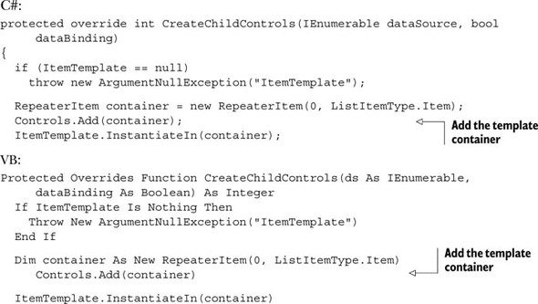
We’ll get back to TemplateContainer soon. Right now, you need to understand how to instantiate the template. The preferred way is to override the CreateChild-Controls method and provide the correct initialization. Because ParseChildren-Attribute is added to the class, no LiteralControls will be created. Listing 6.5 shows the corresponding code.
Listing 6.5. A simple templated control


In this example, a strongly typed template is defined. First, the code instantiates the container and then performs the rendering inside the container itself, which is then added to the control tree  . The template container is a simple class, which is used to simplify the data binding.
The OnDataBinding method inherited from Control is overridden to invoke the EnsureChildControls method  ; this guarantees that child controls in the template are created before the data binding takes place.
Because our template will just show some text, the corresponding template container has only one property, which makes things simple. All the code is contained in the following listing.
Listing 6.6. A custom implementation for a template container
Now you can use this template with the following markup:
<controls:Message runat="server" ID="MyMessage"
                  Text="This is test">
<ItemTemplate>
     <p>Here's a formatted template: <%#Container.Text %></p>
</ItemTemplate>
</controls:Message>
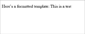
When you define a template, the control will render it. Thanks to our custom template container, we can reference the Text property via the Container property that’s defined on the template. In real-world situations, you can define the container even more to better represent your needs. Figure 6.7 show the result of our work in this section.
Figure 6.7. You can use a template container to enhance the look of your control. In this example, we’re taking a value from the control and formatting it.
Although this exercise was useful so that you could understand how templated controls work, this example is limited in use because data binding isn’t performed in the strict sense of its meaning.
Discussion
Templating is an important thing to keep in mind when you’re building custom controls. It lets you freely define a visual appearance for your page that can be changed without you rewriting the code.
This scenario leads us directly into the next one, where we’re going to address how to use data binding in custom controls.
Technique 40: Data binding in custom controls
To show how data binding works, we need to define a scenario that’s more complex than the previous one. The basics are similar; what changes is the base class that you use. ASP.NET, via the .NET Framework’s BCL, provides a lot of base classes to use as a starting point, without the need to manually implement every single feature. In this scenario, we’ll cover how to build simple custom controls that support data binding and implement all the techniques we’ve covered so far.
Problem
ASP.NET already provides support for the most common situations related to data binding. We want to write a lightweight custom control that can display a single item (using a template) and directly handle the empty state.
Solution
Data binding is so powerful that it’s often used with custom layouts because of its flexibility. Although it’s perfectly legitimate to use a Repeater to display one item from a collection, that’s not the best way to go.
Data-binding controls accept only collections as a data source, so you need to add your item to a fictitious collection in order to display it. In other words, you’re wasting a lot of power to perform a simple operation that involves two templates and a couple of lines of code. In this kind of situation, a custom control might be just what you need.
We’ll start with CompositeDataBoundControls in System.Web.UI.WebControls, which is the preferred starting point when you need to build a custom composite control. Because this control is a container control, the INamingContainer interface is implemented, too. By default, the DataSource property supports only IEnumerable as the source, so the property itself is overridden.
To support data binding, you need to override the CreateChildControls method with parameters. This method is called several times in different stages:
We don’t need a special template container, so we reused the one provided by Repeater. If you prefer to provide your own implementation, take a look at how it’s implemented. This control has an EmptyTemplate property that defines a template to be used when the DataSource property is null. The following code checks the Data-Source property and adds EmptyTemplate if it’s needed:
C#:
  if (dataBinding)
  {
    if (DataSource == null)
    {
      if (EmptyTemplate != null)
       {
        this.Controls.Clear();
        EmptyTemplate.InstantiateIn(this);
       }
    }
    else
...
  }
  If dataBinding Then
    If DataSource Is Nothing Then
      If EmptyTemplate IsNot Nothing Then
        Me.Controls.Clear()
        EmptyTemplate.InstantiateIn(Me)
      End If
    Else
...
  End if
The remaining part of the code, after the else block, picks the DataSource property and assigns it to the template container, via the DataItem property:
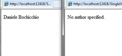
As you can see from the following code snippet, the controls can be used as a normal data binding control:
<controls:SingleView runat="server" ID="AuthorView">
  <ItemTemplate>
    <p><%#Eval("FirstName") %>
       <%#Eval("LastName") %></p>
  </ItemTemplate>
  <EmptyTemplate>
    <p>No author specified.</p>
  </EmptyTemplate>
</controls:SingleView>
Because the ItemTemplate property is marked for two-way data binding, this template can also be used to alter existing data. Figure 6.8 contains different examples of the control at work.
Figure 6.8. Two outcomes for our data-binding control. On the left, the ItemTemplate property is displaying the source. On the right, the EmptyTemplate was instantiated.
This example shows how to combine all the different techniques that you’ve learned in this chapter. By combining attributes, templates, INamingContainer, and data binding, you can build a powerful control in few lines, and you get great performance with maximum flexibility.
Discussion
Data binding is a powerful feature in ASP.NET Web Forms. You can build rich layouts without duplicating any code. If you need special behavior in data binding, you can create a custom control to suit your needs with little effort, thanks to ASP.NET’s page framework.
To complete our examination of custom controls, we’ll turn now to advanced controls that you can use to control the way you declare your controls.
6.3. Advanced controls
You’re going to either love or hate the level of customization that ASP.NET lets you achieve with custom controls. Using custom controls puts you in charge of how to write the markup inside the control. You can also achieve extreme customization by implementing design-time support. We’re not going to address this topic directly here because it’s not mandatory for using custom controls. Implementing design-time support is a matter of deciding whether to support a rich design-time experience. You can find more information about this topic on MSDN at http://www.mng.bz/URn5.
The next topic addresses a special scenario, showing you how to control the declaration of nested controls. You’ll be using a special kind of control, called control builders.
Technique 41: Control builders
These controls are called control builders because they’re responsible for regulating how nested controls are built. In this scenario, you’ll learn how to simplify the markup you use when you’re declaring a control.
Problem
We want to control how the markup inside the control is defined by building our own semantic. Having your own semantic will help you simplify the control’s declaration.
Solution
In most situations, you don’t want the verbosity of ASP.NET’s control declaration that the prefix:controlname pattern uses. For example, when you’re building a CMS, it’s important to have a simplified markup if you plan to let non-technical users rearrange some parts of it. In this scenario, you’ll learn how to build our own semantic to simplify the control declaration.
You can use control builders in a lot of situations. They’re frequently used in ASP.NET to simplify control markup. For example, let’s compare this pseudo-markup:
<controls:Tabs runat="server">
  <Tab Title="Tab A">Content</Tab>
  <Tab Title="Tab B">Content</Tab>
  <Tab Title="Tab C">Content</Tab>
</controls:Tabs>
To this:
<controls:Tabs runat="server">
  <controls:Tab Title="Tab A">Content</controls:Tab>
  <controls:Tab Title="Tab B">Content</controls:Tab>
  <controls:Tab Title="Tab C">Content</controls:Tab>
</controls:Tabs>
Even though the difference isn’t huge, the first version is simpler to declare, less error prone, and easier to understand for a user who knows basic HTML. You can use control builders to transform the second version into the first one.
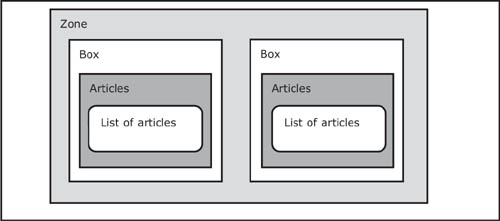
A control builder is a special class that inherits from the System.Web.UI.Control-Builder class. This class offers basic infrastructure and has a method called GetChildControlType, which will be overwritten to include the logic. Before we create our control builder, we need to focus on our scenario. First, we’ll implement a markup dialect to be used in a mini-CMS solution. In a situation like this, the page is typically divided into blocks, also called zones. A zone can both contain controls and be contained by controls. Its role is only to be a placeholder for other controls. Let’s step back to the example pseudo-markup and try to provide our final markup. It will look like this:
<controls:Zone runat="server">
  <box title="First box">
    <articles PageSize="10" Category="ASP.NET" />
  </box>
  <box title="Second box">
    <articles PageSize="5" Category="Silverlight" />
  </box>
</controls:Zone>
This code is self-explanatory. It’s composed of only ASP.NET custom controls, where box represents a box (a container for something), and articles is special syntax that will instantiate a control with a list of articles, organized by category. Figure 6.9 contains a schema of this concept.
Figure 6.9. A zone contains one or more boxes. Each box can contain one or more lists of articles (or other views). This schema can be expanded easily to represent different needs.
If you take a deeper look at the code, you’ll see how simple this markup is for a user who knows HTML. It uses no special ASP.NET-only tags! (In chapter 15, when we analyze how to dynamically load and compile markup from other sources, like a database, you’ll learn how you can use the virtual path provider to close this circle. You’ll be able to load this content from a database where the user has stored it). The markup is stored in a pared-down format that’s transformed in control instances at runtime. You don’t need to transform them by hand because the Page Parser will do the trick for you.
Before moving on, let’s take a look at the Zone class, which holds most of the logic. The code is in the following listing.
Listing 6.7. The Zone control contains other controls

The Zone class is simple but holds two special attributes:
- ParseChildrenAttribute—Regulates how the child controls are parsed
- ControlBuilderAttribute—Points to the class that specifies how the markup is declared
The CMSPartBase class is a simple base class, one that’s shared by all the controls involved in this scenario and that gives them a common set of properties. Using this class will help you to have a set of tags that share some common properties and will simplify the general effort to write a consistent markup.
Now let’s get back to the control builder. The code for it is in the following listing.
Listing 6.8. The ZoneBuilder class takes care of markup


The code is self-explanatory. We’re converting the tag name coming from our control to the effective instance of the corresponding controls. Controls that aren’t mapped inside this method (as plain HTML markup) will be ignored and output as written. This is another advantage of this technique, which you can use to easily mix server-generated parts with plain HTML.
To make nesting easy, the Box class inherits from Zone. We can nest more boxes into a zone to compose complex markups. In contrast, the ArticleView class corresponds to the article tag and has a simple structure:
C#:
public class ArticleView : CMSPartBase
{
  public string Category { get; set; }

  protected override void Render(HtmlTextWriter writer)
  {
    writer.Write("<h1>" + Title + "</h1>");
    writer.Write("<p>This is a list of " + PageSize.ToString() +
                 " articles in " + Category + ".</p>");
  }
}
VB:
Public Class ArticleView
  Inherits CMSPartBase

  Public Property Category() As String

  Protected Overrides Sub Render(writer As HtmlTextWriter)
    writer.Write("<h1>" & Title & "</h1>")
    writer.Write("<p>This is a list of " + PageSize.ToString() &
                 " articles in " & Category & ".</p>")
  End Sub
End Class
This scenario provides a simple explanation of how you can build controls that live inside this ecosystem. In a real-world situation, the control you’ve built would pick the list of articles from the data source and display them in the page. Figure 6.10 shows the results of this page when browsed.
Figure 6.10. Our control instantiates the contained controls, using our control builder. A control builder will let you use a personalized markup.

Control builders are a powerful tool to have because you can decide how your markup will be declared. We’ve explored only a fraction of what you can do with control builders, but you can find more information on MSDN at http://www.mng.bz/Cpk.
Discussion
With this last scenario, our journey of exploration into the features provided by custom controls in ASP.NET Web Forms is complete. This last scenario will come in handy when you need to take your controls to the next level. Now you can control how the markup is written or how the control reacts when other controls are nested.
By combining all the techniques you’ve learned in this chapter, you can build powerful custom controls to take your ASP.NET Web Form-based application to the limit!!
6.4. Summary
Building custom controls is often treated as an art. In fact, it’s one of the most challenging aspects of ASP.NET.
Getting started with custom controls isn’t difficult, but advanced scenarios, like the last one we presented in this chapter, involve a deep understanding of ASP.NET. In more simple situations, custom controls can help you avoid code duplication by implementing and supporting repetitive tasks. You can easily add PostBack and templates to every control, and implementing support for data binding isn’t all that difficult.
For brevity, we omitted some specialized scenarios, like control designer and support in Visual Studio. The idea behind this chapter was to offer you a glimpse of what ASP.NET has to offer in this area. It’s up to you to find out more on your own.
The next chapter is going to show you how to control the way markup is generated by controls. Most of what we’ll reveal will also come in handy when you’re building custom controls.