
Chapter 38
Windows Store Apps
WHAT’S IN THIS CHAPTER?
- How Windows 8 apps differ from Windows desktop apps
- Defining app bars
- Navigating between pages
- Reacting to layout changes
- Using storage and pickers
- Using sharing contracts
- Creating tiles
WROX.COM CODE DOWNLOADS FOR THIS CHAPTER
The wrox.com code downloads for this chapter are found at http://www.wrox.com/remtitle.cgi?isbn=1118314425 on the Download Code tab. The code for this chapter just contains one big sample that shows the various aspects of this chapter:
- Menu Card
OVERVIEW
If you read Chapter 31, then you are now familiar with the foundations of Windows 8 apps and how the Windows Runtime relates to .NET. Knowing the basics covered in Chapter 31 will enable you to begin writing Windows 8 apps. This chapter covers the design principles and special XAML features that are not available with WPF, and demonstrates several aspects of working with Windows 8 apps, such as reacting to layout changes, reading and writing files with the Windows Runtime storage API and file pickers, and using contracts to communicate with other applications.
In addition to Chapter 31, you should also be familiar with the basic information about XAML already covered in Chapters 29, 35, and 36. Only those features specific to Windows 8 apps are covered here.
WINDOWS 8 MODERN UI DESIGN
One of the first things you notice about Windows 8 apps is that they look different to desktop applications. There’s a big emphasis on the UI design, based on the belief that users should feel comfortable with and enjoy working with the application. This focus on design in Windows 8 apps is derived from some principles that are not new. One is Swiss graphic design, developed in the 1950s, which emphasizes cleanliness (lack of clutter) and readability. For example, signs in airports and train stations are based on this concept, enabling users to process information as quickly as possible.
Another foundation of the modern UI design is the famous Bauhaus school in Germany, which was extremely influential between 1919 and 1933. The objective of this school was to unify arts, crafts, and technology, with design based on functionality, not decoration — no unnecessary squiggles if it doesn’t serve the functionality.
The third foundation is motion as defined by cinematography. Animation is an important tool for bringing your application to life. Windows 8 frameworks provide a rich set of animation features to provide users with a realistic experience that both conveys information and makes it enjoyable to use your application.
Content, Not Chrome
The guiding principle of designing Windows 8 applications is focusing on the content, which means presenting users with only the information they need at any given moment, and not distracting them with anything they don’t need — that is, the chrome (menus, toolbar, and so on. When users open Internet Explorer, the content gets the complete view. Menus are hidden unless they are explicitly enabled by the user.
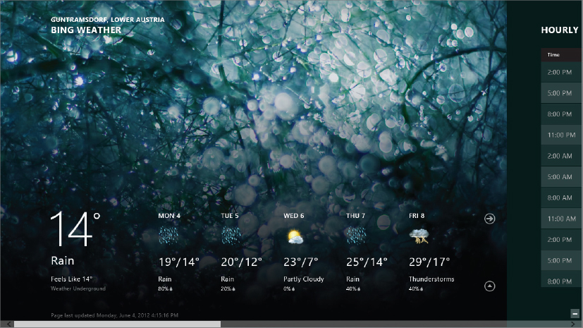
For example, web pages occupy the entire screen, enabling users to quickly zero in on the content they need, without the clutter of various menus and toolbars. Figure 38-1 shows the main view of a weather application. Note how the large graphics make it easy to quickly focus on the desired information.
Of course, users can also change settings and use commands from within the application. To modify settings, the new Charms bar comes into play. Users can activate the Charm bars by swiping from the right edge of the screen, invoking the controls needed to change application settings.
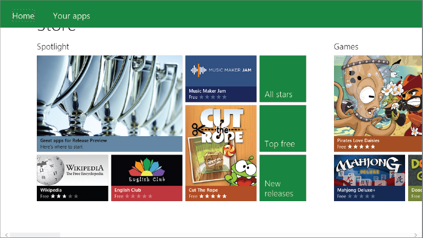
Commands, which are placed in an app bar at the top or the bottom edge of the screen, are similarly activated by the user, who can open them by swiping from the bottom edge or top edge of the screen. Figure 38-2 shows the Windows Store command bar. In this case, the commands are located on top.
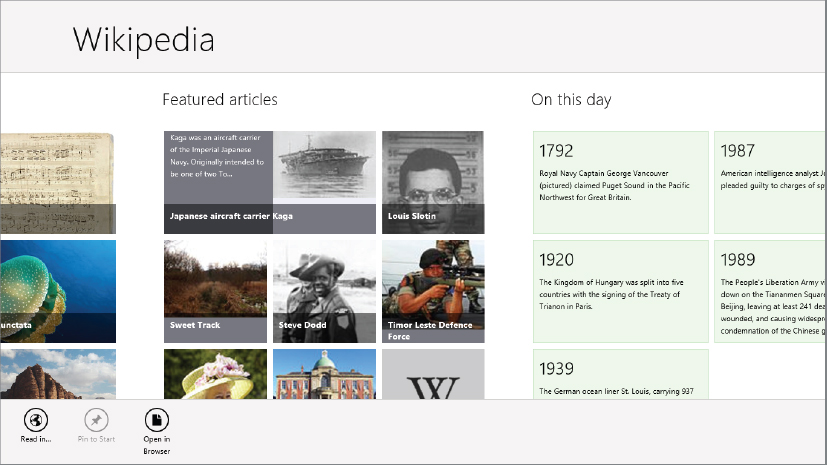
The Wikipedia application, shown in Figure 38-3, has the commands on bottom (as most applications do).
Fast and Fluid
Fast and fluid is another important principle with Windows 8 apps. When using the mouse with a traditional user interface, users are accustomed to a slight delay. Similarly, when clicking a button or moving some objects around the screen, we are used to some delay. Such a delay is unacceptable with touch. If something doesn’t happen immediately, or if the UI blocks, the user experience is very poor.
The new Windows Runtime specifies that if a method might take longer than 50 ms, it is only available asynchronously. With the .NET framework many API calls are both available synchronously and asynchronously. Because synchronous programming has been easier to create compared to async, typically the synchronous version of the API was used. Using the new async features from C# 5, with the async and await keywords, the async API calls are very easy to use. Chapter 13 has all the details about these new keywords. Besides using async APIs, you should also create async APIs with your application for tasks that can take a long time.
Async programming is just one part of fast and fluid. As previously mentioned, animations are also strongly supported in Windows 8, as they tie the user experience together in a natural, realistic way, but without causing distractions. The built-in controls already have animation, enabling you to program smooth transitions, rather than jarring changes. Using these built-in controls, it’s not necessary to define custom animations, although you can also do that if desired.
Readability
Readability is critical to any application, and Windows 8 provides a comprehensive set of style application guidelines. These guidelines cover all typographic aspects of the user’s experience, including readable fonts, color, and letter spacing. For example, the Segoe UI font should be used for UI elements (buttons, date pickers), Calibri for text that the user reads and writes, and Cambria for larger text blocks.
SAMPLE APPLICATION CORE FUNCTIONALITY
The example Windows 8 application developed in this section is used to create menu cards. The menus and pictures you will see are from my wife’s restaurant in the center of Vienna, http://www.kantine.at. You’re welcome to visit this restaurant.
With the application, a restaurant can create menu cards e.g., a breakfast and a dinner card, a soup card, and so on. With this functionality, the application makes use of XAML with C# to get information from the user to write data, deal with images for the menu cards, and any other tasks associated with the application.
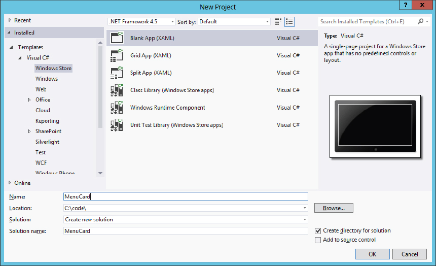
Creating the sample app starts with the Blank App (XAML) template from the Windows Store category, as shown in Figure 38-4.
Files and Directories
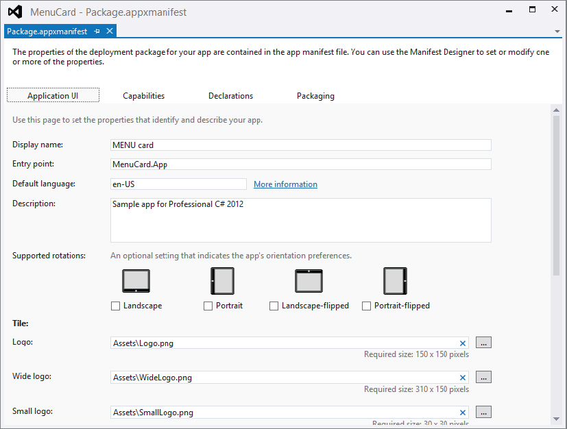
With the project created from the template, the solution consists of a few directories and some files. The Assets directory contains images for the logo of the application and a splash screen. The Common directory is for standard styles and utility classes used and created from templates. With the Blank App (XAML) template, the Common directory just contains styles (filename StandardStyles.xaml). Feature classes will be added when other features using item templates are added to the project. The most important files with the project are App.xaml with its code-file App.xaml.cs, and MainPage.xaml with its code-file MainPage.xaml.cs, and Package.appxmanifest. The XAML and code-file are very similar to the structure you’ve seen with WPF in Chapter 35.
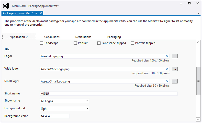
Package.appxmanifest is an XML file that describes packaging and capabilities of the application. Opening this file with Visual Studio opens the Manifest Designer, shown in Figure 38-5. Here, the name of the application and images for the logo and splash screen are defined. The pixel sizes required for the images are shown in this editor. The logo needs to be 150 × 150 pixels; and if the application supports a wide logo as well (which can be selected from the user), the wide logo needs to be 310 × 150 pixels. The splash screen needs 620 × 300 pixels. You can add either PNG or JPG files.
The entry point of the application is the App class. From there the main page is instantiated. Other than the definition of the UI, capabilities and declarations can also be specified with this package. From the Capabilities tab, the application specifies whether it wants access to devices such as the microphone or the webcam. Upon installation of the application from the Windows Store, the user is informed about the application’s requirements. The application cannot use these devices if it doesn’t declare its use. From the Declarations tab, the application declares features it supports; for example, whether it is available for searching from the system, or whether it offers a share target that allows other applications to offer some data to it.
Let’s add some pages to the application.
Application Data
For the data that is used from the UI, the application defines a few types in the subdirectory DataModel.
The class MenuCard (code file MenuCard/DataModel/MenuCard.cs) represents a menu card that contains the major data of the application. This class defines the properties Title, Description, and Image to be used for display. Like all the classes used for data binding, it derives from the base class BindingBase. BindingBase offers an implementation of INotifyPropertyChanged. The method SetProperty that is invoked with the set accessors of the properties is implemented by this base class for change notification. This base class does not yet exist but will be created in the next section with a Visual Studio item template:
using System;
using System.Collections.Generic;
using System.Collections.ObjectModel;
using System.IO;
using System.Linq;
using System.Text;
using System.Xml.Linq;
using Windows.UI.Xaml.Media;
using Windows.UI.Xaml.Media.Imaging;
using Wrox.Win8.Common;

namespace Wrox.Win8.DataModel
{
  public class MenuCard : BindableBase
  {
    private string title;
    public string Titled
    {
      get { return title; }
      set
      {
        SetProperty(ref title, value);
        SetDirty();
      }
    }

    private string description;
    public string Description
    {
      get { return description; }
      set
      {
        SetProperty(ref description, value);
        SetDirty();
      }
    }

    private ImageSource image;
    public ImageSource Image
    {
      get { return image; }
      set { SetProperty(ref image, value); }
    }

    private string imagePath;
    public string ImagePath
    {
      get { return imagePath; }
      set { imagePath = value; }
    }

    public void SetDirty()
    {
        IsDirty = true;
    }
    public void ClearDirty()
    {
      IsDirty = false;
    }
    public bool IsDirty { get; private set; }

    private readonly ICollection<MenuItem> menuItems =
        new ObservableCollection<MenuItem>();
    public ICollection<MenuItem> MenuItems
    {
      get { return menuItems; }
    }

    public void RestoreReferences()
    {
      foreach (var menuItem in MenuItems)
      {
        menuItem.MenuCard = this;
      }
    }

    public override string ToString()
    {
      return Title;
    }
  }
}
The class MenuItem (code file MenuCard/DataModel/MenuItem.cs) that is contained within MenuCard defines simple properties with change notification as well:
using Wrox.Win8.Common;

namespace Wrox.Win8.DataModel
{
  public class MenuItem : BindableBase
  {
    private string text;
    public string Text
    {
      get { return text; }
      set
      {
        SetProperty(ref text, value);
        SetDirty();
      }
    }

    private void SetDirty()
    {
      if (MenuCard != null)
      {
        MenuCard.SetDirty();
      }
    }

    private double price;
    public double Price
    {
      get { return price; }
      set
      {
        SetProperty(ref price, value);
        SetDirty();
      }
    }

    public MenuCard MenuCard { get; set; }

  }
}
The class AddMenuCardInfo (code file MenuCard/DataModel/AddMenuCardInfo.cs) will be used to create new menu cards. This class is also a simple type used for data binding:
using Windows.UI.Xaml.Media;
using Wrox.Win8.Common;

namespace Wrox.Win8.DataModel
{
  public class AddMenuCardInfo : BindableBase
  {
    private string title;
    public string Title
    {
      get { return title; }
      set { SetProperty(ref title, value); }
    }

    private string description;
    public string Description
    {
      get { return description; }
      set { SetProperty(ref description, value); }
    }

    private ImageSource image;
    public ImageSource Image
    {
      get { return image; }
      set { SetProperty(ref image, value); }
    }

    private string imageFileName;
    public string ImageFileName
    {
      get { return imageFileName; }
      set { SetProperty(ref imageFileName, value); }
    }
  }
}
The class MenuCardFactory (in the code file MenuCard/DataModel/MenuCardFactory.cs) acts as singleton to return a list of menu cards. The method InitMenuCards is used to initialize the collection and assign an ObservableCollection<MenuCard> to the cards variable:
using System;
using System.Collections.Generic;
using System.Collections.ObjectModel;

namespace Wrox.Win8.DataModel
{
  public class MenuCardFactory
  {
    private ICollection<MenuCard> cards;
    public ICollection<MenuCard> Cards
    {
      get
      {
        return cards;
      }
    }

    public void InitMenuCards(IEnumerable<MenuCard> menuCards)
    {
      cards = new ObservableCollection<MenuCard>(menuCards);
    }

    private static MenuCardFactory instance = null;
    public static MenuCardFactory Instance
    {
      get
      {
        return instance ?? (instance = new MenuCardFactory());
      }
    }
  }
}Although the application will be used to create menu cards, when it is started for the first time it would be nice to show some initial menu cards to the user. To create the sample data, the method GetSampleMenuCards in the class MenuCardDataFactory returns a list of menu cards filled with some menus. Images for the sample menu cards are stored in the Assets folder and referenced from there, as shown with Breakfast.jpg:
    public static ObservableCollection<MenuCard> GetSampleMenuCards()
    {
      Uri baseUri = new Uri("ms-appx:///");

      var cards = new ObservableCollection<MenuCard>();
      MenuCard card1 = new MenuCard
      {
        Title = "Breakfast"
      };
      card1.MenuItems.Add(new MenuItem
      {
        Text = "Spezialfrühstück",
        Price = 5.4,
        MenuCard = card1
      });
      card1.MenuItems.Add(new MenuItem
      {
        Text = "Wiener Frühstück",
        Price = 4.4,
        MenuCard = card1
      });
      card1.MenuItems.Add(new MenuItem
      {
        Text = "Schinken mit 3 Eiern",
        Price = 4.4,
        MenuCard = card1
      });
      card1.ImagePath = string.Format("{0}{1}", baseUri, "Assets/Breakfast.jpg");
      cards.Add(card1);

      //... more menu cards in the code download
Application Pages
Now let’s add some UI pages to the application. The first page that is added from the template is MainPage.xaml. With the Blank App (XAML) template, the page doesn’t offer any structure, and content can be completely customized. If you don’t create a Windows 8 game or some other application that needs a specific layout, it’s best to make use of a standard format and style, and put the application name in an exactly defined position by the Windows 8 style guidelines. As you begin to run different Windows 8 applications, you’ll find many similarities. Rather than recreate the wheel, you can directly use predefined styles by using a Visual Studio item template, as shown in Figure 38-6.

With the sample application, the main page created previously is replaced with an Items Page template. Other pages that are created with the application are a Basic Page named AddMenuCardPage and an Items Page named MenuItemsPage.
The Basic Page offers a layout to put the application name in the top-most position where users are accustomed to seeing it. A Split Page divides a page in two, with a list in one half and details in the other. An Items Page contains a GridView control to display a list of items within a grid. For using groups of items, the templates Grouped Items Page, Group Detail Page, and Item Detail Page can be used. The Grouped Items Page is used to show the different groups of items and uses a ListView with GroupStyle settings, as well as a CollectionViewSource with grouping. The Group Detail Page shows a single group with detail information and uses a GridView for this task. The Item Detail Page displays the details of one item by using a RichTextBlock and allows switching between items with a FlipView.
Using these template adds some more classes to the Common directory in the project: BindableBase can be used as a base class for some data classes as it implements the interface INotifyPropertyChanged; LayoutAwarePage is a new base class for the custom pages that is aware of rotation changes and offers visual states for rotation. BooleanNegationConverter and BooleanToVisibilityConverter are converters for XAML implementing IValueConverter. RichTextColumns is a class that can be used with RichTextBlock controls for text overflow. Finally, the SuspensionManager is used to store and load state for the application when it is suspended.
Main Page
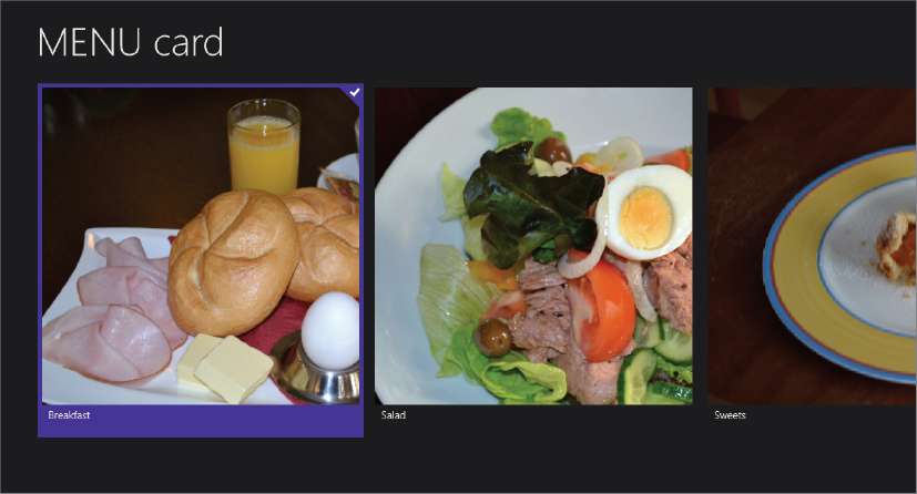
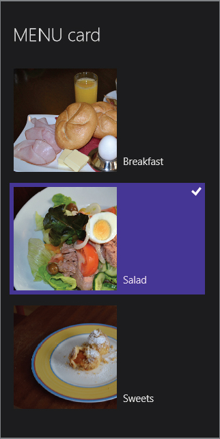
The main page of the application is shown in Figure 38-7. It shows the title of each menu card as well as an image.
To achieve this, only some small adjustments to the XAML code (code file MainPage.xaml) are required, as shown in the following code snippet. From the Items Page template, the XAML code contains a GridView as a child element. What has changed is the item template from the default Standard250x250ItemTemplate to the MenuCardItemTemplate, and an ItemClick event handler to act when items are clicked:
      <GridView x:Name="itemGridView"
                AutomationProperties.AutomationId="ItemsGridView"
                AutomationProperties.Name="Items"
                TabIndex="1"
                Grid.Row="1"
                Margin="0,-4,0,0"
                Padding="116,0,116,46"
                ItemsSource="{Binding Source={StaticResource itemsViewSource}}"
                ItemTemplate="{StaticResource MenuCardItemTemplate}"
                IsItemClickEnabled="True"
ItemClick="OnMenuCardClick"/>The source for the GridView is defined with the ItemsSource property, which references a static resource named itemsViewSource. itemsViewSource is a simple CollectionViewSource specified within the page resources that just binds to the Items property:
        <CollectionViewSource
            x:Name="itemsViewSource"
            Source="{Binding Items}"/>
The MenuCardItemTemplate is defined in the custom styles file StylesMenuCardStyles.xaml. Unlike the default template, where an item is built using two columns, here the items are made from two rows. The size is larger, and it binds to the Image and Title properties. Remember that the MenuCard class defined earlier implements these properties:
  <DataTemplate x:Key="MenuCardItemTemplate">
    <Grid Margin="6">
      <Grid.RowDefinitions>
        <RowDefinition Height="*" />
        <RowDefinition Height="Auto" />
      </Grid.RowDefinitions>
      <Border Background="{StaticResource
          ListViewItemPlaceholderBackgroundThemeBrush}" Width="450" Height="450">
        <Image Source="{Binding Image}" Stretch="UniformToFill"/>
      </Border>
      <StackPanel Grid.Column="1" Margin="10,0,0,0">
        <TextBlock Text="{Binding Title}" Style="{StaticResource ItemTextStyle}"
            MaxHeight="40"/>
      </StackPanel>
    </Grid>
  </DataTemplate>
The collection view source defined earlier binds to the Items collection. The value for the Items collection is assigned in the LoadState method of the MainPage class (code file MenuCard/MainPage.xaml.cs). The implementation of the LoadState method assigns the DefaultViewModel property of the base class LayoutAwarePage. This property returns IObservableMap<string, object>, where any data object can be assigned to a key name. The key name is used within XAML to reference data.
    protected override async void LoadState(Object navigationParameter,
        Dictionary<String, Object> pageState)
    {
      var storage = new MenuCardStorage();
      MenuCardFactory.Instance.InitMenuCards(new ObservableCollection<MenuCard>(
          await storage.ReadMenuCardsAsync()));
      this.DefaultViewModel["Items"] = MenuCardFactory.Instance.Cards;
}Add Menu Card Page
For adding new menu cards, AddMenuCardPage has been added. The template used here was just the Basic Page template. However, there’s not a lot to define here. The user just needs to assign a title, a description, and an image to a menu card. The UI is shown in Figure 38-8. Only two TextBox, one Button, and one Image controls are needed.

The XAML code to define the main controls from the file AddMenuCard.xaml is shown in the following code snippet. Note two important points here: Controls bind to Image, Title, and Description properties, and the data context assigned to a parent control (the Grid) is set to the Item property:
    <Grid Grid.Row="1" DataContext="{Binding Item}">
      <Grid.RowDefinitions>
        <RowDefinition Height="100" />
        <RowDefinition Height="300" />
        <RowDefinition Height="*" />
      </Grid.RowDefinitions>
      <Grid.ColumnDefinitions>
        <ColumnDefinition />
        <ColumnDefinition />
      </Grid.ColumnDefinitions>
      <Border Grid.Row="0" Grid.RowSpan="3" Grid.Column="0" Grid.ColumnSpan="2">
        <Image Source="{Binding Image, Mode=OneWay}" Stretch="UniformToFill" />
      </Border>
      <TextBlock Text="Name:" Style="{StaticResource TitleTextStyle}" Margin="20"
        VerticalAlignment="Center" HorizontalAlignment="Right" />
      <TextBox Grid.Column="1" Text="{Binding Title, Mode=TwoWay}" Margin="20"
        VerticalAlignment="Center" />
      <TextBlock Grid.Row="1" Text="Description:"
        Style="{StaticResource TitleTextStyle}" Margin="20"
        VerticalAlignment="Center"
        HorizontalAlignment="Right" />
      <TextBox Grid.Row="1" Grid.Column="1"
        Text="{Binding Description, Mode=TwoWay}"
        Margin="20" MaxHeight="100" VerticalAlignment="Center" />
      <Button HorizontalAlignment="Center" VerticalAlignment="Center"
        Visibility="{Binding ImageUploaded,
        Converter={StaticResource visibilityConverter}}" Content="Upload Image"
        Grid.Row="2" Grid.Column="0" Grid.ColumnSpan="2"
        Style="{StaticResource TextButtonStyle}" Click="OnUploadImage"
        Padding="10" Margin="20" />
    </Grid>
In the code file, the Item property is assigned to an object of type AddMenuCardInfo (which contains the properties bound to in the XAML code) in the LoadState method (code file AddMenuCardPage.xaml.cs):
    private AddMenuCardInfo info = new AddMenuCardInfo();

    protected override void LoadState(Object navigationParameter,
      Dictionary<String, Object> pageState)
    {
      this.DefaultViewModel["Item"] = info;
    }
Menu Items Page
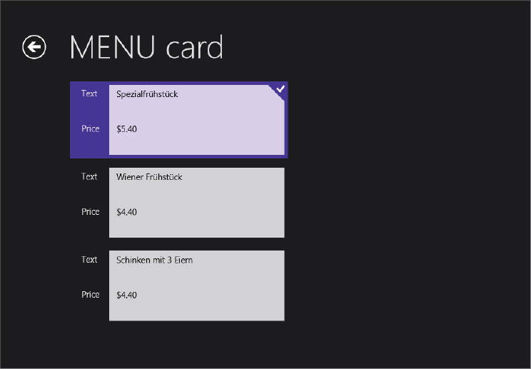
The third page of the application is the MenuItemsPage, shown in Figure 38-9. This page displays the menu items of one menu card and allows for changing the data.
This page again is based on the Items Page template and binds to a list of menu items within the LoadState method (code file MenuItemsPage.xaml.cs):
    protected override void LoadState(Object navigationParameter,
      Dictionary<String, Object> pageState)
    {
      card = navigationParameter as MenuCard;
      if (card != null)
      {
        this.DefaultViewModel["Items"] = card.MenuItems;
      }
    }
Now that three pages exist, you are ready to get into navigating with Windows 8 apps.
APP BARS
Although putting content before chrome is an important design aspect of Windows 8 applications, obviously users need a way to interact with the UI. This is now provided by the new app bar. Unlike previous versions of Windows, which display commands by default, users can choose when they want to view application commands.
Using touch, the app bar shows up when the user swipes from the bottom or top edge of the screen. Using a mouse, the app bar is invoked by clicking the right mouse button. Using a keyboard, users can click the context menu button.
You can define the app bar within the BottomAppBar and the TopAppBar properties of the page. Most applications have an app bar on the bottom. If your application uses app bars at both the top and the bottom, they are both displayed with the same gesture, at the same time.
The following code snippet (code file MainPage.xaml) defines an AppBar element within the BottomAppBar property of the page. Within the AppBar, any XAML elements can be used to define the content and layout of the app bar. In this case, two Button controls are added that make use of a predefined style and add handlers to the Click event:
  <Page.BottomAppBar>
    <AppBar>
      <Grid>
        <Grid.ColumnDefinitions>
          <ColumnDefinition Width="50*"/>
          <ColumnDefinition Width="50*"/>
        </Grid.ColumnDefinitions>
        <StackPanel x:Name="LeftCommands" Orientation="Horizontal" Grid.Column="0"
          HorizontalAlignment="Left">
          <Button Style="{StaticResource AddAppBarButtonStyle}"
            HorizontalAlignment="Left" Tag="Add" Click="OnAddMenuCard" />
          <Button Style="{StaticResource DeleteAppBarButtonStyle}"
            HorizontalAlignment="Left" Tag="Delete" Click="OnDeleteMenuCard" />
        </StackPanel>
        <StackPanel x:Name="RightCommands" Orientation="Horizontal" Grid.Column="1"
          HorizontalAlignment="Right">
        </StackPanel>
      </Grid>
    </AppBar>
  </Page.BottomAppBar>
In the style file generated by the Visual Studio template, some predefined buttons for the app bar exist. Following is the style named AddAppBarButtonStyle that is used with the sample code. This style just defines the value for a character with the Segoe UI Symbol font family to show the plus symbol. Other than that, an outline glyph and a TextBlock to show the text for the button are defined with the base style AppBarButtonStyle:
<Style x:Key="AddAppBarButtonStyle" TargetType="Button"
BasedOn="{StaticResource AppBarButtonStyle}">
<Setter Property="AutomationProperties.AutomationId" Value="AddAppBarButton"/>
<Setter Property="AutomationProperties.Name" Value="Add"/>
<Setter Property="Content" Value=""/>
</Style>Figure 38-10 shows the application with the app bar displayed.

LAUNCHING AND NAVIGATION
To enable navigation between the pages, first the MainPage is shown. The MainPage is activated within the App class in the OnLaunched method (code file App.xaml.cs):
    protected override async void OnLaunched(LaunchActivatedEventArgs args)
    {
      // Do not repeat app initialization when already running, just ensure that
      // the window is active
      if (args.PreviousExecutionState == ApplicationExecutionState.Running)
      {
        Window.Current.Activate();
        return;
      }

      if (args.PreviousExecutionState == ApplicationExecutionState.Terminated)
      {
        //TODO: Load state from previously suspended application
      }

      // Create a Frame to act navigation context and navigate to the first page
      var rootFrame = new Frame();
      if (!rootFrame.Navigate(typeof(MainPage)))
      {
        throw new Exception("Failed to create initial page");
      }

      // Place the frame in the current Window and ensure that it is active
      Window.Current.Content = rootFrame;
      Window.Current.Activate();
    }
OnLaunched is invoked at different times when the application is launched. For example, the application could have been suspended previously, or it may be invoked for sharing data from another application. The LaunchActivatedEventArgs argument provides details about the reason for the launch and the previous state of the application. LaunchActivatedEventArgs defines a Kind property of type ActivationKind whereby you can read the reason for the launch. Some examples of the enumeration values that you can use here are Launch (a normal start of the application by clicking on a tile), Search (starting the application by using search from Windows), File, FileOpenPicker, and FileSavePicker (starting the application by selecting a file). The tile that started the application can be read with the TileId property of LaunchActivatedEventArgs. Applications can offer multiple tiles as a starting action for cases in which different information or behaviour is offered. For example, weather applications make use of this feature to enable users to add different tiles to show the weather for different cities. With the LaunchActivatedEventArgs argument, the application can then show the weather for a specific city in the main page. Previous execution state is read with the PreviousExecutionState property of type ApplicationExecutionState. Possible values are NotRunning, Running, Suspended, Terminated, and ClosedByUser.
With the OnLaunched method, a new Frame is created that acts as navigation context. This class defines the properties CanGoBack and CanGoForward, which can be used to show or hide controls:
      var rootFrame = new Frame();
      if (!rootFrame.Navigate(typeof(MainPage)))
      {
        throw new Exception("Failed to create initial page");
      }
The MainPage.xaml contains a Go Back button that makes use of the CanGoBack property of the Frame and sets the IsEnabled property accordingly:
      <Button x:Name="backButton" Click="GoBack"
          IsEnabled="{Binding Frame.CanGoBack, ElementName=pageRoot}"
          Style="{StaticResource BackButtonStyle}"/>
The Frame class also offers events that enable you to add handlers for when the navigation starts (Navigating), is completed (Navigated), failed (NavigationFailed), or stopped (NavigationStopped). The stopped event occurs when another navigation event is started before the current one is completed.
Navigation starts by calling the Navigate method. The first argument of the Navigate method defines the type of the page where the navigation should terminate. With a second argument it is possible to send some data to the navigated page. In the sample code (code file MenuCard/App.xaml.cs), no data is sent to the MainPage. Instead, the MainPage gets the menu card data on its own request.
One way to navigate away from the main page is by clicking the Add button in the app bar. This button has the Click event associated with the OnAddMenuCard handler method (code file MainPage.xaml.cs) where a simple navigation to the AddMenuCardPage is done:
    private void OnAddMenuCard(object sender, RoutedEventArgs e)
    {
      this.Frame.Navigate(typeof(AddMenuCardPage));
    }
The pages usually have a back button (refer to Figure 38-9). The XAML code for this button is shown in the following code snippet (code file MainPage.xaml). This button has the Click event associated with the GoBack method. The default generated code does not contain the method in the code-behind file; instead, it is implemented in the base class LayoutAwarePage. The IsEnabled property is bound to the CanGoBack property of the Frame. The look of the button is defined by the BackButtonStyle:
      <Button x:Name="backButton" Click="GoBack"
        IsEnabled="{Binding Frame.CanGoBack, ElementName=pageRoot}"
        Style="{StaticResource BackButtonStyle}"/>
Usually one would expect to have the button disabled when CanGoBack is set to false. However, the button is not visible at all because of how it is defined by the style (code file CommonStandardStyles.xaml). With the BackButtonStyle, a visual state is defined that changes the Visibility property of the outer element of the button (RootGrid) to Collapsed, making the button invisible if it is not enabled:
                <VisualState x:Name="Disabled">
                  <Storyboard>
                    <ObjectAnimationUsingKeyFrames Storyboard.TargetName="RootGrid"
                      Storyboard.TargetProperty="Visibility">
                      <DiscreteObjectKeyFrame KeyTime="0" Value="Collapsed"/>
                    </ObjectAnimationUsingKeyFrames>
                  </Storyboard>
                </VisualState>
With the implementation of the GoBack method (code file MenuCard/Common/LayoutAwarePage.cs) only the GoBack method of the Frame is invoked — if GoBack is allowed:
    protected virtual void GoBack(object sender, RoutedEventArgs e)
    {
      // Use the navigation frame to return to the previous page
      if (this.Frame != null && this.Frame.CanGoBack) this.Frame.GoBack();
    }
Another way to navigate away from the MainPage can occur by clicking within an item of the GridView control. Here, the ItemClick event is assigned to the handler method OnMenuCardClick, which is shown in the following code snippet (code file MainPage.xaml.cs). Navigation is sent to the MenuItemsPage. Data is passed with the second parameter of the Navigate method. e.ClickedItem represents a MenuCard instance that is bound to the GridView:
    private void OnMenuCardClick(object sender, ItemClickEventArgs e)
    {
      Frame.Navigate(typeof(MenuItemsPage), e.ClickedItem);
    }
LAYOUT CHANGES
A Windows 8 app must support different sizes and layouts. An application can occupy the full screen with a horizontal or vertical display, or it can occupy just a part of the screen. Windows 8 also supports a split-screen mode where one app is snapped. Users can select a snapped mode by swiping from the left edge of the screen, snapping the application to a limited part of the available space.
The minimum resolution for Windows 8 devices is 1024 × 768. To use snapped mode, the minimum resolution is 1366 × 768. Other values are supported, and you can test the look of your application without the need to have monitors supporting all the highest resolution.
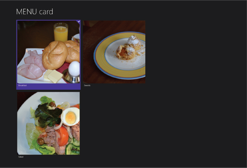
Using the Visual Studio simulator you can easily check the look of the application with different resolutions. Figure 38-11 shows the application with a resolution setting of 2560 × 1440 pixels. Here, the grid switches to two rows instead of one.
You can read the current layout with the static property ApplicationView.Value. This property returns a value of an ApplicationViewState enumeration. The possible values are FullScreenLandscape, Filled, Snapped, and FullScreenPortrait.
The base class LayoutAwarePage offers support for different layouts. With the LayoutAwarePage class (code file MenuCard/Common/LayoutAwarePage.cs), the method StartLayoutUpdates is added to the Loaded event of the page and thus invoked on loading of the page. With the implementation, the sender is added to the _layoutAwareControls collection (by default it’s just page), and sets the visual state to the value returned from the ApplicationViewState enumeration. The method DetermineVisualState just returns a string representation of the enumeration:
    public void StartLayoutUpdates(object sender, RoutedEventArgs e)
    {
      var control = sender as Control;
      if (control == null) return;
      if (this._layoutAwareControls == null)
      {
        // Start listening to view state changes when there are controls
        // interested in updates
        Window.Current.SizeChanged += this.WindowSizeChanged;
        this._layoutAwareControls = new List<Control>();
      }
      this._layoutAwareControls.Add(control);

      // Set the initial visual state of the control
      VisualStateManager.GoToState(control, DetermineVisualState(
        ApplicationView.Value), false);
    }
After attaching the WindowSizeChanged method (code file MenuCard/Common/LayoutAwarePage.cs) to the SizeChanged event, every time the layout changes the method is invoked. This method in turn invokes the InvalidateVisualState method, where the state of the control is changed using the VisualStateManager:
    private void WindowSizeChanged(object sender, WindowSizeChangedEventArgs e)
    {
      this.InvalidateVisualState();
    }

    public void InvalidateVisualState()
    {
      if (this._layoutAwareControls != null)
      {
        string visualState = DetermineVisualState(ApplicationView.Value);
        foreach (var layoutAwareControl in this._layoutAwareControls)
        {
          VisualStateManager.GoToState(layoutAwareControl, visualState, false);
        }
      }
    }
Now just two different looks need to be defined. The MainPage (code file MainPage.xaml) defines a GridView and a ListView. The GridView is used with most layout modes, the ListView only in snapped mode. The ListView has the Visibility property set to Collapsed by default. This property changes dynamically with the snapped mode. The item templates that are used by these controls are different. The GridView uses the item template with the resource key MenuCardItemTemplate, whereas the ListView uses MenuCardItemSnappedTemplate. Otherwise, the settings are similar. Both controls bind to the same data and invoke the same event handler on clicking of the items:
    <GridView x:Name="itemGridView"
                AutomationProperties.AutomationId="ItemsGridView"
                AutomationProperties.Name="Items"
                TabIndex="1"
                Grid.Row="1"
                Margin="0,-4,0,0"
                Padding="116,0,116,46"
                ItemsSource="{Binding Source={StaticResource itemsViewSource}}"
                ItemTemplate="{StaticResource MenuCardItemTemplate}"
                IsItemClickEnabled="True"
                ItemClick="OnMenuCardClick"/>

    <ListView x:Name="itemListView"
              AutomationProperties.AutomationId="ItemsListView"
              AutomationProperties.Name="Items"
              TabIndex="1"
              Grid.Row="1"
              Visibility="Collapsed"
              Margin="0,-10,0,0"
              Padding="10,0,0,60"
              ItemsSource="{Binding Source={StaticResource itemsViewSource}}"
              ItemTemplate="{StaticResource MenuCardItemSnappedTemplate}"
              IsItemClickEnabled="True"
              ItemClick="OnMenuCardClick"/>
The last necessary change to the layout is modifying the Visibility properties of the ListView and the GridView controls. This is done with the VisualState definitions in the XAML code (code file MainPage.xaml). For the view states named FullScreenLandscape and Filled, only the default settings are used. In portrait mode with FullScreenPortrait, the Padding property of the itemGridView is changed. With the snapped mode, the Visibility property of the itemListView is set to Visible, and with the itemGridView it is set to Collapsed:
    <VisualStateManager.VisualStateGroups>
      <!-- Visual states reflect the application's view state -->
      <VisualStateGroup x:Name="ApplicationViewStates">
        <VisualState x:Name="FullScreenLandscape"/>
        <VisualState x:Name="Filled"/>

        <!-- The entire page respects the narrower 100-pixel margin convention
             for portrait -->
        <VisualState x:Name="FullScreenPortrait">
          <Storyboard>
            <ObjectAnimationUsingKeyFrames Storyboard.TargetName="backButton"
              Storyboard.TargetProperty="Style">
              <DiscreteObjectKeyFrame KeyTime="0"
                Value="{StaticResource PortraitBackButtonStyle}"/>
            </ObjectAnimationUsingKeyFrames>
            <ObjectAnimationUsingKeyFrames Storyboard.TargetName="itemGridView"
              Storyboard.TargetProperty="Padding">
              <DiscreteObjectKeyFrame KeyTime="0" Value="96,0,86,56"/>
            </ObjectAnimationUsingKeyFrames>
          </Storyboard>
        </VisualState>

        <!-- The back button and title have different styles when snapped, and the
             list representation is substituted for the grid displayed in all other
             view states -->
        <VisualState x:Name="Snapped">
          <Storyboard>
            <ObjectAnimationUsingKeyFrames Storyboard.TargetName="backButton"
              Storyboard.TargetProperty="Style">
              <DiscreteObjectKeyFrame KeyTime="0"
                Value="{StaticResource SnappedBackButtonStyle}"/>
            </ObjectAnimationUsingKeyFrames>
            <ObjectAnimationUsingKeyFrames Storyboard.TargetName="pageTitle"
              Storyboard.TargetProperty="Style">
              <DiscreteObjectKeyFrame KeyTime="0"
                Value="{StaticResource SnappedPageHeaderTextStyle}"/>
            </ObjectAnimationUsingKeyFrames>

            <ObjectAnimationUsingKeyFrames Storyboard.TargetName="itemListView"
              Storyboard.TargetProperty="Visibility">
              <DiscreteObjectKeyFrame KeyTime="0" Value="Visible"/>
            </ObjectAnimationUsingKeyFrames>
            <ObjectAnimationUsingKeyFrames Storyboard.TargetName="itemGridView"
              Storyboard.TargetProperty="Visibility">
              <DiscreteObjectKeyFrame KeyTime="0" Value="Collapsed"/>
            </ObjectAnimationUsingKeyFrames>
          </Storyboard>
        </VisualState>
      </VisualStateGroup>
    </VisualStateManager.VisualStateGroups>
Now the application can be snapped. The result is shown in Figure 38-12.
STORAGE
Let’s get into the storage API, reading and writing files. Typical Windows 8 apps don’t have access to the full file system without user interaction. However, there are some specific directories from which the application can read data and to which data can be written, and there’s also the option to ask the user for a file. Asking users for files is done using pickers, which are discussed in the section “Pickers.” First, however, this section takes a look at the file system what and how to program with it.
The sample application needs to read and write menu cards, including both items and images. The functionality to store the textual information for the menus and the images is separated, to enable the option to later store images with blogs inside Windows Azure Storage, and the textual information inside either SQL Azure or Windows Azure Table Storage. However, here just local storage is used. With a cloud solution, local storage could be used for caching.
Defining a Data Contract
The data that should be stored is defined in separate classes within the Storage folder. This enables defining attributes needed for serialization independent of the classes that are used to bind them to the UI elements. For serialization of objects, both the XML Serializer and the data contract serializer are available with Windows 8 applications. In this chapter, serialization is done using the data contract, so the DataContract and DataMember attributes are applied to the MenuCardData class (code file MenuCard/Storage/MenuCardData.cs). With this class, only simple properties like Title, Description, and ImagePath are defined for serialization, as well as a collection of MenuItemData. The class also enables easy conversion from and to the MenuCard class by implementing a constructor that accepts a MenuCard as an argument, and a ToMenuCard method that returns a MenuCard:
using System.Collections.Generic;
using System.Runtime.Serialization;
using Wrox.Win8.DataModel;

namespace Wrox.Win8.Storage
{
  [DataContract(Name="MenuCard")]
  public class MenuCardData
  {
    public MenuCardData() { }
    public MenuCardData(MenuCard menuCard)
    {
      this.Title = menuCard.Title;
      this.Description = menuCard.Description;
      this.ImagePath = menuCard.ImagePath;
      MenuItems = new List<MenuItemData>();
      foreach (var item in menuCard.MenuItems)
      {
        MenuItems.Add(new MenuItemData(item));
      }
    }
    public MenuCard ToMenuCard()
    {
      var menuCard = new MenuCard
      {
         Title = this.Title,
         Description = this.Description,
         ImagePath = this.ImagePath
      };
      foreach (MenuItemData item in this.MenuItems)
      {
        menuCard.MenuItems.Add(item.ToMenuItem());
      }
      menuCard.ClearDirty();
      return menuCard;
    }

    [DataMember]
    public string Title { get; set; }
    [DataMember]
    public string Description { get; set; }
    [DataMember]
    public string ImagePath { get; set; }
    [DataMember]
    public List<MenuItemData> MenuItems { get; set; }
  }
}
The class MenuItemData (code file MenuCard/Storage/MenuItemData.cs) represents menu items within a menu card and requires data contract attributes as well:
using System.Runtime.Serialization;
using Wrox.Win8.DataModel;

namespace Wrox.Win8.Storage
{
  [DataContract(Name="MenuItem")]
  public class MenuItemData
  {
    public MenuItemData() { }
    public MenuItemData(MenuItem item)
    {
      if (item != null)
      {
        this.Text = item.Text;
        this.Price = item.Price;
      }
    }

    public MenuItem ToMenuItem()
    {
      return new MenuItem
      {
        Text = this.Text,
        Price = this.Price
      };
    }
    [DataMember]
    public string Text { get; set; }
    [DataMember]
    public double Price { get; set; }
  }
}
Writing Roaming Data
Now you can create a method to write a MenuCard object. There are some predefined folders to which the application can write its data. The folders can be accessed with the ApplicationData class. ApplicationData.Current returns an instance of the ApplicationData singleton object. From there you can access the LocalFolder and RoamingFolder. With the LocalFolder property an application-specific folder that is only available on the local system is returned; RoamingFolder returns a folder where (after the data is written locally) the data is written to a cloud service, enabling users to access this data with every system on which they use the same live account.
The sample application makes use of the roaming folder so that users have the data available with all their Windows 8 systems. The method WriteMenuCardAsync (code file StorageMenuCardStorage) receives a MenuCard with the parameter menuCard and accesses the roaming folder in the first line. Next, it is determined whether the MenuCard object contains any changes since it was last written. The MenuCard has a dirty flag that is changed with every property change. A file is created by invoking the CreateFileAsync method on the StorageFolder. The name for the file contains the title of the menu card. With the second argument on the CreateFileAsync method, it can be specified what should happen if the file already exists. Possible options are to throw an exception or open the existing file. Here the existing file is just overwritten. The opened file and the menu card are then passed to the method WriteMenuCardToFileAsync:
    public async Task WriteMenuCardAsync(MenuCard menuCard)
    {
      StorageFolder folder = ApplicationData.Current.RoamingFolder;

      if (menuCard.IsDirty)
      {
        StorageFile storageFile = await folder.CreateFileAsync(
          string.Format("MenuCards{0}.xml", menuCard.Title),
          CreationCollisionOption.ReplaceExisting);
        await WriteMenuCardToFileAsync(menuCard, storageFile);
        menuCard.ClearDirty();
      }
    }
The method WriteMenuCardToFileAsync finally writes the data with the help of the data contract serializer. The StorageFile class offers several methods that return streams to read and write data — for example, OpenAsync returns an IRandomAccessStream, OpenTransactedWriteAsync returns a StorageStreamTransaction. These streams are all Windows Runtime streams. For the data contract serialization, a .NET stream is required. The extension method OpenStreamForWriteAsync that is defined within the class WindowsRuntimeStorageExtensions directly returns a .NET Stream. The stream returned from this method gets a copy of the MemoryStream that is filled earlier with the DataContractSerializer:
    public async Task WriteMenuCardToFileAsync(MenuCard menuCard,
      StorageFile storageFile)
    {
      var menuCardData = new MenuCardData(menuCard);
      var knownTypes = new Type[]
          {
            typeof(MenuItemData)
          };
      var cardStream = new MemoryStream();
      var serializer = new DataContractSerializer(typeof(MenuCardData), knownTypes);
      serializer.WriteObject(cardStream, menuCardData);

      using (Stream fileStream = await storageFile.OpenStreamForWriteAsync())
      {
        cardStream.Seek(0, SeekOrigin.Begin);
        await cardStream.CopyToAsync(fileStream);
        await fileStream.FlushAsync();
      }
}Now you just need to connect the code to save the menu card with the UI. One point at which saving takes place is when a new menu card is created in the AddMenuCardPage. Upon leaving the page (e.g., clicking the back button), the SaveState method (code file MenuCard/AddMenuCardPage.xaml.cs) is invoked. SaveState is invoked by the base class LayoutAwarePage upon leaving the page within the OnNavigatedFrom method. With the implementation here, a new MenuCard is created from the information that is bound to the UI, and then WriteMenuCardsAsync is invoked to write all dirty menu cards to the roaming storage:
    protected async override void SaveState(Dictionary<String, Object> pageState)
    {
      var mc = new MenuCard
      {
        Title = info.Title,
        Description = info.Description,
        Image = info.Image,
        ImagePath = info.ImageFileName
      };
      mc.SetDirty();
      MenuCardFactory.Instance.Cards.Add(mc);

      var storage = new MenuCardStorage();
      await storage.WriteMenuCardsAsync(MenuCardFactory.Instance.Cards.ToList());
    }
After writing data to the storage, the next step is to read it again.
Reading Data
To read the menu cards, the method ReadMenuCardsAsync (code file MenuCard/Storage/MenuCardsStorage.cs) reads all menu card files from the roaming application folder, fills MenuCard objects, and returns a list. Before reading all the files, a list of XML files from the roaming folder is created. The method CreateFileQuery from the StorageFolder class enables defining a query to search files. The query defined here specifies to not use the indexer, to just read this directory and not subdirectories, and to search for XML files. With the QueryOptions class it is also possible to use the Advanced Query Syntax (AQS) to search for files by using keywords and properties. The files returned from the query are read by using a .NET stream that is returned from the extension method OpenStreamForReadAsync. Next, the deserialization is performed using the data contract serializer:
    public async Task<IEnumerable<MenuCard>> ReadMenuCardsAsync()
    {
      List<MenuCard> varmenuCards = new List<MenuCard>();
      StorageFolder folder = ApplicationData.Current.RoamingFolder;

      StorageFileQueryResult result = folder.CreateFileQuery();
      var queryOptions = new QueryOptions();
      queryOptions.IndexerOption = IndexerOption.DoNotUseIndexer;
      queryOptions.FolderDepth = FolderDepth.Shallow;
      queryOptions.FileTypeFilter.Add(".xml");
      result.ApplyNewQueryOptions(queryOptions);
      IReadOnlyList<StorageFile> files = await result.GetFilesAsync();

      foreach (var file in files)
      {
        using (Stream stream = await file.OpenStreamForReadAsync())
        {
          try
          {
            var serializer = new DataContractSerializer(typeof(MenuCardData));
            object data = await Task<object>.Run(() => serializer.ReadObject(stream));

            MenuCard menuCard = (data as MenuCardData).ToMenuCard();
            menuCard.RestoreReferences();
            menuCards.Add(menuCard);
          }
          catch (Exception )
          {
            // log exception
          }
        }
      }
      return menuCards;
    }
Whereas the StoreState method can be used to write application state, the LoadState method is used to read application state. The following code snippet shows the LoadState method from the MainPage. This method is invoked upon navigating to the page. Here, the method ReadMenuCardsAsync is invoked to get a collection of MenuCard objects. This collection is put into an ObservableCollection, and then put into the view model to use the menu cards for data binding with the UI:
    protected override async void LoadState(Object navigationParameter,
      Dictionary<String, Object> pageState)
    {
      var storage = new MenuCardStorage();
      MenuCardFactory.Instance.InitMenuCards(
        new ObservableCollection<MenuCard>(await storage.ReadMenuCardsAsync()));
      this.DefaultViewModel["Items"] = MenuCardFactory.Instance.Cards;
    }
Reading and writing menu cards is now implemented, but the images are not saved yet.
Writing Images
Writing images needs some special handling. With the sample application, the user can upload images to be used with the menu cards. With images and videos, you need to pay attention to their size. Users can upload images with huge pixel densities that are not really needed when they are just being displayed on the screen. The issue here is that the roaming folder used can have some quotas associated with it; and for data stored in the cloud, charges are based on data sizes stored, and transferring larger images across the network takes more time. With this in mind, you want to store only the image size required.
With the Windows Runtime, resizing images is already part of the framework. The BitmapDecoder class can deal with image resizing, as demonstrated in the following example in the method WriteImageAsync (code file StorageMenuCardImageStorage.cs). An image is received with the IRandomAccessStream argument. The BitmapDecoder accesses the received image stream and here the pixel height and width can be read. When resizing the image, some calculations are performed to maintain the ratio, the new width and height are passed to the BitmapTransform object, and this is then used upon saving the image with the help of the StorageFile object:
    public async Task WriteImageAsync(IRandomAccessStream sourceStream,
      string filename)
    {
      BitmapDecoder decoder = await BitmapDecoder.CreateAsync(sourceStream);
      uint scaledWidth = 0;
      uint scaledHeight = 0;
      if (decoder.PixelWidth > decoder.PixelHeight)
      {
        scaledWidth = 600;
        double relation = (double)decoder.PixelHeight / decoder.PixelWidth;
        scaledHeight = Convert.ToUInt32(relation * scaledWidth);
      }
      else
      {
        scaledHeight = 600;
        double relation = decoder.PixelWidth / decoder.PixelHeight;
        scaledWidth = Convert.ToUInt32(relation * scaledHeight);
      }
      var transform = new BitmapTransform()
      { ScaledWidth = scaledWidth, ScaledHeight = scaledHeight };
      PixelDataProvider pixelData = await decoder.GetPixelDataAsync(
          BitmapPixelFormat.Rgba8,
          BitmapAlphaMode.Straight,
          transform,
          ExifOrientationMode.RespectExifOrientation,
          ColorManagementMode.DoNotColorManage);

      var folder = ApplicationData.Current.RoamingFolder;
      StorageFile destinationFile = await folder.CreateFileAsync(filename);

      using (var destinationStream = await destinationFile.OpenAsync(
        FileAccessMode.ReadWrite))
      {
        BitmapEncoder encoder = await BitmapEncoder.CreateAsync(
          BitmapEncoder.PngEncoderId, destinationStream);
        encoder.SetPixelData(BitmapPixelFormat.Rgba8,
          BitmapAlphaMode.Premultiplied,
          scaledWidth, scaledHeight, 96, 96, pixelData.DetachPixelData());
        await encoder.FlushAsync();
      }
    }
As discussed earlier in the chapter, the application includes some sample data. This provides the user with a good starting point and helps to demonstrate how the application can be used. The predefined text content for the menus was created with code to fill the menu cards. The images are stored in the Assets folder alongside the logos needed by the application. When first starting the application, it is useful to write the menu cards and the images to the roaming folder, which enables dealing with them in the same way as the content that created by the user.
The implementation for the first start of the application is defined in the App class within the method InitSampleDataAsync (code file App.xaml.cs). This method itself is invoked from the OnLaunched handler method in the same class. The method first verifies whether the roaming folder is empty. If it is not empty, the menu cards have been written already. The method GetSampleMenuCards returns menu cards that are filled with sample data, including links to the images from the Assets folder. These images can be retrieved using RandomAccessStreamReference, and creating such an object can be achieved with the CreateFromUri method. CreateFromFile and CreateFromStream are other options used to create RandomAccessStreamReference objects. With the RandomAccessStreamReference object, the method OpenReadAsync is invoked to get a Windows Runtime stream. This is the stream type needed to write the image with the WriteImageAsync method:
    private static async Task InitSampleDataAsync()
    {
      var storage = new MenuCardStorage();
      var imageStorage = new MenuCardImageStorage();
      if (await storage.IsRoamingFolderEmpty())
      {
        List<MenuCard> menuCards = MenuCardFactory.GetSampleMenuCards().ToList();

        foreach (var card in menuCards)
        {
          RandomAccessStreamReference streamRef =
            RandomAccessStreamReference.CreateFromUri(new Uri(card.ImagePath));
          using (IRandomAccessStreamWithContentType stream =
            await streamRef.OpenReadAsync())
          {
            card.ImagePath = string.Format("{0}.png", Guid.NewGuid());
            await imageStorage.WriteImageAsync(stream, card.ImagePath);
          }
        }

        await storage.WriteMenuCardsAsync(menuCards);
      }
    }
Reading Images
Compared to writing images, reading images is the simpler task. Within the method ReadImageAsync (code file MenuCard/Storage/MenuCardImageStorage.cs), first a file is opened to create an IRandomAccessStreamWithContentType, and this stream is passed to the BitmapImage. The image is returned before reading of the image is completed, as this all happens asynchronously. To get success or failure information, you can add event handlers to the ImageOpened and ImageFailed events. In case the path to the image is not correct or another failure happens, these two events are very helpful:
    public async Task<ImageSource> ReadImageAsync(string filename)
    {
      StorageFolder folder = ApplicationData.Current.RoamingFolder;

      StorageFile file = await folder.CreateFileAsync(filename,
        CreationCollisionOption.OpenIfExists);

      var image = new BitmapImage();
      image.SetSource(await file.OpenReadAsync());

      image.ImageOpened += (sender1, e1) =>
      {
      };
      image.ImageFailed += (sender1, e1) =>
      {
      };

      return image;
    }
PICKERS
For security reasons, a Windows 8 application cannot read from or write to any location without user interaction. For such tasks, pickers can be used. With storage, the FileOpenPicker can be used to open a single or multiple files; the FileSavePicker is used to select a filename, folder, and file extension for saving a file; and the FolderPicker is used to select a folder.
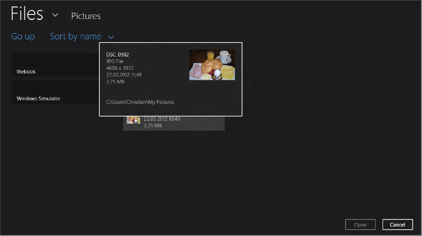
The method OnUploadImage from the class AddMenuCardPage (code file MenuCard/AddMenuCardPage.xaml.cs) makes use of the FileOpenPicker to enable users to select a file for upload. The PickSingleFileAsync method returns a single file. If the user should select multiple files, PickMultipleFilesAync can be used instead. The picker is configured by defining the start location (here the pictures library) and which file extensions can be selected. The StorageFile that is returned from the picker is then read to write the image to the menu card. Earlier, in the discussion on writing images, you saw how the BitmapDecoder can be used to resize images. With the BitmapImage it is also possible — and easier — to define the decoding as shown in the ImageOpened event handler that is implemented as a lambda expression:
    private async void OnUploadImage(object sender, RoutedEventArgs e)
    {
      var filePicker = new FileOpenPicker();
      filePicker.SuggestedStartLocation = PickerLocationId.PicturesLibrary;
      filePicker.FileTypeFilter.Add(".jpg");
      filePicker.FileTypeFilter.Add(".png");
      StorageFile file = await filePicker.PickSingleFileAsync();
      if (file == null) return;

      var stream = await file.OpenAsync(FileAccessMode.Read);

      var image = new BitmapImage();

      image.SetSource(stream);
      image.ImageOpened += async (sender1, e1) =>
      {
        if (image.PixelHeight > image.PixelWidth)
        {
          image.DecodePixelHeight = 900;
        }
        else
        {
          image.DecodePixelWidth = 900;
        }
        stream.Seek(0);
        MenuCardImageStorage imageStorage = new MenuCardImageStorage();
        MenuCardStorage storage = new MenuCardStorage();
        info.ImageFileName = string.Format("{0}.jpg", Guid.NewGuid().ToString());

        await imageStorage.WriteImageAsync(stream, info.ImageFileName);
      };
      image.ImageFailed += (sender1, e1) =>
      {
        // log error
      };

      info.Image = image;
    }
The FileOpenPicker is shown in Figure 38-13. This picker provides a preview of images from the selected folder.
SHARING CONTRACT
Your application is more useful when it offers interaction with other applications. Instead of doing copy and paste, as you’ve done previously, the menu card application could offer data that is directly used with e-mail or an application that posts the information to a website. The application could also receive some information from other applications — for example, pictures for the menu card.
Such communication is done with Windows 8 applications by using a contract. The following sections first turn the sample application into a sharing source, and then a sharing target as well.
Sharing Source
The first consideration in terms of sharing is determining what data should be shared in what format. It’s possible to share simple text, rich text, HTML, and images, but also a custom type. Of course, all these types must be known and used from other applications, the sharing targets. Sharing custom types can only be done with other applications that know the type and are a share target for the type. The sample application only offers HTML code for a menu card.
The HTML code for the menu card is created from the GetHtmlContent method in the class MenuCard (code file DataModelMenuCard.cs). Here, LINQ to XML is used to create HTML content from the Text and Price properties of the MenuItem objects contained within the menu card:
    public string GetHtmlContent()
    {
      return
        new XElement("table",
          new XElement("thead",
            new XElement("td", "Text"),
            new XElement("td", "Price"),
            MenuItems.Select(mi =>
              new XElement("tr",
              new XElement("td", mi.Text),
              new XElement("td", mi.Price.ToString("C")))))).ToString();

}Sharing will be offered from the Menu Card when the Menu items page is opened — to share a single menu card. For better reuse, the sharing code is put into the class SharingContract (code file ContractsSharingContract.cs). The heart of sharing data is the DataTransferManager. In the constructor of the SharingContract the DataTransferManager for the current view is remembered with the manager variable, and an event handler to the DataRequested event is added. Sharing is possible as soon as an event handler is added to the DataTransferManager. When the user requests sharing, the event is fired, thereby invoking the method OnMenuRequested. With the implementation of this method, the DataPackage is filled with data used for sharing. Finally, HTML data is shared by invoking the method SetHtmlFormat. This makes HTML code available for other applications. With HTML, the sharing facility requires some header information with size information. This can be easily created with the HtmlFormatHelper class, as shown here. Calling other methods like SetBitmap, SetRtf, and SetUri enable offering other data.
using System;
using Windows.ApplicationModel.DataTransfer;
using Windows.Storage.Streams;
using Wrox.Win8.DataModel;

namespace Wrox.Win8.Contracts
{
  public class SharingContract : IDisposable
  {
    private MenuCard card;
    DataTransferManager manager;

    public void ShareMenuCard(MenuCard card)
    {
      this.card = card;
      manager = DataTransferManager.GetForCurrentView();
      manager.DataRequested += OnMenuCardRequested;
    }

    private void OnMenuCardRequested(DataTransferManager sender,
      DataRequestedEventArgs args)
    {
      Uri baseUri = new Uri("ms-appx:///");
      DataPackage package = args.Request.Data;
      package.Properties.Title = string.Format("MENU card {0}", card.Title);
      if (card.Description != null)
        package.Properties.Description = card.Description;
      package.Properties.Thumbnail = RandomAccessStreamReference.CreateFromUri(
        new Uri(baseUri, "Assets/Logo.png"));
      package.SetHtmlFormat(HtmlFormatHelper.CreateHtmlFormat(
        card.GetHtmlContent()));
    }

    public void Dispose()
    {
      if (manager != null)
        manager.DataRequested -= OnMenuCardRequested;
    }
  }
}
In case you need the information when the sharing operating is completed — for example, to remove the data from the source application — the DataPackage class fires OperationCompleted and Destroyed events.
Sharing of a menu card is offered when the MenuItemsPage is opened. Within the OnNavigatedTo method, the previously defined SharingContract is instantiated, and the method ShareMenuCard is called:
public sealed partial class MenuItemsPage : Wrox.Win8.Common.LayoutAwarePage
{
private MenuCard card;
private SharingContract sharing;
//...
protected override void OnNavigatedTo(NavigationEventArgs e)
{
base.OnNavigatedTo(e);
if (card != null)
{
sharing = new SharingContract();
sharing.ShareMenuCard(card);
}
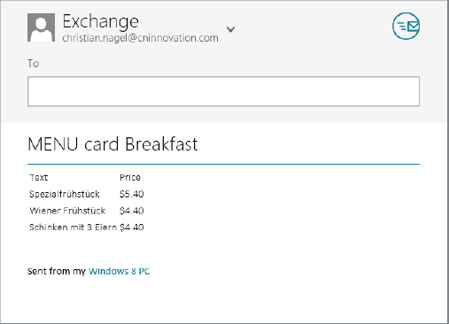
}Figure 38-14 shows the activation of sharing from the Charms bar. Here, the Mail application is the only sharing target that accepts HTML content.

Selecting the Mail application, the DataRequested event is fired and the Menu card application passes menu card information to the DataPackage, which in turn is received from the Mail application. Figure 38-15 shows how the Mail application formats the received HTML content, and here it is possible to send the data directly by e-mail.
Sharing Target
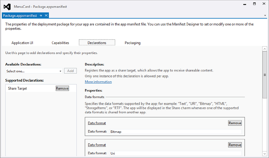
Now let’s have a look at the recipient of sharing. If an application should receive information from a sharing source, it needs to be declared as a share target. Figure 38-16 shows the Manifest Designer’s Declarations page within Visual Studio, where you can define share targets. Here is where you add the Share Target declaration, which must include at least one data format. Possible data formats are Text. URI, Bitmap, HTML, StorageItems, or RTF. You can also specify which file types should be supported by adding the appropriate file extensions.
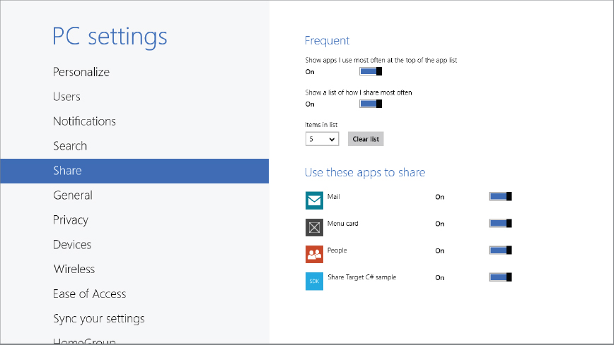
The information in the package manifest is used upon registration of the application. This tells Windows which applications are available as a share target. Users can configure this information from the Share dialog of the PC settings (see Figure 38-17).
You can use a Visual Studio item template Share Target Contract to create the code foundation needed for share targets. When a share source offers data to share, and the available share target is selected by the user, the method OnShareTargetActivated is invoked in the App class. On activation of the share target, it is not the OnLaunched method we’ve used until now that is invoked but rather OnShareTargetActivated. With the implementation, the page that should be shown for the sharing request is activated. This page is displayed by the Charms bar for sharing.
    protected override void OnShareTargetActivated(ShareTargetActivatedEventArgs args)
    {
      var shareTargetPage = new ShareTargetApp.ShareTargetPage1();
      shareTargetPage.Activate(args);
    }
The Activate method within the ShareTargetPage1 class receives activation information with the ShareTargetActivatedEventArgs object. The ShareOperation property returns a ShareOperation object that contains a DataPackageView. This view information gives information about the available data. The available data can be retrieved with the AvailableFormats property, and the data can be accessed with appropriate methods depending on the format, e.g., GetTextAsync and GetBitmapAsync:
    public async void Activate(ShareTargetActivatedEventArgs args)
    {
      this._shareOperation = args.ShareOperation;

      // Communicate metadata about the shared content through the view model
      var shareProperties = this._shareOperation.Data.Properties;
      if (sharedProperties == null) return;

      var thumbnailImage = new BitmapImage();
      this.DefaultViewModel["Title"] = shareProperties.Title;
      this.DefaultViewModel["Description"] = shareProperties.Description;
      this.DefaultViewModel["Image"] = thumbnailImage;
      this.DefaultViewModel["Sharing"] = false;
      this.DefaultViewModel["ShowImage"] = false;
      this.DefaultViewModel["Comment"] = String.Empty;
      this.DefaultViewModel["SupportsComment"] = true;
      Window.Current.Content = this;
      Window.Current.Activate();

      // Update the shared content's thumbnail image in the background
      if (shareProperties.Thumbnail != null)
      {
        var stream = await shareProperties.Thumbnail.OpenReadAsync();
        thumbnailImage.SetSource(stream);
        this.DefaultViewModel["ShowImage"] = true;
      }
    }
When data is retrieved, this must be communicated with the ReportStarted and ReportCompleted methods:
    private void ShareButton_Click(object sender, RoutedEventArgs e)
    {
      this.DefaultViewModel["Sharing"] = true;
      this._shareOperation.ReportStarted();

      // TODO: Perform work appropriate to your sharing scenario using
      //       this._shareOperation.Data, typically with additional information
      //       captured through custom user interface elements added to this page
      //       such as this.DefaultViewModel["Comment"]

      this._shareOperation.ReportCompleted();
    }
TILES
Because tiles are the first entry point of the application, they should be designed to catch the user’s attention. Using the Manifest Designer (see Figure 38-18) you can specify two sizes for logo tiles: one with a size of 150 × 150 pixels, and a wide logo of 310 × 150 pixels. The tile can display a name in addition to the image. If the name should be shown, it can be configured independently for the normal and wide logos, and the foreground and background color can be specified as well.
The tile can also be changed dynamically within the application. Some sample code to update the tile is shown in the following code snippet with the method UpdateTile (code file Notification/TileUpdate.cs). To update the tile, an XML definition needs to be created that defines the tile and an optional notification that defines the expiration time of the tile, and then the tile is updated by using the TileUpdater class:
    public static void UpdateTile()
    {
      TileTemplateType tileTemplate = TileTemplateType.TileWideImageAndText01;
      XmlDocument tileXml = TileUpdateManager.GetTemplateContent(tileTemplate);
      XmlNodeList tileImageAttributes = tileXml.GetElementsByTagName("image");
      ((XmlElement)tileImageAttributes[0]).SetAttribute("src",
        "ms-appx:///Assets/breakfast400.jpg");
      ((XmlElement)tileImageAttributes[0]).SetAttribute("alt", "Breakfast");

      var textElements = tileXml.GetElementsByTagName("text");
      ((XmlElement)textElements[0]).InnerText = "MENU card";

      TileNotification notification = new TileNotification(tileXml);
      notification.ExpirationTime = DateTimeOffset.Now.AddMinutes(60);

      TileUpdater tileUpdater = TileUpdateManager.CreateTileUpdaterForApplication();

      tileUpdater.Update(notification);
    }
Let’s look at this in more detail. If you’ve noticed that many tiles of different applications look very similar, there’s a good reason. The TileTemplateType defines several templates for tiles that can be customized. The template that is used in the sample is TileWideImageAndText01. As the name suggests, this template shows a wide tile with image and text. Other templates can be used for text only or images only, square blocks, or a collection of images. TileWideImageAndText01 contains an image and text whereby the text may be wrapped, TileWideImageAndText02 contains an image and text whereby the text is not wrapped. Using XML classes from the namespace Windows.Data.Xml.Dom, the XML content is modified to add an image from the Assets folder and some text. The final XML code for the tile is shown here:
<tile>
  <visual>
    <binding template="TileWideImageAndText01">
      <image id="1" src="ms-appx:///Assets/breakfast400.jpg" alt="Breakfast"/>
      <text id="1">MENU card</text>
    </binding>
  </visual>
</tile>
With the XML content, a TileNotification is created. The ExpirationTime defines that the tile is reset after 60 minutes. Last, with the TileUpdater, the update is done. The TileUpdater is created from the CreateTileUpdaterForApplication method. Because an application can have multiple tiles, other tiles can be updated with CreateTileUpdaterForSecondaryTile.
Instead of doing the update just once, it is also possible to specify periodic updates. The StartPeriodicUpdate method enables specifying an URL to a server that is invoked repeatedly with a time interval. The time interval is specified with an enumeration that defines values ranging from every half hour to daily. The server needs to return the XML code for the tile. The periodic update runs without the application being active. Starting the TileUpdater instructs Windows to perform the tile update.
SUMMARY
This chapter provided an introduction to many different aspects of programming Windows 8 applications. You’ve seen how XAML is very similar to programming WPF applications as described in previous chapters. Data binding has been used with content controls and items controls. The Visual State Manager was shown in action for dealing with different layout changes. You’ve also seen the Windows Runtime in action for accessing storage to read and write data and images, using roaming storage. Using the FileOpenPicker, files were uploaded with interaction from the user. Also covered was the sharing contract, which defines both the sharing source that offers some data and the sharing target that receives some data. Finally, you looked at tiles, the important first entry point of the application to the user.
Of course, there’s a lot more to know when designing Windows 8 applications. Also available are more pickers (for example, a contact picker); contracts to offer the application for the file open picker; enhanced search capabilities that enable the application to give information to users using toasts; and much more. Unfortunately, space doesn’t allow comprehensive coverage of all these topics. Nonetheless, you now have enough knowledge to get started.
The next chapter is the first of four chapters covering how to write web applications and provides you with a foundation for working with ASP.NET.