
![]()
13
Charting for Fun and Profit
In This Chapter
![]() Adding a chart to your presentation
Adding a chart to your presentation
![]() Getting data from other programs
Getting data from other programs
![]() Editing the data in your chart
Editing the data in your chart
![]() Embellishing your chart with titles, legends, and other stuff
Embellishing your chart with titles, legends, and other stuff
One of the best ways to prove a point is with numbers, and one of the best ways to present numbers is in a chart. With PowerPoint, adding a chart to your presentation is easy. And getting the chart to look the way you want is usually easy, too. It takes a little bit of pointing and clicking, but it works. This chapter shows you how.
Understanding Charts
If you’ve never attempted to add a chart to a slide, the process can be a little confusing. A chart is simply a series of numbers rendered as a graph. You can supply the numbers yourself, or you can copy them from a separate file, such as an Excel spreadsheet. You can create all kinds of different charts, ranging from simple bar charts and pie charts to exotic doughnut charts and radar charts. Very cool, but a little confusing to the uninitiated.
The following list details some of the jargon that you have to contend with when you’re working with charts:
![]() Graph or chart: Same thing. These terms are used interchangeably. A graph or chart is nothing more than a bunch of numbers turned into a picture. After all, a picture is worth a thousand numbers.
Graph or chart: Same thing. These terms are used interchangeably. A graph or chart is nothing more than a bunch of numbers turned into a picture. After all, a picture is worth a thousand numbers.
![]() Chart type: PowerPoint supports several chart types: bar charts, column charts, pie charts, line charts, scatter charts, area charts, radar charts, Dunkin’ Donut charts, and others. You can even create cone charts that look like something that fell off a Fembot in an Austin Powers movie. Different types of charts are better suited to displaying different types of data.
Chart type: PowerPoint supports several chart types: bar charts, column charts, pie charts, line charts, scatter charts, area charts, radar charts, Dunkin’ Donut charts, and others. You can even create cone charts that look like something that fell off a Fembot in an Austin Powers movie. Different types of charts are better suited to displaying different types of data.
![]() Chart Layout: A predefined combination of chart elements, such as headings and legends, that lets you easily create a common type of chart.
Chart Layout: A predefined combination of chart elements, such as headings and legends, that lets you easily create a common type of chart.
![]() Chart Style: A predefined combination of formatting elements that controls the visual appearance of a chart.
Chart Style: A predefined combination of formatting elements that controls the visual appearance of a chart.
![]() Datasheet: Supplies the underlying data for a chart. After all, a chart is nothing more than a bunch of numbers made into a picture. Those numbers come from the datasheet, which is actually an Excel spreadsheet. When you create a chart, PowerPoint automatically starts Excel (if it isn’t already running) and uses Excel to hold the numbers in the datasheet.
Datasheet: Supplies the underlying data for a chart. After all, a chart is nothing more than a bunch of numbers made into a picture. Those numbers come from the datasheet, which is actually an Excel spreadsheet. When you create a chart, PowerPoint automatically starts Excel (if it isn’t already running) and uses Excel to hold the numbers in the datasheet.
![]() Series: A collection of related numbers. For example, a chart of quarterly sales by region might have a series for each region. Each series has four sales totals, one for each quarter. Each series is usually represented by a row on the datasheet, but you can change the datasheet so that each column represents a series. Most chart types can plot more than one series. Pie charts can plot only one series at a time, however. The name of each series can be displayed in a legend.
Series: A collection of related numbers. For example, a chart of quarterly sales by region might have a series for each region. Each series has four sales totals, one for each quarter. Each series is usually represented by a row on the datasheet, but you can change the datasheet so that each column represents a series. Most chart types can plot more than one series. Pie charts can plot only one series at a time, however. The name of each series can be displayed in a legend.
![]() Axes: The lines on the edges of a chart. The X-axis is the line along the bottom of the chart; the Y-axis is the line along the left edge of the chart. The X-axis usually indicates categories. Actual data values are plotted along the Y-axis. Microsoft Graph automatically provides labels for the X- and Y-axes, but you can change them.
Axes: The lines on the edges of a chart. The X-axis is the line along the bottom of the chart; the Y-axis is the line along the left edge of the chart. The X-axis usually indicates categories. Actual data values are plotted along the Y-axis. Microsoft Graph automatically provides labels for the X- and Y-axes, but you can change them.
![]() Legend: A box used to identify the various series plotted on the chart. PowerPoint can create a legend automatically if you want one.
Legend: A box used to identify the various series plotted on the chart. PowerPoint can create a legend automatically if you want one.
 The most interesting thing to know about charting in PowerPoint 2013 is that it is closely integrated with Excel 2013. When you insert a chart in PowerPoint, Excel is automatically started, and the data that you chart is placed in an Excel workbook. However, that Excel workbook isn’t stored as a separate document. Instead, the chart and the datasheet workbook are stored within the PowerPoint document.
Adding a Chart to Your Presentation
To add a chart to your presentation, you have several options:
![]() Create a new slide by using a layout that includes a Content placeholder (an object that reserves space for content on the slide). Then click the Chart icon in the Content placeholder to create the chart.
Create a new slide by using a layout that includes a Content placeholder (an object that reserves space for content on the slide). Then click the Chart icon in the Content placeholder to create the chart.
![]() Use the Insert tab to insert a chart into any slide.
Use the Insert tab to insert a chart into any slide.
![]() Create the chart separately in Microsoft Excel and then paste the chart into PowerPoint. This is the most common method if the chart is based on data that’s already stored in an Excel workbook.
Create the chart separately in Microsoft Excel and then paste the chart into PowerPoint. This is the most common method if the chart is based on data that’s already stored in an Excel workbook.
Adding a new slide with a chart
The following procedure shows how to insert a new slide that contains a chart:
1. Move to the slide that you want the new slide to follow.
2. Click the Home tab and then click the New Slide button in the Slides group.
This action reveals a list of slide layouts.
3. Click one of the slide layouts that includes a Content placeholder.
Several slide types include a Content placeholder. When you click the one you want, a slide with the selected layout is added to your presentation, as shown in Figure 13-1. (In this case, I chose the “Title and Content” layout.)
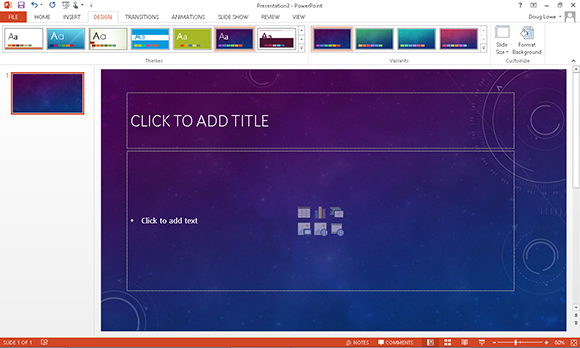
Figure 13-1: A slide with a content placeholder.
As you can see, the Content placeholder includes six little icons for inserting different types of content:
![]() • Table: Inserts a table, as described in Chapter 16.
• Table: Inserts a table, as described in Chapter 16.
 • Chart: Inserts a chart.
![]() • SmartArt: Inserts a SmartArt graphic, as described in Chapter 14.
• SmartArt: Inserts a SmartArt graphic, as described in Chapter 14.
![]() • Picture: Inserts a picture, as described in Chapter 11.
• Picture: Inserts a picture, as described in Chapter 11.
![]() • Online Picture: Inserts a picture from an online source, as described in Chapter 11.
• Online Picture: Inserts a picture from an online source, as described in Chapter 11.
 • Media: Inserts a movie, as described in Chapter 15.
4. Click the Chart icon in the middle of the Content placeholder.
The Chart icon is the one in the middle of the top row of icons. Clicking this icon summons the Insert Chart dialog box shown in Figure 13-2.
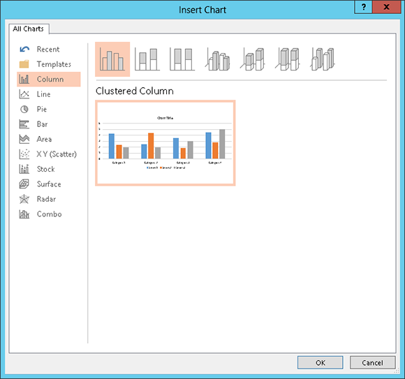
Figure 13-2: The Insert Chart dialog box.
5. Select the type of chart you want to create.
You can select any of the following chart types:
• Column: Data is shown as vertical columns. The columns can be displayed side by side or stacked, and you can pick various shapes for the columns including simple bars, 3-D blocks, cylinders, cones, and pyramids.
• Line: The data is shown as individual points linked by various types of lines.
• Pie: The data is shown as slices in a circular pie.
• Bar: The same as a column chart, except the columns are laid out horizontally instead of vertically.
• Area: Similar to a line chart, but the areas beneath the lines are shaded.
• X Y (Scatter): Plots individual points using two values to represent the X, Y coordinates.
• Stock: Plots high/low/close values.
• Surface: Similar to a line chart but represents the data as a three-dimensional surface.
• Radar: Plots data relative to a central point rather than to X, Y axes.
• Combo: Lets you combine different chart types in a single chart.
6. Click OK.
PowerPoint whirs and grinds for a moment and then inserts the chart into the slide, as shown in Figure 13-3. The reason for all the commotion is that to insert the chart, PowerPoint must find out whether Excel is already running. If not, PowerPoint launches Excel, as you can see in the figure.
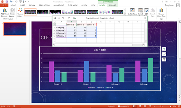
Figure 13-3: A chart after it has been inserted into PowerPoint.
7. Change the sample data to something more realistic.
As you can see, the data for the chart is shown in a separate spreadsheet window that resembles Excel, tiled alongside PowerPoint. You need to edit the data in this spreadsheet to provide the data you want to chart. Notice that any changes you make to the spreadsheet data are automatically reflected in the chart.
For more information, turn to the section “Working with Chart Data,” later in this chapter.
8. Customize the chart any way you want.
For example, you can change the chart layout or style, as described later in this chapter. Figure 13-4 shows a finished chart.

Figure 13-4: A slide with a finished chart.
Adding a chart to an existing slide
If you prefer, you can add a chart to an existing slide by following these steps:
1. Move to the slide on which you want to place the chart.
2. Activate the Insert tab on the Ribbon. Click the Chart button in the Illustrations group.
This step summons the Insert Chart dialog box (refer to Figure 13-2).
3. Select the type of chart you want to create and then click OK.
PowerPoint launches Excel (if it isn’t already running) and inserts a chart based on sample data.
See the section “Changing the Chart Type,” later in this chapter, for more information about chart types.
4. Change the sample data to something more realistic.
For more information about working with chart data, check out the section “Working with Chart Data,” later in this chapter.
5. Finish the chart by setting the chart layout and style.
For more information, see the sections “Changing the Chart Layout” and “Changing the Chart Style,” later in this chapter.
6. Rearrange everything.
The chart undoubtedly falls on top of something else already on the slide. You probably need to resize the chart by selecting it and then dragging it by the love handles. You can move the chart like any other object: Just click and drag it to a new location. You might also need to move, resize, or delete other objects to make room for the chart or change the layer order of the chart or other surrounding objects. You can find information about these manipulations in Chapters 11 and 12.
Pasting a chart from Excel
If the data you want to chart already exists in an Excel workbook, the easiest way to chart it in PowerPoint is to first create the chart in Excel. Then copy the chart to the clipboard, switch over to PowerPoint, and paste the chart to the appropriate slide. When you do so, the chart appears in PowerPoint exactly as it did in Excel.
When you paste an Excel chart into PowerPoint, a smart tag appears near the bottom right of the chart. You can click this smart tag to reveal a menu that lets you indicate whether you want to keep the original formatting of the chart or use the theme in the PowerPoint presentation.
In addition, the smart tag lets you indicate whether the chart should be embedded or linked. If you embed the chart, PowerPoint creates a copy of the Excel data and stores it as a workbook object within your PowerPoint file. This effectively severs the chart in the PowerPoint presentation from the original workbook, so any changes you make to the data in the original workbook aren’t reflected in the PowerPoint chart.
On the other hand, if you link the chart, PowerPoint copies the chart into the PowerPoint presentation but creates a link to the data in the original Excel workbook. Then any changes you make to the data in the original Excel workbook are reflected in the chart.
One final option on the smart tag lets you insert the chart as a picture. If you choose this option, PowerPoint converts the chart to a collection of PowerPoint shape objects, with no linkage to the original Excel chart or data.
Changing the Chart Type
PowerPoint enables you to create 14 basic types of charts. Each type conveys information with a different emphasis. Sales data plotted in a column chart might emphasize the relative performance of different regions, for example, and the same data plotted as a line chart might emphasize an increase or decrease in sales over time. The type of chart that’s best for your data depends on the nature of the data and which aspects of it you want to emphasize.
Fortunately, PowerPoint doesn’t force you to decide the final chart type up front. You can easily change the chart type at any time without changing the chart data. These steps show you how:
1. Click the chart to select it.
When you select a chart, a set of three tabs called the Chart Tools is added to the Ribbon.
2. Click the Design tab, as shown in Figure 13-5.
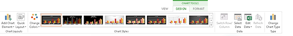
Figure 13-5: The Chart Tools Design contextual tab.
 3. Click the Change Chart Type button (shown in the margin).
PowerPoint displays a gallery of chart types.
4. Click the chart type that you want.
5. Click OK, and you’re done.
Working with Chart Data
The data that provides the numbers plotted in a PowerPoint chart is stored in an Excel workbook. Depending on how you created the chart, this Excel workbook can either be a separate workbook document or be embedded within your PowerPoint document. Either way, you can work with Excel whenever you want to modify the chart data.
To change the data on which a chart is based, select the chart. A set of three tabs called the Chart Tools is automatically added to the Ribbon when you select the chart. Next, choose the Design tab. This tab includes a group called Data, which provides four controls. These controls let you perform various tricks on the data, as described in the following sections.
Switching rows and columns
 The first control in the Data group, shown in the margin, is called Switch Row/Column. It changes the orientation of your chart in a way that can be difficult to describe but easy to visualize. Look back at the chart in Figure 13-4. It’s based on the following data:

As shown earlier in Figure 13-4, the rows are used to determine the data categories. Thus, the chart displays the data for Instruments, Music, Uniforms, and Instruction along the horizontal axis.
If you click the Switch Row/Column button, the chart changes, as shown in Figure 13-6. Here, the chart categorizes the data by city, so sales for River City, Pixley, and Hootersville are shown along the horizontal axis.

Figure 13-6: Swapping the row/column orientation of a chart.
Changing the data selection
 The Select Data button in the Data group of the Design tab (shown in the margin) lets you change the selection of data that your chart is based on. When you click this button, you’re escorted to Excel, and the dialog box shown in Figure 13-7 is displayed.

Figure 13-7: The Select Data Source dialog box.
This dialog box lets you do three basic tasks:
![]() Change the range. You can change the range of data that’s used for the chart by using the Chart Data Range text box.
Change the range. You can change the range of data that’s used for the chart by using the Chart Data Range text box.
![]() Switch row/column. You can switch rows and columns by clicking the Switch Row/Column button. Doing this has the same effect as clicking the Switch Row/Column button back in PowerPoint.
Switch row/column. You can switch rows and columns by clicking the Switch Row/Column button. Doing this has the same effect as clicking the Switch Row/Column button back in PowerPoint.
![]() Modify ranges and series. You can play with the individual ranges that contain the data for each series. You can add a new series, edit the range used for an existing series, delete a series, or change the order in which the series are presented.
Modify ranges and series. You can play with the individual ranges that contain the data for each series. You can add a new series, edit the range used for an existing series, delete a series, or change the order in which the series are presented.
Editing the source data
 To change the actual data values on which a chart is based, click the Edit Data button in the Data group of the Design tab (shown in the margin). This action launches Excel to display the chart data. You can then make any changes you want. When you return to PowerPoint (by clicking anywhere in the PowerPoint window), the chart is updated to reflect your changes.
Refreshing a chart
If a chart is linked to a separate Excel workbook, you can update the chart to reflect any changes that have been made to the underlying data. To do so, follow these steps:
1. Click the chart to select it.
The Ribbon expands to include the Chart Tools tabs.
2. Click the Design tab on the Ribbon.
3. Click the Refresh Data button in the Data group.
The chart is updated with the data from the underlying Excel workbook.
Changing the Chart Layout
A chart layout is a predefined combination of chart elements such as legends, titles, and so on. Microsoft studied thousands of charts and talked to chart experts to come up with galleries of the most common layouts for each chart type.
To change the layout for a chart, follow these steps:
1. Click the chart to select it.
The Ribbon expands to include the Chart Tools tabs.
2. Click the Design tab on the Ribbon.
3. Click the Quick Layout button.
Doing this opens the Quick Layout Gallery, as shown in Figure 13-8.
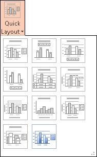
Figure 13-8: The Quick Layout Gallery for column charts.
4. Click the layout you want to use.
The layout you select is applied to the chart. Figure 13-9 shows the Band Sales chart with a different layout applied.
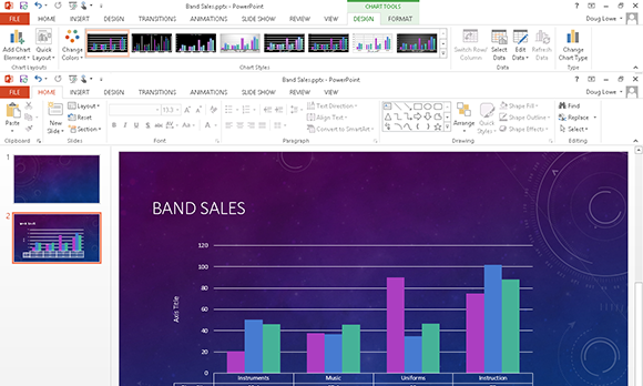
Figure 13-9: Changing the layout changes the appearance of a chart.
Changing the Chart Style
A chart style is a predefined combination of formatting elements such as colors and shape effects. Microsoft provides a large assortment of chart styles to choose from. For example, Figure 13-10 shows the Chart Style gallery for column charts.
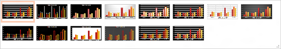
Figure 13-10: The Chart Style gallery for column charts.
To change the style for a chart, follow these steps:
1. Click the chart to select it.
The Ribbon expands to include the three Chart Tools tabs. (Refer to Figure 13-5.)
2. Click the Design tab.
3. Select the style you want to use from the Chart Styles group.
The Chart Styles group displays the most commonly used styles for the chart type.
If the style you want to use isn’t visible in this group, you can click the More button to display a gallery of all available styles. (The More button is the down-arrow button at the bottom of the scroll bar that appears at the right side of the Chart Styles group.)
Embellishing Your Chart
PowerPoint enables you to embellish a chart in many ways: You can add titles, labels, legends, and who knows what else. The easiest way to add these elements is by selecting a chart layout, as described in the earlier section “Changing the Chart Layout.” However, you can create your own unique chart layout by adding these elements individually.
 To do that, select the chart and then click the Chart Elements button that appears next to the chart (shown in the margin). A list of chart elements appears, as shown in Figure 13-11. You can then select the chart elements you want to appear on your chart.
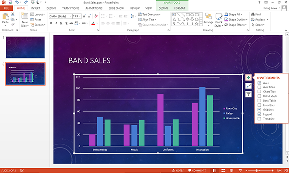
Figure 13-11: Adding elements to a chart.
The following paragraphs describe the elements you can add to your charts:
![]() Axes: Sometimes an axe is what you’d like to use to fix your computer. But in this case, axes refer to the X- and Y-axes on which chart data is plotted. The X-axis is the horizontal axis of the chart, and the Y-axis is the vertical axis. For 3-D charts, a third axis — Z — is also used. The Axes control lets you show or hide the labels used for each chart axis.
Axes: Sometimes an axe is what you’d like to use to fix your computer. But in this case, axes refer to the X- and Y-axes on which chart data is plotted. The X-axis is the horizontal axis of the chart, and the Y-axis is the vertical axis. For 3-D charts, a third axis — Z — is also used. The Axes control lets you show or hide the labels used for each chart axis.
![]() Axis titles: These titles describe the meaning of each chart axis. Most charts use two axes titles: the Primary Horizontal Axis Title and the Primary Vertical Axis Title.
Axis titles: These titles describe the meaning of each chart axis. Most charts use two axes titles: the Primary Horizontal Axis Title and the Primary Vertical Axis Title.
![]() Chart titles: A chart title describes the chart’s contents. It normally appears at the top of the chart, but you can drag it to any location.
Chart titles: A chart title describes the chart’s contents. It normally appears at the top of the chart, but you can drag it to any location.
![]() Data Labels: Lets you add labels to the data points on the chart. For maximum control over the data labels, choose More Options to display the Format Data Labels task pane, as shown in Figure 13-12.
Data Labels: Lets you add labels to the data points on the chart. For maximum control over the data labels, choose More Options to display the Format Data Labels task pane, as shown in Figure 13-12.
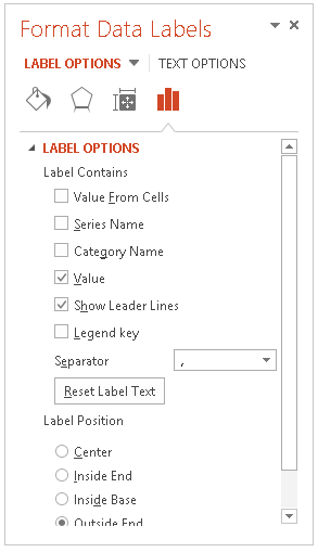
Figure 13-12: The Format Data Labels task pane.
 For most slide types, data labels add unnecessary clutter without adding much useful information. Use labels only if you think that you must back up your chart with exact numbers.
![]() Data Table: The data table is a table that shows the data used to create a chart. Most charts do not include a data table, but you can add one if you think your audience will benefit from seeing the raw numbers. For example, Figure 13-13 shows a chart with a data table.
Data Table: The data table is a table that shows the data used to create a chart. Most charts do not include a data table, but you can add one if you think your audience will benefit from seeing the raw numbers. For example, Figure 13-13 shows a chart with a data table.

Figure 13-13: A chart with a data table.
![]() Error Bars: Adds a graphical element that indicates a range of values for each point rather than a single point. The size of the range can be calculated as a fixed value, a percentage of the point value, or a standard deviation.
Error Bars: Adds a graphical element that indicates a range of values for each point rather than a single point. The size of the range can be calculated as a fixed value, a percentage of the point value, or a standard deviation.
![]() Gridlines: Gridlines are light lines drawn behind a chart to make it easier to judge the position of each dot, bar, or line plotted by the chart. You can turn gridlines on or off via the Gridlines button.
Gridlines: Gridlines are light lines drawn behind a chart to make it easier to judge the position of each dot, bar, or line plotted by the chart. You can turn gridlines on or off via the Gridlines button.
![]() Legends: A legend identifies the data series that appear in the chart. When you click the Legend button, a menu with several choices for the placement of the legend appears. You can also choose More Legend Options to display the Format Legend task pane, shown in Figure 13-14. From this dialog box, you can set the position of the legend as well as control various formatting options for the legend, such as the fill and border style. (Note that you can also drag the legend to move it to another location in the chart.)
Legends: A legend identifies the data series that appear in the chart. When you click the Legend button, a menu with several choices for the placement of the legend appears. You can also choose More Legend Options to display the Format Legend task pane, shown in Figure 13-14. From this dialog box, you can set the position of the legend as well as control various formatting options for the legend, such as the fill and border style. (Note that you can also drag the legend to move it to another location in the chart.)
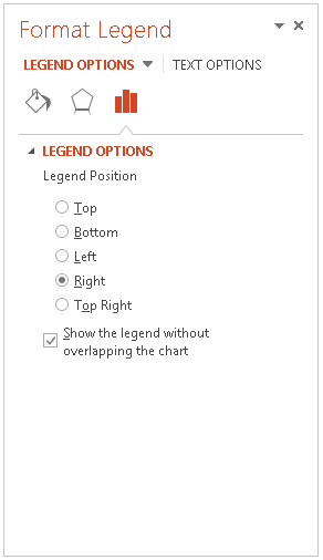
Figure 13-14: The Format Legend task pane.
PowerPoint enables you to create a legend, but you’re on your own if you need a myth or fable.
![]() Trendline: Allows you to add line elements, which shows the trend of one or more data points, using one of several methods to calculate the trend. Figure 13-15 shows a chart with several trendlines added.
Trendline: Allows you to add line elements, which shows the trend of one or more data points, using one of several methods to calculate the trend. Figure 13-15 shows a chart with several trendlines added.

Figure 13-15: A chart with trendlines.