10. Mashing Up Data with PowerPivot
PowerPivot is a free add-in for Excel 2010 brought to you by the SQL Server Analysis Services team at Microsoft. One of the themes for the 2010 release of Office was to improve Excel as a Business Intelligence tool. PowerPivot makes it possible to do jaw-dropping analyses in Excel.
Benefits and Drawbacks to PowerPivot
There are some pluses to PowerPivot, but also a few minuses. This chapter starts with the mega-pluses, which are the things that make you love PowerPivot.
Mega-Benefits of PowerPivot
Here are five mega-benefits to using PowerPivot. Any one of these benefits are enough to make me upgrade to Excel 2010.
• Process far more than a million rows of data—You have probably seen demos with 100 million rows. If you have data sets that extend beyond row 1,048,576, you can now sort, filter, scroll, and pivot those data sets in PowerPivot.
• Create pivot tables from multiple tables without writing a VLOOKUP—You no longer have to write processor-intensive VLOOKUP formulas to join data from two worksheets before creating a pivot table. PowerPivot takes your various Excel tables and mashes them together without having to code VLOOKUPs.
• Mash-up data from disparate sources—The PowerPivot window can import text, Access, RSS, SQL Server, and Excel data and present it in a single pivot table.
• Get access to sets—Microsoft added a cool Set feature to Excel 2010 pivot tables that enables asymmetric reporting. One problem: It only works with OLAP pivot tables, not regular Excel data. The good news: Take your regular data through PowerPivot and you have just created an OLAP pivot table. The heads of the Excel team will spin when I say it, but just having access to sets is enough to make me run every future pivot table through PowerPivot!
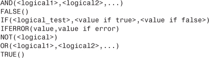
• Do calculations that make Excel’s calculated fields look like they were designed by someone in kindergarten—Microsoft introduced a new formula language in PowerPivot called Data Analysis Expressions (DAX). DAX is comprised of 117 functions that enable you to do two types of calculations. There are 81 typical Excel functions that can be used to add a calculated column to a table in the PowerPoint window. Then, there are 54 functions that are used to create a new measure in the pivot table. These 54 functions add incredible power to pivot tables. Some examples: COUNTROWS(DISTINCT()) finally lets you count the number of distinct rows. CALCULATE(Expression, Filter1, Filter2,... FilterN) is like SUMIFS but for any expression. (Think MAXIFS and more....) There are 34 time intelligence functions that let you compare TOTALYTD sales versus a PARALLELPERIOD.
Moderate Benefits of PowerPivot
The following benefits are nice, but not jaw-dropping amazing:
• Compression—Excel workbooks with PowerPivot data are smaller than workbooks that use traditional PivotCache pivot tables. The data is still stored inside the .xlsx workbook file, but the PowerPivot team came up with better ways to compress the data.
• Join two pivot tables with a single set of slicers—You can have one set of slicers that controls two separate PowerPivot tables.
• Slicer autolayout—Slicers created in regular Excel are always one column and always start at the same size. Slicers created in PowerPivot attempt to use some intellisense to be sized appropriately. It is not full-proof, but at least you see that the PowerPivot team is trying to be thoughtful about your slicers.
• PivotCharts without PivotTables—Well, not really. However, it looks like it. PowerPivot can automatically build a chart on your presentation worksheet, and then tuck the linked pivot table away on another worksheet.
Why Is This Free?
Until Excel 2010, what was the greatest innovation in spreadsheets? Your answer depends on the type of work that you have to do, but some possible answers might be:
• Pivot Tables—When Pito Salas brought the pivot table concept to Lotus 1-2-3, it meant that you never had to do @DSUM and /Data Table 2 anymore.
• VLOOKUP—Join data from two tables. It is what enables people to do things in Excel that should be done in Access.
• IF, SUMIFS, AGGREGATE—These functions enable various conditional calculations.
• 1,048,576 Rows in Excel 2007—This feature could mean you never again have to open Microsoft Access.
With Excel 2010, you now have a new add-in that is as good as all four of those innovations wrapped into one. The PowerPivot add-in provides the following advantages:
• You can do analysis of massive data sets, even data 100 times larger than Excel 2007.
• You can join tables without writing a VLOOKUP.
• You have aggregation and time series functions that have been lacking in Excel.
• You have the ability to do all of this in a pivot table.
It is not an exaggeration to say that PowerPivot is the best spreadsheet improvement to come out of Microsoft since pivot tables debuted in 1993.
Why then would the price for this be free?
Because there are 500 million people using Excel. That is a massive market of people. If you could somehow sell a book to just one-hundredth of one percent of that market, you would have a bestseller on your hands.
The SQL Server Analysis Services team is giving the client side version of PowerPivot to 500 million people because they figure that some small tiny percentage of those people will upgrade to the server version of PowerPivot. To get a server version, you have to buy SharePoint, SQL Server, and other expensive technologies. By empowering Excel pros with these amazing tools, they figure that they might double their existing customer base of SQL Server customers.
This chapter does not cover the server version of PowerPivot. However, it mentions some benefits of the server version.
Benefits of the Server Version of PowerPivot
If your IT folks install the PowerPivot Server, the following additional benefits are available to you:
• Automatic Refresh—In the client side, you have to open PowerPivot every day and click Refresh to have PowerPivot read the updated data sources. With the server version, this can automatically happen overnight.
• Publish to Report Gallery—With the server version, you can publish your PowerPivot pivot tables to a SharePoint server. Someone without Excel can open your workbook in a Web page and use the slicers to filter the data. Those people have a nice gallery of report thumbnails from which to choose. The people in IT can monitor which reports are used and by whom.
Drawbacks to Using PowerPivot
As you start using PowerPivot, you might run into a few annoyances.
• No grouping—PowerPivot cannot use the Group feature of pivot tables. This feature is used a lot to roll daily dates up to months, quarters, and years. You can work around this by using the DAX language to define year, quarter, and month columns, but it is not as simple as using the Group feature.
• You lose Undo—PowerPivot is an add-in. Traditionally, when you run a macro or some external code, the Undo stack is cleared. Thus, anytime you deal with PowerPivot, you are going to lose the ability to undo anything before you went in to PowerPivot.
• No VBA—You can automate regular pivot tables with VBA. You cannot use VBA to control PowerPivot.
• No drilldown—Usually, you can double-click a cell in a pivot table and see the rows that make up that cell. This feature is not in the first version of PowerPivot.
• Excel 2010 only—PowerPivot only works with Excel 2010. You cannot use it with Excel 2007 or with files that are stored in compatibility mode.
Installing PowerPivot
The main trick is to get the PowerPivot add-in that matches your version of Office. Office 2010 ships in 32-bit and 64-bit versions. If you have a new computer running 64-bit Windows, it is possible that you have 32-bit or 64-bit office.
Go to the File menu in Excel 2010 and select Help. The right side of the backstage view shows a version number. If the version number ends with (64-bit), then you need the 64-bit add-in version.
If you plan on dealing with millions of records, then you want to go with the 64-bit versions of Office and PowerPivot. You are still constrained to a 2GB file size limit, but because PowerPivot can compress data, it is possible to fit 10 times that amount of data in a PowerPivot file. The 64-bit version of Office can make use of memory sizes beyond the 4GB limit in 32-bit Windows.
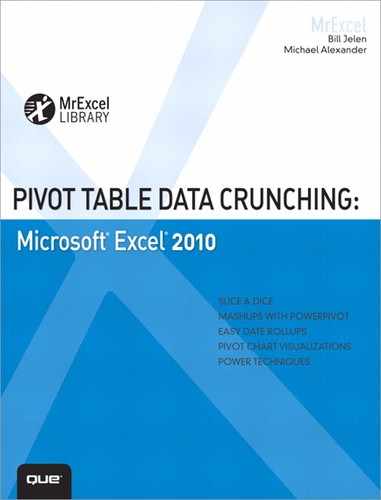
After installing the add-in, you should see a PowerPivot tab on the Excel 2010 ribbon, as shown in Figure 10.1.
Figure 10.1 After successful installation, you have a PowerPivot tab in the ribbon.
Building a PowerPivot Report
This case study walks you through your first PowerPivot data mash up. In this example, you create a report that merges a 1.8 million row CSV file with a store identifying data in Excel.
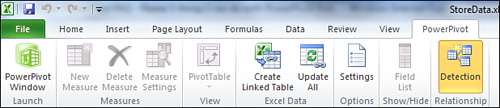
Your main table is a 1.8 million record CSV file called demo.txt. This file is shown in Notepad in Figure 10.2. It is important that you have column headings in Row 1 of the CSV file. The point-of-sale vendor who provides this data usually had a “Run on mm/dd/yyyy” row at the top of the file, a blank row, and then headings in Row 3. This does not work for PowerPivot. You need to get rid of those extraneous rows at the top of the data set.
Figure 10.2 This 1.8 million row file is too big for Excel.
Import a Text File
To import the 1.8 million row file into PowerPivot, follow these steps:
1. Select the PowerPivot tab in Excel 2010.
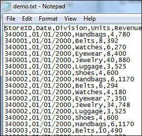
2. Select the PowerPivot Window icon. A new PowerPivot application window appears. PowerPivot offers two tabs: Home and Design. The Home tab is shown in Figure 10.3.
Figure 10.3 The Home tab of the PowerPivot application.
3. You want to import your main table first. This is the large CSV file shown in Figure 10.2. From the Get External Data group, select From Text. PowerPivot shows the Table Import Wizard.
4. Select a Friendly Connection Name, such as Sales History. Click the Browse button and locate your text file. PowerPivot does not default to see the first row as column headers, so the data preview is offering five unfriendly column names of F1, F2, F3, and so on (see Figure 10.4).
Figure 10.4 Initially, the headers are not recognized.
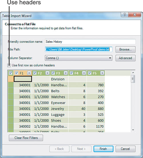
5. Verify that your delimiter is a comma. The drop-down offers standard delimiters such as comma, semicolon, vertical bar, and so on.
6. Select the check box for Use First Row as Column Headers. The preview now shows the real column names.
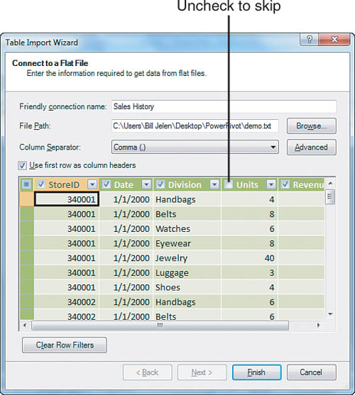
7. If there are any columns that you do not need to import, clear those check boxes. The entire file is going to be read into memory. If you have extraneous columns or particular columns with long text values, you can save memory by clearing them. Figure 10.5 shows the data preview with Units cleared.
Figure 10.5 Choose which columns to import.
Tip
Note that there are filter drop-downs for each field. You can actually sort and filter this 1.8 million row data set. However, it is slower than it will be in a few steps from now. If you open a filter field, you can select to exclude certain values from the import.
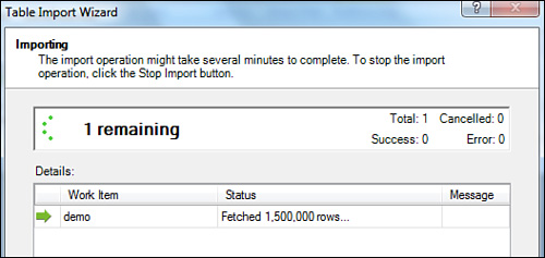
8. Click Finish and PowerPivot begins loading the file into memory. The Wizard shows how many rows have been fetched so far (see Figure 10.6).
Figure 10.6 In less than a minute, PowerPivot is up to 1.5 million rows.
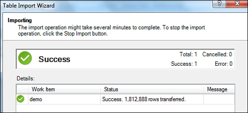
9. When the file is imported, the Wizard confirms how many rows have been imported, as shown in Figure 10.7. Click Close to return to the PowerPivot window.
10. The 1.8 million row data set is shown in the PowerPivot Window. Grab the vertical scroll bar and scroll through the records. You can also Sort, change the number format, or filter (see Figure 10.8).
Figure 10.8 1.8 million records are in a grid that feels a lot like Excel.

Differences Between PowerPivot and Excel
Even though it might feels like you are working with Excel, it is not Excel. The following lists some of the ways PowerPivot is different from Excel:
• You cannot edit an individual cell.
• If you add a calculation in what amounts to Cell E1 in Figure 10.8, that calculation is automatically copied to all rows.
• If you format the revenue in one cell, all the cells in that column are formatted.
• You can change column widths by dragging the border between the column names just like in Excel.
• The Filters in PowerPivot are not as powerful as the new filters introduced in Excel 2007. In particular, the date columns do not show a hierarchical filter where you can choose a year or month.
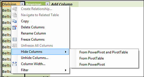
• If you right-click a column, a menu appears where you can rename, freeze, copy, hide, or unhide the columns (see Figure 10.9).
Figure 10.9 Right-click a column to rename, copy, or hide it.
The bottom line is that you have 1.8 million records that you can sort, filter, and later, pivot. This is cool!
Add Excel Data by Copying and Pasting
The previously imported file only has StoreID as a field. It does not have store name or location. However, you probably have a small Excel file that maps StoreID to store name and other relevant data. You can add this data as a new tab in PowerPivot. Follow these steps:
1. Open this workbook in Excel.
2. Select the data with Ctrl+*.
3. Copy it with Ctrl+C.
4. Click the PowerPivot tab. On the left side of the ribbon is an icon to return to PowerPivot (see Figure 10.10).

5. Click the PowerPivot Window icon. PowerPivot returns, and you see your 1.8 million row data set.
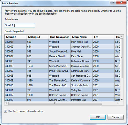
6. Click the Paste icon on the left side of the PowerPivot Home tab. You see a Paste Preview window.
7. Give the new table a better name than Table, like StoreInfo (see Figure 10.11). Click OK.
Figure 10.11 Give the pasted table a name.
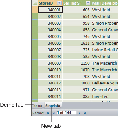
You now see the store information in a new StoreInfo tab. Notice that there are now two worksheet tabs at the bottom of the PowerPivot window, as shown in Figure 10.12.
Figure 10.12 You now have two unrelated tables in the PowerPivot window.
Add Excel Data By Linking
In the previous example, you added the StoreInfo table by using Copy and Paste. This actually creates two copies of the data. One is stored in an Excel worksheet somewhere, and the other is stored in the PowerPivot window. If the original worksheet changes, those changes do not make it through to PowerPivot. Alternatively, you can use the following steps to link the data from Excel to PowerPivot:
Tip
To link to Excel data, that data must be converted to the Table Format introduced in Excel 2007.
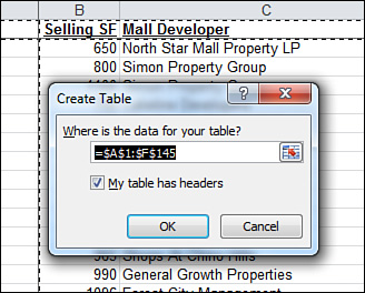
1. If you start with an Excel worksheet, make sure that you have single-row headings at the top (no blank rows or blank columns).
2. Select one cell in the worksheet and press Ctrl+T. Excel asks you to confirm the extent of your table and if your data has headers (see Figure 10.13).
Figure 10.13 Convert your regular Excel data to a Table.
3. The table gets a default format. You can use the Table Tools Design tab to change that format if the dark blue-banded rows are too much for you.
4. Go to the Table Tools Design tab. On the left side of the ribbon, you see that this table is called Table1. Type a new name such as StoreInfo.
5. On the PowerPivot tab, select Create Linked Table, as shown in Figure 10.14.
Figure 10.14 Use the Create Linked Table to get this data into PowerPivot.

The table appears in the PowerPivot window.
Define Relationships
Normally, in regular Excel, you would be creating VLOOKUPs to match the two tables. It is far easier in PowerPivot. Follow these steps:
1. You are linking from one column in your main table to a column in another table. To simplify the relationship process, navigate to your main table and select a cell in the column from which you are linking.
2. Click on the Design tab in the PowerPivot ribbon.
3. Select Create Relationship. The Create Relationship dialog appears. By default, the selected table and column appears in the first two fields, as shown in Figure 10.15.
Figure 10.15 Define a relationship between tables. By selecting the key column before starting, two of the four fields are populated.
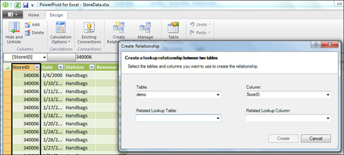
4. If you skipped step 1 and the correct table is not shown in the Table drop-down, then select Demo from the Table drop-down.
5. If you did not select the correct column in step 1, then open the Column drop-down. Select StoreID.
6. Open the Related Lookup table drop-down. Select StoreInfo.
7. Because the column names match, PowerPivot automatically changes the Related Lookup Column to say StoreID, as shown in Figure 10.16.
Figure 10.16 This simple dialog replaces the VLOOKUP.
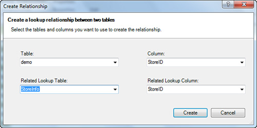
8. Click Create.
You have now created a relationship between the two tables.
Add Calculated Columns Using DAX
One downside to pivot tables created from PowerPivot data is that they cannot automatically group daily data up to years. Before building the pivot table, use the DAX formula language to add a new calculated column to the Demo table.
Follow these steps to add a Year field to the Demo table:
1. Click on the Demo worksheet tab at the bottom of the PowerPivot window.
2. The column to the right of Revenue has an Add Column heading. Click in the first cell of this blank column.
3. Click the fx icon to the left of the formula bar. The Insert Function dialog appears with categories for All, Date & Time, Math & Trig, Statistical, Text, Logical, and Filter. Select Date & Time from the drop-down. You instantly notice that this is not the same list of functions in Excel. Five of the first six functions that appear in the window are exotic and new (see Figure 10.17).
Figure 10.17 DAX offers a different list of functions than Excel.
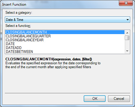
4. Luckily, some familiar old functions are in the list as well. Scroll down and select the YEAR function. Click on the first date in the Date column. PowerPivot proposes a formula of =year(demo[Date]. Complete the formula by typing a closing parenthesis and pressing Enter. Excel fills in the column with the year associated with the date, as shown in Figure 10.18.
Figure 10.18 A new calculated column is added. You want to rename this.
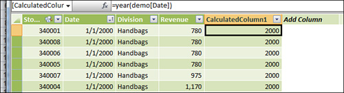
5. Right-click the column and select Rename Column. Type a name such as Year.
There are many more columns that you might think of adding, but let’s move on to using the pivot table.
Build a Pivot Table
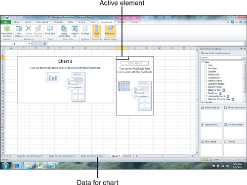
One of the advantages of PowerPivot is that multiple tables can share the same data and slicers. Open the PivotTable drop-down on the Home tab of the PowerPivot ribbon. As shown in Figure 10.19, you have choices for a single pivot table, a single chart, a chart and a table, two charts, and so on.
Figure 10.19 You have many options beyond a single table or chart.
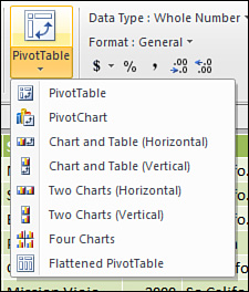
→ To learn how to deal with two or more pivot charts, see the “Combination Layouts” section later in this chapter.
1. Select PivotTable. You now see the PowerPivot tab back in the Excel window.
2. Choose to put the pivot table on a new worksheet (see Figure 10.20).
Figure 10.20 Choose the location for the pivot table.
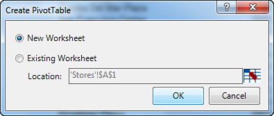
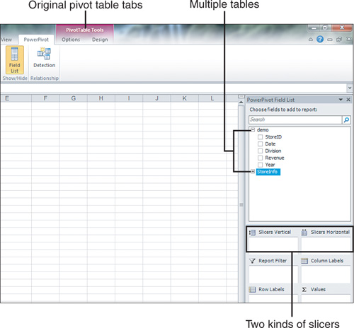
Figure 10.21 shows the initial screen. There are many things to notice. The PowerPivot Field List is a third variation of the pivot table field list. It is actually a new entry in the Task Pane. Both tables are available in the top of the Field List. The main table is expanded to show the field names, but you can expand the other table and add those fields to this pivot table. Two new sections in the drop zones offer vertical or horizontal slicers. Because you are in a pivot table, the PivotTable Tools tabs are available.
Figure 10.21 The PowerPivot field list is different from the regular pivot table field list.
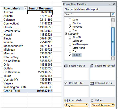
3. Select Revenue from the PowerPivot Field List. Expand the StoreInfo table. Select Region from the StoreInfo table. Excel builds a pivot table showing sales by region (see Figure 10.22). At this point, you have a pivot table from 1.8 million rows of data with a virtual link to a lookup table.
Figure 10.22 This pivot table summarizes 1.8 million rows and data from two tables.
You might want to go to the PivotTable Tools tabs to further format the pivot table. You could apply a currency format and rename the Sum of Revenue field, choose a format with banded rows, and so on.
To show some more features of the PowerPivot pivot table, add some slicer functionality.
Slicers in PowerPivot
Slicers are new in Excel 2010. The slicers in PowerPivot are slightly different from slicers in regular Excel.
1. First, you notice that the PowerPivot Field List offers boxes for Slicers Vertical and Slicers Horizontal. Vertical slicers are placed to the left of your pivot table. They are great for long lists that might need a scroll bar. Horizontal slicers go above your pivot table.
2. Drag the Year field to the Slicers Horizontal drop zone. The years appear in a small 3-column slicer surrounded by a big box, as shown in Figure 10.23. Your first reaction is to make that big box smaller, but do not do this.
Figure 10.23 Microsoft draws a big box around a small slicer.
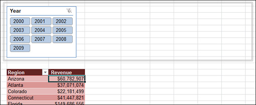
That big box is the slicer parent control. It is actually a drawing object that defines the boundary for all the horizontal slicers. If you make the slicer parent control box small, there will not be room for additional slicers.
3. Add Division and Era to the Slicers Horizontal. All of a sudden, the box around the three slicers looks almost the right size. It’s as if Microsoft knew that you were going to add two more slicers!
4. Add Mall Developer to the vertical slicer. Because it has a long list of relatively long names, it fits well as the only vertical slicer.
5. Slicers work the same as they do in regular Excel pivot tables. Click one item to select it. Ctrl+click additional items to select them as well.
Figure 10.24 shows the default slicers after applying a few filters.
Figure 10.24 PowerPivot chooses the number of columns for each slicer.
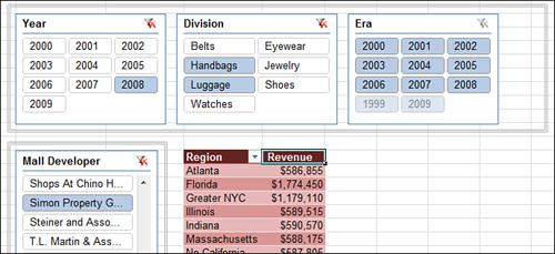
You probably like the PowerPivot slicers better than regular Excel slicers. The PowerPivot spec calls for some intellisense to choose how many columns might work for each slicer. The fact that the PowerPivot takes a guess at arranging the slicers means that you might not have to adjust the slicers. In regular Excel, you find yourself always adjusting the slicers.
The slicer parent control box disappears after you click outside of the pivot table. It comes back when the PowerPivot Field List is displayed. You can resize that box if you want the slicers to take up more or less room. Click the box once and resizing handles appear.
To format the slicers, you have to click on the slicer, not on the bounding box.
Some Things Are Different
If you have spent your whole Excel life building pivot tables out of regular Excel data, you are going to find some annoyances with these PowerPivot pivot tables. Many of these issues are not because of PowerPivot. They are because any PowerPivot pivot table automatically is an OLAP pivot table. This means that it behaves like an OLAP pivot table.
The following lists some items that you should keep in mind when working with PowerPivot pivot tables:
• Days of the week do not automatically sort into Monday, Tuesday, Wednesday, and so on sequence. It takes eight clicks to get them to sort into custom list sequence.
![]() To see how to force a PowerPivot report to sort into custom list sequence, search for “Pivot Table Data Crunching 10” at YouTube.
To see how to force a PowerPivot report to sort into custom list sequence, search for “Pivot Table Data Crunching 10” at YouTube.
• There is a trick in regular Excel pivot tables that you can do instead of dragging field names to the right place. You can go to a cell that contains the word Friday and type Monday there. When you press Enter, the Monday data moves to that new column. This does not work in PowerPivot pivot tables. Decide between Compact, Tabular, and Outline layouts before you drag fields to the correct location. Otherwise, everything snaps back to the original sequence.
• The PowerPivot Field List looks like the regular Field List, but there is a lot of functionality missing. You cannot access filters by hovering over fields in the top of the field list. You cannot rearrange the field list. If you add multiple fields to the Values drop zone, you cannot access the Values field to move it to a new position. The good news: the real PivotTable Field List is available. Turn it back on using PivotTable Tools Options, Field List. You can then move the Values field to the proper location.
• When you are entering a formula in the Excel interface, you can point to a cell to include that cell in the formula. You can do this using the mouse or the arrow keys. Apparently, the PowerPivot team is made up of mouse people because they support building a formula using the mouse in PowerPivot. Old-time Lotus 1-2-3 customers who build their formulas using arrow keys will be disappointed to find that the arrow key method does not work.
• There are two types of refresh with these pivot tables. If you go to the PowerPivot tab and Update All, new data is read from the data sources. This does not automatically refresh the pivot tables. You then have to go to the PivotTable Tools Options tab to click Refresh. Certainly, the Customer Experience Improvement Program data shows that everyone immediately goes from one Refresh to the other Refresh in quick succession. You might complain loudly that these are two separate steps, but remember that you are dealing with two different products, which makes this acceptable.
Two Kinds of DAX Calculations
You have already seen an example where you used a DAX function to add a calculated column to a table in the PowerPivot window. There are 81 functions that are mostly copied straight from Excel for doing these types of calculations. The RELATED function can also be used in a calculated column to grab a value from a different table.
DAX can also be used to create new measures in the pivot table. These functions do not calculate a single cell value. They are all aggregate functions that calculate a value for the filtered rows behind any cell in the pivot table. There are 54 new DAX functions to enable these calculations. The real power is in these functions.
DAX Calculations for Calculated Columns
You have already seen one example of a calculated column. The functions are remarkably similar to the same function in Excel. Therefore, most do not require a lot of explanation.
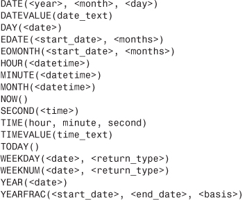
In the Date & Time category, there are 17 functions. The first 16 are identical to Excel’s function. The rarely-documented DATEDIF function in Excel is now renamed as YEARFRAC and is rewritten to actually work:
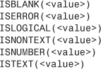
In the Information category, six functions are from Excel:
In the Logical Functions, seven are Excel functions. Do not be concerned that SUMIFS is not in this list. See a discussion on CALCULATE later:
Math and Trig offers 22 familiar functions:

In the Statistical category, there are 10 functions:

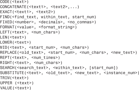
There are some items to note in the Text category.
First, the CONCATENATE function only lets you join two items. Use the & operator instead. Because PowerPivot cannot join two tables based on two fields in each table, you find that you are using concatenation frequently to join fields together.
Second, the Excel TEXT function has been renamed to FORMAT. It still works the same. Apparently, the PowerPivot team wanted a more descriptive explanation of what TEXT actually does:
Most of the items in the Filter and Value Functions category are used for creating new measures. There are two items that are of use in calculated columns:
• DAX introduces the BLANK() function. Because some of the aggregation functions are able to base a calculation on either the ALLNONBLANKROW or FIRSTNONBLANK, you can use the BLANK() function in an IF() function to exclude certain rows from measure calculations.
• You have the RELATED() function. This is described next.
Using RELATED() to Base a Column Calculation on Another Table
The next several examples make use of a sample file called Ch10WeatherMashup.xlsx. This file started out with a generic sales by day and by store data set. A company sells products both in a mall location and at an airport. The two stores are less than 10 miles apart, but they might show different sales trends.
Say you used a Web query and a macro to download weather data for the three years of daily dates. Several examples in the DAX Measure calculation mash up the sales and weather data to look for trends.
While preparing this workbook, you use DAX to create the following calculated columns:
• WeekdayName uses =FORMAT(Sales[Date],"dddd") to convert the date to the day of the week.
Tip
You might be disappointed to find that PowerPivot pivot tables do not respect the custom list when presenting weekdays. For this reason, you should add a new WeekdayID column.
• WeekdayID uses =WEEKDAY(Sales[Date],2). The 2 argument matches the same function in Excel. 2 numbers the days starting with 1 for Monday through 7 for Sunday. The Weekday table is a seven row table that maps 1 to 1-Mon and so on. This way, the day names would sort correctly.
• LocationDays is =CONCATENATE(Sales[Location],Sales[Date]). You see this used later when calculating the distinct number of store days.
Next, you need to calculate sales per store associate. The two locations have different scheduling requirements. The airport location usually operates with one associate, but staffs up to two on the busy travel days of Sunday, Monday, and Friday. The mall location has extra staff on Friday and Saturday. To calculate the number of staff on a given day, you need to concatenate Location and Weekday. The formula for LocationWeek is =Concatenate(Sales[Location],Sales[WeekdayName]). Note that calculated columns have no problem referring to other calculated columns.
A relationship links this column to the staffing table.
You might think that because PowerPivot understands the relationship between the Sales table and the Staffing table that you could write a formula such as =Sales[Net Sales]/Staffing[Staff Level], as shown in Figure 10.25. Unfortunately, this evaluates to an error.
Figure 10.25 Calculated columns do not automatically use the defined relationship.
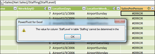
The problem is that the calculation is trying to divide this row’s sales of 2202 by all 14 values in the staffing table.
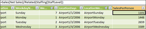
The solution is to use the Related function. Rewrite the formula as =Sales[Net Sales]/Related(Staffing[StaffLevel]). The related function tells DAX that you do not want to divide 2202 by all 14 values in the table, but only by the one value that is related to AirportSunday.
Figure 10.26 shows the result. In the first row, the airport location had two people staffing the store. Thus, the sales per person is half of the 2202. On Tuesday, only one person staffs the store, so SalesPerPerson is the same as Net Sales.
Figure 10.26 The Related function is like a 1-argument VLOOKUP.
Using these calculated columns and relationships, you can create some interesting pivot tables.
Figure 10.27 shows an analysis of sales by weekday at the two locations. You can see in Cell I10 that sales peak at the Mall on Saturday. At the airport, you would think that sales would peak on Friday when business travelers need a gift on their way back home. Instead, they peak on Sunday when business travelers are purchasing new items for their upcoming business meetings.
Figure 10.27 Sales at the airport location peak on Sunday.
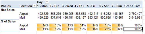
The percentages in Rows 9 and 10 of Figure 10.27 work out because over three years, there are roughly the same number of Mondays as Fridays in the data set.
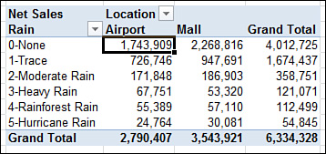
As you continue to do other analyses, the results are not as meaningful. In Figure 10.28, a report of sales by the amount of rain shows that most sales happened on sunny days. However, this could just be telling you that it is sunny a lot more in Florida than rainy.
Figure 10.28 Do people hit the mall more often on sunny days? You cannot tell from this report.
The answer is to use DAX to create new measures that calculate sales per store per day.
Using DAX to Create New Measures
A measure is the OLAP term for a Calculated Field. However, DAX measures can run circles around calculated fields. Before you dive in, you need to remember one mantra, “Filter first, and then calculate.” To understand this mantra, consider Cell C15 in Figure 10.29.
Figure 10.29 How many filters are on Cell C15?
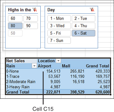
Think about how many filters are applied to Cell C15. You might think that the answer is two, but it is probably four.
Everyone would agree that Cell C15 is filtered to show only records that fell on a Saturday with high temperatures in the 80s. That is two filters.
In addition, the row and column fields are really filters as well. For Cell C15, you only want records with sales at the airport location. You also only want days where there was no rain. That is two additional filters for Cell C15.
As you start to think about DAX measures, remember to figure out the measure for a particular cell in the pivot table; they first filter, and then calculate the result using the DAX formula.
Count Distinct Using DAX
DAX lets you count how many distinct values meet the filter.
Wait—that is so good, it warrants repeating.
DAX lets you count how many distinct values meet the filter! Do you understand the gravity of that statement? People who are creating advanced pivot tables always are tripped up because pivot tables cannot come up with a distinct count of something. In Chapter 12 on VBA, the ridiculous formula =1/COUNTIFS(...) is offered to try to replicate the Count Distinct. DAX now lets you count how many distinct values meet the filter.
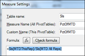
To create a new measure in DAX, use the New Measure icon in the PowerPivot tab. It seems confusing, but keep in mind that this is not a tab in the PowerPivot window, it is the PowerPivot tab in the Excel ribbon. To be clear, click the New Measure icon shown in Figure 10.30.
Figure 10.30 New Measure is on the Excel ribbon on the PowerPivot tab.

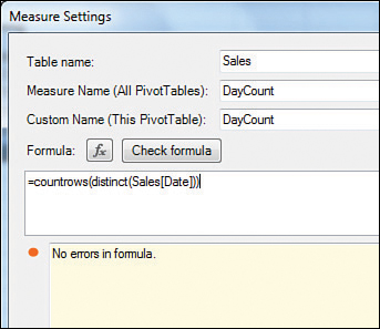
When you click New Measure, you get the Measure Settings dialog, as shown in Figure 10.31:
1. The Table Name should be the base table where your main numerical data is located. Change the first drop-down from Weather to Sales.
2. For the Measure Name, use a name such as DayCount.
3. Use the same name for Custom Name.
4. Measures are always aggregate functions, not cell-level functions. Thus, you must use an aggregate function such as SUM or COUNTROWS.
5. The magic function here is Distinct(Sales[Date]). For any cell in the pivot table, the distinct function returns a list of the distinct values for the rows that match the filter.
Figure 10.31 Edit measures in this dialog.
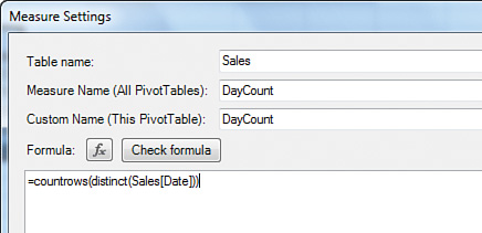
Tip
Note that distinct must be used on a column in the home table. It cannot be applied to a value in a linked table. It is affected by filters applied to linked tables, but you must be using a value in the home table. Distinct actually returns a one-column table with a list of the distinct values. To count how many items there are, use =CountRows(Distinct(Sales[Date]).
6. After typing the formula, click the Check Formula button to make sure that your syntax is correct (see Figure 10.32).
Figure 10.32 Build a formula and then check the syntax.
Think of DayCount as an intermediate result to illustrate the concept of using Distinct.
You could then define a measure of Net Sales divided by DayCount. However, you could also skip DayCount altogether and build Sales Per Day with a single formula:
=SUM(Sales[Net Sales])/COUNTROWS(Distinct(Sales[Date]))
Figure 10.33 shows Sales Per Day based on the amount of rain and the location.
Figure 10.33 Both locations do better on sunny days.
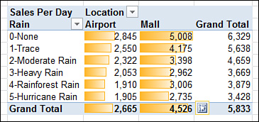
You might have thought that sales would pick up in the airport on rainy days due to rain delays. Apparently, people are too stressed out when their flights are delayed to shop.
Caution
There is something wrong with the totals in Figure 10.33. The Grand Total row for the airport is accurate; there is an average of $2665 in sales per day at the airport. However, if the airport is averaging $2665 a day and the mall is averaging $4526 a day, how can the Grand Total column be showing $5833?
Fortunately, you have the intermediate Day Count column available. Figure 10.34 shows a test report showing sales, days, and sales per day.s
Figure 10.34 Something is wrong in Cell J12.

The airport location was open for all three years. The mall location opened late in 2006 so there are less days for the mall location. The airport is open on Christmas, but the mall is not. Thus, there are many days where only one store is open.
Column I shows total sales of both stores. The Day Count in Column J counts a day when either one store or the other was open. Thus, both stores did sell $6.3 million over the course of the data set. However, because both stores were not open for the entire period, the calculation of $6.3 million divided by 1086 days is wrong.
The solution is to count the distinct number of a concatenated column of location and date. The Location Days column is a calculated column in the PowerPivot window. To see this, refer back to Figure 10.25. In Figure 10.35, two new measures appear:
![]()
Figure 10.35 This calculation works better.
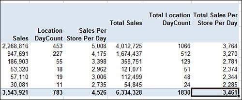
Although these new measures produce the exact same results for the Airport or Mall Sales Per Day, the improvement is that Column K shows the true average sales per store per day.
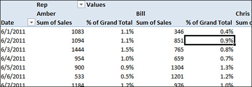
When “Filter, Then Calculate” Does Not Work in DAX Measures
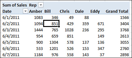
Say that you create a DAX measure for SUM(Sls[Sales]). By definition, all filters are taken into account before PowerPivot starts calculating. To get the 851 in Cell D6 of Figure 10.36, the program filters the data to where Rep=Bill, Date = 6/2/2011. The remaining rows are added to get the 851.
Figure 10.36 Excel applies a filter to calculate the 851.
In essence, without the DAX calculation specifying any filters, the result for Cell D6 in the pivot table is automatically going to sum up the rows shown by the arrows in Figure 10.37.
Figure 10.37 The answer in Figure 10.36 adds up all the arrow rows.

Incidentally, the formula in Cell E12 of Figure 10.37 is =SUMIFS(Sls[Sales],Sls[Rep],"Bill",Sls[Date],40696) and also returns 851. The DAX formula of =SUM(Sls[Sales]) is a bit shorter.
You should appreciate that for most calculations, you never have to specify a filter.
However, this assumption leads to trouble when you need part of your formula to look at all rows, not just the filtered rows.
Say that you want to see how the sales compared to the total sales for the month. You need to calculate a fraction. The numerator of the fraction is going to be SUM(Sls[Sales]). The denominator of the fraction needs to be all the records in the sales table. That is going to be tougher.
In DAX, instead of using SUMIFS, you need to use Calculate. Calculate asks for an expression and then one or more filters. For those filters, you are going to use a special function called ALL. If you ask for Calculate(Sum(Sls[Sales]),ALL(Sls)) then the filter is almost an anti-filter. Rather than further limiting the calculation, ALL says that you want it to look not just at Bill’s sales for 6/2/2011, but all the sales in the table.
In Figure 10.38, a new measure calculates % of Grand Total sales by using =SUM(Sls[Sales])/Calculate(Sum(Sls[Sales]),All(Sls)). The % of Grand Total for Cell F7 says that Bill’s $851 in sales on June 2 represents 0.9 percent of the grand total sales.
Figure 10.38 The denominator of these calculations is always the tough part.
Caution
The past example might seem trivial because you could replace that calculation with Show Values As, % of the Total. However, do not skip over understanding the ALL(Sls) syntax. After you understand that syntax, you can replace the first argument in Calculate with Max, Min, Average, or any function. Therefore, Calculate becomes like SUMIFS, AVERAGEIFS, MINIFS, MAXIFS, and so on.
Early on in the days of the PowerPivot beta, many people blogged an example or two that calculated the % of the total using Calculate and All. This is not the most powerful use of calculated measures.
Say that you want to calculate how Bill’s $851 sale on June 2 compared to all sales on June 2. The numerator of the DAX Measure is =Sum(Sls[Sales]). Again, the denominator is going to be the hard part.
For the denominator, you want to say, “Look at all the sales that match today, but do not pay any attention to the sales rep filter. Give me all sales reps.”
If you asked for ALL(Sls), the calculation would throw out all the filters.
This time, you need to ask for AllExcept(Sls,Sls[Date]). I cannot even count if this is a quadruple or a quintuple negative, but I can tell you that it takes some time to wrap your head around this. You might think of it like this: “DAX is already going to be filtering by date and sales rep. Go ahead and throw out all the filters except for the Date filter. Keep filtering by date.”
In Figure 10.39, the DAX measure calculates =SUM(Sls[Sales])/Calculate(Sum(Sls[Sales]),AllExcept(Sls,Sls[Date])). This calculation shows you the percentage of each day’s sales achieved by a certain rep.
Figure 10.39 All Except says to ignore all filters except the Date filter.

You can also override the filters by specifying other filters in the Calculate function. The actual syntax of the Calculate function is Calculate(Expresion,[filter 1], [filter 2], [filter 3], [filter 4], ...). Just like SUMIFS in Excel 2010, you can keep adding additional filters.
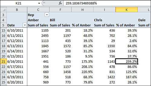
=Calculate(Sls[Sales],Sls[Rep]="Amber") gets all Amber’s sales for this row. If Amber is the sales star in the store, perhaps someone would want to show everyone’s sales as a percentage of Amber’s Sales.
=SUM(Sls[Sales])/ Calculate(Sls[Sales],Sls[Rep]="Amber") shows sales as a percentage of Amber’s total sales for that day. If the store manager posted this report from Figure 10.40, Chris might call home on the 16th to say, “Guess what! I sold 259.2 percent of what Amber sold.”
Figure 10.40 Show all values as a percentage of Amber is not one of the built-in selections, but it is possible with the DAX formula language.
Mix in Those Amazing Time Intelligence Functions
Remember that you can apply many filters in the Calculate function. As you saw in the last example, you could filter to show total sales for the rep named Amber. You can also filter to all dates that match a certain date function.
There are 34 Time Intelligence functions. Say that you want to calculate a running MTD total. You can use the Calculate function and specify a filter of DatesMTD(Sls[Date]). That is the complete filter. You do not need to say, “This row’s date falls within the MTDDates compared to the current date in the report.” You just have to say DatesMTD(Sls[Date]).
In pseudo code you would say, “I want a formula that adds up all the sales for dates that fall in the MTD period compared to the current row, but only for reps that match the current column.”
To add up all the sales, use =Calculate(Sum(sls[Sales]).
For dates that are MTD, use DatesMTD(Sls[Date]).
But only for reps that match, use AllExcept(Sls,Sls[Rep]).
The complete formula in Figure 10.41 is =Calculate(Sum(sls[Sales]), DatesMTD(Sls[Date]),AllExcept(Sls,Sls[Rep])).
Figure 10.41 MTD Sales for each rep.

Caution
Notice that Dale did not work on June 4 and thus gets no calculation for MTD Sales on that date. If you use pivot tables a lot, you understand that empty cells usually show up as blank, and you generally change the pivot table options to have empty cells show up as 0. The same thing is happening here. Because there was no data for Dale for June 4, none of the DAX measures are calculated for that cell. The solution would be to go back to the original data and add in a zero-sale record for every person for every day.
If you download the sample files for this book and look at Ch10DAXMeasures.xlsx, you see other calculated measures in the field list.
Note that a measure can refer to another measure. To get to This Rep’s Percentage of MTD Sales versus all MTD Sales, first you need to build MTDThisRep, as previously shown. Next, you need to build MTD All Reps using =Calculate(Sum(Sls[Sales]),DatesMTD(Sls[Date]),All(Sls)). When it comes time to create the formula to divide those two, you can simply build the formula as =Sls[MTDThisRep]/Sls[MTD All Reps]), as shown in Figure 10.42.
Figure 10.42 You can use previously defined measures to simplify the calculation for another measure.
Tip
The filtering techniques such as All() and AllExcept() are going to work well in the home table. If you need to have a calculation ignore or respect a filter in a linked table, your results might vary. It is always best to have the filter fields in the home table. One workaround is to use the =Related() function in the PowerPivot window to bring a copy of the field from the linked table into the home table.
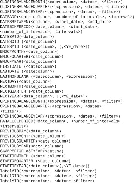
The following is a complete list of Time Intelligence Functions:
Note
Check out the optional Year Ending date parameter in DatesYTD and other arguments. You can finally deal with fiscal years other than those ending on December 31!
For completeness, these are the remaining functions supported by DAX:
Using PowerPivot To Access Named Sets For Asymmetric Reporting
Back in the summer of 2009, I read a post in the Excel team blog about named sets and how they would allow asymmetric reporting. This would enable you to report actual sales for all of the months that have passed and forecast numbers for the future months. I was nearly drooling at the end of the article until they said, “Oh, by the way, this only works for OLAP pivot tables in Excel 2010.” I was crushed.
All the pivot tables created by PowerPivot are automatically OLAP pivot tables. If you need to do asymmetric reporting, take your Excel data to PowerPivot and create the pivot table from there.
→ A detailed example of using a Named Set for Asymmetric reporting can be found in Chapter 12, “Using VBA to Create Pivot Tables.”
Other Notes
The topic of PowerPivot deserves a whole book. In fact, you can read my whole book on the subject, PowerPivot for the Data Analyst (Que Publishing, ISBN: 978-0789743152).
Here are a few miscellaneous topics that did not make it elsewhere in this chapter.
Combination Layouts
The PivotTable drop-down in the PowerPivot Window offers eight choices.
The first choice is a single pivot table and has been used throughout this chapter.
The last choice is a flattened pivot table. That is a pivot table that starts in Outline layout instead of compact layout. The Repeat All Row Labels feature is turned on. If you plan to convert the pivot table to values to reuse it, choosing a flattened pivot table saves you a few clicks along the way.
Note
The other six layouts include pivot charts, which does not make sense to me. PivotCharts look great in Microsoft demos, but no one actually uses them. I see why Microsoft put them here because it gives them something to demo. However, I cannot figure out why they give you six different versions. If one PivotChart is bad, why would anyone ever want four of them?
However, now assume you are trying to create several pivot charts and you found this section in the index. When you choose a combination of multiple elements, you have multiple outlines on the worksheet. In Figure 10.43, the pivot table on the right is the active table. You can tell because the cell pointer is inside the outline for that pivot table. Any changes that you make to the PowerPivot Field list affects that pivot table first.
Figure 10.43 A combination report offers one or more pivot tables or charts.
When you are ready to work on another element in the combination, click on that element. The Field List resets to blank, and you can design that element. All elements share the same slicers.
Note
Note that for each chart on your layout, Microsoft inserted a new worksheet to hold the actual pivot table for the chart.
Report Formatting
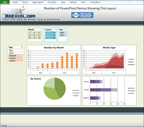
PowerPivot is exciting because it lets people who cannot do VLOOKUPs mash up data and do reports that have never been imagined before. However, Microsoft blogs are busy showing the exact same layout for their PowerPivot demos. They all look like Figure 10.44. You have probably seen many of them. The following steps show how to replicate the layouts shown in the blogs and press:
1. Insert a new worksheet to hold the workbook.
2. Create a combo of two or four pivot charts. Choose a location rather than letting them default. Choose a spot on Row 5 of the new workbook.
3. Add as many slicers as possible to the top and left of the chart.
4. Build the charts.
5. Make Row 1 very tall, perhaps 270 to 300 points tall. Use Insert, Screenshot to add an interesting graphic to Row 1.
6. Add an interesting graphic below the charts to balance the graphic on top of the charts.
7. Go to File, Options, Advanced, Display Options for This Worksheet. Clear the Gridlines check box. If you want to go all out, scroll up and also clear the scroll bars, sheet tabs, and formula bars.
8. Minimize the ribbon.
9. Add a fill color behind the whole worksheet.
10. Although the pivot table is active, click on the bounding box around each slicer. Right-click on the border. Select properties. Select Move and Size with cells.
11. Click away from the pivot table.
Figure 10.44 This dashboard tracks how many publications have shown this style of dashboard generated by PowerPivot.
If your layout contains an actual pivot table, consider converting the pivot table to formulas. You can then actually insert extra rows between the pivot table rows, adding color, and so on.
Refreshing PowerPivot Versus Refreshing Pivot Table
Say your underlying data changes. If it is stored in an Excel linked table, you go to the PowerPivot tab in the Excel ribbon and click Refresh All. If it is stored in an External Data Source, you go to the PowerPivot window and select Refresh. If the data was pasted to PowerPivot, you can Paste Append new data or do a Paste Replace.
This does not refresh the pivot table! When you return to Excel, you have to remember to go to the PivotTable Tools Options tab and select Refresh.
Getting Your Data into PowerPivot with SQL Server
Data coming from SQL Server already has many relationships defined. Find the main Fact table, choose that table, and then click the button for Choose Related Tables. PowerPivot reads the database schema and brings in all the tables with relationships predefined. It is, of course, then possible to add in additional Excel or text data to mash up with the SQL Server data.
Other Issues
Can there be multiple relationships between two tables? No. If you need two relationships, import the lookup table twice and link to each copy separately.
Will PowerPivot ever be available for Excel 200n? No. PowerPivot relies on a number of features added to Excel 2010.
Next Steps
In the next chapter, you learn how macros can help you enhance your pivot table reports and empower users to do their own Excel analysis.