PowerPoint Lesson 2: Getting Started with PowerPoint 2013

PowerPoint 2013 offers eight different document views, several editing panes, and a wide array of editing tools and controls. In this lesson, you’ll work through PowerPoint’s editing interface and get a feel for its natural workflow, from entering your first title slide to preparing for the final presentation.
What you’ll learn in this lesson:
- • Exploring PowerPoint’s various editing views
- • Outlining a presentation, and then fleshing out individual slides
- • Applying and customize Document Themes
- • Combining animations and slide transitions to make your slides more interesting
Starting up
You will work with files from the PPT02lessons folder. Make sure that you have loaded the OfficeLessons folder onto your hard drive from www.digitalclassroombooks.com/Office2013. If you need further instructions, see “Loading lesson files” in the Starting up section of this book.
Your workspace and your toolbox
PowerPoint shares several features with the other Office 2013 apps, but it’s purpose-built for a variety of specific tasks: writing, designing, and laying out slides; developing a presentation flow; generating handouts and presenter cues; refining and rehearsing the presentation; and sharing the presentation, whether live on stage or privately in a kiosk. Each task has an associated editing/viewing mode. Once you have a feel for your work environment and the tools it offers, you can focus all your attention on making useful content.
This lesson walks through the creation of a short presentation, focusing on the way the different features of PowerPoint work together. You won’t present the slide show itself just yet; you will create it now and present the live act in a later lesson.
To begin, launch PowerPoint and open the sample document for this lesson.
1 Launch PowerPoint 2013. From the Launch Screen, click Open Other Presentations, navigate to your PPT02lessons folder, and then select pp02a.pptx.
PowerPoint and the Office 2013 user interface
PowerPoint 2013 presents the basic Office 2013 user interface (UI) optimized for creating presentations of slide decks. In this section, we’ll map out the various tools in the UI, and see how PowerPoint’s tailored interface helps support a smooth workflow.
The Ribbon and Backstage view
The Ribbon, which appears by default atop the application screen, contains PowerPoint’s many editing, viewing, and presenter tools. The Home tab, which is the default toolset, is where you can find the usual font/paragraph formatting tools (but no paragraph Styles; see below). In the Home tab, you can also find commands to add and edit slides, and quick shape-drawing tools. The Insert and Review tabs will be familiar to Office users, though PowerPoint is missing Word’s Styles and Track Changes features.
PowerPoint’s file-management tools are found in the Backstage View (the File tab). The key PowerPoint-specific features are the theme variants for new documents, which let you preview different visual schemes for a given theme right in the New Document gallery, and the options for exporting your presentation as a video or web document (complete with animations, transitions, and audio).

The Design tab houses the Themes gallery and slide design tools.

Configure and run your presentation from the Slide Show tab.
The View tab houses tools to customize your PowerPoint workspace.
Choosing a look with the Design tab
The Design tab illustrates a major conceptual difference between Word and PowerPoint. Word’s Design tab lets you choose a theme, but hides the Themes gallery: you’re expected to settle on one theme, then pick from its Style Sets to suit your taste. PowerPoint doesn’t use Word’s Styles; it has a simplified text style collection, which you edit with the Slide Master tools. The Design tab offers a Theme gallery and a second Variants gallery, which offers several color/background choices for each Theme.
Moving from content to performance
Moving from left to right across PowerPoint’s Tab bar, you get a sense for the application workflow. First you generate your basic slide show content: the Home and Insert tabs support you in adding text, images, and data to your individual slides. Then comes aesthetics: you select a look and feel with the Design tools, link the slides into a series using the Transitions tools, and give individual slides some movement with Animations.
Transitions and Animations also help you think about your individual slides as tools for performance: as content is finalized, the workflow shifts from your slide deck to the slide show. In the Slide Show tab, you’ll find controls for your presentation; crucially, this includes rehearsal and timing tools. The Review tools let colleagues respond to your work.
Finally, the View tab is a kind of master switch for shifting between different editing or viewing modes. The Master views let you set up document-wide formatting. The Slide Master sets default paragraph formatting values (font, color, emphasis), which propagate to all slide layouts; you can then customize each layout in turn. (The Slide Master is PowerPoint’s rough equivalent to Word’s Style Set.) Handout and Notes Masters determine the look for audience and speaker printouts, respectively.
Each of PowerPoint’s Presentation Views is best suited to a specific part of the workflow:
- • Outline View: quickly build a presentation skeleton
- • Normal View: fill in individual slide content
- • Slide Sorter: pull back to focus on overall flow
- • Notes Page: turn slide deck into speaker script
- • Reading View: review the slides as the audience would see it outside PowerPoint’s interface
To see how the different parts of the PowerPoint workflow interact, we’ll now quickly fill in our sample document, one viewing mode at a time.
Building your presentation content
Just as is the case with Word, the fastest way to get started with PowerPoint presentations is to begin with an outline, flesh out each section, and only then work on style and visual presentation. We’ll follow this pattern to turn our sample document skeleton into an internal marketing pitch.
Building an outline
Outline View shows the text content of your slides and nothing more: no images, no careful layout, and no design. PowerPoint presentation outlines work the same, in principle, as Word document outlines: top-level headings correspond to individual slides (rather than Word headings/sections), and each successive outline level maps to bulleted slide content. Since bulleted lists are the most common form of PowerPoint text content, drafting your presentation in Outline View is the fastest way to generate a lot of rough-and-ready slides.
We’ll use Outline View to change our slide order and add a couple of new slides.
1 In the file pp02a.pptx, choose View > Presentation Views > Outline View.
2 Select slide 5 by clicking the white box next to its slide number, and drag it to its new position right after the title slide so it becomes slide 2.
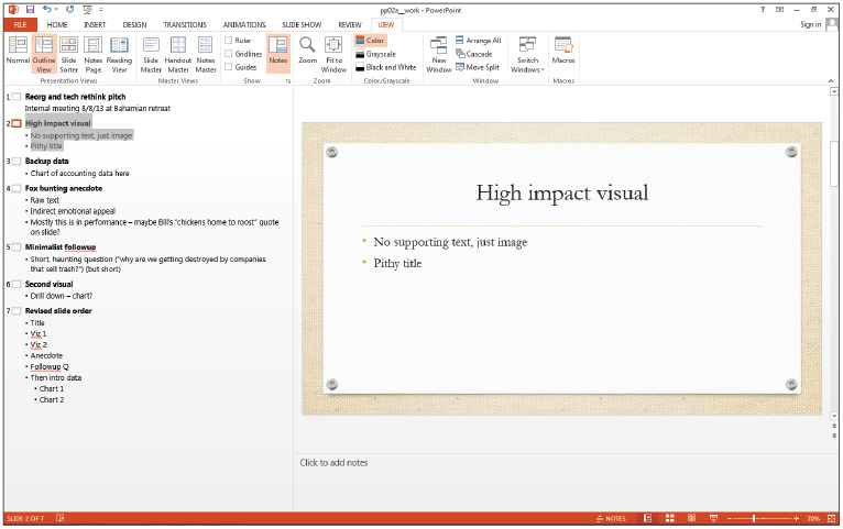
Use the Outline View to move slide 5 under the title slide.
3 Select slide 6, Second visual, and press Ctrl+X to cut the entire slide. Place the cursor at the end of slide 2 in the outline and press Ctrl+V to insert the cut slide in its new position.
4 Resize the outline pane until it’s about half the width of the screen to fit more slides onscreen at once by clicking and dragging the separating line to the right. Select View > Normal to flip back to slide editing mode, and then return to Outline View.
In Outline View, it makes sense to place the text content in the foreground by downsizing the slide visuals; after all, we haven’t thought about layout and design, yet.
5 Finish reordering the existing slides according to the new order in slide 7 and then switch to Normal editing view.
6 Choose File > Save As. Navigate to the PPT02lessons folder and name this file pp02a_work.
Editing slide content
In Normal View, the content of individual slides is front and center. However, when editing slide content, you can temporarily shift from thinking of your presentation as a continuous narrative, and make each slide impactful in itself.
1 Select slide 1 and change the title and subtitle to Reorienting Our IT Approach and A Modest Proposal, respectively.
2 Delete the text content and title from slide 2. The controls to insert visuals appear. Right-click slide 2 in the slides pane, and choose Layout > Blank.
If you’re switching to a blank slide layout, it’s good to clear out all its text content first; otherwise it will carry over to the new layout, with text boxes appearing in odd places (and you’ll have to delete the boxes themselves).
3 Still working on the now-blank slide 2, click Insert > Online Pictures. In the royalty-free clip art search box, search for bad news. From the gallery of results, choose the image of the woman frowning on the phone and click Insert.
4 Clear the title and content from slide 3 and change the layout to Blank. Click Insert > Online Pictures again, and in the clip art search box (not Bing), search for “charts and graphs” (including quotation marks). Shift+click both images and insert them both.
5 Finally, Insert > Online Pictures again and search office.com clip art for “graphs and charts” (with quotes). Insert the resulting image.
Formatting inserted images
After inserting dramatic visuals in a blank slide, you can change their appearance and layout using the Format Picture pane.
1 Right-click one of the inserted images and select Format Picture. Switch to its Size and Properties tab.
2 Under Size, make sure that Lock aspect ratio is checked (so images will keep the same proportions), then type 2 in the Height box and press Return. PowerPoint reads the unlabeled numeral as 2”.
3 Do the same for the other two images. Then enable View > Show > Guides.
4 Drag one of the resized images to the very center of the slide. (With Guides turned on, it will stick when it’s near the center.) Drag a second image to a spot directly to the right of the center image so that an orange span arrow appears between them. Drag the third image to the spot opposite the second, on the left side of the slide.
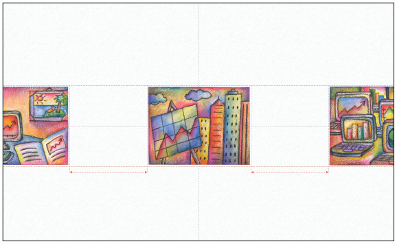
PowerPoint’s drawing guides help you visually line up objects in the slide.
5 If Notes are not already displayed, select View > Show > Notes.
The other commands in the Format Picture pane are reasonably self-explanatory; we’ll return to them in a later lesson.
6 Edit the remaining slides as per these specifications:
- • Slide 2: Add speaker note Average IT response time: 4 years
- • Slide 3: Add speaker note Move slowly through images – drama!
- • Slide 4: Set layout to Section Header, delete all text, change title to “The chickens come home to roost…in the lion’s den…among the eagles” (including quotation marks)
- • Slide 5: Set layout to Two content; change title to Key Question, and change slide content areas: We trail ACME sales by 400% (left) and Why? (right). No bullets in content area to the right (Home > Paragraph > Bullets)
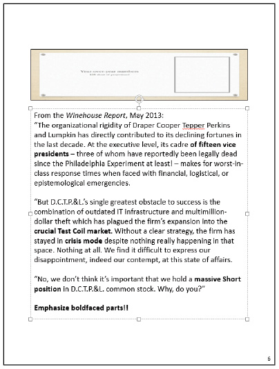
- • Slide 6: Set to Picture with caption layout, make title Year-over-year numbers. Text content: $2B short of projections!
We’ll add a chart to slide 6 in a later section and make the visuals more interesting with animations and transitions.
7 Choose File > Save to save your work.
Creating notes pages
If you don’t want to look at your screen while you deliver your presentation, you can print out Notes Pages, which let you control the layout of your speaker notes on a per-slide basis. This is handy if you want to alternate between improvisatory phrases or suggestions, and word-for-word reading of a complete slide script. We’ll edit a single slide’s notes to see how it works.
1 Switch to View > Presentation Views > Notes Page. Scroll through the presentation and select slide 6.
2 Navigate to your PPT02lessons folder and open pp02b.docx. Copy the text of the document, and then Paste it into the notes area of slide 6.
3 Resize the image of the slide on the notes page, making it much shorter, and then resize the text box to fill the remaining page space. Select all the text and set it to 16pt type in Home > Font > Font Size.
Notes Pages help place your written presentation in its performance context.
You can tailor the Notes Page for each slide in the same way: sometimes the most helpful visual aid is the slide itself; sometimes more textual detail is important.
Reading view
Reading View, new in Office 2013, lets you view your presentation as a series of flat slides with no visual chrome (no animations or transitions, just single screens). Crucially, Reading View also hides the entire PowerPoint interface: there is nothing around the slides to distract you, not even presenter tools.
For a clean look at your presentation, click View > Reading View. Use the usual navigation controls: Space/Return/Right arrow to advance, left arrow to move back. When you’ve got a feel for the way the draft slides present visually, press Escape or navigate past the last slide to return to editing mode, then click Normal View.
Working with text, images, and visual effects
PowerPoint’s text editing tools are more like Excel’s than like Word’s: simple, not meant to handle large-scale text pieces. (The general rule for slide text is: Less Is More.) Its image formatting tools are also streamlined. For the purposes of this lesson, we’ll briefly describe the different panes and toolbars.
Simplified text handling
PowerPoint uses a simplified Style model: you define a style by formatting the text on the Slide Master (for instance, declaring that all title boxes should default to boldface italic text); make changes to layouts using the Slide Layout (for example, no boldface title on a specific slide layout only); and then inherit that formatting when you fill in the slide itself. In complexity and flexibility, PowerPoint’s editing tools are more similar to Excel’s than to Word’s.
Applying character and paragraph formatting works the same way in PowerPoint as it does anywhere else in Office. In this section, we’ll make changes to the Slide Master and to individual slides using a variety of formatting tools.
1 Select slide 1. Triple-click the subtitle and set the text color to red using the formatting popup.
2 Select slide 5. Place the cursor at the end of the 400% line. Press Return to add a line. Press Tab to indent. Type 600% in fiscal Q4. Add another line; press Shift+Tab to reduce indent. Type …while winning customer satisfaction war.
Tab and Shift+Tab work the same way as Word’s bulleted lists or PowerPoint’s outline mode.
3 Select the word Why? In the Home tab and set its font size to 96pt. Right-click Why? and select Format Text Effects to bring up the Format Shape pane.
4 Scroll down to 3D Rotation and select the Parallel preset, Isometric Left Down. Set the Z rotation to 15 degrees.
The Format Shape pane brings the various formatting tools together in a single toolbox; from there, you can alter the background, shape, line and fill colors, and texture of the text box, along with its contents.
5 Choose File > Save or press Ctrl+S to save your work.
Inserting images
Inserting images works consistently across Office apps. You can either click one of the controls in a content area, or use the tools in the Insert tab. We’ll illustrate the principle by inserting a single piece of clip art from online.
1 Select slide 6. Click in the image area, not on the Insert Image control, and then select Insert > Online Pictures.
2 Search the office.com clip art collection for magnifying glass bar graph. Select the image that appears in the gallery, and click Insert.
Adding and editing animations
Animations apply to individual elements within a slide: images, boxes, even individual lines of text. The Animations tab contains the basic animation tools, whereas the Animation pane lets you organize the animations within a slide.
1 In slide 5, click the word ACME. (Don’t select the text, just place the cursor.) Open the Animations tab and apply the Fade animation. Then open the Animation pane. In that pane, click the double caret (![]() ) to expand the animation list.
) to expand the animation list.
PowerPoint automatically animates the entire bulleted list: the first two lines appear on your first click, then the third line when you click again. We’ll uncouple the first two lines, add a dramatic pause before the second, and draw out the animation on the third.
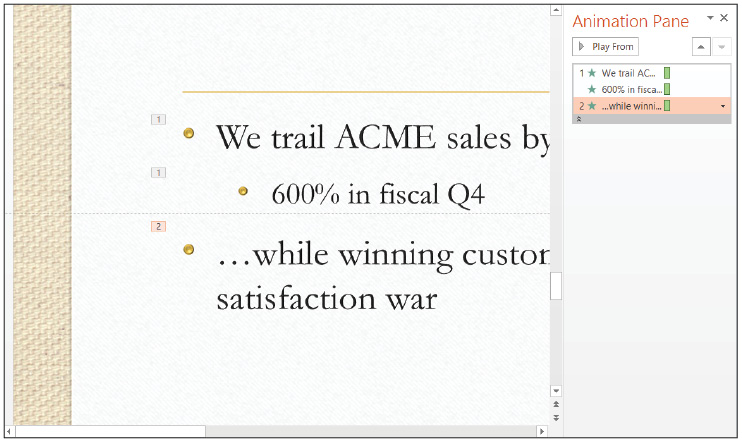
Animation order is indicated by numbered labels in the slide.
1 Select animation #2 in the Animation pane (the ...while winning bullet). From its drop-down menu, select Start After Previous. In the Timing group, set Delay to three seconds (type 3 in the entry box). Set the Duration to one second. What was animation #2 is now folded in to animation #1.
2 By Shift+clicking select both the title and the text box on the left. Click Add Animation, scroll down to the Exit Animations and choose Fade.
3 In the Animations pane, change animation #3 (the ...while winning exit animation) to Start with Previous. The slide now contains three animation events on the slide, in two groups: (1) add top two bullets on click, then add third bullet three seconds later, (2) dismiss all text except Why? on click.
4 Click Why? and add the Fade (entry) animation. Set it to Start After Previous, with a 4-second duration and 1-second delay.
5 Choose File > Save or press Ctrl+S to save your work.
Now preview your work by pressing Shift+F5 to start the slide show from the current slide. The slide starts out displaying just the title, awaiting your input. Click through the various animations (remember to wait for the two delayed entrances) to see how a bit of customization can give a sequence of animations a slightly cinematic quality.
6 To close out this section, animate slide 3: fade in the image to the left 0.5 seconds after loading the slide, then load the other two images one by one.
The easiest way to apply the same animation to multiple objects is with the Animation Painter: after animating the first image, select the image, press Alt+Shift+C to copy its animation, and then click the next image to paint the animation onto it. Repeat this process for image #3.
Transitions and slide sorter
Adding a transition is like animating an entire slide. Think of it as a scene change in a movie: a transition tells the audience to prepare for a new context. The bigger the transition, the bigger the expected context change. This is why we don’t recommend using splashy transitions for every single slide: they tire the audience out.
We’ll add a couple of simple transitions to key points in the presentation and group slides to give us a sense of the presentation’s proportions. For this task we want the Slide Sorter view, which affords a bird’s eye view of the presentation. (In fact, you can’t edit slide content in the Sorter.)
1 Switch to Slide Sorter view. Right-click slide 4 and select Add Section. Do the same with slide 6 to make three sections in total.
Sections don’t materially affect the presentation: unlike Word 2013, you can’t reformat individual sections of a PowerPoint presentation. The purpose of sections is to aid with slide organization, for instance, when distributing the presentation to authors.
2 Click the Default Section heading and press F2 to bring up the Rename Section dialog. Rename the first section The Trailer.
3 Rename the first Untitled Section Make it personal, and call the third Hard data.
The section divisions can be used to lay out the slides for printing later. Now let’s focus on the movement of the presentation by adding a couple of slide transitions. The presentation starts jaunty and turns to finger-pointing later, so we’ll start with some quick transition moves and give the last slide some melodrama with a long fade.
4 Select slide 2 and apply the Push transition (from the Transitions to This Slide gallery). Then apply the Airplane transition to slide 4, modifying it slightly by choosing Left from the Effect Options drop-down menu.
5 Select slide 6 and apply the Fade transition. Add the Through Black effect with the Effect Options tool, then set the transition duration to six seconds (type 6 in the Timing > Duration text box and press Enter).
6 Save your work, then press F5 and walk through the presentation to see how the transitions and animations appear. Note that you can click to skip to the end of a lengthy transition.
The sprightly transitions in the early slides keep the tone light before slowing down on slide 5. Then the slow, dramatic crossfade divides the first section of the presentation, which builds to the question Why are we trailing ACME, from the data-driven second section.
The same basic steps apply to any transition: add the animation, tweak any effect settings, and alter timing if necessary.
Design tools
You can find PowerPoint’s design tools in the Design tab. To establish the look of a slide show, begin by choosing (or editing) a template, then apply a theme, and finally, make fine-grained edits to formatting.
What’s in a template?
The easiest way to see how templates work is to open one up. The idea is the same as in any other Office 2013 app: a template is a skeleton that you fill in with your content. We’ll peek inside a built-in template to see how much work a well-chosen template can save you.
1 Click File > New, and select Suggested Searches: Calendars.
2 From the template gallery, select 2013 Photo calendar (Sun-Sat). Click Create.
Looking at slide 1 (of 12) of the calendar template, you can see how this slide layout works: each calendar day is a content box waiting for text. The Click to edit master styles text is a dummy placeholder: when you click a day it disappears to make way for your own text.
A template can include custom slide layouts to avoid repeatedly and heavily editing the standard layouts; in a later lesson we’ll create a custom Employee Bio layout to illustrate how this works.
3 In the Design tab’s Themes Gallery, select Ion. Note that the slide layout doesn’t change.
4 Switch to Slide Master view. Mouse over the current slide to see which layout is in use.
If you completed Lesson 1, you’ll remember that switching themes altered the content layout, obscuring some heading text. The calendar’s slide layout doesn’t change when you change themes, though, because slide 1 uses a slide layout that’s not overwritten by the Ion theme. We’ll work more with the Slide Master view later.

Custom slide layouts in a monthly calendar template.
5 Close the calendar document without saving.
Applying themes to a slide show
The Design tab’s main features are two galleries: Themes and Variants. A Theme is a slide deck’s look, combining fonts, slide layouts, and theme colors into an aesthetically-pleasing overall design. Variants offer alternative color schemes for a given theme. Using standard slide layouts (as we are in this exercise) allows you to switch between themes without damaging your document layout.
We’ll apply a theme to our slide show, tweak fonts and colors a bit, and then save our customizations.
1 Return to your pp02a_work.pptx document.
2 In the Design tab’s Themes Gallery, select the Quotable theme (they are listed alphabetically). Then choose the red color Variant.
Customizing a theme in the Slide Master view
Slide Master View is built for editing custom slide layouts, but it’s also where you customize PowerPoint’s themes. At a basic level, customizing a theme is as easy as selecting a new font, color scheme, and visual effect.
1 Switch to Slide Master view.
2 In the Background group, change the color scheme to Red Violet; select Garamond-TrebuchetMS from the Fonts menu; and choose Frosted Glass from the Effects menu.
3 Click Edit Theme > Themes > Save Current Theme. Save your now-modified version of the Quotable theme as Frosted Violet Quote.
To build reusable frameworks for presentations (for example, a corporate visual identity and standard slide layout for in-house presentations) you would use these tools to create custom themes and slide layouts. We’ll do so in a later lesson; for the moment, save your work and take this opportunity to further explore any of the editing tools covered in this lesson.
Self study
1 Create a new presentation. Instead of working with built-in slide layouts, create a new 3-column slide layout from scratch by adding individual text boxes to a blank slide in Normal View. For extra credit, reproduce the 3-column layout in Slide Master View, and then reuse it to make several new 3-column slides.
2 Use the Insert > Chart tool to add a bar graph to slide 6 of pp02a_work.ppt; edit the associated mini-spreadsheet right in the PowerPoint window to simulate collapsing sales.
3 Insert several images and text boxes into a single slide, stacked haphazardly atop one another. Then use the Picture > Format > Arrange tools, along with semi-transparent text box fills, to make a complex slide background from the images.
Review
Questions
1 Which command would you use to bring an image into a slide two seconds after the slide loads?
2 Which document view displays slide content with no editing interface, without animations?
3 What colors are the backgrounds in the four variants of the Retrospect theme?
Answers
1 The command that brings an image into a slide two seconds after the slide loads is Animations > Timing > Start: After Previous, Delay: 2.00
2 Reading View is the document view that displays slide content with no editing interface and no animations.
3 The background colors in the four variants of the retrospect theme are White, white, grey, and charcoal.