
- Perform the following step to generate a diagnostic plot of the fitted model:
        > install.packages("survminer")
        > library(survminer)
- Generate sfit in case the previous recipe is not completed:
        > hist(cancer$time, xlab="Survival Time", main="Histogram
        of survival time")

Histogram of survival times
- We can see from the preceding diagram that as days increase, the survival chances are low. The survival rate is high for 100 to 300 days.
- We want to see how gender plays a role in survival or we want to see the survival by gender. This can be achieved by the Kalpan-Meier Estimator plot. Perform the following step:
         > s <- Surv(cancer$time, cancer$status)
         > sfit <- survfit(Surv(time, status)~sex, data=cancer)
- Lets plot the curve:
> plot(sfit)
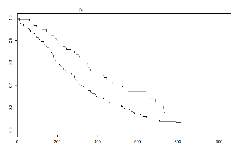
Plot of sfit (Kalpan-Meier Estimator)
- Let's plot using ggsurvplot, which will beautify the plot:
> ggsurvplot(sfit)

- Add the label for gender and the risk table:
        > ggsurvplot(sfit, risk.table = TRUE, legend.labs=c("Male",
        "Female"))

Survival plot with risk table.
- In the same way, we can see the other options instead of gender. The following shows the survival rate by institute:
> ggsurvplot(survfit(Surv(time, status)~inst, data=cancer))
