
Perform the following steps to explore and visualize data:
- First, you can use a bar plot and histogram to generate descriptive statistics for each attribute, starting with Ozone. The following code gives us a bar plot for Ozone Observations:
        > barplot(table(mydata$Ozone), main="Ozone Observations",
        xlab="O bservations", ylab="Frequency")

Ozone observation
- We can generate the bar plot of Temp using the following code:
        > barplot(table(mydata$Temp), main="Temperature Observations",
        xlab="Temprature", ylab="Frequency")

Temperature observation
- In the same way you can generate bar plots for other attributes.
- We then plot the histogram of the different Temp with the hist function:
> hist(mydata$Temp, main="Temperature", xlab = " Temperature ")

Temperature observation
- The histogram will select appropriate bins, but it can be changed using the breaks arguments:
        > hist(mydata$Temp,  main="Temperature", xlab = " Temperature ",
        breaks= 5)

Temperature observation using breaks
- Instead of printing using density, you can also use relative frequency using the prob argument:
        > hist(mydata$Temp,  main="Temperature", xlab = " Temperature ",
        prob=TRUE)

Temperature observation using breaks
- Use the summary function, on the Temp attribute:
> summary(mydata)
Output
 Ozone Solar.R Wind Temp Month
 Min. : 1.00 Min. : 7.0 Min. : 1.700 Min. :56.00 Min. :5.000
 1st Qu.: 21.00 1st Qu.:120.0 1st Qu.: 7.400 1st Qu.:72.00 1st Qu.:6.000
 Median : 23.00 Median :215.0 Median : 9.700 Median :79.00 Median :7.000
 Mean : 47.65 Mean :189.3 Mean : 9.958 Mean :77.88 Mean :6.993
 3rd Qu.: 52.00 3rd Qu.:259.0 3rd Qu.:11.500 3rd Qu.:85.00 3rd Qu.:8.000
 Max. :259.00 Max. :334.0 Max. :20.700 Max. :97.00 Max. :9.000
 Day
 Min. : 1.0
 1st Qu.: 8.0
 Median :16.0
 Mean :15.8
 3rd Qu.:23.0
 Max. :31.0

> boxplot(mydata)
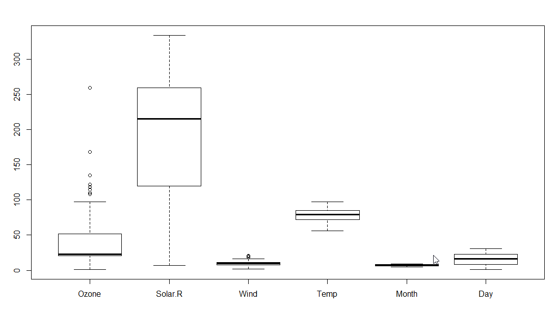
Boxplot for mydata
- A box plot can also be generated for only one attribute:
> summary(mydata$Temp)
 Min. 1st Qu. Median Mean 3rd Qu. Max.
 56.00 72.00 79.00 77.88 85.00 97.00
> boxplot(mydata$Temp)
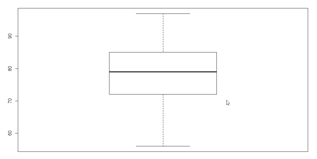
Box plot for temperature
- To print the box plot for every month and temperature, use the following:
        > boxplot(mydata$Temp ~ mydata$Month, main="Month Wise
        Temperature",
        xlab="Month", ylab="Temperature")

Box plot of temperature and months
Before we start predicting the values we need to find the relationship between attributes. Perform the following command to plot the Temp versus all other attributes and it will display different scatter plots one by one. A total of four plots will be generated:
        > plot(mydata$Temp ~ mydata$Day + mydata$Solar.R + mydata$Wind +
        mydata$Ozone, col="blue")

Scatter plot of temperature and Day
On the console it will display the following:
Hit <Return> to see next plot:
Press enter and second plot will be displayed

Scatter plot of temperature and Solar.R
On the console it will display the following:
Hit <Return> to see next plot:
Press enter and third plot will be displayed

Scatter plot of temperature and Wind
On the console it will display the following:
Hit <Return> to see next plot:
Press enter and fourth plot will be displayed

Scatter plot of temperature and Ozone
From the scatter plot we can see that there is a linear relationship between temperature and all other attributes except wind. Wind holds a negative relationship with temperature.