
Chapter 4
Editing Graphics
In This Chapter
![]() Introducing Gimp
Introducing Gimp
![]() Managing the main tools
Managing the main tools
![]() Selecting image elements
Selecting image elements
![]() Working with layers
Working with layers
![]() Understanding filters
Understanding filters
![]() Creating a tiling background
Creating a tiling background
![]() Building banner images
Building banner images
HTML and CSS are powerful tools, but sometimes you still need to use a graphics editor to get the look you want. In this chapter, you learn to use Gimp, a free and powerful graphic editor.
Using a Graphics Editor
You'll find using a graphics editor handy for a number of tasks:
- Modifying an image: The obvious use of a graphical tool is to modify or create an image that will be used on your web page. This could involve changing the image size, correcting the color balance, changing the file type, or cropping the image.
- Preparing a background image: As I discuss in Book II, Chapter 4, background images can be distracting if you aren't careful. Making a lower contrast image (either lighter or darker than normal) might make sense so the text is easier to read. You might also want to prepare a tiled background.
- Building banners: Many websites include a special banner image that's prominent on every page. The banner image usually has a very specific size requirement.
- Modifying existing graphics: You might be modifying a template from the jQuery UI project (see Book VII, Chapter 4) or from a CMS (see Chapter 3 in this minibook). In both cases, you often have images that are close to, but not exactly, what you need.
- Changing colors: Frequently, you have the right pattern, but not the right colors. Modifying colors with a modern graphical tool is surprisingly easy.
Choosing an Editor
Fortunately, great programs that make all these tasks quite easy to perform are available. Raster-based graphics editors are designed to solve exactly this type of problem and many more. A number of important graphics tools are used in web development:
- Adobe Photoshop: The industry standard for web graphics, and indeed for all digital imagery, Photoshop is powerful and capable but quite expensive. A slightly cheaper and less powerful version called Adobe Photoshop Elements is available.
- Adobe Fireworks: Designed specifically for web developers, Fireworks features the ability to slice an image to make a graphical web page from an image — and it's relatively inexpensive.
- Windows Paint: This simple image editor is available in all versions of Microsoft Windows. Although easy to use and already available to Windows users, Paint is relatively limited. It only supports a few image formats and doesn't have full support for transparent images or layers.
- Paint.net: A group of computer science students decided to create an improvement to Microsoft Paint that evolved into a very robust image-editing program. It is free (although, technically, not open source) and has all the features you might need for editing web images. However, the primary version is available only for Windows.
- Gimp: A popular alternative to Photoshop, Gimp has all the features you might need for web image editing. It is completely free, open source, and available for all major operating systems. For these reasons, I use Gimp throughout this chapter (and indeed throughout the book — nearly every graphic was created using Gimp).
 People are passionate about their graphics programs. If you love Photoshop, you might find the Gimp interface strange and unfamiliar. I think learning how Gimp works is worth the time, but if you prefer, you can download GimpShop, a version of Gimp modified to use the same menus and keyboard shortcuts as Photoshop.
Note that in this list I'm only considering full-blown graphics editors. I describe image manipulation programs, such as IrfanView (which is simpler and has fewer features), in Book II, Chapter 4.
I'm also confining the conversation to raster-based image editors, which use a different mechanism for managing images than vector-based image editors. The vector-based approach is slowly gaining popularity on the web, especially with the support for SVG in HTML5. However, most web graphics are in a raster format, even those that were originally created in a vector format. If you are interested in playing with vector graphics, I recommend looking into the excellent free program Inkscape. It has native support for SVG, which is the most universal vector standard for web browsers.
Introducing Gimp
If you haven't already installed Gimp, get a recent copy from this book's website or www.gimp.org. Install the program and take a look at it. The Gimp interface's multiple windows are shown in Figure 4-1.

Figure 4-1: Gimp uses a multiple window model.
I have the Change Foreground Color dialog open in Figure 4-1, and I simply double-clicked the foreground color in the main toolbox to open this dialog. Gimp tends to open a lot of dialogs, which might bother some people. Also, I want to illustrate how powerful the color chooser is. Like most features in Gimp, it has a lot of options.
The Toolbox is Gimp's main control panel. It manages all the tools you use to create images. Gimp also creates an image window, which contains the menu elements, but no image (by default). You can load an image into the image window or create a new image.
Creating an image
You choose the File ⇒ New menu command to create a new image. After you specify the size of your image, a new, blank image appears, as shown in Figure 4-2.
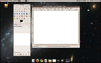
Figure 4-2: It's easy to create a new, blank image.
Of course, you can also load an existing image into Gimp. Gimp accepts all major image formats (and dozens more with optional plug-ins). Use the File ⇒ Open menu command to open an image, or simply drag an image file onto the Gimp Toolbox.
Painting tools
Gimp includes a number of useful tools to create or modify an image. Figure 4-3 shows a few of these tools.

Figure 4-3: These tools are used to draw or modify an image.
- Pencil: The Pencil tool is the standard drawing tool. It draws hard edges in the exact shape of the pen. You can choose from many pen shapes in the Tool Options panel (described in the next section).
- Paintbrush: The Paintbrush tool is similar to the Pencil tool, but it uses a technique called anti-aliasing to make smoother edges. Like the Pencil tool, the Brush tool can use many different pen shapes.
- Eraser: The Eraser tool is used to remove color from a drawing. If the current layer has transparency enabled, the Eraser tool makes things transparent. If transparency is not turned on, the Eraser tool “draws” in the background color.
- Airbrush: The Airbrush tool allows you to paint with a virtual airbrush. You can modify the flow and size of the paint. This tool is especially effective with a pressure-sensitive drawing tablet.
- Ink: The Ink tool simulates a calligraphy brush. The speed of drawing indicates the width of the stroke. It seems quite realistic because everything I draw with it looks just as bad as what I create when I try real calligraphy.
- Clone: The powerful Clone tool allows you to grab content from one part of an image and copy it to another part of the image. This tool is often used in photo retouching to remove scars and blemishes.
- Fill: The Fill tool is used to fill an area with a color or pattern. It has multiple options that allow you to pick the pattern, the color, and the method of filling. (You can fill the current selection or all areas with the same color, for example.)
- Blend: This Blend tool allows you to fill an area with color patterns, similar to the Fill tool. There are numerous options that allow you to determine what pattern is used and how it is distributed. (Many programs call this the Gradient tool.)
A complex program like Gimp deserves (and has) entire books written about it. There's no way I can describe everything in this brief introductory chapter. Still, this should give you an indication of what you can do. Check the many excellent user tutorials at www.gimp.org/tutorials and the manual at www.gimp.org/docs.
Selection tools
Often, you'll be working on specific parts of an image. It's critical to have tools to help you grab a particular part of an image and work with it in isolation. Gimp (like any high-quality graphics tool) has a number of useful selection tools. Figure 4-4 shows where they are in the Toolbox.

Figure 4-4: These tools are used for selecting parts of an image.
- Rectangle Select: The Rectangle Select tool is used to (wait for it . . .) select rectangles. Rectangle selections are easy, and they're pretty common, so this is a good, basic selection tool.
- Ellipse Select: The Ellipse Select tool is like the Rectangle Select tool, but (you're catching on here) it selects ellipses. You can set the aspect ratio to 1:1 to select perfect circles.
- Free Select: Also called the Lasso tool, the Free Select tool allows you to draw a selection by hand. It takes an incredibly steady hand to use well, so it's usually only used for rough selections that are fine-tuned using other techniques.
- Magic Select: Also called the Fuzzy Select, the Magic Wand tool allows you to grab contiguous sections of similar colors. It's handy when you have a large section of a single color that you want to select. (You might want to select a white background and replace it with a pattern, for example.) Hold down the Shift key and make further selections if you want to select more than one color.
- Select by Color: Similar to the Fuzzy Select tool, the Select by Color tool grabs all the pixels of a chosen color, whether they're touching the selected pixel or not, and removes them. (It's ideal for use with a green screen, for example.)
- Scissors Select: The Scissors Select tool uses image-processing techniques to automatically select part of an image. Click along the edge of an element you want to select, and (if you're lucky) the selection will follow the edge. This works fine for high-contrast elements, but conditions have to be perfect.
- Foreground Select: The Foreground Select tool is a multipass tool that simplifies pulling part of an image from the rest. On the first pass, use the Lasso tool to choose the general part of the image you want to select. The image will show a selection mask with selected parts in white and nonselected parts blue. Click the colors you want to keep and then press Enter to commit the selection.
- Bezier Select: The Bezier Select tool is my favorite. Click an image to create a general outline of the selection. (You're actually making a Bezier path, which uses math formulas to draw a curved shape.) Modify the path until it's exactly how you want it and then you can convert it to a selection.
Modification tools
A number of tools are used to modify parts of an image. Figure 4-5 illustrates the main modification tools:
- Move: This tool allows you to move a selection, a layer, or some other element.
- Rotate, Scale, Shear, Perspective, and Flip: These tools all apply transformations to a selection. Use them to rotate or resize a part of your image, or to change the perspective of a section so it appears to be on an angled surface, for example.
- Heal: This tool takes a sample area and applies it to other parts of an image (much like the Clone tool). It is often used in photo retouching to give skin a clean, unblemished look. It's great for fixing the rectangular artifacts that often appear in JPG images.
- Blur/Sharpen: This tool is used to blur (reduce contrast) or sharpen (increase contrast) a small part of the image selectively with the current pen. This tool is often used for quick touch-ups to remove scratches or other blemishes.
- Smudge: This allows you to push a color into adjacent pixels to clean up an image. I frequently use this tool when trying to build a tiled background to help line pixels up in a seamless way.
- Dodge/Burn: This tool is named after a photography darkroom tool. It's used to darken or lighten parts of an image and to remove unwanted shadows.
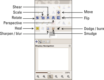
Figure 4-5: These tools modify the existing picture.
Managing tool options
Most tools have options available. For example, when you choose the Pencil or Brush tool, you can select which brush tip to use. When you use the Fill tool, you can determine whether the tool fills with the current color or the current selection. You can also determine whether the tool fills with a color or a pattern.
You can see the Tool Options dialog box for any tool by double-clicking the tool in the Toolbox. Generally, I dock the Tool Options dialog box to the main Toolbox tabs because it's so frequently used.
Utilities
Gimp also comes with a number of handy utilities. The tools highlighted in Figure 4-6 have a variety of uses:
- Color Selector: The two overlapping rectangles show the current foreground and background color. Click one of the rectangles to pick a new color to work with. You can choose colors in a number of ways, using RGB and HSV schemes, as well as prefilled color palettes and a very cool watercolor tool.
- Color Picker: Allows you to determine the RGB value of any pixel on the image and pick that color as the current drawing color. It's very handy when you want to match colors precisely.
- Zoom: Allows you to quickly zoom in and out of your image. Drag around an area, and the selected area will fill the entire window. Hold down the Ctrl key while dragging to zoom out. Hold the center mouse button (often also the scroll wheel) to pan your zoomed-in view in any direction. It's very helpful to zoom in close when you're doing detail work.
- Measure: Drag the mouse on an image, and you can find the distance and angle between any two points. The Move tool is useful for precise placement.
- Move: Allows you to move a selection or layer.
- Align: The Align tool simplifies lining up various elements with each other.
- Crop: Used to crop unwanted border areas from an image.
- Text: Adds editable text to the image. The Text tool works with layers, so check the upcoming “Understanding Layers” section for more detail.
- Perspective Clone: This tool combines the Perspective tool and the Clone tool. Although it's cool, the applications are a bit rare, so I don't use it often in web development.

Figure 4-6: These tools often come in handy.
Understanding Layers
Gimp has an astonishing variety of tools, but most of the interesting things you can do with a raster graphics tool involve a concept called layers. Layers are really pretty simple: Imagine the old animated movies (before digital animation was possible). Painters would create a large background, but the characters were drawn on transparent sheets (called cels in animation). A single frame of an animation might contain a single opaque background with a large number of mainly transparent layers on top. Each layer could be manipulated individually, providing a great deal of flexibility.
Any high-end graphics editor will support some form of layer mechanism. (In fact, support for layers is a primary differentiator between basic and advanced graphics tools.) Figure 4-7 shows the Layers panel in Gimp.

Figure 4-7: The Layers panel allows you to manipulate layers.
The primary area of the Layers panel is the window, showing a stack of layers. The background is on the bottom of the stack, and any other layers are on top. Anything on an upper layer obscures a lower layer. Imagine a camera at the top of the stack pointing down at the stack of layers. If a higher layer has transparency (as it usually does) the lower layer will show through any transparent pixels.
The Opacity slider in the Layers panel allows you to adjust the overall transparency of the layer. This can be useful for quickly lightening or darkening a layer, and for other effects, such as shadows.
Only one layer is active at a time. The current layer is highlighted in the window at the bottom of the Layers panel. Most operations will occur on the active layer only. Click a layer in the layers window to make that layer active.
 Be sure you know which layer is active. Many times I try to draw on a layer and nothing happens. I then typically scribble harder, thinking that will help. Almost always when this happens, I've selected the wrong layer and made a big mess somewhere. It's possible (and common) to have a layer active which is not visible. Fortunately, the Undo command (Ctrl+Z) is quite powerful. If in doubt, keep the Layers panel visible so you can tell which layer is active.
Each layer has two icons next to it that you can activate. The eye icon toggles the layer's visibility. The link icon allows you to link two or more layers together. Each layer also has a name. You can double-click the layer name to change it. This is especially useful when you have a complex image with many layers.
The bottom of the Layers panel has the following buttons to help you manage various layers:
- New Layer: This button creates a new layer. The default type is transparent, but you can also choose to have the layer appear in the foreground or background color.
- Up and down buttons: Allow you to move a layer up or down in the stack. The position of a layer in the stack is important because higher layers have precedence.
- Duplicate Layer: Makes a copy of the currently active layer. If you're modifying a layer, working on a duplicate is a great idea because if you mess up, you still have a backup.
- Anchor: When you copy and paste a part of an image, the pasted segment is placed into a temporary layer. Use the anchor button to nail down the selection to the current layer.
- Delete: Allows you to delete the currently active layer. Be careful you delete the correct layer.
Introducing Filters
Digital editors include a number of other very useful tools. Generally, these tools apply mathematical filters to an image to change the image in some way. The standard installation of Gimp comes with dozens of filters, but here are a few most common to web developers:
- Blur filters: Blur filters reduce the contrast between adjacent pixels to make the image less defined, and can often be used to hide imperfections or scratches. The most common blur is Gaussian blur, but there are many others, including Motion blur, which simulates the blur seen in a slow camera taking a picture of something moving quickly.
- Unsharp mask: A class of filters called sharpen filters are the opposite of blur filters. They increase contrast between adjacent pixels. I don't know why the sharpen filter is called the “Unsharp mask,” but it is. Note: There is no “enhance” filter like the ones so common on crime dramas. Sadly, you can't just “zoom and enhance” endlessly to see the killer's eye color on the reflection of a spoon.
- Colorize: This marvelous tool allows you to keep the contrast of a layer and change the color, which can be perfect for changing the color of hair, eyes, or clothing.
- Brightness/Contrast: Lets you adjust the brightness (overall value) and contrast of a particular layer.
- Color balance: Allows you to adjust the relative amounts of red, green, and blue in a layer, which can be used to improve pictures with poor lighting.
Solving Common Web Graphics Problems
Gimp, and tools like it, can be used in many ways. The rest of this chapter is a cookbook of sorts, showing how to build a number of graphics commonly used in web development.
Changing a color
Frequently, you'll have an image that's good, but not the right color. For example, you may want to change the color of a person's clothing, or make part of a logo fit the color scheme of the rest of your site. Gimp makes performing this effect quite easy:
- Load your starting image into Gimp and make any other adaptations you wish to the original image.
- Use the Fuzzy Select tool to select the part you want to modify.
You might need to use the Shift key to add several variants of the color to the selection.
- Use the Copy command (Ctrl+C) to copy the section of the image you just selected.
- Use the Paste command (Ctrl+V) to paste the selected area into a new layer.
The pasted area goes into a new “pseudo-layer” by default. In the Layers panel you'll see a layer called Floating Selection – Pasted Layer. Click the New Layer button and you'll create a new layer containing only the section you need.
- Colorize the new layer by applying the Colorize filter (Colors ⇒ Colorize).
Play with the color sliders until you get the color you want. Because you made the changes on a new layer, you can always remove or hide the layer to return to the original. (Or have several different color layers so you can play with various options.)
Figure 4-8 shows an example of this technique using an image of a glass of orange juice by Graur Razvan Ionut I found at FreeDigitalPhotos.net. The original image contained only the picture of orange juice, but I duplicated the juice glass and changed the color of the second glass to look like coffee. Of course you'll need to see this effect online at the companion website because the color change will not be apparent in this black-and-white book. See the book's Introduction for more on the companion site.

Figure 4-8: You can use the Colorize filter to change orange juice into coffee.
Building a banner graphic
Nearly every commercial website has a banner graphic — a special graphic, usually with a set size (900×100 is common), that appears on every page. Normally, if you're modifying a CSS template, you have a default banner graphic. You'll want to copy this graphic in order to start with the right size and shape.
You can build a banner many ways, but here's a simple technique you can modify (Figure 4-9 shows the banner's progression):
- Load or create the basic shape.
If you have a starting graphic to use, load it into Gimp. If not, create a new image of the size you need. Mine is 100 pixels tall by 900 pixels wide.
- Create a plasma background.
Use the Plasma filter (Filters ⇒ Render ⇒ Clouds ⇒ Plasma) to create a semi-random pattern. Use the New Seed and Turbulence buttons to change the overall feel. Don't worry about the colors; you remove them in the next step.
- After the plasma background is in place, use the Colorize filter to apply a color to the background.
Pick a color consistent with your theme. For this example, go for a lighter color because you're using shadows, which require a light background. Use the Lightness slider to make a relatively light color. (I'm going for a cloudy sky look, so I set Hue to 215, Saturation to 100, and Lightness to 75.)
- Create a text layer using the Text tool.
Text in a graphic should be large and bold. The Text tool automatically creates a new layer. After you type your text, specify the font and size.
- Duplicate the text layer.
In the Layers panel, make a copy of the text layer. Select the lower of the two text layers (which will become a shadow).
- Blur the shadow.
With the shadow layer selected, apply the Gaussian blur (Filters ⇒ Blur ⇒ Gaussian Blur).
- Move the shadow.
Use the Move tool to move the relative positions of the text and the shadow. Typically, users expect a shadow to be slightly lower and right of the text (simulating light coming from the top left). The farther the shadow is from the text, the higher the text appears to be floating.
- Make the shadow semitransparent.
With the shadow layer still selected, adjust the Opacity slider to about 50 percent. This will make the shadows less pronounced and allow part of the background to appear through the shadow layer.
- Season to taste; make additions based on your needs.
For example, one client wanted a picture of his sign to appear on the banner. I took a photo of the sign, brought it in as a layer, cleaned it up, and rotated and scaled the image until it fit in place.
- Save in a reusable format.
The native format for images in Gimp is XCF. (I have no clue what XCF stands for, but every time I try to make up an acronym, it comes out dirty. There must be something wrong with me.) XCF stores everything — layers, settings, and all. If you need to modify the banner later (and you will), you'll have a good version to work from.
Choose File ⇒ Save As to save the file. If you specify the .xcf extension, Gimp automatically saves in the full format.
- Export to a web-friendly format.
Generally, I save banner graphics as PNG or GIF files. (Gimp supports both formats.) I prefer PNG unless the bottom layer has transparency (because some browsers still don't support the advanced transparency features of the PNG format). Do not save images containing text in JPG format. The JPG compression scheme is notorious for adding artifacts to text.

Figure 4-9: The steps for building a banner.
Normally, when you save to another format, a dialog box of options appears. If in doubt, go with the default values.
Figure 4-10 shows the final banner image. I included the XCF and PNG files on the website. Feel free to open my files in Gimp and experiment.

Figure 4-10: This is a simple but reasonably cool banner.
Building a tiled background
Often, you want a background image to cover the entire page. This can be harder than it seems because you don't know how large the page will be in the user's browser. Worse, large images can take a huge amount of space and slow down the user's experience. The common solution is to use a tiled image that's designed to repeat in the background. Gimp has some very useful tools for building tiled images.
Recall that the background-repeat CSS property allows you to specify how a background repeats. The default setting repeats the background infinitely in both the X and Y axes. You can also set the background to repeat horizontally (repeat-x), vertically (repeat-y), or not at all (no-repeat).
The goal of a tiled background is to make a relatively small graphic fill the entire page and look like a larger image. The secret is to create the image so it's difficult to see where the image repeats. Here's one way to make a tiled background in Gimp (Figure 4-11 shows the background's progression). Of course, you can adapt this technique for your own purposes.

Figure 4-11: Building a tiled background image.
- Create a new image.
The size of your image is important. Smaller images are much more efficient to download, but the pattern is much more obvious. Start with 256 by 256 pixels.
- Build a random pattern.
You can use the Plasma filter technique described in the previous section or try a similar technique by choosing Filters ⇒ Render ⇒ Clouds ⇒ Difference Clouds. The Difference Clouds filter creates a grayscale image but with a number of interesting options. The Tileable option creates a pattern that's ready to tile. Play with these options until you get something interesting.
- Adjust the contrast.
For the best effect, you want a relatively even distribution of values from light to dark. The easiest way to do this is through the automatic normalization tool (Colors ⇒ Auto ⇒ Normalize).
- Pick a gradient.
You'll add colors to your pattern using a technique called gradient mapping. Use the Gradient dialog box (Windows ⇒ Dockable Dialogs ⇒ Gradients) to pick a gradient. Darker colors on your image map to colors on the left of the gradient, and lighter colors map to the left. You can adjust colors, so don't worry if the colors aren't exactly what you want. (If you want, you can make your own gradient with the gradient editor by clicking the Gradient dialog box's New Gradient button.)
- Use the Gradient Map tool (Colors ⇒ Map ⇒ Gradient Map) to map the colors of the gradient to your cloud pattern.
- Offset the image to check for tiling.
The easiest way to see whether the image tiles well is to offset the image. This puts the edges in the center so you can see how the image will look when multiple copies are next to each other. Open the Offset dialog by choosing Layer ⇒ Transform ⇒ Offset. The Offset dialog has a handy x/2, y/2 button. Click the button to see how your image looks.
- Clean the image if necessary.
If you chose the Tileable option when you built the cloud image, the new image will look fine. If not, you may have some visible seams. Use the Smudge and Clone tools to clean up these seams if necessary. Apply the Offset tool a second time to check whether your seams look good.
- Apply filters to get the effect you want.
You may want to colorize your image or blur it a bit to cover any artifacts of your cleanup. Remember that background images should be extremely dark or extremely light with very low contrast if you want readable text.
- Test the image by saving the image in XCF format and a web-friendly format (like PNG), build a simple page using the image as a background, and load the page into your browser to ensure it tiles the way you expect.
Figure 4-12 shows a sample page containing my tiled image as the background.

Figure 4-12: This page features my new tiled background.