
Chapter 7
Going Mobile
In This Chapter
 Improving mobile accessibility
Using media queries to build responsive designs
Working with the jQuery mobile library
Building mobile-friendly interfaces
Adding collapsible interface elements
Building multi-page applications with jQuery mobile
Turning mobile pages into iOS apps
Mobile devices are no longer becoming mainstream. They are mainstream. Although people are still using traditional desktop devices to view the web, mobile devices are more prevalent and important than ever. For the most part, you can treat mobile devices like ordinary web browsers, but they do have a few special considerations and tricks. In this chapter you learn how to be sensitive to the needs of mobile users, and how to do some really cool tricks to make a mobile site really stand out.
Thinking in Mobile
A few years back, mobile programming was completely different than ordinary programming. You had to learn entirely different languages and visual toolsets. Although you can still program in native mobile languages, much of what people want to do with mobile devices can be done in HTML5 with CSS and JavaScript. In fact, this was one of the major drivers of HTML5 and CSS3 — making the web more mobile-friendly.
Virtually all mobile devices now ship with an HTML5-compliant browser, so just by learning HTML5, you're well on your way to mobile development. Any of the pages or programs in this book should work fine on a mobile client. (I tested all on an iPad and an Android phone.)
However, there are a few easy things you can do to improve the browsing experience for those who visit your site on a tablet or mobile phone:
- Make text bigger: Tablets and phones tend to have smaller screens with lower resolution. If your font size is tiny on an ordinary screen, it will but unreadable on a phone. Consider using a larger font size if you expect mobile users.
- Make the user interface larger: It's also a great idea to make buttons larger because they will need to be pressed by thick fingers rather than a tiny mouse. If you're using check boxes or radio buttons, be sure to use a related label to make the target larger. See the section “Using jQuery Mobile to Build Mobile Interfaces” later in this chapter for some great ways to improve your interface with a special version of jQuery UI specifically designed for mobile devices.
- Consider turning off “helpful” features: Many phones and tablets come with tools to automatically capitalize input and to autocorrect misspellings. You can turn these elements off by adding these attributes to an input element:
<input type = "text" autocorrect = "off" autocapitalize = "off">
Think carefully about each input to ensure you've got the best option. For example, a Last Name field would benefit from autocapitalize, but not autocorrect.
- Use specialty input elements: HTML5 includes some excellent new input types. Many of them were designed with mobile keyboards in mind. For example, the <input type = “url”> field creates an ordinary-looking textbox, but on many mobile devices, it pops up a custom keyboard containing the special characters normally seen in a web address ( / and : are more prominent, for example). Likewise, the <input type = “email”> pops up a keyboard that includes the @ sign. Many of the other input elements (date, color, and time) pop up specialty elements designed to work well without a keyboard. Any browser that cannot use these special input types will revert to a standard text input, so this is a very safe tool to use.
- Avoid the : hover state: CSS3 gives nearly every element a : hover state, which is activated when the mouse is hovered over an element but has not been clicked. Touch screens don't have a hover state! Most touch screen events feel just like mouse input, but there's no easy way for a touch screen to replicate the : hover state. It's fine to use this for special effects, but don't make it a major part of your page design if you intend your project to be used by mobile users.
- Build with responsive CSS: Much of the time you can build a page once and have it work pretty well on all browsers, but sometimes you really need something different for different browser sizes and capabilities. This is where media queries come in. Essentially, they allow you to apply special rules based on the current screen size (typically the most important variable). Please see the next section, “Building a Responsive Site,” to get a feel for how to target specific screen sizes.
- Add a viewport indicator: The default behavior for many mobile devices is to simply display the standard page on the smaller screen. Although this can work, it is often difficult to make the screen readable for all screen sizes. If you create a customized layout as described in this chapter, you can set the default behavior of the screen to respond to your improved layout:
<meta name="viewport" content="width=device-width, user
-scalable=false;">
Building a Responsive Site
One way to make a site work well on multiple resolutions is to provide different CSS rules based on the detected media type.
CSS3 has a marvelous new feature called the media query, which allows you to specify a media type and determine various features of the display. You can use this specification to build a subset of the CSS that should be used when the browser detects a certain type or size of display.
Specifying a media type
The @media rule allows you to specify what type of output the included CSS should modify. The most common media types are screen, print, speech, handheld, projection, and tv. There are more, but only print and screen are universally supported.
For example, the following code will specify the font size when the user prints the document:
@media print {
body {
font-size: 10pt;
}
}
This CSS can be embedded into a normal CSS document, but it should typically be placed at the end of the document because it holds exceptions to the normal rules. You can place as much CSS code as you wish inside the @media element, but you should only put CSS code that's relevant to the specific situation you're interested in. For print output, for example, I might turn off all the colors to save ink, and I might use points (pt) for the character size, as points actually have meaning in printed output.
Adding a qualifier
In addition to specifying the media type, the @media rule has another very powerful trick. You can apply a special qualifying condition to the media. For example, look at Figure 7-1.

Figure 7-1: When the page is wider than 500 pixels, it shows black text on a white background.
When the browser is wider than 500 pixels, you can see black text on a white background. But make the screen narrower, and you see something interesting, as shown in Figure 7-2.

Figure 7-2: When the screen is narrower, the colors change!
Normally you would use this trick to change the layout, but start with this simpler color-changing example. I show how to change the layout in the “Making Your Page Responsive” section later in this chapter. Here's the code for this simpler example:
<!doctype html>
<html lang="en">
<head>
<title>narrowBlack.html</title>
<meta charset="UTF-8">
<meta name="viewport" content="width=device-width, user-scalable=false;">
<style type = "text/css">
body {
color: black;
background-color: white;
}
@media (max-width: 500px){
body {
color: white;
background-color: black;
}
}
</style>
</head>
<body>
<h1>Qualifier Demo</h1>
<p>
Try resizing this page. When the page is
wider than 500 pixels, it shows black text on a
white background.
</p>
<p>
When the page is narrower than 500 pixels, the colors
reverse, giving white text on a black background.
</p>
</body>
</html>
Here's how to build a page that adapts to the screen width:
- Build your site as usual.
This is one place where that whole “separate content from layout” thing really pays off. The same HTML will have two different styles.
- Apply a CSS style in the normal way.
Build your standard style in the normal way — for now, embed the style in the page with the <style> tag. Your main style should handle the most common case. (Typically, a full-size desktop.)
- Build a @media rule.
The @media CSS rule should go at the end of the normal CSS.
- Set a max-width: 500px qualifier.
This qualifier indicates that the rules inside this segment will only be used if the width of the screen is smaller than 500 pixels.
- Place special case rules inside the new style set.
Any CSS rules you define inside the @media rule will be activated if the qualifier is true. Use these rules to override the existing CSS. Note you don't have to redefine everything. Just supply rules that make sense in your particular context. In this (trivial) example, I'm swapping the color of the foreground and background, but you can do more interesting things here, as you see in the “Making Your Page Responsive” section later in this chapter.
- Add a viewport.
Mobile browsers will sometimes try to rescale the page so it can all be seen at once. This defeats the purpose of a special style, so use the viewport metatag to indicate that the browser should report its true width. It's also often useful to turn off page-scaling because it should no longer be necessary.
In this example, the browser always applies the main (black text on a white background) style. Then it looks at the @media rule to see if the qualifier is true. If the width is less than 500 pixels, the max-width:500px qualifier is evaluated to true, and all the CSS code inside the @media segment is enabled. The browser then stores both sets of CSS and applies the correct CSS based on the status of the rule.
Making Your Page Responsive
The most common use of the media query is to make dramatic changes in the page layout when a smaller screen is encountered. The screen layouts described throughout Book III are already somewhat sensitive to different screen sizes, but true responsive design goes a step farther by recognizing that the entire layout may need to be changed (not just shrunk) in certain circumstances.
As an example, take a look at the page in Figure 7-3.

Figure 7-3: This is a standard two-column page.
When viewed on a normal desktop display, it shows a two-column design, which is a standard design for traditional monitors. However, take a look at the same exact page when viewed on a smaller display (like the ones you would encounter on a mobile phone). Figure 7-4 shows the smaller page.

Figure 7-4: The same page is now in a single column.
Multiple-column layouts may look great on the desktop (especially with the proliferation of widescreen monitors), but they can be very frustrating to users with narrow browsers. This page detects when the browser is too narrow to display columns, and automatically switches to a single-column display. It also steps up the overall font size to compensate for the generally weaker resolution of mobile screens, and could do more (resizing buttons, for example, to make them easier to hit with fingers).
If the browser is resized again to a larger size, it will revert to the two-column view.
The responsive technique is not difficult to achieve at all. Begin (as always) by looking over the HTML code.
<!doctype html>
<html lang="en">
<head>
<title>responsive.html</title>
<meta charset="UTF-8">
<link rel = "stylesheet"
type = "text/css"
href = "responsiveWide.css" />
<link rel = "stylesheet"
type = "text/css"
href = "responsiveNarrow.css" />
<meta name="viewport" content="width=device-width, initial-scale=1.0">
</head>
<body>
<div id="all">
<header>
<h1>Responsive Layout Demo</h1>
</header>
<nav>
<ul>
<li>one</li>
<li>two</li>
<li>three</li>
<li>four</li>
<li>five</li>
</ul>
</nav>
<div id="content">
<p>
Try this page on different sizes of screens.
</p>
<p>
On wider browsers, it will have a two-column layout.
On a smaller screen (like a phone,) it will revert
to a single-column format better for mobile browsers.
</p>
</div>
<footer>
This is my footer
</footer>
</div>
</body>
</html>
Really, the remarkable thing about this HTML is how unremarkable it is. There's absolutely nothing in the HTML to indicate it will do something special when the page resizes. I do call two separate CSS files (although I could have used just one, I think it's nice to separate the rules).
As you look over the HTML, it seems pretty standard for an HTML5-based two-column layout. I used native HTML5 elements when I could, and named divs for features that don't have an HTML5 semantic tag.
The one new element is the meta viewport attribute in the header. Some mobile browsers automatically zoom into a smaller screen size, and some act like larger browsers and make you zoom in by yourself. If you want the browser to show the smaller size by default, add the meta viewport attribute in the document header. This is especially useful for iOS devices.
<meta name="viewport" content="width=device-width, initial-scale=1.0">
Building the wide layout
If you look over the first CSS file for the responsive example, it will look very much like the kind of two-column design described in Book III. Here's the code for responsiveWide.css:
body {
background-color: red;
}
#all {
background-color: white;
width: 600px;
margin-left: auto;
margin-right: auto;
}
header {
text-align: center;
}
nav {
background-color: green;
float: left;
width: 150px;
color: white;
height: 400px;
}
#content {
background-color: yellow;
float: left;
width: 440px;
height: 400px;
padding-left: 10px;
}
footer {
color: white;
background-color: gray;
clear: both;
text-align: center;
}
Once again, there's absolutely nothing in this code that would indicate anything special is going on. It looks just like the CSS you saw in Book II. That's again a big part of the beauty of responsive design. Build for the base case just like you always do. In this case, I'm building a jello layout with a fixed 600-pixel layout floating in a larger screen. As long as the browser is wider than 600 pixels, the layout will float in the center of the screen. As is typical for this type of layout, I've specified heights for the main containers ( nav and #contents ) to make everything look good.
 For the sake of visual clarity, I changed the background and foreground colors so the size and position of each element would be obvious, even in a black-and-white screen shot. Obviously these garish color values will need to be changed in production. I don't know, though. I'm kind of liking garish.
Adding the narrow CSS
The second CSS file is where the magic (such as it is) happens. It is also a standard CSS file, except:
- The entire file is enclosed in a media query: This second file is entirely based on the exceptions for a smaller browser.
- Trap for a screen less than 600 pixels wide: Since the standard view expects the screen to be larger than 600 pixels, I will trap for any screen narrower than 600 pixels. ( You can try to trap for the size of the typical smart phone, but this is a moving target, as there are too many devices on the market to be certain what the width will be. I simply go for what makes most sense for my design.)
- Overwrite any style rules that need to be changed: If the screen is narrower than 600 pixels, I no longer want a jello layout. Instead, I want the page to be in a single column taking up most of the screen width. I also want to slightly increase the overall text size. Only change the CSS necessary to make your page adapt to the narrower screen.
Here's the code for the responsiveNarrow.css file:
@media (max-width: 600px) {
/*special instructions for narrower screens */
#all {
display: block;
width: 90%;
font-size: 125%;
}
nav {
display: block;
width: 100%;
height: auto;
}
#content{
display: block;
width: 95%;
height: auto;
padding-left: 5%;
}
footer {
display: block;
width: 100%;
}
}
The specific rule changes simply override the style rules defined in responsiveWide.css.
- Set the all div to take up 90 percent of the screen width.
The #all div was set to 600 pixels wide in the main CSS, but here I'm overriding the width to be percentage-based, and to take up 90 percent of whatever the screen width is. I also set the font size to be 125 percent of the standard size, to make the text easier to read on the smaller screen. I don't change anything else about #all because I'm only interested in the screen-width related changes here.
- Change the floated elements to display: block.
The nav and #contents elements were floated in the wide presentation. The easiest way to remove the floating behavior is to assign a new display. Setting the display to block will make the elements act like default divs.
- Give each block a relative width.
The blocks were assigned pixel-based exact widths in the wide layout. This needs to be overridden with a more flexible scheme. I made every element 100 percent of the parent container, which is 90 percent of the overall screen size.
- Set the heights to automatic.
In the wide presentation, it made sense to give each column a specific height. That doesn't make sense in the more fluid mobile presentation. Set the height to automatic to override the heights indicated in the wide CSS code.
- Season to taste.
You'll need to test your code to ensure it's working right. One adjustment is in the padding. In my fixed-width wide version, I specified the padding of the #content div in pixels. In the narrower version, it makes more sense to set this value in percentages.
 This is only a very brief introduction to the media query mechanism. There is much more to this specification than I can show in this (already hefty) book. Please check the W3 specification at www.w3.org/TR/css3-mediaqueries/ for more information on the various techniques you can use with media queries.
Using jQuery Mobile to Build Mobile Interfaces
There's another very popular approach to building mobile-friendly websites, and that's to use an add-on library to jQuery called jQuery Mobile. Jquery Mobile is a powerful combination of JavaScript and CSS code built on top of the jQuery library.
Building a basic jQuery mobile page
Figure 7-5 shows a basic page using jQuery mobile.
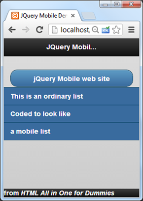
Figure 7-5: This looks almost like a native mobile app, but it's just a web page.
The jQuery library works by taking a normal HTML5 page and modifying it in ways that emulate a native look and feel. The code looks a lot like ordinary HTML:
<!doctype html>
<html lang="en">
<head>
<meta charset="UTF-8">
<title>Mobile Demo</title>
<link rel="stylesheet"
href="http://code.jquery.com/mobile/1.3.1/jquery.mobile-1.3.1.min.css" />
<script src="http://code.jquery.com/jquery-1.9.1.min.js"></script>
<script src="http://code.jquery.com/mobile/1.3.1/jquery.mobile-1.3.1.min.js">
</script>
</head>
<body>
<div data-role = "page" data-theme = "b">
<div data-role = "header" data-position = "fixed">
<h1>JQuery Mobile Demo</h1>
</div>
<div data-role = "content">
<p>
<a href = "http://jquerymobile.com/"
data-role = "button">jQuery Mobile web site</a>
</p>
<ul data-role = "listview">
<li>This is an ordinary list</li>
<li>Coded to look like</li>
<li>a mobile list</li>
</ul>
</div>
<div data-role = "footer" data-position = "fixed">
from <em>HTML All in One for Dummies</em>
</div>
</div>
</body>
</html>
A few details turn this page into a mobile wonder:
- Include the jQuery mobile CSS.
This is a special CSS file designed to transform HTML elements into their mobile counterparts. Although you can download it yourself, most developers link straight to the jQuery site (as I do here).
- Include the standard jQuery library.
Much of the code is based on jQuery, so integrate the jQuery library as well. Once again, I pull jQuery from the main jQuery website.
- Incorporate the jQuery mobile library.
This is a JavaScript library that extends the jQuery library to add new mobile-specific behavior.
- Add a data-role= “page” attribute to the main div.
Create a main div in your page and provide the data-role attribute to it. This is a custom attribute added by jQuery mobile. jQuery looks over the data roles of the various elements and applies style and behavior changes to these elements automatically. Assign your main div the data role page. This tells the browser to treat the entire div as a page. Look ahead to the “Building a multi-page document” section later in this chapter for more on pages.
- Specify a data theme.
You can apply a data theme to any element, but you almost always apply a theme to the page. jquery mobile comes with a number of default themes built in, called “a” through “e.” Experiment to find the one you like, or you can build your own with the special mobile version of the ThemeRoller found at http://jquerymobile.com/themeroller/index.php.
- Add more divs inside your page.
Add a few more divs inside your page div. Generally you'll have three: header, content, and footer.
- Specify the header div with data-role = “header”.
By placing any of your header information inside a div with a “header” data role, you're telling jQuery to treat this element as a mobile header and apply the appropriate styles. The header typically includes an <H1> tag. Look to the section called “Building a multi-page document” for how to add buttons to the header. Typically you'll specify the header to be fixed with the data-position = “fixed” attribute. This ensures the header will stay in place if the rest of the content is scrolled, which is typical behavior in a mobile application.
- Set up a content div.
Add a div with data-role = “content” to set up the main content area of your page. Any of the main body elements of your site should go in this segment.
- Any link can be converted to a button.
The standard convention in web apps is to turn links into buttons that have a larger target than mouse-based input. It's easy to convert any link to a button by adding the data-role = “button” attribute to the anchor tag.
- Convert lists to mobile listviews.
Lists also have special conventions in the mobile world. You can use the (sing along with me now . . .) data-role attribute to turn any list into a listView.
- Build a footer.
Add one more div with data-role set to “footer”. Normally, the footer (like the header) is fixed with the data-position attribute.
Working with collapsible content
The jQuery accordion element described earlier in this minibook is ideal for mobile development because it allows you to place an overview of a lot of text on the screen and allows the user to focus on one element at a time. The jQuery mobile library makes this a very easy mechanism to build for mobile devices.
Figure 7-6 shows a page hinting at my all-time favorite collapsible content.
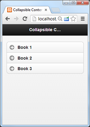
Figure 7-6: I wonder what's in Book 2?
As the user clicks on a book, the hidden content is revealed, as you can see in Figure 7-7.

Figure 7-7: The selected contents expand, and other contents are hidden.
The collapsible content trick is very similar to the standard jQuery mobile example:
<!doctype html>
<html lang="en">
<head>
<meta charset="UTF-8">
<title>collapsible.html</title>
<link rel="stylesheet"
href="http://code.jquery.com/mobile/1.3.1/jquery.mobile-1.3.1.min.css" />
<script src="http://code.jquery.com/jquery-1.9.1.min.js"></script>
<script src="http://code.jquery.com/mobile/1.3.1/jquery.mobile-1.3.1.min.js">
</script>
</head>
<body>
<div data-role = "page">
<div data-role = "header" data-position = "fixed">
<h1>Collapsible Content</h1>
</div>
<div data-role = "content">
<div data-role = "collapsible-set"
data-theme = "c" data-content-theme = "b">
<div data-role = "collapsible">
<h2>Book 1</h2>
<p>
Learn to build a basic site with HTML including new
HTML5 features.
</p>
</div>
<div data-role = "collapsible">
<h2>Book 2</h2>
<p>
Add basic CSS to your sites to change colors and fonts, and
to control backgrounds and images.
</p>
</div>
<div data-role = "collapsible">
<h2>Book 3</h2>
<p>
Use positional CSS to build attractive and flexible site layouts
in a number of different ways.
</p>
</div>
</div>
</div>
</div>
</body>
</html>
The code is mostly standard HTML, with a few new attributes in place.
- Import the standard jQuery mobile stuff.
Import the CSS and JavaScript files from jQuery.com. Of course you can also import your own CSS and JavaScript if you wish, but I keep it simple in this example.
- Set up the data roles as normal.
All jQuery mobile pages have the same general structure. Build a div for the page, and add a header, content, and footer. Specify each of the segments with the data-role attribute.
- Set up a div as a collapsible set.
If you want the accordion behavior, just build a div inside your content with the data-role set to “collapsible-set”.
- Set up the data theme for the collapsed set.
Specify a data theme for the collapsed set. It works best if you also explicitly set a data-content-theme. (If you don't, sometimes the expanded content will not look like it is part of the main element.)
- Place one or more collapsible objects in the set.
A collapsible object is simply a div with the data-role set to collapsible.
- Add some sort of header in each collapsible.
Any headline tag (<H1> through <H6>) will be used as the always-visible handle for the collapsible element.
- Non-header content will be hidden.
Any other content of the collapsible element will be hidden by default and only disclosed when the element is selected.
Building a multi-page document
It's great being able to pare down a web page so it fits on a mobile device, but obviously if the page is smaller, you'll need more of them. Mobile apps often use a page-flipping metaphor to pack more data in a small piece of screen real estate, and the jQuery mobile library has another wonderful tool to make this easy. Take a look at Figure 7-8 to see how to break a single web document into a number of pages.
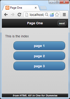
Figure 7-8: This is the main page. It has a bunch of buttons.
So far, this application looks just like the other jQuery mobile apps you've seen so far. One thing is different, and that's the button in the header. It's very common for mobile apps to have navigation buttons in the header. Press the Next button, and you'll see Figure 7-9.
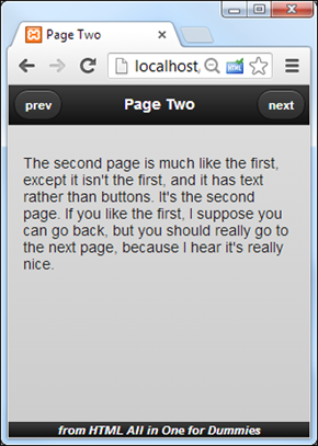
Figure 7-9: The second page is similar.
After a nifty fade transition, the next page appears. This one has two buttons in the header. Pressing Next again takes the user to the third page, illustrated in Figure 7-10.
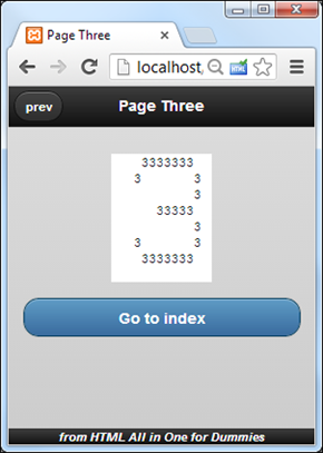
Figure 7-10: I think this is the third page.
The third page is once again very familiar, but this time it has a single button on the left of the header, and another button in the main content area.
The interesting thing about these three pages is they aren't three pages at all! It's all just one page, designed to act like three different pages. There's a couple of advantages to this arrangement.
- CSS and JavaScript resources only need to be loaded once: This keeps the system consistent and improves load times slightly.
- There's no lag time: When the document loads, the whole thing is in memory, even if only one part is visible at a time. This allows you to quickly move between pages without having to wait for server access.
Of course this mechanism doesn't replace ordinary links taking you to new pages. You'd normally implement this type of mechanism when you have a large page you want to treat as several smaller pages so the user doesn't have to scroll.
Here's the code for multiPage.html in its entirety. Of course, I explain each new idea following the listing.
<!doctype html>
<html lang="en">
<head>
<meta charset="UTF-8">
<title>multiPage.html</title>
<link rel="stylesheet"
href="http://code.jquery.com/mobile/1.3.1/jquery.mobile-1.3.1.min.css" />
<script src="http://code.jquery.com/jquery-1.9.1.min.js"></script>
<script src="http://code.jquery.com/mobile/1.3.1/jquery.mobile-1.3.1.min.js">
</script>
<style type = "text/css">
#foot {
font-size: 75%;
font-style: italic;
text-align: center;
}
pre {
margin-left: auto;
margin-right: auto;
background-color: white;
width: 8em;
}
</style>
</head>
<body>
<div id = "page1" data-role = "page" data-theme = "b">
<div id="head" data-role = "header">
<h1>Page One</h1>
<a href = "#page2" class = "ui-btn-right">next</a>
</div>
<div id="content" data-role = "content">
<p>
This is the index
</p>
<ul>
<li><a data-role = "button" href = "#page1">page 1</a></li>
<li><a data-role = "button" href = "#page2">page 2</a></li>
<li><a data-role = "button" href = "#page3">page 3</a></li>
</div>
<div id="foot" data-role = "footer" data-position = "fixed">
from HTML All in One for Dummies
</div>
</div>
<div id = "page2" data-role = "page" data-theme = "b">
<div id="head" data-role = "header">
<a href = "#page1">prev</a>
<h1>Page Two</h1>
<a href = "#page3">next</a>
</div>
<div id="content" data-role = "content">
<p>
The second page is much like the first, except
it isn't the first, and it has text rather than
buttons. It's the second page.
If you like the first, I suppose you can
go back, but you should really go to the next
page, because I hear it's really nice.
</p>
</div>
<div id="foot" data-role = "footer" data-position = "fixed">
from HTML All in One for Dummies
</div>
</div>
<div id = "page3" data-role = "page" data-theme = "b">
<div id="head" data-role = "header">
<a href = "#page2">prev</a>
<h1>Page Three</h1>
</div>
<div id="content" data-role = "content">
<pre>
3333333
3 3
3
33333
3
3 3
3333333
</pre>
<p>
<a href = "#page1" data-role = "button" data-transition = "flip">
Go to index
</a>
</p>
</div>
<div id="foot" data-role = "footer" data-position = "fixed">
from HTML All in One for Dummies
</div>
</div>
</body>
</html>
While the code for this example is long, it doesn't break a lot of new ground.
- Load up the jQuery mobile content.
Pull in the necessary CSS and JavaScript files from the jQuery.com site.
- Apply your own CSS.
Even if you're “borrowing” CSS code from jQuery, you're still allowed to add your own. I added CSS to make the footer and pre elements act the way I want.
- Build your pages.
You can build as many pages as you want, but they all follow the same general jQuery mobile pattern: Create a page div with header, content, and footer divs. Use the data-role attribute to indicate the role of each div.
- Name each of the page-level divs with the id attribute.
Because the user will be flipping through the pages, each page needs some sort of identifier. Give each page a unique id attribute. I went with the rather uninspired page1, page2, and page3. You might think of something more clever than that.
- Build buttons inside the headers.
The only truly new part of this example (aside from the page-flipping itself ) is the buttons in the headers. Skip ahead to the page 2 header, and you'll see something really interesting:
<a href = "#page1">prev</a>
<h1>Page Two</h1>
<a href = "#page3">next</a>If you define a link inside an element with the header data-role, that link will automatically become a button. Furthermore, the first such link defined will automatically be placed to the left of the header, and the second will be placed to the right.
- Force a single button to the right.
If you want a button to be on the right (as I do on the first page), add a class to the button:
<h1>Page One</h1>
<a href = "#page2" class = "ui-btn-right">next</a> - Use internal anchors to skip between pages.
Take a look at the URLs in all the buttons. They begin with a hash, which indicates an internal link inside the document. Remember, though this feels like three different pages to the user, it's really all one big web page.
- Experiment with transitions.
Take a careful look at the button on page three:
<a href = "#page1" data-role = "button" data-transition = "flip">
Go to index
</a>This button has a special data-transition attribute. By default, mobile pages swap with a fade. You can set the transition to slide, slideup, slidedown, pop, fade, or flip. You can also reverse the transition by adding another attribute: data-direction = “reverse”.
Going from Site to App
Everybody wants to make mobile apps these days. Here's the big secret. Many apps are really written in HTML5, CSS, and JavaScript. You already know everything you need to make apps that work on mobile devices. Better yet, you don't need to learn a new language or get permission from the app store or purchase a license, as you do for native apps.
There's a couple of wonderful tricks you can do for iOS users. You can design your program so the user can add an icon directly to the desktop. The user can then start the program like any other app. You can also make the browser hide the normal browser accoutrements so your program doesn't look like it's running in a browser!
It turns out these effects are quite easy to do.
Adding an icon to your program
Modern versions of iOS (the iPhone/iPad operating system) already have the ability to store any web page on the desktop. Just view the web page in Safari and click the Share button. You'll find an option to save the web page to the desktop. You can instruct your users to do this, and they'll be able to launch your program like a normal app.
However, the default icon for a saved app is quite ugly. If you want a nice-looking icon, you can save a small image as a .png file and put it in the same directory as your program. Then, you can add this line to your page (in the header) and that image will appear on the desktop when the user saves your program:
<link rel="apple-touch-icon" href="myImage.png" />
As an added bonus, the iPhone or iPad automatically adjust the image to look like an Apple icon, adding the effects appropriate to the installed version of iOS (rounded and glassy in iOS6, flat in iOS7.)
Of course, this icon trick is an Apple-only mechanism. With most versions of Android, any bookmark you've designated with your main browser can be added to the desktop, but there is no custom icon option. The apple-touch-icon directive will simply be ignored if you're using some other OS.
Removing the Safari toolbar
Although your program looks good from the main screen, when the user activates the program it's still obvious that the program is part of the web browser. You can easily hide the browser toolbar with another line in the header:
<meta name="apple-mobile-web-app-capable" content="yes" />
This code will not do anything different unless the program is called from the desktop. However, in that case, it hides the toolbar, making the program look and feel like a full-blown app. As an added bonus, this runs the program in a full-screen mode, giving you a little more room for game play.
Again, this is an Apple-specific solution. There isn't an easy way to achieve the same effect on the Android devices.
Storing your program offline
Now your program is looking a lot like an app, except it only runs when you're connected to the Internet. HTML5 has a wonderful feature that allows you to store an entire web page locally the first time it's run. Then if the user tries to access the program and the system can't get online, the local copy of the game is run instead. In essence, the program is downloaded the first time it is activated and stays on the local device.
This is a relatively easy effect to achieve:
- Make your program stable: Before you can use the offline storage mechanism, you'll want to make sure your program is close to release-ready. At a minimum, you'll need to ensure you know all of the external files needed by the game.
- Use only local resources: For this kind of project, you can't rely on the external Internet, so you'll need to have all your files local. This means you can't really use PHP or external files. You'll need to have a local copy of everything on the server.
- Build a cache.manifest file: Look at the directory containing your game, and create a new text file called cache.manifest.
- Write the first line: The first line of the cache.manifest file should only contain the text CACHE MANIFEST (all in capital letters).
- Make a list of every file in the directory: Write the name of every file in the directory, one file per line. Be careful with your capitalization and spelling.
- Add the manifest attribute: The <html> tag has a new attribute called manifest. Use this to describe to the server where the cache manifest can be found:
<html lang = "en"
manifest = "cache.manifest"> - Load the page normally: You'll need to load the web page once in the normal way. If all is set up correctly, the browser will quietly make a copy of the file.
- Test offline: The best way to test offline storage is to temporarily turn off wireless access on your machine and then try to access the file. If things worked out, you should be able to see your page as if you were still online.
- Check server settings: If offline storage is not working, you might need to check with your server administration. The text/manifest MIME type needs to be configured on the server. You might have to ask your server administrator to set this option in the .htaccess file for your account:
addtype text/cache-manifest .manifest
Note that it can take the cache-manifest mechanism several hours to recognize changes, so when you make changes to your page, these changes aren't automatically updated to the local browser. That's why it's best to save off-line archiving for near the end of your project development cycle.