
When the first version of Silverlight was released, it contained a whopping two controls, the TextBlock and the Rectangle. Silverlight developers had to build all other controls from these two. Luckily, each new version of Silverlight added a number of controls, to the point that the control set included out of the box in Silverlight 4 is quite impressive. However, there are still a number of commonly used controls not included in Silverlight.
One example of a control missing from the base Silverlight set is a tree-view control. Developers who want to create an application using a tree view are faced with a choice. They can build a tree-view control themselves, purchase a third-party control, or find a free or open source tree-view control. Although all three options are completely valid, in this chapter we'll focus on the last one—and the place we'll find those controls is the Silverlight Toolkit.
The Silverlight Toolkit is an open source project containing a collection of Silverlight controls, components, and utilities. The toolkit contains full open source code, unit tests, samples, and documentation. The latest toolkit, released at the time of Silverlight 4's release, contains more than 30 Silverlight controls, including a number of themes and charting controls.
In this chapter we'll look at a few of the different components of the Silverlight Toolkit in detail. Let's get started!
Because the components in the Silverlight Toolkit are released at different times, they are at different levels of maturity. The components are divided into a number of quality bands that define the maturity levels of the different components.
Controls that have reached a mature quality level are included in the Mature quality band. These controls are not only considered extremely stable, they are shipped in the Silverlight software development kit. As controls reach this quality level, they are added to the Silverlight SDK. At that point, they are still considered part of the Silverlight Toolkit, but they will be installed on workstations when developers install the Silverlight SDK. At the time of the Silverlight 4 release, the following ten controls were included in the mature quality band.
Stable controls that have not yet reached the mature quality-level are placed in the Stable quality band. This band includes the following controls:
DockPanel
Expander
HeaderedContentControl
Label
NumericUpDown
Viewbox
WrapPanel
Controls that have not yet had enough testing to reach a stable quality belong to the Preview quality band. The following controls (as well as 11 themes) belong in this band:
New additions to the Silverlight Toolkit get placed in the experimental quality band. These are components that should be used with caution as they are still under development and have not been tested to the point to reach even a preview quality level. Controls and components in this band include the following.
You'll find the toolkit on CodePlex at http://silverlight.codeplex.com (see Figure 6-1).

You can get the latest toolkit by clicking on the Download tab and selecting either the MSI install or a zip containing the source code. For the purpose of this book, just download and install the MSI; the content in this book is based on the April 2010 release of the Silverlight 4 toolkit as shown in Figure 6-2.
The Silverlight Toolkit contains a number of controls. We've discussed some of these earlier in the book—DataGrid (chapter 5), GridSplitter (chapter 4), and WrapPanel (chapter 3). In this section we'll look at a few others.
The Accordion control lets you include a collection of expandable and collapsible panels that allow you to show groups of content. Each accordion contains a header item and a content item. When the user clicks on the header item, it either expands or collapses the section, showing or hiding its content items. Accordion-like controls are used in many common applications, but probably the one that's most familiar to developers is Visual Studio's Toolbox, as shown in Figure 6-3. Each "tab" in the toolbox can be considered a header item, and the controls contained under each header can be considered the content items.

In this example we will use the Accordion control to display a list of books, grouped by category. Figure 6-4 shows the end result we'll be working toward.

Create a new Silverlight application in Visual Studio 2010 called
AccordionControl. Allow Visual Studio to create a Web Application project to host the application.With the
MainPage.xamlfile selected, position the cursor in the source in theLayout Grid. Find and double-click on theAccordioncontrol in the Toolbox. This will add the control to the page, as well as the proper namespace reference:xmlns:toolkit="http://schemas.microsoft.com/winfx/2006/xaml/presentation/toolkit"
After you've added the Accordion, right-click on the control in the design view and select Reset Layout

<Grid x:Name="LayoutRoot" Background="White"><toolkit:Accordion Name="BookList" Width="200" Margin="10" /></Grid>Switch to the code behind in the file
MainPage.xaml.cs. We need to define the data we'll be binding to the Accordion. For simplicity, we'll define the data right in the code behind file. Add two classes, one forCategoriesand one forBooks.namespace AccordionControl { public partial class MainPage : UserControl { public MainPage() { InitializeComponent(); } }public class BookCategory{public string CategoryName { get; set; }public List<Book> Books { get; set; }}public class Book{public string Title { get; set; }}}Next we need to populate the classes with some data. To do this, first wire up the
Loadedevent and insert the following code.public partial class MainPage : UserControl { public MainPage() { InitializeComponent();this.Loaded += new RoutedEventHandler(MainPage_Loaded);}void MainPage_Loaded(object sender, RoutedEventArgs e){List<BookCategory> Library = new List<BookCategory>();BookCategory cat1 = new BookCategory() {CategoryName = "Silverlight",Books = new List<Book>() };cat1.Books.Add(new Book() { Title = "Beginning Silverlight 4" });cat1.Books.Add(new Book() { Title = "Pro Silverlight 4" });Library.Add(cat1);BookCategory cat2 = new BookCategory() {CategoryName = "ASP.NET",Books = new List<Book>() };cat2.Books.Add(new Book() { Title = "Pro ASP.NET 4" }) ;Library.Add(cat2);}} public class BookCategory { public string CategoryName { get; set; } public List<Book> Books { get; set; } } public class Book { public string Title { get; set; } } }Now we need to define the header and content items, using the
ItemTemplatefor the header and theContentTemplatefor the content. For theItemTemplate, we'll simply define aTextBlockthat will display theBookCategory. For theContentTemplate, we'll define aListBoxcontrol that will contain a list ofTextBlocks, each displaying a bookTitle.<toolkit:Accordion Name="BookList" Margin="10" Width="200"> <toolkit:Accordion.ContentTemplate><DataTemplate><ListBox ItemsSource="{Binding Books}" BorderThickness="0"><ListBox.ItemTemplate><DataTemplate><TextBlock FontWeight="Bold" Text="{Binding Title}" /></DataTemplate></ListBox.ItemTemplate></ListBox></DataTemplate></toolkit:Accordion.ContentTemplate><toolkit:Accordion.ItemTemplate><DataTemplate><TextBlock Text="{Binding CategoryName}" /></DataTemplate></toolkit:Accordion.ItemTemplate></toolkit:Accordion>Next we need to bind the
Librarydata source to theAccordioncontrol.void MainPage_Loaded(object sender, RoutedEventArgs e) { List<BookCategory> Library = new List<BookCategory>(); BookCategory cat1 = new BookCategory() { CategoryName = "Silverlight", Books = new List<Book>() }; cat1.Books.Add(new Book() { Title = "Beginning Silverlight 4" }); cat1.Books.Add(new Book() { Title = "Pro Silverlight 4" }); Library.Add(cat1); BookCategory cat2 = new BookCategory() { CategoryName = "ASP.NET", Books = new List<Book>() }; cat2.Books.Add(new Book() { Title = "Pro ASP.NET 4" }) ; Library.Add(cat2);this.BookList.ItemsSource = Library;}Press F5 to run the solution. If things go as planned, you should see the Accordion displayed. If you click on ASP.NET, the Silverlight section will collapse and hide those books, while the ASP.NET section will expand and display its books, as shown in Figure 6-6.


The AutoCompleteBox is another mature-band toolkit control that is now available through the Silverlight SDK. Its functionality is nothing new to users, as autocomplete textboxes have been around for many years. As you start typing in a textbox, items that match what you are typing are displayed below. You can pick an item from the list instead of having to finish typing it yourself. Since the AutoCompleteBox is contained in the SDK, a reference to the SDK namespace is required to access the control.
xmlns:sdk="http://schemas.microsoft.com/winfx/2006/xaml/presentation/sdk"
To define an AutoCompleteBox in XAML is no different from defining other controls, such as Buttons.
<sdk:AutoCompleteBox Name="FavoriteColor" Width="200" Height="25" />
In the code behind, you can then easily add the items that are displayed when the user types by binding a collection to the ItemsSource property. For example, you can bind to a simple string array containing colors.
public MainPage()
{
    InitializeComponent();
    this.FavoriteColor.ItemsSource = new string[]
    {
        "aqua", "azure", "beige", "black", "blue", "brown", "cyan",
        "gold", "gray", "ivory", "lime", "magenta", "maroon", "navy",
        "olive", "orange", "pink", "purple", "red", "tan", "teal",
        "violet", "wheat", "white", "yellow"
    };
}
When this control is displayed and a user starts to type in the textbox, the colors matching the typed text are displayed below in a list, as shown in Figure 6-7.

You may have also noticed that many autocomplete textboxes automatically complete the text for you as you type. This is controlled by the property IsTextCompletionEnabled, which by default is set to False.
<sdk:AutoCompleteBox
    Name="FavoriteColor"
    Width="200" Height="35"
    FontSize="18"
    IsTextCompletionEnabled="True"   />
Once this property has been set, you will see that the text automatically completes as you type, as shown in Figure 6-8.

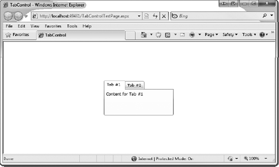
The TabControl provides a way to separate your application's user interface into different tabs. Using the control is very straightforward—you simply create a different TabItem for each tab, and define the content of the tab within the TabItem tags. That's all there is to it. Consider the following example.
<Grid x:Name="LayoutRoot" Background="White">
    <sdk:TabControl Height="100" Width="200">
        <sdk:TabItem Header="Tab #1">
            <TextBlock Text="Content for Tab #1" />
        </sdk:TabItem>
        <sdk:TabItem Header="Tab #2">
            <TextBlock Text="Content for Tab #2" />
        </sdk:TabItem>
    </sdk:TabControl>
</Grid>
This code creates two tabs and displays a TextBlock for each, as shown in Figure 6-9.
The ViewBox is a control that was first offered through the toolkit and is now part of the standard Silverlight control library. As a result, you don't need to define any additional namespace references. Any content placed within the ViewBox is automatically sized to fill the entire ViewBox. This can be ideal if you want to automatically position elements the way you want within the ViewBox. When you need items to change size, instead of changing each one individually, you can simply change the size of the ViewBox and all items are automatically resized to fit. As a quick example, let's create an icon with some text underneath it, as shown in Figure 6-10.
<StackPanel>
    <Image Width="175" Source="cherry.jpg" />
    <TextBlock Text="Cherry" FontSize="30"
        HorizontalAlignment="Center" />
</StackPanel>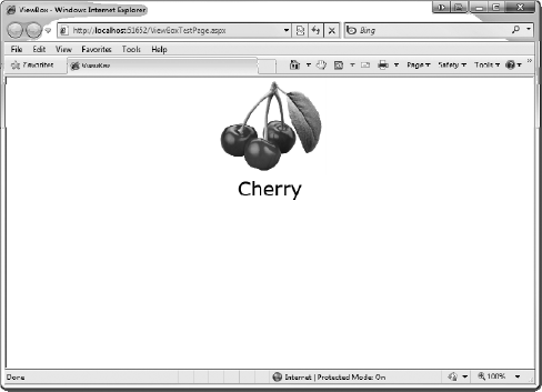
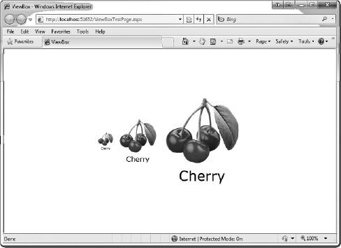
If you wanted to resize these two items without a ViewBox, you would need to change the size of each item. However, by placing both items within a ViewBox, all you need to do is resize the ViewBox. To demonstrate this, place the same source for the icon and text in three different-sized ViewBox controls.
<StackPanel Orientation="Horizontal" HorizontalAlignment="Center">
    <Viewbox Width="40" Margin="5">
        <StackPanel>
            <Image Width="175" Source="cherry.jpg" />
            <TextBlock Text="Cherry" FontSize="30"
                HorizontalAlignment="Center" />
        </StackPanel>
    </Viewbox>
    <Viewbox Width="100" Margin="5">
        <StackPanel>
            <Image Width="175" Source="cherry.jpg" />
            <TextBlock Text="Cherry" FontSize="30"
                HorizontalAlignment="Center" />
        </StackPanel>
    </Viewbox>
    <Viewbox Width="200" Margin="5">
        <StackPanel>
            <Image Width="175" Source="cherry.jpg" />
            <TextBlock Text="Cherry" FontSize="30"
                HorizontalAlignment="Center" />
        </StackPanel>
    </Viewbox>
</StackPanel>
The result is shown in Figure 6-11. As you can see, the icon and text are resized to fit each ViewBox and the proportion and positioning is maintained.
A new feature added in Silverlight 3 is the Modal Child Window. This provides functionality to pop up a window that disables the rest of the application until the window is closed, something that is very common in Windows desktop development. The Silverlight modal window's visual appearance and content is defined by XAML, just like everything else in Silverlight, which gives you a lot of control.
To show a modal dialog, let's create an instance of the window and call its Show() method. The Show() method is an asynchronous call and it returns immediately, so you won't be able to get the result from the dialog using this method. Instead, you'll need to handle the Closed event from the window and check the DialogResult there.
Confirm confirmDlg = new Confirm();
confirmDlg.Closed += new EventHandler(confirmDlg_Closed);
confirmDlg.Show();
void confirmDlg_Closed(object sender, EventArgs e)
{
    Confirm confirmDlg = (Confirm)sender;
    if (confirmDlg.DialogResult == true)
    {
        // User Clicked OK
    }
    else if (confirmDlg.DialogResult = false)
    {
        // User Clicked Cancel
    }
}
Note that the DialogResult is not a standard Boolean type; it is a nullable Boolean. Therefore, there are three possible values: true, false, and null. In C#, a nullable Boolean is specified with the syntax bool?.
void confirmDlg_Closed(object sender, EventArgs e)
{
    Confirm confirmDlg = (Confirm)sender;
    bool? Result = confirmDlg.DialogResult;
}
In addition to simply getting a true/false/null response from the Child Window, you can implement your own properties that can be passed from the dialog. To retrieve these property values, in the Closed() event handler you cast the sender object to your child window's type and simply access the property.
void confirmDlg_Closed(object sender, EventArgs e)
{
    Confirm confirmDlg = (Confirm)sender;
    string myPropValue = confirmDlg.MyProperty;
}
Let's run through a quick exercise to see how to create a modal pop-up window in Silverlight.
In this exercise, you'll create a simple registration form that accepts a first and last name. When someone presses the button to register, a modal window will appear with a terms and conditions notice that users must agree to before proceeding. You won't fully code the registration form, you'll just send a result to a TextBlock so you can see what's going on. Let's get started.
Create a new Silverlight application in Visual Studio 2010 called
ModalWindow. Allow Visual Studio to create a Web Application project to host the application.In the
MainPage.xamlfile, divide the rootGridinto five rows and two columns. The height of the first four rows should be40pixels, and the fifth row should take up the remainder of the application. The width of the first column should be150pixels, and the second should take up the remainder of the application. In addition, change thed:DesignWidthof theUserControlto600.<UserControl x:Class="ModalWindow.MainPage" xmlns="http://schemas.microsoft.com/winfx/2006/xaml/presentation" xmlns:x="http://schemas.microsoft.com/winfx/2006/xaml" xmlns:d="http://schemas.microsoft.com/expression/blend/2008" xmlns:mc="http://schemas.openxmlformats.org/markup-compatibility/2006" mc:Ignorable="d" d:DesignHeight="300" d:DesignWidth="600"> <Grid x:Name="LayoutRoot" Background="White"><Grid.ColumnDefinitions><ColumnDefinition Width="150" /><ColumnDefinition Width="*" /></Grid.ColumnDefinitions><Grid.RowDefinitions><RowDefinition Height="40" /><RowDefinition Height="40" /><RowDefinition Height="40" /><RowDefinition Height="40" /><RowDefinition Height="40" /></Grid.RowDefinitions></Grid> </UserControl>In the first row, add a
TextBlockfor a header with theText"Register for a new Account" that spans both columns. In the second row, add aTextBlockin the first column with theText"First Name", and add aTextBoxin the second column. Add someMarginandPaddingto improve the appearance.<Grid x:Name="LayoutRoot" Background="White"> <Grid.ColumnDefinitions> <ColumnDefinition Width="150" /> <ColumnDefinition Width="*" /> </Grid.ColumnDefinitions> <Grid.RowDefinitions> <RowDefinition Height="40" /> <RowDefinition Height="40" /> <RowDefinition Height="40" /> <RowDefinition Height="40" /> <RowDefinition Height="40" /> </Grid.RowDefinitions><TextBlock Text="Register for a New Account" FontSize="20" FontWeight="Bold" Margin="5" Grid.ColumnSpan="2" /> <TextBlock Padding="5" Margin="5" Text="First Name" FontSize="12" Grid.Row="1" /> <TextBox Padding="5" Margin="5" FontSize="12" Grid.Column="1" Grid.Row="1" /> </Grid>In the third row, add another
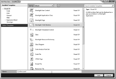
TextBlockin the first column with theText"Last Name," and add aTextBoxin the second column. Add someMarginandPaddingto improve the appearance. In the fourth row, add aButtonto the second column with theText"Register." Finally, in the fifth row, add aTextBlockto the second column with theTextblank. Name theTextBlock"Result." Your XAML should look like the following code, with the result as shown in Figure 6-12.<Grid x:Name="LayoutRoot" Background="White"> <Grid.ColumnDefinitions> <ColumnDefinition Width="150" /> <ColumnDefinition Width="*" /> </Grid.ColumnDefinitions> <Grid.RowDefinitions> <RowDefinition Height="40" /> <RowDefinition Height="40" /> <RowDefinition Height="40" /> <RowDefinition Height="40" /> <RowDefinition Height="40" /> </Grid.RowDefinitions> <TextBlock Text="Register for a New Account" FontSize="20" FontWeight="Bold" Margin="5" Grid.ColumnSpan="2" /><TextBlock Padding="5" Margin="5" Text="First Name" FontSize="12" Grid.Row="1" /> <TextBox Padding="5" Margin="5" FontSize="12" Grid.Column="1" Grid.Row="1" /><TextBlock Padding="5"Margin="5"Text="Last Name"FontSize="12"Grid.Row="2" /><TextBox Padding="5"Margin="5"FontSize="12"Grid.Column="1"Grid.Row="2" /><Button Content="Register"Padding="5"Margin="5"FontSize="12"Grid.Column="1"Grid.Row="3"Click="Button_Click" /><TextBlock Text=""FontSize="14"FontWeight="Bold"Grid.Column="1"Grid.Row="4"Margin="5"Name="Result" /></Grid>Now that you have the main form laid out, turn your attention to the child window. To add a child window to the project, right-click on the Silverlight project (
ModalWindow) and select Add New Item. From the Add New Item dialog, select Silverlight Child Window and name the windowConfirm.xaml, as shown in Figure 6-13.When the Child Window has been added to the project, it will contain the following XAML by default.
<controls:ChildWindow x:Class="ChildWindow.Confirm" xmlns="http://schemas.microsoft.com/winfx/2006/xaml/presentation" xmlns:x="http://schemas.microsoft.com/winfx/2006/xaml" xmlns:controls="clr-namespace:System.Windows.Controls;assembly=System.Windows.Controls" Width="400" Height="300" Title="Confirm"> <Grid x:Name="LayoutRoot" Margin="2"> <Grid.RowDefinitions> <RowDefinition /> <RowDefinition Height="Auto" /> </Grid.RowDefinitions> <Button x:Name="CancelButton" Content="Cancel" Click="CancelButton_Click" Width="75" Height="23" HorizontalAlignment="Right" Margin="0,12,0,0" Grid.Row="1" /> <Button x:Name="OKButton" Content="OK" Click="OKButton_Click" Width="75" Height="23" HorizontalAlignment="Right" Margin="0,12,79,0" Grid.Row="1" /> </Grid> </controls:ChildWindow>
Notice that two buttons have been added for you already, one for
Canceland one forOK. If you look at the code behind for the window, you'll also see that some code is already present.namespace ChildWindow { public partial class Confirm : ChildWindow { public Confirm() { InitializeComponent(); }private void OKButton_Click(object sender, RoutedEventArgs e) { this.DialogResult = true; } private void CancelButton_Click(object sender, RoutedEventArgs e) { this.DialogResult = false; } } }Two event handlers, one for each button, have been wired up, but notice that the code is simply setting the
DialogResultproperty on the window. In the property setter, it will automatically set the response and will execute the dialog'sClose()method, so that's all the code you need.For now, just leave the Child Window as is, but you do need to call it from the Silverlight application. Open the
MainPage.xaml.cscode behind file. Add theButton_Clickevent as well as the code to create an instance of the Child Window and execute theShow()method.private void Button_Click(object sender, RoutedEventArgs e) {Confirm confirmDlg = new Confirm();confirmDlg.Show();}Now run the application and press the Register button. You will see that the Child Window appears, as shown in Figure 6-14. You can drag the window, but notice that the main user interface for your application is inaccessible. Click
OKorCanceland you'll find that the Child Window closes and the application's user interface is once again functioning.Very cool, but let's not stop there. Let's modify the Child Window to show that its content can be customized any way you like by editing the window's XAML. To do this, open the
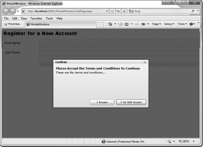
Confirm.xamlfile in XAML design mode. Change theTitleof the window to "Terms and Conditions." Let's also change the height of the Window to200pixels and make theTextof the two buttons read "I Accept" and "I Do Not Accept." Because you are changing the text, you must also adjust the width of the buttons and the margins. (Note that you can just as easily put these two buttons in a HorizontalStackPanelinstead of spacing them using margins.) Finally, add twoTextBlockcontrols to the first row of the rootGridfor the header, and one below it for the terms and conditions text. Your updated XAML should now be similar to the following:<Grid x:Name="LayoutRoot" Margin="2"> <Grid.RowDefinitions> <RowDefinition /> <RowDefinition Height="Auto" /> </Grid.RowDefinitions><StackPanel><TextBlockText="Please Accept the Terms and Conditions to Continue"FontWeight="Bold"FontSize="12" /><TextBlockText="These are the terms and conditions..." /></StackPanel><Buttonx:Name="CancelButton"Content="I Do Not Accept" Click="CancelButton_Click"Width="125"Height="23" HorizontalAlignment="Right"Margin="0,12,0,0" Grid.Row="1" /><Buttonx:Name="OKButton"Content="I Accept" Click="OKButton_Click"Width="100"Height="23" HorizontalAlignment="Right"Margin="0,12,134,0" Grid.Row="1" /></Grid>Go ahead and run the application again and then press the Register button to open the Child Window. Notice that the content changes are reflected, as shown in Figure 6-15. Keep in mind that the content of these window controls is completely customizable with XAML. You can add any controls you wish with any layout you want.
Now let's add code to retrieve results from the dialog. Open the
MainPage.xaml.csfile and within theButton_Clickevent handler, wire up another event handler for the Child Window'sClosed()event. In this new event handler, you need to get the Child Window's instance, which is sent to the handler in thesenderobject. Once you have the window's instance, you can retrieve theDialogResultproperty, which will containtrue, false, ornull.public partial class MainPage : UserControl { public MainPage() { InitializeComponent(); } private void Button_Click(object sender, RoutedEventArgs e) { Confirm confirmDlg = new Confirm(); confirmDlg.Closed += new EventHandler(confirmDlg_Closed); confirmDlg.Show(); }void confirmDlg_Closed(object sender, EventArgs e){Confirm confirmDlg = (Confirm)sender;if (confirmDlg.DialogResult == true){this.Result.Text = "Terms and Conditions Accepted";}else if (confirmDlg.DialogResult == false){this.Result.Text = "Terms and Conditions Not Accepted";}}}Run the application. Press the Register button to display the Child Window, then press the I Accept button from the Child Window. You'll see that the Result
TextBlockis updated to read "Terms and Conditions Accepted," as shown in Figure 6-16.


In this chapter we looked at the Silverlight Toolkit, an excellent resource with a number of rich controls that Silverlight developers can use. What's even better is that the toolkit provides the full source code, so developers can extend the controls and modify them to meet their specific needs. In the next chapter, we will look at data access and networking in Silverlight.