The previous chapter provided an overview of Visual Studio 2010, one of the primary tools used in developing Silverlight applications. In this chapter, you are going to start to dive into some Silverlight development by looking at the layout management controls.
As you have learned, Silverlight applications consist of a number of Silverlight objects that are defined by XAML. Layout management involves describing the way that these objects are arranged in your application. Silverlight includes five layout management controls: Canvas, StackPanel, Grid, WrapPanel, and DockPanel. You will take a look at each of these in-depth. By the end of this chapter, you should have a good understanding of when to use which layout control.
Silverlight provides a very flexible layout management system that lets you specify how controls will appear in your Silverlight application. You can use a static layout as well as a liquid layout that allows your layout to automatically adjust as your Silverlight application is resized in the browser.
Each of the five layout controls provided in Silverlight has its advantages and disadvantages, as summarized in Table 3-1.
Let's begin by looking at the most basic layout control: the Canvas panel.
Table 3.1. Layout Control Pros and Cons
Control | Description | Pros | Cons |
|---|---|---|---|
| Based on absolute position of controls. | Very simple layout. | Requires that every control have a |
| Based on horizontal or vertical "stacks" of controls. | Allows for a quick dynamic layout. Nesting | The layout is limited to stacks of items. Spacing is limited to adding margins to the individual controls and to adjusting the alignment (with the |
Mimics using table elements in HTML to lay out controls. | The most flexible and powerful layout control. You can define just about any type of layout using the | Grid definitions can get somewhat complex at times. Nesting | |
| Based on horizontal or vertical "stacks" of controls wrapping to a second row or column when width or height is reached. | Very similar to the | Limited control of layout as wrapping is automatic when items reach maximum width or height. |
| Layout is based on "docked" horizontal or vertical panels. | Provides an easy way to create basic layout, consuming the entire application space in vertical or horizontal panels. | Layout is limited to horizontal or vertical "fill" panels, often used in conjunction with other nested layout controls. |
The Canvas panel is a basic layout control that allows you to position Silverlight objects using explicit coordinates relative to the canvas location. You can position an object within the Canvas panel by using two XAML attached properties: Canvas.Left and Canvas.Top. Figure 3-1 shows how the object's position is affected by these properties.
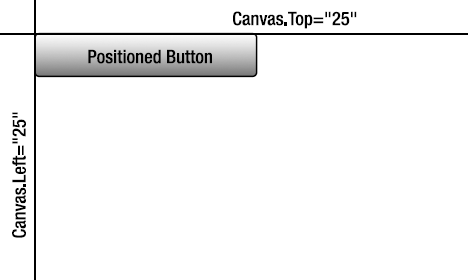
Figure 3.1. The XML attached properties Canvas.Top and Canvas.Left allow you to position the Canvas.
The objects within a Canvas panel have no layout policies placed on them by the layout control and will not resize automatically when your application is resized within the browser.
Let's try out a quick example of using the Canvas panel.
Open Visual Studio 2010 and create a new Silverlight application called
CanvasPanel. Allow Visual Studio to create a Web Application project to host the application.When the project is created, you should be looking at the
MainPage.xamlfile. If you do not see the XAML source, switch to that view so you can edit the XAML. Within the mainGridelement, add aCanvaselement. Assign it aWidthproperty of300and aHeightproperty of300. In order to see theCanvaspanel in the application, also set the background color to green. The following XAML adds thisCanvas:<Grid x:Name="LayoutRoot" Background="White"> <Canvas Background="Green" Width="300" Height="200"> </Canvas> </Grid>At this point, your Silverlight application doesn't look that exciting. It contains only a single green rectangle positioned at the very center of your application, as shown in Figure 3-2.
Let's add a button to this
Canvaspanel. Add the following code to place the button, which has the labelButton1, aWidthproperty of100, and aHeightproperty of30. (TheButtoncontrol is covered in detail in Chapter 4.)<Grid x:Name="LayoutRoot" Background="White"> <Canvas Background="Green" Width="300" Height="200"> <Button Width="100" Height="30" Content="Button 1" /> </Canvas> </Grid>Figure 3-3 shows the button within the canvas.
Let's add another button to the
Canvas, but this time position it below and a bit to the right of the first button by setting itsCanvas.TopandCanvas.Leftas attached properties. Give this button the labelButton 2, as follows:<Grid x:Name="LayoutRoot" Background="White"> <Canvas Background="Green" Width="300" Height="200"> <Button Width="100" Height="30" Content="Button 1" /> <Button Width="100" Height="30" Content="Button 2" Canvas.Left="10" Canvas.Top="40" /> </Canvas> </Grid>At this point, you now have two buttons within the canvas, but at different locations, as shown in Figure 3-4. This is still not very exciting, but this is about as cool as it gets with the
Canvas.Go ahead and run the solution to see the end result as it will appear in the browser. The output is shown in Figure 3-5.


By default, in a new Silverlight project, the root UserControl object is set to a width of 400 and a height of 300. In some cases, you may wish to set the width and height of your Silverlight application within the browser. At other times, however, you will want your Silverlight application to take up the entire window of your browser, and to resize as the browser is resized. This is done very easily within Silverlight. When you wish for the width and height to be set to 100%, simply omit the element's Height and Width attributes.
As an example, the following source has been adjusted for the Canvas panel and the Silverlight application to take up the entire browser:
<UserControl x:Class="FillBrowser.MainPage"
    xmlns="http://schemas.microsoft.com/winfx/2006/xaml/presentation"
    xmlns:x="http://schemas.microsoft.com/winfx/2006/xaml"
    xmlns:d="http://schemas.microsoft.com/expression/blend/2008"
    xmlns:mc="http://schemas.openxmlformats.org/markup-compatibility/2006"
    mc:Ignorable="d">

    <Grid x:Name="LayoutRoot" Background="White">
        <Canvas Background="Green">
        </Canvas>
    </Grid>

</UserControl>
With the omission of the Height and Width declarations for UserControl and Canvas, when you run the Silverlight application, you will see that the canvas takes up 100% of the browser window, as shown in Figure 3-6. It will resize as the browser resizes.

As you've seen, the Canvas panel is a simple layout control. It can be used very effectively in a fixed layout. However, in most cases, you will want to use a static layout for your applications. The StackPanel control provides a more fluid layout control.
The StackPanel provides developers with a quick layout option for positioning objects. The StackPanel control allows you to position Silverlight objects in more of a flow layout, stacking objects either horizontally or vertically. Figure 3-7 shows the basic concept of this layout control.

To better understand the StackPanel control, let's run through an exercise.
In Visual Studio 2010, create a new Silverlight application named
Ch3_StackPaneland allow Visual Studio to create a Web Site project to host the application.When the project is created you should be looking at the
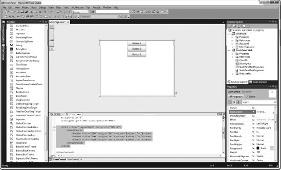
MainPage.xamlfile. If you do not see the XAML source, switch so that you can edit the XAML. Within the mainGridelement, add aStackPanelcontrol and also three buttons with the labelsButton 1, Button 2, andButton 3. Give all three buttons a width of 100 and a height of 30. The following XAML adds theStackPanelcontrol and buttons (the new code is highlighted in bold in all the exercises):<Grid x:Name="LayoutRoot" Background="White"><StackPanel><Button Width="100" Height="30" Content="Button 1"></Button><Button Width="100" Height="30" Content="Button 2"></Button><Button Width="100" Height="30" Content="Button 3"></Button></StackPanel></Grid>At this point, your application should appear as shown in Figure 3-8. Notice that the buttons are stacked vertically. This is because the default stacking orientation for the
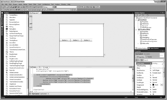
StackPanelcontrol is vertical.Change the orientation of the
StackPanelcontrol to be horizontal by setting theOrientationproperty toHorizontal, as follows:<Grid x:Name="LayoutRoot" Background="White"> <StackPanelOrientation="Horizontal"> <Button Width="100" Height="30" Content="Button 1"></Button> <Button Width="100" Height="30" Content="Button 2"></Button> <Button Width="100" Height="30" Content="Button 3"></Button> </StackPanel> </Grid>With this simple change, the buttons are now stacked horizontally, as shown in Figure 3-9.
Notice that all the buttons are touching each other, which is unattractive. You can easily space them out by using their
Marginproperty. In addition, you can center the buttons by setting theStackPanelcontrol'sHorizontalAlignmentproperty toCenter. Other options forHorizontalAlignmentincludeLeft, Right, andStretch(which stretches the content to the left and right). Make the following changes to adjust the buttons:<Grid x:Name="LayoutRoot" Background="White"> <StackPanel Orientation="Horizontal" HorizontalAlignment="Center"> <Button Width="100" Height="30" Content="Button 1"Margin="5"></Button> <Button Width="100" Height="30" Content="Button 2"Margin="5"></Button> <Button Width="100" Height="30" Content="Button 3"Margin="5"></Button> </StackPanel> </Grid>After you have made these changes, your buttons are spaced out nicely in the center of the application, as shown in Figure 3-10.

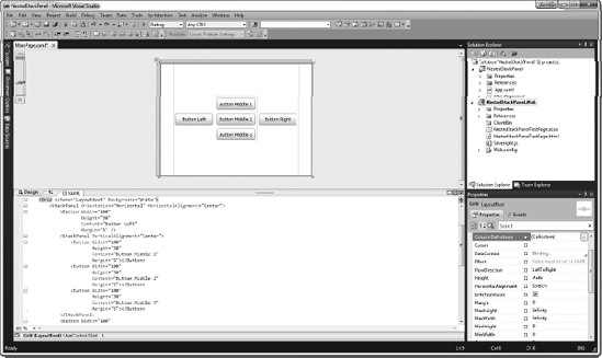
Microsoft designed the control framework so that any object can be contained within another object. One way you can enhance your layout is by nesting a layout control within another layout control. In this example, you will nest a StackPanel control within another StackPanel control, but realize that you can nest any layout control within any other layout control to get the exact layout functionality you are seeking.
In Visual Studio 2010, create a new Silverlight application named
NestedStackPaneland allow Visual Studio to create a Web Application project to host the application.In the
MainPage.xamlfile, add the following items:A
StackPanelcontrol to the rootGridwith itsOrientationproperty set toHorizontaland theHorizontalAlignmentproperty set toCenter.Within that
StackPanel, add two buttons with the labelsButton LeftandButton Right.In between the two buttons, add another
StackPanelwithOrientationset toVerticalandVerticalAlignmentset toCenter.Within that nested
StackPanel, include three buttons with the labelsButton Middle 1, Button Middle 2, andButton Middle 3.All buttons should have a
Marginproperty set to5, and should haveHeightset to30andWidthset to100.
Here is what the updated source looks like:
<Grid x:Name="LayoutRoot" Background="White">
    <StackPanel Orientation="Horizontal" HorizontalAlignment="Center">
        <Button Width="100"
                Height="30"
                Content="Button Left"
                Margin="5" />
        <StackPanel VerticalAlignment="Center">
            <Button Width="100"
                    Height="30"
                    Content="Button Middle 1"
                    Margin="5"></Button>
            <Button Width="100"
                    Height="30"
                    Content="Button Middle 2"
                    Margin="5"></Button>
            <Button Width="100"
                    Height="30"
                    Content="Button Middle 3"
                    Margin="5"></Button>
        </StackPanel>
        <Button Width="100"
                Height="30"
                Content="Button Right"
                Margin="5"></Button>
    </StackPanel>
</Grid>
The cool result of this code is shown in Figure 3-11.
Run the application to see the results.
As you can see from these two exercises, the StackPanel control is a very useful layout option, and you will probably use it often in your Silverlight applications. By nesting Silverlight controls, you have a lot of flexibility when designing your applications. However, in the event that you want more control of the positioning of items in your application, without needing to resort to the absolute positioning used by the Canvas control, the Grid control may be just the layout option you need.
The Grid control provides more fine-tuned layout in Silverlight applications. As a comparison, you can think of using the Grid layout control as similar to using table elements to position items in HTML, only more flexible. With the Grid control, you can define rows and columns, thus creating grid cells, and then add objects to individual cells in the grid or to multiple cells, by using spanning.
To specify in which cell to place an object, you use the Grid.Column and Grid.Row attached properties. Note that these properties are base zero, so the top-left cell it is row 0 and column 0. Figure 3-12 illustrates the row and column locations for the grid.

For most developers, the Grid control will most likely be the layout option of choice, due to its flexibility. At the same time, the Grid control is significantly more complex than the others, as you'll see in the following exercises.
Let's try out a simple Grid panel with four buttons.
In Visual Studio 2010, create a new Silverlight application named
GridPaneland allow Visual Studio to create a Web Application project to host the application.For this example, you are going to need a bit more space in which to work. In the
MainPage.xamlfile, start out by changing theUserControl'sDesignWidthto600andDesignHeightto400, as follows:<UserControl x:Class="GridPanel.MainPage" xmlns="http://schemas.microsoft.com/winfx/2006/xaml/presentation" xmlns:x="http://schemas.microsoft.com/winfx/2006/xaml" xmlns:d="http://schemas.microsoft.com/expression/blend/2008" xmlns:mc="http://schemas.openxmlformats.org/markup-compatibility/2006" mc:Ignorable="d" d:DesignHeight="400" d:DesignWidth="600"><Grid x:Name="LayoutRoot" Background="White"> </Grid> </UserControl>You will notice that by default a Grid control is already added to the page. In order to better see what is going on, turn on the display of grid lines by setting the
ShowGridLinesproperty totrue. The following code shows these additions. Keep in mind that since you have not designated a size for the grid, it will automatically take up the entire size of the parent, and in this case, the entire Silverlight application.<UserControl x:Class="GridPanel.MainPage" xmlns="http://schemas.microsoft.com/winfx/2006/xaml/presentation" xmlns:x="http://schemas.microsoft.com/winfx/2006/xaml" xmlns:d="http://schemas.microsoft.com/expression/blend/2008" xmlns:mc="http://schemas.openxmlformats.org/markup-compatibility/2006" mc:Ignorable="d" d:DesignHeight="400" d:DesignWidth="600"> <GridShowGridLines="True"x:Name="LayoutRoot" Background="White"> </Grid> </UserControl>Next, define the rows and columns in the
Gridcontrol. You do this using the XAML property elementsGrid.RowDefinitionsandGrid.ColumnDefinitions. Add the following XAML to your new grid:<Grid ShowGridLines="True" x:Name="LayoutRoot" Background="White"><Grid.RowDefinitions><RowDefinition Height="70" /><RowDefinition Height="*" /><RowDefinition Height="70" /></Grid.RowDefinitions><Grid.ColumnDefinitions><ColumnDefinition Width="150" /><ColumnDefinition Width="*" /><ColumnDefinition Width="150" /></Grid.ColumnDefinitions></Grid>Notice that for the center row and column, you are setting the
HeightandWidthproperties to"*". The asterisk tells the row and column to take up all available space. As theGridcontrol is resized with the browser window, those columns will be resized to take up all the space not consumed by the fixed-sized columns. After you have added these row and column definitions, your canvas should appear as shown in Figure 3-13.Note
In the previous source we are setting the height and width of the rows and columns to fixed pixel-based values. We can also set the height and width using star sizing, which indicates that the value will be expressed as a weighted proportion of the available space. As an example, if we had two rows, and the height of the first row was set to * and the height of the second row was set to 2*, the first row would take up a third of the available space, while the second row would take up two thirds of the available space.
You can now add objects to the different grid cells. Place a button in each of the four corner cells, giving the buttons the corresponding labels
Top Left, Top Right, Bottom Left, andBottom Right. To place the buttons, add the following code:<Grid ShowGridLines="True" x:Name="LayoutRoot" Background="White"> <Grid.RowDefinitions> <RowDefinition Height="70" /> <RowDefinition Height="*" /> <RowDefinition Height="70" /> </Grid.RowDefinitions><Grid.ColumnDefinitions> <ColumnDefinition Width="150" /> <ColumnDefinition Width="*" /> <ColumnDefinition Width="150" /> </Grid.ColumnDefinitions><Button Width="100"Height="30"Content="Top Left"Margin="5"Grid.Row="0"Grid.Column="0"></Button><Button Width="100"Height="30"Content="Top Right"Margin="5"Grid.Row="0"Grid.Column="2"></Button><Button Width="100"Height="30"Content="Bottom Left"Margin="5"Grid.Row="2"Grid.Column="0"></Button><Button Width="100"Height="30"Content="Bottom Right"Margin="5"Grid.Row="2"Grid.Column="2"></Button></Grid>After the buttons are added, your application should look like Figure 3-14.


Next, you will nest another Grid control in the center cell of the Grid control you just added. This will make the application layout somewhat complex, but it will also serve to show how Grid panels are defined using XAML.
In the
MainPage.xamlwithin theGridPanelproject, add the following items:A
Gridcontrol positioned atGrid.Column=1andGrid.Row=1Three
RowDefinitionand twoColumnDefinitionelementsButtons in the four corners of the new
Gridcontrol, as you just did in the outerGridpanel
The source code should look like the following:
<Grid ShowGridLines="True" x:Name="LayoutRoot" Background="White">
    <Grid.RowDefinitions>
        <RowDefinition Height="70" />
        <RowDefinition Height="*" />
        <RowDefinition Height="70" />
    </Grid.RowDefinitions>
<Grid.ColumnDefinitions> <ColumnDefinition Width="150" /> <ColumnDefinition Width="*" /> <ColumnDefinition Width="150" /> </Grid.ColumnDefinitions> <Button Width="100" Height="30" Content="Top Left" Margin="5" Grid.Row="0" Grid.Column="0"></Button> <Button Width="100" Height="30" Content="Top Right" Margin="5" Grid.Row="0" Grid.Column="2"></Button> <Button Width="100" Height="30" Content="Bottom Left" Margin="5" Grid.Row="2" Grid.Column="0"></Button> <Button Width="100" Height="30" Content="Bottom Right" Margin="5" Grid.Row="2" Grid.Column="2"></Button><Grid Grid.Column="1" Grid.Row="1" ShowGridLines="True"><Grid.RowDefinitions><RowDefinition Height="*" /><RowDefinition Height="*" /><RowDefinition Height="*" /></Grid.RowDefinitions><Grid.ColumnDefinitions><ColumnDefinition Width="*" /><ColumnDefinition Width="*" /></Grid.ColumnDefinitions><Button Width="100"Height="30"Content="Nested Top Left"Margin="5"Grid.Row="0"Grid.Column="0"></Button><Button Width="100"Height="30"Content="Nested Top Right"Margin="5"Grid.Row="0"Grid.Column="2"></Button><Button Width="100"Height="30"Content="Nested B. Left"Margin="5"Grid.Row="2"Grid.Column="0"></Button><Button Width="100"Height="30"Content="Nested B. Right"Margin="5" Grid.Row="2"Grid.Column="2"></Button></Grid></Grid>At this point, your application should look like Figure 3-15. Now, this is a pretty cool layout.
Notice that you have not placed anything in the two columns in the middle row of the new grid. Here, you're going to add a button that spans these two columns, so the button will appear in the center of the row. In order to do this, add the new button to the
Gridcontrol with theGrid.ColumnSpanattached property set to2. The source changes to the innermostGridcontrol are as follows:<Grid Grid.Column="1" Grid.Row="1" ShowGridLines="True"> <Grid.RowDefinitions> <RowDefinition Height="*" /> <RowDefinition Height="*" /> <RowDefinition Height="*" /> </Grid.RowDefinitions> <Grid.ColumnDefinitions> <ColumnDefinition Width="*" /> <ColumnDefinition Width="*" /> </Grid.ColumnDefinitions> <Button Width="100" Height="30" Content="Nested Top Left" Margin="5" Grid.Row="0" Grid.Column="0"></Button> <Button Width="100" Height="30" Content="Nested Top Right" Margin="5" Grid.Row="0" Grid.Column="2"></Button> <Button Width="100" Height="30" Content="Nested B. Left" Margin="5" Grid.Row="2" Grid.Column="0"></Button> <Button Width="100" Height="30" Content="Nested B. Right" Margin="5" Grid.Row="2" Grid.Column="2"></Button><Button Width="100"Height="30"Content="Nested Center"Margin="5"Grid.Row="1"Grid.Column="0"Grid.ColumnSpan="2"></Button></Grid>Now that you have added the button to the center column, your application should look like Figure 3-16. Notice how the button spans the two columns and appears in the center. For experienced HTML developers who are used to laying out their forms with tables, this approach should be very comfortable, as it closely mimics using the
colspanattribute for a<TD>tag.


In this example, you saw how to create a relatively complex layout using the Grid control. As you can see, this is a very powerful and flexible layout tool for your Silverlight applications.
The WrapPanel control was first released in Silverlight 3 via the Silverlight Toolkit. It is very similar to the StackPanel control with one major difference: when items in a WrapPanel will not fit within the width or height of the control, they automatically wrap to a new row (if horizontal orientation) or column (if vertical orientation). This makes the WrapPanel ideal for laying out an unknown number of items as they will automatically wrap to take up the entire space of the control.
As an example, if you look at Figure 3-17 you will see how the WrapPanel will handle placing six items when set to horizontal and vertical orientation. Horizontally, the WrapPanel will place the items one after the other to the right, until no other items can fit within the width of the control. At that time, it will start to place the items in a new row directly below the first row. The same is true for vertical orientation except the items are stacked below the previous item until new items cannot fit within the height of the control, at which time they will be place directly to the right of the previous row.

In this exercise, we will explore the WrapPanel control and how it can be used to display an unknown number of items in stacks vertically and horizontally. Let's get started.
Open Visual Studio 2010 and create a new Silverlight application called
WrapPanel. Allow Visual Studio to create a Web Application to host the application.When the project is created, the file
MainPage.xamlwill be automatically created and will be opened in the XAML designer. We are going to add two rows to the rootGridcontrol and then we will place aWrapPanelin the first row and a button with the labelAdd New Itemin the second row.The
WrapPanelis not part of the core Silverlight control set, but rather it is part of the Silverlight Toolkit. Because of this, you need to make certain you have the Toolkit downloaded and installed. In order to get the proper XML namespace added for theWrapPanel, add it by double-clicking on the control from the Toolbox in Visual Studio. That way Visual Studio will automatically add the Xml namespace to the page.When the
WrapPanelis first added, you will notice that it has some properties set that we may not want set.<toolkit:WrapPanel Height="100" HorizontalAlignment="Left" Margin="10,10,0,0" Name="wrapPanel1" VerticalAlignment="Top" Width="200" />In our case we want the
WrapPanelto take up all the available space of the top row of our Grid. We do not need the HorizontalAlignment, Margin, VerticalAlignment, or Width property set, so we can either delete these properties manually in the source or we can use a new feature in Visual Studio 2010 to assist. In the designer, right-click on theWrapPaneland select Reset Layout
You will then notice that the
WrapPaneldefinition is reduced to the following source:<toolkit:WrapPanel Name="wrapPanel1" />
Once the
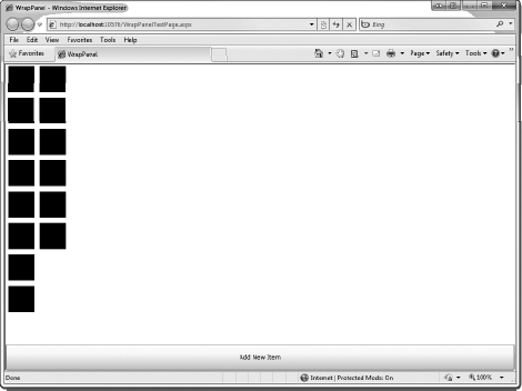
WrapPanelhas been added, your XAML source should appear as follows:<UserControl x:Class="WrapPanel.MainPage" xmlns="http://schemas.microsoft.com/winfx/2006/xaml/presentation" xmlns:x="http://schemas.microsoft.com/winfx/2006/xaml" xmlns:d="http://schemas.microsoft.com/expression/blend/2008" xmlns:mc="http://schemas.openxmlformats.org/markup-compatibility/2006" mc:Ignorable="d" d:DesignHeight="300" d:DesignWidth="400"xmlns:toolkit="http://schemas.microsoft.com/winfx/2006/xaml/presentation/toolkit"><Grid x:Name="LayoutRoot" Background="White"> <Grid.RowDefinitions> <RowDefinition /> <RowDefinition Height="50" /> </Grid.RowDefinitions><toolkit:WrapPanel Name="wrapPanel1" /><Button x:Name="addItem" Click="addItem_Click" Content="Add New Item" Grid.Row="1" /> </Grid> </UserControl>Now we need to add the code behind the button click event. Right click on
addItem_Clickin the XAML and choose "Navigate to Event Handler." This will take you to the code behind ofMainPage.xaml. Add the following code within theaddItem_Clickevent handler.private void addItem_Click(object sender, RoutedEventArgs e) {Rectangle newRect = new Rectangle();newRect.Width = 50;newRect.Height = 50;newRect.Margin = new Thickness(5);newRect.Fill = new SolidColorBrush(Color.FromArgb(255, 0, 0, 0));wrapPanel1.Children.Add(newRect);}We can now test the application. Once the application appears, start pressing the
Add New Itembutton and watch the items appear horizontally as well as wrap to a new row when a new item cannot fit within the width of the control (see Figure 3-19).At this point, you can then go into the XAML designer for
MainPage.xaml, add the propertyOrientation="Vertical"to theWrapPanel, and test the application once again. This time you will notice that the items appear vertically and wrap to new columns once they reach the maximum height, as shown in Figure 3-20.


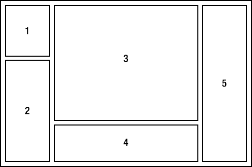
The DockPanel control was first released in Silverlight 3 via the Silverlight Toolkit. It provides the ability to dock controls in all four directions: top, bottom, right, and left. Consider Figure 3-21, which is a possible layout with the DockPanel control involving five controls. The first two controls are docked in the left panel; the third control is docked in the top-center panel; the fourth control is docked in the bottom-center panel; and the fifth control is docked in the right panel.
To achieve this layout without the DockPanel would involve nested layout controls or a fairly complex Grid control. The point is that the for certain situations the DockPanel can definitely be a very effective control.
In this exercise, we will explore the DockPanel control and how it can be used to layout controls docked in different directions.
Open Visual Studio 2010 and create a new Silverlight application called
DockPanel. Allow Visual Studio to create a Web Application to host the application.When the project is created, the file
MainPage.xamlwill be automatically created and will be opened in the XAML designer. We will add aDockPanelto the root Grid and then add buttons that are docked in different positions.Just like we did with the
WrapPanelin the previous section, in order to get the proper XML namespace added for theDockPanel, add it by double-clicking on the control from the Toolbox in Visual Studio. That way Visual Studio will automatically add the Xml namespace and assembly reference to the page. Once the panel has been added, you can then modify the tag how you would like.The default dock behavior is to dock the control left. However, if you want to change that you can use the Dock extended property to change this behavior. As an example to dock a control to the right, you would add the property
controls:DockPanel.Dock="Right"to the control. (Note that we included thexmlns, attribute, which is required.)When you are finished adding the controls, your XAML should look like the following:
<Grid x:Name="LayoutRoot" Background="White"><toolkit:DockPanel Name="dockPanel1"><Button Content="Left Button" toolkit:DockPanel.Dock="Left" /><Button Content="Right Button" toolkit:DockPanel.Dock="Right" /><Button Content="Bottom Button" toolkit:DockPanel.Dock="Bottom" /></toolkit:DockPanel></Grid>The result of this code should appear as shown in Figure 3-22.
Notice that the last button placed in the DockPanel automatically fills the remaining space. This is the default behavior of the DockPanel. However, if you do not want the DockPanel to do this, simply add the LastChildFill property set to False to the DockPanel.
<Grid x:Name="LayoutRoot" Background="White"> <toolkit:DockPanel Name="dockPanel1"LastChildFill="False"> <Button Content="Left Button" toolkit:DockPanel.Dock="Left" /> <Button Content="Right Button" toolkit:DockPanel.Dock="Right" /> <Button Content="Bottom Button" toolkit:DockPanel.Dock="Bottom" /> </toolkit:DockPanel> </Grid>Once you have added this property, the result should appear as shown in Figure 3-23.
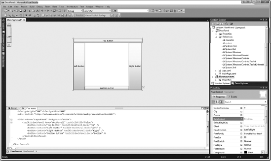
The order in which you place the controls in the
DockPaneldetermines how they are docked with the other controls. For example, notice that button labeledBottom Buttonis docked around the left and right button, because they were added earlier in theDockPanel. However, if we add another button to the first button in theDockPaneland dock it to the top it will occupy the entire width of the control.<Grid x:Name="LayoutRoot" Background="White"> <toolkit:DockPanel Name="dockPanel1" LastChildFill="False"><Button Content="Top Button" toolkit:DockPanel.Dock="Top" /><Button Content="Left Button" toolkit:DockPanel.Dock="Left" /> <Button Content="Right Button" toolkit:DockPanel.Dock="Right" /> <Button Content="Bottom Button" toolkit:DockPanel.Dock="Bottom" /> </toolkit:DockPanel> </Grid>Once you have added this control, the result should appear as shown in Figure 3-24.