So far in this book, you have learned about the many elements of Silverlight and how they can be used to build RIAs. But what if Silverlight doesn't offer the specific functionality you need for an application? In that case, you may want to create a custom control to provide that additional functionality.
The actual procedure for creating custom controls is not that terribly difficult, but understanding the process can be. Under the hood, Silverlight performs some complex work, but most Silverlight developers do not need to know these details. However, in order to understand custom controls and the process used to build them, you must dive in and see how Silverlight ticks.
In this chapter, you will examine when it is appropriate to write custom controls in Silverlight. Then you will look at the Silverlight Control Toolkit and the controls it offers for developers to use in their applications. Next, you will explore the different aspects of the Silverlight control model. Finally, you will build a custom control for Silverlight.
When you find that none of the existing Silverlight controls do exactly what you want, creating a custom control is not always the solution. In fact, in most cases, you should be able to get by without writing custom controls. Due to the flexibility built into the Silverlight controls, you can usually modify an existing one to suit your needs.
As a general rule, if your goal is to modify the appearance of a control, there is no need to write a custom control. Silverlight controls that are built properly, following Microsoft's best practices, will adopt the Parts and States model, which calls for complete separation of the logical and visual aspects of your control. Due to this separation, developers can change the appearance of controls, and even change transitions of the controls between different states, without needing to write custom controls.
So, just when is creating a custom control the right way to go? Here are the primary reasons for writing custom controls:
- Abstraction of functionality:
When developing your applications, you may need to implement some functionality that can be achieved using Silverlight's out-of-the-box support. However, if this functionality needs to be reused often in your application, you may choose to create a custom control that abstracts the functionality, in order to simplify the application. An example of this would be if you wanted to have two text boxes next to each other for first and last names. Instead of always including two
TextBoxcontrols in your XAML, you could write a custom control that would automatically include both text boxes and would abstract the behavior surrounding the text boxes.- Modification of functionality:
If you would like to change the way a Silverlight control behaves, you can write a custom control that implements that behavior, perhaps inheriting from an existing control. An example of this would be if you wanted to create a button that pops up a menu instead of simply triggering a click method.
- Creation of new functionality:
The most obvious reason for writing a custom control in Silverlight is to add functionality that does not currently exist in Silverlight. As an example, you could write a control that acts as a floating window that can be dragged and resized.
Although these are valid reasons for creating custom controls, there is one more resource you should check before you do so: the Silverlight Control Toolkit.
Before you start to build custom controls for Silverlight, you should understand the key concepts of the Silverlight control model. In this section, you will look at two of these concepts:
Following Microsoft's best practices, Silverlight controls are built with a strict separation between the visual aspects of the control and the logic behind the control. This allows developers to create templates for existing controls that will dramatically change the visual appearance and the visual behaviors of a control, without needing to write any code. This separation is called for by the Parts and States model. The visual aspects of controls are managed by Silverlight's Visual State Manager (VSM).
Note
You are not required to adhere to the Parts and State model when developing custom controls. However, developers are urged to do so in order to follow the best practices outlined by Microsoft.
The Parts and States model uses the following terminology:
- Parts:
Named elements contained in a control template that are manipulated by code in some way are called parts. For example, a simple
Buttoncontrol could consist of a rectangle that is the body of the button and a text block that represents the text on the control.- States:
A control will always be in a state. For a
Buttoncontrol, different states include when the mouse is hovered over the button, when the mouse is pressed down on the button, and when neither is the case (its default or normal state). The visual look of control is defined by its particular state.- Transitions:
When a control changes from one state to another—for example, when a
Buttoncontrol goes from its normal state to having the mouse hovered over it—its visual appearance may change. In some cases, this change may be animated to provide a smooth visual transition from the states. These animations are defined in the Parts and States model by transitions.- State group:
According to the Parts and States model, control states can be grouped into mutually exclusive groups. A control cannot be in more than one state within the same state group at the same time.
Properties are a common part of object-oriented programming and familiar to .NET developers. Here is a typical property definition:
private string _name;
public string Name
{
    get { return _name; }
    set { _name = value; }
}
In Silverlight and WPF, Microsoft has added some functionality to the property system. This new system is referred to as the Silverlight property system. Properties created based on this new property system are called dependency properties.
In a nutshell, dependency properties allow Silverlight to determine the value of a property dynamically from a number of different inputs, such as data binding or template binding. As a general rule, if you want to be able to style a property or to have it participate in data binding or template binding, it must be defined as a dependency property.
You define a property as a dependency property using the DependencyProperty object, as shown in the following code snippet:
public static readonly DependencyProperty NameProperty =
    DependencyProperty.Register(
        "Name",
        typeof(string),
        typeof(MyControl),
        null
        );

public int Name
{
    get
    {
        return (string)GetValue(NameProperty);
    }
    set
    {
        SetValue(NameProperty, value);
    }
}
This example defines the Name property as a dependency property. It declares a new object of type DependencyProperty called NameProperty, following the naming convention detailed by Microsoft. NameProperty is set equal to the return value of the DependencyProperty.Register() method, which registers a dependency property within the Silverlight property system.
The DependencyProperty.Register() method is passed a number of arguments:
The name of the property that you are registering as a dependency property—
Name, in this example.The data type of the property you are registering—
string, in this example.The data type of the object that is registering the property—
MyControl, in this example.Metadata that should be registered with the dependency property. Most of the time, this will be used to hook up a callback method that will be called whenever the property's value is changed. This example simply passes
null. In the next section, you will see how this last argument is used.
Now that I have discussed custom controls in Silverlight from a high level, it's time to see how to build your own.
As I mentioned at the beginning of the chapter, creating a custom control does not need to be difficult. Of course, the work involved depends on how complex your control needs to be. As you'll see, the custom control you'll create in this chapter is relatively simple. Before you get to that exercise, let's take a quick look at the two options for creating custom controls.
You have two main options for creating custom functionality in Silverlight:
- With a
UserControl: The simplest way to create a piece of custom functionality is to implement it with a
UserControl. Once theUserControlis created, you can then reuse it across your application.- As a custom control:
The content that is rendered is built from scratch by the developer. This is by far the most complex option for creating a custom control. You would need to do this when you want to implement functionality that is unavailable with the existing controls in Silverlight.
In this chapter's exercise, you will take the custom control approach.
In this exercise, you will build your own "cooldown" button. This button will be disabled for a set number of seconds—its cooldown duration—after it is clicked. If you set the cooldown to be three seconds, then after you click the button, you will not be able to click it again for three seconds.
For demonstration purposes, you will not use the standard Silverlight Button control as the base control. Instead, you will create a custom control that implements Control. This way, I can show you how to create a control with a number of states.
The cooldown button will have five states, implemented in two state groups. The NormalStates state group will have these states:
It will also have a state group named CoolDownStates, which will contain two states:
Keep in mind that this is only an example, and it has many areas that could use improvement. The goal of the exercise is not to produce a control that you will use in your applications, but rather to demonstrate the basic steps for creating a custom control in Silverlight.
Let's get started by creating a new project for the custom control.
In Visual Studio 2010, create a new Silverlight Application named
CoolDownButtonTestand allow Visual Studio to create a Web Application project to host your application.From Solution Explorer, right-click the solution and select Add

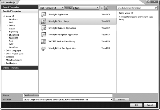
In the Add New Project dialog box, select the Silverlight Class Library template and name the library
CoolDownButton, as shown in Figure 14-1. If prompted about which version of Silverlight to use, select Silverlight 4 and press OK, as shown in Figure 14-2.By default, Visual Studio will create a class named
Class1.cs. Delete this file from the project.Right-click the
CoolDownButtonproject and select AddIn the Add New Item dialog box, select the Class template and name the class
CoolDownButtonControl, as shown in Figure 14-3.


Now you're ready to create the control. Let's begin by coding the properties and states.
Set the control class to inherit from
Control, in order to gain the base Silverlight control functionality, as follows:namespace CoolDownButton { public class CoolDownButtonControl : Control { } }Now add the control's public properties, as follows:
namespace CoolDownButton { public class CoolDownButtonControl : Control {public static readonly DependencyProperty CoolDownSecondsProperty =DependencyProperty.Register("CoolDownSeconds",typeof(int),typeof(CoolDownButtonControl),new PropertyMetadata(new PropertyChangedCallback(CoolDownButtonControl.OnCoolDownSecondsPropertyChanged)));public int CoolDownSeconds{get{return (int)GetValue(CoolDownSecondsProperty);}set{SetValue(CoolDownSecondsProperty, value);}}private static void OnCoolDownSecondsPropertyChanged(DependencyObject d, DependencyPropertyChangedEventArgs e){CoolDownButtonControl cdButton = d as CoolDownButtonControl;cdButton.OnCoolDownButtonChange(null);}public static readonly DependencyProperty ButtonTextProperty =DependencyProperty.Register("ButtonText",typeof(string),typeof(CoolDownButtonControl),new PropertyMetadata(new PropertyChangedCallback(CoolDownButtonControl.OnButtonTextPropertyChanged)));public string ButtonText{get{return (string)GetValue(ButtonTextProperty);}set{SetValue(ButtonTextProperty, value);}}private static void OnButtonTextPropertyChanged(DependencyObject d, DependencyPropertyChangedEventArgs e){CoolDownButtonControl cdButton = d as CoolDownButtonControl;cdButton.OnCoolDownButtonChange(null);}protected virtual void OnCoolDownButtonChange(RoutedEventArgs e){}} }As explained earlier in the chapter, in order for your properties to allow data binding, template binding, styling, and so on, they must be dependency properties. In addition to the dependency properties, you added two callback methods that will be called when the properties are updated. By naming convention, the
CoolDownSecondsproperty has aDependencyPropertyobject namedCoolDownSecondsPropertyand a callback method ofonCoolDownSecondsPropertyChanged(). So you need to watch out, or your names will end up very long, as they have here.Add some private members to contain state information, as follows:
namespace CoolDownButton { public class CoolDownButtonControl : Control {private FrameworkElement corePart;private bool isPressed, isMouseOver, isCoolDown;private DateTime pressedTime;... } }The
corePartmembers are of typeFrameworkElementand will hold the instance of the main part, which will respond to mouse events. TheisPressed, isMouseOver, andisCoolDownBoolean members will be used to help keep track of the current button state. And thepressedTimemember will record the time that the button was clicked in order to determine when the cooldown should be removed.Add a helper method called
GoToState(), which will assist in switching between the states of the control:private void GoToState(bool useTransitions) { // Go to states in NormalStates state group if (isPressed) { VisualStateManager.GoToState(this, "Pressed", useTransitions); } else if (isMouseOver) { VisualStateManager.GoToState(this, "MouseOver", useTransitions); } else { VisualStateManager.GoToState(this, "Normal", useTransitions); } // Go to states in CoolDownStates state group if (isCoolDown) { VisualStateManager.GoToState(this, "CoolDown", useTransitions); } else { VisualStateManager.GoToState(this, "Available", useTransitions); } }This method will check the private members you added in the previous step to determine in which state the control should be. When the proper state is determined, the
VisualStateManager.GoToState()method is called, passing it the control, the name of the state, and whether or not the control should use transitions when switching from the current state to this new state (whether or not an animation should be shown).
Now let's turn to the visual aspect of the control.
The default control template is placed in a file named generic.xaml, which is located in a folder named themes. These names are required. The generic.xaml is a resource dictionary that defines the built-in style for the control. You need to add the folder and file, make some adjustments to the file, and then add the XAML to set the control's appearance.
To add the required folder, right-click the
CoolDownButtonproject and select AddRight-click the newly added
themesfolder and select AddIn the Add New Item dialog box, select the Silverlight Resource Dictionary template and name the file
generic.xaml, as shown in Figure 14-4. Click Add, and confirm that thegeneric.xamlfile was added within thethemesfolder.Right-click the
generic.xamlfile and select Properties. Change the Build Action to Resource and remove the resource for the Custom Tool property, as shown in Figure 14-5.Open the
generic.xamlfile. You will see that, by default, the file has the following contents:<ResourceDictionary xmlns="http://schemas.microsoft.com/winfx/2006/xaml/presentation" xmlns:x="http://schemas.microsoft.com/winfx/2006/xaml"> </ResourceDictionary>Next we need to add a reference to the
CoolDownButtonnamespace:<ResourceDictionary xmlns="http://schemas.microsoft.com/winfx/2006/xaml/presentation" xmlns:x="http://schemas.microsoft.com/winfx/2006/xaml"xmlns:bsl="clr-namespace:CoolDownButton"></ResourceDictionary>Now you can add the actual XAML that will make up the control. First, add a
Styletag, with theTargetTypeset toCoolDownButtonControl. Then add aSetterfor the control template, and within that, add theControlTemplatedefinition, again withTargetTypeset toCoolDownButtonControl. The control will consist of twoRectanglecomponents: one for the button itself, namedcoreButton, and one for the 75% opacity overlay that will be displayed when the button is in itsCoolDownstate. It will also have aTextBlockcomponent to contain the text of the button. This defines the control in the default state. Therefore, the opacity of the overlay rectangle is set to 0% to start, because the overlay should not be visible by default. The additions are as follows:<ResourceDictionary xmlns="http://schemas.microsoft.com/winfx/2006/xaml/presentation" xmlns:x="http://schemas.microsoft.com/winfx/2006/xaml" xmlns:bsl="clr-namespace:CoolDownButton"><Style TargetType="bsl:CoolDownButtonControl"><Setter Property="Template"><Setter.Value><ControlTemplate TargetType=" bsl:CoolDownButtonControl"><Grid x:Name="LayoutRoot"><RectangleStrokeThickness="4"Stroke="Navy"Fill="AliceBlue"RadiusX="4"RadiusY="4"x:Name="innerButton" /><TextBlockHorizontalAlignment="Center"VerticalAlignment="Center"Text="Test"TextWrapping="Wrap"/><RectangleOpacity="0"Fill="#FF000000"Stroke="#FF000000"RenderTransformOrigin="0.5,0.5"RadiusY="4" RadiusX="4"x:Name="corePart"><Rectangle.RenderTransform><TransformGroup><ScaleTransformScaleX="1"ScaleY="1"/></TransformGroup></Rectangle.RenderTransform></Rectangle></Grid></ControlTemplate></Setter.Value></Setter></Style></ResourceDictionary>Now that you have defined the default appearance of the control, you need to add the
VisualStateGroups, along with the different states for the control. To do this, add the following code just before the firstRectangle. Notice that for each state, aStoryboardis used to define the state's visual appearance:<VisualStateManager.VisualStateGroups> <VisualStateGroup Name="NormalStates"> <VisualState Name="Normal"/> <VisualState Name="MouseOver" > <Storyboard > <DoubleAnimation Storyboard.TargetName="innerButton" Storyboard.TargetProperty="(UIElement.StrokeThickness)" Duration="0" To="6"/> </Storyboard> </VisualState> <VisualState x:Name="Pressed"> <Storyboard> <DoubleAnimation Storyboard.TargetName="innerButton" Storyboard.TargetProperty="(UIElement.StrokeThickness)" Duration="0" To="2"/> </Storyboard> </VisualState> </VisualStateGroup> <VisualStateGroup Name="CoolDownStates"> <VisualState Name="Available"/> <VisualState Name="CoolDown"> <Storyboard> <DoubleAnimation Storyboard.TargetName="corePart" Storyboard.TargetProperty="(UIElement.Opacity)" Duration="0" To=".75"/> </Storyboard> </VisualState> </VisualStateGroup> </VisualStateManager.VisualStateGroups>


Now let's turn our attention back to the CoolDownButtonControl.cs file to finish up the logic behind the control.
To complete the control, you need to handle its events and define its control contract.
First, you must get an instance of the core part. Referring back to step 8 in the "Defining the Control's Appearance" section, you'll see that this is the overlay rectangle named
corePart. This is the control on top of the other controls, so it is the one that will accept the mouse events. To get the instance ofcorePart, use theGetChildElement()method. Call this method in theOnApplyTemplate()method that is called whenever a template is applied to the control, as follows:public override void OnApplyTemplate() { base.OnApplyTemplate(); CorePart = (FrameworkElement)GetTemplateChild("corePart"); GoToState(false); } private FrameworkElement CorePart { get { return corePart; } set { corePart = value; } }Notice that this method calls the base
OnApplyTemplate()method, and then calls theGoToState()method, passing itfalse. This is the first time that theGoToState()method will be called, and you are passing itfalseso that it does not use any transitions while changing the state. The initial view of the control should not have any animations to get it to the initial state.At this point, you need to wire up event handlers to handle the mouse events. First, create the event handlers themselves, as follows:
void corePart_MouseEnter(object sender, MouseEventArgs e)
{
    isMouseOver = true;
    GoToState(true);
}

void corePart_MouseLeave(object sender, MouseEventArgs e)
{
    isMouseOver = false;
    GoToState(true);
}

void corePart_MouseLeftButtonDown(object sender, MouseButtonEventArgs e)
{
    isPressed = true;
    GoToState(true);
}
void corePart_MouseLeftButtonUp(object sender, MouseButtonEventArgs e) { isPressed = false; isCoolDown = true; pressedTime = DateTime.Now; GoToState(true); }Next, wire up the handlers to the events. You can do this in the
CorePartproperty's setter, as follows. Note that in the case where more than one template is applied, before wiring up the event handlers, you need to make sure to remove any existing event handlers.private FrameworkElement CorePart { get { return corePart; } set {FrameworkElement oldCorePart = corePart;if (oldCorePart != null){oldCorePart.MouseEnter -=new MouseEventHandler(corePart_MouseEnter);oldCorePart.MouseLeave -=new MouseEventHandler(corePart_MouseLeave);oldCorePart.MouseLeftButtonDown -=new MouseButtonEventHandler(corePart_MouseLeftButtonDown);oldCorePart.MouseLeftButtonUp -=new MouseButtonEventHandler(corePart_MouseLeftButtonUp);}corePart = value; if (corePart != null){corePart.MouseEnter +=new MouseEventHandler(corePart_MouseEnter);corePart.MouseLeave +=new MouseEventHandler(corePart_MouseLeave);corePart.MouseLeftButtonDown +=new MouseButtonEventHandler(corePart_MouseLeftButtonDown);corePart.MouseLeftButtonUp +=new MouseButtonEventHandler(corePart_MouseLeftButtonUp);}} }Recall that when the button is clicked, you need to make sure the button is disabled for however many seconds are set as the cooldown period. To do this, first create a method that checks to see if the cooldown time has expired, as follows:
private bool CheckCoolDown()
{
    if (!isCoolDown)
    {
        return false;
    }
    else
    {
        if (DateTime.Now > pressedTime.AddSeconds(CoolDownSeconds))
        {
            isCoolDown = false;
            return false;
        }
        else
        {
            return true;
        }
    }
}
The logic behind this method is pretty simple. If the
isCoolDownflag istrue, then you are simply checking to see if the current time is greater than thepressedTimeadded to the cooldown. If so, you reset theisCoolDownflag and returnfalse; otherwise, you returntrue.Now you need to surround the code in each of the event handlers with a call to the
CheckCoolDown()method, as follows. If the cooldown has not yet expired, none of the event handlers should perform any action.void corePart_MouseEnter(object sender, MouseEventArgs e) { if (!CheckCoolDown()){isMouseOver = true; GoToState(true);}}void corePart_MouseLeave(object sender, MouseEventArgs e) { if (!CheckCoolDown()) { isMouseOver = false; GoToState(true);}} void corePart_MouseLeftButtonDown(object sender, MouseButtonEventArgs e) { if (!CheckCoolDown()) { isPressed = true; GoToState(true);}} void corePart_MouseLeftButtonUp(object sender, MouseButtonEventArgs e) {if (!CheckCoolDown()){ isPressed = false; isCoolDown = true; pressedTime = DateTime.Now; GoToState(true);}}Recall that in step 2 of the "Defining Properties and States" section you created a method called
OnCoolDownButtonChange(). At that time, you did not place anything in this method. This is the method that is called whenever there is a notification change to a dependency property. When a change occurs, you need to callGoToState()so the control can reflect the changes, as follows:protected virtual void OnCoolDownButtonChange(RoutedEventArgs e) { GoToState(true); }Next, create a constructor for your control and apply the default style key. In many cases, this will simply be the type of your control itself.
public CoolDownButtonControl()
{
    DefaultStyleKey = typeof(CoolDownButtonControl);
}
The final step in creating the control is to define a control contract that describes your control. This is required in order for your control to be modified by tools such as Expression Blend. This contract consists of a number of attributes that are placed directly in the control class, as follows. These attributes are used only by tools; they are not used by the runtime.
namespace CoolDownButton {[TemplatePart(Name = "Core", Type = typeof(FrameworkElement))][TemplateVisualState(Name = "Normal", GroupName = "NormalStates")][TemplateVisualState(Name = "MouseOver", GroupName = " NormalStates")][TemplateVisualState(Name = "Pressed", GroupName = " NormalStates")][TemplateVisualState(Name = "CoolDown", GroupName = "CoolDownStates")][TemplateVisualState(Name = "Available", GroupName = "CoolDownStates")]public class CoolDownButtonControl : Control { ... } }
This completes the creation of the custom control.
Now you're ready to try out your new control.
Compile your control.
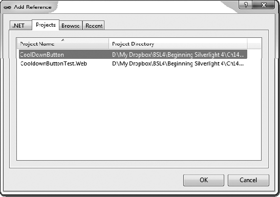
If everything compiles correctly, you need create an instance of your control in your
CoolDownButtonproject. To do this, right-click theCoolDownButtonproject in Solution Explorer and select Add Reference. In the Add Reference dialog box, select the Projects tab and chooseCoolDownButton, as shown in Figure 14-6. Then click OK.Navigate to your
MainPage.xamlfile within theCoolDownButtonproject. First add a newxmlnsto theUserControldefinition, and then add an instance of your control, as follows:<UserControl x:Class="CooldownButtonTest.MainPage" xmlns="http://schemas.microsoft.com/winfx/2006/xaml/presentation" xmlns:x="http://schemas.microsoft.com/winfx/2006/xaml" xmlns:d="http://schemas.microsoft.com/expression/blend/2008" xmlns:mc="http://schemas.openxmlformats.org/markup-compatibility/2006"xmlns:bsl="clr-namespace:CoolDownButton;assembly=CoolDownButton"mc:Ignorable="d" d:DesignHeight="300" d:DesignWidth="400"> <Grid x:Name="LayoutRoot" Background="White"><bsl:CoolDownButtonControlCoolDownSeconds="3"Width="150" Height="60" /></Grid> </UserControl>Run the project. You should see your button.
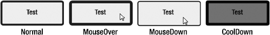
Test the states of your button. When you move the mouse over the button, the border thickness will increase. Click the mouse on the button, and the border will decrease. When you release the mouse from the button, the border will go back to normal, and the overlay will appear. You can continue to move the mouse over the button, and you will notice that it will not respond to your events until three seconds have passed. Figure 14-7 shows the various control states.
Clearly, this cooldown button has a lot of room for improvement. However, the goal was to show you the basic steps involved in creating a custom control. As you most certainly could tell, the process is pretty involved, but the rewards of following the best practices are worth it. When the control is built properly like this, you can apply custom templates to it to dramatically change its appearance, without needing to rewrite any of the code logic.
Without a doubt, this was the most complex content so far covered in this book. The goal was to give you a basic understanding of what is involved in creating custom controls the right way in Silverlight.
In this chapter, you looked at when you might want to create a custom control. Then you learned about some of the key concepts within the Silverlight control model, including the Parts and States model and dependency properties. Finally, you built your own custom control.