
So far in this book, the primary focus has been on using Visual Studio 2010 to create Silverlight applications. Visual Studio provides developers with a strong IDE for developing RIAs. However, you may want your Silverlight applications to contain some complicated design elements, and in these cases, it's not much fun to edit the XAML manually. To address this problem, Microsoft has created Expression Blend, a product built to edit XAML documents visually.
Whereas Visual Studio has been designed to cater to the developer, Expression Blend has been built for the designer. As you've seen, Silverlight does a fantastic job of separating the appearance and logic of an application, so developers and designers can work side by side. ASP.NET took a few strides to achieve this separation, but still fell short in many ways. I think you will find that Silverlight has reached a new layer in this separation, making it much more practical for designers and developers to truly work in parallel in designing applications.
The first reaction most ASP.NET software developers will have when opening Expression Blend is shock. "Wow, this looks like no Microsoft development product I have ever seen!" And it is true that Expression Blend is quite different from the standard Visual Studio IDE type of product. The Microsoft developers have finally provided a product for the graphic designer audience, and they have attempted to make it very similar to the tools designers are accustomed to using. As software developers, we may need to play around a bit in Expression Blend to get the feel of it. Personally, I have found it quite cool to learn and use, and I think you will, too.
This chapter will get you started with Expression Blend. You'll learn about its key features and its workspace. Finally, I'll walk you through creating a grid layout with Expression Blend.
In this section, you will look at some of the notable features in Expression Blend, including the following:
Visual XAML editor
Visual Studio 2010 integration
Split-view mode
Visual State Manager and template editing support
Timeline
Note
One of the things that Microsoft has done better and better over the past few years is documentation. Expression Blend's documentation is quite comprehensive. For additional information about any of the items discussed in this chapter, refer to the User Guide provided with Expression Blend.
Clearly, the biggest feature of Expression Blend is that it provides a WYSIWYG editor for XAML. XAML is a very clean language, but it can also get quite complex quickly when you are working with your applications. This is especially true when you start to add animations and transformations, which are covered in Chapter 13.
Although it is possible to edit your XAML files completely in Visual Studio using IntelliSense, there is no substitute for a visual editor. In addition, the XAML that Expression Blend creates is very clean and developer-friendly. This should make developers happy, considering the terrible memories of earlier versions of FrontPage, where every change you made would result in your code being mangled beyond recognition.
In addition, when you start working with styles (covered in Chapter 12), IntelliSense support in Visual Studio becomes limited, so the XAML is very difficult to edit manually. Expression Blend provides an extremely quick and easy way to edit and create styles, which is another reason it is an invaluable tool for editing your Silverlight applications.
Due to the strong push for developers and designers to work in parallel, and given the fact that XAML files are included directly within Visual Studio 2010 projects, a valid concern would be how well Expression Blend and Visual Studio work together. If there were conflicts between the two IDEs, there could be conflicts between the developers and designers, resulting in resistance to working in parallel.
The good news is that Expression Blend integrates with Visual Studio. Visual Studio 2010 projects can be opened directly in Expression Blend and vice versa. In addition, while Expression Blend creates Visual Studio 2010 projects by default, it is also capable of opening Visual Studio 2008 and 2005 projects.
As is shown in Figure 11-1, Expression Blend allows you to work in design and source (XAML) mode simultaneously. For example, you can draw an object at the top in design mode, and the XAML in the source window will be updated automatically. In addition, you can just as easily edit the XAML, and the change will be reflected automatically in the design window.
One of the cool features of Silverlight is the fact that all controls released with it support the new Parts and State model, which requires strict separation between a control's logic and appearance. Microsoft recommends that all custom controls also support this model.
By separating the logic from the appearance of a control, a developer or designer can completely change the appearance of a control without affecting its behavior. This process is known as creating a template, or skinning, and is regulated by Visual State Manager (VSM). Expression Blend provides a very clean way to create and edit these parts and states, which makes skinning your applications a relatively simple task. You'll learn more about VSM and skinning in Pro Silverlight 4 in C# by Matthew MacDonald (Apress, 2010).
In Silverlight, animations are based on keyframes within a storyboard. These keyframes are set on a timeline, and they define the start and end points of a smooth visual transition. Figure 11-2 shows the Expression Blend timeline, which is located in the Objects and Timeline panel.

The timeline provides you with structure for all of the animation sequences in your Silverlight application. Instead of the timeline being based on abstract frames, it is based on time, which makes it very straightforward and easy to understand. Also, as you develop your animations, you can quickly navigate to any given time on the timeline to check the appearance of your application at that point.
As you've learned, one of the key features of Expression Blend is that it integrates directly with Visual Studio 2010 projects. This exercise demonstrates how you can use the two products side by side while creating and editing projects.
Open Expression Blend. By default, when you open Expression Blend, you will see the splash screen shown in Figure 11-3. If you do not want this screen to appear when you start Expression Blend, you can simply uncheck the Run at startup check box at the bottom left. For now, if this screen appears, click Close to continue with the example.
You should now have an empty Expression Blend workspace. From the main menu, click File

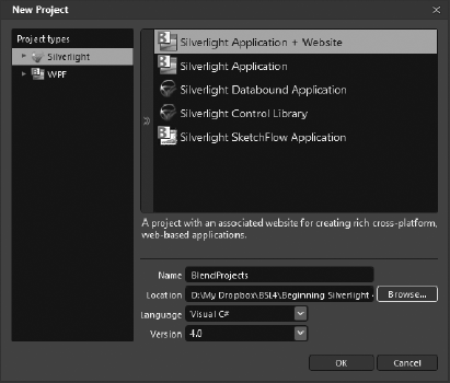
In the New Project dialog box, select Silverlight 3 Application + Website for the project type, and then enter
BlendProjectsfor the project name, as shown in Figure 11-4. Click OK to create the new project.By default, Expression Blend will open the
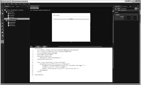
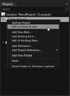
MainPage.xamlfile for editing. In the upper- right portion of the artboard (which contains the XML) are options to switch between design, XAML, and split-mode view. Click Split to see both the XAML and the design view at the same time, as shown in Figure 11-5.Now edit this project in Visual Studio. In the Project panel, right-click the
BlendProjectsproject and select Edit in Visual Studio, as shown in Figure 11-6. This will automatically start Visual Studio 2010 and open your project.Note
Step 5 assumes that you have already installed Visual Studio 2010. If not, you will need to install that to continue.
In Visual Studio 2010, double-click
MainPage.xamlin Solution Explorer. Let's make a simple change to the application in Visual Studio.Modify the root
Gridto add the following code shown in bold, to define aStackPanelwith aTextBlock, TextBox, andButton.<UserControl xmlns="http://schemas.microsoft.com/winfx/2006/xaml/presentation" xmlns:x="http://schemas.microsoft.com/winfx/2006/xaml" x:Class="BlendProjects.MainPage" Width="640" Height="480"><Grid x:Name="LayoutRoot" Background="White"><StackPanel Margin="20" Orientation="Vertical"><TextBlock Margin="5" Text="Enter Your Name:" /><TextBox Margin="5" x:Name="txtName" /><Button Margin="5" Content="Click Me!" /></StackPanel></Grid></UserControl>From the main menu, click File
Switch back to Expression Blend. It will prompt you with the File Modified dialog box, as shown in Figure 11-7. Click Yes. You will see Expression Blend refresh the project so that it reflects the changes you made in Visual Studio 2010.


Pretty nifty, right? The same file modification is offered when you do the reverse: make a change in Expression Blend and then go back into Visual Studio. Feel free to try this out yourself.
As this exercise demonstrated, Expression Blend and Visual Studio work together seamlessly. You can switch back and forth between the two products without fear of data loss or conflicts.
Note
Although usually Expression Blend will be used together with Visual Studio, Expression Blend will actually pick up on changes to open files caused by edits in any editor.
Now that I have briefly discussed some of the key features of Expression Blend, let's take a look at the different elements of its workspace. Despite its radical appearance, developers will find many similarities between Visual Studio and Expression Blend.
Let's start out by looking at Expression Blend in Animation workspace mode. You enter this mode by selecting Window
The Expression Blend Toolbox provides the tools for adding and manipulating objects within your application. As shown in Figure 11-8, it is divided into five primary sections: selection tools, view tools, brush tools, object tools, and asset tools. The object tool group includes six submenus, which contain path tools, shape tools, layout tools, text controls, and common controls.

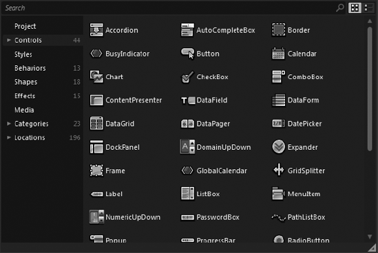
Clicking the Asset Tools icon at the very bottom of the Toolbox opens the Asset Library window, which lists the Silverlight system controls, as shown in Figure 11-9.
The Project panel is very similar to Solution Explorer in Visual Studio. It lists all the files associated with the project.
The Project panel also displays project references and properties. See Figure 11-6 for an example of the Project panel.
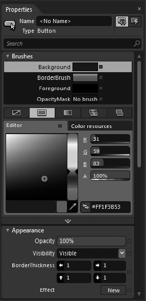
The Properties panel allows you to view and modify the properties of objects on the artboard. Figure 11-10 shows an example of the Properties panel when an Ellipse control is selected.
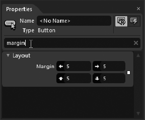
The Properties panel is divided into a number of sections to help you easily find specific properties. The sections displayed depend on the object you have selected. In addition, the Search box at the top of the Properties panel allows you to filter the listing by typing in the property name. Figure 11-11 shows an example of the Properties panel after searching for the Margin property.
All objects that are added to your Silverlight application are represented in the Objects and Timeline panel. Since items can be nested within other objects, a type of layering takes place. For objects that contain additional objects, an arrow will appear to the left of the item. Click this arrow to expand and collapse the display of the nested objects.
When animation is added to your Silverlight application, storyboards are created. Storyboards are represented in the timeline, as shown earlier in Figure 11-2. You'll learn more about the timeline in Chapter 13.
As discussed in Chapter 3, you have a number of options when it comes to laying out your Silverlight application. Although these layout controls can be added manually, Expression Blend offers a visual option. In this section, you will look at how Expression Blend can be used to easily work with the Grid layout control.
In Expression Blend, you place dividers to create columns and rows in the grid. When a Grid control is defined, Expression Blend will show blue rulers above and to the left of the grid. When you move your cursor over the blue rulers, a row divider will appear. Clicking the blue ruler will place the divider, and dragging a placed divider will move it. You will have a chance to try this out in a moment.
In the top-left corner of the window is an icon that determines the grid's edit mode. There are two layout editing modes for a grid within Expression Blend:
- Canvas layout mode:
In canvas layout mode, when column and row dividers are moved, elements inside those rows and columns stay in place.
- Grid layout mode:
In grid layout mode, the elements move with the column and row dividers.
Let's give layout in Expression Blend a try. In this exercise, you will create a simple grid layout with three rows and two columns. Then you will nest a secondary grid within the right-center cell, and place two more rows within that grid. The end product will look like Figure 11-12.

In Expression Blend, create a new Silverlight Application + Website project named
BlendLayout. TheMainPage.xamlfile will be opened automatically, and as usual, a rootGridnamedLayoutRootwill be present.First, create the column definitions. To do this, at about 25% from the left of the top blue grid ruler, click the ruler to place a grid divider, as shown in Figure 11-13. If you examine the XAML, you will notice that the
<Grid.ColumnDefinitions>element has been added, along with two<ColumnDefinition>elements, as follows (note that your percentages do not need to be exact):<UserControl xmlns="http://schemas.microsoft.com/winfx/2006/xaml/presentation" xmlns:x="http://schemas.microsoft.com/winfx/2006/xaml" x:Class="BlendLayout.MainPage" Width="634" Height="480"><Grid x:Name="LayoutRoot" Background="White"><Grid.ColumnDefinitions><ColumnDefinition Width="0.251*"/><ColumnDefinition Width="0.749*"/></Grid.ColumnDefinitions></Grid> </UserControl>Next, create the rows. In the blue grid ruler on the left, click at about 10% from the top and 10% from the bottom to place two dividers. Your grid should now look like the one shown in Figure 11-14.
The source for the
MainPage.xamlfile should be very similar to the following (the actual heights and widths do not need to be exact):<UserControl xmlns="http://schemas.microsoft.com/winfx/2006/xaml/presentation" xmlns:x="http://schemas.microsoft.com/winfx/2006/xaml" x:Class="BlendLayout.MainPage" Width="634" Height="480"> <Grid x:Name="LayoutRoot" Background="White"><Grid.RowDefinitions><RowDefinition Height="0.106*"/><RowDefinition Height="0.788*"/><RowDefinition Height="0.106*"/></Grid.RowDefinitions><Grid.ColumnDefinitions> <ColumnDefinition Width="0.251*"/> <ColumnDefinition Width="0.749*"/> </Grid.ColumnDefinitions> </Grid> </UserControl>At this point, you have created a number of cells. Now, let's create a nested grid within the right-center cell. To do this, make certain that the
LayoutRootis selected in the Objects and Timeline panel, and then double-click theGridcontrol in the Toolbox. This will add aGridof the default size to your application, as shown in Figure 11-15.With this new grid selected, edit its properties. In the Properties panel, set the properties as shown in Figure 11-16.
The nested grid should now take up the entire right-center cell. In the Objects and Timeline panel, double-click the
innerGridobject you just added. The top and left grid rulers will now appear for the inner grid, as shown in Figure 11-17.At this point, you could easily add rows and columns using the rulers, as you did with the
LayoutRoot, but let's try a different method.With
innerGridselected, in the Properties panel's Search box, type Definitions. This will display theRowDefinitionsandColumnDefinitionsproperties, as shown in Figure 11-18.Click the button to the right of RowDefinitions (Collection) to bring up the RowDefinition Collection Editor dialog box.
Click the "Add another item" button near the bottom of the RowDefinition Collection Editor dialog box and add two
RowDefinitionitems. Set theHeightproperty for the firstRowDefinitionto be25 (Star)and theHeightproperty for the secondRowDefinitionto75 (Star), as shown in Figure 11-19. Then click OK to close the editor.In the Properties panel, set the
ShowGridLinesproperty for bothGridstoTrue. The final XAML should look like the following (again, the heights and widths only need to be close):<UserControl xmlns="http://schemas.microsoft.com/winfx/2006/xaml/presentation" xmlns:x="http://schemas.microsoft.com/winfx/2006/xaml" x:Class="BlendLayout.MainPage" Width="634" Height="480"> <Grid x:Name="LayoutRoot" Background="White" ShowGridLines="True"> <Grid.RowDefinitions> <RowDefinition Height="0.106*"/> <RowDefinition Height="0.788*"/> <RowDefinition Height="0.106*"/> </Grid.RowDefinitions> <Grid.ColumnDefinitions> <ColumnDefinition Width="0.251*"/> <ColumnDefinition Width="0.749*"/> </Grid.ColumnDefinitions><Grid Margin="0" Grid.Row="1" Grid.Column="1" ShowGridLines="True"> <Grid.RowDefinitions> <RowDefinition Height="25*"/> <RowDefinition Height="75*"/> </Grid.RowDefinitions> </Grid> </Grid> </UserControl>Press F5 to test your application. The result should appear, as shown earlier in Figure 11-12.


As you can see, once you get used to working with Expression Blend, it can save you quite a bit of typing. This will make laying out your applications a much faster and easier task.
In this chapter, you took a first look at Expression Blend and how it can be used alongside Visual Studio 2010 to help you design your Silverlight applications. You also looked at working with the Grid layout control to create complex layouts for your applications.
The upcoming chapters explain how to use Expression Blend to style your Silverlight applications, as well as add transformations and animations to your applications.