
Of course you will want to create a rich appearance for your Silverlight application. You'll make choices about your design. What font size and family will you use? How much space will you place between your objects? What size of text boxes and buttons will you use?
As you'll learn in this chapter, you can control the styles of your Silverlight application's UI elements in several ways. The first approach you will explore is the straightforward use of inline properties. Then you will look at how to define and apply Silverlight styles.
You can simply define style properties directly in the object definitions. As an example, the following code snippet sets the FontFamily, FontSize, FontWeight, and Margin properties within the TextBlock itself.
<TextBlock
    Grid.Row="0"
    Grid.Column="0"
    Text="First Name"
    FontFamily="Verdana"
    FontSize="16"
    FontWeight="Bold"
    Margin="5" />
You can set inline properties using either Visual Studio or Expression Blend. Let's try out both.
The following exercise demonstrates how to use Visual Studio 2010 to define the appearance of your Silverlight applications with inline properties. In this exercise, you will create the UI for a simple data-input application. You will not add any logic to the application, since the focus is on the appearance of the controls.
Open Visual Studio 2010 and create a new Silverlight application named
Ch12_VSInlineStyling. Allow Visual Studio to create a Web Application project to host the application.When the project is created, you should be looking at the
MainPage.xamlfile. If you do not see the XAML source, switch to that view. Start by adjusting the size of theUserControlto get some additional space in which to work. SetHeightto400andWidthto600, as follows:<UserControl x:Class="Ch12_VSInlineStyling.MainPage" xmlns="http://schemas.microsoft.com/winfx/2006/xaml/presentation" xmlns:x="http://schemas.microsoft.com/winfx/2006/xaml"Width="600" Height="400"><Grid x:Name="LayoutRoot" Background="White"> </Grid> </UserControl>Add four rows and two columns to the root
Grid. Set the width of the left column to150, leaving the rest of the row and column definitions unspecified, as follows:<Grid x:Name="LayoutRoot" Background="White"><Grid.RowDefinitions><RowDefinition /><RowDefinition /><RowDefinition /><RowDefinition /></Grid.RowDefinitions><Grid.ColumnDefinitions><ColumnDefinition Width="150" /><ColumnDefinition /></Grid.ColumnDefinitions></Grid>Next, add
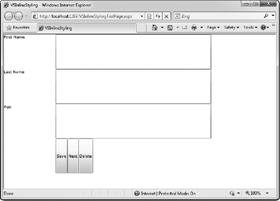
TextBlockcontrols in the three top-left columns andTextBoxcontrols in the top-right columns, with the textFirst Name,Last Name, andAge. Then add threeButtoncontrols within a horizontalStackPanelin the bottom-right column. Give these buttons the labelsSave,Next, andDelete. (Again, you won't be adding any logic to these controls; you will simply be modifying their appearance.) The code for this layout follows:<Grid x:Name="LayoutRoot" Background="White"> <Grid.RowDefinitions> <RowDefinition /> <RowDefinition /> <RowDefinition /> <RowDefinition /> </Grid.RowDefinitions> <Grid.ColumnDefinitions> <ColumnDefinition Width="150" /> <ColumnDefinition /> </Grid.ColumnDefinitions><TextBlock Grid.Row="0" Grid.Column="0" Text="First Name" /><TextBlock Grid.Row="1" Grid.Column="0" Text="Last Name" /><TextBlock Grid.Row="2" Grid.Column="0" Text="Age" /><TextBox Grid.Row="0" Grid.Column="1" /><TextBox Grid.Row="1" Grid.Column="1" /><TextBox Grid.Row="2" Grid.Column="1" /><StackPanel Grid.Row="3" Grid.Column="2" Orientation="Horizontal"><Button Content="Save" /><Button Content="Next" /><Button Content="Delete" /></StackPanel></Grid>Press F5 to start the application. You will see that the UI you have created is far from attractive, as shown in Figure 12-1. So let's make this ugly UI look a bit nicer by adding some styling.
Start with the three
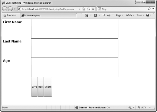
TextBlockcontrols. Within Visual Studio, set theFontFamily,FontSize,FontWeight, andMarginproperties directly within eachTextBlockdefinition, as shown in the following code snippet. As you type the property names, you will notice that IntelliSense makes this task a bit less tedious. Once you have set the four properties on theFirst Name TextBlock, copy and paste the properties to the other twoTextBlockcontrols.<TextBlock Grid.Row="0" Grid.Column="0" Text="First Name"FontFamily="Verdana"FontSize="16"FontWeight="Bold"Margin="5" /><TextBlock Grid.Row="1" Grid.Column="0" Text="Last Name"FontFamily="Verdana"FontSize="16"FontWeight="Bold"Margin="5" /><TextBlock Grid.Row="2" Grid.Column="0" Text="Age"FontFamily="Verdana"FontSize="16"FontWeight="Bold"Margin="5" />Run the application again. You can see the changes that have been made to the
TextBlocklabels, as shown in Figure 12-2.Now let's focus on the
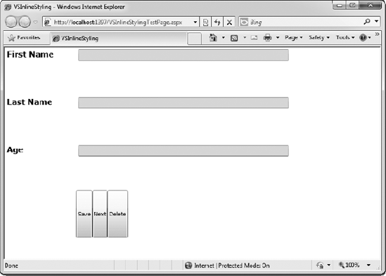
TextBoxcontrols. Add the following style attributes to these controls.<TextBox Grid.Row="0" Grid.Column="1"VerticalAlignment="Top"Height="24"Margin="5"FontSize="14"FontFamily="Verdana"Foreground="Blue"Background="Wheat" /><TextBox Grid.Row="1" Grid.Column="1"VerticalAlignment="Top"Height="24"Margin="5"FontSize="14"FontFamily="Verdana"Foreground="Blue"Background="Wheat" /><TextBox Grid.Row="2" Grid.Column="1"VerticalAlignment="Top"Height="24"Margin="5"FontSize="14"FontFamily="Verdana"Foreground="Blue"Background="Wheat" />Run the application to see the effect. It should look like Figure 12-3.
Notice that the spacing between the rows is too large. Ideally, the spaces should only be large enough to allow the margins of the controls to provide the separation. To adjust this spacing, on each
RowDefinition, change theHeightproperty toAuto, as follows:<Grid.RowDefinitions><RowDefinition Height="Auto" /><RowDefinition Height="Auto" /><RowDefinition Height="Auto" /><RowDefinition Height="Auto" /></Grid.RowDefinitions> <Grid.ColumnDefinitions> <ColumnDefinition Width="150" /> <ColumnDefinition /> </Grid.ColumnDefinitions>Once more, run the application to see how it looks at this point. Figure 12-4 shows the results of the automatic height settings.
The next elements to tackle are the
Buttoncontrols. Add the following style attributes to these three controls:<Button Content="Save"FontFamily="Verdana"FontSize="11"Width="75"Margin="5" /><Button Content="Next"FontFamily="Verdana"FontSize="11"Width="75"Margin="5" /><Button Content="Delete"FontFamily="Verdana"FontSize="11"Width="75"Margin="5" />Run the application to see the effect. It should look like Figure 12-5.
Finally, it would be nice to add a margin around the entire application. To do this, simply add a
Marginproperty definition to the rootGrid, as follows:<Grid x:Name="LayoutRoot" Background="White" Margin="25">
Press F5. The final product is a UI that looks pretty nice, as shown in Figure 12-6.


As you saw in this exercise, the process of setting inline properties in Visual Studio is simple and straightforward. However, the sample application contained only nine controls. You will look at some better options later in this chapter, in the "Silverlight Styles" section. Next, let's see how to set inline properties within Expression Blend.

The previous example used Visual Studio to set the inline properties of an application's controls. For those of you who are not a big fan of a lot of typing, you may find that Expression Blend is a better place to set these properties. In this next exercise, you will perform the same styling as in previous exercise, but using Expression Blend to set the properties, rather than Visual Studio 2010. Let's give it a try!
Open Expression Blend and create a new Silverlight 4 application named
Ch12_BlendStyling.The
UserControlis 640 by 480 by default when created in Expression Blend, so you can leave that size. The first thing to do is add the column and row definitions. You can copy and paste the grid definitions from the previous exercise, or you can add the columns and rows using Expression Blend's grid editor, as described in Chapter 9. The end result should look like Figure 12-7.Next, add the controls to the form. In the Toolbox, double-click the
TextBlockcontrol three times to add threeTextBlockcontrols to the grid. Then double-click theTextBoxcontrol three times, which will add threeTextBoxcontrols below theTextBlockcontrols.Double-click the
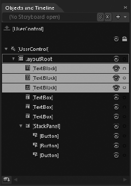
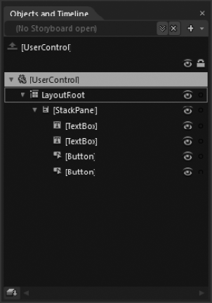
StackPanellayout control. Once theStackPanelis added, double- click it in the Objects and Timeline panel so that it is outlined, as shown in Figure 12-8.With the
StackPanelselected, double-click theButtoncontrol three times. The threeButtoncontrols will appear within theStackPanel, as shown in Figure 12-9.By default, Expression Blend adds a number of properties that you don't want. In the next steps, you'll remove the properties shown in bold in the following XAML:
<Grid x:Name="LayoutRoot" Background="White" > <Grid.RowDefinitions> <RowDefinition/> <RowDefinition/> <RowDefinition/> <RowDefinition/> </Grid.RowDefinitions> <Grid.ColumnDefinitions> <ColumnDefinition Width="150"/> <ColumnDefinition/> </Grid.ColumnDefinitions> <TextBlockHorizontalAlignment="Left"VerticalAlignment="Top"Text="TextBlock"TextWrapping="Wrap"/><TextBlock HorizontalAlignment="Left"VerticalAlignment="Top" Text="TextBlock" TextWrapping="Wrap"/><TextBlock HorizontalAlignment="Left"VerticalAlignment="Top" Text="TextBlock" TextWrapping="Wrap"/><TextBox HorizontalAlignment="Left"VerticalAlignment="Top" Text="TextBox" TextWrapping="Wrap"/><TextBox HorizontalAlignment="Left"VerticalAlignment="Top" Text="TextBox" TextWrapping="Wrap"/><TextBox HorizontalAlignment="Left"VerticalAlignment="Top" Text="TextBox" TextWrapping="Wrap"/> <StackPanelMargin="0,0,50,20"> <Button Content="Button"/> <Button Content="Button"/> <Button Content="Button"/> </StackPanel> </Grid>In the Objects and Timeline panel, highlight all of the
TextBlockandTextBoxcontrols, as shown in Figure 12-10. You can highlight multiple items in the Objects and Timeline panel by holding down the Shift or Ctrl key as you click.With these six controls selected, look in the Properties panel. Notice that any property that is set in the XAML has a white dot to its right. (Properties you cannot edit have a gray dot.) You can easily remove these properties from the XAML and "reset" the code by clicking the white dot and selecting Reset. Start out by resetting the
HorizontalAlignmentproperty located in the Layout section of the Properties panel, as shown in Figure 12-11. Then reset theVerticalAlignmentproperty. This will remove theHorizontalAlignmentandVerticalAlignmentproperty definitions in the XAML.The
TextWrappingproperty is located in the Text Section of the Properties panel, but you must extend the section to see it. I figured that this would be a good opportunity to show you another feature of the Properties panel. At the top of the Properties panel, type TextWrapping into the Search box. That will filter the Properties panel to show only theTextWrappingproperty. Click and reset that property as well.Next, highlight the
StackPaneland reset itsMarginproperty in the same way. When you have finished all of these steps, the XAML should contain the following source code:<Grid x:Name="LayoutRoot" Background="White" > <Grid.RowDefinitions> <RowDefinition/> <RowDefinition/> <RowDefinition/> <RowDefinition/> </Grid.RowDefinitions> <Grid.ColumnDefinitions> <ColumnDefinition Width="150"/> <ColumnDefinition/> </Grid.ColumnDefinitions> <TextBlock Text="TextBlock"/> <TextBlock Text="TextBlock"/> <TextBlock Text="TextBlock"/> <TextBox Text="TextBox"/> <TextBox Text="TextBox"/> <TextBox Text="TextBox"/> <StackPanel> <Button Content="Button"/> <Button Content="Button"/> <Button Content="Button"/> </StackPanel> </Grid>Now you need to place these controls in the proper cells in your grid. Click to highlight the control in the Objects and Timeline panel. In the Layout section of the Properties panel, you will see
RowandColumnproperties. Set their values so that you have the following result:<Grid x:Name="LayoutRoot" Background="White" > <Grid.RowDefinitions> <RowDefinition/> <RowDefinition/> <RowDefinition/> <RowDefinition/> </Grid.RowDefinitions> <Grid.ColumnDefinitions> <ColumnDefinition Width="150"/> <ColumnDefinition/> </Grid.ColumnDefinitions> <TextBlock Text="TextBlock"/> <TextBlock Text="TextBlock"Grid.Row="1"/> <TextBlock Text="TextBlock"Grid.Row="2"/> <TextBox Text="TextBox"Grid.Column="1"/> <TextBox Text="TextBox"Grid.Column="1" Grid.Row="1"/> <TextBox Text="TextBox"Grid.Row="2" Grid.Column="1"/><StackPanel Grid.Column="1" Grid.Row="3"> <Button Content="Button"/> <Button Content="Button"/> <Button Content="Button"/> </StackPanel> </Grid>Go through each of the TextBlock controls to set the
Textproperties toFirst Name,Last Name, andAge. Next, set theTextproperty of theTextBoxcontrols to blank (or just reset the property). Then set theOrientationproperty for theStackPaneltoHorizontal. Finally, set theContentproperty for theButtoncontrols toSave,Next, andDelete. The final result should be the following:<Grid x:Name="LayoutRoot" Background="White" > <Grid.RowDefinitions> <RowDefinition/> <RowDefinition/> <RowDefinition/> <RowDefinition/> </Grid.RowDefinitions> <Grid.ColumnDefinitions> <ColumnDefinition Width="150"/> <ColumnDefinition/> </Grid.ColumnDefinitions> <TextBlock Text="First Name"/> <TextBlock Text="Last Name"Grid.Row="1"/> <TextBlock Text="Age"Grid.Row="2"/> <TextBox Grid.Column="1"/> <TextBox Grid.Column="1" Grid.Row="1"/> <TextBox Grid.Row="2" Grid.Column="1"/> <StackPanel Grid.Column="1" Grid.Row="3"Orientation="Horizontal"> <ButtonContent="Save"/> <ButtonContent="Next"/> <ButtonContent="Delete"/> </StackPanel> </Grid>Run the solution, and you will see the initial layout, which should look the same as what you started with in the previous exercise (Figure 12-1). The next thing to do is set the style properties for your controls.
Highlight all three
TextBlockcontrols. In the Properties panel, set the following properties:FontFamily:VerdanaFontSize:16FontWeight:BoldMargin:5,5,5,5
Select the three
TextBoxcontrols and set the following properties:FontFamily:VerdanaFontSize:14FontWeight:BoldForeground:#FF0008FFBackground:#FFF9F57DVerticalAlignment:TopMargin:5,5,5,5
Highlight the three
Buttoncontrols and set the following properties:FontFamily:VerdanaFontSize:11Width:75Margin:5,5,5,5
Switch to split-view mode. Within the XAML, place your cursor within one of the
RowDefinitionitems. Then, in the Properties panel, set theHeightproperty toAuto. Repeat this for all of theRowDefinitionitems in theGrid. When you are finished setting theHeightproperties on theRowDefinitionitems, the XAML for the application should be as follows:<Grid x:Name="LayoutRoot" Background="White" > <Grid.RowDefinitions> <RowDefinition Height="Auto"/> <RowDefinition Height="Auto"/> <RowDefinition Height="Auto"/> <RowDefinition Height="Auto"/> </Grid.RowDefinitions> <Grid.ColumnDefinitions> <ColumnDefinition Width="150"/> <ColumnDefinition/> </Grid.ColumnDefinitions> <TextBlock Text="First Name" FontFamily="Verdana" FontSize="16" FontWeight="Bold" Margin="5,5,5,5"/> <TextBlock Text="Last Name" Grid.Row="1" FontFamily="Verdana" FontSize="16" FontWeight="Bold" Margin="5,5,5,5"/> <TextBlock Text="Age" Grid.Row="2" FontFamily="Verdana" FontSize="16" FontWeight="Bold" Margin="5,5,5,5"/> <TextBox Text="" Grid.Row="0" Grid.Column="1" FontFamily="Verdana" FontSize="14" FontWeight="Bold" Foreground="#FF0008FF" Background="#FFF9F57D" VerticalAlignment="Top" Margin="5,5,5,5"/><TextBox Text="" Grid.Row="1" Grid.Column="1" FontFamily="Verdana" FontSize="14" FontWeight="Bold" Foreground="#FF0008FF" Background="#FFF9F57D" VerticalAlignment="Top" Margin="5,5,5,5"/> <TextBox Text="" Grid.Row="2" Grid.Column="1" FontFamily="Verdana" FontSize="14" FontWeight="Bold" Foreground="#FF0008FF" Background="#FFF9F57D" VerticalAlignment="Top" Margin="5,5,5,5"/> <StackPanel Grid.Row="3" Grid.Column="1" Orientation="Horizontal"> <Button Content="Save" Margin="5,5,5,5" Width="75" FontFamily="Verdana"/> <Button Content="Next" Margin="5,5,5,5" Width="75" FontFamily="Verdana"/> <Button Content="Delete" Margin="5,5,5,5" Width="75" FontFamily="Verdana"/> </StackPanel> </Grid>Your application will appear something like what is shown in Figure 12-12. When you run the application, it should look very similar to the application at the end of the previous exercise (Figure 12-6).


Getting the code perfect is not the point of this exercise. It's OK if your application doesn't look exactly like my screenshot. The main objective was to get you familiar with setting and resetting inline properties in Expression Blend.
In these two exercises, you saw how to change the appearance of your Silverlight applications using inline properties in Visual Studio 2010 and Expression Blend. Although this method is very straightforward, in a normal application with a lot of controls, setting all of the properties can become tedious. And if you need to change the appearance of some elements throughout the application, it will not be an easy task. This is where Silverlight styles come in.
In the previous section, you saw how you can change the appearance of a Silverlight application by setting inline properties. This works perfectly fine, but it presents maintenance problems. From a maintenance perspective, it's better to separate the style properties from the control definitions. For example, consider the following TextBlock definition:
<TextBlock
    Grid.Row="0"
    Grid.Column="0"
    Text="First Name"
    FontFamily="Verdana"
    FontSize="16"
    FontWeight="Bold"
    Margin="5" />
Suppose you defined all your TextBlock controls this way, throughout your application. Then, if you wanted to update the look of your application's text boxes, you would need to modify the TextBox definitions one by one. To save time and avoid errors, it's preferable to be able to make updates to properties related to the control's appearance in one central location, rather than in each instance of the control.
This problem is certainly not new to Silverlight. Developers and designers have faced this challenge for years with HTML-based pages. HTML solves the problem with a technology known as Cascading Style Sheets (CSS). Instead of specifying the different attributes of HTML controls directly, developers can simply specify a style for the control that corresponds to a style in a style sheet. The style sheet, not the HTML, defines all of the different appearance attributes for all controls. This way, if developers want to adjust an attribute of a control in an application, they can change it in the style sheet one time, and that change will be automatically reflected in every control in the application that references that style.
Silverlight offers a similar solution. Silverlight allows you to create style resources, in much the same way you would define styles in a CSS style sheet. In Silverlight, style resources are hierarchical, and can be defined at either the page level or the application level. If defined at the page level, the styles will be available only to controls on that page. Styles defined at the application level can be utilized by controls on all pages across the entire application. The "Silverlight Style Hierarchy" section later in this chapter provides more information about the style hierarchy.
A Silverlight style is defined using the <Style> element, which requires two attributes: the Key attribute represents the name of the style, and the TargetType attribute tells Silverlight which type of control gets the style. Within the <Style> element, the style is made up of one or more <Setter> elements, which define a Property attribute and a Value attribute. As an example, the preceding TextBlock control's appearance properties could be defined in the following Silverlight style definition:
<Style x:Key="FormLabel" TargetType="TextBlock">
   <Setter Property="FontFamily" Value="Verdana"/>
   <Setter Property="FontSize" Value="16"/>
   <Setter Property="FontWeight" Value="Bold"/>
   <Setter Property="Margin" Value="5,5,5,5"/>
</Style>
In HTML, to reference a style from a control, you simply set the style attribute. In Silverlight, this syntax looks a little different. Silverlight styles are referenced in a control using an XAML markup extension. You saw markup extensions in use in Chapter 5—when working with data binding in Silverlight, you set a control's property using the form {Binding, <path>. To reference the sample FormLabel style from your TextBlock, the syntax would look as follows:
<TextBlock Text="Age" Grid.Row="2" Style="{StaticResource FormLabel}"/>Let's give styles a try, starting with defining styles at the page level.
In this exercise, you will define the styles as a static resource at the page level, using Expression Blend. The application will have a very simple UI, so you can focus on styles.
In Expression Blend, create a new Silverlight 4 Application + Website named
Ch12_Styles.Double-click the
StackPanelcontrol in the Toolbox to add aStackPanel. With theStackPanelselected, reset theWidthandHeightproperty so theStackPanelwill automatically resize. Next, double-click theStackPanelin the Objects and Timeline panel so it is selected (you should see the border change around theStackPanelitem). With theStackPanelselected, add twoTextBoxand twoButtoncontrols to theStackPanel. The Objects and Timeline panel should appear as shown in Figure 12-13.The XAML at this point should appear as follows:
<Grid x:Name="LayoutRoot" Background="White" >
   <StackPanel HorizontalAlignment="Left" VerticalAlignment="Top">
      <TextBox Text="TextBox" TextWrapping="Wrap"/>
      <TextBox Text="TextBox" TextWrapping="Wrap"/>
      <Button Content="Button"/>
      <Button Content="Button"/>
   </StackPanel>
</Grid>
Run the application. As shown in Figure 12-14, at this point, it really is nothing special. Now you'll use Silverlight styles to spice up its appearance.
First, you need to build your Silverlight styles. Select the first
TextBoxin the Objects and Timeline panel and select Object
At this point, you may notice a few changes:
The Objects and Timeline panel now contains the style object, but all of the form objects are no longer visible. At the top of the Objects and Timeline panel, you will see an up arrow with the text TextBoxStyle (TextBox Style) to its right. If you hover the mouse over the arrow, you will see a message that reads "Return scope to [UserControl]," as shown in Figure 12-16. Clicking this arrow will return you to the Objects and Timeline panel that you have grown used to, with the different form objects showing.
A new breadcrumb appears at the top of the artboard, as shown in Figure 12-17. The breadcrumb provides another way for you to navigate back to normal design mode.
The XAML has changed. A new
<UserControl.Resources>section has been added, and the firstTextBoxhas an addedStyle="{StaticResource TextBoxStyle}"attribute, as follows:<UserControl.Resources>
<Style x:Key="TextBoxStyle" TargetType="TextBox"/></UserControl.Resources> <Grid x:Name="LayoutRoot" Background="White" > <StackPanel HorizontalAlignment="Left" VerticalAlignment="Top"><TextBox Text="TextBox" TextWrapping="Wrap"Style="{StaticResource TextBoxStyle}"/><TextBox Text="TextBox" TextWrapping="Wrap"/> <Button Content="Button"/> <Button Content="Button"/> </StackPanel> </Grid>
Next, you will set the different style attributes for your
TextBoxStyle. Make certain that theTextBoxStyleis still in the Objects and Timeline panel, and from the Properties panel, set the following properties:FontSize:22FontFamily:Trebuchet MSForeground:#FFFF0000Margin:5
If you now examine the XAML, you will see that Expression Blend has added a number of
Setterelements to theTextBoxStyle, as follows:<UserControl.Resources> <Style x:Key="TextBoxStyle" TargetType="TextBox"><Setter Property="FontSize" Value="22"/><Setter Property="FontFamily" Value="Trebuchet MS"/><Setter Property="Foreground" Value="#FFFF0000"/><Setter Property="Margin" Value="5"/></Style> </UserControl.Resources>Click the up arrow in the Objects and Timeline panel to return to the
UserControl, and highlight the firstButtoncontrol you added. With it selected, choose ObjectThis will create the new style
ButtonStyleofTargetType Buttonand will add theStyleattribute to the first button on your form. With theButtonStyleselected, set the following properties:FontSize:20FontFamily:Trebuchet MSFontWeight:BoldWidth:200Margin:5Foreground:#FF0000FF
With these properties set, your XAML will be updated to add the new
Setterelements to theButtonStylestyle, as follows:<UserControl.Resources> <Style x:Key="TextBoxStyle" TargetType="TextBox"> <Setter Property="FontSize" Value="22"/> <Setter Property="FontFamily" Value="Trebuchet MS"/> <Setter Property="Foreground" Value="#FFFF0000"/> <Setter Property="Margin" Value="5"/> </Style><Style x:Key="ButtonStyle" TargetType="Button"><Setter Property="FontSize" Value="20"/><Setter Property="FontFamily" Value="Trebuchet MS"/><Setter Property="FontWeight" Value="Bold"/><Setter Property="Width" Value="200"/><Setter Property="Foreground" Value="#FF0000FF"/><Setter Property="Margin" Value="5"/></Style></UserControl.Resources>Now you have two styles defined, and two of your controls are set to these styles. Next, you need to set the style for your other controls.
Return to the
UserControlin the Objects and Timeline panel and select the secondTextBoxcontrol. Select ObjectSelect the second
Buttoncontrol and select ObjectYour XAML should now look as follows:
<UserControl.Resources> <Style x:Key="TextBoxStyle" TargetType="TextBox"> <Setter Property="FontSize" Value="22"/> <Setter Property="FontFamily" Value="Trebuchet MS"/> <Setter Property="Foreground" Value="#FFFF0000"/> <Setter Property="Margin" Value="5"/> </Style> <Style x:Key="ButtonStyle" TargetType="Button"> <Setter Property="FontSize" Value="20"/> <Setter Property="FontFamily" Value="Trebuchet MS"/> <Setter Property="FontWeight" Value="Bold"/> <Setter Property="Width" Value="200"/> <Setter Property="Foreground" Value="#FF0000FF"/> <Setter Property="Margin" Value="5"/> </Style> </UserControl.Resources><Grid x:Name="LayoutRoot" Background="White" > <StackPanel HorizontalAlignment="Left" VerticalAlignment="Top"> <TextBox Text="TextBox" TextWrapping="Wrap" Style="{StaticResource TextBoxStyle}"/> <TextBox Text="TextBox" TextWrapping="Wrap" Style="{StaticResource TextBoxStyle}"/> <Button Content="Button" Style="{StaticResource ButtonStyle}"/> <Button Content="Button" Style="{StaticResource ButtonStyle}"/> </StackPanel> </Grid>Run the application. The form now appears as shown in Figure 12-18.
Now, let's say that you want to change the width of the text boxes in your application. Currently, their width is automatically set, but you would like to change them to a fixed width of 400 pixels. If you were using inline properties, as in the first two exercises in this chapter, you would need to set the property for each
TextBoxcontrol in your application. However, since you are using Silverlight styles, you can simply change theTextBoxStyle, and allTextBoxcontrols assigned to that style will be updated automatically. Let's see how this works.To modify the
TextBoxStyleproperty from Expression Blend, click the Resources panel. When you expand theUserControlitem, you will see your two styles listed. To the right ofTextBoxStyle, you will see an Edit Resource button, as shown in Figure 12-19. Click this button, and you will see that you have returned to theTextBoxStyle's design scope.In the Properties panel, set the
Widthproperty of theTextBoxStyleto400. Then click the up arrow in the Objects and Timeline panel to return to theUserControlsscope.Your XAML should now look as follows:
<Style x:Key="TextBoxStyle" TargetType="TextBox"> <Setter Property="FontSize" Value="22"/> <Setter Property="FontFamily" Value="Trebuchet MS"/> <Setter Property="Foreground" Value="#FFFF0000"/> <Setter Property="Margin" Value="5"/>
<Setter Property="Width" Value="400"/></Style>Run the application to confirm that the width of both text boxes has been updated, as shown in Figure 12-20.


This exercise showed how Silverlight styles can be used as an alternative to defining styles inline. As you can see, this approach provides for much cleaner XAML and also greatly improves the ease of maintaining your application.
In the previous example, you defined the styles locally, within your UserControl. If you have multiple UserControl components that you would like to share styles, you can define the styles at the application level. As far as the controls are concerned, there is absolutely no difference. You still indicate the style for the control using the Style="{StaticResourceStyleName}" extended attribute. What does change is where the styles are defined.
In the preceding example, your styles were defined within the <UserControl.Resources> element on the UserControl itself, as follows:
<UserControl.Resources>
<Style x:Key="TextBoxStyle" TargetType="TextBox">
<Setter Property="FontSize" Value="22"/>
<Setter Property="FontFamily" Value="Trebuchet MS"/>
<Setter Property="Foreground" Value="#FFFF0000"/>
<Setter Property="Margin" Value="5"/>
<Setter Property="Width" Value="400"/>
</Style>
<Style x:Key="ButtonStyle" TargetType="Button">
<Setter Property="FontSize" Value="20"/>
<Setter Property="FontFamily" Value="Trebuchet MS"/>
<Setter Property="FontWeight" Value="Bold"/>
<Setter Property="Width" Value="200"/>
<Setter Property="Foreground" Value="#FF0000FF"/>
<Setter Property="Margin" Value="5"/>
</Style>
</UserControl.Resources>
<Grid x:Name="LayoutRoot" Background="White" >
   <StackPanel HorizontalAlignment="Left" VerticalAlignment="Top">
      <TextBox Text="TextBox" TextWrapping="Wrap"
         Style="{StaticResource TextBoxStyle}"/>
      <TextBox Text="TextBox" TextWrapping="Wrap"
         Style="{StaticResource TextBoxStyle}"/>
      <Button Content="Button" Style="{StaticResource ButtonStyle}"/>
      <Button Content="Button" Style="{StaticResource ButtonStyle}"/>
   </StackPanel>
</Grid>In order to define the styles at the application level, instead of defining the styles in the <UserControl.Resources>, you move them to the App.xaml file within the element <Application.Resources>, as follows:
<Application.Resources>
<Style x:Key="TextBoxStyle" TargetType="TextBox">
   <Setter Property="FontSize" Value="22"/>
   <Setter Property="FontFamily" Value="Trebuchet MS"/>
   <Setter Property="Foreground" Value="#FFFF0000"/>
   <Setter Property="Margin" Value="5"/>
   <Setter Property="Width" Value="400"/>
</Style>
<Style x:Key="ButtonStyle" TargetType="Button">
<Setter Property="FontSize" Value="20"/>
<Setter Property="FontFamily" Value="Trebuchet MS"/>
<Setter Property="FontWeight" Value="Bold"/>
<Setter Property="Width" Value="200"/>
<Setter Property="Foreground" Value="#FF0000FF"/>
<Setter Property="Margin" Value="5"/>
</Style>
</Application.Resources>That is all there is to it. Again, there are no changes at all to the controls themselves. For example, to use these styles on your UserControl, the XAML would still look like the following:
<Grid x:Name="LayoutRoot" Background="White" >
    <StackPanel HorizontalAlignment="Left" VerticalAlignment="Top">
        <TextBox Text="TextBox" TextWrapping="Wrap"
            Style="{StaticResource TextBoxStyle}"/>
        <TextBox Text="TextBox" TextWrapping="Wrap"
            Style="{StaticResource TextBoxStyle}"/>
        <Button Content="Button" Style="{StaticResource ButtonStyle}"/>
        <Button Content="Button" Style="{StaticResource ButtonStyle}"/>
    </StackPanel>
</Grid>A new feature as of Silverlight 4 is the ability to place your style definitions in external files called Merged Resource Dictionaries. As I have discussed in this chapter, you can define styles at the document or application level. If defining in the application level, your styles must be placed in the App.xaml file. This can result in a very large App.xaml. In Silverlight 4, you can now place your style definitions in external files and simply reference them in your application. An additional benefit from this change is that you can now create styles that can be easily reused between your applications, by simply copying the style resource files to your new solution. An example of using Merged Resource Dictionaries is seen the following code.
You can add a Resource Dictionary to a Silverlight application in Visual Studio by right-clicking on your project in the Solution Explorer and selecting Add New Item. On the Add New Item screen select the template named Silverlight Resource Dictionary and enter a name for the dictionary as shown in Figure 12-21.

You can then add your style information to the resource dictionary as the following code displays.
<ResourceDictionary
    xmlns="http://schemas.microsoft.com/winfx/2006/xaml/presentation"
    xmlns:x="http://schemas.microsoft.com/winfx/2006/xaml">

    <Style x:Key="Heading1" TargetType="TextBlock">
        <Setter Property="FontSize" Value="22" />
        <Setter Property="Foreground" Value="Silver" />
    </Style>

    <Style x:Key="Heading2" TargetType="TextBlock">
        <Setter Property="FontSize" Value="18" />
    </Style>

</ResourceDictionary>
Finally, to use the resource dictionary in your application, you need to add an entry in the ResourceDictionary.MergedDictionaries section, as shown in the following code. Once you have added the entry for the ResourceDictionary, you can then use the styles as normal.
<UserControl.Resources>
    <ResourceDictionary>
        <ResourceDictionary.MergedDictionaries>
            <ResourceDictionary Source="Dictionary1.xaml" />
        </ResourceDictionary.MergedDictionaries>
    </ResourceDictionary>
</UserControl.Resources>
<StackPanel x:Name="LayoutRoot">
<TextBlock Text="Heading 1" Style="{StaticResource Heading1}" />
<TextBlock Text="Heading 2" Style="{StaticResource Heading2}" />
</StackPanel>As I mentioned earlier in the chapter, Silverlight styles are hierarchical. When a control has a style set, Silverlight will first look for the style at the local level, within the document's <UserControl.Resources>. If the style is found, Silverlight will look no further. If the style is not found locally, it will look at the application level. If the style is not found there, an XamlParseException will be thrown.
In addition to locally defined styles overriding application-level styles, any properties that are defined inline in the control element itself will override properties within the style. For example, consider the following XAML:
<UserControl.Resources>
    <Style x:Key="TextBoxStyle" TargetType="TextBox">
        <Setter Property="FontSize" Value="22"/>
        <Setter Property="FontFamily" Value="Trebuchet MS"/>
        <Setter Property="Foreground" Value="#FFFF0000"/>
        <Setter Property="Margin" Value="5"/>
        <Setter Property="Width" Value="400"/>
    </Style>
    <Style x:Key="ButtonStyle" TargetType="Button">
        <Setter Property="FontSize" Value="20"/>
        <Setter Property="FontFamily" Value="Trebuchet MS"/>
        <Setter Property="FontWeight" Value="Bold"/>
        <Setter Property="Width" Value="200"/>
        <Setter Property="Foreground" Value="#FF0000FF"/>
        <Setter Property="Margin" Value="5 "/>
    </Style>
</UserControl.Resources>

<Grid x:Name="LayoutRoot" Background="White" >
    <StackPanel HorizontalAlignment="Left" VerticalAlignment="Top">
        <TextBox Text="TextBox" TextWrapping="Wrap"
            Style="{StaticResource TextBoxStyle}" FontSize="10"/>
        <TextBox Text="TextBox" TextWrapping="Wrap"
            Style="{StaticResource TextBoxStyle}"/>
        <Button Content="Button" Style="{StaticResource ButtonStyle}"/>
        <Button Content="Button" Style="{StaticResource ButtonStyle}"/>
    </StackPanel>
</Grid>
Both TextBox controls are set to the TextBoxStyle style; however, the first TextBox has an inline property defined for FontSize. Therefore, when you run the XAML, it will appear as shown in Figure 12-22.

Notice that even though FontSize was defined inline, the control still picked up the remaining properties from TextBoxStyle. However, a locally defined style will prevent any properties from being applied from an application-level style.
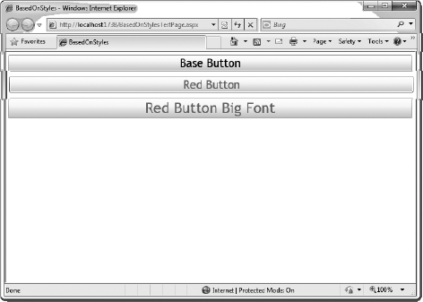
A feature that first showed up in Silverlight 3 is the ability to create styles that are based on another style. This allows you to create base styles that can help organize and maintain your styles across your application. As an example, consider the following source. Notice there are three styles that are defined. BaseButtonStyle defines the base style, RedButton derives from BaseButtonStyle inheriting all properties from the base style including the FontSize, FontFamily, Margin and additionally sets the Foreground to Red. There is also a third style, RedButtonBigFont, that derives from the RedButton style, and overrides the FontSize.
<UserControl.Resources>
    <Style x:Key="BaseButtonStyle" TargetType="Button">
        <Setter Property="FontSize" Value="22" />
        <Setter Property="FontFamily" Value="Trebuchet MS" />
        <Setter Property="Margin" Value="5" />
    </Style>

    <Style x:Key="RedButton" TargetType="Button"
           BasedOn="{StaticResource BaseButtonStyle}">
        <Setter Property="Foreground" Value="Red" />
    </Style>

    <Style x:Key="RedButtonBigFont" TargetType="Button"
           BasedOn="{StaticResource RedButton}">
        <Setter Property="FontSize" Value="28" />
    </Style>

</UserControl.Resources>
<StackPanel x:Name="LayoutRoot">
<Button Style="{StaticResource BaseButtonStyle}"
Content="Base Button" />
<Button Style="{StaticResource RedButton}"
Content="Red Button" />
<Button Style="{StaticResource RedButtonBigFont}"
Content="Red Button Big Font" />
</StackPanel>If you run this source, you will get the results shown in Figure 12-23. Notice that the Red Button has all of the attributes of the Base Button, but additionally has the font color red. Similarly, the "Red Button Big Font" button has all the attributes of the Red Button, but overrides the FontSize to have a larger font.
Prior to Silverlight 4, all styles had to contain both a key and a TargetType. A new feature present in Silverlight 4 is the ability to create an implicit style that will be applied to all controls of a given TargetType automatically. This means that if you know that you want the default look of all your Button controls, you can create an implicit style that will be applied to all buttons without having to set the Style property on the actual Button control definitions.
Consider the following example of a StackPanel that contains five buttons. The first four buttons simply have the base <Button /> definition, where the last Button also includes a style reference. Because the first four buttons do not have a style specified, they will all use the implicit Button style defined in UserControl.Resources. The last Button will not use any of the Style properties defined in the implicit style, however, since it has an explicit style specified. Instead, it will get its style from the OverrideStyle style. The result of the following example is shown in Figure 12-24.
<UserControl.Resources>
    <Style TargetType="Button">
        <Setter Property="FontSize" Value="10" />
        <Setter Property="Width" Value="200" />
        <Setter Property="Foreground" Value="Red" />
        <Setter Property="Content" Value="Default Style" />
        <Setter Property="Margin" Value="5" />
    </Style>
    <Style x:Key="OverrideStyle" TargetType="Button">
        <Setter Property="FontSize" Value="14" />
        <Setter Property="Width" Value="300" />
        <Setter Property="FontWeight" Value="Bold" />
        <Setter Property="Content" Value="Overridden Style" />
    </Style>
</UserControl.Resources>

<StackPanel x:Name="LayoutRoot" Background="White">
    <Button />
    <Button />
    <Button />
    <Button />
    <Button Style="{StaticResource OverrideStyle}"  />
</StackPanel>
In this chapter, you looked at options for styling your Silverlight applications. You saw how to define style properties inline using both Visual Studio and Expression Blend. Then you explored defining styles with Silverlight styles, both at the document level and the application level. In the next chapter, you will look at using Expression Blend to define Silverlight transformations and animations.