
The previous chapter focused on the form controls contained in Silverlight. In this chapter, you will look at two controls that are made to display lists of data: the ListBox and DataGrid. These controls are typically bound to data through a technique known as data binding, which I'll explore first.
Through data binding, UI elements (called targets) are "bound" to data from a data source (called the source), as illustrated in Figure 5-1. When the data sources change, the UI elements bound to those data sources update automatically to reflect the changes. The data can come from different types of sources, and the target can be just about any UI element, including standard Silverlight controls.

Data binding simplifies application development. Since changes are reflected automatically, you do not need to manually update the UI elements. Also, by using data binding, you are able to separate the UI from the data in your application, which allows for a cleaner UI and easier maintenance.
Data binding in Silverlight is accomplished by using the Binding class. The Binding class has two components—the source and target—and a property that defines the way the two are bound, called the binding mode. The source is the data that is to be bound, the target is a property of the control that the data is to be bound to, and the mode defines how the data is passed between the source and the target (one-way, one-time, or two-way). You'll see how this works in the upcoming exercise.
To define the binding of a control's property, you use XAML markup extensions, such as {Binding <path>}. For example, to bind the Text property of a TextBox to a data source's FirstName element, you would use the following XAML:
<TextBox Text="{Binding FirstName }" />To help explain data binding in Silverlight, let's build a very simple application. The application will include a Book object that contains two properties: Title and ISBN. These properties will be bound to two TextBox controls. Figure 5-2 shows the end result of the example.

Create a new Silverlight application in Visual Studio 2010. Name the project
BasicDataBinding, and allow Visual Studio to create a Web application project to host your application.Edit the
MainPage.xamlfile to define two columns and six grid rows. Place aTextBlockin each row in column 1 and aTextBoxin each row in column 2. Also add some margins and some alignment assignments to improve the layout. The code for the page follows:<Grid x:Name="LayoutRoot" Background="White"><Grid.ColumnDefinitions><ColumnDefinition Width="Auto" /><ColumnDefinition /></Grid.ColumnDefinitions><Grid.RowDefinitions><RowDefinition /><RowDefinition /><RowDefinition /><RowDefinition /><RowDefinition /><RowDefinition /></Grid.RowDefinitions><TextBlock Text="Book Title"VerticalAlignment="Center"Margin="5" /><TextBlock Text="ISBN-13"VerticalAlignment="Center"Margin="5"Grid.Row="1" /><TextBox Text="{Binding Title}"Height="24"Margin="5"Grid.Column="1" /><TextBox Text="{Binding ISBN}"Height="24"Margin="5"Grid.Column="1" Grid.Row="1" /><TextBlock Text="Book Title"VerticalAlignment="Center"Margin="5"Grid.Row="2" /><TextBlock Text="ISBN-13"VerticalAlignment="Center"Margin="5"Grid.Row="3" /><TextBox Text="{Binding Title}" Height="24" Margin="5" Grid.Column="1" Grid.Row="2" /> <TextBox Text="{Binding ISBN}" Height="24" Margin="5" Grid.Column="1" Grid.Row="3" /> </Grid>Next, edit the code behind,
MainPage.xaml.cs. Add aLoadedevent handler for the application, which will fire when the application is loaded by the client. This is accomplished with the following source code:public partial class MainPage : UserControl { public MainPage() { InitializeComponent();this.Loaded += new RoutedEventHandler(Page_Loaded);}void Page_Loaded(object sender, RoutedEventArgs e){}}Now you need to add a class to define a
Bookobject. Below theMainPageclass, add the following class definition:namespace BasicDataBinding { public partial class MainPage : UserControl { public MainPage() { InitializeComponent(); this.Loaded += new RoutedEventHandler(Page_Loaded); } void Page_Loaded(object sender, RoutedEventArgs e) { } }public class Book{public string Title { get; set; }public string ISBN { get; set; }}}Now that you have
Bookdefined, you need to create an instance ofBookand set it to theLayoutRoot'sDataContext, as follows:void Page_Loaded(object sender, RoutedEventArgs e) {Book b = new Book(){Title = "Beginning Silverlight 4: From Novice to Professional",ISBN = "978-1430229889"};this.LayoutRoot.DataContext = b;}When you set up binding definitions for different controls, the controls do not know where they are going to get their data. The
DataContextproperty sets the data context for a control that is participating in data binding. TheDataContextproperty can be set directly on the control. If a given control does not have aDataContextproperty specified, it will look to its parent for its data context. The nice thing about this model is that if you look above in the XAML for the page, you will see little indication of where the controls are getting their data. This provides an extreme level of code separation, allowing designers to design XAML UIs and developers to work alongside the designers, defining the specifics of how the controls are bound to their data sources.At this point, you can go ahead and start debugging the application. If all goes well, you will see the four text boxes populated with the data from the
Book's instance (see Figure 5-2).With the application running, change the book title in the first text box to just "Beginning Silverlight," by removing the "From Novice to Professional."
You might expect that, since the third text box is bound to the same data, it will automatically update to reflect this change. However, a couple of things need to be done to get this type of two-way binding to work.
One problem is that, currently, the
Bookclass does not support notifying bound clients of changes to its properties. In other words, when a property changes inBook, the class will not notify theTextBoxinstances that are bound to the class of the change. You could take care of this by creating a change event for each property. This is far from ideal; fortunately, there is an interface that a class can implement that handles this for you. This interface is known asINotifyPropertyChanged. Let's use it.Modify the
Bookclass definition to inherit fromINotifyPropertyChanged. Notice that when you inherit fromINotifyPropertyChanged, you need to addusing System.ComponentModel. Luckily, Visual Studio will help you with this, as shown in Figure 5-3.Next, you can let Visual Studio do some more work for you. After adding the
using System.ComponentModelstatement, right-clickINotifyPropertyChangedand select Implement Interface
Now Visual Studio has added a new public event to your class:
public class Book : INotifyPropertyChanged{ public string Title { get; set; } public string ISBN { get; set; }public event PropertyChangedEventHandler PropertyChanged;}Next, you need to create a convenience method that will fire the
PropertyChangedevent. Call itFirePropertyChanged, as shown in the following code:public class Book : INotifyPropertyChanged { public string Title { get; set; } public string ISBN { get; set; } public event PropertyChangedEventHandler PropertyChanged;void FirePropertyChanged(string property){if (PropertyChanged != null){PropertyChanged(this,new PropertyChangedEventArgs(property));}}}Now you need to extend the simplified properties by adding private members and full
get/setdefinitions to define thegetandsetoperations, as shown in the following code. Thegetis just like a normalgetoperation, where you simply return the internal member value. For theset, you first set the internal member value, and then call theFirePropertyChangedmethod, passing it the name of the property.public class Book : INotifyPropertyChanged {private string _title;private string _isbn;public string Title{get{return _title;}set{_title = value;FirePropertyChanged("Title");}}public string ISBN{get{return _isbn;}set{_isbn = value;FirePropertyChanged("ISBN");}}public event PropertyChangedEventHandler PropertyChanged;void FirePropertyChanged(string property) { if (PropertyChanged != null) { PropertyChanged(this, new PropertyChangedEventArgs(property)); } } }With this completed, your class is set up to notify bound clients of changes to the
TitleandISBNproperties. But you still need to take one more step. By default, when you bind a source to a target, theBindingModeis set toOneWaybinding, which means that the source will send the data to the target, but the target will not send data changes back to the source. In order to get the target to update the source, you need to implement two-way (TwoWay) binding.Note
Earlier, I mentioned that there are three options for
BindingMode. The third option isOneTimebinding. In this mode, the values are sent to the target control property when the object is set to theDataContext. However, the values of the target property are not updated when the source value changes.To change to two-way binding, add the
Mode=TwoWayparameter when defining the{Binding}on a control, as follows:<TextBlock Text="Book Title" VerticalAlignment="Center" Margin="5" /> <TextBlock Text="ISBN-13" VerticalAlignment="Center" Margin="5" Grid.Row="1" /> <TextBox Text="{Binding Title,Mode=TwoWay}" Height="24" Margin="5" Grid.Column="1" /> <TextBox Text="{Binding ISBN,Mode=TwoWay}" Height="24" Margin="5" Grid.Column="1" Grid.Row="1" /> <TextBlock Text="Book Title" VerticalAlignment="Center" Margin="5" Grid.Row="2" /> <TextBlock Text="ISBN-13"VerticalAlignment="Center" Margin="5" Grid.Row="3" /> <TextBox Text="{Binding Title,Mode=TwoWay}" Height="24" Margin="5" Grid.Column="1" Grid.Row="2" /> <TextBox Text="{Binding ISBN,Mode=TwoWay}" Height="24" Margin="5" Grid.Column="1" Grid.Row="3" />Rebuild and run your application. Update any of the fields, and leave the focus on the control. You'll see that the two-way binding is triggered, and the corresponding field is also updated, as shown in Figure 5-5.


Congratulations! You have just created a Silverlight application that allows for two-way data binding. We will now move on to look at data binding lists of data to the two list controls provided in Silverlight: DataGrid and ListBox.
In addition to binding to data, elements can be bound directly to other elements, which can significantly improve the readability and efficiency of your code. The syntax for binding to an element is very similar to binding to a data item, the only difference is that in the binding an ElementName is specified, which is very much like setting the ItemsSource to the Element. As an example, if you wanted to bind the IsEnabled property of a control to a checkbox's IsChecked property. Assuming the checkbox is named EnableButton, the binding syntax would be the following.
IsEnabled="{Binding IsChecked, Mode=OneWay, ElementName=EnableButton}"Notice that the binding is the same as it would be when binding to a data source, except that we have added the ElementName=EnableButton. Let's try this out in an exercise.
Note
Prior to Silverlight 4, in order for an element to support element binding it had to derive from the FrameworkElement class. This unfortunately left out a number of objects that would ideally support element binding. In Silverlight 4, any object that derives from the DependencyObject now supports element binding. This opens up many new binding opportunities in Silverlight directly through XAML, such as supporting transformations.
To help explain element to element binding in Silverlight, let's build a very simple application. The application will include a button and a checkbox. When the checkbox is checked, the button is enabled, when the checkbox is unchecked, the button is disabled. Let's get started.
Create a new Silverlight application in Visual Studio 2010. Name the project
ElementBinding, and allow Visual Studio to create a Web application project to host your application.Edit the
MainPage.xamlfile to add aStackPanelto the rootGrid. Place a ToggleButton andCheckBoxnamedEnableButtonwithin thatStackPanelso theToggleButtonappears above theCheckBox. Add a margin of 20 on theStackPaneland 5 on theToggleButtonandCheckBoxto add some spacing between the controls. The code for the page follows:<Grid x:Name="LayoutRoot" Background="White"><StackPanel Margin="20"><ToggleButton Margin="5" Content="Click to Toggle" /><CheckBoxx:Name="EnableButton" IsChecked="true"Margin="5" Content="Enable Button" /></StackPanel></Grid>Next, we need to bind the ToggleButton's
IsEnabledproperty to the CheckBox'sIsCheckedproperty. We will do this with one way binding as described earlier in this chapter, and we will set the ElementName to EnableButton, which is the name we gave our CheckBox. The updated source code should now look like the following:<Grid x:Name="LayoutRoot" Background="White"> <StackPanel Margin="20"> <ToggleButton Margin="5" Content="Click to Toggle"IsEnabled="{Binding IsChecked, Mode=OneWay,ElementName=EnableButton}"/> <CheckBox x:Name="EnableButton" IsChecked="true" Margin="5" Content="Enable Button" /> </StackPanel> </Grid>That is it! No coding is required for this demo. Run the sample and will see that the
ToggleButtonis enabled, as shown in Figure 5-6.Now uncheck the Enable Button checkbox and you will see that the
ToggleButtonis no longer enabled, as shown in Figure 5-7.


The data grid type of control has been around for ages and has been the primary choice for developers who need to display large amounts of data. The DataGrid control provided by Silverlight is not just a standard data grid, however. It contains a great deal of rich user functionality that, in the past, has been present only in third-party data grid components. For example, the Silverlight DataGrid handles resizing and reordering of grid columns.
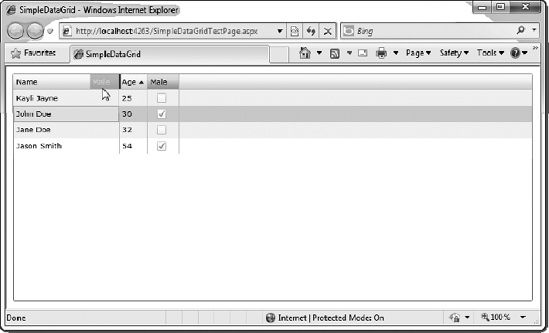
Figure 5-8 shows an example of a very simple DataGrid, where the columns were automatically generated. Notice how the column titled Male is a check box. The DataGrid control has built-in intelligence to automatically show Boolean data types as check box cells.

Let's run through a simple DataGrid example.
Create a new Silverlight application in Visual Studio 2010. Name the project
SimpleDataGrid, and have Visual Studio create a hosting web application for you.Add the
DataGridto your application. To do this, simply add theDataGridto the rootGridin your XAML, and set theMarginproperty to10to get some spacing around the grid. In addition, give theDataGridthe namegrid. Note that, by default, theGrid'sAutoGenerateColumnsproperty is set totrue. If you were going to define the columns manually, you would want to set this property tofalse. However, since you want the grid to create the columns automatically, you can simply omit the property. TheDataGriddefinition follows:<Grid x:Name="LayoutRoot" Background="White"><sdk:DataGrid Name="grid" Margin="10" /></Grid>Note
Why use
<sdk:DataGrid>? As discussed in Chapter 4, theDataGridis contained in an assembly calledSystem.Windows.Controls.Data, which is not added to Silverlight applications by default. This way, if your application does not need any of the extended controls, the file size of your Silverlight application can be smaller. However, in order to add aDataGridto your application, you need to reference the new assembly and add anxmlnsreference to the assembly in theUserControldefinition.xmlns:sdk=http://schemas.microsoft.com/winfx/2006/xaml/presentation/sdk
As you might expect by now, Visual Studio can do all the work for you. To use this functionality in Visual Studio, drag the
DataGridcontrol from the Toolbox to add it to your application (or simply double-click on the DataGrid in the Toolbox). Visual Studio will add a newxmlnsreference in theUserControlat the top of the.xamlpage calleddata.Next, build the class that will be bound to the
DataGrid. Call the classGridDatafor simplicity, and give it three properties:Name(string),Age(int), andMale(Boolean). Also for simplicity, create a static method that will return anObservableCollection(requires adding a using clause forSystem.Collections.ObjectModel) containing some sample data that will be bound to the grid. In addition, define the class directly in theMainPage.xaml.csfile. This is not really a good idea in the real world, but for the sake of an example, it will work just fine. Ideally, you will want to define your classes in separate files or even in completely separate projects and assemblies. The code for theGridDataclass follows:namespace SimpleDataGrid { public partial class MainPage : UserControl { public MainPage() { InitializeComponent(); } }public class GridData{public string Name { get; set; }public int Age { get; set; }public bool Male { get; set; }public static ObservableCollection<GridData> GetData(){ObservableCollection<GridData> data =new ObservableCollection<GridData>();data.Add(new GridData(){Name = "John Doe",Age = 30,Male = true});data.Add(new GridData(){Name = "Jane Doe",Age = 32,Male = false});data.Add(new GridData(){Name = "Jason Smith",Age = 54,Male = true});data.Add(new GridData(){Name = "Kayli Jayne",Age = 25,Male = false});return data;}}}Note
When you are binding a collection of data to a
DataGridorListBox, you may be tempted to use theListgeneric class. The problem with using theListclass is that it does not have built-in change notifications for the collection. In order to bind aDataGridandListBoxto dynamic data that will be updated, you should use theObservableCollectiongeneric class. TheObservableCollectionclass represents a collection of dynamic data that provides built-in notification when items in the collection are added, removed, or refreshed.Now that you have the XAML and the class defined, you can wire them up. To do this, first create an event handler for the
Loadedevent of the page, as follows:public partial class MainPage : UserControl { public MainPage() { InitializeComponent();this.Loaded += new RoutedEventHandler(Page_Loaded);}void Page_Loaded(object sender, RoutedEventArgs e){}}When the page is loaded, you want to call
GetData()from theGridDataclass and bind that to theDataGrid'sItemsSourceproperty, as follows:public partial class MainPage : UserControl { public MainPage() { InitializeComponent(); this.Loaded += new RoutedEventHandler(Page_Loaded); } void Page_Loaded(object sender, RoutedEventArgs e) {this.grid.ItemsSource = GridData.GetData();} }Build and run the application. If all is well, you should see the
DataGriddisplayed (see Figure 5-8).
Let's take a few moments and play around with this DataGrid to explore some of its features. First of all, if you click any of the column headers, you will notice that sorting is automatically available, as shown in Figure 5-9.
Next, if you place your cursor at the edge of one of the columns, you can use the mouse to click and drag the column's edge to resize the column, as shown in Figure 5-10. Again, this functionality is provided for free with the DataGrid's rich client-side functionality.
Finally, if you click and hold the mouse on one of the column headers, then drag it left or right to another column header's edge, you will see the column header move and a dark gray border appear between the columns. For instance, click and drag the Male column to the left of the Age column, as shown in Figure 5-11. When a dark-gray border shows up between the two columns, release the mouse, and you will see that the Male column now appears to the left of the Age column in the DataGrid.


You'll agree that this is pretty nice out-of-the-box functionality for simply defining a DataGrid with this code:
<data:DataGrid x:Name="grid" Margin="10" />
Now that you have implemented a simple DataGrid example, let's explore some of the additional options available.
In the previous example, you allowed the DataGrid to automatically generate columns based on the data to which it was bound. This is not a new concept—it has been around in data grid components since the initial release of ASP.NET. But what if you want to have some additional control over the columns that are created in your DataGrid? What if you want to add a column that contains some more complex information, such as an image? You can do this by first setting the AutoGenerateColumns property on the grid to false. Then you need to generate the columns manually.
Columns are defined in a DataGrid using the Columns collection. The following is an example of setting the Columns collection in XAML. Notice that it sets the AutogenerateColumns property to False. If you neglect to do this, you will get all of the autogenerated columns in addition to the columns you define within the Columns collection.
<my:DataGrid x:Name="grid" Margin="10" AutoGenerateColumns="False">
    <my:DataGrid.Columns>

    </my:DataGrid.Columns>
</my:DataGrid>
You can place three types of columns within a Columns collection: a text column (DataGridTextColumn), a check box column (DataGridCheckBoxColumn), and a template column (DataGridTemplateColumn). All of the column types inherit from type DataGridColumn. A number of notable properties apply to all three column types, as shown in Table 5-1.
Table 5.1. DataGridColumn Properties
Property | Description |
|---|---|
| Turns on and off the ability for the user to drag columns to reorder them |
| Turns on or off the ability for the user to resize the column's width with the mouse |
| Determines the order in which the column appears in the |
| Defines the content of the column's header |
| Determines if the column can be edited by the user |
| Sets the maximum column width in pixels |
| Sets the minimum column width in pixels |
| Determines whether or not the column will be visible to the user |
| Sets the width of the column, or can be set to automatic sizing mode |
The DataGridTextColumn defines a column in your grid for plain text. This is the equivalent to BoundColumn in the ASP.NET DataGrid. The primary properties that can be set for a DataGridTextColumn are the Header, which defines the text that will be displayed in the columns header, and the DisplayMemberBinding property, which defines the property in the data source bound to the column.
The following example defines a text column with the header Name and is bound to the data source's Name property.
<my:DataGrid x:Name="grid" Margin="10" AutoGenerateColumns="False">
    <my:DataGrid.Columns>
        <my:DataGridTextColumn
                Header="Name"
                DisplayMemberBinding="{Binding Name}" />
            </my:DataGrid.Columns>
</my:DataGrid>As you would expect, the DataGridCheckBoxColumn contains a check box. If you have data that you want to display as a check box in your grid, this is the control to use. Here is an example of the DataGridCheckBoxColumn that contains the header Male? and is bound to the data source's Male property:
<my:DataGrid x:Name="grid" Margin="10" AutoGenerateColumns="False">
    <my:DataGrid.Columns>
        <my:DataGridCheckBoxColumn
                Header="Male?"
                DisplayMemberBinding="{Binding Male}" />
            </my:DataGrid.Columns>
</my:DataGrid>If you want data in your grid column that is not plain text and is not a check box, the DataGridTemplateColumn provides a way for you to define the content for your column. The DataGridTemplateColumn contains a CellTemplate and CellEditingTemplate, which determine what content is displayed, depending on whether the grid is in normal view mode or in editing mode.
Note that while you get features such as automatic sorting in the other types of DataGrid columns, that is not true of the DataGridTemplateColumn. These columns will need to have additional logic in place to allow for sorting.
Let's consider an example that has two fields: FirstName and LastName. Suppose that when you are in normal view mode, you want the data to be displayed side by side in TextBlock controls. However, when the user is editing the column, you want to display two TextBox controls that allow the user to edit the FirstName and LastName columns independently.
<my:DataGridTemplateColumn Header="Name"><my:DataGridTemplateColumn.CellTemplate><DataTemplate> <StackPanel Orientation="Horizontal"> <TextBlock Padding="5,0,5,0" Text="{Binding FirstName}"/> <TextBlock Text="{Binding LastName}"/> </StackPanel> </DataTemplate></my:DataGridTemplateColumn.CellTemplate><my:DataGridTemplateColumn.CellEditingTemplate><DataTemplate> <StackPanel Orientation="Horizontal">
<TextBox Padding="5,0,5,0"
                    Text="{Binding FirstName}"/>
                <TextBox Text="{Binding LastName}"/>
            </StackPanel>
        </DataTemplate>
    </my:DataGridTemplateColumn.CellEditingTemplate>
</my:DataGridTemplateColumn>
Now that we have covered the basics of manually defining the grids in a DataGrid, let's try it out.
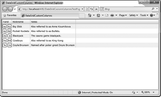
I thought it would be fun to build a DataGrid that contains a list of starting hands in poker. If you have ever watched poker on TV, you most likely heard the players refer to things like "pocket rockets" and "cowboys." These are simply nicknames they have given to starting hands. The DataGrid you are going to build in this example will look like Figure 5-12.
Create a new Silverlight application called
DataGridCustomColumns. Allow Visual Studio to create a Web Site project to host the application.After the project is loaded, right-click the
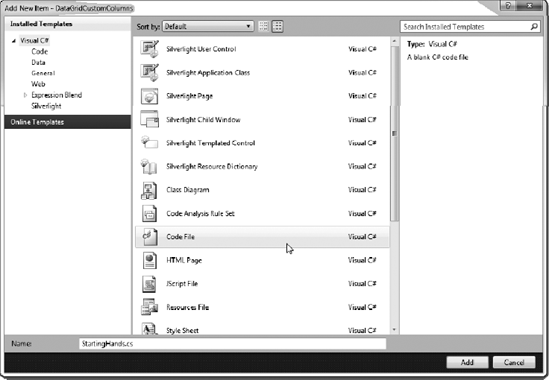
DataGridCustomColumnsproject and select Add New Item. In the Add New Item dialog box, select Code File for the template, and name the classStartingHands.cs, as shown in Figure 5-13. Click the Add button to add the class to the project.Now define the
StartingHandsclass. The class will contain four properties:Nickname(string),Notes(string),Card1(string), andCard2(string). Also create a static method in the class calledGetHands(), which returns anObservableCollectionofStartingHandsinstances. The code follows:using System; using System.Net; using System.Windows; using System.Windows.Controls; using System.Windows.Documents; using System.Windows.Ink; using System.Windows.Input; using System.Windows.Media; using System.Windows.Media.Animation; using System.Windows.Shapes;
using System.Collections.ObjectModel;

namespace DataGridCustomColumns
{
    public class StartingHands
    {
        public string Nickname { get; set; }
        public string Notes { get; set; }
        public string Card1 { get; set; }
        public string Card2 { get; set; }

        public static ObservableCollection<StartingHands> GetHands()
        {
            ObservableCollection<StartingHands> hands =
            new ObservableCollection<StartingHands>();

            hands.Add(
                new StartingHands()
                {
                    Nickname = "Big Slick",
                    Notes = "Also referred to as Anna Kournikova.",
                    Card1 = "As",
                    Card2 = "Ks"
                });

            hands.Add(
            new StartingHands()
            {
                Nickname = "Pocket Rockets",
                Notes = "Also referred to as Bullets.",
                Card1 = "As",
                Card2 = "Ad"
            });

            hands.Add(
                new StartingHands()
                {
                    Nickname = "Blackjack",
                    Notes = "The casino game blackjack.",
                    Card1 = "As",
                    Card2 = "Js"
                });

            hands.Add(
                new StartingHands()
                {
                    Nickname = "Cowboys",
                    Notes = "Also referred to as King Kong",
                    Card1 = "Ks",
                    Card2 = "Kd"
                });
hands.Add( new StartingHands() { Nickname = "Doyle Brunson", Notes = "Named after poker great Doyle Brunson", Card1 = "Ts", Card2 = "2s" }); return hands; } } }Now that the class is built, in the
MainPage.xamlfile, change the width of theUserControlto be500and add aDataGridnamedgrdDatato the rootGridby double-clicking theDataGridcontrol in the Toolbox. Add a 15-pixel margin around theDataGridfor some spacing, and set theAutoGenerateColumnsproperty toFalse. The code follows:<Grid x:Name="LayoutRoot" Background="White"><sdk:DataGrid AutoGenerateColumns="False" Name="grdData" /></Grid>Next, define the columns in the
DataGrid. To do this, add theDataGrid.Columnscollection, as follows:<Grid x:Name="LayoutRoot" Background="White"> <sdk:DataGrid AutoGenerateColumns="False" Name="grdData"><sdk:DataGrid.Columns></sdk:DataGrid.Columns></sdk:DataGrid></Grid>Referring back to Figure 5-12, the first column in the
Gridcontains the two cards in the hand. To build this, you use aDataGridTemplateColumn. Within theDataGridTemplateColumn, add aCellTemplatecontaining aGridwith two columns, each containing aBorder, Rectangle, andTextBlock, which will overlap each other. Bind the twoTextBlockcontrols to theCard1andCard2properties from the data source. Enter the following code:<sdk:DataGrid AutoGenerateColumns="False" Name="grdData"> <sdk:DataGrid.Columns><sdk:DataGridTemplateColumn Header="Hand"><sdk:DataGridTemplateColumn.CellTemplate><DataTemplate><Grid><Grid.ColumnDefinitions><ColumnDefinition /><ColumnDefinition /></Grid.ColumnDefinitions><BorderMargin="2" CornerRadius="4"BorderBrush="Black" BorderThickness="1" /><RectangleMargin="4" Fill="White" Grid.Column="0" /><BorderMargin="2" CornerRadius="4" BorderBrush="Black"BorderThickness="1" Grid.Column="1" /><RectanglMargin="4" Fill="White" Grid.Column="1" /><TextBlockText="{Binding Card1}" HorizontalAlignment="Center"VerticalAlignment="Center" Grid.Column="0" /><TextBlockText="{Binding Card2}" HorizontalAlignment="Center"VerticalAlignment="Center" Grid.Column="1" /></Grid></DataTemplate></sdk:DataGridTemplateColumn.CellTemplate></sdk:DataGridTemplateColumn></sdk:DataGrid.Columns> </sdk:DataGrid>Again, referring back to Figure 5-12, the next two columns contain the nickname of the starting hand and notes about the starting hand. To implement this, use two
DataGridTextColumncolumns. Set theHeadersof the columns toNicknameandNotesaccordingly.<sdk:DataGrid AutoGenerateColumns="False" Name="grdData"> <sdk:DataGrid.Columns> <sdk:DataGridTemplateColumn Header="Hand"> <sdk:DataGridTemplateColumn.CellTemplate> <DataTemplate> <Grid> <Grid.ColumnDefinitions> <ColumnDefinition /> <ColumnDefinition /> </Grid.ColumnDefinitions> <Border Margin="2" CornerRadius="4" BorderBrush="Black" BorderThickness="1" /> <Rectangle Margin="4" Fill="White" Grid.Column="0" /> <Border Margin="2" CornerRadius="4" BorderBrush="Black" BorderThickness="1" Grid.Column="1" /> <Rectangle Margin="4" Fill="White" Grid.Column="1" /><TextBlock Text="{Binding Card1}" HorizontalAlignment="Center" VerticalAlignment="Center" Grid.Column="0" /> <TextBlock Text="{Binding Card2}" HorizontalAlignment="Center" VerticalAlignment="Center" Grid.Column="1" /> </Grid> </DataTemplate> </sdk:DataGridTemplateColumn.CellTemplate> </sdk:DataGridTemplateColumn><sdk:DataGridTextColumnHeader="Nickname"Binding="{Binding Nickname}" /><sdk:DataGridTextColumnHeader="Notes"Binding="{Binding Notes}" /></sdk:DataGrid.Columns> </sdk:DataGrid>Finally, wire up the controls to the data source. To do this, navigate to the
MainPage.xaml.csfile and add an event handler to thePage Loadedevent. Within thatLoadedevent, simply set theDataGrid'sItemsSourceproperty equal to the return value of theStartingHands.GetHands()static method. Here's the code:public partial class MainPage : UserControl { public MainPage() { InitializeComponent();this.Loaded += new RoutedEventHandler(Page_Loaded);}void Page_Loaded(object sender, RoutedEventArgs e){this.grdData.ItemsSource = StartingHands.GetHands();}}Compile and run your application. If all goes well, your application should appear, as shown earlier in Figure 5-12.
This completes our DataGrid with custom columns example. Naturally, in a real-world application, you would be getting the data for these hands from an external data source, such as a web service or an XML file. We will be looking at that in Chapter 6. Now, let's take a look at the ListBox control.
In the past, the list box type of control has been considered one of the common controls in programming—no more special than a drop-down list. However, in Silverlight, this has all changed. The ListBox is perhaps one of the most flexible controls used to display lists of data. In fact, referring back to ASP.NET controls, the Silverlight ListBox is more a cousin to the DataList control than the ASP.NET ListBox control. Let's take a peek at this powerful control.
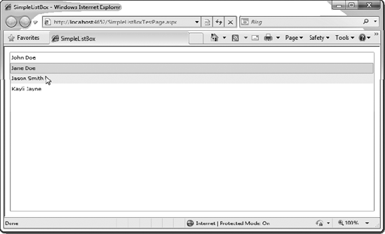
If we wire up the ListBox to our Person data from our earlier DataGrid example, you will see that, by default, the ListBox really is just a standard ListBox.
<ListBox Margin="10" x:Name="list" DisplayMemberPath="Name" />
One additional property you may have noticed in this ListBox definition is DisplayMemberPath. If you are defining a simple text-based ListBox, the ListBox needs to know which data member to display. Since the Person class contains three properties (Name, Age, and Male), we need to tell it that we want the Name to be displayed. Figure 5-14 shows the results.
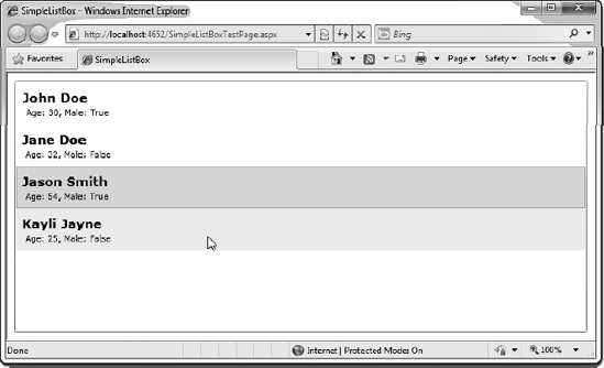
However, the ListBox control can contain much more than plain text. In fact, if you define a custom ItemTemplate for the ListBox, you can present the items in a more interesting way. Here's an example using the same Person data:
<ListBox Margin="10" x:Name="list">
    <ListBox.ItemTemplate>
        <DataTemplate>
            <StackPanel Margin="5" Orientation="Vertical">
                <TextBlock
                    FontSize="17"
                    FontWeight="Bold"
                    Text="{Binding Name}" />
                <StackPanel Margin="5,0,0,0" Orientation="Horizontal">
                    <TextBlock Text="Age: " />
                    <TextBlock Text="{Binding Age}" />
                    <TextBlock Text=", Male: " />
                    <TextBlock Text="{Binding Male}" />
                </StackPanel>
            </StackPanel>
        </DataTemplate>
    </ListBox.ItemTemplate>
</ListBox>
Figure 5-15 shows how this custom ListBox appears in a browser.
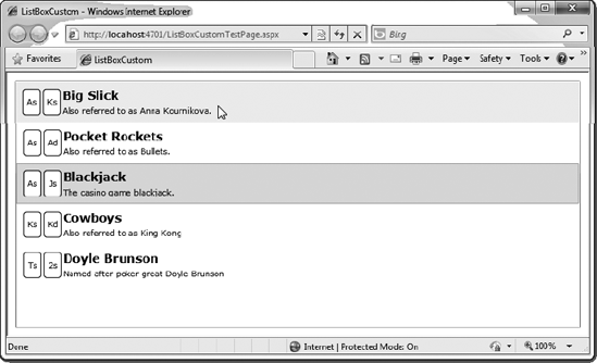
Let's take the same data that displayed poker starting hands from the previous exercise and see what type of cool ListBox you can build with it. Figure 5-16 shows the custom ListBox you'll create in this exercise.
Start out by creating a new Silverlight application called
ListBoxCustomand allow Visual Studio to create a hosting web site.You will use the same class that you built in the earlier
DataGridexercise. Right-click the Silverlight project, choose Add Existing Item, and browse toStartingHands.csto add that class to the project.When you add the existing
StartingHands.csclass, it is in a different namespace than your current project. You can reference that namespace by adding ausingstatement at the top of your Silverlight application, or you can just change the namespace, as follows:namespace ListBoxCustom{ public class StartingHands { public string Nickname { get; set; } public string Notes { get; set; }public string Card1 { get; set; } public string Card2 { get; set; } ... }}Next, you need to define the
ListBox'sItemTemplate. TheItemTemplatewill contain a horizontal-orientedStackPanelincluding the grid to display the two cards. It will also include a nested vertical-orientedStackPanelthat will contain twoTextBlockcontrols to display theNicknameandNotesdata. Here is the code:<Grid x:Name="LayoutRoot" Background="White"><ListBox Margin="10" x:Name="list"><ListBox.ItemTemplate><DataTemplate><StackPanel Margin="5" Orientation="Horizontal"><Grid><Grid.ColumnDefinitions><ColumnDefinition /><ColumnDefinition /></Grid.ColumnDefinitions><BorderMargin="2" CornerRadius="4"BorderBrush="Black" BorderThickness="1" /><Rectangle Margin="4" Fill="White"Grid.Column="0" Width="20" /><BorderMargin="2" CornerRadius="4" BorderBrush="Black"BorderThickness="1" Grid.Column="1" /><Rectangle Margin="4" Fill="White"Grid.Column="1" Width="20" /><TextBlockText="{Binding Card1}" HorizontalAlignment="Center"VerticalAlignment="Center" Grid.Column="0" /><TextBlockText="{Binding Card2}" HorizontalAlignment="Center"VerticalAlignment="Center" Grid.Column="1" /></Grid><StackPanel Orientation="Vertical"><TextBlockText="{Binding Nickname}"FontSize="16"FontWeight="Bold" /><TextBlockText="{Binding Notes}" /></StackPanel></StackPanel></DataTemplate></ListBox.ItemTemplate></ListBox></Grid>The only thing left to do is to wire up the
ListBoxto the data source. To do this, navigate to thepage.xaml.cscode behind, and add an event handler for thePage Loadedevent. Then, within thatLoadedevent handler, add the following code to set theListBox'sItemsSourceto the return value from theStartingHands.GetHands()method, as you did earlier in theDataGridexample.public partial class MainPage : UserControl { public MainPage() { InitializeComponent();this.Loaded += new RoutedEventHandler(Page_Loaded);}void Page_Loaded(object sender, RoutedEventArgs e){list.ItemsSource = StartingHands.GetHands();} }Run the application. If all goes well, you will see the
ListBoxshown in Figure 5-16.
As you can see, the ListBox control's flexibility lets developers display lists of data in some very cool ways.
Earlier you read that the base type required for element binding was changed to the DependencyObject class. In addition to this, there are a number of new features regarding data binding in Silverlight 4, three of which I will discuss in this section. All three come in the form of new binding extensions. First I will discuss the string formatting, then I will discuss the extensions TargetNullValue and FallBackValue.
In prior versions of Silverlight, in order to perform string formatting while data binding you would need to write a converter that would format the data during binding. In Silverlight 4 you are now able to format the data directly in XAML. This greatly simplifies the process of creating bindings that require some formatting of the data. Adding string formatting is as simple as adding a StringFormat extension in the XAML markup of the data binding. The StringFormat extension supports the same formatting options as the String's Format method.
Consider the following XAML. There are four text boxes displayed, all bound to the same property in code behind. The difference, however, is that each TextBox change displays the data differently based on the binding's StringFormat extension. The first TextBox shows the raw data, the second formats the data to three decimal places, the third shows the value in scientific notation, and the fourth shows the data as currency. The result is shown in Figure 5-17.
<Grid x:Name="LayoutRoot" Background="White">
    <Grid.RowDefinitions>
        <RowDefinition Height="*" />
        <RowDefinition Height="*" />
        <RowDefinition Height="*" />
        <RowDefinition Height="*" />
    </Grid.RowDefinitions>
    <TextBox
        Margin="5"
        Grid.Row="0"
        Text="{Binding DecimalValue}" />
    <TextBox
        Margin="5"
        Grid.Row="1"
        Text="{Binding DecimalValue, StringFormat='##.###'}" />
    <TextBox
        Margin="5"
        Grid.Row="2"
        Text="{Binding DateValue, StringFormat='MMM dd, yyyy'}" />
    <TextBox
        Margin="5"
        Grid.Row="3"
        Text="{Binding DecimalValue, StringFormat='c'}" />
</Grid>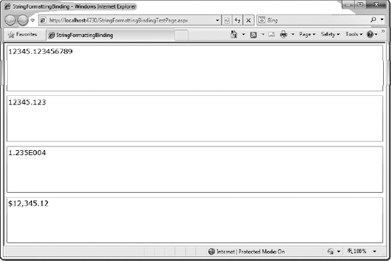
As you can see from this example, you can easily change the format of data directly through the XAML.
Two other extensions have been added to the base binding class in Silverlight 4: the TargetNullValue and FallBackValue extensions. These extensions allow you to specify data that will be displayed in the case when the data being bound to the control is not as expected. TargetNullValue provides a value for the binding that should be used if the data value being bound is null. An example of using this extension is shown here:
<TextBox Text="{Binding ValueName, TargetNullValue='Value is Null'}" />FallBackValue provides a value to be used if the bound data is missing or if there was a mismatch that occurred. An example of using the FallBackValue extension is shown here:
<TextBox Text="{Binding ValueName, FallbackValue='Value Not Found'}" />In this chapter, you looked at how to bind lists of data to Silverlight controls. Then you focused on two controls typically bound to data: the DataGrid control and the ListBox control. You saw how these controls are flexible and can show data in unique ways. However, in all of these examples, the classes contained static data. In real-world examples, the data that you will normally list in a DataGrid or ListBox will be coming from some external data source, such as an XML file or a web service. In the next chapter, you will look at how to get data from these external data sources and how to use that data to bind to your Silverlight applications.