For those who have worked with Silverlight 1.0, one of the first observations you most likely made was the lack of common controls such as the Button, TextBox, and ListBox. In fact, Silverlight 1.0 provided only two basic controls: Rectangle and TextBlock. From these, the developers were expected to implement all of the rich controls they needed. As you can imagine, it was quite a bit of work to create all of the form controls using just these two base controls.
Since then, Microsoft's vision of Silverlight has gone beyond basic animations to spark up your applications and into the realm of feature-rich user interfaces (UIs). To this end, Silverlight 4 includes a strong base of controls that you can use within your Silverlight applications.
In this chapter, you will first look at the Silverlight controls in general by examining control properties and events. You will then take a brief tour of some of the more common form controls included in Silverlight 4. This chapter is meant to provide a high-level introduction to these common Silverlight controls. You will continue to work with the controls throughout the remainder of the book, so you will see more specific usage scenarios.
The most straightforward and simple way to set a property is by using attribute syntax. However, in some cases, you will use element syntax.
Most properties that can be represented as a simple string can be set using attribute syntax. Setting an attribute in XAML is just like setting an attribute in XML. An XML element contains a node and attributes. Silverlight controls are defined in the same way, where the control name is the node, and the properties are defined as attributes.
As an example, you can easily use attribute syntax to set the Width, Height, and Content properties of a Button control, as follows:
<Button Width="100" Height="30" Content="Click Me!"></Button>
Element syntax is most commonly used when a property cannot be set using attribute syntax because the property value cannot be represented as a simple string. Again, this is very similar to using elements in XML. The following is an example of setting the background color of a button:
<Button Width="100" Height="30" Content="Click Me!">
    <Button.Background>
        <SolidColorBrush Color="Blue"/>
    </Button.Background>
    <Button.Foreground>
        <SolidColorBrush Color="Red"/>
    </Button.Foreground>
</Button>Sometimes when defining a property via an attribute, the value cannot be represented as a simple string—rather, it is converted to a more complex type. A common usage of a type- converter-enabled attribute is Margin. The Margin property can be set as a simple string, such as in the following:
<Button Width="100" Content="Click Me!" Margin="15"></Button>
When you set the Margin property in this fashion, the left, right, top, and bottom margins are all set to 15 pixels. What if you want to set the top margin to 15 pixels, but you want the other three margins to be 0? In order to do that, you would set the Margin property as follows:
<Button Width="100" Content="Click Me!" Margin="0,15,0,0"></Button>
In this case, Silverlight takes the string "0,15,0,0" and converts it into a more complex type. The string is converted to four values: left margin = 0, top margin = 15, right margin = 0, and bottom margin = 0.
This type-conversion concept is not new to Silverlight. For those of you familiar with Cascading Style Sheets (CSS), the same sort of structure exists. As an example, when you are defining a border style, within the simple string value for a border, you are actually setting the thickness, color, and line style. The following border assignment in CSS will set the border thickness to 1 pixel, the line style to be solid, and the color to #333333 (dark gray):
border: 1px solid #333333;
In Chapter 3, you learned how to set a control's position within a Canvas panel by using attached properties. An attached property is a property that is attached to parent control. In the Chapter 3's example, you specified the Button control's position within the Canvas object by setting two attached properties: Canvas.Top and Canvas.Left. These two properties reference the Button control's parent, which is the Canvas.
<Canvas>
    <Button Width="100" Content="Click Me!"
            Canvas.Top="10" Canvas.Left="13" />
</Canvas>When you first look at the controls included in Silverlight 2, you will probably feel pretty comfortable, as they seem what would be expected. However, when you dig a bit deeper into the control features, you will find that the controls are much more flexible and powerful than they first appear.
One of the key features of controls in Silverlight 2 is the ability to put just about anything within a control. A Button control can contain a StackPanel, which can contain an Ellipse control and a TextBlock control. There really are few limitations as to what the contents of a control can be. Figure 4-1 shows an example of a standard Silverlight 2 Button control containing a StackPanel, a nested StackPanel, an Ellipse, a TextBlock, and a ListBox.

The following code was used to produce the control in Figure 4-1:
<Button Height="180" Width="200">
    <StackPanel Orientation="Vertical">
        <StackPanel Margin="5"
            VerticalAlignment="Center"
            Orientation="Horizontal">

            <Ellipse Fill="Yellow" Width="25" />
            <TextBlock VerticalAlignment="Center"
                Margin="5" Text="Check Forecast" />

        </StackPanel>
        <ListBox FontSize="11" Opacity="0.5"
            Margin="2" x:Name="lstForecastGlance">
            <ListBoxItem>
<TextBlock VerticalAlignment="Center"
Text="Mon: Sunny (85)" />
</ListBoxItem>
<ListBoxItem>
<TextBlock VerticalAlignment="Center"
Text="Tue: Partly Cloudy (89)" />
</ListBoxItem>
<ListBoxItem>
<TextBlock VerticalAlignment="Center"
Text="Wed: Thunderstorms (78)" />
</ListBoxItem>
<ListBoxItem>
<TextBlock VerticalAlignment="Center"
Text="Thu: Thunderstorms (76)" />
</ListBoxItem>
<ListBoxItem>
<TextBlock VerticalAlignment="Center"
Text="Fri: Partly Cloudy (71)" />
</ListBoxItem>
<ListBoxItem>
<TextBlock VerticalAlignment="Center"
Text="Sat: Mostly Sunny (74)" />
</ListBoxItem>
<ListBoxItem>
<TextBlock VerticalAlignment="Center"
Text="Sun: Sunny (80)" />
</ListBoxItem>
</ListBox>
</StackPanel>
</Button>As the code shows, the example simply nests additional content within the Button control. As you can imagine, this can be a very powerful feature.
As with other Microsoft programming frameworks, Silverlight provides an event mechanism to track actions that take place within Silverlight applications. Two types of actions are tracked within Silverlight:
Actions that are triggered based on some input from the user. Input actions are handled and "bubbled" up from the browser to the Silverlight object model.
Actions that are triggered based on a change of state of a particular object, including the object's state in the application. These actions are handled directly from the Silverlight object model.
Event handlers are methods that are executed when a given event is triggered. You can define event handlers either in the XAML markup itself or in managed code. The following exercises will demonstrate how to define event handlers in both ways.
Let's get started by defining event handlers within the XAML markup.
Open Visual Studio 2010 and create a new Silverlight project called
EventHandlers. Allow Visual Studio to create a Web Application project to host the application.When the project is created, you should be looking at the
MainPage.xamlfile. If you do not see the XAML source, switch to that view so that you can edit the XAML. Within the rootGridof the Silverlight page, add grid row and column definitions (as explained in Chapter 3) to define four rows and two columns, as follows:<Grid x:Name="LayoutRoot" Background="White"><Grid.RowDefinitions><RowDefinition Height="70" /><RowDefinition Height="70" /><RowDefinition Height="70" /><RowDefinition Height="*" /></Grid.RowDefinitions><Grid.ColumnDefinitions><ColumnDefinition Width="150" /><ColumnDefinition Width="*" /></Grid.ColumnDefinitions></Grid>Next, add a
Buttoncontrol to the upper-left grid cell and aTextBlockcontrol in the upper-right cell.<Grid x:Name="LayoutRoot" Background="White"> <Grid.RowDefinitions> <RowDefinition Height="70" /> <RowDefinition Height="70" /> <RowDefinition Height="70" /> <RowDefinition Height="*" /> </Grid.RowDefinitions> <Grid.ColumnDefinitions> <ColumnDefinition Width="150" /> <ColumnDefinition Width="*" /> </Grid.ColumnDefinitions><ButtonWidth="125"Height="35"Content="XAML Event" /><TextBlockText="Click the XAML Event!"Grid.Column="1"VerticalAlignment="Center"HorizontalAlignment="Center" /></Grid>Add the
Clickproperty to the button. When you typeClick=, Visual Studio will prompt you with the option of automatically creating a new event handler, as shown in Figure 4-2. When the <New Event Handler> option is displayed, simply press Enter, and Visual Studio will complete theClickproperty, as follows:<Button Width="125" Height="35" Content="XAML Event" Click="Button_Click" />In addition, Visual Studio automatically adds an event handler called
Button_Clickto the code-behind class for the Silverlight application, as follows:public partial class MainPage : UserControl { public MainPage() { InitializeComponent(); }private void Button_Click(object sender, RoutedEventArgs e){} }For this example, you will change the
Textproperty within theTextBlock. In order to do this, you first need to give theTextBlocka name so you can access it from the code behind. Add the following code:<TextBlockName="txtXAMLEventText"Text="Click the XAML Event!" Grid.Column="1" VerticalAlignment="Center" HorizontalAlignment="Center" />Now change the
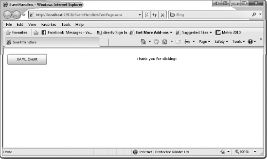
Textproperty of theTextBlockwithin theButton_Clickevent, as follows:private void Button_Click(object sender, RoutedEventArgs e) {txtXAMLEventText.Text = "Thank you for clicking!";}Run the application and click the XAML Event button. The text to the right of the button will change to "Thank you for clicking." Figures 4-3 and 4-4 show the application before and after clicking the XAML Event button.
Now that you have seen how to define an event handler in the XAML markup, in the next exercise you will continue by adding another event handler using managed code.


Let's continue with the project named EventHandlers from the previous exercise. You'll add another button and wire up its event handler using managed code.
Add another
ButtonandTextBlockin the second row of theGrid, as follows:<Grid x:Name="LayoutRoot" Background="White"> <Grid.RowDefinitions> <RowDefinition Height="70" /> <RowDefinition Height="70" /> <RowDefinition Height="70" /> <RowDefinition Height="*" /> </Grid.RowDefinitions> <Grid.ColumnDefinitions> <ColumnDefinition Width="150" /> <ColumnDefinition Width="*" /> </Grid.ColumnDefinitions> <Button Width="125" Click="Button_Click" Height="35" Content="XAML Event" /> <TextBlock Name="txtXAMLEventText" Text="Click the XAML Event!" Grid.Column="1" VerticalAlignment="Center" HorizontalAlignment="Center" /><ButtonWidth="125"Height="35"Content="Managed Event"Grid.Row="1" /><TextBlockText="Click the Managed Event!"Grid.Column="1"VerticalAlignment="Center"HorizontalAlignment="Center"Grid.Row="1" /></Grid>In order to reference the new
Buttoncontrol in managed code, you must give it and theTextBlockcontrol a name, as shown in the following snippet:<ButtonName="btnManaged"Width="125" Height="35" Content="Managed Event" Grid.Row="1" /> <TextBlockName="txtManagedEventText"Text="Click the Managed Event!" Grid.Column="1" VerticalAlignment="Center" HorizontalAlignment="Center" Grid.Row="1" />Your page should now appear as shown in Figure 4-5.
Next, you need to add the event handler. Right-click the Silverlight page and select View Code. This will switch to the code behind of the page.
From here, you will use the standard CLR language-specific syntax for adding event handlers. Since you are using C#, the syntax is to use the
+=operator and assign it to a newEventHandler. Visual Studio will help you with this.After the
InitializeComponent()method call in thePageconstructor, start typing"this.btnManaged.Click +=". At this point, Visual Studio will display the message "new RoutedEventHandler(bntManaged_Click); (Press TAB to insert)," as shown in Figure 4-6. Press Tab to complete the event handler definition.Visual Studio will once again prompt you for the name of the event handler. Go ahead and press Tab again to accept the default name. At this point, your source should look like this:
public partial class MainPage : UserControl { public MainPage() { InitializeComponent();this.btnManaged.Click += new RoutedEventHandler(btnManaged_Click);}void btnManaged_Click(object sender, RoutedEventArgs e){throw new NotImplementedException();}private void Button_Click(object sender, RoutedEventArgs e) { txtXAMLEventText.Text = "Thank you for clicking!"; } }Now the only thing left to do is add the code to the event handler. You will notice that, by default, Visual Studio added code to automatically throw a
NotImplementedException. Remove that line and replace it with the following line to change theTextBlockcontrol's text.void btnManaged_Click(object sender, RoutedEventArgs e) {txtManagedEventText.Text = "Thank you for clicking";}Run the application and click the Managed Event button. You will see the text for the second
TextBlockis updated to say "Thank you for clicking," as shown in Figure 4-7.


This exercise demonstrated how to wire up an event handler using C# and managed code.
In the remainder of the chapter, we will take a tour of the more commonly used form controls in Silverlight. Let's start off by looking at the Border control.
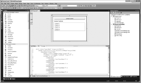
The Border control provides a way to add a border and background to any one control in Silverlight. Even though a border is applied to only one control, you can always place a border around a StackPanel or Grid, and as a result include many controls within a border.
The syntax to add a Border control to your Silverlight project is very simple, as you can see from the following example:
<Grid x:Name="LayoutRoot" Background="White">
    <Border BorderThickness="2" BorderBrush="Black" Margin="10">
        <StackPanel Margin="10">
            <Button Content="Sample Button" Margin="5" />
            <TextBlock Text="Sample TextBlock" Margin="5" />
            <ListBox Margin="5">
                <ListBoxItem>
                    <TextBlock Text="ListItem 1" />
                </ListBoxItem>
                <ListBoxItem>
                    <TextBlock Text="ListItem 2" />
                </ListBoxItem>
                <ListBoxItem>
                    <TextBlock Text="ListItem 3" />
                </ListBoxItem>
                <ListBoxItem>
                    <TextBlock Text="ListItem 4" />
                </ListBoxItem>
            </ListBox>
        </StackPanel>
    </Border>
</Grid>
Figure 4-8 shows the results.
Another feature of the Border control is the ability to round the corners of the border using the CornerRadius property. Here is how the preceding example could be modified to provide a Border control with a CornerRadius property of 10:
<Border
    BorderThickness="2"
    BorderBrush="Black"
    Margin="10"
    CornerRadius="10">
The border with rounded corners is shown in Figure 4-9.
You can declare a background color for your border using the Background property. Like the BorderBrush property, the Background property can be set to either a color or a brush type. Here is an example of setting a border with a background color of silver:
<Border
    BorderThickness="2"
    BorderBrush="Black"
    Margin="10"
    CornerRadius="10"
    Background="Silver">
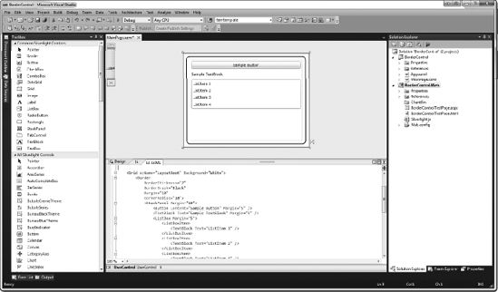
Figure 4-10 shows the result of adding the background color.

The following is an example of a more complex Border control that contains a gradient for the border and background, by using a Brush object:
<Border BorderThickness="2" Margin="10" CornerRadius="10"><Border.Background><LinearGradientBrush><LinearGradientBrush.GradientStops><GradientStop Color="Green" Offset="0" /><GradientStop Color="White" Offset="1" /></LinearGradientBrush.GradientStops></LinearGradientBrush></Border.Background><Border.BorderBrush><LinearGradientBrush><LinearGradientBrush.GradientStops><GradientStop Color="Black" Offset="0" /><GradientStop Color="White" Offset="1" /></LinearGradientBrush.GradientStops></LinearGradientBrush></Border.BorderBrush><StackPanel Margin="10"> <Button Content="Sample Button" Margin="5" /> <TextBlock Text="Sample TextBlock" Margin="5" /> <ListBox Margin="5"> <ListBoxItem> <TextBlock Text="ListItem 1" /> </ListBoxItem> <ListBoxItem> <TextBlock Text="ListItem 2" /> </ListBoxItem> <ListBoxItem> <TextBlock Text="ListItem 3" /> </ListBoxItem> <ListBoxItem> <TextBlock Text="ListItem 4" /> </ListBoxItem> </ListBox> </StackPanel> </Border>
Figure 4-11 shows the border with the gradient applied.

One of the most common controls in applications is a text box, which is the standard control for collecting basic string input from the user. Also ubiquitous are check boxes and radio buttons, which allow users to select from a list of choices—more than one choice in the case of check boxes, and a single choice in the case of radio buttons. Silverlight provides the TextBox, CheckBox, and RadioButton for these standard controls. The following exercises will also give you a chance to work with the Ellipse and Rectangle controls.
This exercise demonstrates the use of the TextBox control in Silverlight by creating a simple application that will request the red, green, and blue values to fill an ellipse with a given color. The resulting application will appear as shown in Figure 4-12.

In Visual Studio, create a new Silverlight application named
TextBoxControl. Allow Visual Studio to create a Web Application project to host your application.In the
MainPage.xamlfile, within the rootGridelement, add threeRowDefinitionitems, as follows:<Grid x:Name="LayoutRoot" Background="White"><Grid.RowDefinitions><RowDefinition Height="50" /><RowDefinition Height="50" /><RowDefinition /></Grid.RowDefinitions></Grid>Add three
TextBoxandTextAreacontrols contained in a horizontal-orientedStackPanelto the first row, aButtoncontrol to the second row, and anEllipsecontrol to the third row. In addition, place aTextBlockin the third row to stack on top of theEllipsecontrol for error-reporting purposes. Name each of theTextBoxcontrols, as well as theButtoncontrol and theTextBlock. These additions are shown in the following code:<Grid x:Name="LayoutRoot" Background="White"> <Grid.RowDefinitions> <RowDefinition Height="50" /> <RowDefinition Height="50" /> <RowDefinition /> </Grid.RowDefinitions> <StackPanel Orientation="Horizontal"HorizontalAlignment="Center"><TextBlockVerticalAlignment="Center"Text="Red:" /><TextBoxName="txtRed"Height="24"Width="50"Margin="5" /><TextBlockVerticalAlignment="Center"Text="Green:" /><TextBoxName="txtGreen"Height="24"Width="50"Margin="5" /><TextBlockVerticalAlignment="Center"Text="Blue:" /><TextBoxName="txtBlue"Height="24"Width="50"Margin="5" /></StackPanel><ButtonName="btnTry"Content="Try Color"Grid.Row="1"Width="100"Height="24" /><EllipseName="ellipse"Grid.Row="2"Stroke="Black"StrokeThickness="5"Margin="20" /><TextBlockName="lblColor"Grid.Row="2"HorizontalAlignment="Center"VerticalAlignment="Center"FontSize="20"FontFamily="Arial"FontWeight="Bold" /></Grid>Now add the
Clickevent to theButtoncontrol. Do this in the code behind, as explained earlier in the section "Try It Out: Declaring an Event in XAML."public partial class MainPage : UserControl { public MainPage() { InitializeComponent();this.btnTry.Click += new RoutedEventHandler(btnTry_Click);}void btnTry_Click(object sender, RoutedEventArgs e){throw new NotImplementedException();}}When the button is clicked, the application will change the
Fillproperty of theEllipsecontrol, which expects aSolidColorBrush. You can create theSolidColorBrushusing theColors.FromArgb()method, which accepts four arguments: one for opacity, and one byte each for the red, green, and blue values. You will get the red, green, and blue values from theTextBoxcontrols using theTextproperty.void btnTry_Click(object sender, RoutedEventArgs e) {this.ellipse.Fill = new SolidColorBrush(Color.FromArgb(255,byte.Parse(this.txtRed.Text),byte.Parse(this.txtGreen.Text),byte.Parse(this.txtBlue.Text)));}Since the values for red, green, and blue must be an integer from 0 to 255, you can either validate them using Silverlight validation or take the easy way out and just wrap your code in a
try/catchblock, and then report the error using theTextBlock. You'll go with the latter approach here. To keep things clean, you will make sure the error message is cleared if all works correctly. Here is the updated code:void btnTry_Click(object sender, RoutedEventArgs e) { try { this.ellipse.Fill = new SolidColorBrush( Color.FromArgb( 255, byte.Parse(this.txtRed.Text), byte.Parse(this.txtGreen.Text), byte.Parse(this.txtBlue.Text) ));this.lblColor.Text = "";}catch{this.lblColor.Text = "Error with R,G,B Values";}}Build and run the application to see what you get. Type 255, 0, and 0 in the Red, Green, and Blue text boxes, respectively, and then click the Try Color button. You should see the ellipse turn red. Just for the fun of it, if you leave one of the values blank or enter a value other than 0 through 255, you will see the error message.
Now that we have taken a quick look at the TextBox control, let's turn our attention to two other common controls: CheckBox and RadioButton.
The following exercise will give you a first look at the RadioButton and CheckBox controls. You will build a simple survey, as shown in Figure 4-13.

Create a new Silverlight application in Visual Studio and call it
CheckBoxRadioButton. Allow Visual Studio to create a Web Application project to host the application.In the
MainPage.xamlfile, divide the rootGridinto two rows. In each row, place aStackPanelwith vertical orientation and aMarginproperty set to10.<Grid x:Name="LayoutRoot" Background="White"><Grid.RowDefinitions><RowDefinition /><RowDefinition /></Grid.RowDefinitions><StackPanel Orientation="Vertical" Grid.Row="0" Margin="10"></StackPanel><StackPanel Orientation="Vertical" Grid.Row="1" Margin="10"></StackPanel></Grid>The top row will be used to demonstrate the use of the
RadioButtoncontrol, and the bottom row will feature theCheckBoxcontrol. Let's begin with theRadioButton.The
RadioButtoncontrol allows users to select only one selection out of a number ofRadioButtoncontrols that share the same group name. This is set using theRadioButton'sGroupingproperty.Although you could simply type in each of the color choices for the radio buttons as text using the
Contentproperty, I thought it would be less boring to use colored rectangles instead. As we discussed earlier in the section "Nesting Controls Within Controls," one of the benefits of Silverlight controls is that you can nest just about anything within the different controls. This is just another example of that flexibility.Place five
RadioButtoncontrols in the firstStackPanel, each with aRectanglecontrol of a different color. For the group name, useFavoriteColor. To make the content of theRadioButtoncontrols display as left-justified, set theHorizontalAlignmentproperty toLeftfor each one. Here is the code:<StackPanel Orientation="Vertical" Grid.Row="0" Margin="10"><TextBlockText="What is your favorite color?" /><RadioButton HorizontalAlignment="Left" GroupName="FavoriteColor"><Rectangle Width="100" Height="10" Fill="Red" /></RadioButton><RadioButton HorizontalAlignment="Left" GroupName="FavoriteColor"><Rectangle Width="100" Height="10" Fill="Blue" /></RadioButton><RadioButton HorizontalAlignment="Left" GroupName="FavoriteColor"><Rectangle Width="100" Height="10" Fill="Green" /></RadioButton><RadioButton HorizontalAlignment="Left" GroupName="FavoriteColor"><Rectangle Width="100" Height="10" Fill="Yellow" /></RadioButton><RadioButton HorizontalAlignment="Left" GroupName="FavoriteColor"><Rectangle Width="100" Height="10" Fill="Purple" /></RadioButton></StackPanel>Next, do the same for the
CheckBoxcontrols in the bottom row, except here, just go the boring route and supply the choices as text. In addition,CheckBoxcontrols are left-justified by default, and they do not need to be grouped. Here is the code for theCheckBoxportion:<StackPanel Orientation="Vertical" Grid.Row="1" Margin="10"><TextBlock Text="What Technologies are you familiar with?" /><CheckBox Content="Silverlight" /><CheckBox Content="ASP.NET" /><CheckBox Content="Visual Studio 2010" /><CheckBox Content="Expression Blend 4" /></StackPanel>Go ahead and run the solution to see the end result as it will appear in the browser. The output is shown in Figure 4-13. Notice that, as you would expect, you are able to select only one radio button at a time, but you can click as many check boxes as you wish.
When a Silverlight application is deployed, it goes into an .xap file. This file will need to be downloaded by every client that accesses the Silverlight application.
A big benefit of Silverlight is that the size of this .xap file is kept very small. One reason this file can be small is that the most commonly used controls are included in theSilverlight Runtime, which is already present on every machine with Silverlight installed.
However, Silverlight provides a number of controls beyond this commonly used set of controls. These controls are included in two separate assemblies: System.Windows.Controls.dll and System.Windows.Controls.Data.dll. These dynamic link libraries (DLLs) will be included in the application .xap file only if the developer used a control from one of these extended control sets in that application.
When a developer uses a control from one of the other control libraries, an additional xmlns declaration will be added in the UserControl definition. This xmlns will have a prefix associated with it that will then be used to reference the individual controls.
For example, if you add a DataGrid to your Silverlight application in Visual Studio, your source will appear as follows:
<UserControl
    xmlns:data=
     "clr-namespace:System.Windows.Controls;assembly=System.Windows.Controls.Data"
    x:Class="SilverlightApplication1.Page"
    xmlns="http://schemas.microsoft.com/winfx/2006/xaml/presentation"
    xmlns:x="http://schemas.microsoft.com/winfx/2006/xaml"
    Width="400" Height="300">
    <Grid x:Name="LayoutRoot" Background="White">
        <data:DataGrid></data:DataGrid>
    </Grid>
</UserControl>
Notice the additional xmlns declaration pointing to the System.Windows.Controls namespace within the System.Windows.Controls.Data assembly.
Tip
To view which controls belong to which assemblies, first create a new Silverlight application and add a DataGrid and GridSplitter to the root Grid. Then select View
Now we will work through an exercise using one of the controls in the System.Windows.Controls assembly.
One of the controls that resides in the System.Windows.Controls assembly is the GridSplitter. This control provides the ability for a user to change the width of a column or row in an application. If used properly, the GridSplitter can greatly improve the appearance of your application, as well as the user experience. In the following exercise, you will implement a simple GridSplitter.
Create a new Silverlight application in Visual Studio called
GridSplitterControl. Allow Visual Studio to create a Web Application project to host the application.In the
MainPage.xamlfile, divide the rootGridinto two columns. The first column should be 150 pixels in width, and the second should take up the remainder of the application. To be able to see what is going on in the grid, setShowGridLinestoTrue. Also add twoTextBlockcontrols to the application: one in the first column and one in the second column. Your source should appear as follows:<Grid x:Name="LayoutRoot" Background="White"><Grid.ColumnDefinitions><ColumnDefinition Width="150" /><ColumnDefinition /></Grid.ColumnDefinitions><TextBlockText="Apress, Inc." /><TextBlockGrid.Column="1"Text="Beginning Silverlight 4: From Novice to Professional" /></Grid>At this point, your Silverlight application should look like Figure 4-14.
Notice that you cannot see all of the text in the second column. Let's add a
GridSplittercontrol to the application so users can resize the two columns to be able to view all the text in both columns.Within the XAML, place the cursor just below the
TextBlockdefinitions you added. Then, in the Visual Studio Toolbox, double-click theGridSplittercontrol. This will add thexmlnsto theSystem.Windows.Controlsassembly, and it will also add theGridSplitterto the application. Then set theBackgroundproperty of theGridSplittertoLightGray. The source appears as follows:<Grid x:Name="LayoutRoot" Background="White"> <Grid.ColumnDefinitions> <ColumnDefinition Width="150" /> <ColumnDefinition /> </Grid.ColumnDefinitions> <TextBlock Text="Apress, Inc." /> <TextBlock Grid.Column="1" Text="Beginning Silverlight 4: From Novice to Professional" /><sdk:GridSplitter Name="gridSplitter1" Background="LightGray" /></Grid>Tip
As discussed earlier in this section, since the GridSplitter belongs in the Silverlight SDK control library instead of the standard controls library, we must add a references to the sdk control namespace and assembly. The entry in the UserControl definition would be the following:
xmlns:sdk="http://schemas.microsoft.com/winfx/2006/xaml/presentation/sdk">
Since we named the reference "sdk," that is the prefix used in defining the GridSplitter (<sdk:GridSplitter>).
Run the application. It should look similar to Figure 4-15. Notice that you can now click and drag the
GridSplitterto resize the twoGridcolumns.


As you can see, it's quite easy to gain the rich functionality of a grid splitter in your application with the Silverlight GridSplitter control.
In this chapter, you took a brief look at some of the common form controls that are provided with Silverlight. The chapter was meant only as an introduction to the controls. You will be looking at these controls in more advanced capacities in the upcoming chapters.
In the next chapter, you will look at the Silverlight list controls: ListBox and DataGrid.