chapter sixteen
Making Your Website Look Great Across Multiple Devices
With so many different types of devices able to access the web today, how a web page is displayed on those devices needs to change to best suit the device it is being viewed on. At the moment, the Cool Shoes & Socks page is suited for desktop browsers, but cramming all of that page into the small screen of a mobile device, for example, makes the content very small and difficult to read.
As you saw in Chapter 2, CSS2 offers media types (www.w3.org/TR/CSS2/media.html), which allow you to apply styles to specific conditions such as screen, print, and handheld. Of course, these media types were rather short-sighted. What is handheld? A mobile phone? A tablet device, such as an iPad? A Nintendo DS? All these devices could be considered as “handheld,” but they still differ greatly—in size, in features, and the environment in which they are used.
 The CSS3 media queries module (
www.w3.org/TR/css3-mediaqueries/) adds many new ways for you to query attributes of a device on which a page is being viewed and to set up styles specific to those conditions.
In this chapter, you use the free Opera Mobile Emulator (www.opera.com/developer/tools/mobile/) to build and test a Cool Shoes & Socks page that is capable of adapting to varying device conditions.
Project files update (ch16-00): If you haven’t followed the previous instructions and are comfortable working from here onward or would like to reference the project files up to this point, you can download them from www.wiley.com/go/treehouse/css3foundations.
Using Opera Mobile Emulator
Before you begin adding media queries to the Cool Shoes & Socks stylesheet, first take a look at the page in Opera Mobile Emulator.
1. Download and install Opera Mobile Emulator from www.opera.com/developer/tools/mobile/.
2. After it is installed, open Opera Mobile Emulator.
When you open Opera Mobile Emulator, you are presented with the options for the device you want to emulate, as shown in Figure 16-1. By changing these settings, you can set up an environment similar to many Android devices such as Samsung Galaxy S, HTC Desire, Motorola Xoom, and so on.

Figure 16-1 The initial window of Opera Mobile Emulator.
Opera Mobile Emulator conveniently has a list of profiles for many devices, which saves you from having to change options such as Resolution and Pixel Density.
Ideally, you should test in as many devices as possible, but as you did with desktop browsers, choose one profile to develop with, and when you’re done, test in other profiles.
3. From the Profile list, select Samsung Galaxy S II and click Launch.
When a profile launches, you are presented with a window that has the same dimensions as the Samsung Galaxy S II, and you can start using the Opera Mobile browser as if you were using it on that device.
4. With the Cool Shoes & Socks page open in your desktop browser, copy the URL of the page from the address bar.
5. Return to Opera Mobile Emulator, click the address bar, and paste the URL. Then press Return on your keyboard or click the Go button in the bottom right.
You now see the Cool Shoes & Socks page in the same way it would be viewed on a Samsung Galaxy S II, as shown in Figure 16-2. Cool stuff, right? You can view your pages in a whole range of mobile devices.
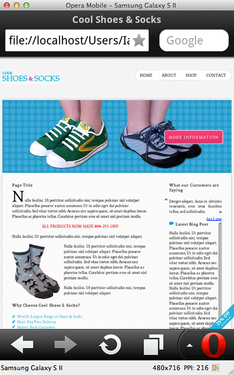
Figure 16-2 The Cool Shoes & Socks page viewed in a Samsung Galaxy S II profile using Opera Mobile Emulator.
In the bottom-right corner of the Opera Mobile Emulator window is a small rotate symbol, as shown in Figure 16-3. Click this symbol to rotate the device, as if it is in your hands and you are changing it from portrait to landscape view and vice versa.
As you can see, Cool Shoes & Socks is difficult to read on such a small device. If this were the real device in your hand, you would probably zoom in to read the content. Using media queries, you can make it so that users don’t need to zoom in and swipe around the page to be able to read it, while generally improving their experience of Cool Shoes & Socks when viewing it on a mobile device.
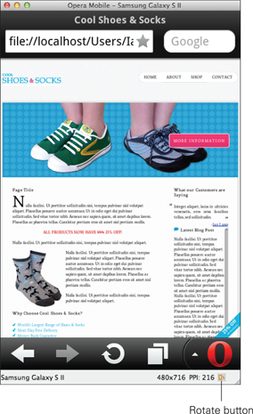
Figure 16-3 The rotate button in Opera Mobile Emulator that allows you to change the emulated device between portrait and landscape views.
Scaling the Viewport on Mobile Devices
When you view a web page on a mobile device, many mobile browsers scale the viewport so the page fits on the screen without the need for horizontal scroll bars. The reason Cool Shoes & Socks is so small when viewed in Opera Mobile Emulator—and you’ll find the same happens across many devices—is that the page is scaled down to fit.
Because media queries are a new technology, many websites don’t use them. Therefore, a mobile browser scaling down the viewport in this way provides a solution that makes the majority of web pages display reasonably well on a smaller screen. Text can often be hard to read at this size, but users can get a quick overview of the page and zoom in to the sections they want to see or read—a better approach than being able to show only a small part of a web page at a higher zoom level.
Because you’re working on the Cool Shoes & Socks page now, though—with the media queries module in a Recommendation status—you get the privilege of choosing how your web page looks on a mobile device. Letting a mobile browser scale the viewport is a quick fix but not a perfect one, which is where media queries step in.
As yet, there isn’t a way to change the scaling of the viewport via CSS, although the feature is on its way in the CSS Device Adaption module (dev.w3.org/csswg/css-device-adapt/#the-viewport-rule). However, you can scale the viewport using HTML.
1. In index.html, below <meta charset=”utf-8” />, add the following:
<meta name=”viewport”
content=”width=device-width, initial-scale=1, maximum-scale=1”>
2. Save index.html.
When you specify the width as device-width, the viewport is set to the same width as the device. The initial-scale is the zoom applied to the page when it first loads, 1 being the equivalent of 100%. When maximum-scale is set to 1, the page can’t be zoomed in more than 100%. The CSS Device Adaption module explains that the initial-scale property will actually be called zoom; likewise, similar properties such as minimum-scale and maximum-scale (which determine how far in and out the user is allowed to zoom) will be translated to min-zoom and max-zoom.
Because the CSS Device Adaption module is an Editor’s draft at the time of writing, CSS3 Foundations doesn’t cover that module. If you would like more information about <meta name=”viewport”>, see the Mobile Web Application Best Practices at www.w3.org/TR/mwabp/#bp-viewport.
So what does this change do to Cool Shoes & Socks? As shown in Figure 16-4, the page now zooms right in. Everything is bigger but crammed into a smaller place, so whether the page is more readable is arguable. Likewise, some elements look a little broken and/or could do with being positioned differently. Using media queries, you can address all these issues and only for the mobile experience—the desktop experience isn’t changed.
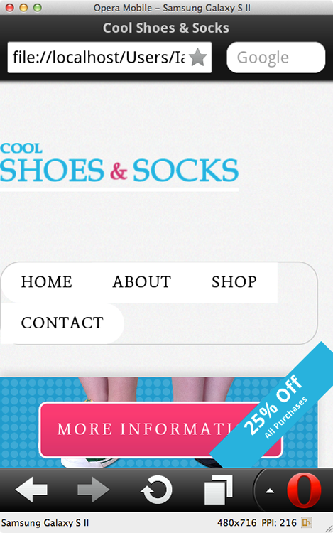
Figure 16-4 The Cool Shoes & Socks page viewed in Opera Mobile Emulator with an initial-scale of 1 and the viewport width set to be the same as the device’s width.
Using Media Queries
Browser support: IE 9+, Firefox 3.5+, Chrome 4+, Opera 9.5+, Safari 4+
Although the media queries module is a part of the CSS3 specification, these queries are in a Recommendation status, meaning they are no longer experimental and can be used safely. Unfortunately, Internet Explorer 6, 7, and 8 don’t support media queries, but you already took steps in the preceding chapter to work around that issue. What’s more, mobile devices and tablets don’t use these older browsers, so media queries and older versions of Internet Explorer don’t pose much of a problem.
As you saw in Chapter 2, you add media types to a stylesheet using the @media rule, for example:
@media screen {
/* styles to be applied to screen devices here */
}
Any rule sets placed with this @media rule apply only to the screen. Media queries use the same syntax and build on media types. Whereas the previous media type applied to the screen, the following media query applies to a color screen:
@media screen and (color){
/* styles to be applied to color screen devices here */
}
You can use the same query with the media attribute in a <link> element, like so:
<link rel=”stylesheet” media=”screen and (color)”
href=”styles.css” />
You place media queries in parentheses (); they are logical expressions that can either be true or false. Here, if the media is a color screen, the query is true and the necessary styles are applied; otherwise, the query is false and the styles are ignored.
Color is just one of the many media features that you can use to compose a media query, which you look at after learning how to use logical operators.
Using Logical Operators
Logical operators allow you to create complex @media rules—stringing media queries together.
And
The and keyword enables you to combine features of a query. For example:
@media screen and (color)
In this query, the media must be a screen and a color one at that. If the media is a screen but can display only black and white, the @media rule is false and the styles don’t apply.
Or
To specify a logical OR expression, you can list queries, separated by a comma. For example:
@media screen and (color), projection and (color)
This query applies to color screens or color projectors. Only one of the queries in the list needs to be true for the @media rule to be true.
Not
When you use the not keyword, the result of a media query is negated. The following @media rule is true on a color screen:
@media screen and (color)
The following is false for a color screen but true for everything else:
@media not screen and (color)
This means anything that isn’t a color screen has the specified styles applied to it.
Only
Because older browsers can read @media rules but not media queries, older browsers may ignore the query and still apply a stylesheet regardless of whether the query is true or false. To prevent that from happening, you can place the only keyword at the start of an @media rule to make older browsers ignore the entire rule, like so:
@media only screen and (color)
Modern browsers know that the only keyword is just present to throw off older browsers, and they continue reading everything after it. The only keyword is used with every Cool Shoes & Socks @media rule.
Applying Styles to Specific Media Features
Media features, such as color shown previously, are used in media queries to describe the requirements of the environment you want to apply styles to.
Many features accept optional min- or max- prefixes to express “greater than or equal to” and “less than or equal to.” For example, min-width: 100px is true for anything with a width of 100px or more.
In this section, below the name of each media feature, you see which media type a media feature applies to and whether it supports min- and max- prefixes.
Let’s look at what each media feature describes and then implement some of them into the Cool Shoes & Socks stylesheet.
width
Applies to: all visual and tactile (a device that allows for being touched) media types | Accepts min/max prefixes: yes
width describes the width of the viewport on a targeted display, that is, the width of the browser’s viewing area.
Assuming you want to apply styles to a viewport with a width equal to or less than 960px, such as the 700px wide browser window shown in Figure 16-5, you can use the max-width media feature:
@media only screen and (max-width: 960px) {
/* styles to be applied to screen devices when the viewport has
a width equal to or less than 960px */
}

Figure 16-5 The Cool Shoes & Socks page viewed in a browser with a width of 700px.
Using the query @media only screen and (width: 960px) applies only to viewports with an exact width of 960px.
height
Applies to: all visual and tactile media types | Accepts min/max prefixes: yes
height describes the height of the viewport on a targeted display, that is, the height of the browser’s viewing area.
Media queries tend to use the width media feature more than height, but this feature still has its uses.
For example, you could query the height of the browser to move important elements—ones that you want the users to see as soon as they visit the page—further up the page when their viewport has a small height. You may decide that the “25% Off” banner on the Cool Shoes & Socks page would get in the way of more important content when the browser height is smaller than usual and therefore use a media query to hide it below a certain height.
@media only screen and (max-height: 500px) {
/* styles to be applied to screen devices when the viewport has
a height equal to or less than 500px */
}
device-width
Applies to: all visual and tactile media types | Accepts min/max prefixes: yes
Whereas the media feature width is the width of the viewport, device-width is the width of the screen.
device-width is often used to target devices such as mobiles and tablets. Consider the following example:
@media only screen and (min-device-width: 320px)
and (max-device-width: 480px)
With this query, all screen devices with a screen width ranging between 320px and 480px have the specified styles applied to them. This range of widths applies to many mobile devices both in portrait and landscape orientations, but not bigger devices such as tablets and desktop computers.
Unlike the viewport, the size of a screen obviously can’t be changed.
device-height
Applies to: all visual and tactile media types | Accepts min/max prefixes: yes
device-height describes the height of a screen. As with the height media feature, it is not as commonly used as width or device-width but shares similar purposes as those described for height.
orientation
Applies to: bitmap (devices that output an image, such as screen or print) media types | Accepts min/max prefixes: no
The orientation media feature takes two values, portrait and landscape, and is written as follows:
@media only screen and (orientation: portrait)
@media only screen and (orientation: landscape)
orientation is portrait when the value of the height media feature is greater than or equal to the value of the width media feature; otherwise, orientation is landscape.
aspect-ratio
Applies to: bitmap media types | Accepts min/max prefixes: yes
aspect-ratio is the ratio between the width and height media features (the width and height of the viewport). As with many of the media features, aspect-ratio tends to be used with a min- or max- prefix.
This media query describes a viewport with a width that is equal to or greater than its height:
@media only screen and (min-aspect-ratio: 1/1)
device-aspect-ratio
Applies to: bitmap media types | Accepts min/max prefixes: yes
device-aspect-ratio is the ratio between the device-width and device-height (the width and height of a screen).
The following media query describes a device’s screen with an aspect ratio of 16/9:
@media only screen and (device-aspect-ratio: 16/9)
color, color-index, monochrome, resolution, scan, and grid
The following media features are used for more specialized pages and applications:
• color—Describes the number of bits per color component of the output device
• color-index—Describes the number of entries in the color lookup table of the output device
• monochrome—Describes the number of bits per pixel in a monochrome frame buffer
• resolution—Describes the resolution of the output device
• scan—Describes the scanning process of tv output devices
• grid—Queries whether the output device is grid or bitmap
For more information on these media features, see the Media Queries module at www.w3.org/TR/css3-mediaqueries/#device-aspect-ratio.
Adding Media Queries to Cool Shoes & Socks
Now that you know what media features are available, you can modify the layout of Cool Shoes & Socks specifically for mobile devices and then move on to adjusting the tablet experience and desktop experience when the browser window is narrower than 960px.
Media Queries for Mobile Devices
As you saw in Figure 16-4, Cool Shoes & Socks when viewed on a smaller device gets messy, so let’s tidy it up and make the experience better for smaller devices.
1. At the bottom of styles.css, add the following @media rule:
/* Mobile (portrait and landscape)*/
@media only screen and (max-device-width: 480px) {
}
This rule applies to devices that have a screen width up to 480px—many mobile devices. It’s a good idea to include a comment above the @media rule to remind you and/or your colleagues what exactly a media query is targeting.
2. Inside the @media rule, add the following declarations:
#header .logo {
display: block;
float: none;
margin: 0 auto;
}
#header {
padding: 0 10px;
}
#header nav, .sidebar, #content{
float: none;
width: 100%;
}
.banner-ad {
display: none;
}
The first two rule sets, #header .logo and #header, center the logo and add padding to either side of the header.
The third rule set, #header nav, .sidebar, #content, is one you will see a lot for mobile layouts (the selectors may be different but the declarations the same). Because the desktop version of Cool Shoes & Socks has multiple columns, when the width of the page is much smaller on devices such as mobile, there isn’t enough room for two columns. When you set the header navigation, sidebar, and content area to float: none; and width: 100%;, those elements all stretch out into one column, giving them the space they need to become more readable.
The fourth rule set, .banner-ad, hides the “25% Off” banner, which, as mentioned previously, may get in the way of content. What’s more, fixed position elements don’t work well on mobile devices, so it’s a good idea to avoid them where possible.
The mobile layout isn’t quite right yet, so add a few more rule sets to the same @media rule.
3. Inside the @media rule and below the other rule sets you just added, add the following:
#header nav > ul {
border: none;
}
#header nav li {
border-radius: 20px;
border: #ccc solid 1px;
margin: 0 0 5px 0;
width: 100%;
}
#header nav ul ul {
display: none;
}
.sidebar {
border-top: 3px dotted #ccc;
clear: both;
margin: 60px 0 0 0;
padding: 20px 0 0 0;
}
.sidebar, .sidebar aside:hover,
.sidebar aside:nth-child(3):hover {
-webkit-transform: none;
-moz-transform: none;
-o-transform: none;
-ms-transform: none;
transform: none;
}
#footer li {
display: block;
float: none;
line-height: 200%;
}
The first rule, #header nav > ul, removes the border around the navigation, and the second rule, #header nav li, adds borders around each navigation link instead. Because mobile devices often have touch capabilities now, it is good practice to make sure any link on a page has a wide target area so the users can easily press it without having to concern themselves about being too accurate.
The third rule set, #header nav ul ul, hides the drop-down menus. It’s a good idea to hide complex drop-down menus on touch devices. Just remember to make sure the top-level pages have links to their child pages or provide an alternative navigation.
The fourth rule set, .sidebar, changes the layout of the sidebar somewhat. Now that the sidebar sits below the content (rather than to its side as in the desktop version), it’s given a top border to visually separate it and some margin and padding on top to push it a little further away from the bottom of the content area.
The fifth rule set, .sidebar, .sidebar aside:hover, .sidebar aside:nth-child(3):hover, overrides the transforms when the sidebar elements are hovered over. Because the mobile layout is a smaller space, it’s better to hide these animated transforms.
The last rule set, #footer li, tidies up the links in the footer.
Finally, modify the product showcase for mobile devices.
4. Still inside the @media rule and below the other rule sets you just added, add the following:
.showcase {
height: 200px;
overflow: hidden;
}
.showcase li {
-webkit-animation: none;
-moz-animation: none;
-ms-animation: none;
-o-animation: none;
animation: none;
}
.showcase img {
height: auto;
margin-left: -50%;
max-width: 200%;
width: 200%;
}
5. Save styles.css.
Because the product showcase shrinks a little too small on mobile devices, the first rule set, .showcase, increases its height and also hides any overflowing content, which works well with the changes made in the third rule set.
The second rule set, .showcase li, removes the cycling animation from the product showcase. Note that in Opera Mobile Emulator, the browser doesn’t support animations, so the users don’t see them anyway. Other browsers that do support them, such as Safari on the iPhone, don’t support the animation particularly well, so that has been removed from the mobile experience.
The last rule set, .showcase img, makes the product images twice as wide (and thus twice as tall). It also overwrites the inhertied max-width: 100%; declaration, because in this case, having the image bigger than its container is desired. To keep the product image in the center, you give it a margin-left of -50%.
With all these styles applied that are specific to mobile devices, the mobile experience is much improved. Figure 16-6 shows how Cool Shoes & Socks looks in Opera Mobile Emulator; the logo is centered, and the navigation is much more suited to a touch device.

Figure 16-6 The Cool Shoes & Socks web page viewed in Opera Mobile Emulator with styles applied to it that are specific to mobile devices.
Figure 16-7 shows that the product showcase has been slightly modified for the mobile experience, and the content is all in one easier-to-read column.
If you rotate the device into landscape, you see the same rules still apply, but thanks to the fluid layout you built, the page stretches out to make use of the extra width, as shown in Figure 16-8.

Figure 16-7 The product showcase and content area.

Figure 16-8 The same Cool Shoes & Socks web page viewed in landscape view.
You may feel the product showcase when viewed in landscape needs tweaking, to bring the product image up a small amount, as shown in Figure 16-9.

Figure 16-9 The product showcase when viewed in landscape.
I personally like the slightly abstract nature of the image in this way and am happy to have it stay like that. If you want to change it, you could add another media query that targets mobile devices only when in landscape orientation, like so:
/* Mobile (landscape)*/
@media only screen and (max-device-width: 480px) and (orientation: landscape) {
.showcase img {
margin-left: -25%;
width: 150%;
}
}
Project files update (ch16-01): If you haven’t followed the previous instructions and are comfortable working from here onward or would like to reference the project files up to this point, you can download them from www.wiley.com/go/treehouse/css3foundations.
Media Queries for Tablets and Narrow-Size Desktop Browsers
Cool Shoes & Socks now provides a much better experience for mobile devices with a width up to 480px. The desktop experience looks great at 960px and higher, but there’s still a gap between 480px and 960px that may need some additional styles. This gap covers tablet devices in addition to desktop experience when the browser is narrower than 960px.
Let’s start with the desktop browser below 960px. In Figure 16-10, the browser window has been reduced to a width of 800px.

Figure 16-10 The Cool Shoes & Socks page viewed in a browser at a width of 800px.
For the most part, the normal desktop experience is sufficient, although notice that the logo and navigation in the header touch the sides of the browser window. You can change that:
1. At the bottom of styles.css, add the following @media rule:
/*viewport 960px and below*/
@media only screen and (max-width: 960px) {
#header {
padding: 0 40px;
}
}
2. Save styles.css.
This media query applies to screen devices where the viewport width is 960px or less. Because the maximum width of the website is 960px, whenever the browser window is equal to or less than that, the header has some space on either side of it.
Now, what if the width of the browser window is reduced even more? Figure 16-11 shows that at a width of 700px, the navigation and logo no longer have enough space to sit aside each other. The content and sidebar sitting side by side are also starting to look a little cramped.
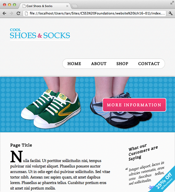
Figure 16-11 The Cool Shoes & Socks page viewed in a browser at a width of 700px.
The point where the navigation moves down below the logo is at about 710px; this point can be determined by resizing the window slowly or by using a tool such as responsivepx (www.responsivepx.com). This is known as a breakpoint. You could add a few styles to change the layout of the navigation at 710px or below, but because the content area starts to get too squashed as this point, a better approach would be to adopt a similar layout to the mobile layout.
Rather than write another @media rule and lots more styles, adapt the @media rule that was written for mobile devices.
3. In styles.css, find the following @media rule:
/* Mobile (portrait and landscape)*/
@media only screen and (max-device-width: 480px)
4. Change that @media rule and the comment that describes its purpose to the following:
/* Mobile (portrait and landscape) and viewports up to
a 735px width */
@media only screen and (max-width: 735px) {
When you change the last query to max-width: 735px, the mobile layout applies to mobile devices and viewports equal to or below a width of 735px. Although it was determined that the breakpoint of the navigation was at 710px, the navigation got a bit too close to the logo, so it’s been increased to 735px.
The mobile layout disabled the animation on the product showcase, which is undesired, so make another @media rule specific to mobile devices only and move the showcase rule sets into that.
5. From the @media rule @media only screen and (max-width: 735px), remove the following:
.showcase {
height: 200px;
overflow: hidden;
}
.showcase li {
-webkit-animation: none;
-moz-animation: none;
-ms-animation: none;
-o-animation: none;
animation: none;
}
.showcase img {
height: auto;
margin-left: -50%;
max-width: 200%;
width: 200%;
}
6. Above @media only screen and (max-width: 735px), add the following:
/* Mobile (portrait and landscape) */
@media only screen and (max-device-width: 480px) {
.showcase {
height: 200px;
overflow: hidden;
}
.showcase li {
-webkit-animation: none;
-moz-animation: none;
-ms-animation: none;
-o-animation: none;
animation: none;
}
.showcase img {
height: auto;
margin-left: -50%;
max-width: 200%;
width: 200%;
}
}
7. Save styles.css.
When you move the showcase rule sets out of the @media rule that applies to mobile devices and viewports up to a width of 735px, the slideshow begins animating again in desktop browsers (where browsers support CSS3 animations). To keep it from working on mobile devices, you then add an @media rule specific to mobile again.
With the desktop experience below a viewport width of 735px now taking on the mobile layout, the newsletter box looks a little stretched, as shown in Figure 16-12, so you can change that.
8. At the bottom of styles.css, add the following:
/* viewport between 480px and 735px */
@media only screen and (min-width: 480px) and (max-width: 735px) {
#newsletter {
margin: 0 auto;
width: 50%;
}
}
This rule causes the newsletter box to be 50% wide when the viewport is between a width of 480px and 735px.
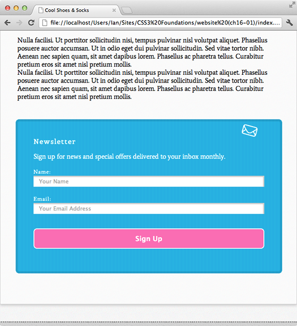
Figure 16-12 The newsletter box is a little too stretched when viewed in a browser window at 700px.
Summary
In this chapter, you made the final changes to Cool Shoes & Socks, and you now have a web page that is responsive and adapts to present itself in the best possible way for the particular device it is being viewed on!
At times, you may question why media queries are necessary when mobile browsers attempt to automatically scale web pages for better user experience, but as time goes on and many more differing devices are released, media queries will truly show their strength. Implementing them now doesn’t just future proof a web page; it offers a superior experience for your users, too.