chapter nine
Understanding Display, Position, and Document Flow
In this chapter, you complete the main layout of Cool Shoes & Socks, making use of the display and position properties. Plus, you learn about the flow of a document. Later in the chapter, you use some of the more advanced CSS selectors that were covered in Chapter 3, to create a drop-down menu that will appear when users hover over the “Shop” link.
Project files update (ch09-00): If you haven’t followed the previous instructions and are comfortable working from here onward or would like to reference the project files up to this point, you can download them from www.wiley.com/go/treehouse/css3foundations.
Document Flow
A document is the fancy name for a web page. A web page has a flow, which determines the layout of elements. Prior to the preceding chapter, in which you made elements float, the entirety of the Cool Shoes & Socks page had a “normal flow.”
All elements on a web page, by default, have a normal flow, referred to as being “in flow.” This means the position of one element affects the next. Figure 9-1 shows how the Cool Shoes & Socks page looked at the end of Chapter 7, where all elements were in flow—each element following the next.
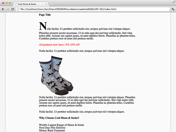
Figure 9-1 The Cool Shoes & Socks page as it was at the end of Chapter 7.
Assume you have a page with two paragraphs of content (whether they are on a web page or a word processing document, which also has a normal flow). When you add a new paragraph in between the other two, the second paragraph is pushed down to accommodate the new paragraph. This happens because the document has a normal flow and elements are positioned relative to each other.
Using CSS, you are able to take an element “out of flow,” using the position: absolute; declaration. When you do this, an element no longer affects or is affected by the elements around it. This capability has an endless number of uses, and when an element doesn’t need to be in flow, it allows for greater control over the position of that element.
The beauty of this capability is that a containing element can be in flow but its child elements can be out of flow—useful for web page features such as drop-down menus (shown in Figure 9-2), which you add to the page later in this chapter.
The normal flow and absolute position are types of positioning schemes that affect the document’s flow. Float is another form of positioning scheme, which essentially is a hybrid of normal flow and absolute positioning. Floats are first laid out according to the normal flow (affecting the elements relative to it) and then taken out of the flow of the document, being absolutely positioned, typically to the left or right of its containing element.
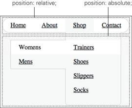
Figure 9-2 A menu positioned relative and “in flow,” with a drop-down submenu positioned absolute, “out of flow.”
You already used the float positioning scheme in the preceding chapter, so now take a look at the normal flow and how you can manipulate elements within that scheme.
display
Initial value: inline | Inherited: No | Applies to: All | CSS2.1
Browser support: IE 4+, Firefox 1+, Chrome 1+, Opera 7+, Safari 1+
The display property determines the type of box an element generates and has values such as block, inline, inline-block, list-item, none, and quite a few different values relating to the display of tables.
block
Most elements are given the declaration display: block; by a browser’s default stylesheet. An element that is a block—referred to as being block-level—doesn’t have other block-level elements to the side of it, which, as shown in Figure 9-1, is why elements only appear one after the other vertically rather than side by side.
By default, block-level elements usually have some white space around them, but this is something you removed when adding the CSS Reset in Chapter 2 for better consistency across browsers.
Figure 9-3 shows two <div> elements, which are block-level and 100% wide by default.
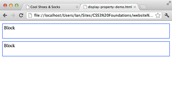
Figure 9-3 Two block elements with a default width of 100% and specified height of 40px.
This display properties demonstration page can be found in the project files ch09-00, named display-property-demo.html
On the Cool Shoes & Socks page at present, the Sign Up button in the newsletter box is an inline-block element. While the margin top value of 2em and margin bottom value of 1em of the Sign Up button are being rendered, the margin left and right value of auto are not. The reason is that inline and inline-block elements don’t have a defined width; they are simply the width of their contents—more on this shortly. So, when the browser sees that margin left and right value of auto, it can’t determine the unused space around that element because it doesn’t know how wide that element is, and as such, the button doesn’t get centered. To work around that problem, make the Sign Up button block-level instead:
1. In styles.css, find the rule set for input[type=”submit”][class=”button”] and add the following declaration:
display: block;
2. Save styles.css.
Now the Sign Up button is block-level, the margin declaration margin: 2em auto 1em; takes full effect, and the button is horizontally centered relative to the newsletter box.
Code Challenge: Make the Newsletter Labels Block-level
In styles.css, do the following:
Add a new rule set for label below the #newsletter label rule set with the declaration display: block;.
inline
An element with the declaration display: inline; is only the size of the content it contains and positions itself inline, meaning it doesn’t attempt to push itself away from, or below other elements.
In Figure 9-4, I placed two inline-level elements in between two block elements. Because the element above the inline-level elements is a block, it can’t have elements to its side, so the inline elements are placed below it. The inline elements don’t form new blocks, so they sit side by side and are only as wide as the contents they contain. Because of this, properties that affect the layout of an element can’t be used on inline elements, such as width, height, and margin. In Figure 9-4, each element has a height of 40px, but this is ignored for the inline-level elements.
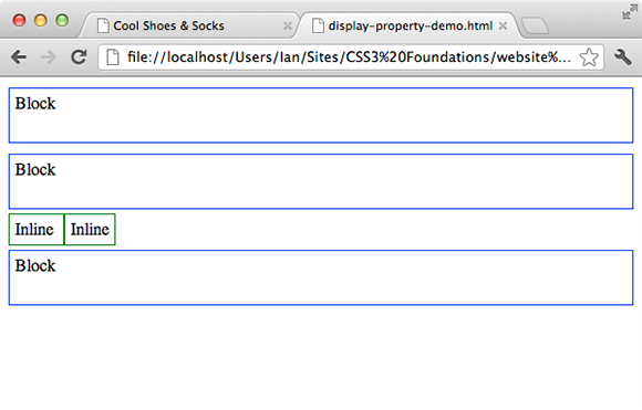
Figure 9-4 Two inline elements among two block elements.
By default, elements such as anchors <a>, images <img>, and quotes <q> are inline-level.
Prior to giving the Cool Shoes & Socks page a max-width declaration in Chapter 5, you may have noticed some inline-level elements.
Figure 9-5 shows that the image and More Information button in the product showcase are both inline-level, positioning them side by side (the More Information button breaks onto a new line because the page isn’t wide enough for both the image and link). The fact that these elements are inline is not as obvious when you give the page a maximum width because there isn’t enough room for the elements to sit beside each other.
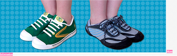
Figure 9-5 Some of the inline-level elements prior to Chapter 5.
Later in this chapter, you use the position property to position the More Information button over the top of the showcase image.
Some elements that display well as inline-level are the navigation links, which are currently display: list-item;. Change that as follows:
1. In styles.css, find the #header nav > ul > li rule set and add the following declaration:
display: inline;
2. Save styles.css.
When you make each navigation list item inline-level, those links line up horizontally, as shown in Figure 9-6. This arrangement makes better use of the horizontal space available.

Figure 9-6 The navigation links positioned inline.
inline-block
Sometimes you might want an element to be inline but still give it dimensional values such as height and margin. These types of elements can be given the declaration display: inline-block;.
In Figure 9-7, I added two inline-block elements to a page. These properties take on attributes of both inline-level and block-level elements. First, they take on an inline-level, being positioned next to each other. Unlike inline-level elements, though, they are then formatted as a block-level, allowing them to be given dimensional properties. As you can see, these inline-block elements have taken on the height declaration of 40px, just like the block-level elements have.
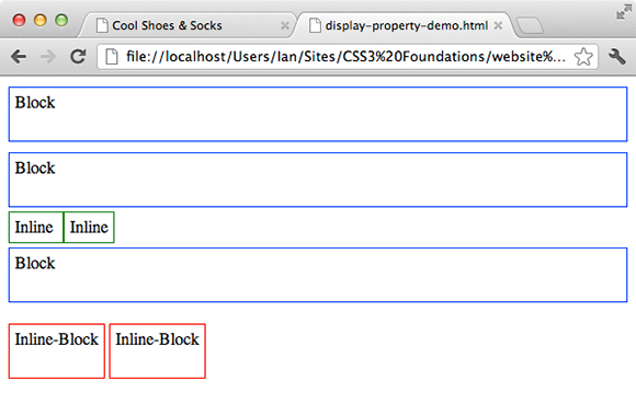
Figure 9-7 Inline-block elements in relation to block and inline elements.
Aside from the height and margin of the inline-block elements, can you see what else is different about them when compared to the inline-level elements? Inline-block elements are horizontally separated by 4 pixels of white space. This is an intended behavior although, admittedly, an annoying one! I show you how to fix this behavior in a moment.
Although you made the navigation links inline, you will shortly add margin properties to them, so instead make them inline-block:
1. In styles.css, change the display declaration of #header nav > ul > li to
display: inline-block;
2. Save styles.css.
As you can see in Figure 9-8, inline-block elements are separated by 4 pixels, and although the width of the navigation links isn’t critical (there’s plenty of room for the navigation links to stretch out), it’s often easier to get rid of these additional 4 pixels, especially when you know some elements are going to have quite a few different styles applied to them.

Figure 9-8 The navigation links now being displayed as inline-block.
These 4 pixels aren’t actually caused by the CSS but instead the white space in the HTML (the spaces that separate the <li> elements).
1. In index.html, find the unordered list in the header:
<nav role=”navigation”>
<ul>
...
</ul>
</nav>
2. Remove any white space between the top level closing </li> and opening <li> elements, so
<li><a href=”#” title=”Return to the front page”>Home</a></li>
<li><a href=”#” title=”About Company Name”>About</a></li>
becomes
<li><a href=”#” title=”Return to the front
page”>Home</a></li><li><a href=”#” title=”About Company Name”>About</a></li>
and so on. You should only need to remove three amounts of white space between four list items.
3. Save index.html.
When you do this, the HTML that makes up the navigation links is a little more difficult to read but it at least removes the 4 px of white space, as shown in Figure 9-9.

Figure 9-9 The navigation links with no space between them.
Note that Internet Explorer versions 6 and 7 don’t support display: inline-block;. However, they fortunately treat display: inline; in the same way that other browsers—that better support the CSS specification—treat display: inline-block;. So, when an element is required to be inline-block, you can simply specify the declaration display: inline; only for Internet Explorer 6 and 7. You learn how to create a stylesheet specifically for the use of older versions of Internet Explorer in Chapter 15.
list-item
List items—the <li> elements that are placed within either ordered <ol> or unordered <ul> lists—have the declaration display: list-item; by default. When an element is a list-item, it generates a block box and a marker box—if that element has a visual representation of being a list item in the form of a bullet point or other graphical element. Styling lists are covered in Chapter 11.
Displaying Tables
When a page contains a table, using the HTML element <table>, it, by default, has the declaration display: table;. Aside from the hack you saw in the preceding chapter, where display: table; was used to prevent the margins of an element from collapsing (a trait of tables), and one other hack to achieve vertical alignment—which you see later in this chapter—display: table; tends to be used only for tables, suprisingly! Because the <table> element already has this display value written into user agent stylesheets, you most likely don’t need to use it in your own CSS. This, too, goes for the other table display values; inline-table, table-row, table-row-group, table-header-group, table-footer-group, table-column, table-group-column, table-cell, and table-caption.
 If you would like to find out more about these table values, see the CSS Table Model at
 www.w3.org/TR/CSS21/tables.html#value-def-table.
none
As you saw in Chapter 5, giving an element the declaration display: none; doesn’t just hide that element; it tells the browser not to even render it so that no box is generated at all and the layout is treated as though this element doesn’t exist—even though it’s still present in the HTML.
If you would like to hide an element but still have it affect layout, see the opacity and visibility properties, which were covered in Chapter 5.
position, top, right, bottom, and left
Initial value: static | Inherited: No | Applies to: All | CSS2.1
Browser support: IE 4+, Firefox 1+, Chrome 1+, Opera 4+, Safari 1+
position is another property that affects the flow of a document. The values that can be used are static and relative, which affect the normal flow, and fixed and absolute, which take elements out of flow.
The CSS3 Positioned layout module found at www.w3.org/TR/css3-positioning/ introduces two new values, center and page, but unfortunately they are yet to be implemented into any browsers, so it is too early to cover them.
You can use the position declaration in conjunction with the properties top, right, bottom, and left (except for when using position: static;), which allow you to change the position of an element. How these properties relate to the position of an element is determined based on the value of the position declaration.
You can give top, right, bottom, and left any type of value such as percentages, pixels, or ems.
static
Elements are position: static; by default. A static element is a normal box laid out in the normal flow. Static elements aren’t affected by the top, right, bottom, and left properties.
relative
When you make an element position: relative;, it too is laid out in the normal flow of a document—known as the “normal position.” From its normal position, you can then offset the position of an element relative to its normal position using the top, right, bottom, and left properties. The elements following a relative element are affected based on the normal position of that element; its relative position doesn’t affect layout.
Assume you would like to change the position of the <h1> page title on the Cool Shoes & Socks page. In Figure 9-10, you can see the page title is static and in flow, meaning the <p> elements and <img> below it are placed below it.
If you give <h1> the declaration position: relative;, the page appears exactly the same as when that element is position: static;. However, a relative element can be manipulated with top, right, bottom, and left.
Figure 9-10 The page title in its default static position.
In Figure 9-11, I gave the <h1> a top value of 30px. This value moved the page title 30px, relative to the top of its normal position.
Note the only difference between Figure 9-10 and Figure 9-11 is the position of the text—the area taken up by the <h1> element doesn’t change. The flow of the document isn’t affected because the page title’s normal position remains in flow and in the same position, so although the text is offset, the contents below aren’t affected in any way.
When an element is position: relative;, top, left, right, and bottom offset that element relative to the top, left, right, and bottom of the normal position, respectively.
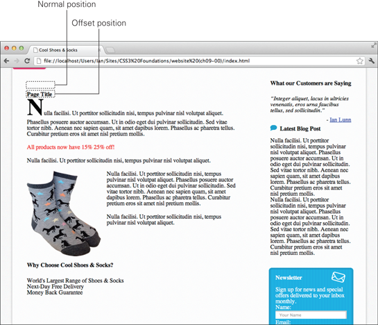
Figure 9-11 The page title with the declarations position: relative; top: 30px;.
absolute
When you make an element position: absolute;, it is taken out of the document’s flow and ignores the layout of elements surrounding it.
Now use position: absolute; to finally move that pesky More Information button:
1. In styles.css, add the following declarations to the .showcase .button rule set:
position: absolute;
top: 0;
2. Save styles.css.
When you make the button absolute, it is taken out of flow (see Figure 9-12), and the main container finally touches the bottom of the product showcase. This effect was always intended, but because the button was in flow and sat between the two, they were separated.

Figure 9-12 The More Information button no longer affects the flow of the page.
Note that after this change, the button touches the top of the page, which isn’t the intended final position. This happens because the position of an absolute element is relative to the next containing element with a defined position other than static. Because you haven’t declared any other element as being absolute, relative, or fixed yet, the browser treats the <html> element as the containing element, and as such, the button is positioned relative to the overall page. So, as you can see, top: 0; makes the button touch the top of the page.
3. In styles.css, add the following declaration to the .showcase rule set:
position: relative;
4. Save styles.css.
Now that you’ve made the <div class=”showcase”> element relative, the button contained within it is positioned relative to it, as shown in Figure 9-13. It touches the top of the showcase, but it would look better if it were placed over to the right and vertically centered.

Figure 9-13 The More Information button is now positioned relative to its containing the <div class=”showcase”> element.
Unfortunately, vertically centering an element via CSS isn’t as straightforward as it could be. There is a vertical-align property, but it doesn’t work in a way you may initially expect—it caught me out to begin with. Continue with the position property for now and come back to the vertical-align property later in this chapter along with a hack to make the showcase button vertically centered.
Make the footer stretch across the entire page (regardless of the page size and disrespecting the containing <body> element):
1. In styles.css, add the following declarations to the #footer rule set:
left: 0;
position: absolute;
width: 100%;
2. Save styles.css.
Although the footer is contained with the <body> element, because the footer has no containing element with a position declaration, it is positioned relative to the <html> element.
fixed
The final value for the position property is fixed. As with absolute elements, a fixed element is taken out of a document’s flow and does not affect the layout of elements around it. Unlike absolute, however, a fixed element is positioned relative to the viewport (the browser window) and does not move when the page is scrolled.
For this example, add a banner image to the bottom of the page:
1. In index.html, below the closing </footer> and above the closing </body> elements, add the following HTML:
<img class=”banner-ad” src=”images/banner-25percent.png” alt=”25% Off All Purchases” />
2. Save index.html
3. In styles.css, add the following declaration:
.banner-ad {
bottom: 0;
position: fixed;
right: 0;
}
4. Save styles.css.
As shown in Figure 9-14, the 25% off banner remains fixed to the bottom right of the browser window. No matter whether or not the user scrolls, that element remains fixed in that position, so it’s always on display—sort of like you had the power to glue an element to the inside of the user’s screen!
Unfortunately, Internet Explorer 6 doesn’t support position: fixed;, and furthermore, very few browsers on mobile devices support position: fixed; due to technical performance issues. Fixed elements tend to be used for noncritical aspects of a page, such as notices and adverts, so for browsers that don’t support fixed elements, they can be hidden or modified to be displayed in a different way using styles specific to those nonsupporting browsers; this topic is covered in Chapter 15. Because the 25% banner used for Cool Shoes & Socks is an image—that can only be square in proportion—the transparent section of the image prevents a user from clicking anything below that invisible area, so for smaller screen sizes where that area may cover any part of the page that may be interacted with, it is necessary to hide that banner anyway.
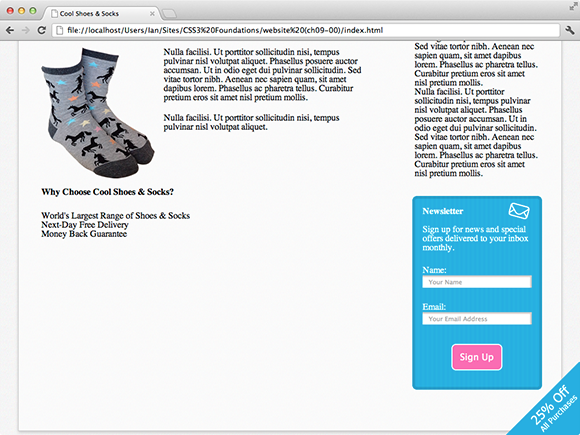
Figure 9-14 The banner ad fixed to the bottom and right of the viewport.
Code Challenge: Change the Position of the Quotes Around the Customer Testimonials Without Affecting the Flow
In styles.css, do the following:
1. Add a new rule set for blockquote with the declaration position: relative;.
2. Add the declarations position: absolute; left: -20px; top: -10px; to the blockquote p:before rule set.
3. Add the declarations position: absolute; right: 0; bottom: -20px; to the blockquote p:after rule set.
Project files update (ch09-01): If you haven’t followed the previous instructions and are comfortable working from here onward or would like to reference the project files up to this point, you can download them from www.wiley.com/go/treehouse/css3foundations.
Using display, position, and z-index to Create a Drop-Down Menu
Now that you have the power of display and property tucked into your CSS utility belt, you can flex this knowledge and create a drop-down menu.
1. In index.html, below this HTML:
<a href=”#” title=”Visit our shop”>Shop</a>
Add the following HTML:
<ul>
<li><a href=”#” title=””>Trainers</a>
<ul>
<li><a href=”#” title=””>Womens</a></li>
<li><a href=”#” title=””>Mens</a></li>
</ul>
</li>
<li><a href=”#” title=””>Shoes</a>
<ul>
<li><a href=”#” title=””>Womens</a></li>
<li><a href=”#” title=””>Mens</a></li>
</ul>
</li>
<li><a href=”#” title=””>Slippers</a></li>
<li><a href=”#” title=””>Socks</a></li>
</ul>
2. Save index.html
This HTML will add a submenu to the Shop link. Now to style it:
3. In styles.css, below the #header nav > ul > li rule set, add the following rule sets:
#header nav ul > li:hover {
background: #f5f5f5;
}
#header nav ul ul > li:hover {
background: white;
}
These rules make each navigation link of the top-level list a gray color and any link from second-level lists onward white whenever hovered over.
4. Below the #header nav ul ul > li:hover rule set, add the following rule set:
#header nav ul li a {
color: black;
display: block;
padding: 10px 20px;
}
Here, you make the links within the list items display: block;. When you make the <a> elements block (remembering they’re inline by default), they can now take on dimensional properties and, as such, become bigger than if they were left as inline.
Take a breather here for a minute. As shown in Figure 9-15, you now have a partially styled submenu but it’s more of a drop-up list at the moment! This is caused because the child lists of the top-level lists are in flow and affecting the elements around them. The answer is to take them out of flow.
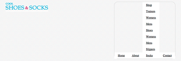
Figure 9-15 The second-level unordered lists, which need to be positioned differently.
5. Add the following rule set below the #header nav ul li a rule set:
#header nav ul ul {
/*style all lists below the top-level list*/
background: #f5f5f5;
border: 1px solid #ccc;
border-bottom-left-radius: 8px;
border-bottom-right-radius: 8px;
border-top: none;
padding: 20px 0;
position: absolute;
min-width: 140px;
}
This rule set styles any unordered list below the top-level list, and because the drop-down menu consists of quite a few rule sets, a comment is added in this rule set to remind you or anyone else in the future what this rule set selects—a good practice, particularly when selectors start to get complex.
Along with the borders, padding, and a minimum width, you also give the drop-down menus an absolute position, moving them out of flow so they no longer affect the elements around them. However, as shown in Figure 9-16, although the drop-down menu kind of looks as though it’s in the right position, it’s hidden behind the product showcase.
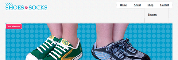
Figure 9-16 The drop-down menu out of flow but hidden behind the product showcase.
For now, fix this and then come back to the explanation after the drop-down menu is working.
6. In the same rule set, add the following declaration:
z-index: 10;
The drop-down menu now appears above the product showcase, although the third level of links isn’t quite styled correctly.
7. Below the #header nav ul ul rule set, add a new rule set:
#header nav ul ul ul {
/*style all lists below the second-level list*/
border: 1px solid #ccc;
border-right: none;
border-bottom-left-radius: 0;
border-bottom-right-radius: 0;
padding: 0;
}
The links Trainers and Shoes both have their own drop-down menus (a third-level list of links). As shown in Figure 9-17, these menus appear over their parent menu at present; ideally, it would be good to have those menus appear to the left of their respective parent links.
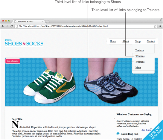
Figure 9-17 The third-level menus appear over their second-level parents.
8. Add the following declarations to the #header nav ul ul ul rule set:
left: -100%;
top: -1px;
Now the menus appear to the left perfectly, but each menu sits in the same position at the top. These third-level lists inherit the declaration position: absolute; from their parent lists. Remember that the position of an absolute element is relative to its parent, so at the moment, the declaration top: -1px; places all third-level lists 1 pixel above the place where the second-level list is positioned. Having each third-level list start in the same vertical position as the second-level link it belongs to would make more sense.
9. Below the rule set #header nav ul ul, add a new rule set:
#header nav ul ul li {
position: relative;
}
Now the third-level menus are positioned relative to their respective second-level link instead of the overall second-level list. The top value of -1px accounts for the 1 pixel border.
This wouldn’t be much of a drop-down menu if it constantly sat there with every link showing; after all, the point of a drop-down menu is to make better use of space, hiding links until the user needs to use them.
10. Add a declaration to the #header nav ul ul rule set:
visibility: hidden;
11. Below the rule set #header nav ul ul ul, add a new rule set:
#header nav li:hover > ul{
/*show the menu of the list item being hovered over*/
visibility: visible;
}
Here, you hide any list of links below the top level and allow them to become visible only when the user hovers over their respective parent link.
Finally, for the drop-down menu, make the corners of the top-level list rounded.
12. Below the rule set #header nav > ul > li, add two new rule sets:
#header nav > ul > li:first-child {
border-top-left-radius: 20px;
border-bottom-left-radius: 20px;
}
#header nav > ul > li:last-child {
border-top-right-radius: 20px;
border-bottom-right-radius: 20px;
}
13. Save styles.css.
Congratulations! The drop-down menu is now fully functional, as was shown in Figure 9-2. Before you move on, though, you need to understand what that z-index declaration does.
z-index
Initial value: auto | Inherited: No | Applies to: Positioned elements | CSS2.1
Browser support: IE 4+, Firefox 1+, Chrome 1+, Opera 4+, Safari 1+
When giving elements a position declaration, you might find that sometimes elements overlap one another. The problem you saw in Figure 9-16, where the drop-down menu appears behind the product showcase, is that both of these elements have a defined position and neither one is in flow, making them visually clash—meaning one sits behind the other. When elements are taken out of flow, a page becomes three-dimensional, and by using z-index, you can control the stacking order of those elements.
The z-index, by default, is auto, meaning the stacking order is 0. By giving the z-index property a number as a value, you determine how high up the stack an element is.
Before you gave the drop-down menu a z-index, it and the product showcase had a default stack order of 0. If two elements are both at the same position in the stack order, their positioned is determined by the order of the HTML; elements that appear later in the HTML are given precedence. By giving the drop-down menu a z-index of 10, you move it above the product showcase.
Why 10? The navigation is the most important part of the website that has a position declaration, so at no point should it be hidden below another element. There aren’t 10 positioned elements on the page, so 10 can be assumed as being the highest level. If you want to be extra safe though, you can give it a z-index of 10000 or even 1000000. The CSS specification doesn’t determine a maximum number for z-index but some very dedicated people have done tests to determine this number for each browser. You’ll be pleased to know that every browser in use today can support stack orders higher than 2 billion (for more information, visit www.softwareas.com/whats-the-maximum-z-index). I hope that’s enough for you! Of course, if you want to make your CSS maintainable now and in the future, it’s best to be sensible with z-index values.
Code Challenge: Apply z-index to Other Elements
In styles.css, do the following:
1. Add the declaration z-index: 5; to the .showcase .button rule set.
2. Add the declaration z-index: 9; to the .banner-ad rule set.
Project files update (ch09-02): If you haven’t followed the previous instructions and are comfortable working from here onward or would like to reference the project files up to this point, you can download them from www.wiley.com/go/treehouse/css3foundations.
vertical-align and Vertical Centering Techniques
As explained early in this chapter, achieving vertical alignment via CSS is unfortunately not as straightforward as you might expect. Although the vertical-align property seems like a perfect fit for the job, it works only for inline-level and table-cell elements. Let’s look at the vertical-align property and then use some “hacks” to make block-level elements vertically center.
vertical-align
Initial value: baseline | Inherited: No | Applies to: inline-level and table-cell elements | CSS2.1
Browser support: IE 4+, Firefox 1+, Chrome 1+, Opera 4+, Safari 1+
The small speech bubble image that is included in the “Latest Blog Post” title is inline-level (remember images are inline by default):
<h3><img src=”images/bg-blog.png” alt=”Latest Blog Post” />Latest Blog Post</h3>
The initial value for vertical-align is baseline, meaning the bottom of the speech bubble image vertically aligns with the baseline of the title, as shown in Figure 9-18.
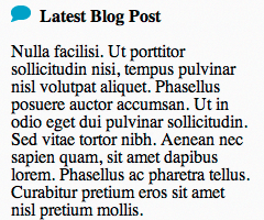
Figure 9-18 The speech bubble vertically aligned to the baseline of the text.
vertical-align also accepts the following values, as demonstrated in Figure 9-19:
• middle—Aligns the vertical midpoint of the inline element with the baseline and half of the x-height (the height of the lowercase x character). In Figure 9-19, note that because the speech bubble image is 15 px tall, the browser doesn’t quite perfectly center the image.
• sub—Lowers the baseline of the inline element to meet the position for subscripts <sub>.
• super—Raises the baseline of the inline element to meet the position for superscripts <sup>.
• text-top—Aligns the top of the inline element with the top of the text.
• text-bottom—Aligns the bottom of the inline element with the bottom of the text.
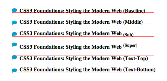
Figure 9-19 The speech bubble when vertically aligned to the baseline, subscript, superscript, text-top, and text-bottom positions.
This vertical alignment demonstration page can be found in the project files ch09-02, named vertical-align-property-demo.html
You can give two other values to vertical-align: top and bottom. Where text-top and text-bottom align an inline-level element relative to text, top and bottom align an inline-level element with the top or bottom of the parent’s content area.
In Figure 9-20, I demonstrated this technique by adding an inline image of those awesome horse socks with a vertical-alignment of text-bottom (aligning its bottom with the bottom of the text). In the first example, I gave the speech bubble image a vertical align of text-top, which aligns its top with the top of the text. However, because the image of the socks is much taller than the rest of the contents, the parent’s content area is bigger too. If you want to position the speech bubble relative to the top of the content area instead of the text, you can specify a vertical alignment of top.
If none of those values take your fancy and you want a little more control, you can also specify a unit of length or a percentage where 0 represents the same as baseline. A positive number raises the inline-level or table-cell element above the baseline, and a negative number lowers it.
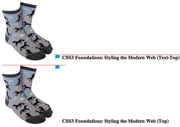
Figure 9-20 The difference between vertically aligning the speech bubble to the text-top and top.
Vertical Centering Techniques
It’s both disappointing and initially misleading that the vertical-align property can be used only on inline-level and table-cell elements. The position: center; declaration introduced in the CSS Level 3 Positioned layout module found at www.w3.org/TR/css3-positioning/ will, I hope, see the light of day and make vertical alignment easier in the future. For now, though, let’s go back to positioning the showcase button and cover a few different techniques for making it vertically centered.
The following techniques all have their own pros and cons, and unfortunately, there isn’t a perfect solution. Therefore, when you are vertically aligning elements in the future, use your best judgment.
To give you an understanding of each technique, steps are provided that ask you to make changes to the project files, then undo those changes to try the next technique. If you want to follow along, please do. However, if you just want to understand the technique that the Cool Shoes & Socks page will use, please follow the instructions for the third technique only.
The Fake Table Cells Technique
If you can’t go to the party, you can bring the party to you. You can use vertical-align only on inline-level and table-cell elements, so cheat and use display: table-cell; as follows:
1. In styles.css, add the declaration display: table to the .showcase rule set:
display: table;
2. Remove the following declarations from the .showcase .button rule set:
position: absolute;
top: 0;
3. Add a width declaration to the .showcase img rule set:
width: 100%;
4. Add a new rule set below the .showcase .button rule set:
.button-cell {
display: table-cell;
vertical-align: middle;
width: 148px;
}
5. Save styles.css.
When you use display: table-cell; on an element, that element must be contained in a table (or an element mimicking a table with the declaration display: table;). Because the showcase <div class=”showcase”> contains the showcase button, that is given the declaration display: table;. If the .showcase .button rule set were to be given the declaration display: table-cell;, the button would become 100% tall because cells stretch to fill the entirety of the containing table. This is the downfall to using fake table cells. Although this approach emulates vertical alignment beautifully, it requires an additional element to be wrapped around the one you want to vertically align to prevent that element from becoming 100% tall.
6. In index.html, modify:
<a class=”button purchase” href=”#” title=”Purchase product”>
More Information
</a>
Make sure it is contained in a <div> with the class button-cell:
<div class=”button-cell”>
<a class=”button purchase” href=”#” title=”Purchase product”>
More Information
</a>
</div>
7. Save index.html.
The other problem, as shown in Figure 9-21, is that elements within a table can only sit aside each other, meaning the button isn’t visually over the top of the showcase images.
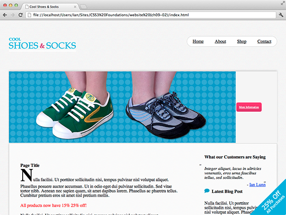
Figure 9-21 The showcase button vertically centered.
Using fake table cells offers the most robust vertical alignment. When you are increasing text size in browsers such as Mozilla Firefox, the element stays vertically centered, but it means using more HTML and, in the showcase example, prevents elements from appearing on top of each other. Furthermore, display: table-cell; doesn’t work in Internet Explorer versions 6 and 7.
The Stretched Element Technique
Stretching an element positions the element absolutely in relation to its containing parent and allows for both vertical and horizontal alignment.
1. Undo the changes made for the Fake Table Cells technique both in index.html and styles.css.
2. In styles.css, add the following declarations to the .showcase .button rule set:
bottom: 0;
left: 0;
right: 0;
height: 16px;
margin: auto;
width: 148px;
As shown in Figure 9-22, this technique is much easier than the Fake Table Cells technique and works in a way more desirable for the product showcase.
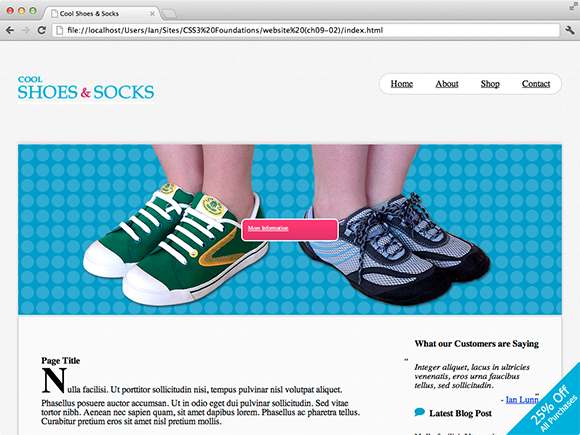
Figure 9-22 The showcase button both vertically and horizontally aligned.
3. Because the button should be positioned over to the right, you can remove the left declaration and modify the right declaration:
right: 2.1875em;
4. Save styles.css.
The Stretched Element technique is another useful method, particularly because it’s so easy and can horizontally center an element, too. However, when you are increasing the size of text in a browser such as Firefox, as shown in Figure 9-23, although the button always stays vertically centered, the text breaks out of the button. Because the purpose of resizing text is to make a page more readable, the user may be annoyed to find this happens to the text at a larger size.
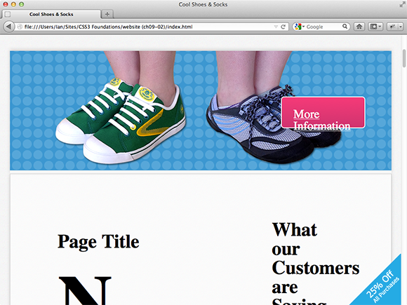
Figure 9-23 The showcase button vertically centered but with a larger font size in Mozilla Firefox.
The 50% Top Minus Half the Elements Height Technique
Another solution, and the final solution used for the Cool Shoes & Socks page, is to set the top position of the showcase button to 50% and then pull up the button by half of its own height to make it vertically centered:
1. Undo the changes made for the Stretched Element technique.
2. In styles.css, change the top declaration in the .showcase .button rule set:
top: 50%;
3. In the same rule set, add the following declarations:
font-size: 1.6em;
right: 2.1875em;
margin-top: -26px;
4. Save styles.css.
As shown in Figure 9-24, the button is now vertically aligned. When you give the button a top position of 50%, the top of the button is placed in the vertical center of the product showcase. However, this isn’t a true vertical alignment. For it to be perfectly centered, the vertical center of the button needs to be in the vertical center of the showcase. To achieve this result, you specify a margin-top of -26px, half of the element’s overall height, which pulls up the button by 50%.
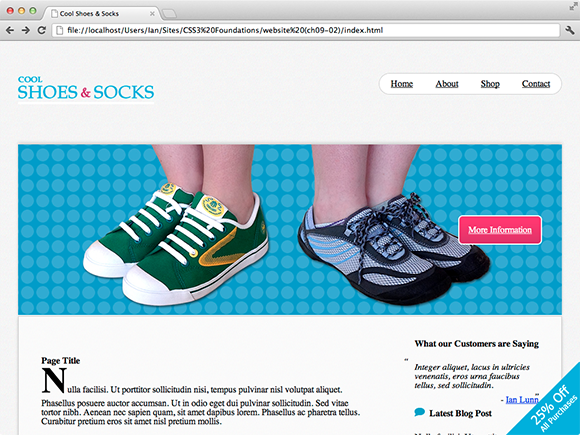
Figure 9-24 The showcase button is now vertically aligned.
Yes, this breaks the rule I’ve mentioned several times already: You should try not to declare or expect an element to be a specific height because in some browsers, users can change the font size to their liking.
Because the showcase button doesn’t have a specified height, though, it stretches with the size of the text. So with this technique, unlike the Stretched Element technique, the text doesn’t break out of its containing box.
This does mean, however, that the button loses its vertical alignment if the text is resized, as shown in Figure 9-25, but it means the text is more readable—better serving the purpose of a browser’s text resizing feature. Putting readability before aesthetics is a good priority.
Although the Cool Shoes & Socks page uses the 50% Top Minus Half the Elements Height technique, all three vertical alignment techniques have their uses. Which technique you use really depends on the scenario. On the web, you can find other vertical alignment techniques, such as at www.css-tricks.com/centering-in-the-unknown/, which also have their own pros and cons.

Figure 9-25 The web page in Firefox with the default text size increased.
overflow
Initial value: visible | Inherited: No | Applies to: block elements | CSS2.1
Browser support: IE4+, Firefox 1+, Chrome 1+, Opera 7+, Safari 1+
When creating a web page, sometimes you find that content you want to place in a containing element is bigger than its container. Throughout CSS3 Foundations, I have mentioned that you shouldn’t restrict an element to a specific height because in some browsers, a user can control the size of text and content may grow bigger than the height of that element. If you do have content bigger than its containing element or you absolutely have to give an element a specific height (clients and bosses can be pushy!), you can use the overflow property to better control how that overflowing content is displayed—or not displayed, as the case may be.
Go ahead and restrict the height of the “Latest Blog Post” element:
1. In styles.css, add a new rule set for the .post element, under the .testimonials rule set:
.post {
height: 200px;
}
In Figure 9-26, I also gave the <aside class=”post”> element a red border along with its height of 200px to demonstrate the boundaries of that element. As you can see, with no specified overflow declaration, the overflowing content is visible. Note that the containing element affects the document flow, but the overflowing content does not. It all looks a bit messy and unreadable.
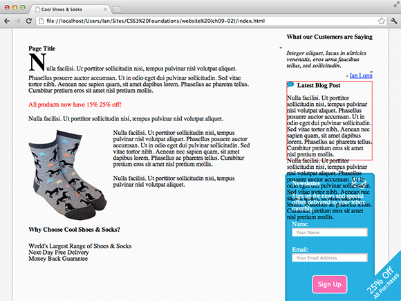
Figure 9-26 The “Latest Blog Post” box with overflowing content.
If you feel that the content isn’t very important, you can simply hide the overflow by giving it an overflow declaration of hidden.
2. Add an overflow declaration:
overflow: hidden;
As shown in Figure 9-27, the overflowing content is now hidden, but the line of text at the bottom is cut off. Because it’s text being cut off and not something less forgiving, such as an image, hiding text in this way isn’t ideal. It may lead the users to becoming frustrated because they know they are missing out on some content they can’t get to.
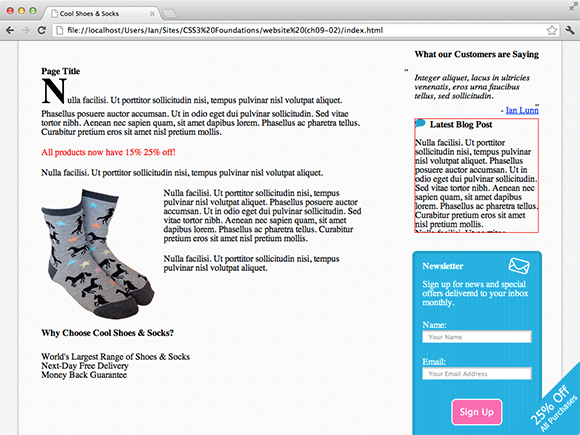
Figure 9-27 The “Latest Blog Post” with its overflowing content hidden.
This is where scroll value for overflow comes in handy.
3. Change the hidden value of the overflow declaration to scroll:
overflow: scroll;
Figure 9-28 shows how the “Latest Blog Post” box is displayed in Mozilla Firefox on an Apple Mac and a Windows PC; now the box has a scroll bar of its own. Firefox, Opera, and Internet Explorer show both vertical and horizontal scroll bars for an overflow: scroll; element, even if the content of that element overflows only on one axis. Chrome and Safari are a little more intelligent and show a scroll bar only when it is needed. To work around this and make the experience more consistent across browsers, you can use the properties overflow-x and overflow-y.
Because the .post element has a specified height with the default width auto, it never overflows horizontally, only vertically. So, to make Firefox, Opera, and Internet Explorer show only a vertical scroll bar, you can move on to step 4.
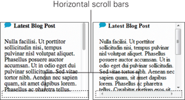
Figure 9-28 The “Latest Blog Post” with a scroll bar to allow the user to see overflowing content. Viewed in Firefox on an Apple Mac to the left and Firefox on a Windows PC to the right.
4. Change the property overflow to overflow-y:
overflow-y: scroll;
5. Save styles.css.
Now, as you can see in Figure 9-29, all browsers show only the vertical scroll bar.
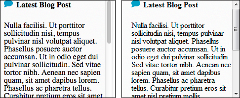
Figure 9-29 The “Latest Blog Post” with a vertical scroll bar only. Viewed in Firefox on an Apple Mac to the left and Firefox on a Windows PC to the right.
Summary
You’ve finished the main layout of the Cool Shoes & Socks page. Looks pretty cool, don’t you think? Of course, it functions well, too. The page now has quite a lot of navigation links, but they’re all tucked away nicely in a drop-down menu, which means users can find where they want to navigate quickly without being overwhelmed by choice.
If you view the page in a browser other than the one you’re using to create Cool Shoes & Socks, almost certainly you will find inconsistencies and broken bits. Breathe a sigh of relief—that’s to be expected. In Chapters 15 and 16, you learn to make Cool Shoes & Socks cross browser compatible and modify its layout for when it is viewed on mobile devices.
In the next chapter, you learn to change the font and font styles, characteristics that can really make Cool Shoes & Socks unique.