chapter four
Creating Styles Using Property Values
So far, you’ve used a handful of properties to add styles to the page, such as background-color, background-image, and color. You learn more of these properties from Chapter 5 onward. Before that, take a look at the different types of values that can be used with properties, allowing you to apply the exact styles you want to a page.
Color Keywords
You’ve already added some colors to the page, which all made use of color keywords, like so:
#main {
background-color: white;
}
White is one color keyword of 16 that CSS defines:
• Black
• Silver
• Gray
• White
• Maroon
• Red
• Purple
• Fuchsia
• Green
• Lime
• Olive
• Yellow
• Navy
• Blue
• Teal
• Aqua
In CSS Level 3, another 146 color keywords have been added. I don’t list them all here, but you can find them at www.w3.org/TR/css3-color/#svg-color.
 So, as those extended color keywords were introduced in CSS Level 3, does that mean they won’t work in older browsers that don’t support CSS3? Not quite. This is one of those times when CSS3 was updated to match what was already being implemented by browsers. The extended colors, known as X11 colors, are originally from another browser technology—SVG. SVG has been supported in browsers for many years, and because of that, so too have most of the extended colors. I say “most” because you may find some browsers don’t support all 146 extended colors.
Having 162 colors isn’t that breathtaking, is it? The web would be a boring-looking place if you had access to only that many colors.
What if you’re creating a website for somebody else and she asks you for “a color similar to hot pink, except not quite hot pink, more like a dark strawberry color, except closer to a raspberry red”? First, I sympathize with you! Second, no, that’s not a color keyword, but with the possibility to use more than 16 million colors, you’ll be glad to hear that there are not 16 million color keywords.
Color Values
You can also use other color values and functions to access more than 16 million colors; they are RGB and HSL.
RGB (Hexadecimal)
RGB stands for Red, Green, Blue, and in its hexadecimal (hex for short) form, it consists of a hash or pound symbol (#), followed by either three (RGB) or six (RRGGBB) hexadecimal characters. Hexadecimal characters are 0–9 and A–F.
Project Files Update (ch04-00): If you haven’t followed the previous instructions and are comfortable working from here onward or would like to reference the project files up to this point, you can download them from www.wiley.com/go/treehouse/css3foundations.
I mentioned previously that you should make a background color closely match the background image. The gray color you applied earlier looks a lot darker than the gray (as shown in Figure 4-1) of the background image though, right?

Figure 4-1 The dark background color compared to the background image applied in Chapter 3.
You can change that using RGB:
1. In styles.css, find
body {
background-color: gray;
}
2. Change the gray keyword to #f5f5f5.
3. Save styles.css.
Because the background image still takes precedence over the background color, you might want to comment out the background image to see the change you just made (See the sidebar Using Comments and “Commenting Out”). Remember to uncomment it again after you view the change.
Example:
body {
background-color: #f5f5f5;
/* background-image: url(“../images/bg-body.jpg”); */
}
When a hex value is #000000, it has no color, making it black, and at the opposite end of that range, #ffffff is white. Your background color should now closer match the color of the background image, but how on earth do you determine #f5f5f5 is a gray color? To get the exact color, you need to use a tool, often known as a color picker; see the sidebar “Color Pickers.”
To make writing hexadecimal values a little quicker, when a value has repeating characters (such as #ffffff), you can write #fff instead. Three character values are expanded to six by replicating each character. For example, #fb0 expands to #ffbb00.
Unfortunately, you can’t shorten #f5f5f5.
RGB (Integer Range)
RGB can also be specified via an integer range from 0 – 255 or 0 – 100%. Much like hex, the bottom of the range (0) represents black, and the top (255/100%) is white.
To set the background to white, for example, you can use the following:
body {
background-color: rgb(255, 255, 255);
}
rgb() is a function, and its arguments are the red, green, and blue values.
You can specify the same gray color as the background as follows: rgb(245, 245, 245). Many color pickers will be able to give you these values.
RGBA
In CSS Level 3, you can specify an alpha argument along with the red, green, and blue arguments. Alpha allows an element to take on a level of transparency.
To select the main content area of the page and make its background white, with a slight transparency, follow these steps:
1. In styles.css, find the following:
#main {
background-color: white;
}
2. Add another background-color declaration, like so:
#main {
background-color: white;
background-color: rgba(255, 255, 255, 0.6);
}
3. Save styles.css.
Here, you select the element with an ID of main and give it two background-color declarations, but why? Because RGBA is a part of the CSS Level 3 specification, it is implemented only in modern browsers. When a browser sees these declarations, if it doesn’t understand rgba(), it renders only the first declaration, making the background color white. If it understands both declarations (in the case of modern browsers), it renders the latter (remember this is how the cascade works), setting background-color to white (255, 255, 255) with a 0.6 (60%) transparency. This is a safe way to use CSS Level 3 features, providing graceful degradation for older browsers.
HSL and HSLA
Having read about RGB, you may be thinking that specifying colors in that way is unintuitive, and you’d be right. Although you can guess at a value for a particular color, that guess will be far from accurate.
CSS Level 3 aims to make guessing color values more intuitive with the introduction of the HSL function. HSL stands for Hue, Saturation, and Lightness.
Imagine a color wheel with red at the top (0° or 360°). As you move clockwise around that color wheel, the colors fade between yellow (60°), green (120°), cyan (180°), blue (240°), magenta (300°), and then back to red. (See Figure 4-2.)
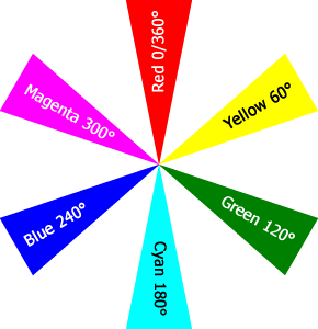
Figure 4-2 The position of the main colors on a color wheel.
Assuming you want a red color, you choose the hue value 0 or 360.
Next, you choose the saturation value, which is a percentage value. The higher the value, the brighter the color of red you get.
Finally, you can increase the red color’s lightness using a percentage value again. Using 0% makes the color completely black, whereas 100% makes it completely white.
HSL might not sound that intuitive, but unlike RGB, it allows you to select a base color quicker and then tweak it to your needs.
Much like RGBA, an HSLA function also exists; it allows you to change the opacity of a color by using the alpha argument—a decimal value between 0 and 1, 0 being transparent, 1 being opaque.
Again, because HSL is implemented only in modern browsers, you need to add a declaration that older browsers can understand, like so:
body {
background-color: #f5f5f5;
background-color: hsl(0, 0, 0.961);
}
This approach is rather convoluted, though. The purpose of using HSL is to make choosing colors easier. Because older browsers require a color property they understand, you would have to go to the effort of using a color picker to determine the hexadecimal equivalent of the HSL value, defeating its purpose. Because of this, I recommend you stick with using the RGB property instead; you need to use a color picker either way!
Code Challenge: Add More Colors to the Page
In styles.css:
1. Add a rule set with the selector #newsletter and the declarations color: white; background-color: #00ACDF;.
2. Add a rule set with the selector #footer and the declarations background-color: #ccc; background-image: url(“../images/bg-footer.jpg”);.
3. Add a rule set with the selector .showcase .button:hover and the declaration background-color: #00ACDF;.
4. Below the rule set input[type=”submit”][class=”button”], add a new rule set with the selector input[type=”submit”][class=”button”]:hover and the declaration background-color: #d4326d;.
Project files update (ch04-01): If you haven’t followed the previous instructions and are comfortable working from here onward or would like to reference the project files up to this point, you can download them from www.wiley.com/go/treehouse/css3foundations.
Units
A unit is a measurement consisting of a number immediately followed by a unit identifier, such as 5cm or 20%, used for properties such as height, width, and font-size. Only when a unit of length is 0 can the unit identifier be omitted. There are numerous types of unit; percentages, lengths, and time to name a few.
Percentages
By using a percentage, you tell the browser how much space an element should take up, relative to its containing element. To change the width of the content area:
1. In styles.css, add the following:
#content {
width: 65%;
}
2. Save styles.css.
At present, the content area is contained in the div with ID of main, which has a default width of 100%. This means the main area will fill the full size of the viewport (the area in which the page is rendered). Now that you’ve given the content area a width of 65%, try resizing your web browser to see that area expand and shrink to always be 65% of the viewport width.
Using percentages is a great way to make an element’s size relative to another element’s size. When making a responsive layout, you rely on percentages to allow for the changing of a web page’s structure so it best fits the device on which it is being viewed.
You can apply percentages to many different types of properties: width, height, and font-size being just a few.
You use more percentage values and add structural CSS in Chapter 6.
Units of Length
There are two types of unit of length: absolute and relative. Absolute units consist of physical units (inches, centimeters, millimeters, points, and picas) and pixel units. Relative units consist of ems, rems, and exs.
Absolute Units
Absolute units are fixed and don’t relate to one another, meaning they aren’t inherited. They can be a little tricky to understand due to screens having different pixel densities (pixels are the tiny dots that make up a screen).
Physical Units
Physical units are anchored using the measurements of a device, assuming the pixel density of that device is 96dpi (96 dots per inch/pixels per inch).
Sample usage of physical units:
width: 10in;
width: 25.4cm; /* 1 inch = 2.54cm */
width: 254mm;
width: 720pt; /* 1 inch = 72pt */
width: 60pc; /* 1pc = 12pt */
If a device has 96dpi and you declare the width of an element should be 1 inch, that element is 96px wide. The problem is, not all devices are 96dpi, and therefore, physical units are not particularly useful for the web. They are, however, more useful for print stylesheets. You don’t use physical units in CSS3 Foundations.
Pixel Units
Pixels are possibly the most common unit used for the web.
Sample usage:
width: 960px; /* 1px = 0.75pt */
Pixels are commonly relied on because they are easy to use, the downside being that you can’t scale them in relation to each other.
If a user requires that the contents of a page become bigger so he can better see it, many browsers nowadays have a zoom feature that makes the whole page bigger. In this instance, the fact that pixels don’t scale doesn’t matter—because the page is zoomed and everything becomes bigger. In older browsers, this zoom feature isn’t available, but in its place is a text resize feature. Users of older browsers aren’t able to utilize this feature if you choose to use pixels. Furthermore, because you will want to change the size of text for mobile devices, using relative units called ems makes it easier in the long run, allowing you to manipulate the overall scale with just one change to the CSS.
Relative Units
Relative units are those that relate to each other, being inherited from their parent element.
Em
The W3C defines an em unit as “the computed value of the font-size property of the element on which it is used.” Not particularly straightforward, is it? Use an em unit as follows to better understand it:
1. In styles.css, add the following to the body selector:
font-size: 1em;
2. Save styles.css.
If you view the page now, you notice nothing has changed! The default font size of the <html> element is 16px, and because font size is inherited, the font size of the body is also 16px. By declaring a font size of 1em, you tell the browser you want the font size to be 16px (16px = inherited value (16px) × 1em). Ems get slightly trickier when font sizes are inherited.
Now consider a list as an example to demonstrate inheritance:
<ul>
<li>Item 1</li>
<li>Item 2
<ul>
<li>Item 3</li>
</ul>
</li>
</ul>
Say the <body> element has a font size of 16px and you give a list item a font size of 2em, like so:
li {
font-size: 2em;
}
In this case, Item 1 and Item 2 in the list have a calculated font size of 32px, but because Item 3 is a child of Item 2, it first inherits the calculated font size of 32px. Then the browser calculates 32px × 2em, giving it a font size of 64px.
To avoid this, you could just set the font size on the <ul>, like so:
ul {
font-size: 2em;
}
Setting the size this way makes each list item inherit the same font size, and they all become 32px. Sometimes this result isn’t avoidable, though, and you need to do the following to adjust Item 3:
li {
font-size: 2em;
}
li li {
font-size: 1em;
}
Here, Item 1 and Item 2 are 2 em, making them 32px (32px = inherited value (16px) × 2em). Item 3 inherits the font size of 32px; then the browser calculates 32px × 1em, giving it the same font size as its parent element.
Although ems may sound troublesome at first, they’re key to creating responsive websites. They allow you to quickly scale text (and other elements) in size, which is essential for making a website accessible across many different devices. In older versions of Internet Explorer, a web page that uses ems allows users to scale text themselves via built-in browser options.
There is a nice trick you can use to make working with ems a little easier:
1. In styles.css, find the font size you applied to the body selector:
font-size: 1em;
2. Change its value to 62.5%:
font-size: 62.5%;
3. Save styles.css.
Here, you tell the browser to make the body’s font size 62.5% of its default size (inherited value (16px) × 0.625 = 10px). Now 1 em is the equivalent of 10px, 1.2em is 12px, and so on. Figure 4-3 shows this in action.
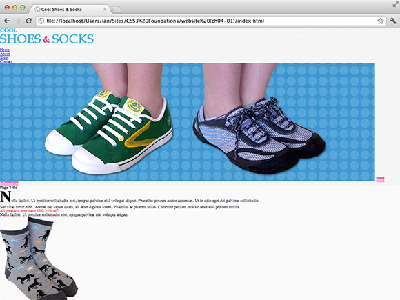
Figure 4-3 The Cool Shoes & Socks page with a font size of 62.5% (10px).
Yikes! As shown in Figure 4-3, the text is much smaller now! You can fix that:
1. In styles.css, below the rule set for the body selector, add the following:
#header, #main, #footer {
font-size: 1.6em;
/* inherited value (10px) x 1.6em = 16px */
}
2. Save styles.css.
Ems can be used for many more properties. You will see examples of this later in the book.
Rem
CSS Level 3 introduces a new unit called Rem (Root em). The W3C is aware of the difficulties when dealing with inherited values and em, so it introduced rem. Rem inherits its value only from the root element, that being the <html> element. So, in the em unit example, Item 3 inherited the value of its parent—causing its font size to double; when you use rem, this wouldn’t happen because each element inherits only the same font size from the root.
Although this is an easier way to use ems, unfortunately, it isn’t supported in all browsers yet, so for the moment, you cannot use rems to create a cross-browser-compatible website.
Ex
Ex refers to the x-height of a font (the height of the lowercase x) but unfortunately isn’t particularly reliable. Because of this, it is less commonly relied on for creating web pages; therefore, you don’t use this unit in CSS3 Foundations.
Other Units
The CSS3 specification lists other units that haven’t been covered in this chapter. You will learn to use angle units in Chapter 12 when rotating elements, and time units in Chapter 14 when animating elements.
The specification also includes frequency and resolution units, which tend to have more of a special use-case and viewport-percentage length units that, as yet, are unsupported in browsers.
If you’d like to know more about these unit types, please see the CSS3 Values module at: www.w3.org/TR/css3-values.
Summary
Getting to know the different types of property values means the way in which you style a page can become more diverse and you can commit your design ideas to screen quicker, with greater accuracy.
In the next chapter, you’ll learn many new presentational properties on which to use the values described in this chapter. The Cool Shoes & Socks page will really start to transform into something that closer resembles a modern day web page.