
chapter eight
Creating a Multicolumn Layout
One of the most common layouts in web design is a multicolumn layout. By giving a web page columns, you can separate content into relevant sections, making better use of the space available.
Multicolumn layouts are most commonly achieved using the float property, which technically was never added to the CSS specification for the purpose of creating robust, multicolumn layouts. Its true purpose is actually quite a simple one: to allow one element to flow next to another. Creating multiple columns via the use of float, clear, and other properties is really a “hack”—you’re making use of something in the way it wasn’t intended—but it’s a hack that is needed because CSS, as yet, offers very little in terms of enabling the creation of multicolumn layouts.
 CSS Level 3 sees the introduction of flexbox (
www.w3.org/TR/css3-flexbox) and regions (www.w3.org/TR/css3-regions), modules that aim to improve how columns and content areas are created on a web page. Unfortunately, both of these modules are in working draft and have little to no support in modern browsers, so they can’t be used on a working website.
Currently, each element on the Cool Shoes & Socks web page vertically follows the next. In this chapter, you learn the basics of the float and clear properties and then combine these properties along with others to place elements side by side to make better use of the horizontal space available.
Project files update (ch08-00): If you haven’t followed the previous instructions and are comfortable working from here onward or would like to reference the project files up to this point, you can download them from www.wiley.com/go/treehouse/css3foundations.
float
Initial value: none | Inherited: No | Applies to: All unless display in none or position is absolute | CSS2.1
Browser Support: IE 4+, Firefox 1+, Chrome 1+, Opera 7+, Safari 1+
At present, the product image of those irresistible horse socks—positioned in the main content of the Cool Shoes & Socks page—breaks the flow of text and takes up more space than necessary. By floating that image, you can make the text flow alongside it:
1. In styles.css, below the #main rule set, add a new rule set:
.product {
float: left;
}
2. Save styles.css.
As shown in Figure 8-1, the product image now floats to the left of the containing element, and following elements that were vertically positioned below that element now flow to its right. By floating the elements this way, you utilize some of that unused space, and the image looks as though it relates to the text now.
Of course, you can float elements to the right of the containing element too, by declaring float: right;, which makes elements flow to the left of that floated element.
float also accepts the value none, which means an element should not float.
When using float, you can style a floating element just as you would when it’s not floating. Although having the text flow to the side of the product image is desired, at the moment there’s not much space between the image and text. You can change that:
1. In styles.css, add the following to the .product rule set:
margin: 0 1em 1em 0;
2. Save styles.css.
The image now has a small amount of white space to its right as well as below it.
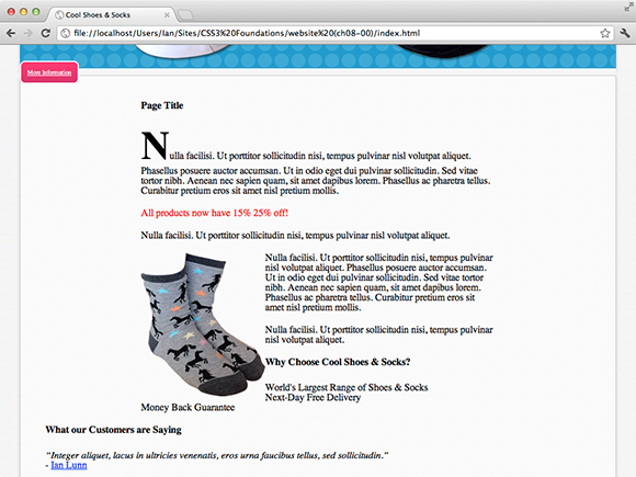
Figure 8-1 The main text flowing to the right of the floating image.
clear
Initial value: none | Inherited: No | Applies to: Block-level elements (covered in Chapter 9) | CSS2.1
Browser support: IE4+, Firefox 1+, Chrome 1+, Opera 3.5+, Safari 1+
You may notice that now the product image is floating and the text flows to its right, so too does the “Why Choose Cool Shoes & Socks” title and list items below it (contained with the <div class=”benefits”> element). Assume the “Why Choose Cool Shoes & Socks” content is to appear below the product image, it can be pushed down by clearing the float.
clear works in tandem with the float property and accepts the values left, right, both, and none.
1. In styles.css, add a new rule set for .benefits, like so:
.benefits {
clear: left;
}
2. Save styles.css.
By clearing the left side of the <div class=”benefits”> element, you tell the browser this element shouldn’t have a floating element to its left. When you declare clear: left;, the browser positions a cleared element to make sure its top border is below the bottom border of the floating element, pushing that element down, as shown in Figure 8-2.

Figure 8-2 The <div class=”benefits”> element clearing any floating elements to its left.
Likewise, if you need to clear the right side, you can declare clear: right;, or to clear both sides, you can declare clear: both;.
If you give the .benefits rule set the declaration clear: both;, because no elements are floating to the right, the same visual effect is achieved.
Floating Multicolumns
The float and clear properties work together to allow for placing elements next to each other. When float and clear were introduced to CSS, it became apparent that they could be used beyond their intended purpose for creating multiple columns that can sit aside each other.
The sidebar was intended to sit to the right of the main content on the Cool Shoes & Socks web page, so set that up now:
1. In styles.css, find the #content rule set and add the following:
float: left;
2. Save styles.css.
Note that the <div id=”content” role=”main”> element was originally centered via the declaration margin: 0 auto;, but this no longer applies because the float declaration takes precedence, and as shown in Figure 8-3, the content box now floats to the left of its containing element <div id=”main” class=”group”>.
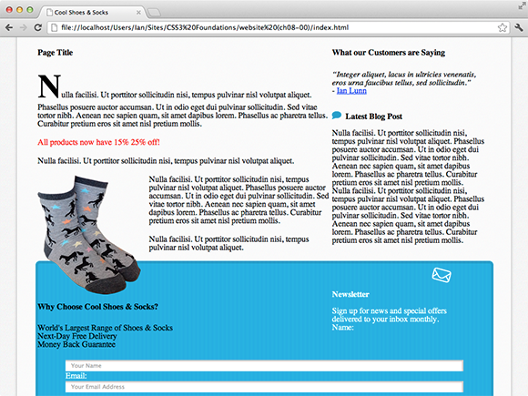
Figure 8-3 The content box floating to the left of its containing element.
3. In styles.css, add a new rule set:
.sidebar {
float: right;
width: 25%;
}
4. Save styles.css.
As you can see in Figure 8-4, although you created two columns, the layout isn’t quite right. The reason is that now all the elements within the main element are floating; there’s nothing clearing the elements below it. Consequently, those elements are trying to flow to the sides of the columns.
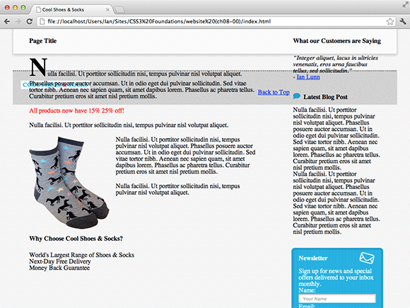
Figure 8-4 The two columns floating side by side, but elements below that aren’t being cleared.
This is the “hacky” nature of creating columns with floats, and you can find many ways around this issue.
You may think that clearing the footer <footer id=”footer” role=”contentinfo”> element would seem to work because that is the element that follows on from the floating elements.
To do that, you could add the following to the #footer rule set:
clear: both;
Although this technique does as expected—the footer clears below the floating columns—an unexpected behavior occurs, too: The main container doesn’t appear to be aware of the size of the columns and is no longer wrapped around them, as shown in Figure 8-5.
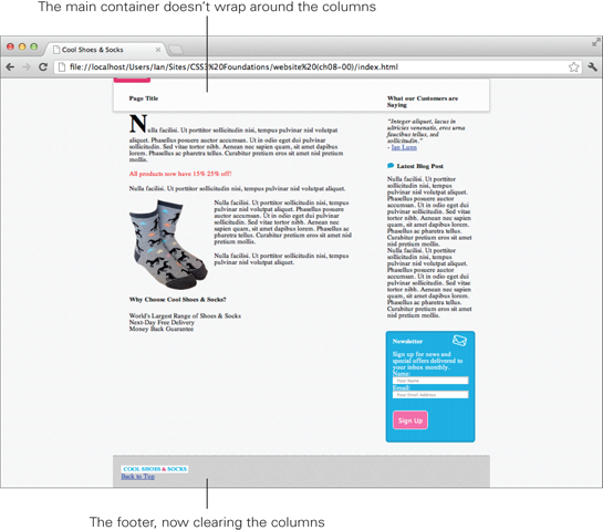
Figure 8-5 The browser window zoomed out to show the footer is now cleared, but the height of the main container isn’t right.
You might be tempted to specify the height of the main container to make it appear to contain the columns, but doing so is a bad practice because you can’t guarantee the main container or its contents will always be the same height. This solution is a no-go.
You could add an empty HTML element below the two floated elements:
<div id=”main” class=”group”>
<div id=”content” role=”main”>
...
</div>
<div class=”sidebar” role=”complementary”>
...
</div>
<div class=”clear”></div>
</div>
Then use CSS to select the empty element to clear it:
.clear {
clear: both;
}
Figure 8-6 shows this solution works perfectly in all browsers, but it means adding an empty element to the page, which goes against best practice. So is there a better technique?
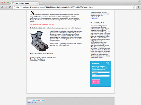
Figure 8-6 The browser window zoomed out to show the columns cleared by an empty HTML tag.
I could show you many different ways to work around this situation, and if you were to ask a few web designers and developers, they all would probably give you a different answer as to which technique they use. Remember that float and clear weren’t created for the purpose of columns, so there’s no explanation in the CSS specification of how to achieve this effect. Ideally, the best technique is the easiest to implement while not breaking any rules of good practice. With this in mind, I personally use and recommend a technique that has evolved over time and eventually been given the name micro clearfix hack by Nicolas Gallagher, who has worked to make this particular technique as small and efficient as possible. You can read about his work on it at http://nicolasgallagher.com/micro-clearfix-hack.
The micro clearfix hack in all of its glory:
.group:before, .group:after {
content: “”;
display: table;
}
.group:after {
clear: both;
}
.group {
zoom: 1;
}
You may see this code used elsewhere on the web with the class name “clearfix” or “cf” for short. I personally prefer to call the class “group” to show that it contains a group of elements (acting as columns).
By using this CSS, you can give an element containing floating elements the class named group to fix the issue. The main container already has the class group, so add this fix to the CSS:
1. In styles.css, below the body rule set, add the following:
.group:before, .group:after {
content: “”;
display: table;
}
.group:after {
clear: both;
}
.group {
zoom: 1;
}
2. Save styles.css.
The page now looks as intended, as it did in Figure 8-6 but with a more robust clearfix solution applied to it, but what exactly is that CSS doing?
It’s using some properties yet to be covered:
.group:before, .group:after
First, pseudo-elements are placed before and after the .group element.
content: “”;
display: table;
The pseudo-elements are given an empty content declaration, which, as explained in Chapter 3, is required to get pseudo-elements working.
These pseudo-elements are told to display as if they were tables. The display property is covered in the Chapter 9. When you make them act as tables, margin-collapse is prevented, which is to say any margins on elements before and after these elements are still respected.
.group:after {
clear: both;
}
The pseudo-element that is placed after the .group element is then cleared on both sides, which makes the main container the correct height—so it actually contains the floating elements—and pushes the footer down below the main container.
These rule sets alone create a clearing effect that fixes the issue seen in Figure 8-6. However, as is often the case, this fix doesn’t work in Internet Explorer versions 6 and 7 without one final tweak:
.group {
zoom: 1;
}
As explained with the filter property in Chapter 5, Microsoft used to be in the habit of adding unofficial properties to its browsers. zoom is another of those properties, but here you can use it to get Internet Explorer versions 6 and 7 to clear the floating elements correctly. By using zoom, you can work around a bug in these browsers that make the clear fix work as expected.
Now this CSS is in place, whenever an element contains floating elements, you can give that containing element a class of group to make the container clear them properly.
With the sidebar now floating to the right of the page and with a width of 25%, you can see that all those styles you added to the newsletter box finally make sense. No longer is the newsletter box stretched right across the page with lots of padding; instead, it’s a nice-looking box that draws the users’ eyes in an attempt to persuade them to sign up for the newsletter.
You may have noticed the header also has a class of group; the reason is that the logo and navigation float side by side, just like the content and sidebar.
1. In styles.css, find the #header .logo rule set and add the following:
float: left;
width: 240px;
2. Find the #header nav rule set and add the following declaration:
float: right;
3. Save styles.css.
By floating the logo to the left and navigation to the right, as shown in Figure 8-7, you make better use of the horizontal space available. At the moment, the navigation still looks a little messy, but in Chapter 9, you learn about display properties to better align those navigation links.
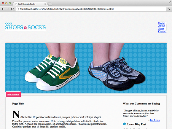
Figure 8-7 The logo and navigation links now float side by side.
Code Challenge: Make the Footer Elements Float Side by Side
In styles.css, do the following:
1. Add a new rule set for #footer li:nth-child(1) with the declaration float: left;.
2. Add a new rule set for #footer li:nth-child(2) with the declaration float: right; .
3. Add the declaration float: right; to the blockquote cite rule set.
Summary
After you make the footer elements float, you may notice that the footer isn’t being cleared. In the next chapter, you use a different method to change how the footer is displayed, so clearing it isn’t necessary.
In this chapter, you’ve given the Cool Shoes & Socks page a multicolumn layout by floating elements, then clearing any elements that should sit below those columns.
In the next chapter, you complete the main layout of Cool Shoes & Socks. You change the layout of the navigation links using the display property and learn about manipulating the position of elements in the flow of the document.