chapter seven
Creating Space and Understanding the Box Model
The box model describes the layout of elements on a web page. In this chapter, you learn how margin, padding, and border affect the layout of the box model, making structuring a page easier.
Project files update (ch07-00): If you haven’t followed the previous instructions and are comfortable working from here onward or would like to reference the project files up to this point, you can download them from www.wiley.com/go/treehouse/css3foundations.
The Box Model
In Chapter 5, you used padding to create some space between the content and border of the newsletter box and changed the border properties. By making these changes, you affected the box model of the main newsletter element <form id=”newsletter” action=”#”>.
Now add some margin and padding to the footer to better understand these properties:
1. In styles.css, below the other declarations in the #footer rule set, add the following:
margin-top: 2.5em;
padding: 1.4em 0;
2. Save styles.css.
Here, you change the box model of the <footer id=”footer” role=”contentinfo”> element, as shown in Figure 7-1.
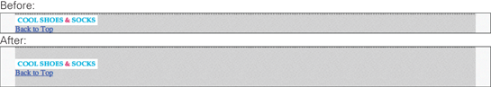
Figure 7-1 The footer element before and after adding the margin and padding properties.
Because the box model is invisible—it changes the visual layout of an element, but you can’t see the boundaries that make up that element—Figure 7-2 shows exactly how the margin-top and padding property change the box model for the footer.
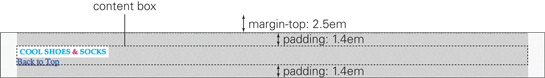
Figure 7-2 The way the box model of the footer element is laid out.
Look familiar? Figure 5-19 in Chapter 5 showed the content area and padding area to demonstrate background-clip and background-origin. In Figure 7-2, the margin area is also shown, which adds space outside the footer element.
Figure 7-3 shows how the content, padding, border, and margin areas relate.
• The content area is that which contains the content.
• The padding area, which is optional and 0 by default, is the area between the content area and the inner edge of the border.
• The border, which is optional and none by default, is the visual edge around an element (in Figure 7-3 I made the border 27px so it can be clearly seen).
• The margin area, which is optional and 0 by default, is the area outside the border.

Figure 7-3 A simplified version of the box model.
Using Web Developer Tools to Better Understand the Box Model
Sometimes working with the box model can be troublesome. Although manipulating the box model affects elements visually, you can never be sure where the boundaries of the content, border, padding, and margin areas are.
A handy little trick is to apply a temporary border around an element to see exactly how it is laid out, by using the following declaration on the element you are working on:
border: red solid 1px;
Of course, because this is only a temporary style for your use during the creation of a web page, you can make the border style whatever you want. Sometimes I find myself using temporary border styles each with a different color on multiple elements.
Although seeing the border of an element is helpful, it doesn’t show the margin area, and you can only guess at where the content and padding areas are.
Many web developer tools make working with the box model easier, by showing the areas that make up the box model.
In Figure 7-4, I right-clicked on the footer element and selected Inspect Element to use Google Chrome’s web developer tools.

Figure 7-4 The footer element being inspected in Google Chrome’s web developer tools with the simplified box model in the smaller pane to the right.
Chrome, Firefox (when using Firebug), Safari, and Opera show a visual representation of the box model directly on the page. All browsers (including Internet Explorer 9+) show a visual representation along with measurements in the side panel under “Layout” (or “Metrics” in Chrome and Safari).
In Chrome and Safari 6+, each particular area that makes up the box model is color-coded. The blue area is the content area; green, the padding; yellow, the border; and orange, the margin.
Opera and older versions of Safari don’t color-code the areas. Just remember that the content area is the innermost, followed by the padding, and then margin areas.
When using Firebug for Firefox, you must right-click an element and select Inspect Element. Firebug doesn’t show the box model until you hover over the element in the DOM window, though. It colors the content area blue, the padding purple, and the margin green.
Internet Explorer 9’s equivalent of the Inspect Element feature is called Select element by click, which you can find in the F12 Developer Tools, represented as a white cursor. After you select that, you can then click on the element you want to inspect.
margin
Initial value: 0 | Inherited: No | Applies to: All except elements with table display types other than table-caption, table, and inline-table | CSS2.1
Browser Support: IE 3+, Firefox 1+, Chrome 1+, Opera 3.5+, Safari 1+
As you saw in the box model explanation, margin applies space outside an element. A margin can be a value of any length type, such as pixels, percentages, and ems. You also can use the auto keyword to make the browser determine the margin of an element based on the unused space around that element.
Using margin is a great way of adding white space—also known as negative space—between elements on a web page. White space is an empty area and doesn’t necessarily mean a space is white in color. It is used to give web pages design aesthetics such as rhythm and balance, making for a better user experience.
You may agree at the moment that the Cool Shoes & Socks page doesn’t have much rhythm or balance; all the elements are squashed together because they have margins of 0. You can change that:
1. In styles.css, find the following declaration in the body rule set:
margin: 0 auto;
This is the declaration you added in Chapter 5 to make the page centered.
The margin property is actually shorthand for the properties margin-top, margin-right, margin-bottom, and margin-left. By specifying two values for the shorthand margin property, you tell the browser the top and bottom of the <body> element should have no margin and the left and right should have a margin of auto.
2. Change the margin value of the body rule set to the following:
margin: 2.5em auto 0 auto;
3. Save styles.css.
Now the <body> has a margin-top of 2.5em, a margin-right of auto, a margin-bottom of 0, and a margin-left of auto. The <body> is still centered but now with some white space above it so the logo no longer touches the top of the window.
You also are able to achieve the same effect using just three values, like so: margin: 2.5em auto 0. In this case, the margin-top is 2.5em, the margin-left and margin-right are auto, and the margin-bottom is 0.
Code Challenge: Add More Margins to Elements
In styles.css, do the following:
1. Add a new rule set for #header with the declaration margin: 0 0 2em 0;.
2. Add a new rule set for #header .logo with the declaration margin: 2.4em 0;.
3. Add a new rule set for #header nav with the declaration margin-top: 2em;.
4. Add the declaration margin: 0 auto; to the #content rule set.
5. Add a new rule set for .container with the declarations max-width: 920px; and margin: 0 auto;.
6. Add the declaration margin: 2em auto 1em; to the input[type=”submit”][class=”button”] rule set.
7. Add a new rule set for aside with the declaration margin: 0 0 2em 0;.
8. Add the declaration margin: 0 0 1.6em 0; to the rule set aside > h3.
9. Add a new rule set for #content h1, #content h2, #content h3, #content h4 with the declaration margin: 0 0 1.6em 0;.
10. Add a new rule set for #content p, #content ul with the declaration margin: 0 0 1.25em 0;.
11. Add a new rule set for blockquote cite with the declaration margin: 0.625em 0 0 0;.
12. Add a new rule set for #newsletter h3 with the declaration margin: 0 0 1em 0;.
13. Add a new rule set for #newsletter label with the declaration margin: 1.5em 0 0 0;.
14. Add a new rule set for .aside with the declaration margin: 0 0 2em 0;.
15. Add a new rule set for .post h3 with the declaration margin: 0 0 1em 0;.
16. Add a new rule set for .post img with the declaration margin: 0 .5em 0 0;.
Project files update (ch07-01): If you haven’t followed the previous instructions and are comfortable working from here onward or would like to reference the project files up to this point, you can download them from www.wiley.com/go/treehouse/css3foundations.
padding
Initial value: 0 | Inherited: No | Applies to: All except table-row-group, table-header-group, table-footer-group, table-row, table-column-group and table-column | CSS2.1
Browser Support: IE 4+, Firefox 1+, Chrome 1+, Opera 3.5+, Safari 1+
padding works in a similar way to margin but instead applies to the inside of an element prior to the border, rather than the outside of the element after the border.
The value of padding can be a percentage or any unit of length, but with it, unlike margin, you can’t use the auto keyword.
In Chapter 5, you added padding to the newsletter box, like so:
#newsletter {
...
padding: 6%;
}
This value gives each side of <form id=”newsletter” action=”#”> a 6% padding, which is a percentage relative to the overall width of the newsletter box.
Now, because you haven’t defined a width for the newsletter box, its width by default is auto. This auto setting, as explained previously, tells the browser to calculate an element’s width based on the unused space. The width is calculated after the padding, so the calculated width of the newsletter box is 88%. Why so? Because each side of the newsletter box has a 6% padding, meaning in total the left and right have 12% padding, leaving that figure 88%. The way in which the box model is calculated seems—to me at least—more difficult than it needs to be, and I expand on this issue shortly so it doesn’t catch you out.
As with margin, you can specify one to four values for padding:
• One applies to all four sides of an element.
• The first value of two applies to top and bottom and the second left and right.
• The first value of three applies to the top, the second to left and right, and the third to the bottom.
• Four values apply to top, right, bottom, and left, respectively.
Code Challenge: Add More Padding to Elements
In styles.css, do the following:
1. Add the declaration padding: 2.5em; to the #main rule set.
2. Add the declaration padding: 1em; to the .button rule set.
3. Remove the declaration of padding: 20px; from the .showcase .button rule set.
4. Add the declaration padding: .8em; to the input[type=”submit”][class=”button”] rule set.
5. Add a new rule set for .testimonials with the declaration padding: 1em 0 0 0;.
6. Add the declaration padding: .4em 1em; to the input[type=”text”], input[type=”email”] rule set.
Project files update (ch07-02): If you haven’t followed the previous instructions and are comfortable working from here onward or would like to reference the project files up to this point, you can download them from www.wiley.com/go/treehouse/css3foundations.
The Pitfall of the Box Model and Working Around It
In the definition of the padding property, I mentioned the box model can sometimes be harder to work with than it needs to be. Let’s take a deeper look at this issue so you can avoid any confusion in the future, or if you are in the fortunate position of not needing to support anything but modern browsers, a way around these difficulties altogether.
When creating a page, you may decide to declare that an element should have a width of 100%. Do that now for the newsletter box:
1. In styles.css, find the #newsletter rule set and add the following:
width: 100%;
2. Save styles.css.
As shown in Figure 7-5, the newsletter box has a width greater than 100%, even though you told it to be 100%!
Figure 7-5 The newsletter extends beyond the boundaries of the page.
The reason is that, by default, the width of an element is applied only to the content area. The #newsletter rule set declares that the newsletter box should have a border width of 5px, a padding of 6%, and a width of 100%:
#newsletter {
color: white;
border-radius: 8px;
border: rgba(0,0,0,0.1) solid 5px;
background:
url(“../images/icon-newsletter.png”) no-repeat 91% 2%,
url(“../images/bg-newsletter.png”) repeat 0 #00ACDF;
padding: 6%;
width: 100%;
}
The width of the newsletter box is now
• 10px (5px for the left border and 5px for the right) +
• 12% (for the left and right padding) +
• 100% (for the content area)
Although the browser can easily do these calculations, it makes your job styling elements a little harder because you have to do the math, too. It’s not a very human-friendly way of working with the box model, is it? You’ll be glad to hear that the W3C is aware of this issue, and CSS Level 3 introduces the box-sizing property, which allows you to change how the box model works. Unfortunately, because it’s a CSS Level 3 feature, it isn’t supported in Internet Explorer versions 6 and 7. If you have the privilege of not needing to support these older browsers, I cover box-sizing in a moment, but because the Cool Shoes & Socks scenario requires Internet Explorer 7 support, you need to fix the newsletter box so it does fit into the page properly:
1. In styles.css, change the width declaration of the #newsletter rule set:
width: 88%;
2. Save styles.css.
This solution is still not completely perfect. You’ve changed the width of the newsletter box to account for the 12% of padding, but the calculated width is still 88% + 12% + 10px, meaning the newsletter box is still 10px bigger than 100%. Because the border is specifically 5 pixels on each side, you can’t adjust the width again to account for the border, as you can’t use percentages with the border-width property.
As you can see in Figure 7-6, the newsletter box isn’t quite centered. The left of the newsletter box has a space of 40px, and the right is 32px. This 8px difference is due to the 10px border on the newsletter box (minus 2px for the border on #main).

Figure 7-6 The amended newsletter box that is no longer centered with a width of 88%.
To fix this, do the following:
1. Add a margin declaration to the #newsletter rule set:
margin-left: -4px;
2. Save styles.css.
By giving the newsletter box a left margin of -4px, you forcefully pull it over to the left to balance out the space, making each side 36px. You may feel a little strange doing that. It kind of feels as though you are forcefully yanking the newsletter box back over to the left—fighting against the browser. As you gain experience with CSS, though, you’ll find that from time to time these little “hacks” give you the control you need to make everything look perfect.
box-sizing
Initial value: content-box | Inherited: No | Applies to: All elements that accept width and height | CSS3
Unprefixed browser support: IE 8+, Chrome 9+, Opera 7+, Safari 5.1+
Prefixed browser support: Firefox 1+, Chrome 1+, Safari 3+
 The
The box-sizing property, which was introduced in CSS Level 3, gives web page creators the choice of how they want the box model to work. The initial value for box-sizing is content-box, which has been used throughout CSS3 Foundations up to this point and is the described box model in this chapter.
In a nutshell, with box-sizing set to content-box, when you are specifying a width and height, those properties are applied to the content area of an element, and then the padding and border are applied outside those dimensions, as shown in Figure 7-7.

Figure 7-7 The way the areas of the box model are laid out when the box-sizing is content-box.
By changing the box-sizing to border-box, you, like me, may find the box model easier to work with. Before I explain, remember that box-sizing works in all modern browsers, as well as Internet Explorer 8, but not versions 6 and 7. For this reason, you use box-sizing: border-box; for only a few elements that don’t need to be perfect in older versions of Internet Explorer.
border-box applies padding and borders inside an element with a specified width and height, as shown in Figure 7-8.
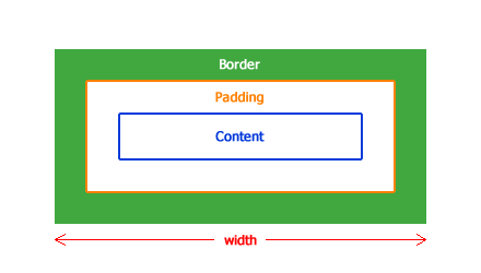
Figure 7-8 The way the areas of the box model are laid out when the box-sizing is border-box.
So, if the newsletter box has a specified width of 100%, you don’t have to work around the centering issues you saw. These styles caused the newsletter box to appear bigger than the width of the page:
#newsletter {
color: white;
border-radius: 8px;
border: rgba(0,0,0,0.1) solid 5px;
background:
url(“../images/icon-newsletter.png”) no-repeat 91% 2%,
url(“../images/bg-newsletter.png”) repeat 0 #00ACDF;
padding: 6%;
width: 100%;
}
If you were to give the #newsletter rule set the declaration box-sizing: border-box;, the browser would make the newsletter box 100% and then apply the padding and border inside that, meaning the newsletter box wouldn’t get any bigger than the defined 100%. Woohoo! Such a simple property makes working with the box model so much easier. No more math!
Again, box-sizing isn’t supported in Internet Explorer 6 and 7, so you should use it only if you’re not supporting those browsers or use it on noncritical styles. Now add a noncritical style to the page and make use of box-sizing: border-box in doing so:
1. In styles.css, find the rule set for input[type=”text”], input[type=”email”] and add the following:
width: 100%;
2. Save styles.css.
The input fields with type text and email (which are in the newsletter box) now have a width of 100%, but because those elements also have padding, the same issue occurs as with the newsletter box itself.
In Figure 7-9, you can see that the input fields have a width of 100% + 2em because of the declaration padding: .4em 1em;.
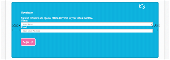
Figure 7-9 The input fields are not centered.
Rather than adjust values and use that negative margin-left hack as you did before, use the box-sizing property to change how the box model is laid out instead:
1. In styles.css, add the following to the rule set input[type=”text”], input[type=”email”]:
box-sizing: border-box;
2. Save styles.css.
As yet, Firefox does not support the unprefixed box-sizing property. If you are using Firefox as your development browser, please use -moz-box-sizing: border-box; instead. If using a different browser, you will provide support for Firefox in Chapter 16.
And now, the input fields are exactly 100% wide and not a single pixel more, as you can see in Figure 7-10. You don’t even need to do any math. Freedom!
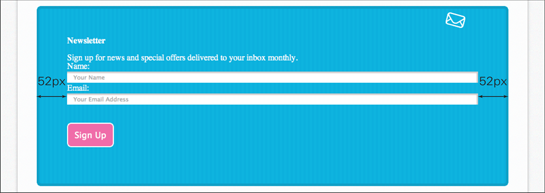
Figure 7-10 The input fields are centered now the box-sizing has been changed to border-box.
You may remember content-box and border-box from the background-clip and background-origin definitions in Chapter 5. You may also remember a third value those properties accepted, called padding-box, which at present is included in the CSS3 User Interface Module, where box-sizing is described (www.w3.org/TR/css3-ui/).
padding-box works in a similar way to border-box. Where border-box draws a border and padding inside the specified width and height of an element, padding-box draws the padding only on the inside and the border remains on the outside. I’m not sure why you would choose this property over the original box model content-box (because it’s just as unintuitive to start with, if not more so) or the newer and easier to use border-box. This is obviously an opinion shared by browser vendors and the W3C, too, because not all browser vendors have implemented padding-box, and the W3C has suggested padding-box might be removed from the specification in the future.
Summary
In this chapter, you learned about the mysterious box model—the way in which browsers determine the layout of elements. The box model is an important concept to understand if you really want to achieve well-laid-out pages that can not only change in size based on the device a page is being viewed on but will also remain robust and modular as you continue building and styling a page. As you saw in the code challenges, a page will often have many padding and margin properties applied to it. Spending a little extra time carefully considering padding and margin during the layout stage can often save you a lot of time in the future.
With this knowledge under your belt, you’re close to completing the layout of the Cool Shoes & Socks page. In the next chapter, you learn to make elements “float” next to each other, creating a multicolumn layout.