chapter fifteen
Testing Across Multiple Browsers
The first thing to do to make your website cross browser compatible is to get yourself a glass of water (to drink, not to throw over the computer) and take a deep breath. You’ve spent countless hours trying to make your website perfect. You’ve used best practices and been extra careful to use the latest CSS3 features safely. But when you open a browser you haven’t developed in—especially older browsers such as Internet Explorer versions 6 and 7—you’re going to see broken bits, sometimes just a few broken bits, other times lots. Fear not, this happens to everyone and is just the nature of creating web pages. Usually, a broken page looks worse than it actually is, and you can fix it in no time.
Obviously, every web page is different, so how you go about achieving cross browser compatibility is unique to each page. The most universal approach is to follow best practices—keeping your code clean and semantic, which you’ve done throughout CSS3 Foundations.
In this chapter, you start by making sure the Cool Shoes & Socks page works in modern browsers, add the CSS3 properties that need to be prefixed for other browsers, and then move on to add fixes for Internet Explorer versions 6, 7, and 8.
Project files update (ch15-00): If you haven’t followed the previous instructions and are comfortable working from here onward or want to reference the project files up to this point, you can download them from www.wiley.com/go/treehouse/css3foundations.
Vendor Prefixing the Easy Way
Until now, you’ve used vendor prefixes only on CSS3’s experimental properties to save having to write out the same property multiple times.
I developed the Cool Shoes & Socks page in Google Chrome, and now that it’s complete, I want to take a look at it in Mozilla Firefox. If you used Firefox to create Cool Shoes & Socks, take a look at it in another modern browser, such as Chrome, Safari, or Opera.
Pleasingly, Cool Shoes & Socks doesn’t look too bad at all in Firefox. Figure 15-1 shows that the page has a few issues, but they all relate to the fact that the stylesheet uses experimental CSS3 properties, which is yet to include those properties with a -moz- prefix—or any other vendor prefix for that matter. Without the full set of vendor prefixes, the showcase doesn’t animate, the input fields in the newsletter box are too wide (because of no prefixed box-sizing property), and the “25% Off” banner isn’t rotated.

Figure 15-1 The Cool Shoes & Socks page viewed in Mozilla Firefox.
In Chapter 3, I mentioned the free tools available to speed up writing prefixed properties. My personal recommendation is www.prefixr.com/.
Using Prefixr, you can have the prefixed properties you wrote for the Cool Shoes & Socks page converted into those that you purposely did not write to save yourself some time.
1. In styles.css, highlight and copy all the text from the body rule set onward.
2. Visit www.prefixr.com/ in your browser.
3. Click the text area on the Prefixr website and delete any content within it.
4. Paste your copied stylesheet into the empty text area, as shown in Figure 15-2.
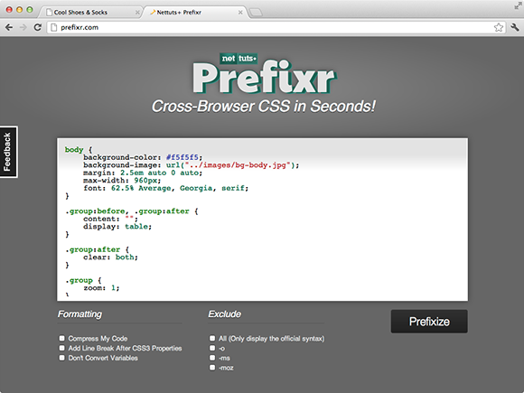
Figure 15-2 The #main rule set copied into the prefixr.com text area.
5. Uncheck the Add Line Breaks After CSS3 Properties option (all options should be unchecked).
6. Click the Prefixize button.
Prefixr then returns the stylesheet with any necessary prefixed properties included.
7. Highlight and copy this modified stylesheet from the Prefixr text area.
8. Paste the modified stylesheet in place of the existing one.
9. Save styles.css.
Prefixr—or any other automatic CSS prefixer tool for that matter—doesn’t quite do 100% of the job, so you need to make a few changes manually. Making these manual changes, however, is much less work than having to write all the vendor prefixes yourself. Let’s look at what Prefixr does and doesn’t do:
1. In styles.css, find the #main rule set:
#main {
background: white;
background: rgba(255, 255, 255, 0.6);
border: #ccc solid 1px;
-webkit-box-shadow: 0 3px 8px 0 #ccc;
box-shadow: 0 3px 8px 0 #ccc;
padding: 2.5em;
-webkit-perspective: 1000px;
}
In Chapter 5, you added the box-shadow declaration to this #main rule set. As you can see, Prefixr automatically adds the prefixed -webkit-box-shadow declaration for you. You can use the box-shadow property in all modern browsers without a prefix, but some mobile browsers that use the WebKit layout engine still require the prefixed property, so Prefixr adds it.
Prefixr unfortunately doesn’t automatically prefix the perspective property, so you can do that manually.
2. After the -webkit-perspective: 1000px; declaration, add the following:
-moz-perspective: 1000px;
-ms-perspective: 1000px;
-o-perspective: 1000px;
perspective: 1000px;
3. Save styles.css.
Note that just as Prefixr does, you should always place the official, nonprefixed property below the prefixed versions; that way, the official property will be used over the unofficial properties as soon as a browser supports it.
The next rule set that Prefixr works its magic on is .showcase .button. As you can see, this tool takes the work out of having to write the gradient applied to the showcase button:
background: -webkit-linear-gradient(top, #FB3876 0%, #d4326d 100%);
background: -moz-linear-gradient(top, #FB3876 0%, #d4326d 100%);
background: -o-linear-gradient(top, #FB3876 0%, #d4326d 100%);
background: -ms-linear-gradient(top, #FB3876 0%, #d4326d 100%);
background: linear-gradient(top, #FB3876 0%, #d4326d 100%);
No action is required here, but I’m sure you’ll agree, not having to write out all these properties with the heavy syntax of linear-gradient() is a timesaver.
Just below the .showcase .button rule set, you see the @keyframes rules. Prefixr takes the @-webkit-keyframes rule and makes one for each browser, including a nonprefixed @keyframes rule. Unlike other rule sets, the keyframes rules are only referenced, so their position within a stylesheet isn’t essential. Prefixr chooses to place the official @keyframes rule above the prefixed versions, which isn’t a problem.
As mentioned in Chapter 5, when you use the opacity property—which isn’t supported by Internet Explorer versions 6, 7, and 8—Prefixr automatically adds the filter property, which emulates opacity. You used opacity in the @keyframes rules, but because old versions of Internet Explorer don’t understand @keyframes anyway, the filter property can safely be removed. The filter properties don’t actually cause any harm if they remain in the stylesheet, so this step is optional, but always trying to keep your stylesheets as clean as possible is good practice.
4. Remove any instance of the filter and -ms-filter properties from styles.css.
As you make your way through the stylesheet, you see that Prefixr prefixes many more properties too:
• The .showcase li animations from the preceding chapter
• The box-sizing property in input[type=”text”],input[type=”email”]
• The transform property added to several of the .sidebar elements
• The transform, transform-origin, and transition properties added to the .banner-ad rule set
None of these modifications require your action. However, Prefixr slightly tampers with the content declarations in the blockquote p:before and blockquote p:after rule sets. The content properties originally have the values “201C” and “201D”, but Prefixr strips out the backslashes, so you need to add them back in.
5. In blockquote p:before, add a backslash inside the quotation marks:
content: “201C”;
6. In blockquote p:after, add a backslash inside the quotation marks:
content: “201D”;
Finally, because Prefixr also strips out some of the prefixed border-image properties in the #footer rule set, add those back in.
7. In the #footer rule set, below the -moz-border-image declaration, add the following:
-ms-border-image: url(“../images/bdr-footer.png”) 4 repeat;
-o-border-image: url(“../images/bdr-footer.png”) 4 repeat;
8. Save styles.css.
All in all, when you run a stylesheet through Prefixr, you need to do a little work to tidy things up afterward, but overall you save some time and, most importantly, your sanity. Writing those prefixed properties isn’t fun!
Testing Modern Browsers
Now that you’ve prefixed all the necessary CSS3 properties, how do those changes help with the cross browser compatibility of Cool Shoes & Socks?
When testing cross browser compatibility, look for visual issues, but also test the functionality of the page. Hover over the drop-down menus and other elements with :hover rules, make sure the showcase animation runs correctly, and also resize your browser to make sure everything scales correctly.
Firefox 13 and Safari 5
Now the stylesheet contains the necessary prefixed properties, and due to modern browsers all closely supporting the CSS specifications, achieving browser consistency isn’t particularly hard. In Figure 15-3, you can see that Firefox now displays the page just as Chrome does. Safari 5 also renders the page just as Chrome and Firefox do.
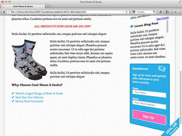
Figure 15-3 The Cool Shoes & Socks web page viewed in Firefox 13.
Opera 11 and 12
When viewed in Opera 11 and 12, Cool Shoes & Socks doesn’t provide quite the same experience as the other browsers, due to Opera 11 and 12 not supporting @keyframes or 3D transforms, as shown in Figure 15-4. This is not a problem, though; Opera still displays the web page perfectly well, and the code exists in the stylesheet for the time when Opera does decide to support 3D transforms, making the page future proof.
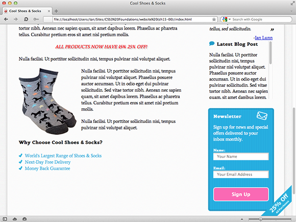
Figure 15-4 The Cool Shoes & Socks web page viewed in Opera 12.
Internet Explorer 10
At the time of writing, Microsoft Internet Explorer 10 has not been officially released but has been made available for testing. Visually, Internet Explorer 10 has no issues, but there is an issue with the 3D transform applied to the sidebar when hovered over, as shown in Figure 15-5.
Internet Explorer 10 unfortunately doesn’t support transform-style: preserve-3d yet, which, as shown in Figure 15-5, is why the newsletter box appears to be positioned strangely when hovered over, causing horizontal scroll bars to appear—something you’ve tried to avoid up until now.

Figure 15-5 The Cool Shoes & Socks web page viewed in Internet Explorer 10.
You can find the CSS that affects the sidebar within the .sidebar rule set:
.sidebar {
float: right;
width: 25%;
-webkit-transform: rotateY(-40deg);
-moz-transform: rotateY(-40deg);
-ms-transform: rotateY(-40deg);
-o-transform: rotateY(-40deg);
transform: rotateY(-40deg);
-webkit-transform-style: preserve-3d;
-moz-transform-style: preserve-3d;
-ms-transform-style: preserve-3d;
-o-transform-style: preserve-3d;
transform-style: preserve-3d;
}
Unfortunately, Microsoft chose to support the nonprefixed transform property despite not yet supporting transform-style: preserve-3d. This means that you can’t simply remove the prefixed -ms-transform property to fall back to a 2D sidebar because the nonprefixed transform property is still applied. You could remove the transform property too, but then all other browsers that do support transform-style: preserve-3d would also lose out on the 3D sidebar.
This situation is somewhat frustrating. Microsoft shouldn’t really have decided to support the nonprefixed transform property until the prefixed -ms-transform property worked fully. You can work around this issue, however:
1. In styles.css, find the .sidebar rule set and delete the following declaration:
-ms-transform: rotateY(-40deg);
2. In the same rule set, below the transform: rotateY(-40deg); declaration, add the following:
-ms-transform: none;
3. In the .sidebar .aside:hover rule set, delete the following declaration:
-ms-transform: rotateY(-40deg);
4. In the same rule set, below the transform: rotateY(-40deg); declaration, add the following:
-ms-transform: none;
5. In the .sidebar .aside:nth-child(3):hover rule set, delete the following declaration:
-ms-transform: rotateY(40deg) translateX(-50px) scaleZ(2) translateZ(100px);
6. In the same rule set, below the transform: rotateY(40deg) translateX(-50px) scaleZ(2) translateZ(100px); declaration, add the following:
-ms-transform: none;
7. Save styles.css.
The .sidebar rule set now looks like this:
.sidebar {
float: right;
width: 25%;
-webkit-transform: rotateY(-40deg);
-moz-transform: rotateY(-40deg);
-o-transform: rotateY(-40deg);
transform: rotateY(-40deg);
-ms-transform: none;
-webkit-transform-style: preserve-3d;
-moz-transform-style: preserve-3d;
-ms-transform-style: preserve-3d;
-o-transform-style: preserve-3d;
transform-style: preserve-3d;
}
What you do here is break the rules a little—by placing a prefixed property below the nonprefixed property—but only to fix the issue caused by Microsoft breaking the rules—supporting the nonprefixed transform property before it fully supported the nonprefixed -ms-transform property.
Because you place the -ms-transform: none; declaration below the transform: rotateY(-40deg); declaration, Internet Explorer 10 does not have a transform applied to it. The sidebar just falls back to 2D. This is the safest way to deal with Microsoft’s shortcomings. If—and it’s always a big if with Internet Explorer—Microsoft does follow the advice set out in the CSS specifications, it will eventually drop support for prefixed properties such as -ms-transform, so your declaration of -ms-transform: none; will be ignored and the transform: rotateY(-40deg); declaration will be used in its place. This result is what is desired for Cool Shoes & Socks anyway; you just have to take these measures temporarily while Internet Explorer 10 doesn’t fully support 3D transforms.
Internet Explorer 9
Internet Explorer 9 offers a similar experience to Opera 12. @keyframes and 3D transforms aren’t supported. Neither are transitions, so when you hover over the “25% banner,” the banner just snaps between sizes. The rounded corners on elements are also unsupported. Again, this lack of support isn’t a problem. The users will never know anything is wrong because the page still appears and functions perfectly for them; they just miss out on a few visual treats.
Firefox 3.6
In Chapter 1, I mentioned that Firefox 3.6 is still in use today—despite the latest Firefox being version 13 at the time of writing! Firefox 3.6 provides a similar experience to Internet Explorer 9, and thanks to the best practices you’ve adhered to throughout CSS3 Foundations, it doesn’t require any additional attention; it displays and functions to the level the browser is capable of.
Testing Older Versions of Internet Explorer
So far, the browser-testing ride has been pretty smooth. Cool Shoes & Socks works in the latest versions of modern browsers used today. It’s a certainty that older versions of Internet Explorer will require some extra attention though.
Internet Explorer 8
From the outset, Cool Shoes & Socks doesn’t look too bad in Internet Explorer 8, although a few issues arise as you move down the page, as shown in Figure 15-6.
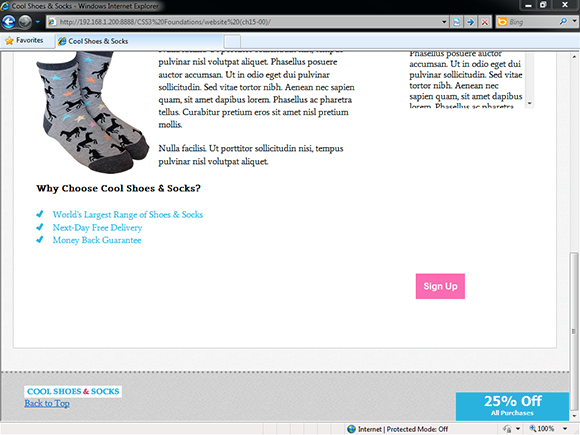
Figure 15-6 The Cool Shoes & Socks web page viewed in Internet Explorer 8.
First of all, the newsletter box disappeared! This isn’t actually a browser bug, though. When adding multiple backgrounds to the newsletter box in Chapter 5, I didn’t include an instruction to provide a fallback for older browsers that don’t support multiple backgrounds. If you forget to add fallbacks—we all do from time to time—you can pick up these omissions during browser testing and fix them:
1. In styles.css, find the #newsletter rule set:
#newsletter {
color: white;
border-radius: 8px;
border: rgba(0,0,0,0.1) solid 5px;
background: url(“../images/icon-newsletter.png”) no-repeat 91% 2%, url(“../images/bg-newsletter.png”) repeat 0 #00ACDF;
padding: 6%;
margin-left: -4px;
width: 88%;
}
2. Above the background declaration, add another background declaration:
background: url(“../images/bg-newsletter.png”) repeat 0 #00ACDF;
3. Save styles.css.
With two background declarations, browsers that don’t understand the second multiple image declaration simply ignore it and apply the first.
Now that the background image is in place, it also becomes apparent that the border declaration isn’t being applied either. The reason is that Internet Explorer 9 doesn’t understand the rgba() function used to style the border. Add another fallback property.
4. In the #newsletter rule set, above the border declaration, add the following:
border: #009CC8 solid 5px;
5. Save styles.css.
This procedure provides browsers that don’t support the rgba() function a value that they do understand.
With the border fixed, you may notice the Sign Up button in the newsletter box isn’t centered as it is in other browsers. This is a bug in Internet Explorer 8, and to work around it, you need to give the Sign Up button a width.
1. In styles.css, find the input[type=”submit”][class=”button”] rule set and add the following declaration:
width: 100%;
2. Save styles.css.
Finally, for Internet Explorer 8, the Cool Shoes & Socks logo and Back to Top link in the footer aren’t floated to the left and right of the page. The reason is that the rule sets for these elements use the :nth-child() selector, which isn’t supported in versions 6, 7, and 8 of Internet Explorer.
The Cool Shoes & Socks page uses the :nth-child() selector five times, but three of those are to apply transforms and animations to the product showcase and sidebar, which older versions of Internet Explorer don’t support anyway. Because only two of the :nth-child() selectors affect Internet Explorer 6, 7, and 8, the simplest solution is just to give the elements a class name and change the rule set to use a class selector instead of :nth-child().
1. In index.html, find the two <li> elements within <div class=”nav container”>.
2. Change the first <li> to give it the class small-logo, like so:
<li class=”small-logo”>
3. Change the second <li> to give it the class back-to-top, like so:
<li class=”back-to-top”>
4. Save index.html.
5. In styles.css, find the rule set #footer li:nth-child(1) and change the selector to #footer .small-logo.
6. In styles.css, find the rule set #footer li:nth-child(2) and change the selector to #footer .back-to-top.
7. Save styles.css.
Although this is a sensible option for the Cool Shoes & Socks page, you might not always want to have to change all your advanced selectors to simpler ones that older browsers can understand; otherwise, there would be no point in using them. One solution for this problem is to use JavaScript to help older browsers understand advanced selectors. Rather than write your own JavaScript to give them this capability, though, you can use a free utility to do this job for you. Called Selectivizr, it is located at www.selectivizr.com/.
When you download and place a <script> reference in the <head> of the page—just as you did with live.js in Chapter 2—along with a JavaScript library such as jQuery, many advanced CSS selectors work in older browsers. Visit the Selectivizr website at www.selectivizr.com/ for complete instructions on how to add this reference if you need to.
Conditional Comments for Internet Explorer 6, 7, and 8
Internet Explorer versions 6 and 7 never made much of an effort to adhere to standards—with Internet Explorer 8 doing a little better but still not great—and because of that, whenever you check a web page in them, you certainly find issues, in particular in Internet Explorer 6. Sometimes you need to make fundamental changes to a page to get it working in these older versions of Internet Explorer, but that is at the detriment to the other browsers that do work. Thankfully, you can use conditional comments to apply styles to specific versions of Internet Explorer.
Let’s look at some of the issues in Internet Explorer 7 and then use conditional comments to add fixes.
As shown in Figure 15-7, the first issue with Internet Explorer 7 is the layout of the navigation links; they appear vertically one after the other rather than side by side.
In Chapter 9, I mentioned that Internet Explorer 6 and 7 don’t support display: inline-block;, which is what is applied to these navigation links. Luckily, these browsers treat display: inline; as if it were display: inline-block; anyway.
If you go into styles.css and change the #header .nav > ul > li rule set so that the display property has a value of inline, this change fixes Internet Explorer 6 and 7 but breaks modern browsers. Instead, create a conditional stylesheet:

Figure 15-7 The Cool Shoes & Socks web page viewed in Internet Explorer 7.
1. In index.html, below the <link> reference to css/styles.css, add the following:
<!--[if lt IE 8]><link rel=”stylesheet” href=”css/styles-ie7.css” type=”text/css” /><![endif]-->
2. Save index.html.
This code adds a stylesheet to the page that is to be applied only when a specific condition is met. The condition if lt IE 8 means “if less than Internet Explorer 8.” So, when the Cool Shoes & Socks page is viewed in any version of Internet Explorer below version 8, the styles-ie7.css stylesheet is applied.
Following are a few examples of conditional comments you might like to use:
• if IE—If any version of Internet Explorer
• if IE 6—If the browser is specifically Internet Explorer version 6
• if gt IE 8—If the browser is greater than version 8 of Internet Explorer
• if gte IE 8—If the browser is greater than or equal to version 8 of Internet Explorer
• if lt IE 9—If the browser is less than version 9 of Internet Explorer
• if lte IE 8—If the browser is less than or equal to version 8 of Internet Explorer
You can also use an exclamation mark (!) to apply to anything that does not match a condition; for example, if !IE applies to anything that isn’t Internet Explorer. For more information about conditional comments, see www.quirksmode.org/css/condcom.html.
Now that you have a conditional comment set up, add a new stylesheet to be applied to Internet Explorer 7.
3. Create a new file called styles-ie7.css and save it in the css folder.
4. In styles-ie7.css, add the following rule set:
#header .nav > ul > li {
display: inline;
vertical-align: top;
}
5. Save styles-ie7.css.
Because you add the conditional stylesheet below the main stylesheet, any styles added to it overwrite the main styles. This rule set overwrites the navigation links’ display: inline-block; declaration from the main stylesheet and makes them display: inline; instead. You also include vertical-align: top; to make each link align to the top.
Also shown in Figure 15-7 is that the page has a horizontal scroll bar. Sometimes, older versions of Internet Explorer have inexplicable bugs such as this, and the best way to find a fix is through trial and error. By commenting out sections of HTML in index.html, I found that it was either the sidebar <div class=”sidebar” role=”complementary”> or an element within the sidebar that was causing the page to be wider than necessary. By then commenting out sections within the sidebar, I found that it was the <cite> tag within the <blockquote>. With this knowledge, I then went into styles.css and commented out each declaration in the blockquote cite rule set until I found the culprit: float: right;.
The <cite> element appears to be acting bigger than it is (causing the page to become wider), so my natural reaction was to specify a width. As with the Send button issue you saw in Internet Explorer 8, this issue appears to be similar. To fix it, add an Internet Explorer 7–specific style:
1. In styles-ie7.css, add the following rule set:
blockquote cite {
width: 100%;
text-align: right;
}
2. Save styles-ie7.css
Just one visual issue is left in Internet Explorer 7. The input fields in the newsletter box are too wide for the box. The reason is that you used box-sizing: border-box; on these elements, which isn’t supported in Internet Explorer 6 or 7. Internet Explorer 6 and 7 only treat box-sizing as the default padding-box. For more information on this issue, see Chapter 7.
1. In styles-ie7.css, add the following rule set:
input[type=”text”],input[type=”email”] {
width: 88%;
}
2. Save styles-ie7.css.
Because the newsletter box has a padding of 6% both on the left and right sides, when you make the width of the input fields 88%, they perfectly fit in the box again. Note that this effect is true only when the width of the browser is 960px or greater—which leads to the next Internet Explorer fix.
In the next chapter, you use media queries to make the Cool Shoes & Socks page adapt based on the width of the page. Internet Explorer 6, 7, and 8 don’t support media queries, though, so you can add a conditional style sheet for them that prevents the web page shrinking below 960px.
1. In index.html, above the previously added conditional stylesheet, add the following:
<!--[if lt IE 9]><link rel=”stylesheet” href=”css/styles-ie.css” type=”text/css” /><![endif]-->
2. Save index.html.
3. Create a new file called styles-ie.css and save it in the css folder.
4. In styles-ie.css, add the following declaration:
body {
width: 960px;
}
When you add this conditional stylesheet that applies to all versions of Internet Explorer below version 9, Cool Shoes & Socks viewed in those browsers isn’t able to shrink below a width of 960px. This workaround ensures the layout doesn’t shrink down to the point where content becomes unreadable.
Universal Internet Explorer 6 Stylesheet
Now comes the gut-wrenching moment...when viewing Cool Shoes & Socks in Internet Explorer 6, it isn’t going to be pretty. Thankfully, the days of supporting Internet Explorer 6 are close to over—if not already over.
If you absolutely have to support Internet Explorer 6 and make it appear close to how other browsers do, you can add fixes in the same way as with Internet Explorer 7 and 8: Create a conditional stylesheet that applies styles to Internet Explorer 6 only. Cool Shoes & Socks takes more of a radical approach, though.
As shown in Figure 15-8, Cool Shoes & Socks viewed in Internet Explorer 6 isn’t pretty. Rather than spend x number of hours fixing it with a conditional stylesheet, you can simply remove all styles, leaving just the bare content—all that’s really important on the page.
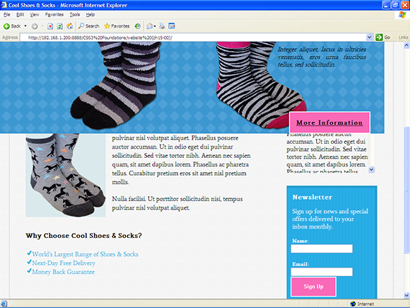
Figure 15-8 The Cool Shoes & Socks web page viewed in Internet Explorer 6.
Using Andy Clarke’s (www.stuffandnonsense.co.uk/) Universal Internet Explorer 6 Stylesheet code.google.com/p/universal-ie6-css/, you can achieve this result easily.
1. In index.html, modify the <link> reference to styles.css so it is wrapped in a conditional comment, like so:
<!--[if ! lte IE 6]><!--><link rel=”stylesheet” href=”css/styles.css” type=”text/css” /><![endif]-->
This lines hides the main stylesheet from Internet Explorer versions 6 and below but still allows it to apply to everything else.
2. Below the <link> reference to styles-ie7.css, add the following line:
<!--[if lte IE 6]><link rel=”stylesheet” href=”http://universal-ie6-css.googlecode.com/files/ie6.1.1.css” media=”screen, projection”><![endif]-->
3. Save index.html.
With this last line you add, versions of Internet Explorer less than or equal to version 6 are given a basic stylesheet that removes all but the necessary styles from Cool Shoes & Socks and any other page you care to add it to in the future.
Summary
In this chapter, you made the Cool Shoes & Socks web page cross browser compatible for desktop browsers—not the easiest of tasks but one that is essential. Each browser now displays Cool Shoes & Socks without issues and at a level it is capable of.
The steps you took to provide a basic experience for Internet Explorer 6 may seem radical, but with Internet Explorer 6 having a very small market share now—and not even Microsoft supports it anymore—that experience still provides any remaining users of Internet Explorer 6 with all the content the page has to offer. They just don’t get the bells and whistles.
In the next chapter, you use media queries to make the page change based on the attributes of the device it is being viewed on, making mobile experiences in particular richer.