chapter three
Mastering the Power of CSS Selectors
In this chapter, you will learn to master the power of CSS selectors, which allow you to select any HTML element to be styled. Selectors have a very friendly learning curve and are easy to start with but can become more advanced as and when you are ready.
Writing Your First Styles
CSS is a collection of rule sets (also called rules), which consist of a selector and a declaration.
A selector is used to select the element you want to apply styles to, and a declaration is the combination of a property and a value for that element, as shown in Figure 3-1. You learn about property values in the next chapter and properties from Chapter 5 onward.
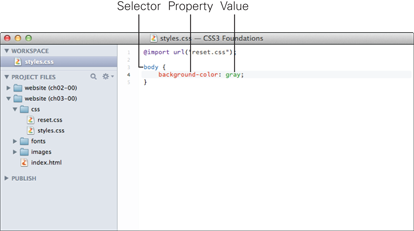
Figure 3-1 A rule set that changes the background color of the <body> element, written in Espresso text editor.
You end a declaration with a semicolon; this way, you are able to add multiple declarations within the same rule set.
Project Files Update (ch03-00): If you haven’t followed the previous instructions and are comfortable working from here onward or would like to reference the project files up to this point, you can download them from www.wiley.com/go/treehouse/css3foundations.
Go ahead and add the style shown in Figure 3-1 to the page.
1. Open styles.css and add the following:
body {
background-color: gray;
}
2. Save styles.css.
To see the affect of this rule, open index.html in your browser of choice. Whenever you save a modification made to styles.css, index.html, or any other file, you should refresh the browser to see the most up-to-date version of the page.
The rule you just added to styles.css tells the browser to select the <body> HTML element and apply the background color gray to it.
What if you want to add another style to the <body> element? Rather than add another body selector, you can simply define a second declaration within this rule, as shown here:
1. Inside the body selector, below the background-color declaration, add the following:
background-image: url(“../images/bg-body.jpg”);
2. Save styles.css.
Note that in CSS, a word followed by parentheses is known as a function. A function requires at least one argument (depending on the function being used), which, in the case of the url() function, is the path to an image. In Chapter 5 you will learn more about background-image and what exactly those two dots mean in the path.
You now see a background image applied to the body of the page, as shown in Figure 3-2. What happened to the background color? Don’t worry; it’s still there! The browser sees that you’ve added both a background color and background image to the same selector. The browser knows that a background image has more detail than a background color and is the preferred choice. So why add a background color if it’s hidden behind an image? In some cases, the browser may not download images (a user can turn them off, for example, or a technical issue may prevent the image from being downloaded and displayed). If this happens, the page still has a background color similar to that of the image. Also, an image may be too small to cover the whole background; the areas that it doesn’t cover show the background color.
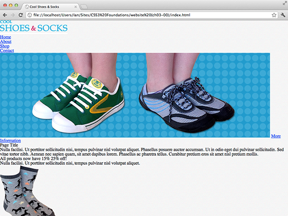
Figure 3-2 The page with a background image applied to it.
If you’ve had a good look through the project files, you may have noticed that the image bg-body.jpg is small (only 40 × 40 pixels), yet the background image when viewed in the browser covers the whole page. The reason is that a background image, by default, repeats, so when viewing the page in a browser, the background image is repeated multiple times to cover the whole page. More on background images in Chapter 5.
Inheritance and the Relationship Between Elements
Just before you begin selecting elements to style, it’s a good idea to understand CSS inheritance and the relationship between elements.
When applying a style to an element, depending on the property being used, that style may be inherited by other elements. The following rule set makes text in the <body> element blue:
body {
color: blue;
}
Assume this is applied to the following HTML (a simplified version of index.html):
<body>
<div id=”main” class=”group”>
<h1>Page Title</h1>
<p>Nulla facilisi. Ut porttitor sollicitudin nisi, tempus pulvinar nisl volutpat aliquet.</p>
</div>
</body>
Although the <body> element doesn’t contain any text itself, the text within <h1> and <p> will still have the blue color applied to them. This is because the color property is inherited. From Chapter 5 onward, CSS3 Foundations explains properties in greater depth and points out whether each is inherited.
What is meant by inherited, though? Because <body> in the HTML example contains the <h1> and <p> elements, they are known as the descendants of <body>. An inherited property is one that is passed down and applied to descendant elements, unless that element overrides it with a property of its own.
Descendants can also be referred to as children, but only when an element is the direct descendant of another. For example: the <h1> and <p> elements are descendants of <body> and children of <div id=”main” class=”group”>. Likewise, <div id=”main” class=”group”> is a child of <body>.
An element that contains other elements may be called the parent, and two elements at the same level (such as the <h1> and <p> in the example) are called siblings.
More advanced selectors allow you to select an element based on its relationship with others, which you will see shortly.
Selectors
Selectors are the conditions of a CSS rule set. The true power of selectors comes from their capability to be combined, allowing you to create very specific conditions, applying styles only to the exact element or elements you want.
Universal Selector
The universal selector is represented by an asterisk (*) and selects every element that makes up a web page:
* {
color: black;
}
In this example, every element is given a black text color. Note that this isn’t a very effective method of applying this style, though. Because styles are inherited, rather than apply a style to every element, you could apply it to a body selector instead, which would give the exact same result, but a little quicker. Because each rule set is an action the browser carries out to turn HTML and CSS into a beautiful page, this sort of consideration means a browser can work faster and the user can see a page quicker. So, because it’s not always the most efficient approach to styling multiples elements, universal selectors tend to be used with a combination of other selectors to make them apply only to specific elements rather than all of them. More on combining selectors shortly.
Type Selector
When you added a background color to the <body> element, you used a type selector to do that. A type selector is the name of an HTML element. A type selector can be used as follows:
1. In styles.css, add the following rule set:
h1 {
font-weight: bold;
}
2. Save styles.css.
Here, you select the <h1> element—a type selector. This declaration makes the <h1> bold. Changing the font style is covered in more detail in Chapter 11.
Unless otherwise specified, add new rule sets below others you’ve already added.
ID and Class Selectors
IDs and classes, which are attributes of an HTML element, allow you to be more specific when styling elements.
As you saw in the project files, some elements already have IDs and class attributes. The main content area, for example, is a <div> with an ID of main and class of group:
<div id=”main” class=”group”>
If you use a type selector for this element to make its background color white, for example, you add the following to the CSS:
div {
background-color: white;
}
The problem here is that although the main content area is now white, so too is every other <div> on the page. By using an ID selector instead, you can select just that particular <div>.
Go ahead and change the main content area’s background color to white:
1. In styles.css, add the following:
#main {
background-color: white;
}
2. Save styles.css.
The hash or pound symbol (#) represents an ID. An ID should be used only once per page. Consequently, it allows you to be very specific when applying styles.
Similar to the ID is the less specific class selector. When elements on a page (or across a website) need to share the same styles, you should use a class selector. Unlike IDs, classes can be used on a page as many times as you want.
You will eventually apply quite a few styles to the call to action button described in Chapter 2 (remember its purpose is to attract the user’s eye) and will use it multiple times on the same page. Because of this, it makes sense to use the button class for elements representing a button.
Style any element with the button class like so:
1. In styles.css, add the following:
.button {
background-color: hotpink;
color: white;
}
2. Save styles.css.
The full-stop, period, or dot represents a class. Here, you make the background color hot pink and make the text of the button white. You take a closer look at these property values, known as color keywords, in the next chapter.
Grouping Selectors
Sometimes you may want to apply a style to more than one element. You recently made the text of the <h1> element bold but what if you want the subtitle elements such as <h2>, <h3>, and <h4> to be bold too? You could write a rule set that selects each element individually, but a quicker way is to group those selectors instead.
1. In styles.css, find the h1 rule set:
h1 {
font-weight: bold;
}
2. Modify the rule set to include other title elements, like so:
h1, h2, h3, h4 {
font-weight: bold;
}
3. Save styles.css.
By separating each selector with a comma, you can apply the same styles to multiple elements.
Combinators
Combinators allow you to apply styles to elements based on their relationship with other elements. All the selectors you’ve learned up to now can be used with combinators to make even more specific selectors.
Descendant Combinators
A descendant selector describes the descendant of an element. Descendant combinators are great for styling elements that exist inside of other elements.
1. In styles.css, add the following:
blockquote p {
font-style: italic;
}
2. Save styles.css.
In this example, only <p> elements that are descendants of <blockquote> will be made italic. By using a descendant combinator, you can be more specific about which elements you want to select.
Child Combinators
Sometimes, a descendant combinator isn’t quite strict enough for your purposes. Follow these steps to use a child combinator:
1. In styles.css, add the following:
aside > h3 {
font-weight: bold;
}
2. Save styles.css.
A child combinator is a greater-than character (>) placed between two selectors. With the selector you just added, the <h3> title element that is a child of the <aside> element will be made bold.
Child combinators are unsupported in Internet Explorer 6.
Sibling Combinators
CSS Level 3 introduces sibling combinators, allowing you to create selectors for elements when at the same level.
Adjacent Sibling Combinator
You can use the adjacent sibling combinator to style elements that share the same parent, providing one element immediately follows the other:
1. In styles.css, add the following:
p + .offer {
color: red;
}
2. Save styles.css.
An adjacent sibling combinator is a plus symbol (+) placed between two selectors. With the selector you just added, the element <p class=”offer”> is made red, only when it follows another <p> element.
Adjacent sibling combinators are unsupported in Internet Explorer 6.
General Sibling Combinator
Like the adjacent sibling combinator, elements making use of the general sibling combinator share the same parent; however, because their relationship is “general,” one element doesn’t have to immediately follow the other to be selected:
p ~ h2 {
color: black;
}
Where an adjacent sibling selector selects only the element that immediately succeeds it, the general sibling selector in this example selects all <h2> elements that succeed a <p> element.
A general sibling combinator is a tilde symbol (~) placed between two selectors.
General sibling combinators are unsupported in Internet Explorer 6.
Attribute Selectors
Attribute selectors allow you to select elements by referring to their attributes, such as ID, class, title, src, and so on. “But wait,” you cry! “Didn’t you just cover IDs and classes?” Yes! Technically, the ID and class selectors you just learned about are their own unique types of selectors. You can also select IDs and classes using attribute selectors.
When you made the background color of the main section white, you used this rule set:
#main {
background-color: white;
}
You can accomplish exactly the same goal using an attribute selector, like so:
div[id=”main”] {
background-color: white;
}
Which should you use? Because attribute selectors aren’t supported in Internet Explorer 6, and ID and class selectors are just a little quicker to type anyway, I’d suggest using those instead.
Of course, elements can have a lot of other attributes you could use to create a selector. Here’s an example:
1. In styles.css, add the following:
input[type=”text”], input[type=”email”] {
border: none;
}
2. Save styles.css.
Here, you select the newsletter input fields with attribute types text and email and declare these elements should have no border.
The power of attribute selectors doesn’t just end there.
Selecting Elements with an Attribute, Regardless of Its Value
This example selects an element such as <a title=”More information”>. As long as it has a title, it is selected regardless of the title’s value:
a[title] {
color: blue;
}
Selecting Elements with Multiple Attributes
The following example selects an element that has both of the attributes type=”submit” and class=”button”:
1. In styles.css, add the following:
input[type=”submit”][class=”button”] {
font-size: 1em;
}
2. Save styles.css.
This will give the newsletter sign up button <input class=”button” id=”submit-newsletter” type=”submit” value=”Sign Up” /> a font size of 1em. More on font-size in Chapter 11.
Other Attribute Selectors
Attribute selectors don’t just stop there, but the remainders tend to be for more special use case situations, so they aren’t covered in CSS3 Foundations.
These other attribute selectors allow you to select an element that:
• Contains multiple attribute values
• Has an attribute value list of hyphen-separated words
• Has an attribute value starting with, ending with, or containing a certain string of text
If the sound of those takes your fancy, I’d recommend reading more about them at reference.sitepoint.com/css/attributeselector.
Pseudo-Classes
Sometimes, a part of a web page isn’t made up of a physical element, meaning it can’t be selected through the use of a normal selector; this is where pseudo-classes come in use. Note that, unfortunately, pseudo-classes are not supported in all browsers and each of the following descriptions will state which browsers a pseudo-class is not be supported in. In CSS3 Foundations, you don’t rely on too many pseudo-classes, and any issues that may occur in browsers that don’t support these pseudo-classes are addressed in Chapter 16.
Dynamic Pseudo-Classes
Dynamic pseudo-classes allow you to style an element when it is interacted with—when a user hovers over it, for example.
At present, when a user hovers over links on the Cool Shoes & Socks page, the links don’t change. You can use pseudo-classes to make it so:
1. In styles.css, add the following below the body rule set:
a:link {
text-decoration: underline;
}
a:hover {
text-decoration: none;
}
2. Save styles.css.
A pseudo-class consists of a colon (:) followed by the name of the pseudo-class. Here, you add two pseudo-class rule sets: one for an unvisited link and another for when a user is hovering over a link. An unvisited link is underlined, and when hovered over, that underline is removed. When the cursor moves away from the link (and is no longer being hovered over), the underline is applied again.
You can use other dynamic pseudo-classes along with :hover:
1. In styles.css, add the following:
a:visited {
color: black;
}
a:active {
color: red;
}
a:focus {
outline-color: black;
outline-style: dotted;
outline-width: 1px;
}
2. Save styles.css.
The :visited styles indicate—you guessed it—a link that has been visited. When you make this link a different color, a user can quickly scan a page he is returning to should he wish to find where he navigated previously.
The :active style is applied when an element is activated by the user—that is, when the user presses the mouse button down on a link. Hold down your mouse button on a link, and you see its color change to red, until you release the mouse button.
Focus is when an interactive element is deemed to have the user’s attention—when an input text box is clicked, for example. With the :focus pseudo-class, you add a very important style: the outline property. It may not seem that important at the moment, but it’s crucial for accessibility. You take a deeper look at outline and its importance in Chapter 5.
It’s possible for elements to have more than one pseudo-class at a time. A link can be both :visited and :active, for example. If you want to style a link such as that, you could use the following:
a:visited:active {
color: orange;
}
Structural Pseudo-Classes
Structural pseudo-classes are used when you want to select elements based on generic criteria, such as the second <p> element amongst three.
Selecting Child Elements
The pseudo-class :nth-child() allows you to select a particular child element based on its position relative to its siblings within a parent element:
p:nth-child(1) {
background-color: lightblue;
}
You should place an argument within the parentheses of :nth-child() to specify an element that is the nth element relative to its siblings; this can be either a number or the words odd or even. By selecting only odd or even elements, you can create an alternating color for rows within a table, for example (making the table easier to scan with the eye). Figure 3-3 shows this style applied to the Cool Shoes & Socks page.

Figure 3-3 A light blue background color applied to p:nth-child(1).
The <p> element within the “What Our Customers Are Saying” section is given a light blue background because that is the only <p> element to be a first child among its siblings. The first child <p> elements within the content and newsletter sections are headings and not paragraphs, which is why the first paragraphs in those particular sections are not given the same background color.
Be aware that :nth-child(1) represents the first element, which can also be expressed as :first-child. Similarly, you can use :last-child to select the last element, or if you want to start counting from the last child, you can use :nth-last-child(), where :nth-last-child(1) is the last element and :nth-last-child(2) is the element next to the last.
You can also select an element if it is the only child of its parent (it has no siblings), using :only-child.
nth-child() isn’t supported in Internet Explorer versions 6, 7, and 8.
Selecting Child Elements of a Particular Type
Where :nth-child()selects a child element based on its position among its siblings (regardless of what types of element they are), :nth-of-type() does the same but counts only siblings of the same type:
p:nth-of-type(1) {
background-color: lightblue;
}
Figure 3-4 shows this style applied to the Cool Shoes & Socks page, in place of the :nth-child(1) rule. Now, three <p> elements are given a background color of light blue.
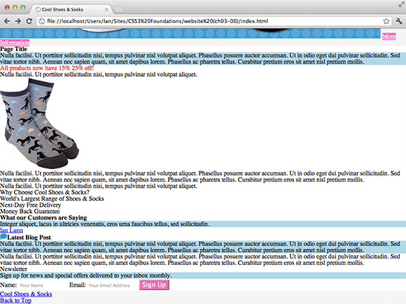
Figure 3-4 A light blue background color applied to p:nth-of-type(1).
As with :nth-child(), :nth-of-type() has similar variants. :nth-last-of-type() allows for counting elements of the same type from the last child. :first-of-type selects the first element of a specific type, and :last-of-type selects the last element of a specific type. Finally, :only-of-type selects an element if it is the only child of the specified type (it can have siblings, but only those that aren’t of the same type).
:nth-child(), :first-of-type(), :last-of-type(), and :only-of-type() aren’t supported in Internet Explorer versions 6, 7, and 8.
Selecting Empty Elements
Usually, you should aim to avoid having empty elements on a page (although they are sometimes used for dynamic sites where content is added after the browser or a user carries out a particular action). To select an empty element, use the :empty pseudo-class.
:empty() isn’t supported in Internet Explorer versions 6, 7, and 8.
Selecting the Root Element
The root of a web page can be selected using :root, which most often is the <html> element.
:root() isn’t supported in Internet Explorer versions 6, 7, and 8.
The Target Pseudo-Class
You are able to place an anchor link on a page that refers to a section on that same page.
At the bottom of the Cool Shoes & Socks page, there is a Back to Top anchor link, which links to the element with an ID of header. When the user clicks that link, the browser moves back up to the header element (at the top of the page). The header is the target of this link.
If a user clicks on an anchor link, you can style its target to make it stand out, like so:
:target {
color: red;
}
The UI Element States Pseudo-Classes
The :enabled and :disabled pseudo-classes are used to select elements in enabled and disabled states. For example, on a dynamic page, a form may contain input fields irrelevant to a particular user and can be disabled to prevent the user from interacting with that field.
You disable a field in the HTML, as follows:
<input disabled type=”email” placeholder=”Your Email Address” />
A field that isn’t disabled is considered enabled. If you want to prevent user frustration when disabling an input field, it’s a good idea to change its color to represent that, like so:
:disabled {
background-color: lightgray;
}
Another element state pseudo-class is :checked, which again relates to input forms—this time, check boxes and radio buttons. When an element is checked, it can be styled as follows:
:checked {
background-color: green;
}
:enabled(), :disabled() and :checked(), aren’t supported in Internet Explorer versions 6, 7, and 8.
The Language Pseudo-Class
You can use the :lang pseudo-class to declare styles based on the language of an element. Assume, for example, a quote is in French, like this:
<blockquote>
<p lang=”fr”>Integer aliquet, lacus in ultricies venenatis, eros urna faucibus tellus, sed sollicitudin.</p>
</blockquote>
The HTML specifies the quote is of a French language (lang=”fr”). To apply a style to only elements of French language, you can use the following:
:lang(fr) {
color: blue;
}
:lang() isn’t supported in Internet Explorer versions 6 and 7.
The Negation Pseudo-Class
The negation pseudo-class, :not(), allows you to select elements that do not represent its argument. As you saw with the language pseudo-class, you can style an element if it matches a particular language, but what if you want to style all languages except French? Rather than add each language code to the language pseudo-class, you can do the following:
:not(:lang(fr)) {
color: blue;
}
Now all elements that aren’t of the French language have blue text.
:not() isn’t supported in Internet Explorer versions 6 and 7.
Pseudo-Elements
Pseudo-elements are parts of a web page that have physical form but aren’t defined by an element—the first line of a paragraph, for example.
Officially, a pseudo-element is made of two colons (::) followed by the name of the element. When you use two colons, pseudo-elements are visually distinguishable from pseudo-classes (with their one colon). However, using one colon is also acceptable, so the choice is yours. I use just one colon throughout CSS3 Foundations.
Selecting the First Line
To select the first line of text, use the pseudo-element :first-line (or ::first-line if you’re going with two colons), like so:
p:first-line {
font-weight: bold;
}
Selecting the First Letter
To select the first letter, use the pseudo-element :first-letter, as shown in the following steps:
1. In styles.css, add the following:
#content p:first-of-type:first-letter {
font-size: 4em;
font-weight: bold;
}
2. Save styles.css.
Here, you combine quite a lot of the selectors you’ve learned so far. You use a descendant combinator to select only <p> elements within the <div id=”content” role=”main”> element. You also combine the :first-of-type pseudo-class with :first-letter, which has selected the first element of type <p>, and then select only the :first-letter from that.
By using this selector, you style the first letter of the content section with a large and stylish typographic letter (as shown in Figure 3-5), much like an old book! You learn what an em is in the next chapter and font styles such as font-weight in Chapter 11.
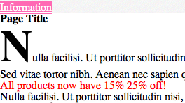
Figure 3-5 The first letter of the content area styled to be bigger and bolder than other text.
Generating Content Before and After an Element
Sometimes, you might want to add a style before or after an element that doesn’t warrant using another element within the HTML to do that. For this, you can use :before and :after pseudo-elements.
Using :before and :after, add some quotation marks to the customer testimonials:
1. In styles.css, below the blockquote p rule set, add the following:
blockquote p:before {
content: “201C”;
}
2. Save styles.css.
Here, you use another descendant combinator to select only <p> elements within <blockquote> elements and then tell the browser to create a pseudo-element before the <p> element and give it the content “201C”. What on earth is 201C?! It’s an American Standard Code for Information Interchange (ASCII) value, which is a scheme used by computers to understand text. The 201C represents an opening quotation mark (“). You can find more ASCII codes at www.ascii.cl/htmlcodes.htm.
As you see, this CSS rule adds a quotation mark before the quote. In Chapter 5 you see more uses for the content property, and if you’re thinking “what place does content have in CSS?” I explain that too.
The :after pseudo-element works in the same way:
1. In styles.css, below the blockquote p:before rule set, add the following:
blockquote p:after {
content: “201D”;
}
2. Save styles.css.
This time, 201D represents a closing quotation mark.
The :before and :after pseudo-elements have huge potential. Because they are nonphysical elements (they’re not a part of the HTML), you can do a lot with them without having to change the structure of your web page.
Sometimes you may want to use a pseudo-element to apply styles to the page but not have to put content inside the element using the content property. Because pseudo-elements don’t work in the absence of the content property, you can simply use the declaration content: “”; to trick the browser into showing the pseudo-element. You’ll see an example of this in Chapter 8.
Selector Specificity and the Cascade
Now that you’ve learned about selectors, you probably realize that they are certainly powerful things, often with more than one way to select the same element. For example:
header#header > nav[role=”navigation”] {
color: blue;
}
nav {
color: red;
}
These selectors both select the navigation element <nav role=”navigation”>.
The question is: Because these rules select the same element but try to apply different styles to it, which gets used?
Quite simply, the most specific selector wins. Because I’ve gone over the top with the first selector (I’m just showcasing my selector superpowers, but in the real world, the less your selectors consist of the better), the browser applies the first style.
This is known as specificity, and it is calculated in a points system, as follows:
• Count the number of ID selectors in the selector
• Count the number of class selectors, attribute selectors, and pseudo-classes in the selector
• Count the number of type selectors and pseudo-elements in the selector
• Ignore the universal selector
IDs are deemed to be very specific (because they are unique to the page) and count as 100 points. Each class, attribute, and pseudo-class selector counts as 10 points, and each type or pseudo-element selector counts as 1 point.
So, out of the two selectors in the example, header#header > nav[role=”navigation”] gets 112 points and nav gets only 1!
If the first rule should be more important than the other, I could be more sensible and just make it header nav (giving it 2 points). This is better for performance and makes CSS more manageable in the future; plus, you can still clearly see this rule is more specific, without going to the lengths of calculating specificity!
What if both rules are as specific as each other? For example:
nav {
color: red;
}
nav {
color: blue;
}
In this case, the latter rule always wins.
This attribution of importance is known as the cascade—where the C in CSS comes from.
The !important Rule
If you’re the type of character who doesn’t play by the rules and that’s how you want your CSS to be, let me introduce you to !important.
You’ve learned the rules of the cascade, but sometimes you might need to make a selector that has less specificity more important than those with higher specificity.
The !important rule is ideal during development when you just want to see a style applied to the page, regardless of specificity. It’s arguable whether !important should be used in production at all because it’s better for performance that you respect the cascade. Here is a good use case, though:
.error {
color: red !important;
}
This approach tends to be used on dynamic sites. Imagine a contact form in which the user hasn’t added all the required details. It’s important that the color of the error message be red (above any other color potentially being applied to this element through other selectors) so that the user knows he’s made a mistake and his eye is drawn to it.
The !important rule should start with an exclamation mark (!) and be placed after a property value before the closing semicolon.
Summary
Although you’ve seen a lot of selectors in this chapter, the key is to keep them as simple as possible. While you’re learning how to create and style web pages, there is nothing wrong with just using type, class, and ID selectors until you feel comfortable enough to try others.
The reason there are so many selectors available is to allow for creating CSS that is more efficient, modular, and robust. That doesn’t mean, however, that if you don’t use advanced selectors your pages will be slow. A well-considered selector against a more beginner-friendly one may shave a few milliseconds off the time it takes a browser to render a page—something that only really pays off on bigger websites with heavy amounts of user traffic.
In the next chapter, you learn the different types of values that can be used with properties to style a page just the way you want!