chapter two
Getting Started
As you make your way through CSS3 Foundations, you learn CSS from the basics to the more advanced topics, all the while adding to an overall project that will eventually become a fully featured web page.
Often, I find the best way to learn new things is to create a scenario with particular restrictions and an end goal. In doing this, you can focus on reaching that end goal by limiting the number of choices you have to make (an infinite number of choices is often scary and off-putting, so it’s always good to define boundaries!). This approach to learning also means you have to make some real-world decisions to get the best possible outcome for the project.
So, without further ado, I’d like to introduce you to the fictitious company Cool Shoes & Socks (CSS for short—get it?).
The folks at Cool Shoes & Socks have asked you to style the company’s website for them. This web-savvy company, like the name says, sells cool shoes and socks. The staff have given you the go-ahead to use CSS3 on the website; their only caveat is that you must make the website gracefully degrade in browsers that don’t support CSS3. The company is also very aware that the web is accessed on many different types of devices (and its underfunded research department has determined socks will be able to access the web in the near future), so having a Responsive Web Design is very important to everyone involved.
Cool Shoes & Socks has already had the HTML of the site written and handed it to you to begin implementing CSS and modifying the HTML should that be necessary.
Getting Started with the Project Files
In a moment you will download the Cool Shoes & Socks project files that are built on throughout CSS3 Foundations. At specific milestones in the book, the most up-to-date project files are made available for you to reference or in case you want to skip a section and start at a different point. These milestones are marked in the book, along with the project file number and a link to where you can download it.
Downloading the Project Files
Go to www.wiley.com/go/treehouse/css3foundations in your web browser, where you can download the project files. The project files are contained within a Zip file that you should unzip into the location of your choosing.
Example, I unzipped the files to the following directories:
• Windows: C:/Users/Ian/Sites/CSS3 Foundations/
• Mac: Users/Ian/Sites/CSS3 Foundations/
Folder Structure and Good Practices
When you unzip the downloaded file, you are presented with folders named website followed by a chapter and milestone number, such as (ch02-00), representing the first milestone of Chapter 2 (the one you begin with). Each website folder contains the project files that are worked on throughout CSS3 Foundations. My personal recommendation is to keep the files within the website folder. So, my folder structure looks like this:
Users/Ian/Sites/CSS3 Foundations/website (ch02-00)/
Often, you might want to save files that aren’t part of the website but relate to it (such as notes, instructions from a client, images that have yet to be edited), so it’s a good idea to have a website folder within the project folder to keep it separate from those extra files.
Within the website (ch02-00) folder, you find the following folders and files:
• css
• fonts
• Average-OFL.txt
• Average-Regular.eot
• Average-Regular.woff
• Belgrano-OFL.txt
• Belgrano-Regular.eot
• Belgrano-Regular.woff
• images
• banner-25percent.png
• banner-shoes.jpg
• banner-socks.jpg
• banner-trainers.jpg
• bdr-footer.png
• bg-blog.png
• bg-body.jpg
• bg-footer.jpg
• bg-newsletter.png
• check.png
• icon-newsletter.png
• logo-small.png
• logo.png
• socks-horses.png
• index.html
A good practice is to separate external files (those separate from the main HTML files, known as assets or dependent files) into their own folders. Being organized in this way speeds up your workflow and makes managing a website easier.
Another good practice is to follow consistent naming conventions for your images. For example, bg-body.jpg and bg-footer.jpg are so called because they are applied as backgrounds (bg, meaning background). Multiple versions of the company logo exist, all beginning with the prefix logo-, which keeps them together alphabetically. As a website grows, using naming conventions such as these makes finding your files quicker.
Of course, these are only my personal preferences; you may like to use different naming conventions or folder structures that work better for you.
Understanding the HTML Template
The web page template (index.html) is written in HTML5. Because you will build on and style one page in CSS3 Foundations, links to other pages are only included to represent and demonstrate a real-world web page. href links are given the value #, which means the page only refers to itself. Should you wish to add more pages in the future, feel free to change the links.index.html in all of its glory:
<!DOCTYPE html>
<html lang=”en”>
<head>
<meta charset=”utf-8” />
<title>Cool Shoes & Socks</title>
<!--[if lt IE 9]>
<script src=”http://html5shiv.googlecode.com/svn/trunk/html5.js”></script>
<![endif]-->
</head>
<body>
<header id=”header” class=”group” role=”banner”>
<a href=”#” title=”Return to the front page”>
<img class=”logo” src=”images/logo.png” alt=”Cool Shoes & Socks” />
</a>
<nav role=”navigation”>
<ul>
<li>
<a href=”#” title=”Return to the front page”>Home</a>
</li>
<li>
<a href=”#” title=”About Company Name”>About</a>
</li>
<li class=”products”>
<a href=”#” title=”Visit our shop”>Shop</a>
</li>
<li>
<a href=”#” title=”Contact us”>Contact</a>
</li>
</ul>
</nav>
</header>
<div class=”showcase”>
<img src=”images/banner-trainers.jpg” alt=”Some of our cool trainers” />
<a class=”button purchase” href=”#” title=”Purchase product”>
More Information
</a>
</div>
<div id=”main” class=”group”>
<div id=”content” role=”main”>
<h1>Page Title</h1>
<p>Nulla facilisi. Ut porttitor sollicitudin nisi, tempus pulvinar nisl volutpat aliquet. Phasellus posuere auctor accumsan. Ut in odio eget dui pulvinar sollicitudin. Sed vitae tortor nibh. Aenean nec sapien quam, sit amet dapibus lorem. Phasellus ac pharetra tellus. Curabitur pretium eros sit amet nisl pretium mollis.</p>
<p class=”offer”>
All products now have <span class=”strike”>15%</span> 25% off!
</p>
<p>Nulla facilisi. Ut porttitor sollicitudin nisi, tempus pulvinar nisl volutpat aliquet.</p>
<img class=”product” src=”images/socks-horses.png” alt=”Horse Socks” />
<p>Nulla facilisi. Ut porttitor sollicitudin nisi, tempus pulvinar nisl volutpat aliquet. Phasellus posuere auctor accumsan. Ut in odio eget dui pulvinar sollicitudin. Sed vitae tortor nibh. Aenean nec sapien quam, sit amet dapibus lorem. Phasellus ac pharetra tellus. Curabitur pretium eros sit amet nisl pretium mollis.</p>
<p>Nulla facilisi. Ut porttitor sollicitudin nisi, tempus pulvinar nisl volutpat aliquet.</p>
<div class=”benefits”>
<h3>Why Choose Cool Shoes & Socks?</h3>
<ul>
<li>World’s Largest Range of Shoes & Socks</li>
<li>Next-Day Free Delivery</li>
<li>Money Back Guarantee</li>
</ul>
</div>
</div>
<div class=”sidebar” role=”complementary”>
<aside>
<h3>What our Customers are Saying</h3>
<ul class=”testimonials”>
<li>
<blockquote>
<p>Integer aliquet, lacus in ultricies venenatis, eros urna faucibus tellus, sed sollicitudin.</p>
<cite>
<a href=”http://www.ianlunn.co.uk/” title=”Visit Ian Lunn’s website”>Ian Lunn</a>
</cite>
</blockquote>
</li>
</ul>
</aside>
<aside class=”post”>
<h3>
<img src=”images/bg-blog.png” alt=”Latest Blog Post” />
Latest Blog Post
</h3>
<p>Nulla facilisi. Ut porttitor sollicitudin nisi, tempus pulvinar nisl volutpat aliquet. Phasellus posuere auctor accumsan. Ut in odio eget dui pulvinar sollicitudin. Sed vitae tortor nibh. Aenean nec sapien quam, sit amet dapibus lorem. Phasellus ac pharetra tellus. Curabitur pretium eros sit amet nisl pretium mollis.</p>
<p>Nulla facilisi. Ut porttitor sollicitudin nisi, tempus pulvinar nisl volutpat aliquet. Phasellus posuere auctor accumsan. Ut in odio eget dui pulvinar sollicitudin. Sed vitae tortor nibh. Aenean nec sapien quam, sit amet dapibus lorem. Phasellus ac pharetra tellus. Curabitur pretium eros sit amet nisl pretium mollis.</p>
</aside>
<aside>
<form id=”newsletter” action=”#”>
<h3>Newsletter</h3>
<p>Sign up for news and special offers delivered to your inbox monthly.</p>
<label>Name: </label>
<input type=”text” placeholder=”Your Name” />
<label>Email: </label>
<input type=”email” placeholder=”Your Email Address” />
<input class=”button” id=”submit-newsletter” type=”submit” value=”Sign Up” />
</form>
</aside>
</div>
</div>
<footer id=”footer” role=”contentinfo”>
<ul class=”container”>
<li class=”small-logo”>
<a href=”#” title=”Return to the front page”>
Cool Shoes & Socks
</a>
</li>
<li class=”back-to-top”>
<a href=”#header” title=”Go back to the top of the page”>
Back to Top
</a>
</li>
</ul>
</footer>
</body>
</html>
So, what does this code mean?
The first line, <!DOCTYPE html>, specifies the type of markup the document (the technical term for a web page) will use; in this case, it uses HTML.
Next is the <head>, which is the location where you place metadata about the web page. The template’s <head> contains the charset (which tells the browser what character encoding to use) and the title of the page. You also use <head> to add resources such as stylesheets and JavaScript, among other metadata. Because the template is built using HTML5 elements—which isn’t supported by Internet Explorer 6, 7, and 8—a script is referenced here that makes those browsers understand HTML5. Conditional comments are used to make the script apply only to Internet Explorer versions below version 9. Conditional comments are explained in Chapter 15.
<head>
<meta charset=”utf-8” />
<title>Cool Shoes & Socks</title>
<!--[if lt IE 9]>
<script src=”http://html5shiv.googlecode.com/svn/trunk/html5.js”>
</script>
<![endif]-->
</head>
The <body> tags follow the closing </head> tag. Here, you place the structure and content of the page:
<body>
...
</body>
Inside the <body> tags is the header of the web page:
<header id=”header” class=”group” role=”banner”>
<a href=”#” title=”Return to the front page”>
<img class=”logo” src=”images/logo.png” alt=”Cool Shoes & Socks” />
</a>
<nav role=”navigation”>
<ul>
<li>
<a href=”#” title=”Return to the front page”>Home</a>
</li>
<li>
<a href=”#” title=”About Company Name”>About</a>
</li>
<li class=”products”>
<a href=”#” title=”Visit our shop”>Shop</a>
</li>
<li>
<a href=”#” title=”Contact us”>Contact</a>
</li>
</ul>
</nav>
</header>
The header <header> is given the ID header, the class group and the role banner. IDs, classes, roles, and other additional information within element tags are known as attributes. In CSS, you can select elements based on their attributes.
The role attribute lets screen readers (software used by people with disabilities such as visual impairment) know that this particular section of the page is a banner, defined as being “a region that contains mostly site-oriented content, rather than page-specific content” (www.w3.org/TR/wai-aria/roles#banner). The roles model is another specification being developed by the W3C, which aims to improve the accessibility of web pages for persons with disabilities. For more information, see www.w3.org/TR/wai-aria/.
The header also contains the Cool Shoes & Socks logo and site navigation.
Underneath the header is a product showcase:
<div class=”showcase”>
<img src=”images/banner-trainers.jpg” alt=”Some of our cool trainers” />
<a class=”button purchase” href=”#” title=”Purchase product”>
More Information
</a>
</div>
The product showcase contains one large image and a call to action that links to more information about the product. A call to action (CTA) is an area of the page that aims to grab the attention of web page visitors and lead them through to achieving a particular goal. The product showcase is the place where Cool Shoes & Socks can show off its best products and latest offers; the CTA aims to lead visitors through to finding out more information about the products and potentially buying some shoes or socks. Employing calls to action is a classic technique used across many sites on the web. A CTA often stands out from the rest of the page to draw visitors’ eyes to it, leading them to complete an action. Using CSS, you can make this button stand out from the rest of the page to achieve that goal.
After the product showcase is the main content of the page. First, look at the main structure of this section:
<div id=”main” class=”group”>
<div id=”content” role=”main”>
...
</div>
<div class=”sidebar” role=”complementary”>
<aside>
…
</aside>
</div>
</div>
The line <div id=”main” class=”group”> contains the content of the page as well as a sidebar that holds customer testimonials, the latest blog posts and a newsletter sign up form. The preceding code shows only the structure of this main section. As you make your way through CSS3 Foundations, you learn how to create columns, placing the content on the left, with the sidebar to its right. Again, this code uses role attributes to assist screen readers.
Finally, prior to the closing of the </body> and </html> tags, you see the pages footer:
<footer id=”footer” role=”contentinfo”>
<ul class=”container”>
<li class=”small-logo”>
<a href=”#” title=”Return to the front page”>Cool Shoes & Socks</a>
</li>
<li class=”back-to-top”>
<a href=”#header” title=”Go back to the top of the page”>Back to Top</a>
</li>
</ul>
</footer>
The footer holds a link to the front of the page and a link to the top of the page.
Figure 2-1 shows index.html when viewed in a web browser. The template doesn’t much resemble a web page yet, does it? All the information is there and so too is the navigation, but it doesn’t look that great.
In Figure 2-1, notice that the content of the page is gibberish. This sort of text is known as Lorem Ipsum. It’s dummy text that can be used to fill out a web page with content, prior to real content being put in place. By using dummy text, you can see how a page will look and function before you get any real content.
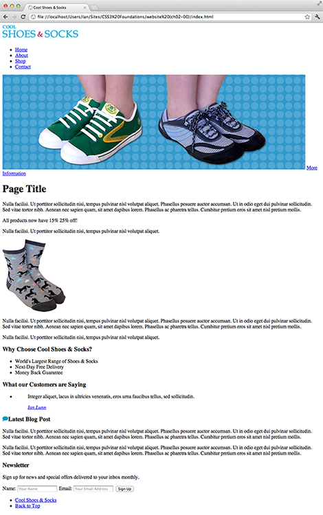
Figure 2-1 The index.html file when viewed in Google Chrome.
Getting Started with CSS
To create a new stylesheet file, follow these steps:
1. In your text editor, create a new file and name it styles.css.
2. Save the file in the css folder of your website project.
You must now reference that stylesheet in the web page.
Adding CSS to a Page
As you saw in the HTML template, the <head> is the place where you add metadata and reference the resources on which the page relies.
In the <head> section of index.html, reference the stylesheet you just created as follows:
<head>
<meta charset=”utf-8” />
<title>Cool Shoes & Socks</title>
<link rel=”stylesheet” href=”css/styles.css” type=”text/css” media=”all” />
<!--[if lt IE 9]>
<script src=”http://html5shiv.googlecode.com/svn/trunk/html5.js”>
</script>
<![endif]-->
</head>
Here, you add a link for which the relationship (rel) to this page is a stylesheet. The hypertext reference (href) points to the place where that stylesheet is located within your project files and is of type text/css. This stylesheet will be utilized across all media types. More on media types shortly. Note that when a page is using the HTML5 doctype <!DOCTYPE html>, specifying the type is optional.
Often, you require multiple stylesheets per page. To do this, you can simply add another <link>:
<link rel=”stylesheet” href=”css/styles.css” type=”text/css” media=”all” />
<link rel=”stylesheet” href=”css/styles2.css” type=”text/css” media=”all” />
Alternatively, within a stylesheet, you can use the @import rule, which is a reference from one stylesheet to another and can be added anywhere within a stylesheet:
@import url(“styles2.css”);
@import url(“styles3.css”);
Which approach is better? <link> performs better over @import (you can find out more about the performance impact of @import at: www.stevesouders.com/blog/2009/04/09/dont-use-import/) but on a live web page (on the web and viewable by everyone), neither approach is best!
When you’re creating a web page, separating styles into multiple sheets is a good idea to make managing styles easier. However, when a site is live, ideally, you should have only one stylesheet. This is best practice, making a web page more efficient. Whether you choose to use multiple <link> references within the HTML or use @import in your main stylesheet is entirely your choice. Just remember for good practice, you should merge all stylesheets into one when it’s time for a web page to go live. This is something you’ll do in Chapter 17.
Using Media Types
As mentioned in Chapter 1, you can apply a stylesheet to specific media types, such as screen, print, and handheld. Note that if a media attribute isn’t specified, a browser treats that referenced stylesheet as applying to all media types, like so:
<link rel=”stylesheet” href=”css/styles.css” type=”text/css” />
This is a safe (it works in all browsers) and slightly quicker way of referencing a stylesheet.
What about multiple stylesheets for different media types? No problem. Assume styles.css is the main CSS file applied to all media types, but you decide you want to add an extra stylesheet that is only applied when you print the web page. You can do that like so:
<link rel=”stylesheet” href=”css/styles.css” type=”text/css” />
<link rel=”stylesheet” href=”css/print.css” type=”text/css” media=”print” />
Here, the first <link> references a stylesheet to be applied to all media types (because you haven’t specified a media type). However, the second <link> references a stylesheet specifically for print. The main stylesheet still applies to all media types (including print), but the additional print stylesheet applies only to the print media type.
Sometimes styles within the print stylesheet can override the ones in the main stylesheet. Most of the time this will be intentional, but sometimes you get conflicts. The next chapter covers specificity and importance that determines which styles should be applied when style conflicts occur.
Much like using the @import rule for adding additional stylesheets into another stylesheet, you can also use the @media rule for defining styles for specific media types within a stylesheet.
Assume you have just one main stylesheet, like the following:
<link rel=”stylesheet” href=”css/styles.css” type=”text/css” />
Rather than adding another <link> to reference a print stylesheet, within styles.css, you can add the following with the main stylesheet:
@media print{
/*print styles here*/
}
Any styles within this @media rule are applied only to printed web pages. Anything outside this rule is applied to all media types.
You may find using media rules more desirable because it means referencing only one stylesheet, which is more efficient.
Inline Styles
In the earlier days of the web, it was possible to use inline styles, forgoing the need for a referenced stylesheet. In fact, you still are able to use inline styles today, but it’s advisable that you don’t.
Inline styles are those applied directly to HTML, as follows:
<body style=”color: blue; margin: 10px;”>
By applying styles in this way, you lose all the benefits previously mentioned. No longer can styles be shared across pages, pages become more difficult to maintain, and styles can’t be tailored to suit differing types of devices and environments.
Although the web has, fortunately, moved away from inline styles, e-mail hasn’t. E-mails are also created using HTML and CSS, but unlike the web, the standards and technologies haven’t moved forward.
E-mail clients are in the unfortunate position of relying on old technologies with a lack of standardization, and because of that, they often don’t support the CSS used in today’s modern web. Therefore, if you want to create an HTML/CSS-based e-mail, it is better to use inline styles.
User Agent Stylesheets
Before you begin applying styles to a page, it’s important to understand that browsers apply their own default stylesheet to every web page—often referred to as a user agent stylesheet.
User agent stylesheets add default styles to HTML elements. These styles make an HTML page without any custom CSS applied to it instantly readable. When creating a web page using these stylesheets, you don’t have to apply all the default CSS styles as defined by the CSS specification to elements yourself.
Figures 2-2 and 2-3 show the web page in Chrome and Internet Explorer 9, respectively. You may notice differences between the two. For example, the logo in Internet Explorer 9 has a blue border around it, but in Chrome it doesn’t. The reason is that these two browsers use different user agent stylesheets. Microsoft, the vendor of Internet Explorer 9, made the decision that a linked image should have a border around it; otherwise, you have no visual indication that it’s a link. Microsoft makes a fair point; but in most cases, this border is undesirable, and furthermore, no other modern browser does that.
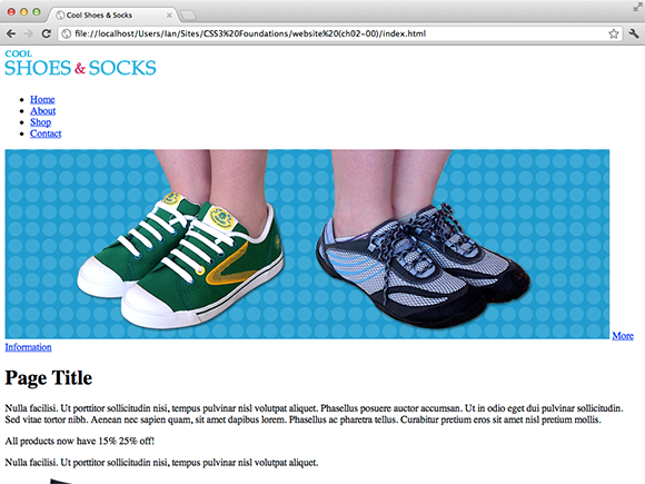
Figure 2-2 The index.html file when viewed in Google Chrome.

Figure 2-3 The index.html file when viewed in Internet Explorer 9.
In modern browsers, user agent stylesheets are similar, making creating cross-browser-compatible (pages that work in all browsers) pages easier, but particularly in older browsers, consistency isn’t so good. You can be thankful that there’s an easy solution to fix these inconsistencies.
Using a CSS Reset for Better Browser Consistency
A CSS Reset is a set of styles that overwrite user agent styles, making the default styles as consistent as possible across all browsers. Eric Meyer (www.meyerweb.com/eric/), an industry leader, has worked on improving this technique over many years, producing a small set of styles that make writing CSS much easier from the start.
By using a CSS Reset, you must add a few default styles back into your own CSS, because they are almost certainly required, but that is a small task when you consider how much easier it is to begin with consistent styles across all browsers.
To add a CSS Reset to the web page, follow these steps:
1. Copy and paste Eric Meyer’s CSS Reset from www.meyerweb.com/eric/tools/css/reset/.
2. Create a new file and name it reset.css.
3. Paste the CSS Reset into reset.css.
4. Save reset.css into your css folder (which should already contain styles.css).
5. In styles.css, add the following:
@import url(“reset.css”);
6. Save styles.css.
You’ve now added an additional stylesheet and imported it into the main stylesheet. Remember, using multiple stylesheets when you create your web page makes for a more efficient workflow, but before you make a website live, it’s good practice to add all stylesheets into one. If you’d like to do that now, simply paste Eric Meyer’s CSS Reset into the top of styles.css instead of a new file.
Eric Meyer’s CSS Reset as of July 2012:
/* http://meyerweb.com/eric/tools/css/reset/
v2.0 | 20110126
License: none (public domain)
*/
html, body, div, span, applet, object, iframe,
h1, h2, h3, h4, h5, h6, p, blockquote, pre,
a, abbr, acronym, address, big, cite, code,
del, dfn, em, img, ins, kbd, q, s, samp,
small, strike, strong, sub, sup, tt, var,
b, u, i, center,
dl, dt, dd, ol, ul, li,
fieldset, form, label, legend,
table, caption, tbody, tfoot, thead, tr, th, td,
article, aside, canvas, details, embed,
figure, figcaption, footer, header, hgroup,
menu, nav, output, ruby, section, summary,
time, mark, audio, video {
margin: 0;
padding: 0;
border: 0;
font-size: 100%;
font: inherit;
vertical-align: baseline;
}
/* HTML5 display-role reset for older browsers */
article, aside, details, figcaption, figure,
footer, header, hgroup, menu, nav, section {
display: block;
}
body {
line-height: 1;
}
ol, ul {
list-style: none;
}
blockquote, q {
quotes: none;
}
blockquote:before, blockquote:after,
q:before, q:after {
content: ‘’;
content: none;
}
table {
border-collapse: collapse;
border-spacing: 0;
}
You come to understand this CSS in the following chapters.
After you add a CSS Reset, compare the web page in Chrome and Internet Explorer 9 again (see Figures 2-4 and 2-5). They’re much more consistent now, right? The blue border has been removed from the logo in Internet Explorer 9 and the spacing between elements is almost exactly the same.
In these figures, you may notice that a lot of the spacing between elements has been removed, but you add that again shortly.

Figure 2-4 The index.html file in Chrome with a CSS Reset applied to it.
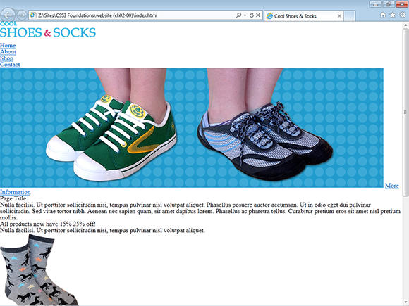
Figure 2-5 The index.html file in Internet Explorer 9 with a CSS Reset applied to it.
Summary
In this chapter, you’ve set up the project files that are worked on throughout CSS3 Foundations. By adding a CSS Reset to the project, you’ve given yourself a more consistent base to begin working from.
In the next chapter, you’ll learn about the syntax of CSS (the rules of how it should be written), and start selecting elements to be styled using Selectors.