chapter fourteen
Bringing Your Website to Life with Transitions and Animations
Possibly CSS3’s most exciting features are transitions and animations. Transitions allow the values of properties to change smoothly over a specific duration, meaning the color of an element can fade from red to blue, slide from one area of the page to another, shrink and grow when hovered over, and so on. The possibilities are endless.
Whereas transitions change an element from a start to end state, animations allow you to have more control over those states, specifying keyframes, the exact moments when a property should change.
Project files update (ch14-00): If you haven’t followed the previous instructions and are comfortable working from here onward or would like to reference the project files up to this point, you can download them from www.wiley.com/go/treehouse/css3foundations.
Animating Elements from A to B Using Transitions
To demonstrate transitions, make the “25% Off” banner transition in size when it’s hovered over. Before you add transitions to the element though, first set up the start and end states of the transition:
1. In styles.css, find the .banner-ad rule set and modify the transform declaration to reduce the scale() function, as follows:
-webkit-transform: translate(75px, -25px) rotate(-45deg) scale(.8);
2. Below the .banner-ad rule set, add a new rule set:
.banner-ad:hover {
cursor: default;
-webkit-transform: translate(75px, -25px) rotate(-45deg) scale(1.1);
}
3. Save styles.css.
As yet, these changes haven’t added a transition to the banner. In the first step, you make the banner scale down to 80%. Then by adding the .banner-ad:hover rule set, you make it so that the banner will scale up to 110% when hovered over. Think of the first rule set as the start state and the :hover rule set as the end state of a transition. You are telling the browser how the banner should look at the start and end. Now you need to tell it how to transition between those two states using several transition properties.
transition-property
Initial value: all | Inherited: No | Applies to: all elements | CSS3
Unprefixed browser support: IE 10+, Firefox 16+, Opera 12.5+
Prefixed browser support: Firefox 4+, Chrome 4+, Opera 10.5+, Safari 3.1+
Because an element can have many different CSS properties applied to it, when making it transition, you might need to be specific about which property is transitioned. For example, say an element has the following properties:
color: blue;
height: 100px;
The initial value for transition-property is all, meaning all animatable properties are animated. You might want only the color property to transition, though. The transition-property allows you to specify that.
1. In styles.css, in the .banner-ad:hover rule set, add the following declaration:
-webkit-transition-property: -webkit-transform;
2. Save styles.css.
The -webkit-transform value refers to the property in the same rule set, which you added a moment ago:
-webkit-transform: translate(75px, -25px) rotate(-45deg) scale(1.1);
Although you’ve now told the browser you only want the transform declaration to animate, it won’t animate until a duration is also specified, which you’ll do in a moment.
The only other property in this rule set is cursor: default;, which is a property that can’t be animated anyway. Technically, you could get away with not including this declaration in the rule set because the initial value of all selects only the transform property anyway. Of course, for maintainable CSS, it’s better practice to specify exactly which properties you want to animate in case you add more properties in the future that you may not want to have animated.
If you want to specify more than one property, separate each with a comma, like so:
transition-property: transform, color;
 For a list of properties that can be animated, see the list of animatable properties at
 www.w3.org/TR/css3-transitions/#animatable-properties.
transition-duration
Initial value: 0s | Inherited: No | Applies to: all elements | CSS3
Unprefixed browser support: IE 10+, Firefox 16+, Opera 12.5+
Prefixed browser support: Firefox 4+, Chrome 1+, Opera 11.6+, Safari 3+
Now that the browser knows you want to have the transform property transition, you need to tell it how long that transition should take—the time between going from the start to end states.
1. In the .banner-ad:hover rule set, add the following declaration:
-webkit-transition-duration: 1s;
2. Save styles.css.
Here, you specify a one-second duration between the start and end states. Hover over the banner in your browser, and you see this happen (see Figure 14-1). Cool, right? The banner now transitions from an 80% scale to 110% over a one-second period.

Figure 14-1 The start and end states of the banner.
The transition-duration is specified in seconds although if you want a millisecond value, you can place a decimal point before the value; that is, .1s is the equivalent of 100 milliseconds.
transition-timing-function
Initial value: ease | Inherited: No | Applies to: all elements | CSS3
Unprefixed browser support: IE 10+, Firefox 16+, Opera 12.5+
Prefixed browser support: Firefox 4+, Chrome 1+, Opera 11.6+, Safari 3+
Although you’ve now achieved the transition on the banner, you can use a few more properties to have even more control over the effect. The transition-timing-function property describes how the intermediate values used during a transition are calculated—in other words, how the bit between the start and end acts.
The initial value for transition-timing-function is ease, and there are a lot of other keyword values you can use with it, too:
• ease—This timing function starts gently (not quite slow), speeds up in the intermediate, and then ends slow.
• linear—Start, intermediate, and end are all at the same constant speed.
• ease-in— This timing function starts slow, speeds up in the intermediate, and continues until end.
• ease-out—Start and intermediate are the same speed, then it slows down at the end.
• ease-in-out— This timing function starts slow, speeds up in the intermediate. and slows down at the end.
• step-start— This timing function jumps immediately to the end and stays there.
• step-end— This timing function stays in its start state until the end and then jumps immediately to the end state.
There are also some advanced functions you can use to really have complete control over the transition: steps() and cubic-bezier().
These functions aren’t covered in CSS3 Foundations because they are a little too advanced, but if you want to know more, visit www.w3.org/TR/css3-transitions/#transition-timing-function-property. If you want to experiment with cubic-bezier(), which essentially allows you to create the keyword values and everything in between, I recommend visiting http://cubic-bezier.com/, which allows you to easily create your own timing functions.
transition-delay
Initial value: 0s | Inherited: No | Applies to: all elements | CSS3
Unprefixed browser support: IE 10+, Firefox 16+, Opera 12.5+
Prefixed browser support: Firefox 4+, Chrome 1+, Opera 11.6+, Safari 3+
The final transition property is transition-delay, which allows you to specify a delay that occurs prior to the transition starting. Its initial value of 0s means a transition will start immediately. A transition-delay of 1s, for example, causes the browser to wait one second prior to starting a transition. As with transition-duration, if you would like to use an amount less than one second, you can place a decimal point before the value to specify milliseconds.
With transition-delay, you also are able to specify a negative value. Assuming you give the banner a transition-delay of -.5s, the transition does not occur for half a second and then appears to begin partway through—from half a second onward.
transition (Shorthand)
Unprefixed browser support: IE 10+, Firefox 16+, Opera 12.5+
Prefixed browser support: Firefox 4+, Chrome 1+, Opera 11.6+, Safari 3+
To make working with transitions easier, you can combine the transition-related properties into one easy-to-use declaration using the transition property.
1. In styles.css, in the .banner-ad:hover rule set, remove the following declarations:
-webkit-transition-property: -webkit-transform;
-webkit-transition-duration: 1s;
2. In their place, add the shorthand declaration:
-webkit-transition: -webkit-transform 1s;
3. Save styles.css.
The shorthand property should take the following syntax:
transition: transition-property transition-duration transition-timing-function transition-delay;
Because you don’t use transition-timing-function and transition-delay properties here, you can omit them from the shorthand declaration. Note that because transition-duration and transition-delay can be given the same type of value, the order in which they are specified is important. The first value is treated as the duration; and the second, the delay.
When applying the transition to more than one property, you should separate values of the transition shorthand property with a comma. For example,
transition: transform 1s ease 0s, color 2s linear 0s;
This declaration causes the transform property in a rule set to transition for one second with an ease and the color property to transition for two seconds with a linear timing function. Neither property has a delay.
Making the Banner Transition Back to Its Normal State
Now that the banner is transitioning just the way you like when it’s hovered over, you may notice it snaps back to its start state when the cursor is moved away from it. How to make it transition back? All you need to do is apply the same transition declaration to the .banner-ad rule set:
1. In the .banner-ad rule set, add the following declaration:
-webkit-transition: -webkit-transform 1s;
2. Save styles.css.
Code Challenge: Make the Sidebar Sections Transition
In styles.css, do the following:
1. In the .sidebar aside:hover rule set, add the declaration -webkit-transition: -webkit-transform .5s;.
2. Add a new rule set for .sidebar aside below the .sidebar rule set with the declaration -webkit-transition: -webkit-transform .5s;.
Project files update (ch14-01): If you haven’t followed the previous instructions and are comfortable working from here onward or would like to reference the project files up to this point, you can download them from www.wiley.com/go/treehouse/css3foundations.
Animating Elements from A to Z Using Keyframes
The transitions you just added to the page make an element smoothly change from one property value to another over a specific period of time. These transitions occur when an event is triggered, such as a user hovering over an element.
Animations also make an element smoothly change between different property values, but unlike transitions, they don’t have to just consist of a start and end state. Using keyframes, you can create points that an animation should reach before changing again, allowing much more control over the effect onscreen. If an animation is 10 seconds long, you can specify exactly what happens over that period of time, maybe changing an element’s color to blue at 2 seconds, green at 6 seconds, and black at 10 seconds. Animations can also be triggered by events or can be started when the page is loaded, with options to allow you to decide how many times an animation should repeat.
To demonstrate animations, you turn the product showcase (the section with the image of some trainers and a More Information button) into a set of images that cycle from one to the other.
Set up the basics first:
1. In index.html, find the following code:
<div class=”showcase”>
<img src=”images/banner-trainers.jpg”
alt=”Some of our cool trainers” />
<a class=”button purchase” href=”#” title=”Purchase product”>
More Information
</a>
</div>
2. Replace it with the following:
<div class=”showcase”>
<ul>
<li>
<img src=”images/banner-trainers.jpg”
alt=”Some of our cool trainers” />
</li>
<li>
<img src=”images/banner-shoes.jpg”
alt=”Some of our cool shoes” />
</li>
</ul>
<a class=”button purchase” href=”#” title=”Purchase product”>
More Information
</a>
</div>
3. Save index.html.
This HTML adds two product images to the product showcase (you add a third later), each in its own list item <li>, as shown in Figure 14-2. Using CSS, you place one image over the other so only one can be seen at a time. You then use CSS3 animation properties to make the images cycle between one another.
4. In styles.css, find the .showcase .button rule set and increase the z-index from 5 to 9.
5. Find the .showcase .button:hover rule set, and below it, add these rule sets:
.showcase ul {
background: #009CC8;
position: relative;
z-index: 9;
}
.showcase li {
position: absolute;
top: 0;
width: 100%;
}
.showcase li:first-child {
z-index: 3;
position: relative;
}
.showcase li:nth-child(2) {
z-index: 2;
}
6. Save styles.css.

Figure 14-2 The Cool Shoes & Socks page zoomed out to show two product images in the showcase, which will be eventually be positioned one over the other.
When you add this CSS, the Cool Shoes & Socks page appears the way it did prior to your adding the new showcase HTML. However, the second product image now sits behind the first. When you make .showcase ul a relative position, its child elements (the list items <li>) can be positioned absolutely. The z-index of 9 makes it appear above all positioned elements, apart from the drop-down menu.
Each list item <li> is positioned absolute so that it doesn’t affect the flow of the document and is placed at the top of the showcase (making all list items added to the showcase stack on top of each other).
By using the pseudo-selector :first-child, you select the first list item that contains a product image. Because this is the first product image to be displayed, it’s given a z-index of 3 (you eventually make the product image consist of three images). In the preceding paragraph, I said that each list item is positioned absolute so it doesn’t affect the document flow and the items can be stacked on top of each other. If the list items were all left like this, the showcase would disappear because it has no contents affecting it, and its height would become 0 px. To stop this from happening, you position the first list item only as relative. This way, it still affects the document’s flow, and because it’s the first image in the showcase anyway, it is always at the top. Another way to work around this situation is make the position of all list items absolute and then specify a height for .showcase ul. If you do this, though, the product showcase is always a set height and doesn’t shrink with the images when the browser window is resized.
Finally, you use another pseudo-selector, .showcase li:nth-child(2), to select the second list item and place that below the first, using z-index.
With this code added, you’re good to go! Now to animate the showcase images...
@keyframes
Unprefixed browser support: IE 10+, Firefox 16+, Opera 12.5+
Prefixed browser support: Firefox 5+, Chrome 1+, Opera 12+, Safari 4+
When creating CSS animations, you must declare the states of an animation in a @keyframes rule. Because animations are still experimental, you should prefix the @keyframes rule, such as @-webkit-keyframes.
1. In styles.css, below the .showcase .button:hover rule set, add a @keyframes rule:
@-webkit-keyframes fadeOut {
}
This rule consists of the prefixed @-webkit-keyframes keyword and an identifier fadeOut, which is the name of the animation you will create; you’re free to use whatever identifier you like. The name of the @keyframes rule is referenced using the animation-name property, which links the animation you’re going to create to the element you want it to apply to.
Within this @keyframes rule, you can now place rule sets that act as the states of the animation:
2. In the @-webkit-keyframes fadeOut rule, add the following rule sets:
from {
opacity: 1;
}
to {
opacity: 0;
}
3. Save styles.css.
The first rule set, from, tells the browser an element should begin with an opacity of 1 (opaque) and then animate to an opacity of 0 (transparent). Because the fadeOut animation is not yet linked to an element, no elements fade yet.
The from keyword represents 0% of an animation (the start), and the to keyword represents 100% (the end). An animation that goes from 0% to 100% works in the same way as a transition (changing from one style to another), but within animations, unlike transitions, you can add keyframes anywhere, using percentage values. Later, you use this rule to complete the cycling product showcase:
@-webkit-keyframes fadeOut {
from {
opacity: 1;
z-index: 4;
}
16.666% {
opacity: 0;
z-index: 4;
}
50% {
opacity: 0;
z-index: -1;
}
51%{
opacity: 1;
}
}
This animation makes an element start with a z-index of 4, and then 16.666% (I explain this percentage later) into the animation, change its opacity to 0 (fading out the element). At 50% in, the z-index changes to -1 (moving the element behind other elements in the product showcase), and then at 51% in, the opacity changes back to 1 to make the element visible again, ready for the animation to be cycled.
Don’t worry if this description goes over your head. For now, stay with the simple from - to animation to learn how to apply it to an element and then come back to this more complex animation later.
animation-name
Initial value: none | Inherited: No | Applies to: all elements | CSS3
Unprefixed browser support: IE 10+, Firefox 16+, Opera 12.5+
Prefixed browser support: Firefox 5+, Chrome 1+, Opera 12+, Safari 4+
The animation-name property links an element to a @keyframes rule. The animation you added to styles.css is called fadeOut, so reference that now:
1. In styles.css, in the .showcase li:first-child rule set, add the following declaration:
-webkit-animation-name: fadeOut;
2. Save styles.css.
That’s all there is to it. The first list item now has the fadeOut animation applied to it, but the element doesn’t animate just yet because it doesn’t know how long to animate.
You can also give the animation-name the value none, in case you need to stop an element from inheriting an animation.
animation-duration
Initial value: 0s | Inherited: No | Applies to: all elements | CSS3
Unprefixed browser support: IE 10+, Firefox 16+, Opera 12.5+
Prefixed browser support: Firefox 5+, Chrome 3+, Opera 12+, Safari 4+
animation-duration works in the exact same way as transition-duration. You give it a value in seconds, like so:
1. In .showcase li:first-child add the following declaration:
-webkit-animation-duration: 5s;
2. Save styles.css.
With the animation-duration added to the first list item, when the page loads, the animation runs, causing the image to go from an opacity of 1 to 0 over a five-second period. As the first image fades out, the second that sits behind it is shown, as shown in Figure 14-3.
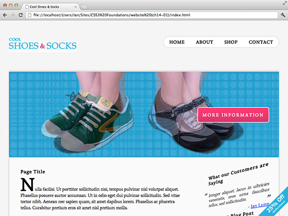
Figure 14-3 The first product image midway through fading out, revealing the second product image.
animation-timing-function
Initial value: ease | Inherited: No | Applies to: all elements | CSS3
Unprefixed browser support: IE 10+, Firefox 16+, Opera 12.5+
Prefixed browser support: Firefox 5+, Chrome 3+, Opera 12+, Safari 4+
animation-timing-function does exactly the same as the transition-timing-function property. It describes how the intermediate values used during a transition are calculated. Because animations can repeat multiple times, the animation-timing-function describes these intermediate values over each cycle of an animation.
1. In .showcase li:first-child, add the following declaration:
-webkit-animation-timing-function: ease-in-out;
2. Save styles.css.
For the full list of timing functions you can use, see the transition-timing-function property description earlier in this chapter.
animation-delay
Initial value: 0s | Inherited: No | Applies to: all elements | CSS3
Unprefixed browser support: IE 10+, Firefox 16+, Opera 12.5+
Prefixed browser support: Firefox 5+, Chrome 3+, Opera 12+, Safari 4+
Just like transitions, animations can also be given a delay, which works in the exact same way.
1. In .showcase li:first-child, add the following declaration:
-webkit-animation-delay: 5s;
2. Save styles.css.
Now, when the page is first loaded, the first product image doesn’t start fading out until after a five-second delay.
As with transition-delay, you can also specify a negative delay that causes an animation to wait for x number of seconds and then start x number of seconds into that animation.
animation-iteration-count
Initial value: 1 | Inherited: No | Applies to: all elements | CSS3
Unprefixed browser support: IE 10+, Firefox 16+, Opera 12.5+
Prefixed browser support: Firefox 5+, Chrome 3+, Opera 12+, Safari 4+
animation-iteration-count determines how many times an animation should occur. You can give it a number or the keyword infinite to make an animation cycle with no end. By default, animation-iteration-count is 1.
1. In .showcase li:first-child, add the following declaration:
-webkit-animation-iteration-count: infinite;
2. Save styles.css.
When you make the iteration count infinite, the animation constantly cycles with no end.
animation-direction
Initial value: normal | Inherited: No | Applies to: all elements | CSS3
Unprefixed browser support: IE 10+, Firefox 16+, Opera 12.5+
Prefixed browser support: Firefox 5+, Chrome 3+, Opera 12+, Safari 4+
At the moment, the opacity of the product image is animated to make it fade out, but when the animation cycles back to its start, the image instantly snaps back to opaque, which doesn’t look quite right. Using the animation-direction property, you can make the animation reverse when it reaches its end.
1. In .showcase li:first-child add the following declaration:
-webkit-animation-direction: alternate;
2. Save styles.css.
When you alternate the animation direction, odd iterations of the animation cause the product image to fade out, and each even iteration reverses the animation, making the product image fade in, achieving a much more subtle effect.
You can use the following keywords with animation-direction:
• normal (initial value)—All iterations of the animation are played as specified.
• reverse—All iterations of the animation are played in the reverse direction from the way they were specified.
• alternate—The animation cycle iterations that are odd counts are played in the normal direction, and the animation cycle iterations that are even counts are played in reverse.
• alternate-reverse—The animation cycle iterations that are odd counts are played in reverse, and the animation cycle iterations that are even counts are played in a normal direction.
The reverse and alternate-reverse keywords are currently only supported in Internet Explorer 10+, Firefox 16+, and Chrome 19+.
Note that when an animation is reversed, the timing functions are also reversed. So, when played in reverse, an ease-in animation appears to be an ease-out animation.
animation-play-state
Initial value: running | Inherited: No | Applies to: all elements | CSS3
Unprefixed browser support: IE 10+, Firefox 16+, Opera 12.5+
Prefixed browser support: Firefox 5+, Chrome 3+, Opera 12+, Safari 4+
The animation-play-state property determines whether or not an animation is paused. By default, all animations have the value running, but you can also use paused to pause an animation.
1. In styles.css, below the .showcase li rule set, add the following rule set:
.showcase ul:hover li {
-webkit-animation-play-state: paused;
}
2. Save styles.css.
With this rule set, whenever the product showcase .showcase ul is hovered over, each list item that contains an image is paused.
animation-fill-mode
Initial value: none | Inherited: No | Applies to: all elements | CSS3
Unprefixed browser support: IE 10+, Firefox 16+, Opera 12.5+
Prefixed browser support: Firefox 5+, Chrome 3+, Opera 12+, Safari 4+
The last property to be used with animations is animation-fill-mode, which defines what values are applied by the animation outside the time it is executing.
The initial value for animation-fill-mode is none, meaning properties defined in a @keyframes rule apply only to an element while it is being animated.
Before you added the animation-direction property with a value of alternate, the animation just snapped back to the beginning when it reached its end, which looked a little messy. Sometimes you just want an animation to run on an element and then stay that way after the animation finishes. You can achieve this effect by using the animation-fill-mode value forwards. This value tells the browser that after an animation ends, the final styles applied to the element in that animation should continue forward, outside the animation’s execution time.
Likewise, you can use an animation-fill-mode value of backwards to have the first values of an animation applied to an element before the animation begins, or a value of both, which combines the forwards and backwards values.
Because the fadeOut animation you currently have set up is infinite (it has no end), changing the animation-fill-mode doesn’t make a difference, but you use it later to make the cycling image showcase better.
animation (Shorthand)
Unprefixed browser support: IE 10+, Firefox 16+, Opera 12.5+
Prefixed browser support: Firefox 5+, Chrome 3+, Opera 12+, Safari 4+
In total, eight properties relate to animations, and for this reason, they can be combined into the shorthand property animation—all except animation-play-state because, as you saw, that tends to get added to a different rule set, such as :hover.
The shorthand property should take the following syntax:
animation: animation-name animation-duration animation-timing-function animation-delay animation-iteration-count animation-direction animation-fill-mode
Just like the transition shorthand, because some values can be the same (such as animation-duration and animation-delay), the order in which the animation property is formed is important.
1. In styles.css, remove the six animation properties from .showcase li:first-child and replace with the following shorthand animation declaration:
-webkit-animation: fadeOut 5s ease-in-out 5s infinite alternate;
2. Save styles.css.
Using this shorthand doesn’t change the page visually in any way; it’s just a nicer and more maintainable way to write animations.
Project files update (ch14-02): If you haven’t followed the previous instructions and are comfortable working from here onward or would like to reference the project files up to this point, you can download them from www.wiley.com/go/treehouse/css3foundations.
Creating a Cycling Image Showcase
You’ve learned how to use the animation properties, but the cycling image showcase consists of only two images and doesn’t particularly look that great yet. Now take a look at a slightly more advanced animation technique.
Start by adding a third image to the product showcase:
1. In index.html, look for the following HTML:
<li>
<img src=”images/banner-shoes.jpg”
alt=”Some of our cool shoes” />
</li>
2. Below that HTML, add another list item:
<li>
<img src=”images/banner-socks.jpg”
alt=”Some of our cool socks” />
</li>
3. Save index.html.
Because the current fadeOut animation only hides and shows the top image over a five-second period, this newly added third image won’t ever be shown with the animation as it is.
1. In styles.css, below the .showcase li:nth-child(2) rule set, add a new rule set for the third product:
.showcase li:nth-child(3) {
z-index: 1;
}
2. Remove the following declaration from .showcase li:first-child:
-webkit-animation: fadeOut 5s ease-in-out 5s infinite alternate;
Here, you remove the animation from the first product so that you can apply an animation to all the images; that way, they each fade out.
3. In the .showcase li rule set, add the following declaration:
-webkit-animation: fadeOut 15s ease-in-out 5s infinite forwards;
4. Save styles.css.
This animation is modified somewhat. It still refers to the fadeOut @keyframes animation but now spans over a 15-second period and no longer alternates (goes in reverse when it reaches the end). The animation also has a 5-second delay. Because this animation applies to all the products in the showcase, they all fade out at the same time. Now make it so that they fade out at different times.
5. In the .showcase li:nth-child(2) rule set, add the following declaration:
-webkit-animation-delay: 10s;
6. In the .showcase li:nth-child(3) rule set, add the following declaration:
-webkit-animation-delay: 15s;
7. Save styles.css.
A useful feature of CSS is that you can apply the shorthand animation property to multiple elements but then overwrite individual values of animation, as you do here—overwriting the animation-delay. The second product image now has a 10-second delay, and the third has a 15-second delay.
Finally, you need to adjust the animation itself to get the product images fading out one at a time.
8. In the @-webkit-keyframes fadeOut rule, replace the from and to rule sets with the following:
from {
opacity: 1;
z-index: 4;
}
16.666% { /*2.5s*/
opacity: 0;
z-index: 4;
}
50% { /*7.5s*/
opacity: 0;
z-index: -1;
}
51%{
opacity: 1;
}
9. Save styles.css.
With this animation now added to the stylesheet, each product image is visible for 5 seconds and then takes 2.5 seconds to fade out (revealing the next image).
I added comments to the 16.666% and 50% rule sets to show that they are active at 2.5 seconds and 7.5 seconds into the animation, but because there’s quite a lot going on here, let’s take a closer look at what’s happening (see Figure 14-4).
After the initial 5-second delay on the first product (which occurs only once, when the page loads), the from rule set is activated, and the first product is placed on top of the others and made opaque. From the start of the animation, the first product image begins to fade until it is completely transparent at 16.666% into the animation (16.666% of 15 seconds is roughly 2.5 seconds).
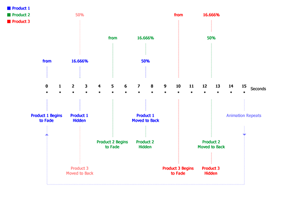
Figure 14-4 The events of the animation over a 15-second period.
So, at 2.5 seconds into the animation, the first product is now transparent, which means the second is showing. For another 2.5 seconds, the second image is displayed until it too begins to fade.
At 50% into the animation (7.5 seconds), the third image is displayed because the second product image is transparent, and the first image is moved behind them both.
Just after the first image is moved to the back, at 51%, is it then made opaque, ready and waiting for the third image to fade and reveal it, completing one cycle of the animation.
Summary
CSS3’s transitions and animations are great additions to the technology you have for creating web pages. The most exciting aspect is that because they’re so new, there are many cool things to be done with them yet to be discovered; you just need some imagination!
Unfortunately, transitions and animations aren’t supported in all browsers, but because they only add an extra edge to the page, the fact that some browsers don’t understand them doesn’t matter. You can safely use them in the knowledge that in their absence they don’t cause a page to look broken.
In the next chapter, you look at the Cool Shoes & Socks page you created using other web browsers and begin fixing their inconsistencies to make the page cross browser compatible.