chapter thirteen
Going Beyond with 3D Transforms
In the preceding chapter, you used the transform property to create 2D visual effects, but you can also use it for 3D effects. As with the 2D effects, the 3D effects are great for adding visual flair to a site, especially when used in conjunction with the transitions and animations covered in the next chapter.
At the time of writing, Internet Explorer 10 and Firefox 16 do not require vendor prefixes for properties relating to 3D transforms. Like 2D transforms though, for the safest possible implementation, use vendor prefixed properties followed by the official unprefixed property.
In this chapter, you make the Cool Shoes & Socks sidebar rotate in a 3D space.
Project files update (ch13-00): If you haven’t followed the previous instructions and are comfortable working from here onward or would like to reference the project files up to this point, you can download them from www.wiley.com/go/treehouse/css3foundations.
perspective
Initial value: none | Inherited: No | Applies to: All elements with a display declaration relating to block, inline or table | CSS3
Unprefixed browser support: IE 10+, Firefox 16+
Prefixed browser support: Firefox 10+, Chrome 12+, Safari 4+
Before you can begin making elements 3D, you need to create a 3D space using the perspective property.
1. In styles.css, find the #main rule set and add the following declaration:
-webkit-perspective: 1000px;
2. Save styles.css.
This declaration doesn’t create any visual effect on the page; it just tells the browser to make the main content container <div id=”main” class=”group”> 3D.
Think of the perspective as being how far the viewer is from an object.
Figure 13-1 shows that if perspective is 50px and an element is moved toward the viewer by 25px, the element is 50% closer to the viewer. If perspective is 500px and the element is again moved toward the viewer by 25px, the element is only 5% closer. A lower number of pixels applied to the perspective creates a greater visual impact because the viewer appears to be closer to the elements onscreen.

Figure 13-1 A low number applied to perspective has a greater visual impact.
You can give perspective any unit of length as a value.
perspective-origin
Initial value: 50% 50% | Inherited: No | Applies to: All elements with a display declaration relating to block, inline or table | CSS3
Unprefixed browser support: IE 10+, Firefox 16+
Prefixed browser support: Firefox 10+, Chrome 12+, Safari 4+
Whereas perspective determines how far the viewer appears to be looking at a 3D element, perspective-origin determines the appearance of the viewer’s position. The initial value of 50% 50% means the viewer will see a 3D element as if that viewer is looking at it straight on. The X and Y position will be in the middle.
Again, perspective-origin just sets up the 3D space for the elements within it, so alone it doesn’t create any visual representation. I demonstrate how it does affect elements in a moment when using the transform function, translateZ().
perspective-origin takes two values, the X and Y positions, and can be given any length value; a percentage; or the keywords left, center, right, top, and bottom. A percentage value of 0% 0% is the equivalent of left top, 100% 100% is right bottom, and so on. If only one value is given, the second is assumed to be center.
transform and 3D Transform Functions
Initial value: none | Inherited: No | Applies to: All elements with a display declaration relating to block, inline or table | CSS3
Unprefixed browser support: IE 10+, Firefox 16+
Prefixed browser support: Firefox 10+, Chrome 12+, Safari 4+
In the preceding chapter, you used 2D transform functions such as translateX(), translateY(), scaleX(), scaleY(), and so on. When creating 3D transforms, you can use functions that control the Z axis along with the X and Y axes.
translateZ() and translate3d()
Whereas the functions translateX() and translateY() move an element left and right and up and down, the translateZ() function moves forward and back (toward and away from the viewer).
The following instructions are temporary, used to demonstrate translateZ(). If you’d like to follow them to experiment in your own browser, note that the additional HTML and CSS will be removed afterward.
Place an empty <div class=”temp”></div> element immediately inside the main container <div id=”main” class=”group”> and give it the following rule set:
.temp {
border: black solid 5px;
box-sizing: border-box;
position: absolute;
height: 100%;
width: 100%;
}
Temporarily remove the padding declarations from the #main rule set and make it position: relative; so that the empty <div class=”temp”> becomes the same width and height, as shown in Figure 13-2.

Figure 13-2 Google Chrome zoomed out to show the empty div with a black border around it.
With the main content container <div id=”main” class=”group”> set to have a perspective of 1000px, its direct child elements can be moved in that 3D space, which is what you can do with the empty <div class=”temp”>:
-webkit-transform: translateZ(-500px);
After you transform the empty <div class=”temp”> and move it back 500 pixels on the Z axis, it appears to move away from the viewer, as shown in Figure 13-3.
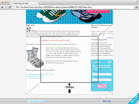
Figure 13-3 The empty div, moved back 500px in the 3D space of the main container.
Now look at how perspective-origin can affect this 3D effect by applying the following declaration to the #main rule set:
-webkit-perspective-origin: 30% 30%;
As Figure 13-4 shows, when you change the perspective-origin, the element is no longer viewed straight on. The viewer now sees the element as if looking at it from an angle.

Figure 13-4 The empty div, now viewed from a different perspective origin.
Of course, this is just a visual demonstration to better show how 3D space works on a 2D screen.
To add a real-world 3D effect, remove the previous modifications if you chose to follow them, then go ahead and apply translateZ(), like so:
1. In styles.css, below the .sidebar rule set, add a new rule set:
.sidebar:hover {
-webkit-transform: translateZ(100px);
}
2. Save styles.css.
Now, when the sidebar is hovered over, it appears to move toward the viewer by 100px, as shown in Figure 13-5. You may think this effect seems excessive, and I agree! At the moment, the entire sidebar moves forward, which may get annoying for the user. Shortly, you change this effect so it applies only to the newsletter box, and I explain why you can’t do that just yet.

Figure 13-5 The Cool Shoes & Socks page zoomed out to show the sidebar moves toward the viewer when hovered over.
When creating 3D effects, if you are declaring more than one translate function, instead of specifying translateX(), translateY(), and translateZ(), you can use the shorthand function translate3d(), which takes three arguments: the X axis, Y axis, and Z axis, in that order.
rotateX(), rotateY(), rotateZ(), and rotate3d()
In the preceding chapter where you manipulated elements in two dimensions, you rotated the “25% Off” banner using the rotate() function.
When rotating in 2D, elements can be rotated only clockwise or counterclockwise. Now that the main content container is a 3D space, any elements within it can be rotated not just in 2D but in 3D too, either rotated on the X, Y, or Z axis, or a combination.
Now rotate the sidebar of the Cool Shoes & Socks page.
1. In styles.css, find the .sidebar rule set and add the following declaration:
-webkit-transform: rotateX(10deg);
2. Save styles.css.
rotateX() rotates an element on the X axis. Rotated on a positive angle, the .sidebaris rotated away from the viewer at the top and toward the viewer at the bottom, as shown in Figure 13-6; it kind of looks like the Star Wars opening crawl text! A 180-degree rotation on the X axis would flip an element vertically.

Figure 13-6 The Cool Shoes & Socks page zoomed out to show the sidebar rotated on the X axis by 10 degrees.
Because the X axis rotation is unsuitable for the page, change it to a Y axis rotation instead.
3. In the .sidebar rule set, modify the transform declaration as follows:
-webkit-transform: rotateY(-40deg);
4. Save styles.css.
Rotating on the Y axis by a positive angle rotates an element’s left side toward the viewer and right side away. The opposite occurs when rotating by a negative angle, which is what you do by modifying the transform declaration, as shown in Figure 13-7. A 180-degree rotation on the Y axis would flip an element horizontally.

Figure 13-7 The Cool Shoes & Socks page zoomed out to show the sidebar rotated on the Y axis by –40 degrees.
Finally, using rotateZ() to rotate on the Z axis achieves the same effect as the rotate() function in a 2D space. A positive angle rotates an element clockwise; and a negative angle, counterclockwise.
If rotating more than one axis, you may consider using the shorter rotate3d() function, which should be given the X, Y, and Z values in that order.
scaleZ() and scale3d()
If you can translate and rotate in 3D, you won’t be surprised to read you can scale, too. A quick recap: scaleX()scales an element horizontally, and scaleY()scales an element vertically. So what about scaleZ()?
scaleZ() controls depth but, of course, not the depth of the element because an element doesn’t have a thickness; it can only be flat. scaleZ() works in conjunction with translateZ() to scale an element along the Z axis, affecting its visual size (although not its actual dimensions) as if it were moved toward or away from the viewer.
At the moment, when the sidebar is hovered over, it’s moved forward 100px by this declaration:
-webkit-transform: translateZ(100px);
You can increase this visual effect by scaling on the Z axis:
1. In styles.css, find the .sidebar:hover rule set and modify the transform declaration:
-webkit-transform: scaleZ(2) translateZ(100px);
2. Save styles.css.
This modification scales the sidebar on the Z axis by 2, meaning the size of the element is the same size as if it were sitting on the Z axis at 200px, as shown in Figure 13-8. Again, this effect is over the top, but you can make it a little more sophisticated as you go on.

Figure 13-8 The sidebar scaled on the Z axis by 2.
A transform such as
transform: scaleZ(2) translateZ(100px);
creates the same visual effect as
transform: translateZ(200px);
scaleZ() can be given only a number as its argument, which is a multiplication of an element’s position on the Z axis.
If you need to scale all three axes, rather than specify three separate functions, scaleX(), scaleY(), and scaleZ(), you can use the function scale3d(), which takes three arguments: the X, Y, and Z values.
Multiple 3D Transform Functions
As with 2D transform functions, you can use as many as necessary by separating functions with a space, such as
transform: rotateY(-40deg) scaleZ(2) translateZ(100px);
Note that when you list transform functions in this way, a browser treats each as if it is specified separately in the order listed. This effect is particularly important when you’re using ScaleZ(). The Z axis must be scaled prior to an element being translated on that axis. Therefore,
transform: rotateY(-40deg) scaleZ(2) translateZ(100px);
scales on the Z axis, whereas
transform: rotateY(-40deg) translateZ(100px) scaleZ(2);
doesn’t scale on the Z axis.
transform-style
Initial value: flat | Inherited: No | Applies to: All elements with a display declaration relating to block, inline or table | CSS3
Unprefixed browser support: IE 10+, Firefox 16+
Prefixed browser support: Firefox 10+, Chrome 12+, Safari 4+
When an element is given a perspective declaration—making it a 3D space—only its direct child elements can be manipulated in 3D. The sidebar, which is currently rotated in 3D, is the direct child of the main content container <div id=”main” class=”group”>. Child elements of that sidebar are treated as having a transform-style of flat. This is the reason you couldn’t apply the translateZ() and scaleZ() functions only to the newsletter box previously. With a transform-style of flat, the newsletter box wouldn’t have been affected by those transforms because it doesn’t exist in a 3D space yet.
Now tell the browser that the sidebar should pass down its 3D space to its child elements (each <aside> element):
1. In the .sidebar rule set, add the following declaration:
-webkit-transform-style: preserve-3d;
2. Save styles.css.
By doing this, you can now manipulate the child elements of the sidebar in the same 3D space, something you couldn’t do before, and this is the reason you applied the 3D effects to the whole sidebar instead of just the newsletter box.
Make it so that the “What Our Customers Are Saying” and “Latest Blog Post” sections rotate only when hovered over and the newsletter box moves toward the viewer.
3. Change the .sidebar:hover selector to .sidebar aside:nth-child(3):hover.
4. Modify the transform declaration in the aside:nth-child(3):hover rule set to include rotateY() and translateX() functions:
-webkit-transform: rotateY(40deg) translateX(-50px) scaleZ(2) translateZ(100px);
5. Below the .sidebar rule set, add a new rule set:
.sidebar aside:hover {
-webkit-transform: rotateY(40deg);
}
6. Save styles.css.
Now, when the individual sections of the sidebar are hovered over, they rotate 40 degrees, back to a flat position so the user can read the contents in 2D. The newsletter box also rotates, but it moves toward the user in a 3D space. By making the newsletter box “pop” off the screen, you can hope that it will persuade the user to consider signing up for the Cool Shoes & Socks newsletter.
In the next chapter, you apply smooth animations to these transforms.
backface-visibility
Initial value: visible | Inherited: No | Applies to: All elements with a display declaration relating to block, inline or table | CSS3
Unprefixed browser support: IE 10+, Firefox 16+
Prefixed browser support: Firefox 10+, Chrome 12+, Safari 4+
As mentioned previously, a 180-degree rotation on the X and Y axes would “flip” an element—as if somebody picked it up and turned it over. Try this on the .sidebar rule set, for example:
-webkit-transform: rotateY(180deg);
You can see the sidebar from the back, as shown in Figure 13-9.

Figure 13-9 The sidebar “flipped” 180 degrees, so it displays in reverse.
You have control over whether the contents of an element are shown when they’re viewed from the back like this, via the backface-visibility property. By default, all transformable elements have a visible backface; however, if you want to hide an element when it is showing its backface, you can use the following:
-webkit-backface-visibility: hidden;
Summary
In this chapter, you learned how to go beyond the traditional 2D layout of a web page and move elements in a 3D space. The transform property has a huge amount of potential with all the 2D and 3D functions it offers. Because this is a reasonably new CSS feature, the web is only beginning to see what creative possibilities can be made with the power of 3D transforms.
Not all browsers support transforms, but that’s not a problem; the visual effects you added in this chapter simply don’t show in nonsupporting browsers, and the content still appears perfectly readable and accessible, as it did prior to adding these transforms.
The fun with transforms doesn’t stop here. Possibly the best thing about them is that they can be animated, too! You do just that in the next chapter.